I’ve been tattooing gamers for over a decade, and let me tell you, this corner of the industry has exploded. Back in 2012, I’d get maybe one Zelda triforce a month. Now? I’ve got a whole binder of reference art from clients who want everything from Elden Ring boss fights to Stardew Valley farm scenes. Gaming tattoos hit different because they’re not just aesthetic. They’re memory tattoos. That 400-hour save file. That friend who moved away but you still raid with. That game that got you through a rough year. I’ve sat with clients who cried explaining what their piece means. That’s the job. But here’s the thing, some gaming imagery translates beautifully to skin, and some fights you every step. Let’s break down what actually works.
Popular Styles That Hold Up
Not every art style from a screen survives the jump to skin. I’ve learned this the hard way, watching gorgeous concept art turn into muddy messes after healing. These are the approaches that consistently work in my chair.
Pixel Art and Retro Graphics
8-bit and 16-bit designs are having a massive moment. The clean grid structure translates surprisingly well to tattooing, each “pixel” becomes a deliberate block of ink. I’ve done Space Invader rows, Mario power-ups, and entire Pokémon sprites about the size of a credit card. The trick is sizing. Too small, and the pixels bleed together into gray mush. I tell clients: minimum 2 inches for simple sprites, 4+ for anything with detail. Color saturation matters too. That bright Link-green from your childhood? It needs to be punched in hard or it’ll heal to a sad olive. Black and gray pixel art ages cleaner, in my experience. Less variables.
Realistic Portraits and Scenes
Character portraits from games like The Last of Us, God of War, or Cyberpunk 2077 can be stunning. But I always warn people: faces are unforgiving. A slightly off Kratos eyebrow and you’ve got angry uncle energy instead of angry god energy. I prefer doing environmental scenes, Minecraft biomes, Bloodborne’s gothic architecture, the glowing caverns of Hollow Knight. These give me more compositional freedom and age more gracefully. Skin shifts. A landscape can absorb some blur; a nostril placement cannot.
- Neo-traditional gaming mashups: think Sailor Jerry linework with Mario mushrooms or Metroid varia suit elements
- Japanese-inspired pieces: Okami’s brushstroke aesthetic, Sekiro’s prosthetic arm mechanics rendered as irezumi
- Minimalist line art: simple controller outlines, health bar designs, inventory icons
- Glitch aesthetic: intentional distortion effects that reference digital corruption
Design Ideas That Mean Something
The best gaming tattoos I’ve done aren’t the flashiest. They’re the most specific. A client last year got the exact coordinates of her first Minecraft house, rendered as a small chest tattoo in the game’s font. Another guy brought in his dad’s old high score from Galaga, handwritten on a cocktail napkin from 1983. We replicated that napkin, creases and all, on his ribs. That’s the stuff that holds up emotionally and visually.
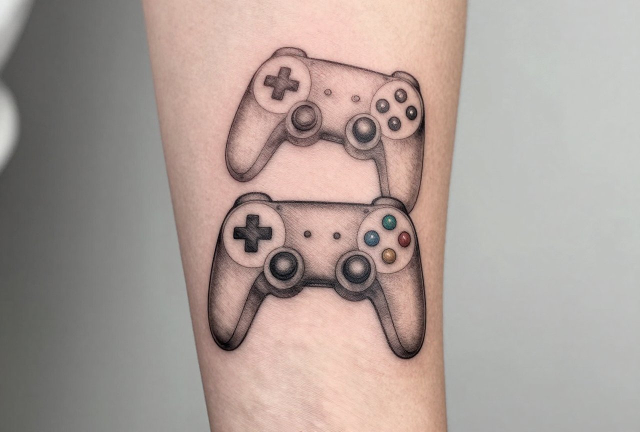
Inventory and UI Elements
Health bars, mana meters, stamina wheels, these read instantly to gamers and look intriguing to everyone else. I’ve tattooed Dark Souls estus flasks that glow under UV. The Legend of Zelda heart container is basically a rite of passage at this point; I’ve probably done forty. What I love about UI tattoos is their graphic clarity. They’re designed to read at a glance on a screen, so they already solve a lot of the legibility problems that plague more complex designs.
Quotes and Typography
“It’s dangerous to go alone” in the original Zelda font. “The cake is a lie” in Aperture Science styling. These work when the typeface is iconic and the placement respects the line length. I did “Prepare to die” on a client’s forearm in the Dark Souls credit font, sharp, medieval, blackletter-adjacent. The kerning was brutal to get right, but two years later it still punches. Avoid tiny text. Always. I’ve seen too many gaming quotes become illegible blobs because someone wanted it “subtle.”
- Spawn coordinates from your favorite open-world game
- Weapon or item descriptions rendered as small flash-style pieces
- Dialogue options from narrative games (Mass Effect’s renegade interrupt symbol, Disco Elysium’s thought cabinet)
- Controller button layouts with personal modifications, your actual custom mappings
Best Placements for Gaming Ink
Where you put it changes everything. I’ve tattooed full sleeves of interconnected game references and I’ve done single tiny pieces behind ears. Both can work. Both have different rules.
Forearms are the sweet spot for most gaming pieces. Visible enough to spark conversation, enough real estate for detail, and the skin there tends to be cooperative. I’ve done gorgeous Bioshock plasmid designs on inner forearms where the natural curve of the muscle follows the art flow. Thighs and calves give you more space for scene work, I’ve put entire Breath of the Wild landscapes on calves that wrap slightly, using the leg’s cylinder shape to create depth.
Chest and back pieces work for the committed. I spent eighteen hours over three sessions on a full-back Dark Souls bonfire scene with linking fire and dying embers. The shoulder blades were perfect for the smoke plume rising. The lower back held the sword detail. But chest skin, especially on guys who hit the gym, stretches and shifts. I make sure clients understand: that perfect composition might morph if your body changes significantly.
Hands, fingers, and necks? I do them, but I always have the conversation. These spots are hard to hide, they fade faster from sun and use, and some artists flat-out refuse. I did a small D-pad on a client’s finger. Cute. Bold. He loves it. But it needed a touch-up at eight months. That’s reality.
Color Choices and Aging
This is where I get technical with clients because gaming art is often saturated as hell. Neon pinks. Electric blues. That specific Overwatch orange. Here’s what actually happens.
What Fades Fast
Yellows and light greens. Always. I’ve seen bright Pikachu yellows drop to a mustard stain in three years without religious sunscreen use. Pastels, think Animal Crossing’s soft palette, go chalky and gray. White ink? On most skin tones it becomes invisible or yellows. I steer people toward deeper, more saturated versions of their desired colors. That electric blue becomes a navy with blue highlights. Still reads as the character, lasts twice as long.
What Lasts
Black and gray. Traditional red. Deep forest green. Purple holds better than people expect. For gaming pieces, I often suggest a “color key” approach, one dominant color that carries the gaming reference, surrounded by black and gray that grounds it. A client got a Portal piece: the orange portal as a small bold circle, the rest of the composition in black and gray test chamber architecture. That orange is still popping five years later because it wasn’t fighting with five other bright colors.
- UV-reactive ink for “glowing” effects, cool but requires blacklight to see, fades unpredictably
- Red ink specifically for low-health or damage indicators
- Metallic golds and silvers for trophy/achievement iconography
Tips for Choosing Your Gaming Tattoo
After thousands of hours in the chair, this is what I wish every gaming client knew before they walked in.
First: screenshot your reference at multiple resolutions. The 4K render from the promotional art is not what the in-game model looks like. I need to see the actual asset I’ll be translating. Second: consider the game’s age and your relationship to it. I’ve had clients request tattoos from games that came out six months prior. Nothing wrong with that, but I always ask, will this matter to you in ten years? The games that stick, that you return to, that shaped how you see the medium? Those make better tattoos. Third: trust your artist’s adaptation. The exact loading screen art might not work at tattoo scale. I need to adjust line weights, simplify backgrounds, sometimes redesign entirely. That’s not betrayal of the source, that’s making it function as a tattoo.
I also tell people to think about placement in terms of their daily life. You want that full neck piece showing while you stream? Great. You’re a teacher who wants to keep it hidden? We can work with that. The gaming reference doesn’t lose power because it’s on your upper arm instead of your throat. I’ve done gorgeous pieces on hips and ribs that only the client and their partner see. Intimacy can be part of the point.
Final Thoughts
Gaming tattoos are mainstream now, but the best ones still feel personal. I’ve watched the industry shift from raised eyebrows to genuine appreciation for this art form. The key is respecting both the source material and the medium. Skin isn’t a screen. It breathes, stretches, scars, ages. A great gaming tattoo finds the overlap between what you love and what actually works in that living, changing canvas. Bring your references. Bring your stories. I’ll bring the technical knowledge to make it last. That’s the collaboration. And honestly? Some of my favorite pieces in my portfolio are the ones where a client trusted me to interpret their 200-hour save file into something they’ll carry forever. That’s the job. That’s the privilege.
Frequently Asked Questions
Will a colorful gaming tattoo look bad in ten years?
Not if it’s done right. Deep, saturated colors last longer than pastels or neons. I always push for richer versions of bright game colors, and sunscreen is non-negotiable for keeping any color tattoo bold. Black and gray will always outlast color, but a well-executed color piece ages gracefully with proper care.
Can you tattoo a screenshot exactly as it appears in-game?
Rarely. Screenshots are designed for pixels, not skin. I need to adapt the image, adjusting line weights, simplifying detail, sometimes redrawing entirely so it functions as a tattoo. The goal is capturing the feeling and recognition, not photographic replication that would blur into a mess within a year.
How do I know if a game I love now will be worth tattooing later?
I ask clients one question: have you returned to this game multiple times? The games that stick with you, the ones you replay, reference, or that changed how you think about gaming, those make tattoos that stay meaningful. The flavor-of-the-month release rarely earns permanent skin space.
Are hand and finger tattoos a bad idea for gaming designs?
They fade faster, blur more easily, and are harder to hide professionally. I do them, but I always have a real conversation about maintenance and touch-ups. Small controller icons or D-pads can work, but they need to be bold and simple, not detailed portraits or tiny text.

