I’ve had a guy tear up in my chair getting Stan Lee’s signature. I’ve watched a dad and his teenage son get matching Avengers numbers. Marvel tattoos aren’t going anywhere, and honestly? After ten years in shops, I still love doing them. But here’s the thing, not every cool panel translates to skin. That hyper-detailed splash page with twenty characters? It’s gonna blur into a muddy mess by year five. The best Marvel pieces I’ve done come from clients who understand the medium. Skin isn’t paper. Ink spreads. Colors shift. Let me walk you through what actually works.
Popular Styles That Hold Up
Style choice makes or breaks a Marvel tattoo. I’ve seen gorgeous concept art turn into unrecognizable blobs because someone insisted on photorealism at two inches wide. Here’s what survives.
Neo-Traditional and American Traditional
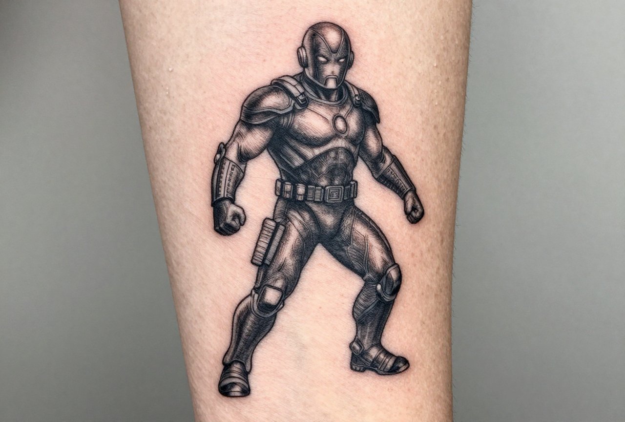
Bold lines. Limited color palette. These age like whiskey. I did a Captain America shield last month, thick black outline, saturated red and blue, minimal shading. That piece will look sharp in fifteen years. Traditional Thor’s hammers, classic Spider-Man portraits with heavy black spiderweb backing, Iron Man helmets simplified to geometric shapes. The trick is letting the style do the work. You don’t need every rivet on the armor. You need the silhouette that reads instantly from across the room.
Blackwork and Fine Line
Two totally different beasts. Blackwork thrives on high contrast, think Venom’s face, negative-space webs, the Black Panther mask as solid black geometry. Fine line is trickier. I’ve turned away clients who wanted a delicate line-art Infinity Gauntlet the size of a quarter. Fine line works for Marvel when you go bigger and simpler: a single continuous-line Spider-Man profile, minimalist arc reactors, tiny logos. But it needs breathing room. Skin expands, contracts, sun damages. Thin lines become broken roads eventually.
Illustrative and Comic-Panel Style
This is where we get to play. Roy Lichtenstein-inspired dots, actual panel borders with “THWIP” sound effects, the half-tone shading from old print comics. I tattooed a full sleeve last year that looked like a torn comic page wrapping around the arm, panel gutters, yellowed paper tone in the background, a full-bleed action sequence. The client understood something crucial: the artifice is the point. We’re not trying to trick anyone into thinking it’s a photograph. We’re translating a graphic medium into another graphic medium.
Design Ideas Beyond the Obvious
Everyone walks in wanting the same ten things. I get it. But the memorable pieces come from deeper cuts and smarter approaches.
- Character moments, not poses: Spider-Man holding Gwen Stacy. Tony Stark’s first arc reactor, cracked and bloody. Logan’s hands with the claws finally retracted, old and tired. These tell stories. Static poses don’t.
- Objects and symbols: Mjolnir with a worthiness enchantment inscription. The Eye of Agamotto as a standalone piece. Captain Marvel’s star on a pilot jacket patch. These read cleaner and invite questions.
- Quote integration: “I am Groot” in actual Groot bark texture. “With great power” in vintage typewriter font wrapping around a wrist. The words matter, but the typography treatment matters more.
- Team dynamics: Not the full roster. Two hands reaching, Cap and Bucky, separated by decades. Peter and Miles, spider-symbols overlapping. The negative space between characters often carries more weight than cramming everyone in.
What We Actually See in Shops
Deadpool breaking the fourth wall, literally, holding up a panel border. The “Snap” as a half-faded dust effect on a forearm. X-Men ’97 title cards for the nostalgia crowd. The new generation wants Moon Knight’s broken mask and Ms. Marvel’s bangle. The old guard still asks for Silver Surfer silhouettes against cosmic backgrounds. Both work. Both tell me who I’m tattooing.
Best Placements for Marvel Work
Placement changes everything. I’ve done the same Iron Man helmet on a shoulder cap and a calf, two completely different tattoos.
High-Visibility Spots
Forearms for the proud. Upper arms for the “I can cover it at work” crowd. These flat, muscular planes handle detail well. Spider-Man web-shooting up a forearm, wrapping around the wrist? Classic. The natural flow of the muscle guides the composition. I always tell clients: follow the anatomy, don’t fight it. A Captain America shield on a rounded shoulder looks like a shield. On a flat inner bicep, it looks like a distorted oval.
Large-Format Canvas
Back pieces for the committed. Full comic spreads. Thanos versus the assembled Avengers. These need scale to breathe. I did a Galactus full-back piece, purple helmet, cosmic background, the whole cosmic entity treatment. Took twelve sessions. The client sat like a rock. Thighs work similarly for big work without the social visibility.
Small and Strategic
Behind the ear for tiny logos. Finger sides for Infinity Stones (though I warn everyone: finger tattoos fade fast, need touch-ups, and hurt like hell). Ankle placements for characters in “flight” poses. Ribs for vertical compositions, Spider-Man crawling up the side, buildings receding. The rib cage moves, so I design with that motion in mind. Static images feel wrong there. Something climbing, reaching, stretching, that’s where ribs shine.
Color Choices: What Lasts vs. What Fades
I have a color chart in my station showing clients their tattoo at one year, five years, ten years. It’s not pretty, but it’s honest.
Red shifts toward orange-pink. Blue holds better but can go muddy. Yellow? I basically make clients sign a waiver. It disappears into skin tones. White turns yellowish or vanishes entirely. For Marvel work, this matters enormously.
- Spider-Man: I use a deeper, slightly blue-red instead of fire-engine. It ages toward a natural red instead of salmon.
- Hulk: Forest green, not lime. The neon stuff dies fast.
- Thanos: That purple actually holds surprisingly well, darker violet tones have staying power.
- Cosmic backgrounds: I lean into black and deep blue with strategic white highlights, not rainbow explosions. The galaxy look is overdone and ages poorly.
Black and grey Marvel pieces are underrated. A full blackwork Daredevil, horned silhouette against Hell’s Kitchen brick texture. Wolverine in greywash, all aggression and shadow. These age with dignity. Color is fun. Greyscale is forever.
Tips for Choosing Your Marvel Tattoo
After thousands of consultations, here’s what separates good Marvel tattoos from regrettable ones.
Reference Smart, Not Hard
Bring me ten images, not one. I need to see what you love about the character. The pose? The costume era? The emotional beat? A single movie still limits us. I had a client bring me every comic appearance of Kate Bishop Hawkeye from 2005 to present. We found the through-line: the purple, the attitude, the improvised weaponry. Her piece is unmistakably Kate, not generic archer.
Trust the Artist’s Eye
When I say “this won’t work at that size,” I’m not being difficult. I’m being a professional. I’ve watched clients go to cheaper artists who said yes to everything. Six months later, they’re in my chair for a cover-up that costs triple. The skin only has so much real estate. The ink only holds so much detail. A good artist will push back. That’s the one you want.
Think About the Long Game
Marvel’s hot right now. It’ll be hot in ten years, probably. But your relationship to it changes. I have a client who got a huge Iron Man piece in 2008, right after the first movie. He’s in his forties now. Still loves it. Why? Because Tony Stark meant something specific to him, recovery, redemption, building yourself back. Not “I liked a blockbuster.” The tattoos that last are the ones with personal architecture underneath the pop culture surface.
Final Thoughts
Marvel tattoos are a gift to work on. The visual language is established, the emotional connections are real, and the clients care deeply. But that caring can become pressure. You want it perfect. I want that too. Perfect, in tattooing, means something that looks intentional on skin, that moves with the body, that tells your specific story through a shared cultural lens.
Come in with passion. Come in with references. Come in ready to collaborate. The best piece on my wall isn’t the most technically perfect, it’s the one where the client and I found something together that neither of us would have made alone. That’s the Marvel magic. Not the movies. Not the comics. The alchemy between what you love and what we can build on your skin, permanently, honestly, with our own two hands.
Frequently Asked Questions
How do I pick between MCU and comic book versions of a character?
Go with whichever version carries personal weight for you. I see a lot of clients mix eras, classic comic costume with a movie actor’s face. Your artist can help blend sources into something unique that doesn’t feel like a straight screenshot.
Will a full-color Marvel sleeve look weird when I’m older?
Any bold, well-executed tattoo ages with you, not against you. I tell clients: the style matters more than the subject. A traditional-style Thor ages better than a photorealistic one. Saturated colors with strong outlines hold their identity even as skin changes.
Can you tattoo actual comic panels on skin?
Yes, but we adapt heavily. Actual panel borders, speech bubbles, and dot patterns work great. Tiny printed text doesn’t, letters blur together. I redraw text larger, simplify backgrounds, and use the comic language as design elements rather than literal reproduction.
What’s the most requested Marvel tattoo you actually refuse to do?
The Infinity Gauntlet with all six stones on fingers. It never reads well at finger scale, the stones become colored blobs, and finger tattoos fade unpredictably. I usually redirect clients to a full-hand design on the back of the hand or a gauntlet on a larger placement.
