Tattoo Ideas Quotes can stay personal for years when the words, placement, and line weight belong together. I once chose lettering too small for the skin, and the result lost its crisp shape fast. These ideas focus on readable scale, meaningful ink, and styles that can age with you. Your choice matters!
Fine Line Life Quote Collarbone Tattoo
A fine-line life quote across the collarbone feels delicate, personal, and quietly striking. On fair cool-pink skin, black lettering creates a crisp path that follows the bone instead of fighting it. If you want life-quotes-tattoos with a graceful finish, keep the sentence short enough to read in one glance.
Ask your artist to test the quote at full size before the stencil touches your skin. I’d rather see three clean words than a long phrase squeezed into a narrow line. Your collarbone moves when you breathe, so a flowing script needs enough spacing to stay legible.
The main idea here is what I call the Collarbone Reading Rule: you should read the entire quote without turning your shoulder or searching for the next letter. Single-needle black ink can look understated at first, but it needs room around every character. If you’re considering a delicate phrase, compare it with short meaningful tattoo ideas before you commit.
A tiny heart, a date, or one clean botanical mark can frame the sentence without crowding it. Think soft curves, gentle joins, and a polished ending rather than extra decoration. You’ll want your artist to show healed examples, because fresh ink can look sharper than it will after the surface settles.
Placement notes:
– Centered under the collarbone. A visible, elegant line. – Slightly angled toward the shoulder.
More movement and less symmetry. – Two short lines. Better balance for a longer quote.
Don’t choose this placement only because it photographs well. Your skin needs enough width for the lettering, and your daily clothing may rub the area during healing. A short, personal phrase will age better than a crowded sentence.
Roman Numeral Tattoo With Deep Meaning
Roman numerals can hold a powerful memory without explaining it to everyone who sees it. The macro view of warm ivory skin makes the inked letters feel bold and intimate, especially when the numbers mark a birthday, anniversary, or private turning point. These tattoos-with-deep-meaning work best when your date still matters without a caption.
I’d keep the numeral structure clean and avoid stacking too many symbols. Four to eight characters often gives your artist enough space for strong edges, but your exact design depends on placement and scale. A dark Roman numeral stencil should show the spacing before the artist begins, because one uneven gap can change the entire rhythm.
The Roman Anchor is a simple decision rule: choose one date, one direction, and one visual weight. If you add a crown, initials, flowers, and a second date, the meaning gets blurry. A classic numeral line can feel more personal than an elaborate composition, and your future self won’t have to decode it.
Before booking, check whether your chosen symbols are correct. I’ve seen people copy a date from memory and discover the error after the needle work was finished.
You don’t need a complicated design, but you do need a careful proof. A related Yin Yang tattoo meaning guide can help if your date connects to balance or two people.
The photo’s close crop suits a tattoo that’s meant to be examined. Use a medium line weight, firm black pigment, and enough negative skin between characters. Solid black numeral ink will usually read longer than a whisper-thin line, especially if you place it somewhere that receives regular sun.
Your artist can adjust the numerals for ribs, sternum, wrist, or inner arm. Ribs offer privacy but may feel more intense during the appointment. The inner forearm is easier to see and tends to be more tolerable, though you’ll need to protect it from sunlight after healing.
Handwritten Script Tattoo Along The Rib
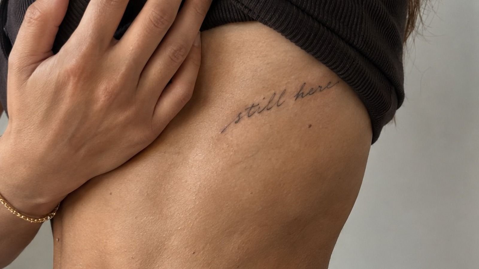
Handwritten script along the rib has an expressive, lived-in quality that printed lettering can’t copy. On medium olive skin, the healed tattoo looks personal because the letters carry the small irregularities of a real hand. That raw quality suits words tattoo ideas built around a family note, a lyric, or your own handwriting.
Bring your artist a clear scan rather than a blurry phone photograph. They’ll need to see every loop, crossing, and connection. A healed script sample is especially useful because your reference should show how the line settles, not only how fresh ink looks.
I call this the Rib Flow Test: place the quote along a natural curve, then check whether your eye follows the phrase without stopping. If the words look broken into separate islands, the design needs more breathing space. You’ll want the first letter to have a clear entry point and the last letter to finish softly.
Rib placement can be more painful because the skin sits close to bone, especially over the side body. Your session might be short if the quote is compact, but your artist should never rush clean lettering.
I made the mistake of treating a small tattoo like a quick appointment once. Small doesn’t mean simple.
Keep the script dark enough to remain readable, and don’t ask for every letter to be microscopic. Handwritten black pigment can look refined without becoming fragile. If your quote has a long tail or dramatic capital, let that feature breathe instead of hiding it under another symbol.
Possible additions:
– One tiny leaf at the beginning. – A small star after the final word. – A single date beneath the handwriting.
Skip a crowded rib collage here. Your quote is the subject, and extra imagery can make the design feel less personal. If you’re comparing scripts with meaningful symbols, browse Yggdrasil tattoo meaning for ideas about memory, growth, and family roots.
Tiny Words Tattoo Behind The Ear
Tiny words behind the ear can feel dainty and discreet, especially when the phrase follows the curve behind the ear instead of sitting in a stiff horizontal line. On golden tan skin, the anatomical placement guide makes the positioning easy to understand. This is a minimal option for your shortest, most personal phrase.
Choose two or three words at most. A phrase like “keep going” or “stay soft” can work, while a full sentence may become too compressed. Your artist should create the stencil at the size they intend to tattoo, not enlarge a tiny digital preview and assume it will translate.
The Behind-the-Ear Scale Check is simple: you should recognize each word from a normal conversational distance in the artist’s stencil. If you can’t, the tattoo may be too small. Sterile transfer stencil lines should show the exact letter height, curve, and distance from the ear before the session begins.
This placement can receive friction from hair, hats, headphones, and mask straps. You’ll need to keep the area clean and avoid unnecessary rubbing while the surface heals.
The surface may settle in roughly 2 to 3 weeks, while complete healing can take about 2 to 3 months. Don’t judge the final line on day three.
I’d choose a sleek sans-serif or simple handwritten style here, not ornate lettering with several flourishes. A sharp, dainty phrase can look more timeless when the letters aren’t competing for space. If you want another symbolic direction, compare your idea with Yant tattoo meaning before narrowing the words.
The photo’s guide-style framing also reminds you to think about hair coverage. Your tattoo can be private beneath longer hair or visible with a short cut. That choice is yours, but you should consider how often you want to explain the phrase to other people.
Botanical Quote Tattoo Across The Forearm
A botanical quote across the forearm gives your words an ornate frame without turning the phrase into a crowded illustration. The aged off-white flash sheet shows several black lettering designs, so your eye can compare shape, rhythm, and botanical balance before choosing one. This style suits elegant, expressive unique-quote-tattoos.
Look for a design where the stems guide the eye toward the words. A thin branch beneath the quote can create structure, while leaves at both ends can soften the edges. You’ll want the lettering to remain the clearest element, even when the surrounding plants are more vibrant.
The Botanical Bracket Method uses two visual anchors, one at the beginning and one at the end. That keeps a long quote from drifting across your forearm. Black botanical flash ink works well for a crisp design, but your artist can use open skin between leaves to prevent the piece from becoming a solid patch.
Forearms are often more tolerable than ribs, feet, hands, or sternum areas. Still, your inner forearm may see more sun than you expect.
UV exposure can soften contrast over time, so sunscreen after complete healing matters. I’d skip delicate gray shading if the quote must stay highly readable.
You can ask for a vintage serif, a rounded script, or a crisp type style. Don’t combine three lettering styles in one quote. A polished layout with one supporting leaf shape will feel more intentional than a page full of competing details.
Flash-sheet planning notes:
– Black lettering with open skin around each word. – Fine leaves with visible stems. – One quote length tested against your forearm. – A clean outer edge without random filler.
If the meaning connects to faith, nature, or heritage, you might also read about Yantra tattoo meaning before adding a symbol. Your best design will have a reason for every line.
Bold Lettering Tattoo On The Upper Arm
Bold lettering on the upper arm creates a fierce statement, especially against deep ebony skin where strong black shapes can look exceptionally clear. The three-quarter crop shows how the tattoo follows the shoulder and upper arm without taking over the entire body. This is a powerful choice for a phrase you’re ready to carry openly.
Start with the words, then select the typeface. A heavy serif can feel masculine or classic, while a thick rounded style may look more playful. Your artist should test contrast and spacing on your skin tone before choosing the final fill.
Bold doesn’t mean every letter needs to touch.
The Upper-Arm Weight Rule says the text should have one dominant line weight and one supporting detail at most. Opaque blackwork lettering gives the quote visual authority, while a small open-skin gap can keep the letters from merging after years of wear. You’ll want the phrase to read clearly from a few steps away.
I’d skip a trendy ultra-condensed font for a long sentence. It may fit the stencil, but your future tattoo needs enough interior space to breathe. If you’re looking at fierce life-quotes-tattoos, choose a phrase with a direct rhythm rather than adding extra words for drama.
Your artist may suggest a larger size because upper-arm skin can support strong lettering well. That doesn’t mean you need to fill the whole arm. A focused quote with a sharp border, a small date, or one meaningful mark can feel complete without becoming a sleeve.
A good upper-arm design can move with your body. Your shoulder changes shape when you lift your arm, so the stencil should be checked in a relaxed position and a raised position. And yes, that small test can prevent a slanted quote later!
If the phrase has religious weight, read YHWH tattoo meaning with care before you choose lettering. Your tattoo should reflect your belief, not simply copy a symbol that looks dramatic.
Matching Life Quote Tattoos For Partners
Matching life quote tattoos for partners can be romantic without being identical. The close-up inner-forearm view shows how two people might share the same lettering structure while choosing separate words. That approach feels meaningful because your tattoos connect, but each one still belongs to the person wearing it.
You could split one sentence between two forearms, or choose two short phrases with the same line weight. Matched inner-forearm lettering makes the relationship visible when you stand together, yet each tattoo remains readable alone. If your connection changes, the design should still hold personal meaning for you.
The Two-Phrase Promise is my preferred approach: one shared idea, two complete statements. Avoid a sentence that becomes nonsense when one person is absent. You’ll want each phrase to feel empowering on its own, not like half a message waiting for someone else.
Inner forearm placement is usually more tolerable than ribs, feet, hands, or sternum, though every person experiences pain differently. Your artist can mirror the designs or rotate them inward so the words face you. I’d choose inward-facing text if the tattoo is primarily a private reminder.
Matching tattoos don’t need matching sizes. If your arm widths differ, the artist can preserve the same visual rhythm while adjusting the lettering slightly. A graceful shared detail, such as one tiny star or curved underline, may be enough to connect the pieces.
Think about ink density too. A delicate phrase paired with a heavy phrase can look disconnected, even if the words match. Your pair should share at least one design language, such as serif letters, rounded script, or a single black line weight.
You can explore Yellow Rose tattoo meaning if you want a symbolic link between the quotes. It’s a romantic option, but your own words should remain the center of the design.
Sacred Words Tattoo With Fine Linework
Sacred words on the wrist can feel understated, sacred, and deeply personal. The healed fine-line tattoo on medium warm ivory skin shows why a small phrase can carry a haunting amount of emotion without needing heavy imagery. This direction works for spiritual words, a prayer, or a reminder you want close every day.
Wrist placement gives you frequent visibility, which can be comforting when the words are chosen carefully. Your phrase should be short enough to read while your hand is relaxed. Healed fine-line lettering may soften slightly as the skin settles, so spacing matters more than decorative flourishes.
The Wrist Visibility Rule asks one question: will you still want to see this phrase during ordinary moments, not only when you’re dressed for a photo? If the answer is yes, your design has a strong foundation. If you’re unsure, choose a less visible placement and live with a temporary version first.
Wrist skin moves, folds, and receives regular contact from sleeves and jewelry. You’ll need gentle washing, light moisturizing, and a break from swimming while the surface heals. Avoid direct sun until the area has recovered, then protect the tattoo with sunscreen whenever your wrist is exposed.
I’d keep the ink black instead of adding pale color to a tiny sacred phrase. A small color accent can look elegant when there’s enough space, but white or soft pigment may lose contrast sooner. The most timeless result is often a crisp phrase with one carefully chosen line.
Your words can be in a language connected to your family or faith, but verify spelling with someone qualified. Arabic tattoo quotes can inspire a meaningful direction, though you should confirm translation and calligraphy before booking.
This is a personal tattoo, so don’t let a trend decide the wording. An expressive phrase that makes sense to you will outlast a stylish phrase chosen for someone else’s approval. That’s the part worth protecting!
Watercolor Quote Tattoo On The Shoulder
A watercolor quote tattoo on the shoulder brings playful color around words that might otherwise feel formal. The anatomical placement guide shows how the design wraps over the shoulder rather than sitting as a flat sticker. On medium olive skin, a controlled wash can feel vibrant, graceful, and daring.
Your artist should treat the lettering as the readable anchor and the watercolor as support. Watercolor tattoo pigment can create a soft surrounding effect, but the quote still needs clear edges and enough contrast. If the colors become too close to the skin tone, your words may disappear in photographs and daily life.
The Shoulder Wrap Test checks the design from three views: front, side, and back. You’ll want the quote to remain balanced as the shoulder moves. A design that looks perfect from the front can become oddly stretched when you lift your arm, so insist on a full placement check.
Watercolor tattoos often benefit from a black or dark-gray lettering structure. I’d avoid placing pale yellow directly inside tiny letters because it may lose definition. A crisp serif or simple handwritten phrase can hold the center while loose splashes create the surrounding movement.
Shoulder skin is often a more tolerable placement than ribs, feet, hands, or sternum. Your session length depends on the size and detail, and your artist may split a larger composition into more than one appointment. Don’t rush the color just to finish quickly.
Useful color directions:
– Deep red with muted ochre. – Indigo with soft violet. – Forest green with a small warm accent. – Black lettering with restrained color marks.
If your quote connects to strength or mythology, browse Zeus tattoo meaning for symbolic ideas. You don’t need to copy the imagery, but it may help you decide whether the color should feel bold, sacred, or more understated.
Minimalist Single Word Finger Tattoo
A single-word finger tattoo can be sharp, stylish, and intensely personal because there’s nowhere for extra decoration to hide. The split image makes the process clear: a stencil on white paper beside the same design healed on a finger. This is a useful reminder that your final tattoo must work beyond the fresh-ink stage.
Choose a word with strong letter shapes and avoid overly thin connections. Finger skin receives friction, washing, and movement, so lines may soften faster than they would on a protected area. Finger stencil lettering lets you see whether each character has enough space before the appointment.
The One-Word Test is simple: say the word aloud and ask whether it still matters without a long explanation. If you need a paragraph to defend it, you may want a different phrase. Your tattoo can be minimal without being random.
I’d choose a compact sans-serif, a clean serif, or one controlled handwritten style. Avoid tiny loops that can blur together as the ink settles. You’ll want your artist to show healed finger work, not only fresh photographs taken minutes after the session.
Finger tattoos can be more painful than an upper arm or shoulder because the skin is close to bone and constantly used. They may also need a touch-up depending on how your skin holds pigment. That isn’t a failure, but you should include the possibility in your plan and budget.
A small word can look feminine, masculine, or completely neutral depending on the letterform. The meaning comes from your choice, not a label. If you want a symbolic alternative, explore Yin Yang tattoo meaning and see whether one word still feels like the stronger idea.
Your finger design should be readable in the stencil and calm in the healed photo. The cleanest version usually wins. No extra flourish required.
Vintage Typewriter Quote Tattoo On The Back
A vintage typewriter quote across the upper back has a classic, literary presence without feeling overly polished. On deep brown skin with a warm undertone, the three-quarter crop shows how the lettering can sit across the shoulder blades and remain visually grounded. This style suits a longer quote with a strong personal history.
Typewriter letters need consistent spacing, but they don’t have to look mechanically perfect. Slight variation can make the piece feel more human. Typewriter-style black lettering should remain dark and open, especially if the quote contains narrow letters such as “e,” “a,” or “s.”
The Backline Balance is the planning concept I use here: center the emotional weight of the sentence, not merely the number of characters. A short word may need more surrounding space than a long word. Your artist can adjust the design so the quote follows your upper back without looking squeezed.
Upper-back placement is easier to keep covered during early healing, which can help if your clothing or work exposes other tattoo areas. You’ll still need gentle care, clean fabric, and protection from sun after healing. Your skin may look settled on the surface before the deeper layers are fully recovered.
I’d skip a perfectly straight quote if your body naturally curves across the shoulder blades. A slight arc can feel more intentional and comfortable. If you want vintage references, keep the letter shape old-fashioned, but avoid adding random keys, ink bottles, or decorative borders unless they carry meaning.
A longer phrase may require more than one session, depending on size and detail. Your artist should give you a realistic plan rather than promising that every design can be completed quickly. And if you’re nervous about a large back piece, start with a temporary print at the same scale.
For more symbolic lettering research, Yggdrasil tattoo meaning can help you think about history, roots, and continuity. Your quote will feel more timeless when the imagery and words point in the same direction.
The Meaning Should Survive the Trend Cycle
I’ve changed my mind about quote tattoos more than once. At first, I thought the safest choice was the smallest possible lettering, tucked somewhere nobody could see.
Then I lived with a piece that was too small, watched the lines soften, and realized privacy isn’t useful if you can’t read your own words. That mistake changed how I plan every tattoo now.
The strongest design usually begins with the phrase, not the placement. Your words have a natural rhythm, and your artist needs to hear that rhythm before choosing a typeface.
A meaningful sentence across the collarbone may need different spacing than the same sentence on a wrist. I’d rather adjust the location than force the quote into a shape it doesn’t fit.
I’m also less impressed by novelty than I used to be. A dramatic style can feel exciting for six months, but your tattoo has to meet you through ordinary mornings, job changes, relationships, and aging skin.
That’s why I keep returning to crisp black lettering, deliberate negative space, and placement that respects the body. Those choices aren’t flashy, but they’re dependable.
Your artist matters as much as your wording. Look for healed photos, clean linework, consistent lettering, and a studio that explains aftercare without rushing you.
Ask how the design may age, especially if you’re considering very fine lines or high-friction areas. A thoughtful artist may tell you to enlarge the quote, remove a detail, or choose a different spot. Listen to that advice!
I’d also resist copying a quote just because it performs well online. Use inspiration to identify what you like, then rewrite the idea in your own language. If your meaning connects to symbols, read Yant tattoo meaning or YHWH tattoo meaning for context, but don’t borrow sacred text casually.
The most personal tattoo is the one you can explain without mentioning Pinterest.
A Few Things Worth Answering
Where can I buy Tattoo Ideas Quotes, and is there a disclosure?
You don’t buy the tattoo itself online. You choose an artist, review their portfolio, and book a consultation at a licensed studio. This article has no affiliate links or paid product recommendations, so your best next step is a local artist with healed lettering work.
How much does a Tattoo Ideas Quotes usually cost?
A typical US quote tattoo may cost about $100 to $300, depending on the artist, region, size, and placement. Many studios have a minimum around $50 to $100, while hourly rates often fall near $100 to $250. Your quote’s detail will affect the final estimate.
Are Tattoo Ideas Quotes a good idea for a first tattoo?
Yes, quote tattoos can suit a first tattoo when you choose readable wording and a tolerable placement. A short phrase gives you control over size and meaning. Your forearm, upper arm, shoulder, or thigh may feel easier than ribs, feet, hands, or sternum.
How do I choose a tattoo artist for Tattoo Ideas Quotes?
Choose an artist with clean lettering, healed examples, and a style that matches your reference. Ask about hygiene, stencil sizing, line weight, and aftercare. You’ll want to see work on skin tones similar to yours, because contrast and healed texture can vary.
How much do Tattoo Ideas Quotes hurt?
Pain depends on the person and placement. Ribs, feet, hands, and sternum are often more intense because they sit close to bone. Forearms, thighs, and shoulders are usually more tolerable.
Your session may feel easier when you’re rested, hydrated, and prepared.
How long does a Tattoo Ideas Quotes take to heal?
The surface commonly heals in about 2 to 3 weeks, but complete healing can take roughly 2 to 3 months. Wash gently, moisturize as directed, and avoid swimming and strong sun during early healing. Your artist’s instructions should guide your routine.
What’s the best placement for Tattoo Ideas Quotes?
The forearm, upper arm, collarbone, shoulder, and thigh are strong choices because they offer readable skin and different visibility levels. Your best placement depends on pain tolerance, work, sun exposure, and how often you want to see the words.
Where I’d Start First
If I had to pick one, I’d start with the healed handwritten script along the rib. It carries your own mark, so the quote won’t feel copied when trends shift. Choose a readable size, protect it from UV, and let your words stay yours.