Tattoo Writing Fonts stay crisp years later when the lettering has enough breathing room, solid black pigment, and a placement that suits your skin’s movement. I learned that after choosing a delicate script that looked elegant on paper but blurred at the wrist. Your font can be expressive and lasting. You just need the right structure.
- Fine-line Script Fonts for Wrist Tattoos (The Fine-Line Spacing Rule)
- Bold Gothic Lettering Across the Forearm
- Delicate Handwriting Fonts Behind the Ear
- Minimal Word Tattoos Along the Ribcage (The Breath-Space Method)
- Ornate Chicano Fonts for Shoulder Ink (The Blackwork Balance Rule)
- Flowing Cursive Fonts on the Collarbone
- Sharp Typewriter Fonts for Finger Tattoos
- Sacred Lettering Designs Along the Spine (The Centerline Reading Rule)
- Playful Bubble Fonts for Ankle Tattoos
- Vintage Serif Fonts Across the Chest
- Meaningful Quote Fonts for Inner Arm Ink
1Fine-line Script Fonts for Wrist Tattoos (The Fine-Line Spacing Rule)
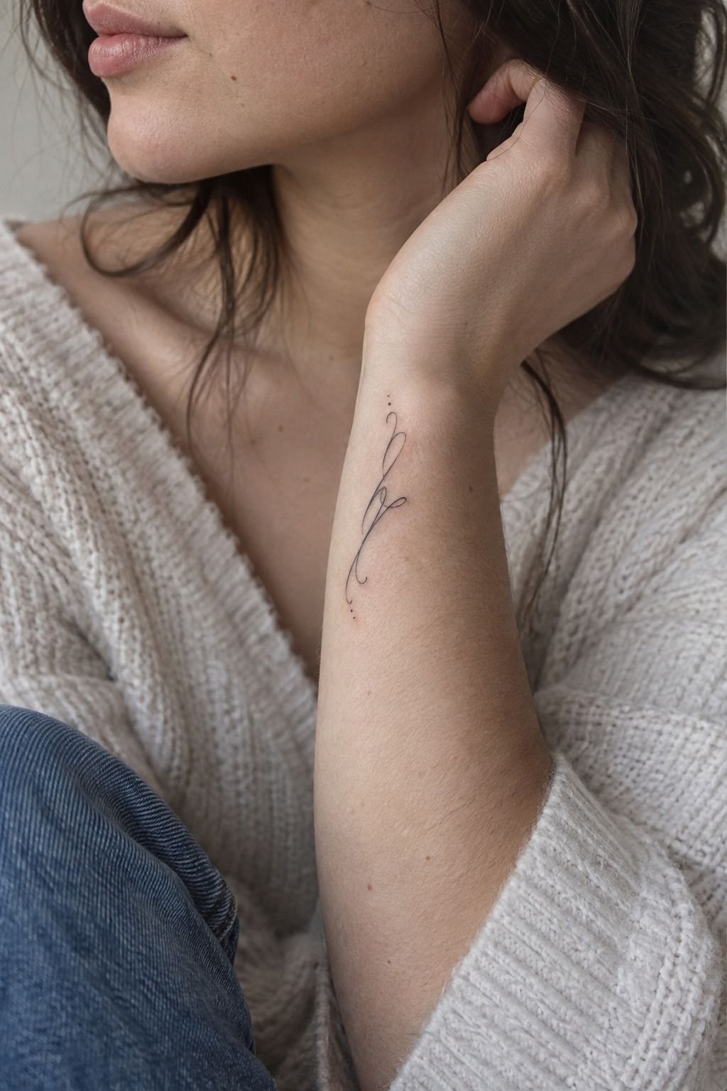
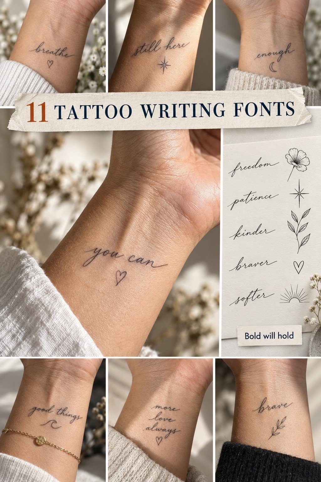
A fine-line script can look delicate, personal, and graceful on a wrist, especially when the letters follow the natural curve instead of fighting it. If you’re drawn to tattoo-handwriting-fonts, ask for connected strokes with visible gaps between loops. Your artist should test the stencil while your wrist is relaxed, not flexed.
The photo’s fair cool-pink skin and three-quarter crop suit a crisp black design with a restrained scale. I’d choose a 3RL single-needle cartridge for the smallest strokes, but I wouldn’t chase hairline-thin ink just to make the piece look dainty. Lines can spread as they age, and a little extra weight keeps your word readable.
Try a short name, date, or two-word phrase rather than a full sentence. Your wrist moves constantly, so a long quote can turn into visual noise. A personal word with solid black pigment will read more clearly than pale grey shading, particularly if you’re comparing a romantic script with an understated monoline style.
I tested a similar placement once and made the lettering too tight. It looked polished on day one, but the loops had nowhere to breathe. If you want a reference for symbolic lettering, compare your phrase with these Chinese writing tattoo meanings before you book.
2Bold Gothic Lettering Across the Forearm
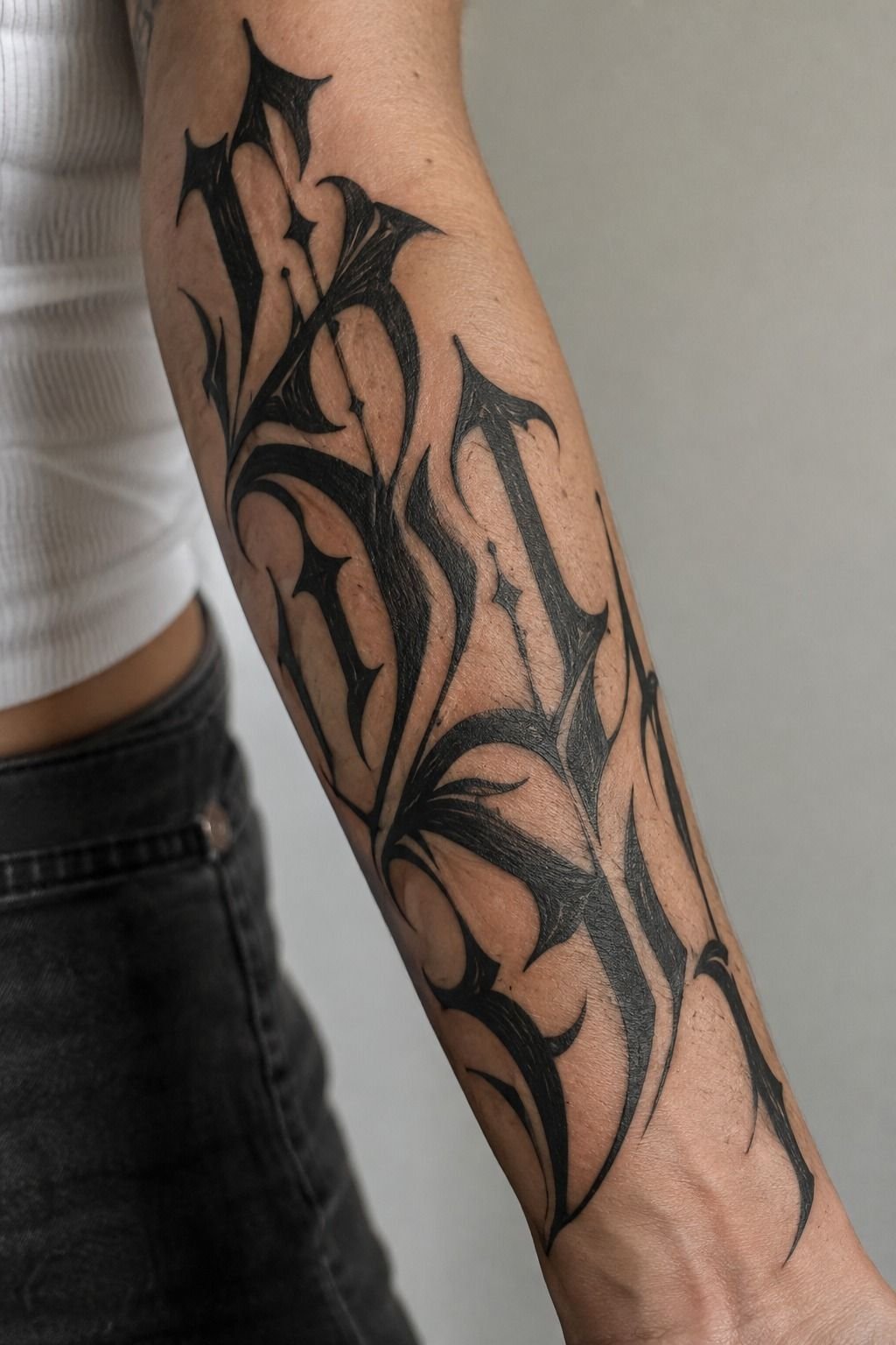
Bold Gothic lettering gives your forearm a fierce, iconic quality because the thick verticals create a strong rhythm from a distance.
3Delicate Handwriting Fonts Behind the Ear
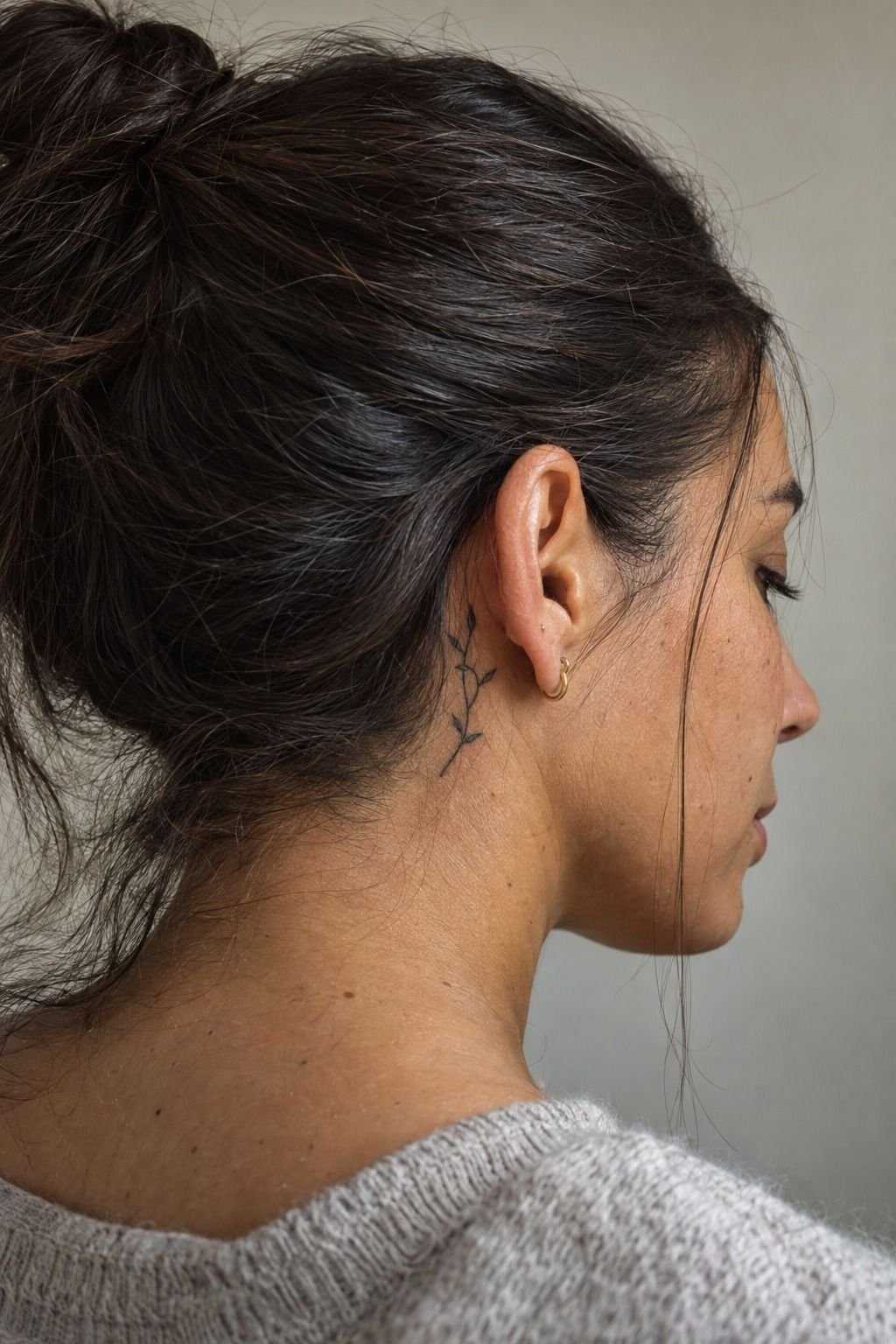
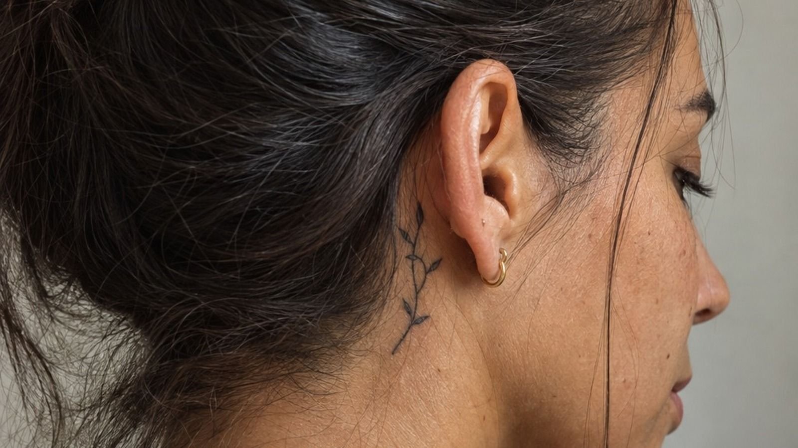
Behind-the-ear lettering works best when the phrase is brief, expressive, and slightly curved to follow the small plane beneath the ear. The healed example on medium olive skin feels lived-in because the linework has settled instead of looking freshly glossy. If you’re choosing different-fonts-for-tattoos, keep this placement personal and visually quiet.
I’d use a compact handwritten alphabet with open lowercase letters, especially in words containing e, a, or s. Stencil transfer gel helps your artist place the design accurately on a curved area, but you should still check the stencil from the front and side. Your phrase may look balanced in one angle and cramped in another.
This is a spot where subtle can become too faint. I’d avoid pale grey wash and overly ornate flourishes because the ear’s movement already breaks up the reading line. A crisp black outline with one meaningful curl feels more timeless than a busy flourish that disappears into hair.
You’ll also want to think about visibility before you choose your final wording. Your hair may cover the tattoo most days, which makes it ideal for a private reminder, but sunlight can still reach it. If the phrase has spiritual weight, read through these YHWH tattoo meanings before settling on the letterforms.
4Minimal Word Tattoos Along the Ribcage (The Breath-Space Method)
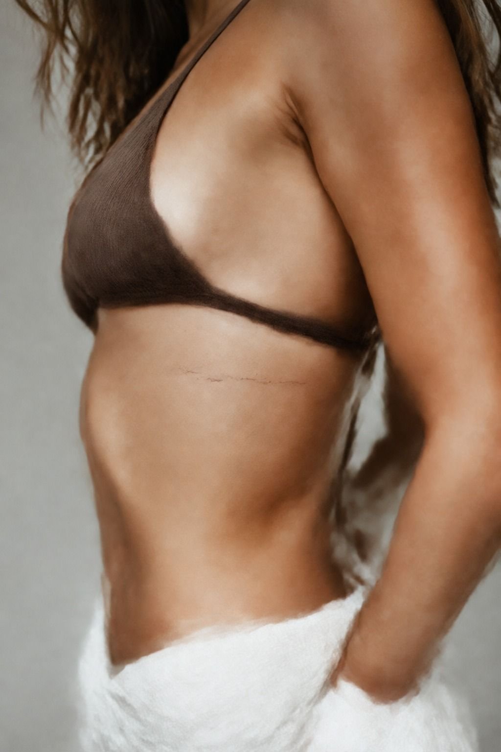
Minimal word tattoos along the ribcage look sleek when the lettering follows the body’s natural line instead of sitting stiffly across it.
5Ornate Chicano Fonts for Shoulder Ink (The Blackwork Balance Rule)
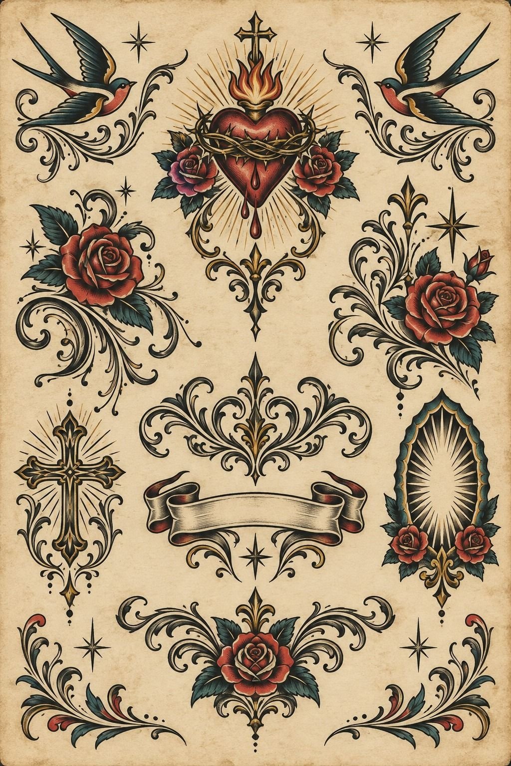
Ornate Chicano lettering belongs on a shoulder when you want a bold, intricate composition with movement around the word. The aged off-white flash sheet in the image gives the style its handmade character: black ink, sweeping serifs, teardrop details, and decorative flourishes arranged like a finished design rather than a typed phrase.
Your artist can build the lettering around the shoulder’s rounded anatomy, letting the top curve carry the largest letters and the lower edge taper into smaller details. Blackwork shading gives the design depth, but I’d keep the darkest areas concentrated near the main word. Too much fill makes the flash-inspired shape feel heavy.
I’d skip mixing Chicano lettering with a delicate modern script in the same small tattoo. That contrast sounds daring, but the two alphabets can compete for attention. A single ornate alphabet feels more polished, especially when your shoulder moves and the tattoo needs one clear visual anchor.
Use a clean stencil first, then let the hand-drawn details come through in the final pass. If you want a sacred or symbolic phrase, your artist can frame it with restrained rays, stars, or ornamental curves. A yantra tattoo meaning may give you useful direction without forcing extra decoration into your lettering.
6Flowing Cursive Fonts on the Collarbone
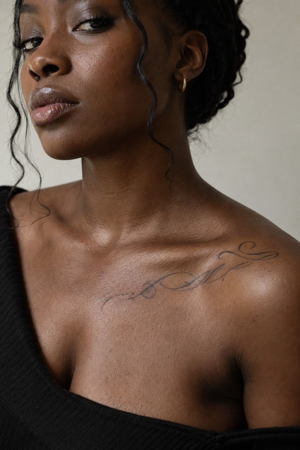
Flowing cursive on the collarbone can feel romantic, elegant, and quietly daring because the lettering follows a visible bone instead of hiding in a flat patch of skin.
7Sharp Typewriter Fonts for Finger Tattoos
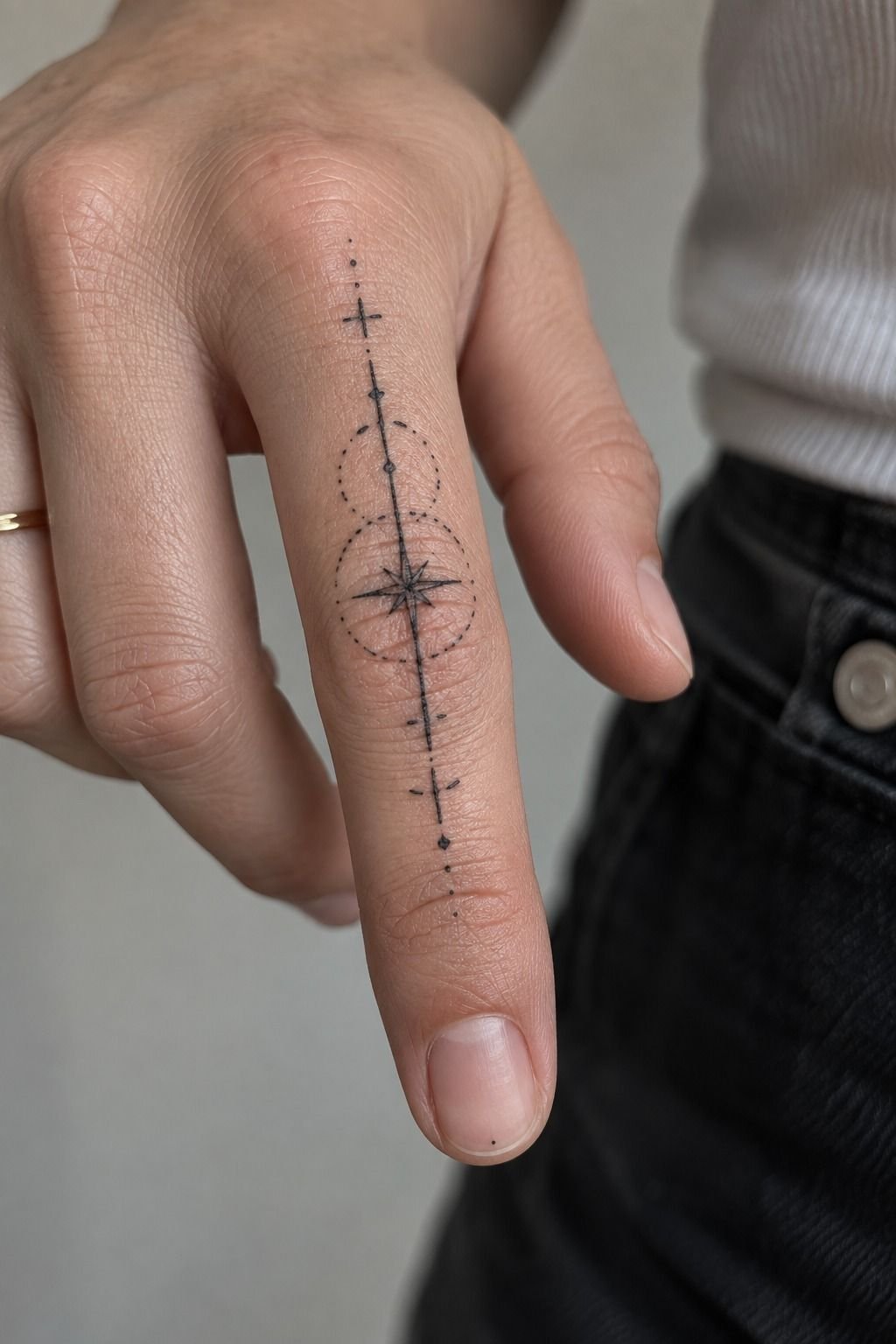
Sharp typewriter lettering gives a finger tattoo a crisp, vintage quality, but the small surface leaves no space for careless details. The macro image shows fair cool-pink skin, fine ink texture, and a design occupying most of the frame. If you’re considering tattoo-words-fonts for your hand, choose a short word with sturdy characters.
A typewriter font works because its letters are structured and recognizable. 3RL black linework can create the narrow strokes, but your artist may adjust the stencil so tiny openings don’t close during healing. Ask to see the word at its true size, not enlarged on a phone screen.
I’d skip ultra-thin punctuation and miniature flourishes on a finger. They look sharp for a photograph, but fingers experience friction, washing, sun, and constant movement. A slightly heavier letter will keep your tattoo legible longer, even if it loses a trace of its original delicacy.
Finger tattoos can also require patience. Your artist may recommend a touch-up after the skin has fully settled, but you shouldn’t judge the final result during the first few days. Keep your aftercare gentle, avoid soaking the area, and let the ink stabilize before you decide whether the font needs adjustment.
8Sacred Lettering Designs Along the Spine (The Centerline Reading Rule)
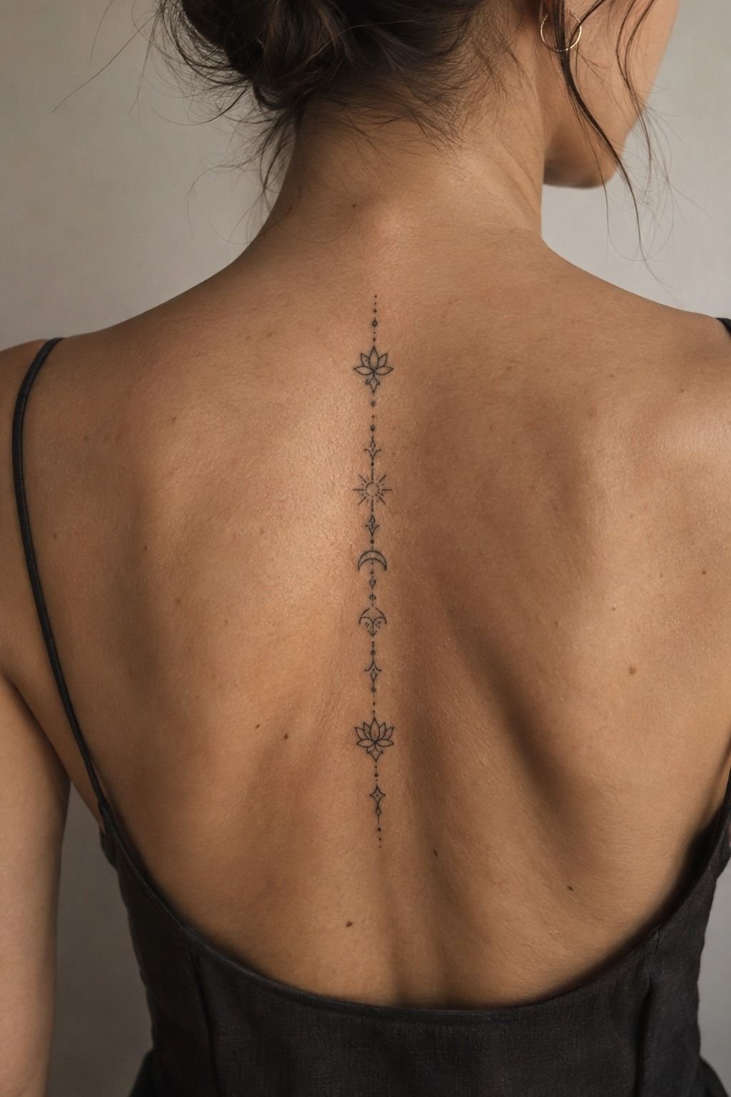
Sacred lettering along the spine creates a vertical, powerful composition, especially when the phrase is arranged with measured gaps instead of packed into one narrow column. The healed lettering on medium warm ivory skin looks personal and lived-in. If you want meaningful text with an ethereal quality, the spine gives the words a ceremonial presence.
Your artist should mark the centerline carefully before applying the stencil. Fine black lettering can follow the spine while each word remains readable from the side, but the design shouldn’t rely on perfect symmetry. Bodies shift, and a slightly organic alignment often feels more expressive than a rigid vertical ruler.
I’d avoid placing every letter directly over the vertebrae. The bony center can be more uncomfortable, and the tattoo may look stiff if the composition has no lateral breathing room. A narrow phrase with small outward flourishes gives your back more movement.
Your artist can also separate words with dots or restrained symbols.
Why choose a sacred phrase if you haven’t checked the meaning behind every word? Your tattoo will stay with you long after the reference image disappears. Read these Zeus tattoo meanings or YHWH tattoo meanings if you’re comparing powerful spiritual references, then choose the lettering that feels honest rather than merely dramatic.
9Playful Bubble Fonts for Ankle Tattoos
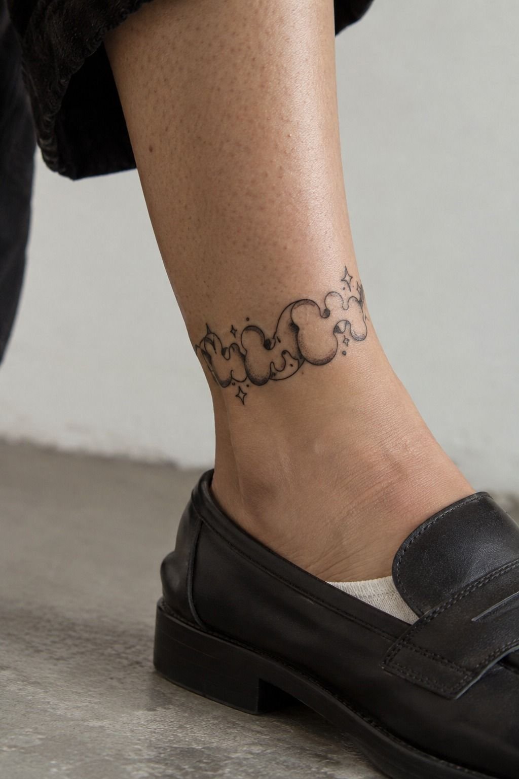
Playful bubble lettering brings a whimsical, vibrant mood to the ankle, and the rounded shapes can follow the curve of the bone without looking severe.
10Vintage Serif Fonts Across the Chest
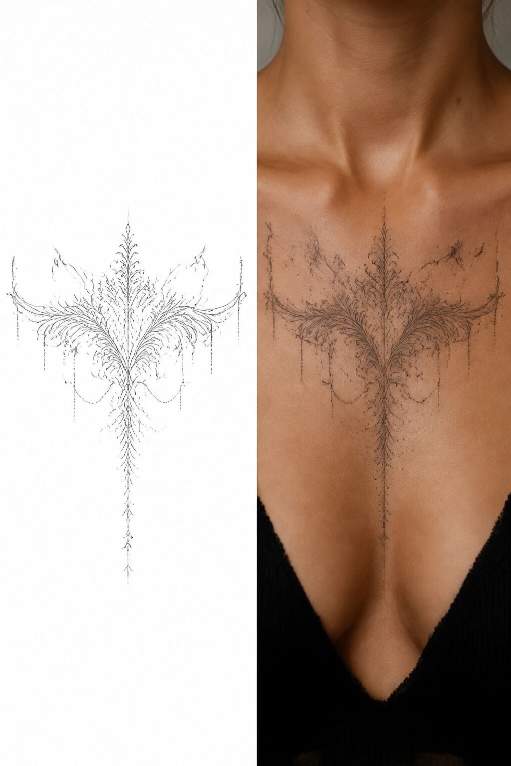
Vintage serif lettering across the chest can feel classic, masculine, feminine, or completely personal depending on the weight of the serifs and the spacing between words. The split image makes the planning process visible: stencil on white paper at left, healed design on skin at right. If you’re comparing cool-tattoo-fonts, this is a strong choice for readable structure.
Your artist should compare the stencil with the healed reference before beginning. Vintage serif lettering needs enough contrast between thick and thin strokes, especially across a broad chest where the design may cross changing planes. I’d rather see fewer letters with confident spacing than a full quote squeezed into one straight line.
The chest can support a larger composition, but larger doesn’t mean busier. I’d avoid stacking several serif styles because the result can look like a poster instead of a tattoo. One disciplined alphabet, one consistent line weight, and one clear phrase will age more gracefully.
The area can also be more sensitive near the sternum and collarbone. Your artist may divide a long appointment into manageable portions, and you should plan clothing that won’t rub the fresh work. For meaningful historical or spiritual text, compare your wording with Chinese writing tattoo meanings before committing to a translation.
11Meaningful Quote Fonts for Inner Arm Ink
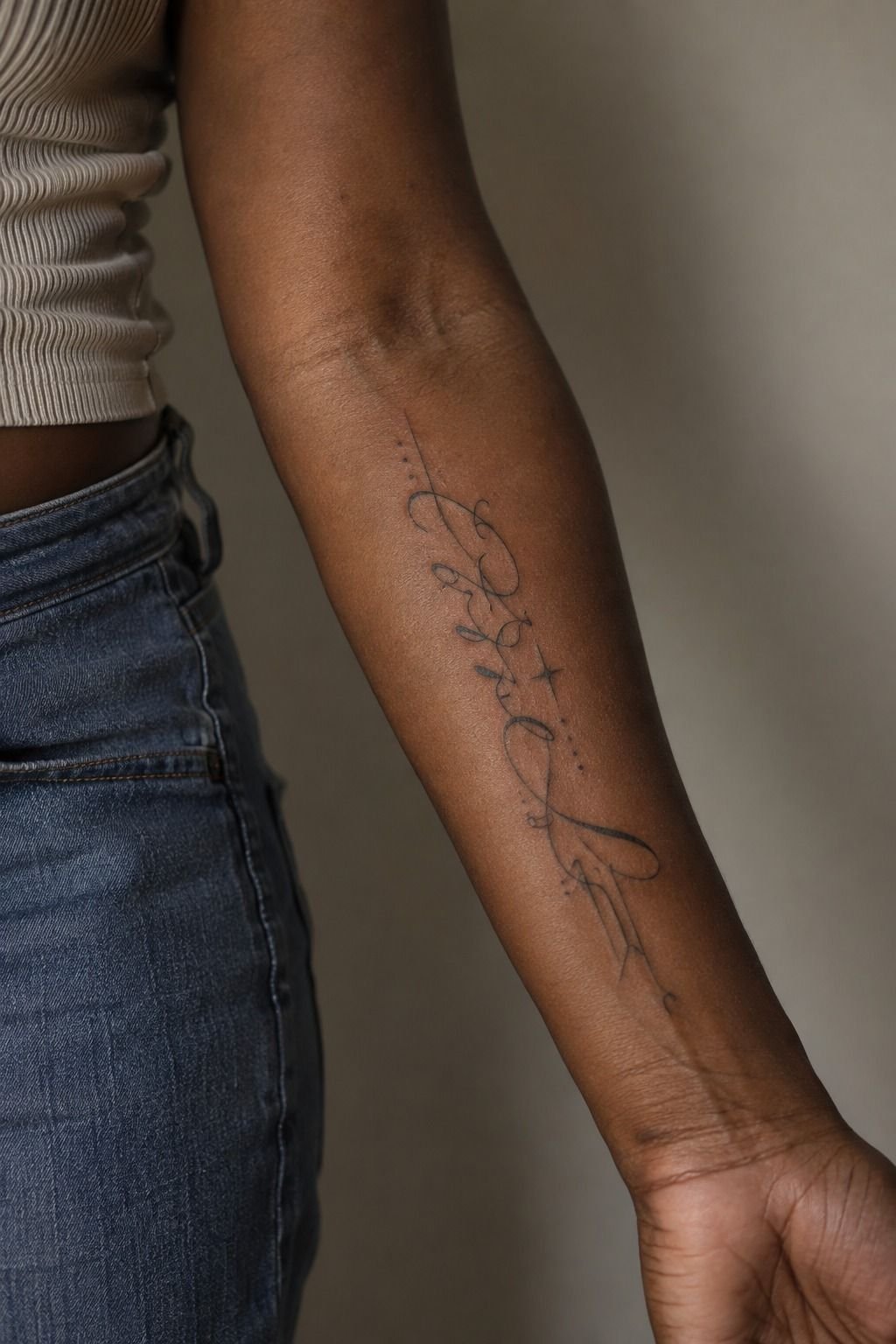
A meaningful quote on the inner arm gives you visibility without making the tattoo impossible to keep private. The deep brown skin with warm undertones in the image suits a crisp, expressive lettering style with enough weight to remain clear. If your phrase carries emotional history, choose a font that supports the words rather than performing over them.
I’d recommend a clean handwritten or restrained serif alphabet for most quotes. High-contrast black pigment can make the lettering readable, while excessive grey shading may reduce clarity after healing. Your artist should show healed work on comparable skin and explain how the chosen line weight will behave.
I’d skip the ultra-detailed calligraphy trend for a long sentence. It looks intricate in a stencil, but every extra loop gives the eye another place to lose the reading path. Your inner arm has enough length for a phrase, so let the words breathe and keep the flourishes limited to the first or last letter.
A quote should still sound like you when nobody else sees it. Read it aloud, check the punctuation, and sit with the wording for a few weeks before booking. If the phrase connects to balance, faith, or identity, these yin yang tattoo meanings may help you refine the idea without adding unnecessary symbols.
Where Should You Start? The Two-Year Readability Rule
I’ve changed my opinion about tattoo fonts after watching fresh lettering become healed lettering. At first, I wanted the finest line and the most intricate script because those references looked delicate and editorial. Then I saw how crowded loops softened at the wrist.
That experience made me more careful, not more fearful. Crisp tattoo writing depends on spacing, placement, contrast, and patience.
The two-year test is simple: can you imagine reading the phrase after the gloss disappears, the skin settles, and the lines widen slightly? If the answer is no, edit the font before you edit your meaning.
A bold Gothic design may be less dainty than a fine-line script, but it can remain clearer from across the room. A minimal rib word may feel quieter than a full quote, but the negative space gives it room to age.
Your placement also changes the decision. Ribs, feet, hands, and sternum are often more painful because they sit close to bone. The forearm, thigh, and shoulder are generally more tolerable areas.
I wouldn’t call one placement universally best. I’d choose the spot that matches your tolerance, visibility needs, and willingness to protect the tattoo from ultraviolet exposure.
Healing takes time, too. The surface commonly settles in about 2 to 3 weeks, while complete healing can take roughly 2 to 3 months.
During that period, gentle washing, light hydration, and avoiding pools and strong sun matter more than any aftercare slogan. Your font can be timeless and personal, but it still needs ordinary care to stay crisp.
Here are the practical reference points I use before booking:
The Questions I Get Asked Most
How much does a Tattoo Writing Fonts tattoo usually cost?
A small lettering tattoo often costs about $100 to $300 in the US, though artists may charge a studio minimum of roughly $50 to $100 or an hourly rate near $100 to $250. Your final price depends on size, placement, artist experience, and how intricate the design is.
– Studio minimum – Hourly pricing – Regional variation
Are Tattoo Writing Fonts a good idea for a first tattoo?
Yes, lettering can be a meaningful first tattoo when your phrase is short and your placement is manageable. Clear linework helps you understand how tattoos age, while an inner arm, outer forearm, shoulder, or thigh may feel more tolerable than ribs, feet, hands, or sternum.
– Short personal phrase – Tolerable placement – Healed portfolio examples
How do I choose a tattoo artist for Tattoo Writing Fonts?
Choose an artist whose portfolio shows clean lettering and healed photographs, not only fresh tattoos. You’ll want to check their specialty, stencil precision, hygiene standards, and experience with your preferred style. Ask to see comparable skin tones and placements before you pay a deposit.
– Healed lettering photos – Clean studio practice – Style-specific portfolio
How much do Tattoo Writing Fonts hurt?
Pain varies by placement, but ribs, feet, hands, and sternum are often more intense because the skin sits close to bone. Your forearm, thigh, and shoulder are usually more tolerable. Placement comfort matters because staying relaxed can help your artist keep the lettering steady.
– Bone-adjacent areas – Outer forearm – Shoulder and thigh
How long does a Tattoo Writing Fonts tattoo take to heal?
The surface usually heals in about 2 to 3 weeks, while complete healing can take roughly 2 to 3 months. Wash gently, moisturize lightly, avoid pools, and protect your tattoo from strong sun. You shouldn’t judge the final crispness while the skin is still settling.
– Gentle washing – Light hydration – Sun protection
What’s the best placement for Tattoo Writing Fonts?
The best placement depends on your visibility, pain tolerance, and phrase length. An inner arm gives you easy reading and moderate flexibility, while a collarbone or rib placement feels more expressive. Readable spacing matters more than chasing a placement because it is popular online.
– Inner arm visibility – Forearm readability – Ribcage or collarbone movement
Which One Would I Start With?
If I had to pick one, I’d start with a short fine-line script on the inner forearm. You’ll get readable spacing, easier healing access, and less friction than a finger or ankle. Pin these Tattoo Writing Fonts for later, then ask your artist for a healed example before booking.