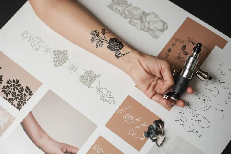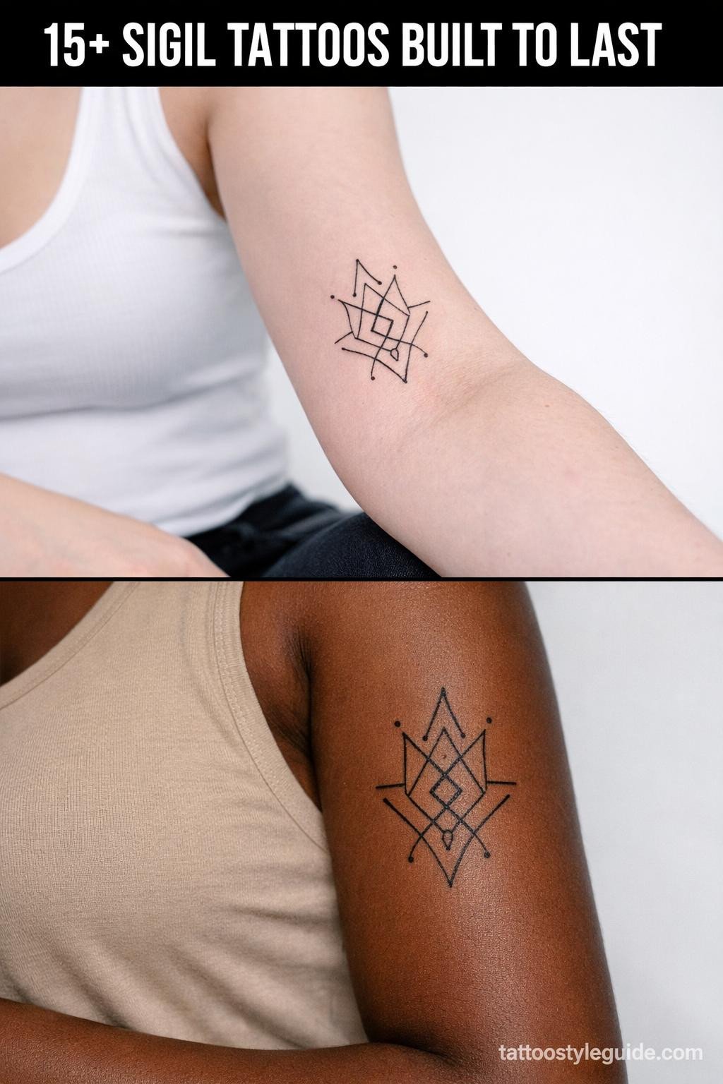
Sigil tattoos fail when the person wearing them can’t explain what the mark means without reaching for the word “energy.” The symbol has to be load-bearing from the start, not decorative. That’s what separates a sigil tattoo with staying power from one that reads as noise by year three.
The technical stakes are real. Sigil work lives or dies on linework precision. Closed geometric chambers that aren’t fully sealed blur into each other as skin shifts. The references below are organized by style and approach, covering the full range from fine line cuneiform to trash polka chaos marks.
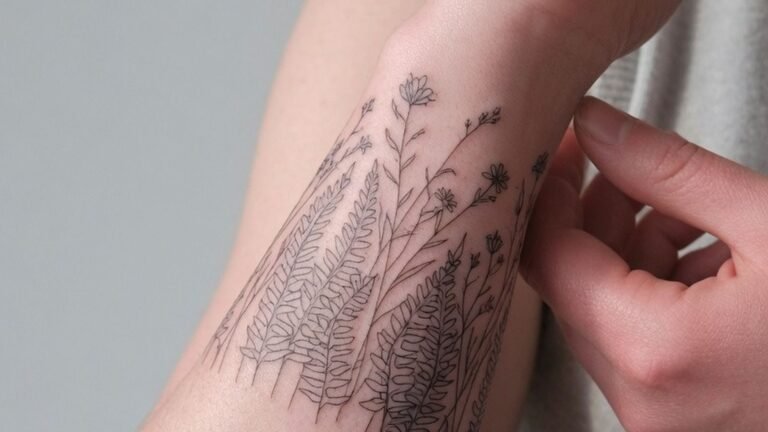
When the Hand Placement Asks Too Much of Fine Line
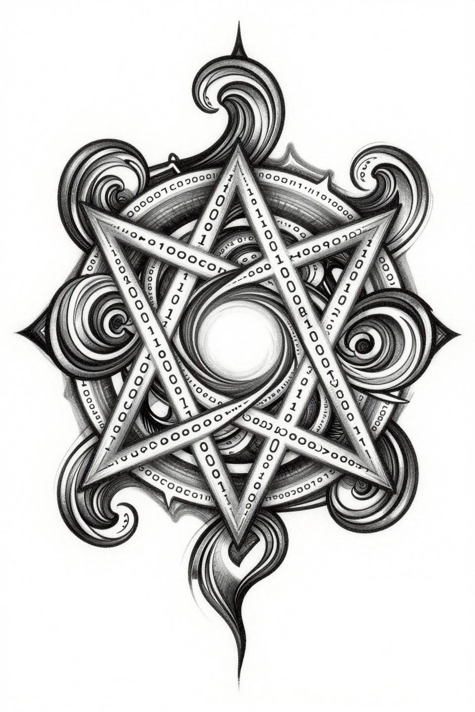
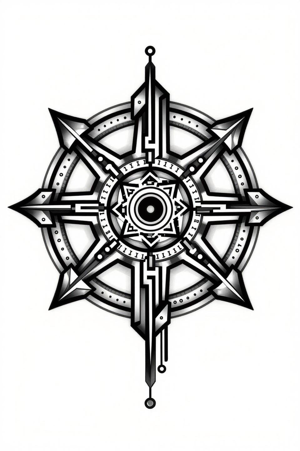
An inverted pentagram chaos sigil built on algorithmic fractal branches, with recursive spiral arms pulling from a central void and corrupted binary sequences threaded through geometric breaks. The diamond frame composition holds asymmetric weight without tipping the design.
Hand placement means friction, sun, and constant flexion. Bold outlines at this weight are the right call: hairline work here would require touch-ups every 18 months minimum.
Neo-Tribal Geometry That Earns Its Complexity
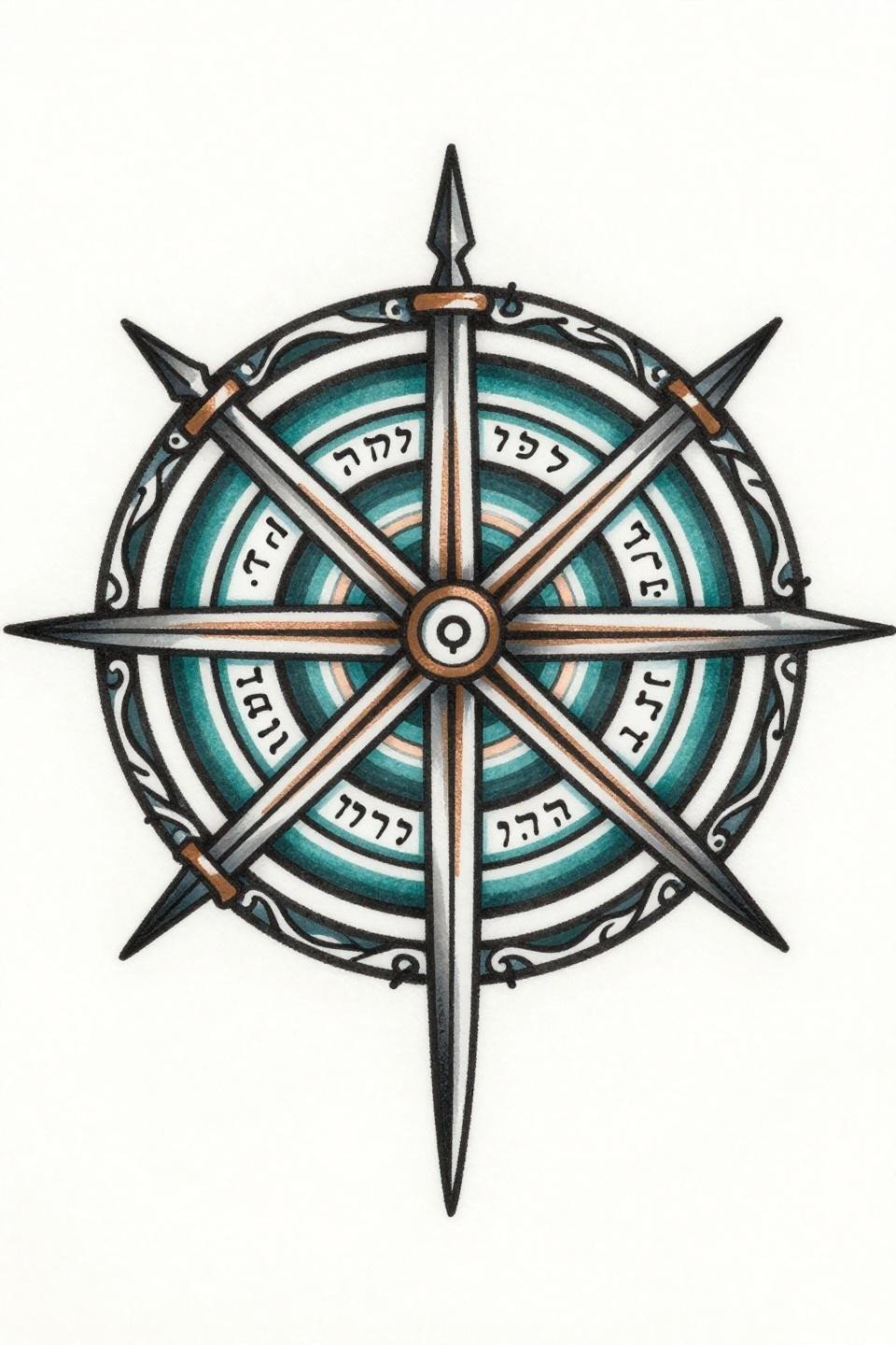
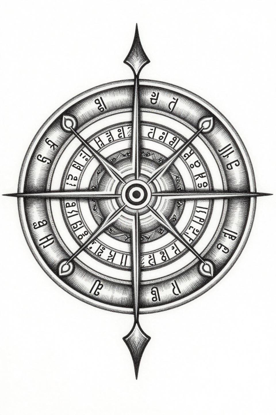
The Sigil of Solomon rendered with seven nested polygonal chambers, crossed ceremonial daggers at the binding seal, Hebrew letter sequences on the outer ring, all wrapped in Art Nouveau curvilinear flourishes. Flat color fills at 2-3pt outline weight give this enough structure to survive as a large-format piece.
Organic flourishes around hard geometry age differently. The linework holds; the curvilinear edges soften slightly over a decade, which actually reads as intentional patina on this style.
Small Cybersigilism: Where Minimum Viable Size Lives
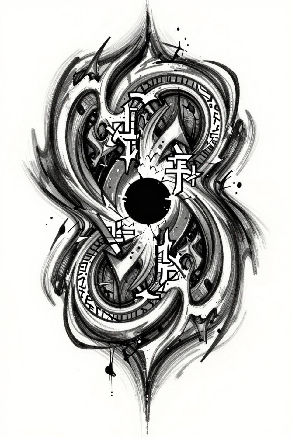
Recursive data-stream spirals collapsing into a void-black core, with algorithmic rune-glyphs branching like neural pathways and fractured mirror-plane geometry suggesting digital collapse. The gestural jagged linework reads as raw sketch energy at flash scale but needs a confident hand to execute without wobble.
At small scale, the grey wash midtones are what keep this from becoming a black blob. An artist who controls dilution ratios through speed, not pressure, is the only call here. Check their healed work portfolio, not just fresh shots.
Sigil Art in Trash Polka: Controlled Destruction
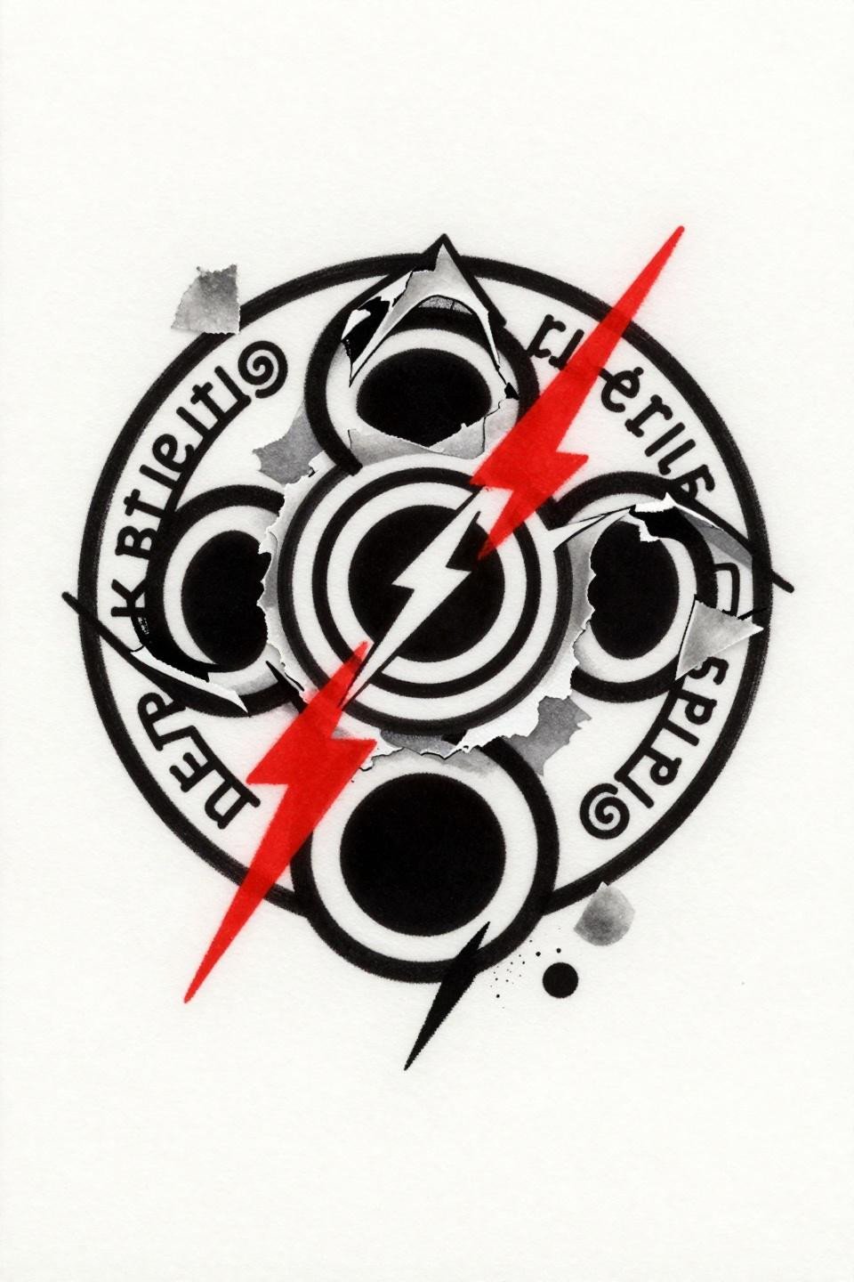
A binding and banishment sigil built on three nested concentric circles, a void-black central hexagon with crossed lightning bolts, and asymmetric angular rupture lines. Crimson accent against solid black with torn collage texture marks is a trash polka hallmark: two colors, maximum tension.
The gestural smear strokes here are the artist’s signature territory. This style punishes timid execution. The lines either commit or they read as accidental.
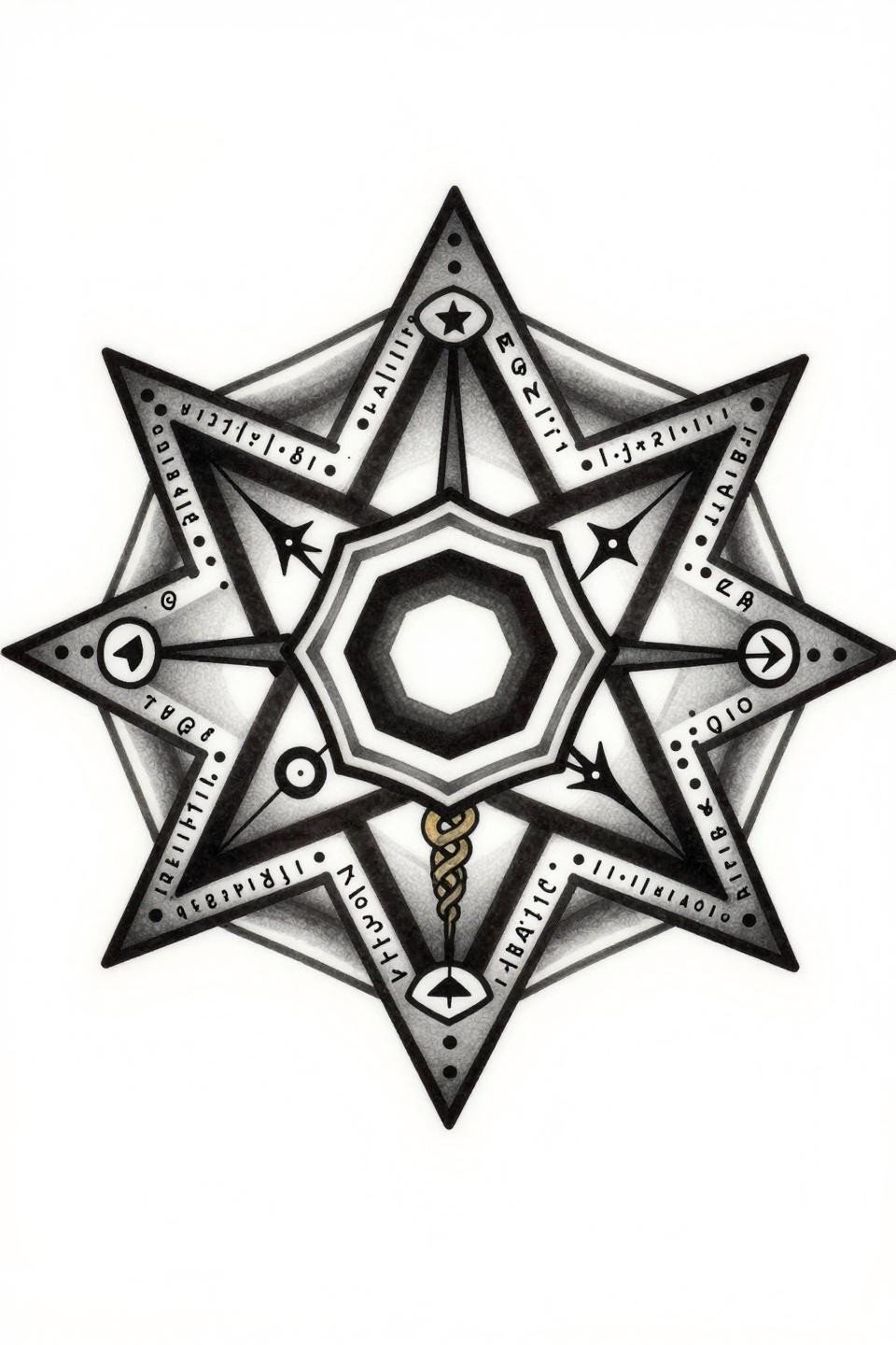
Goetia Seals for Men Who Understand Placement Scale

A Goetia demon summoning sigil rendered in old school sailor style: void-black Seal of Solomon with interlocking triangles, bound serpent coils at the perimeter, archaic Latin script along the outer ring. Bold 2-3pt outlines at this weight hold for a decade plus on protected placements like the chest or upper back.
The bilateral symmetry here is the technical signal. Any wobble at the triangle intersections exposes the artist immediately. This is a reference worth showing a veteran, not a shop’s walk-in chair.
Fine Line Cuneiform: Reading the Longevity Trade-Off
Sumerian cuneiform binding sigil with three nested wedge-shaped glyphs forming a downward-pointing protective triangle, using hairline 0.5mm single-needle strokes and open negative space. This is the highest-risk rendering in the collection for long-term legibility.
Single needle 1RL work at this weight needs an artist who controls machine speed precisely. On olive and darker skin tones, these fine lines need to run slightly bolder to maintain contrast past year five.
Enochian Sigils for Women Who Want Edge Without Maximalism
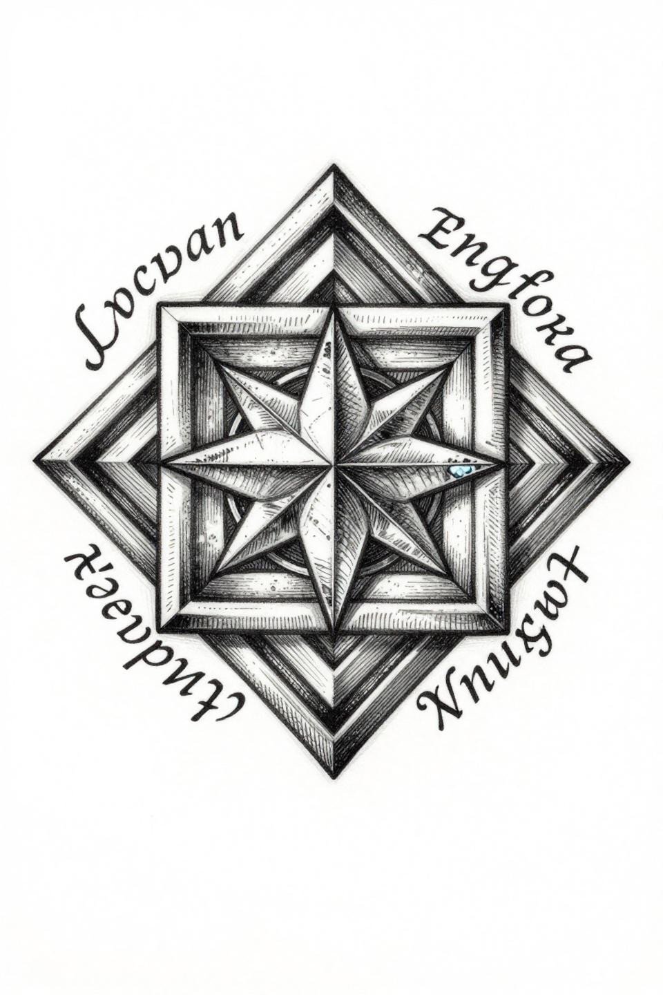
An Enochian magic sigil with interlocking square chambers, divine names in flowing script around the perimeter, and a central four-pointed star with crystalline geometric lattice. The crosshatch parallel-line engraving gives this woodcut weight that reads at distance without requiring solid black fills.
The diamond frame composition suits sternum and upper back placements. Protected placement plus bold hatching density means this reference has the best shelf life in the collection for women choosing a centerpiece piece.
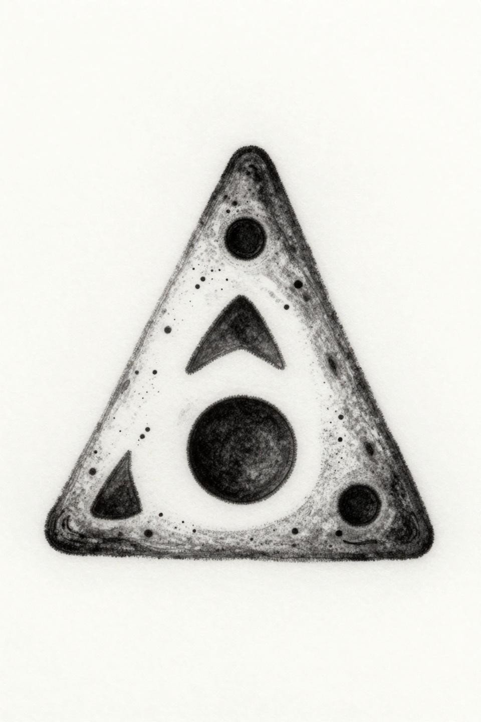
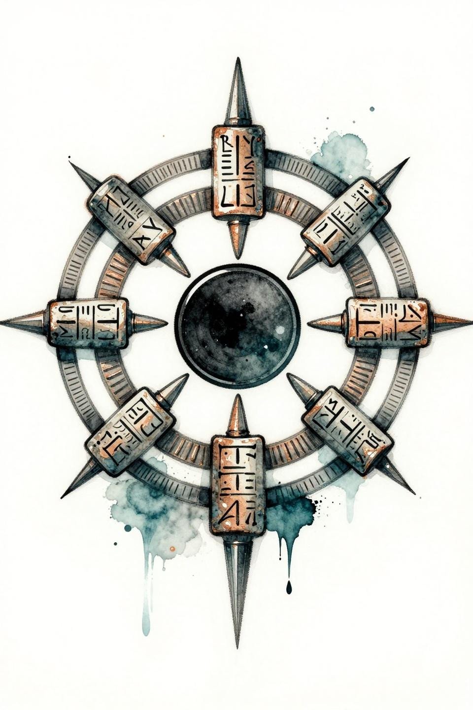
Sigilism Design Rooted in Alchemical Correspondence
Seven planetary alchemical symbols placed at heptagram star points, with a mercury caduceus woven through the center and dotwork script equations along the edges. Executing this in Japanese irezumi linework structure gives the geometric composition a boldness that keeps every chamber readable at scale.
The inverted triangular composition is a collector-level choice. It signals understanding of compositional hierarchy, not just symbol selection. Artists who do Japanese work well tend to handle this reference better than those who specialize in geometric alone.
Neo-Sigilism and the Sak Yant Structural Debt
A protective sigil built on intersecting curved yant lines forming shield geometry, with sacred syllables in concentric arcs and a central bindu point radiating dharma-wheel spokes. The tight parallel-line engraving with ruled crosshatch density variation is borrowed directly from Sak Yant tradition.
Neo-sigilism designs that pull from Sak Yant structure tend to age more predictably than those built on purely contemporary geometry. The hatching compresses slowly rather than blowing out. Explore how this connects to broader cybersigilism tattoo design variations that share the same sacred geometry DNA.
Magic Symbol Geometry: When the Mandala Actually Means Something
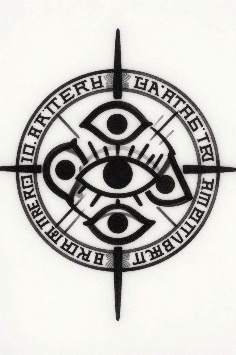
Three interlocking crescents forming a trinity knot around a central eye glyph, with straight-line energy vectors radiating outward in perfect symmetry. Bold 3pt outlines and flat solid black fills with zero gradients make this the most durable reference in the set.
High negative space contrast reads clean on all skin tones. Blackwork at full saturation holds density indefinitely if the artist commits to layered passes, and this composition is built for exactly that.
Watercolor Mandala Sigils and What Fades First
A Sumerian binding sigil with three nested wedge-shaped glyphs arranged in circular mandala formation, a void-black seal disk at center, and deep teal watercolor blooms with copper metallic accent washes in wet brush quality. The void-black seal disk is doing the structural work here.
Watercolor without an anchoring outline blurs by year three to five. This reference survives longer than most because the black seal at center holds the eye while the color field fades to a wash. The teal reads as intentional softening, not degradation.
Neotribal Chaos Lines: The Continuous Stroke Problem
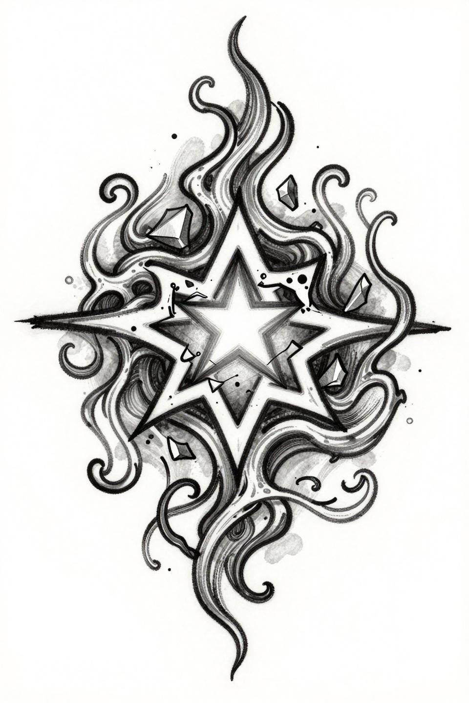
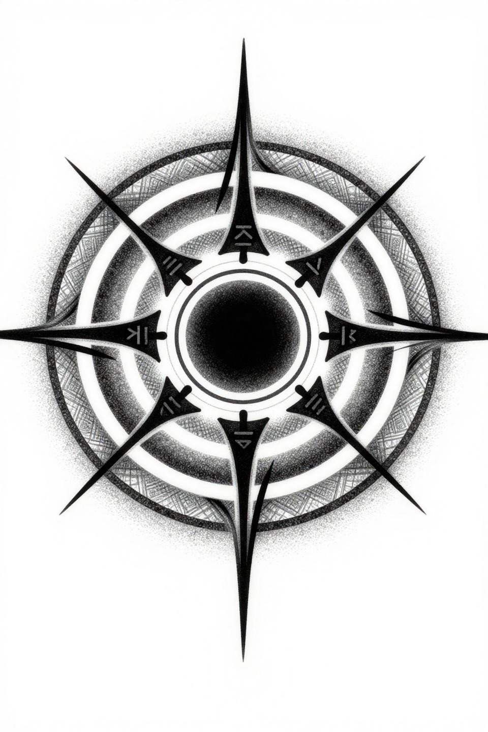
A chaos sigil with organic root-vein tendrils spiraling from a central void, a five-pointed star intersection at core, and fractured geometric shards in an asymmetric organic flow. Executed in single continuous line calligraphic brush stroke, this is one of the hardest references in the collection to replicate at skin level.
The unbroken fluid stroke means no second chances. An artist who does this style well moves at consistent speed with no hesitation marks. That consistency is the only quality signal that matters for this reference.
Small Cybersigilism in Art Deco: Circuit Board as Sacred Geometry
Fractured circuit-board pathways forming sacred geometry, a pixelated mandala core, binary-code rim inscription, and angular chrome-finish planes with hard-edge geometric fills. The compass-drafted angular geometry and vector-precision linework are what separate this from the looser cybersigilism references.
Art deco structure with zero gradients means this reference scales down cleanly. Small placement on the wrist or inner arm works because every line has a defined terminus. Nothing bleeds into adjacent territory.
Blackwork Dotwork Sigils at Year Five: The Honest Assessment
An occult protective sigil with interlocking concentric circles, angular runic symbols radiating outward from a void-black central seal, built entirely on stipple dot gradient running dense at core and open at the outer edges. No solid line outlines anywhere in the composition.
Dotwork without outlines migrates slightly over five years. Consistent dot size across the full gradient is the artist skill signal to look for. Uneven dot density at the outer ring is the first place degradation shows.
Take three to five of these references and filter by placement before your consultation. Stack marks that are too small for the body zone you’re targeting are the most common planning mistake in sigil work. Match the composition scale to the canvas, then let the artist adjust the line weight from there.