Hand tattoo ideas got real for me the week I booked my first one at 30. I wanted something tiny and cool, got too cautious, and picked a mark that looked delicate for about five minutes. Then I learned the boring part that matters: placement, contrast, and how your hands get used all day.
Why Did My First Hand Tattoo Feel So Timid?
[IMAGE: tiny finger symbol on a real hand, healed texture, natural daylight, close enough to show wear]
Before I figured any of this out, the back of my hand and fingers looked like a half-made decision. One tiny symbol. Too little contrast.
Too close to a high-wear edge. I kept telling myself I liked how subtle it was, but subtle and readable are not the same thing on a hand.
You know that feeling when a tattoo is not bad, but it never quite lands when you look down? That was me.
The skin was clean, the idea meant something, and still the piece felt timid next to how much movement hands have. I was not dealing with a bad artist.
I was dealing with a choice that did not respect wear, sunlight, soap, friction, and the fact that hands are always in motion.
I started saving screenshots, checking healed photos, and paying way more attention to what still looked crisp after six months. That changed everything.
Pretty hand tattoos can heal nice, but only if you build for the job your skin is doing every day. That realization stung a little, but it helped!
- I Started With A Tiny Finger Symbol
- Would Fine Line Florals Survive My Knuckles?
- I Placed A Meaningful Word Along The Thumb
- Botanical Flow Beat A Stuck-On Hand Tattoo
- Could Red Ink Ever Hold On A Side Finger?
- Blackwork Gave My Hand A Backbone
- I Wrapped A Snake Around The Index
- Dotwork Looked Minimal, But Symmetry Was Harder
- I Kept One Palm Side Tattoo Hidden
- Matching Tattoos Can Stay Clean, Not Corny
- I Asked For Bold Lines On The Knuckles
- I Planned Healing Around Daily Hand Use
1I Started With A Tiny Finger Symbol
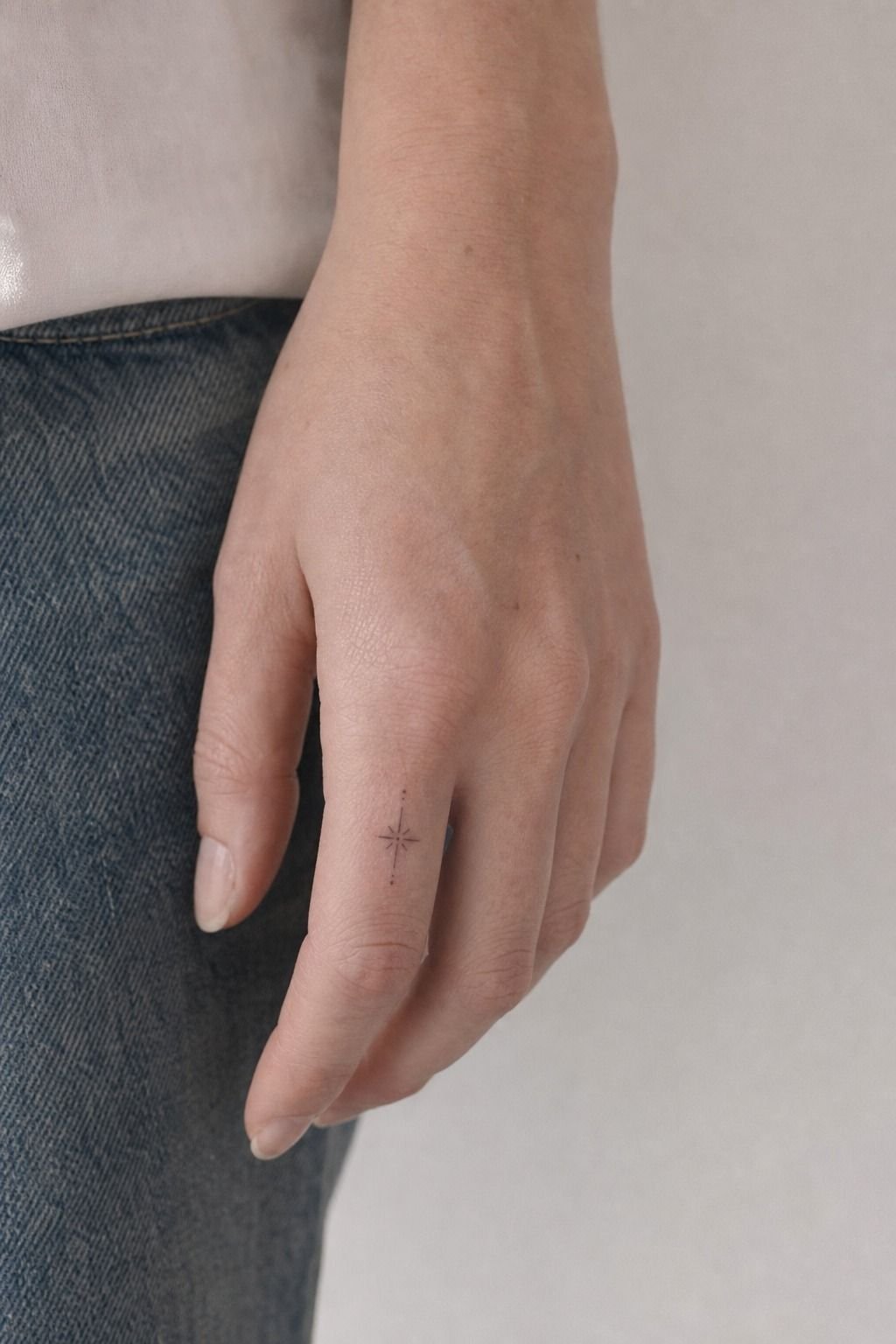
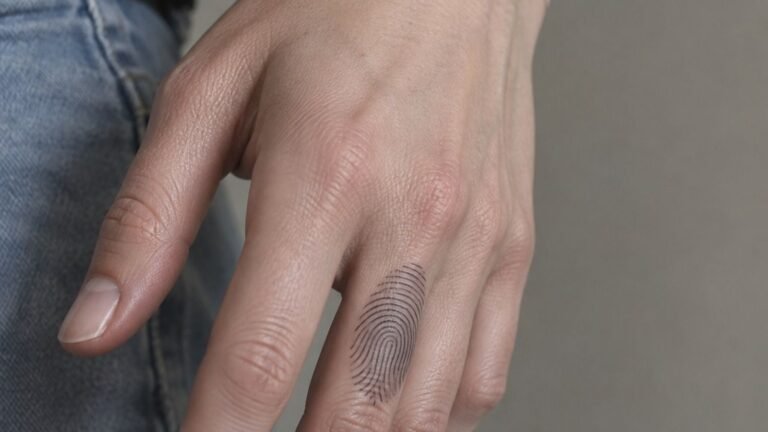
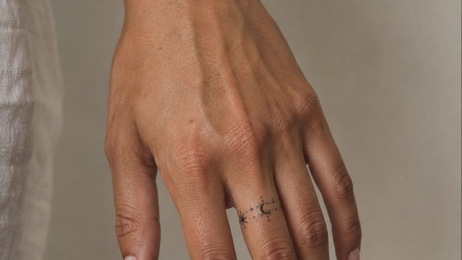
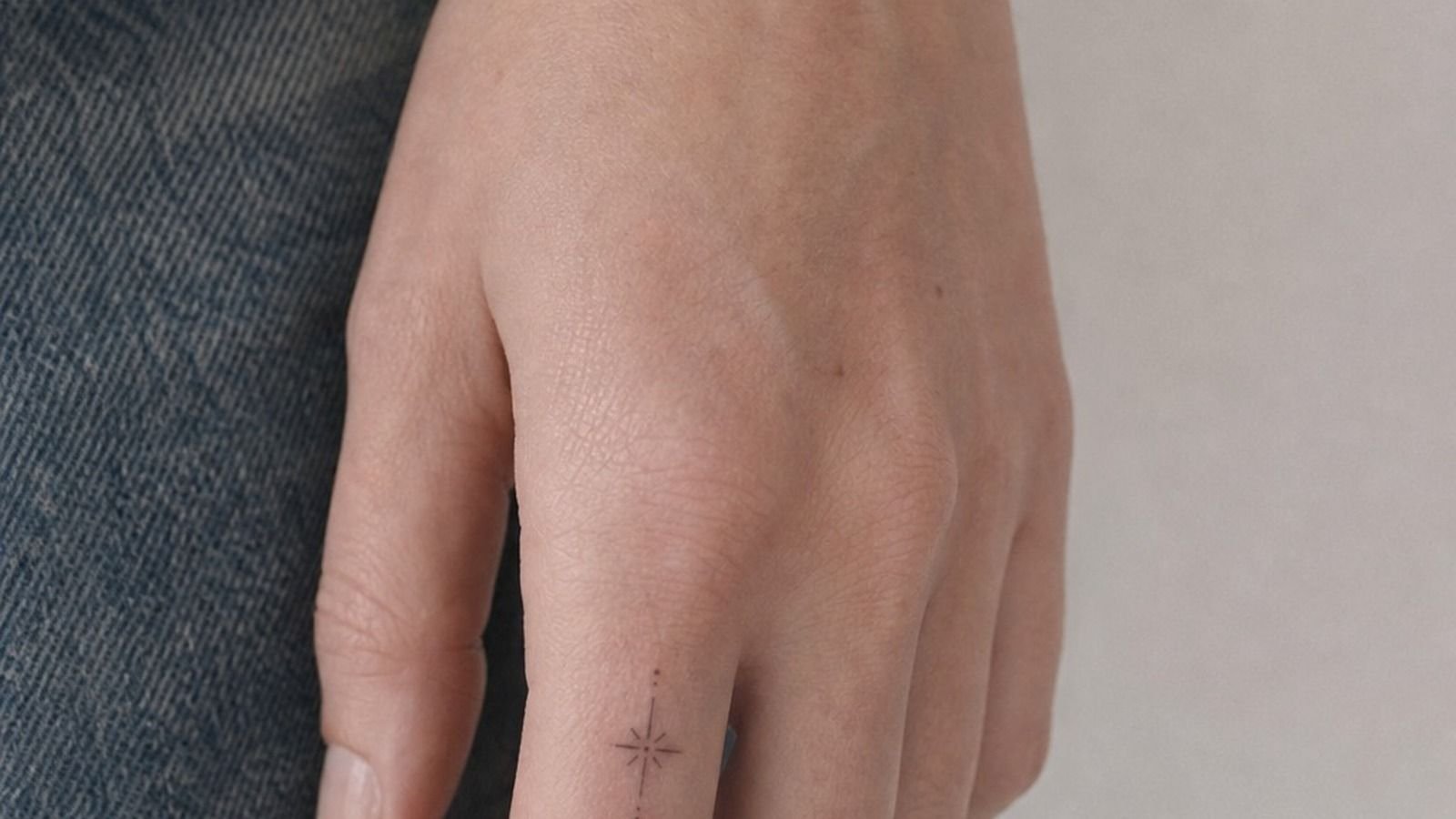
[IMAGE: black linework symbol on the side finger, very small scale, healed edges, visible fold line]
I started with a tiny finger symbol because I thought smaller meant safer. It does not. On fingers, tiny can turn to soup faster than you think if the lines are too close or the symbol sits right where your skin folds all day.
Mine was about half an inch tall, done in black linework, and tucked along the side of the finger where friction is constant. The meaning was solid. The hold was not.
If you’re drawn to meaningful tattoos, keep the shape dead simple and give each line real clearance. A dot, crescent, or little star can age cute on you.
A tiny complex sigil usually won’t.
I wish I’d read more healed examples like three dot hand tattoo meaning before I booked it. And I’d tell you the same thing now: if the design needs explaining at three inches from your face, it’s too fussy for that placement.
2Would Fine Line Florals Survive My Knuckles?
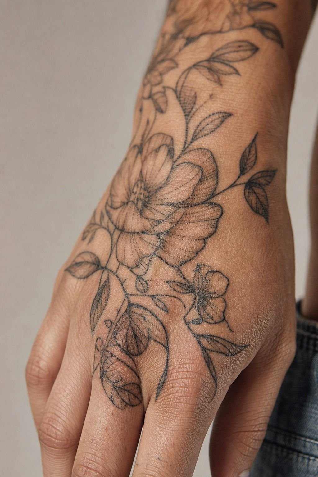
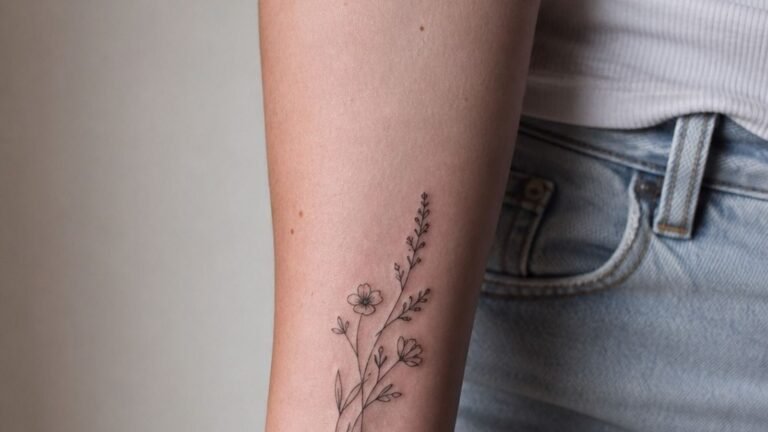
[IMAGE: fine line floral knuckles with open petal shapes, healed black and grey, natural hand bend]
Then I moved toward fine line florals across the knuckles, and that was the first time the tattoo started reading clean at a glance. The key was not making them tiny. It was building petals with enough air between them that the lines could settle without crashing together.
The artist used a single needle setup for the finer stems and a slightly heavier liner for the outer petals, which is why the flowers looked soft instead of scratchy. You can see the ink texture up close on knuckle work, especially when the hand flexes.
That means one clean pull matters more than cute detail. If your artist is pecking at every curve, I’d walk.
This placement also taught me something about back of hand tattoos. The hand has a lot going on already, so a floral should follow the bone flow, not fight it. But keep the centers open.
Closed, packed flower middles on knuckles can heal flat fast. If you want another pattern that rewards patient spacing, 20 mandala tattoo designs that reward a steady hand shows the same lesson in a different shape.
3I Placed A Meaningful Word Along The Thumb
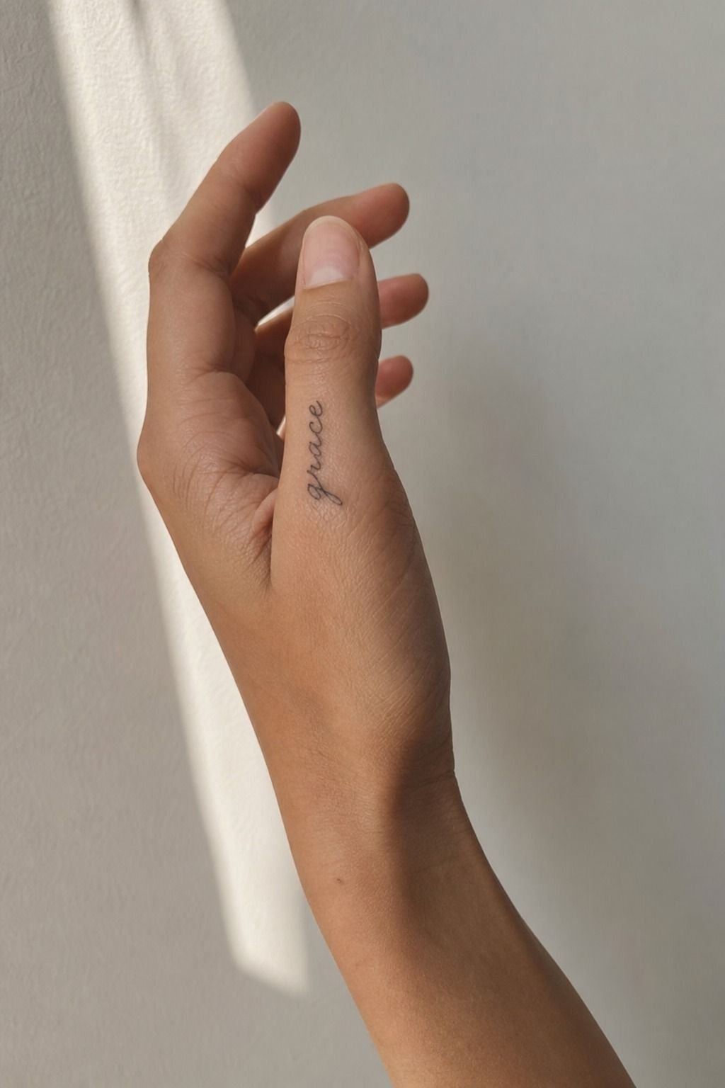
[IMAGE: fine line script running with the thumb line, four-letter word, crisp healed lettering]
A word along the thumb gave me more control because the placement already has direction. I picked a short word with only four letters, and that saved me. Long scripts down a thumb usually get chewed up visually because every bend in the hand breaks the read.
I asked for fine line script that was simple, upright, and just large enough to survive healing. No fake calligraphy.
No hairline loops. If you want a word to hold, you need crispy and confident lines, not ten fuzzy passes pretending to be elegant.
This is where a lot of meaningful tattoos fail. The idea is strong, but the lettering choice is too fragile.
If lettering is your thing, compare healed hand work with something symbolic like yhwh tattoo meaning so you can decide whether you want text or symbol doing the heavy lifting. I also like checking a stronger icon such as yin yang tattoo meaning before committing to script. I learned fast that your thumb can carry one clean thought, not a whole speech.
4Botanical Flow Beat A Stuck-On Hand Tattoo
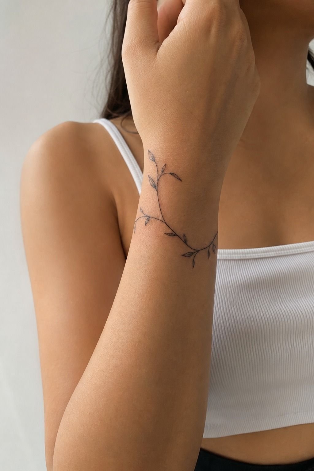
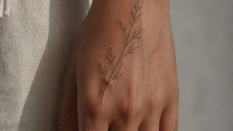
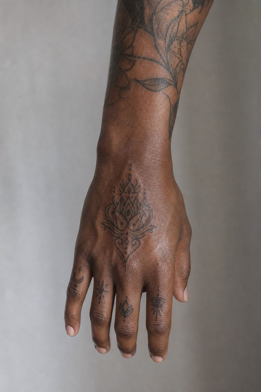
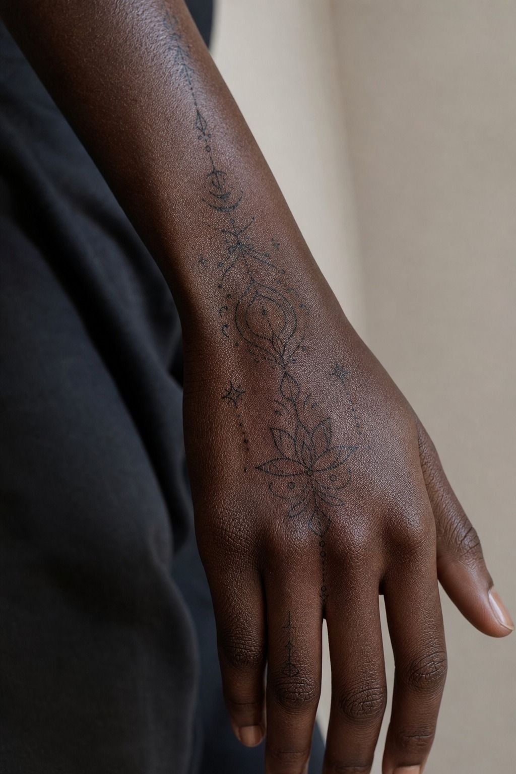
[IMAGE: botanical vine tattoo flowing from wrist onto hand, open leaves, soft black and grey]
Once I understood flow, I added a wrist to hand vine, and that piece changed the whole story. Instead of stopping the eye at the hand, the design pulled movement from the wrist forward, which made the tattoo feel intentional rather than dropped on.
This was around 4 to 5 inches of fine line botanical work with leaves spaced far enough apart that each one had a clear silhouette. That is the part a lot of people rush.
You do not need more leaves. You need better pacing.
If you’re thinking about hand wrist tattoos, let the vine wrap where the tendons already guide the motion, then keep the leaf tips simple so they heal soft, not patchy.
I also like this route for first-timers who want visibility without full knuckle commitment. You get some low-wear skin near the wrist, and that helps the whole piece age nicer. For more placement reality, start with the hand tattoo pain guide before you commit.
5Could Red Ink Ever Hold On A Side Finger?
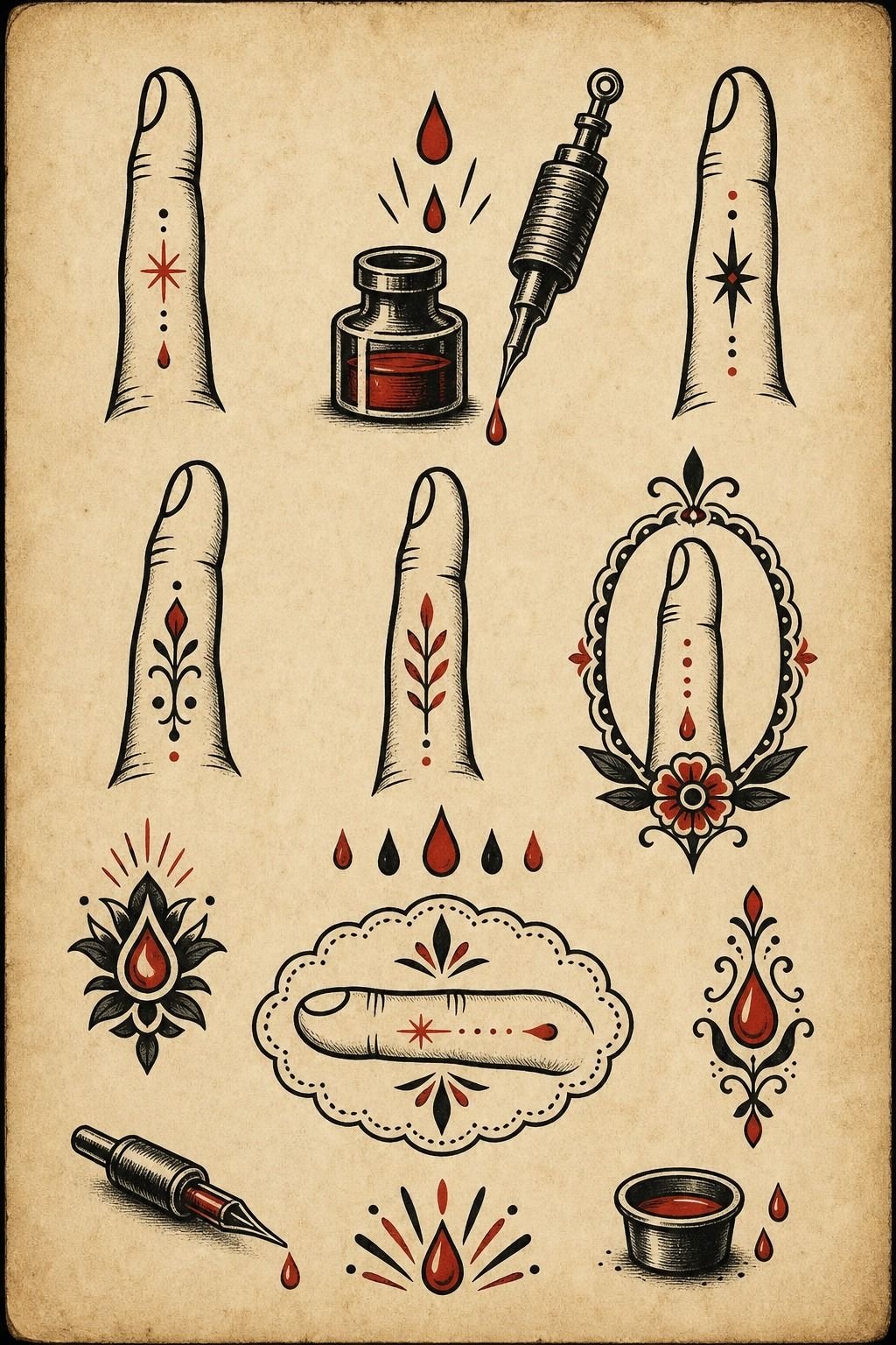
[IMAGE: fine red ink tattoo on the side finger, simple tiny shape, healed but slightly softened]
Red ink on a side finger looked cool on paper long before it looked smart on skin. That is the blunt truth. The color was bright, the vibe was playful, and the placement still fought me every day.
The issue wasn’t that red ink linework is doomed. The issue was stacking a delicate color choice onto one of the roughest hand placements possible. Side-finger skin gets rubbed, washed, and knocked around nonstop.
If you want red, keep the design bold, keep the shape simple, and don’t pretend a whisper-thin line will stay sharp there.
I still like red as spice. I just would not use it for a fragile little charm on a high-wear edge.
If you’re set on that look, bump it onto the upper hand or wrist so it has a better shot at healing bright. That little shift matters a lot!
6Blackwork Gave My Hand A Backbone
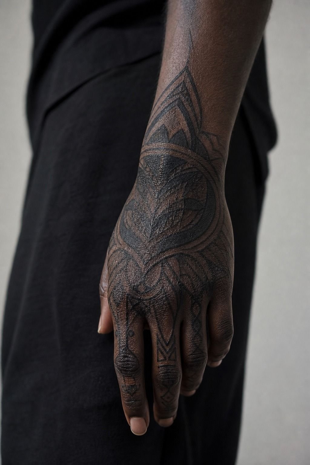
[IMAGE: blackwork hand tattoo with solid fill and open skin breaks, rich contrast, natural daylight]
When I wanted the hand to read stronger, I picked blackwork. That was the first time I stopped apologizing for the tattoo and started liking it every time I caught it in daylight. Solid black just has more authority on a hand, especially on rich skin tones where contrast does beautiful work.
The piece used packed black fill with open breaks so the shape stayed legible from a few feet away. That is the move.
If you blanket the whole hand without enough open skin, the design gets muddy fast. If you under-pack it, it heals thin and tired.
Good blackwork sits in the middle: saturated, clean-edged, and calm.
I point people toward bolder references like skeleton hand tattoo meaning when they need to understand why shape matters more than tiny detail. And if you’re looking at hand tattoos for men, do not let that label box you in. Bold is not gendered.
It just holds better.
7I Wrapped A Snake Around The Index
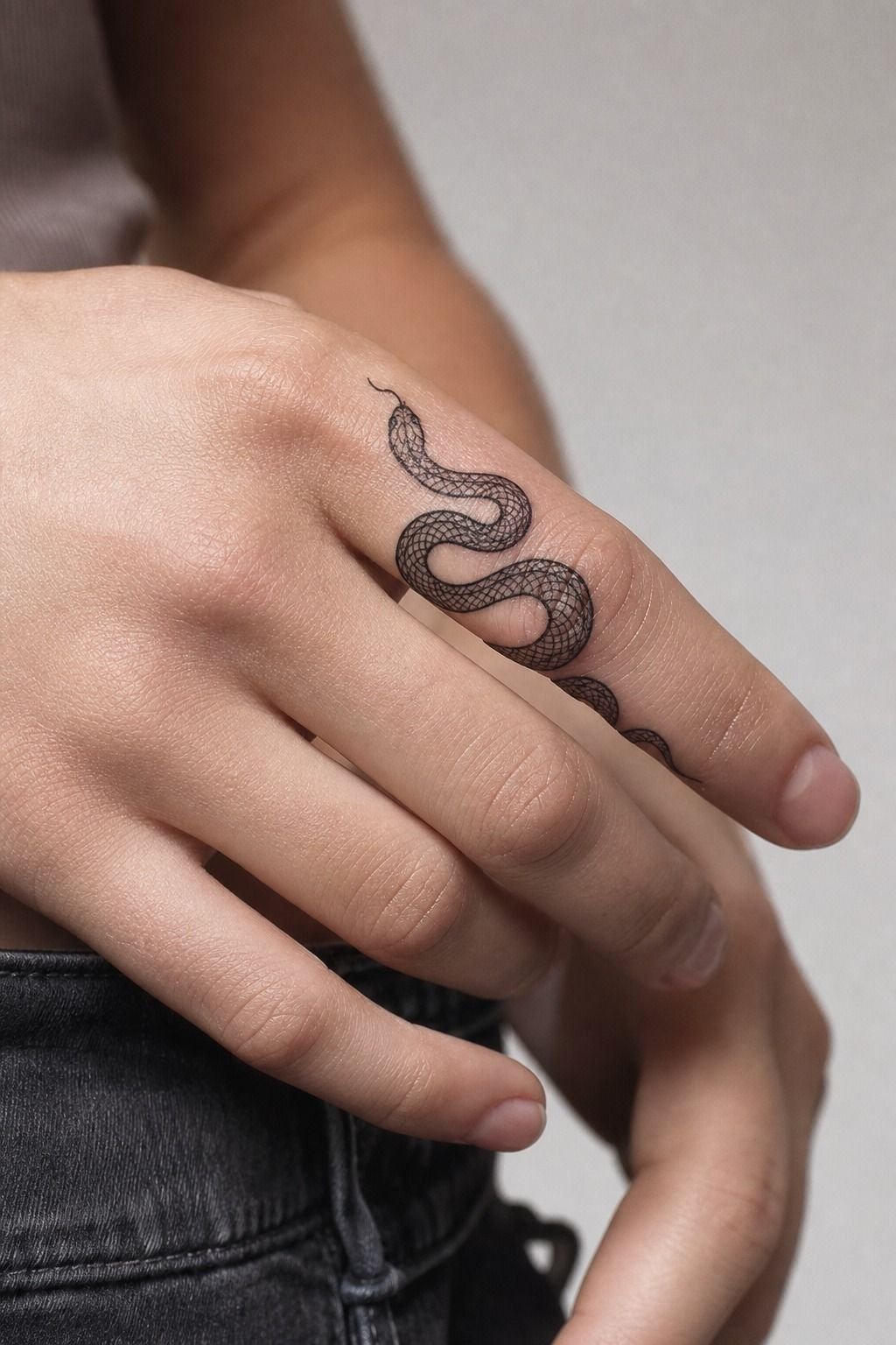
[IMAGE: snake finger tattoo wrapping the index, long coil, simple head, crisp black outline]
A snake around the index finger taught me that movement can do half the design work for you. The finger already bends and points, so a snake body has somewhere to travel. That makes it a smarter pick than a static emblem jammed into the same skinny strip of skin.
The version that works best keeps the coils long and the head simple, with fine line scales suggested instead of fully mapped. Please don’t let anyone put micro-detail in every scale.
That’s how you get soup later. One clean silhouette, a solid eye, and just enough body rhythm to sell the idea. That’s it.
If you love symbolic hand tattoo designs, compare the readability of this with something balanced like yin yang tattoo meaning. You can also study the vertical pull in yggdrasil tattoo meaning if you want another design that uses height well. But I still think the snake wins on a finger because the anatomy is doing part of the storytelling for you.
8Dotwork Looked Minimal, But Symmetry Was Harder
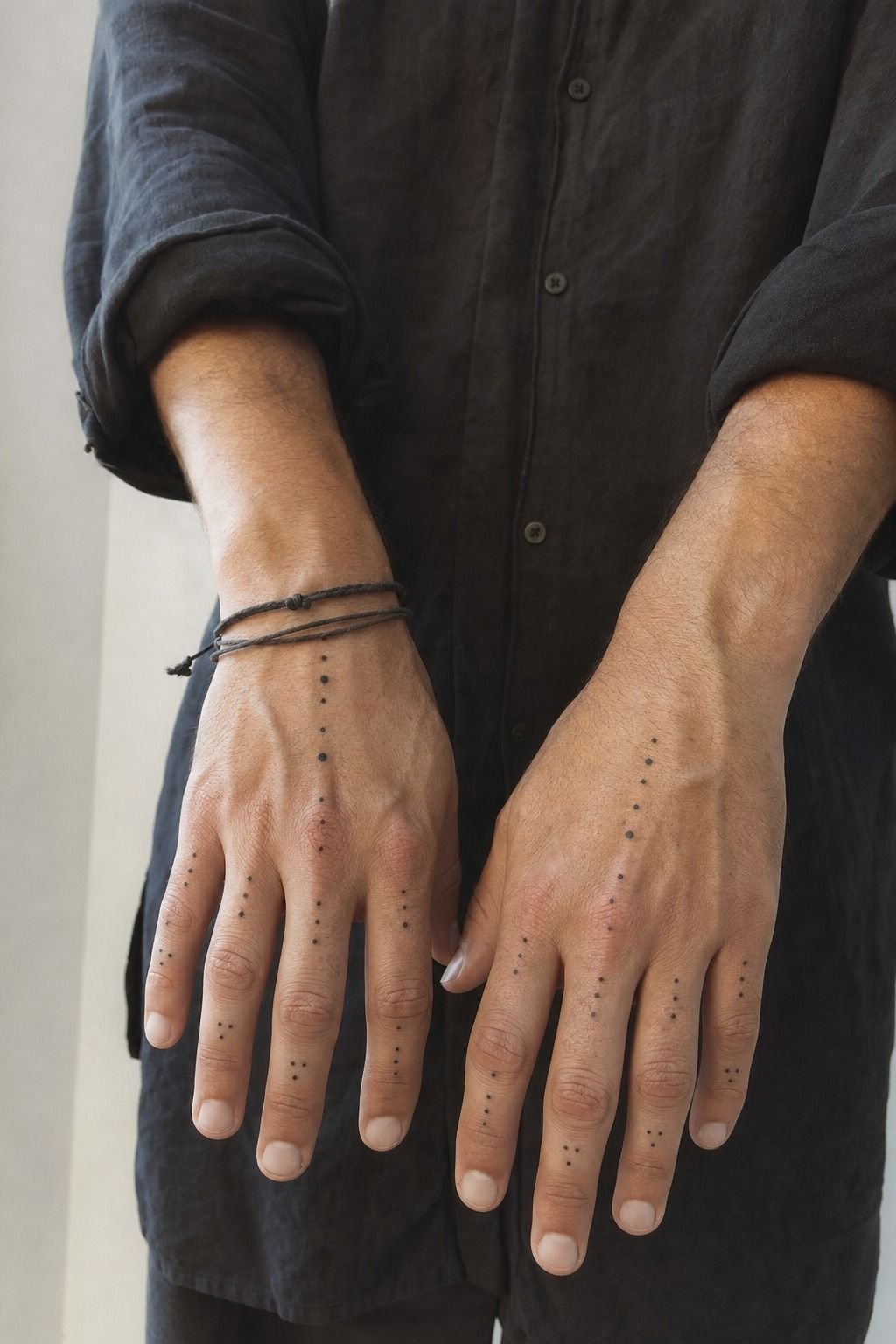
[IMAGE: dotwork hand tattoo mirrored across both hands, airy pattern, healed black dots, clean spacing]
Dotwork across both hands sounded minimal, but it took more planning than any of my line pieces. Symmetry looks easy on Pinterest. On real hands, it can go weird fast because one hand usually sits differently, moves differently, and even swells differently while healing.
What saved it was keeping the dotwork pattern airy instead of dense. Wider gaps gave each cluster a cleaner read, and that made the whole pair look intentional rather than busy. Tiny packed dots on hands can fade unevenly and start looking dusty, which is not the vibe anybody wants.
If you like matching placement without exact twins, this is where I would loosen up. Let one side lead and let the other echo it. Your hands already are not perfect copies, so your tattoo does not need to fake that either.
9I Kept One Palm Side Tattoo Hidden
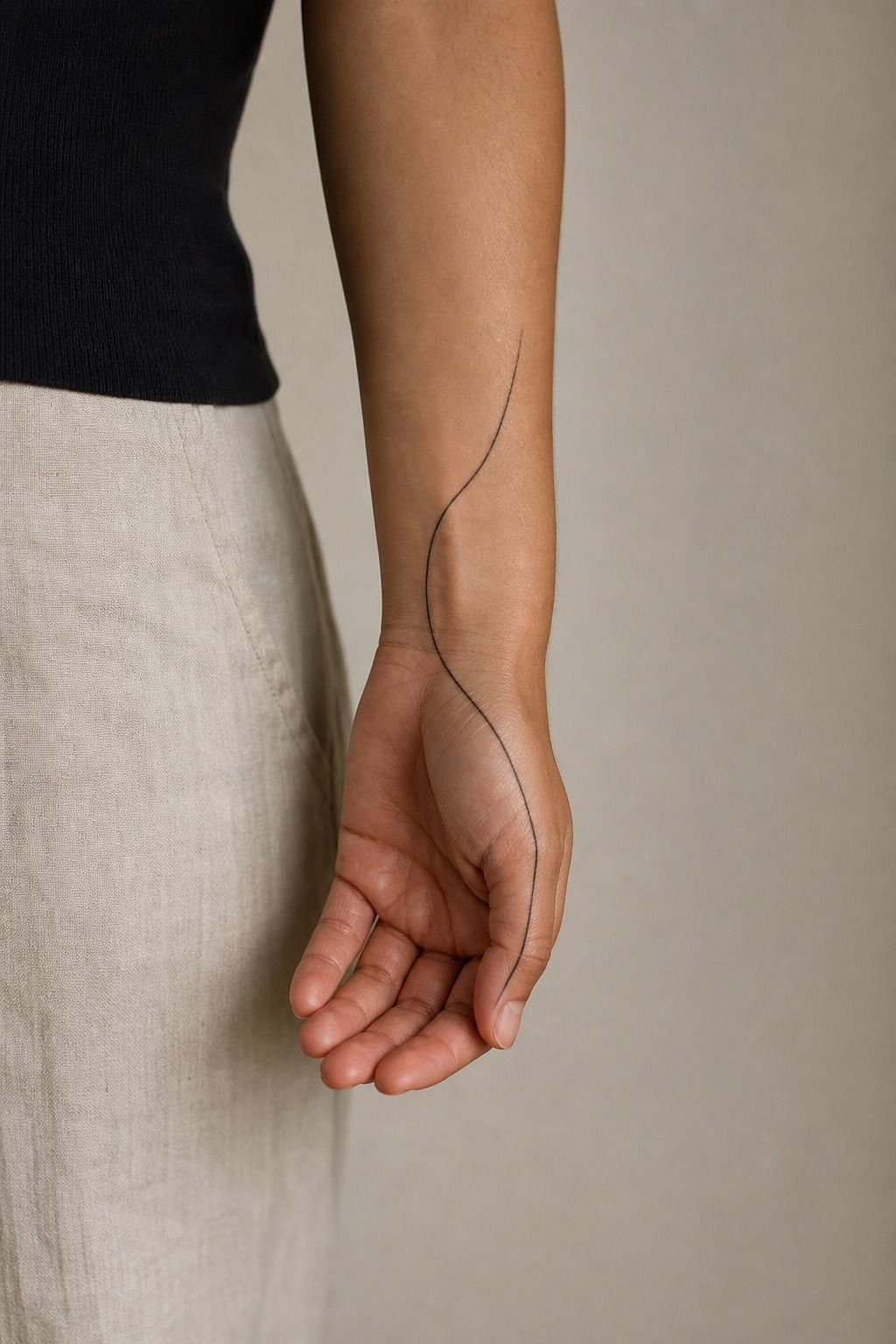
[IMAGE: side-hand wrap tattoo peeking from the palm edge, simple symbol, heavier anchors, healed skin]
Keeping one tattoo on the palm side gave me the privacy I thought I wanted from the first piece, but in a smarter way. Hidden placements feel personal without forcing the design to be microscopic. That’s a better trade.
This one wrapped just enough onto the side of the hand to reveal itself when I turned my wrist, which made it feel intimate without being invisible. The artist drew it as fine line wrap placement with slightly heavier anchor points at the ends so the shape would not drift visually.
Smart move. Palm-side skin is rougher, and wear is real.
If you want a design that feels coded or spiritual, look at how symbols carry weight in pieces like yggdrasil tattoo meaning. I also like the balance you see in yin yang tattoo meaning for hidden placements because the shape stays clean.
But keep your own hidden piece simple. Palm-side tattoos are for people who love the placement enough to baby the healing and accept that touch-ups may happen.
10Matching Tattoos Can Stay Clean, Not Corny
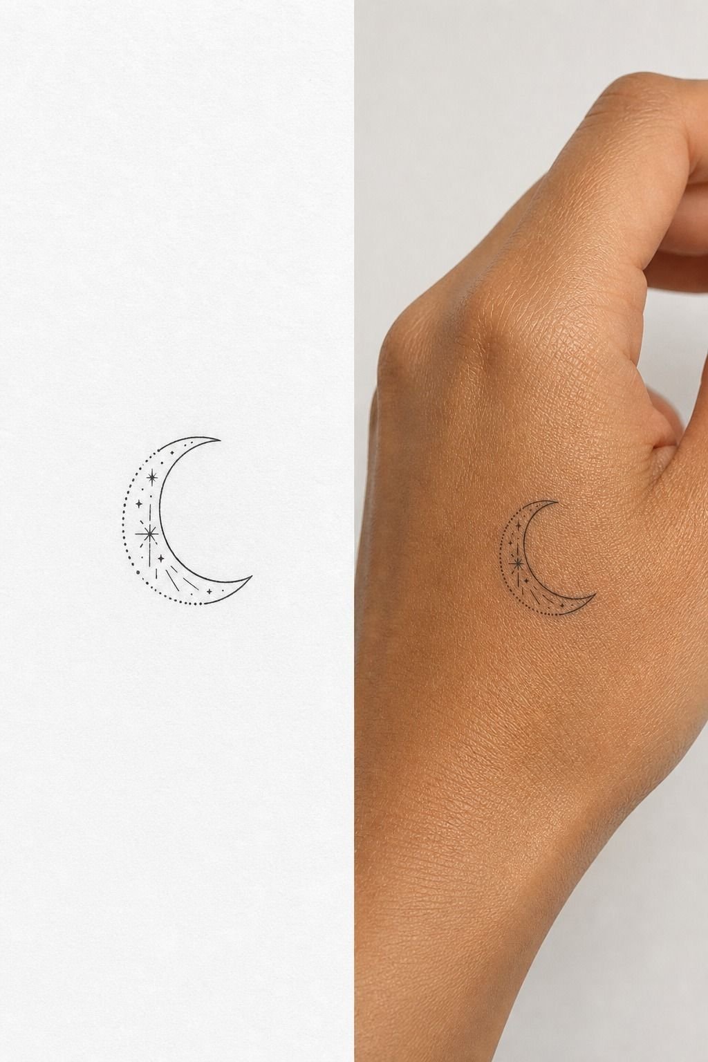
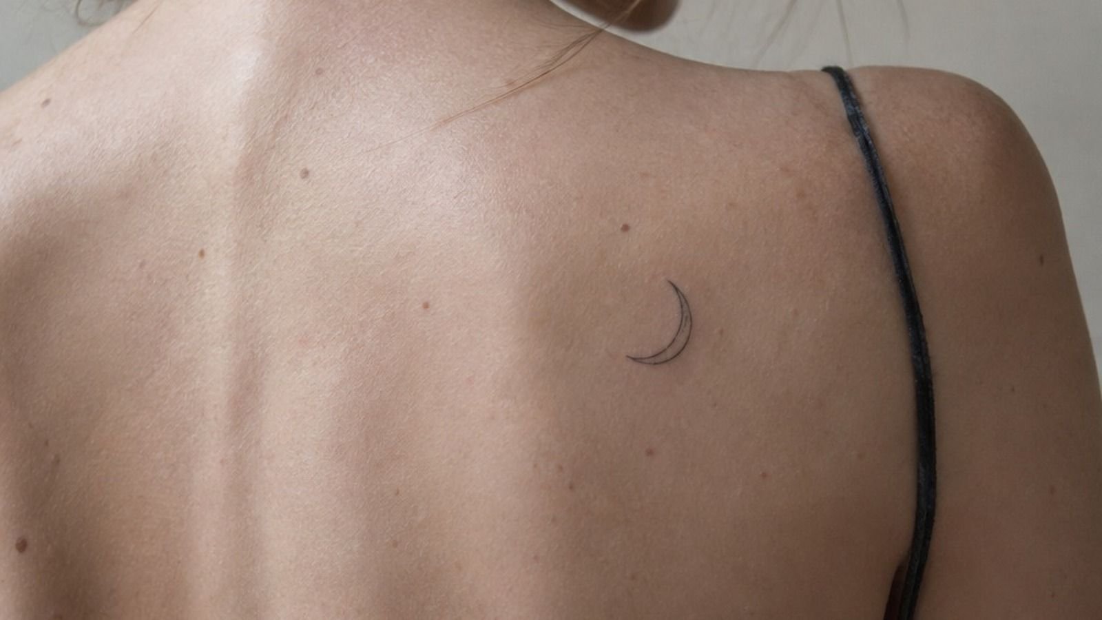
[IMAGE: matching moon tattoos on two hands, simple crescent shapes, crisp black line, healed finish]
Matching a small moon with a friend could have gone cheesy fast, so we kept it disciplined. Same shape.
Same size. No extra sparkle dust.
No second symbol trying too hard to make the story deeper.
The smartest part was using crescent moon linework that stayed open through the center instead of filling it with tiny stars or texture. That’s what made it feel sweet, not messy. Matching tattoos on hands need even more restraint because the placement already makes the statement loud.
If you’re doing this with somebody else, agree on scale before anything else. A moon that is cute at one inch can get fussy real fast once people start shrinking it for the side finger. Keep it simple and it’ll age way better.
11I Asked For Bold Lines On The Knuckles
[IMAGE: bold knuckle lettering with thick but clean strokes, healed hand, natural flex in the fingers]
Bold lines on knuckles were my answer after I got tired of pretending faint detail would somehow win the fight against hand wear. It will not. Knuckles crease, wash out, and take abuse, so the line choice has to be honest from the start.
I asked for bold liner work with enough thickness to stay visible after healing, but not so thick that the letters or symbols merged when my hand closed. That’s a narrow lane, which is why portfolio review matters so much here.
You want healed photos. Fresh tattoos tell you nothing about longevity.
For anyone weighing iconography, compare how hard a strong symbol hits in pieces like zeus tattoo meaning. And if you’re choosing between whisper-thin and bold on knuckles, I’d pick bold every single time. Hands are not the place for timid line decisions.
12I Planned Healing Around Daily Hand Use
[IMAGE: fresh hand tattoo aftercare with clean skin, thin ointment layer, no wrap, bright bathroom light]
Planning the healing around daily hand use turned out to be the smartest part of the whole makeover. First few days, it is an open wound, treat it like that.
Gentle unscented soap. Thin ointment. No heavy gym grip.
No pool. No picking.
I kept the design day for a week when my workload was lighter, and that mattered more than I expected. A healing hand tattoo hates constant friction, sanitizer overload, hot water, and long cleaning sessions. If your job is hard on your hands, book with that reality in mind instead of hoping your skin will somehow power through.
The artist recommended unscented aftercare balm only in a whisper-thin layer, and that kept the piece from getting soggy or chewed up. That is the balance. Moist, not suffocated.
Once it hit the silver skin stage, the tattoo looked a little dull before it brightened back up. Normal.
Annoying, but normal!
Why The Hold-First Rule Beat My First Instinct
[IMAGE: healed hand tattoo collage showing bold blackwork, floral spacing, thumb script, and wrist flow]
I used to choose hand tattoo ideas the way most people do on a late-night scroll. I looked for what felt delicate, emotional, and easy to hide if I panicked.
That sounds reasonable until the tattoo is on the part of your body that takes the most abuse outside your feet. Hands are high-wear.
They wash, bend, rub, bake in UV, and heal under constant motion. So the rule that finally fixed my regret was simple: pick what holds first, then make it pretty.
That changed how I judged every design. I stopped asking, “Is this meaningful enough?” and started asking, “Will this still read clean after thousands of hand washes?” That one question cuts through a lot of bad decisions. A tiny finger symbol can be cool, but only if the line spacing is generous.
Fine line florals can be beautiful, but only if the petals are open and the centers don’t clog. A script word can work, but only if the letters are simple enough to survive the thumb bending all day. Bold will hold is not a cliché in the studio.
It’s physics.
I also learned that regret doesn’t always mean the tattoo was a mistake. Sometimes it means the design logic was half-finished. My first piece wasn’t ugly.
It just wasn’t built for the job. Once I started respecting contrast, skin movement, and placement, the whole hand made more sense. And honestly, that was a relief.
You don’t need the loudest tattoo on earth. You need one clean idea, enough size, and an artist who can pull a crisp line without chewing you up.
Here’s the part I’d tell any client now. Cute matters. Meaning matters.
But hold comes first, or the rest won’t last. If you want Pinterest-exact, I’m not your artist. References are for vibe.
Your actual hand, your skin texture, your job, and your tolerance for touch-ups should decide the final shape. That’s the grown-up version of hand tattoo planning, and it works.
The Touch-Up Math: How Much Did It Cost?
[IMAGE: hand tattoo pricing visual with finger symbol, thumb script, floral knuckles, blackwork, and session notes]
Here’s the honest cost range I wish I’d looked at before the first appointment. Hand tattoos are usually priced by shop minimum for tiny pieces or by hourly rate once the design gets bigger and more placement-specific.
My own sequence added up because I changed direction instead of getting it right once. The first small finger tattoo was the shop minimum.
The stronger follow-up work moved into hourly pricing at about $150 to $250 an hour depending on the artist and the city. If you’re budgeting, plan for the tattoo and the chance of one touch-up.
That’s not failure. That’s hand skin.
For quick planning, I break it down like this. A tiny symbol is the cheap experiment.
A thumb word or side-hand mark is the careful middle ground. A larger blackwork hand piece costs more up front, but it often gives you stronger value because you aren’t paying later to rescue a design that started too faint.
The Skin-Wear Filter Versus Wishful Thinking
[IMAGE: healed hand tattoo comparison between open bold design and tiny crowded design, same lighting, realistic skin]
After the cost math, this is the second filter I’d use. If a design only works at tiny scale, skip it.
If the lines need to sit almost on top of each other, skip it. If the placement lives on constant rub, soap, and flexing, assume you’ll either simplify it or maintain it.
That is not me being harsh. That’s me trying to save you from paying twice for a tattoo that never had a fair shot.
You can still choose pretty hand tattoos, meaningful tattoos, or bolder hand tattoo designs. Just run them through the skin-wear filter first.
I do that now with every hand idea, and it keeps me honest. High-wear zones are not off-limits. They just charge interest later in fading, blur, and touch-ups.
Low-wear help matters too. A wrist-leading design with outer hand placement usually gives you a cleaner runway than a side-finger micro tattoo.
That is why I keep steering people back to scale, contrast, and simple silhouettes. Those choices do not feel flashy in the moment.
They just age better.
The Questions I Get Asked Most
How much does a hand tattoo usually cost?
About $100 to $300 is common for a small hand tattoo, while tiny pieces may fall at a $50 to $100 shop minimum. Bigger blackwork or wrap designs climb with time.
– Small linework often takes 30 to 90 minutes. – Hourly pricing usually lands around $100 to $250. – Touch-up planning should be part of your budget.
Are hand tattoos a good idea for a first tattoo?
Yes, but only if you pick a design that reads clean and heals stable. A simple symbol, short word, or open floral can work well if you respect placement.
– Cleaner shapes beat micro-detail every time. – Wrist-adjacent skin is easier than the palm edge. – Healed portfolio photos matter more than fresh ones.
How do I choose a tattoo artist for hand tattoos?
Pick someone whose healed linework still looks crisp. Fresh photos are easy. Healed hand work tells the truth.
Start by comparing their portfolio to solid references like the hand tattoo pain guide and 20 mandala tattoo designs that reward a steady hand.
– Hand tattoo samples should show healed results. – Style match matters for fine line, lettering, or blackwork. – Calm stencil placement is a green flag in the studio.
How much do hand tattoos hurt?
They hurt a fair amount because hands are bony and busy, but the pain is usually manageable in short sessions. Lines feel sharper. Shading is more of a dull burn.
– Outer hand skin is often more chill than fingers. – Finger joints can feel especially spicy. – Short breaks are smarter than trying to be heroic.
How long does a hand tattoo take to heal?
Surface healing is usually 2 to 3 weeks, and the full settle often takes 2 to 3 months. Your aftercare discipline matters more on hands than almost anywhere else.
– Gentle soap keeps the skin clean without stripping it. – Thin ointment helps early, then light lotion takes over. – Sun and pools are two of the fastest ways to mess it up.
What’s the best placement for a hand tattoo?
The best placement is usually where the design gets enough clearance. Back of hand, thumb line, and wrist-to-hand flow are easier to read than cramped side-finger micro tattoos. If you need more placement examples, compare three dot hand tattoo meaning with skeleton hand tattoo meaning and notice how much the silhouette changes the hold.
– Back of hand gives you stronger visibility. – Wrist-to-hand flow gives the design better pacing. – Side finger placement works best if you accept maintenance.
Where I’d Start First
If I had to pick one, I’d start with the wrist-to-hand vine. It gives you more skin, more flow, and less forced tiny detail than a finger piece.
That’s why it heals cleaner. Pin that direction for later and let your artist scale it to your hand.