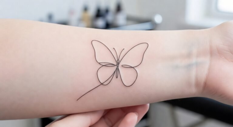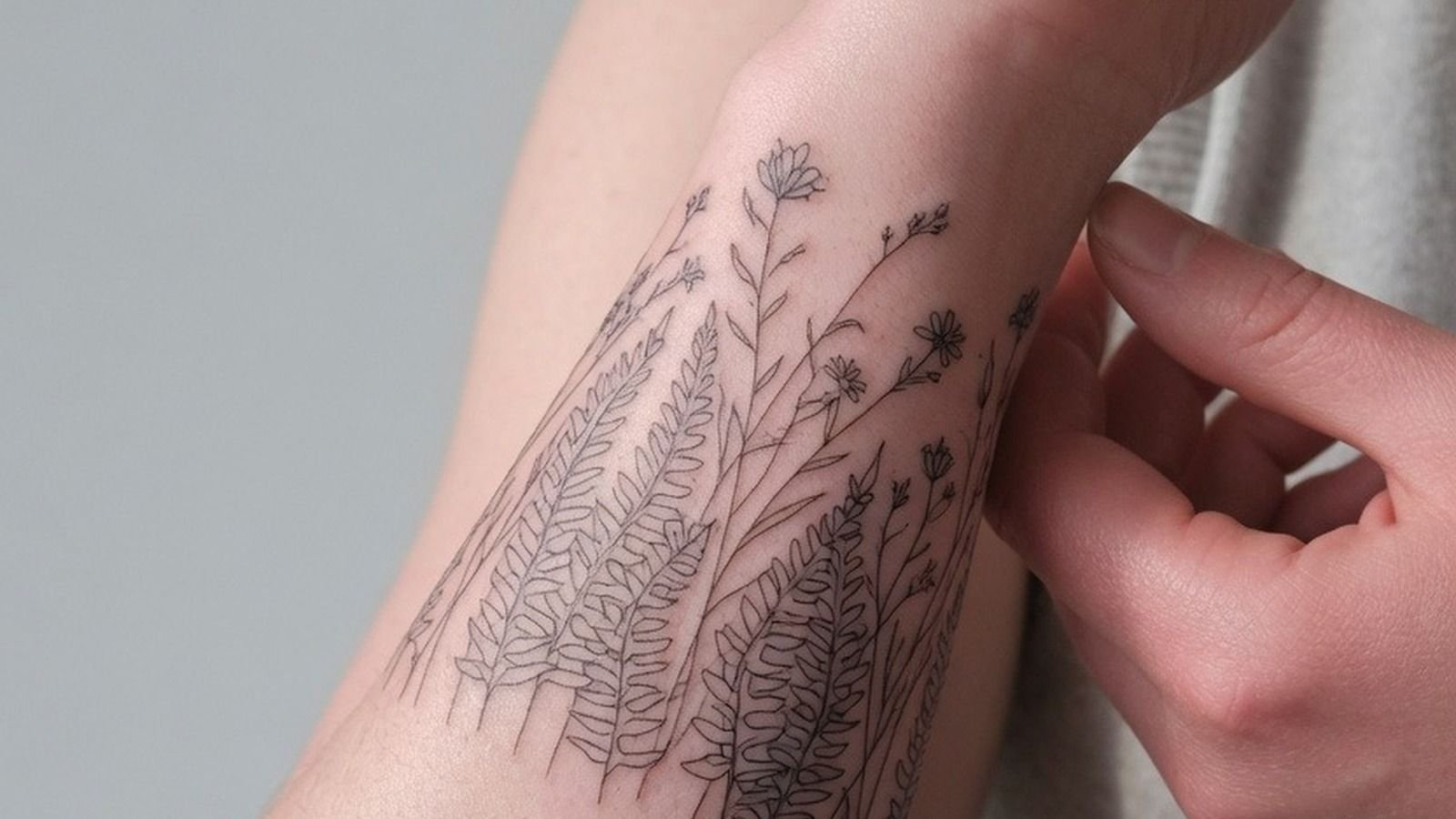
I changed my wrist tattoo placement because the first stencil sat too close to my crease. I got this piece the week I turned 30, moved it less than half an inch, and it healed cleaner than I expected. Tiny change. Huge difference!
Here’s what it looked like before: a blank patch of inner wrist I’d been saving for the right idea, with a crease that would have chewed up the original placement every time I bent my hand.
- Choosing My Dominant Wrist For Visibility
- Testing The Inner Wrist With Temporary Ink
- Measuring A Tiny Design Against Wrist Width
- Positioning Fine Line Art Below The Crease
- Leaving Room Around My Wrist Bone
- Comparing Vertical And Horizontal Wrist Flow
- Placing Lettering Where I Can Read It
- Aligning Matching Symbols Across Both Wrists
- Checking Upper Wrist Placement In Photos
- Balancing A Bracelet Tattoo With Natural Movement
- Mapping Pain Around The Inner Wrist
- Avoiding The Tendon Line During Stenciling
- Setting A Simple Tattoo Above My Hand
- Keeping Botanical Details Clear On Narrow Skin
- Choosing Red Ink For An Inside Wrist
- Confirming The Design From Every Angle
- Planning Wrist Coverage For Future Tattoos
- Protecting Fresh Ink During Daily Hand Use
- Tracking Wrist Tattoo Healing Day By Day
1Choosing My Dominant Wrist For Visibility
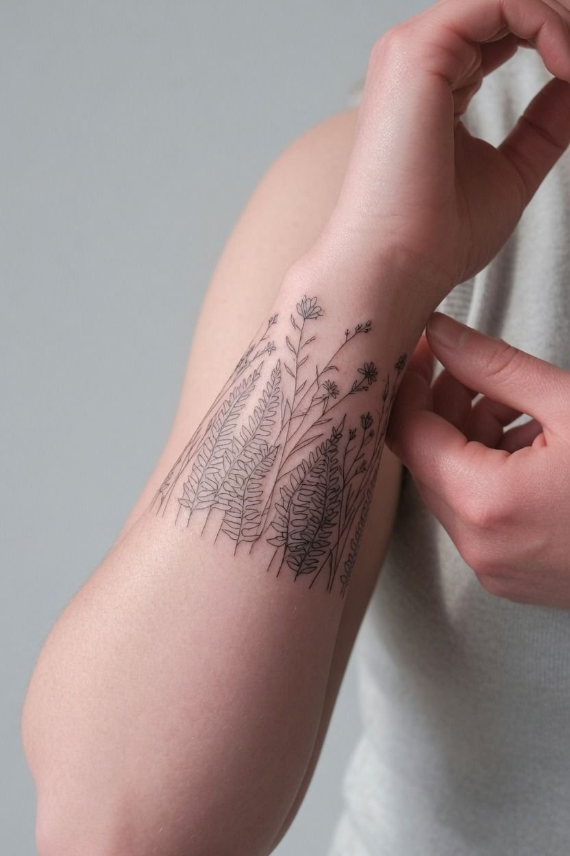
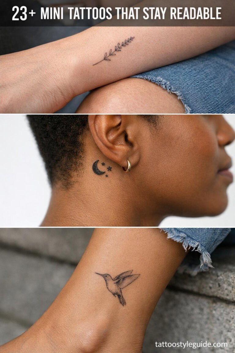
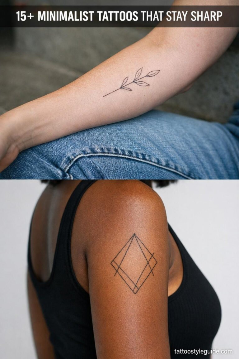
I picked my dominant wrist because I wanted to catch the tattoo while reaching for coffee, typing, and holding my phone. If you want your wrist-tats to feel personal, that’s the wrist you’ll notice most. Mine is a fine line botanical in black, about 1.5 inches tall, and it reads fast without taking over my hand.
But visibility has a cost. Your dominant wrist gets more sun, soap, friction, and desk contact, so you need a clean design with enough breathing room.
I’d skip tiny script packed against the crease. It may look delicate on stencil day, but it can heal fuzzy if your skin is constantly bending and rubbing.
Check wrist tattoo ideas before you commit to a design you’ll see fifty times a day.
2Testing The Inner Wrist With Temporary Ink
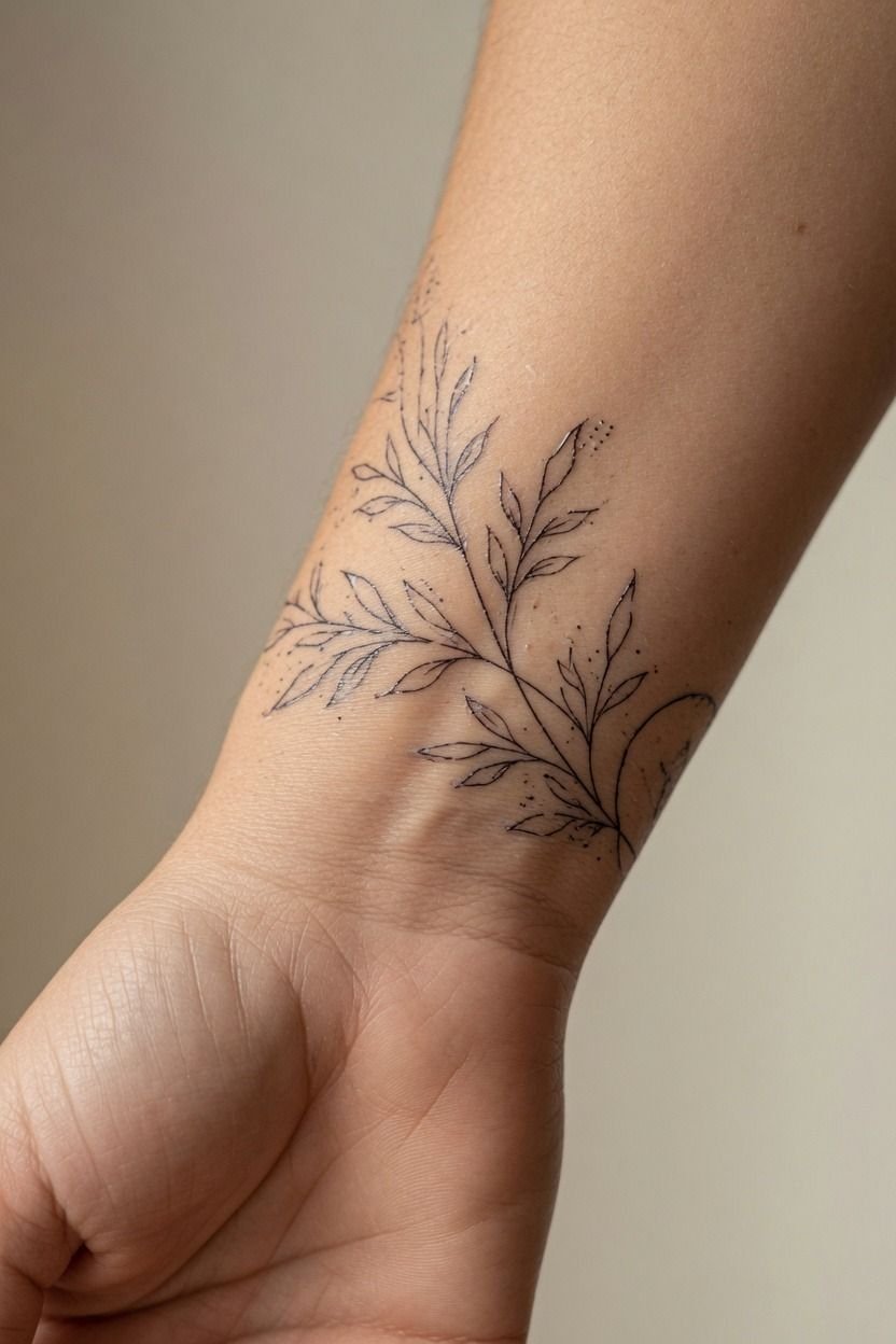
Before I let a needle touch me, I wore the design as temporary ink for two days.
3Measuring A Tiny Design Against Wrist Width
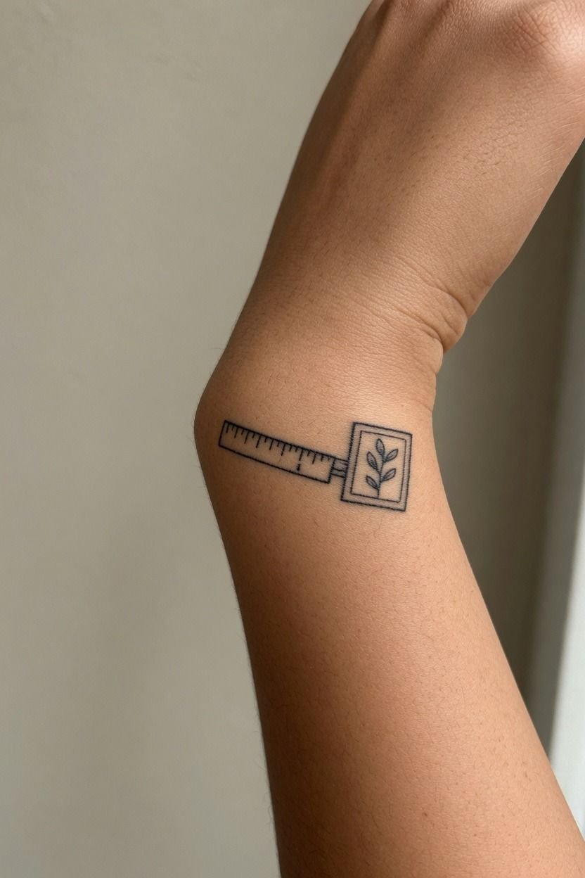
I measured my wrist before finalizing the design because a tiny tattoo can turn to soup when it’s trying too hard. My artist and I kept the main shape around 1.25 inches wide, leaving open skin on both sides so the lines could breathe.
A simple-wrist-tattoo needs negative space more than it needs extra petals, stars, or lettering. I’d rather see three clear leaves in single-needle black ink than nine cramped ones.
You can always add later. You can’t unblur a packed design.
Use a tattoo placement chart to compare wrist width with forearm, hand, and inner-arm placement. If your idea needs more detail, move it up. That size on a wrist is gonna mush out.
4Positioning Fine Line Art Below The Crease
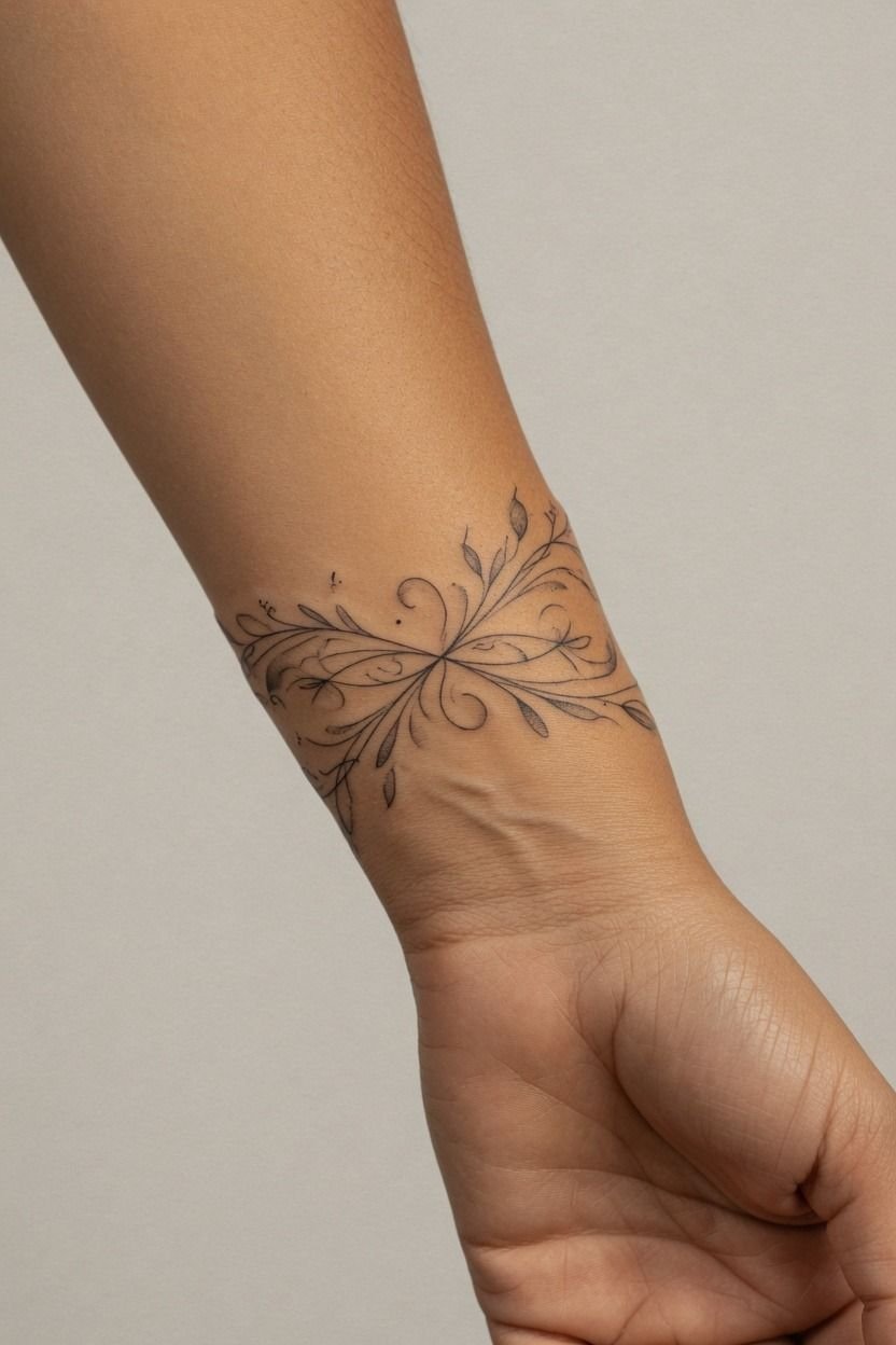
The best move I made was placing my fine line art below the bend, not directly in it.
5Leaving Room Around My Wrist Bone
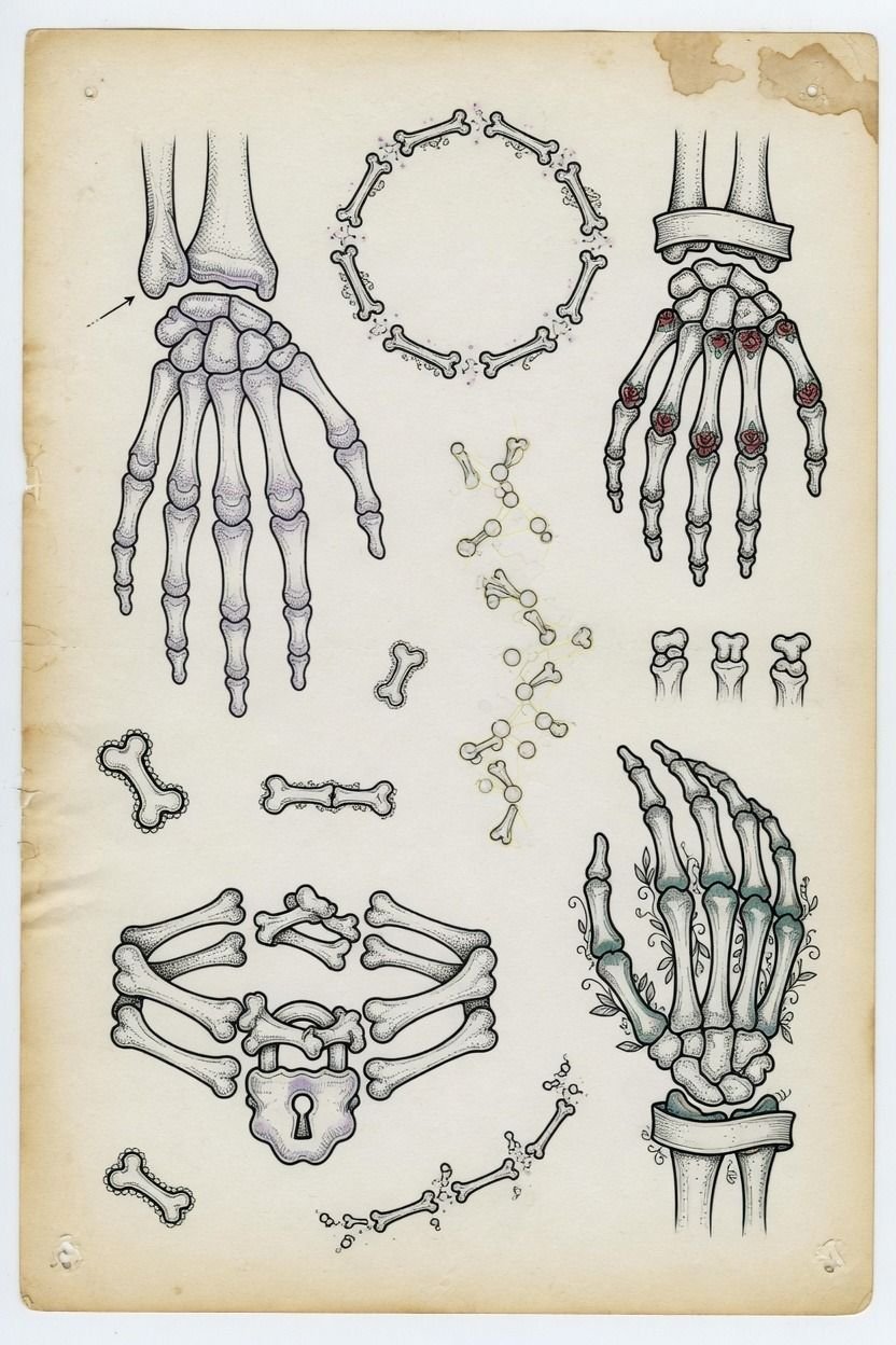
I used the wrist bone as a boundary, not a target. The original placement hugged it too tightly, and the stencil looked pinched from every side. Once we moved the design off that bump, it looked calmer and more intentional.
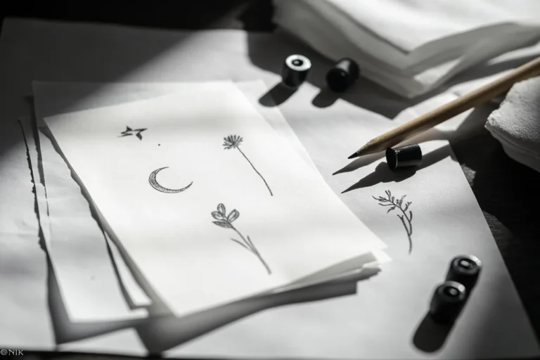
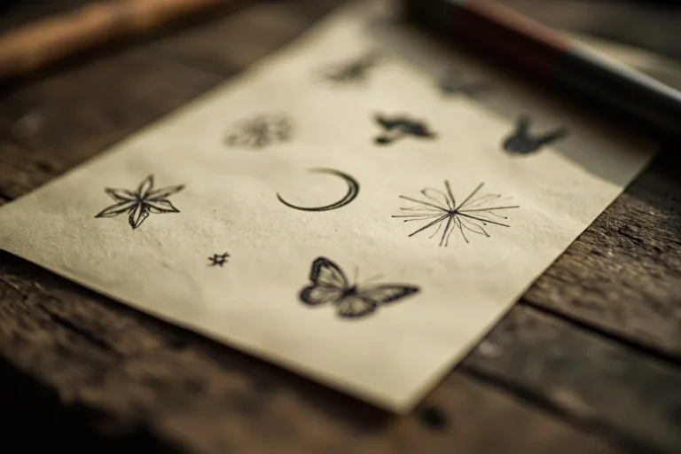
For cute-wrist-tattoos, leave visible skin around the bone so your lines don’t look like they’re falling off a cliff. A flash sheet can help here because you can compare several small shapes at once: a crescent, tiny flower, clean heart, or small branch.
I’d skip a design that wraps over the bone unless your artist has drawn it for your exact wrist. Flat paper is a liar. Skin curves, shifts, and swells a little while you heal.
6Comparing Vertical And Horizontal Wrist Flow
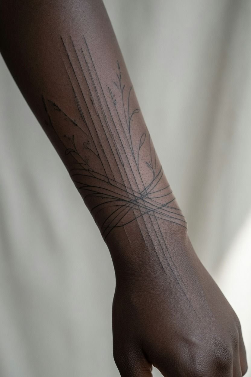
Vertical flow won for me. My botanical stem ran toward my forearm, so the tattoo followed my arm instead of cutting across it like a bracelet. On my wrist, horizontal placement made the stencil look wider and busier than the actual design deserved.
If you’re choosing between a vertical and horizontal upper-wrist-tattoo, take photos from three angles. Vertical designs usually age nicer because they have room to stretch upward. Horizontal designs can be solid too, especially for short lettering or matching symbols, but they need simpler shapes.
A fine line crescent reads clean vertically. A delicate bracelet line can read clean horizontally.
What doesn’t read clean? A full miniature scene squeezed into a one-inch strip.
7Placing Lettering Where I Can Read It
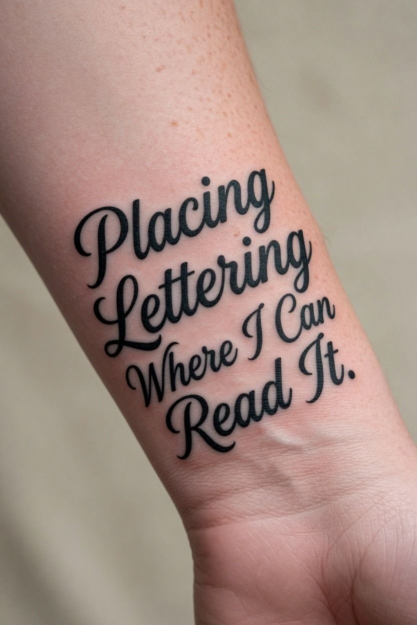
I placed my lettering where I could read it without twisting my arm like a pretzel.
8Aligning Matching Symbols Across Both Wrists
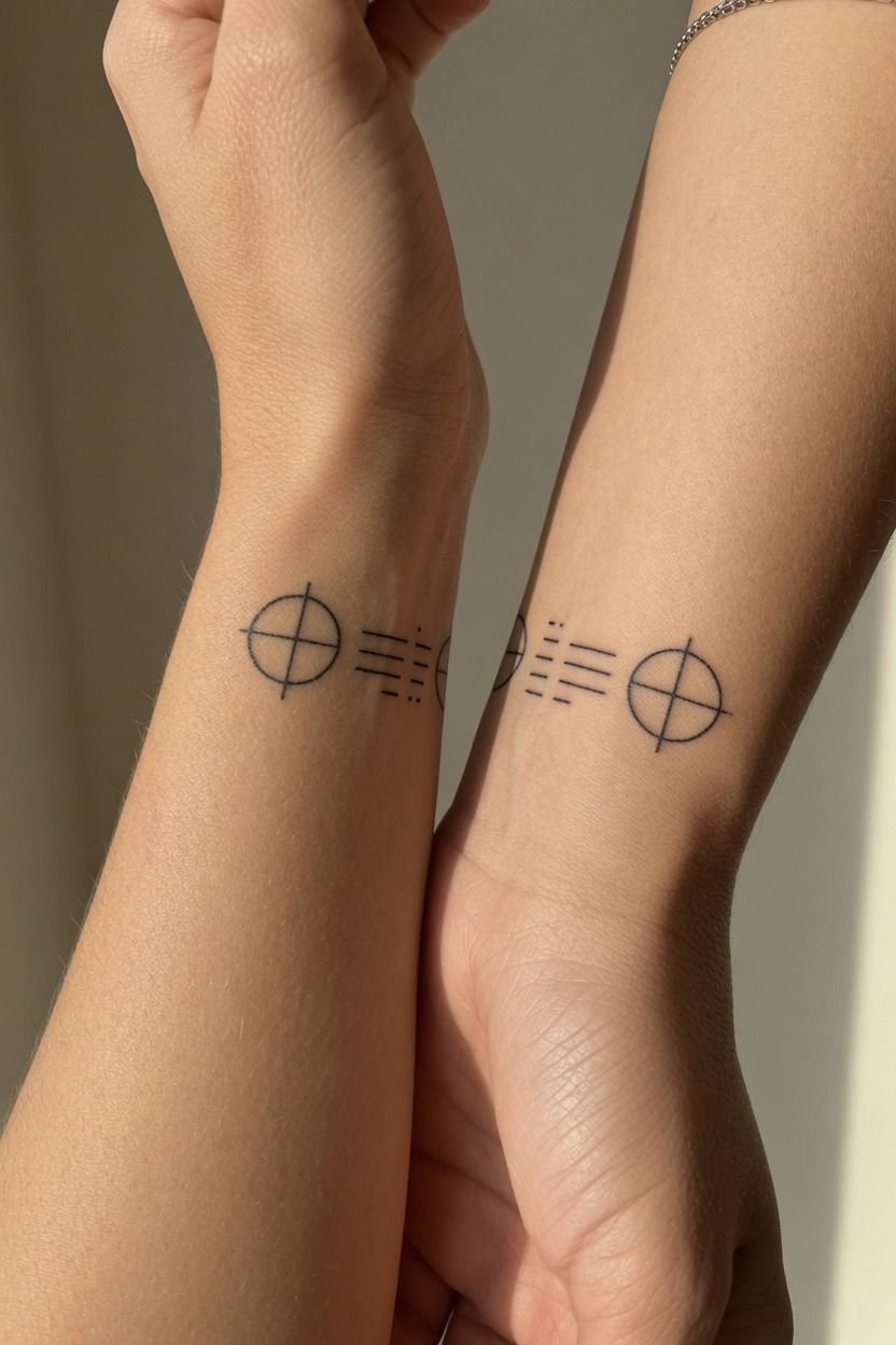
Matching symbols need alignment, but they don’t need to be mirror-perfect. I lined mine up by checking where each mark sat when both palms faced up. The result looked balanced without feeling like a factory stamp.
For inside-wrist-tattoos-for-women, I like a pair of single-needle stars or tiny botanical shapes that share a visual weight. One can tilt slightly with your anatomy. That’s normal.
Your left and right wrists aren’t identical, and forcing them to be can make one side look wrong.
Use how to plan tattoo placement if you’re building a matched pair. You’ll want to consider watches, bracelets, future tattoos, and which wrist gets more wear before booking.
9Checking Upper Wrist Placement In Photos
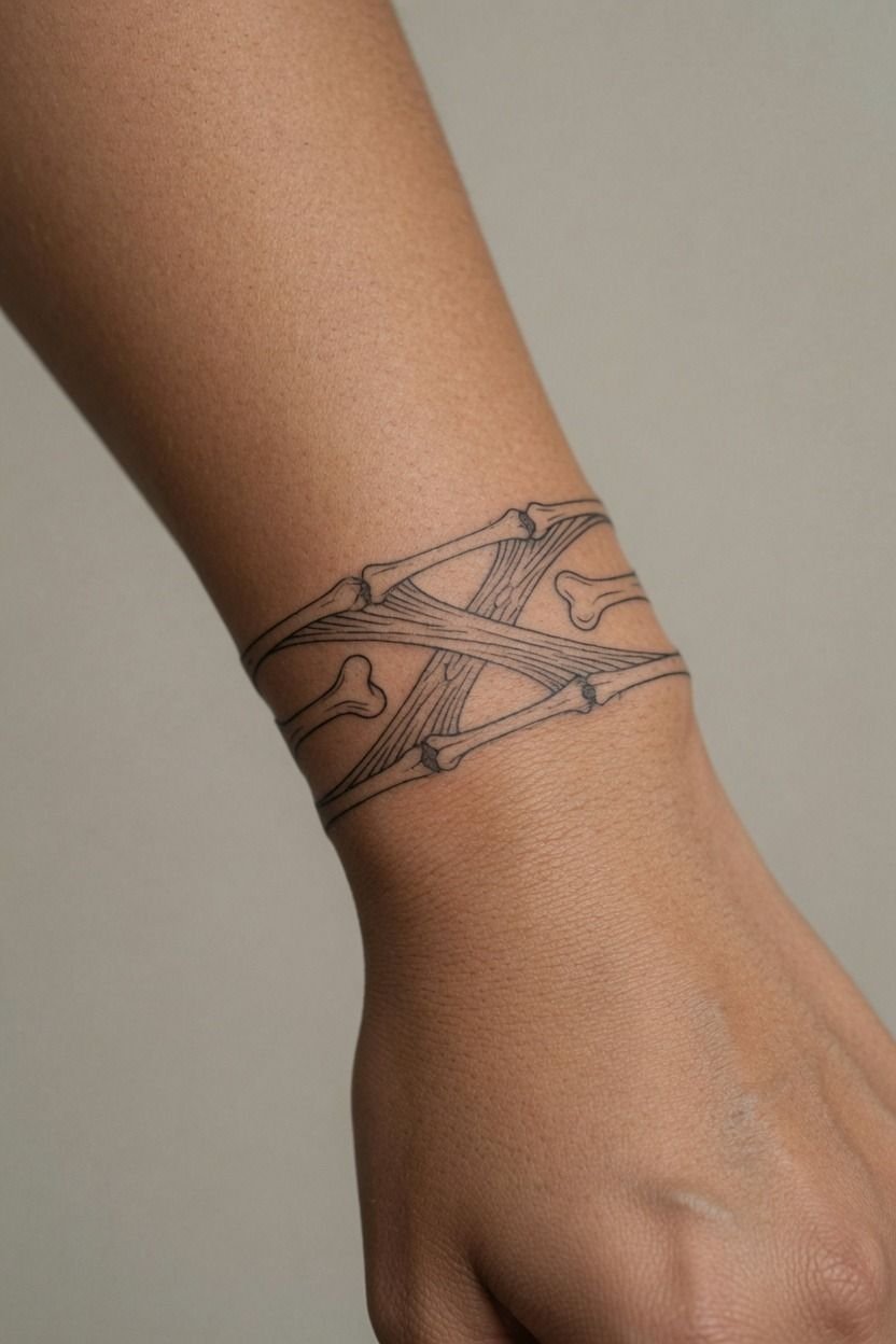
I checked upper wrist placement in photos because mirrors can flatter a stencil that looks weird from the side.
10Balancing A Bracelet Tattoo With Natural Movement
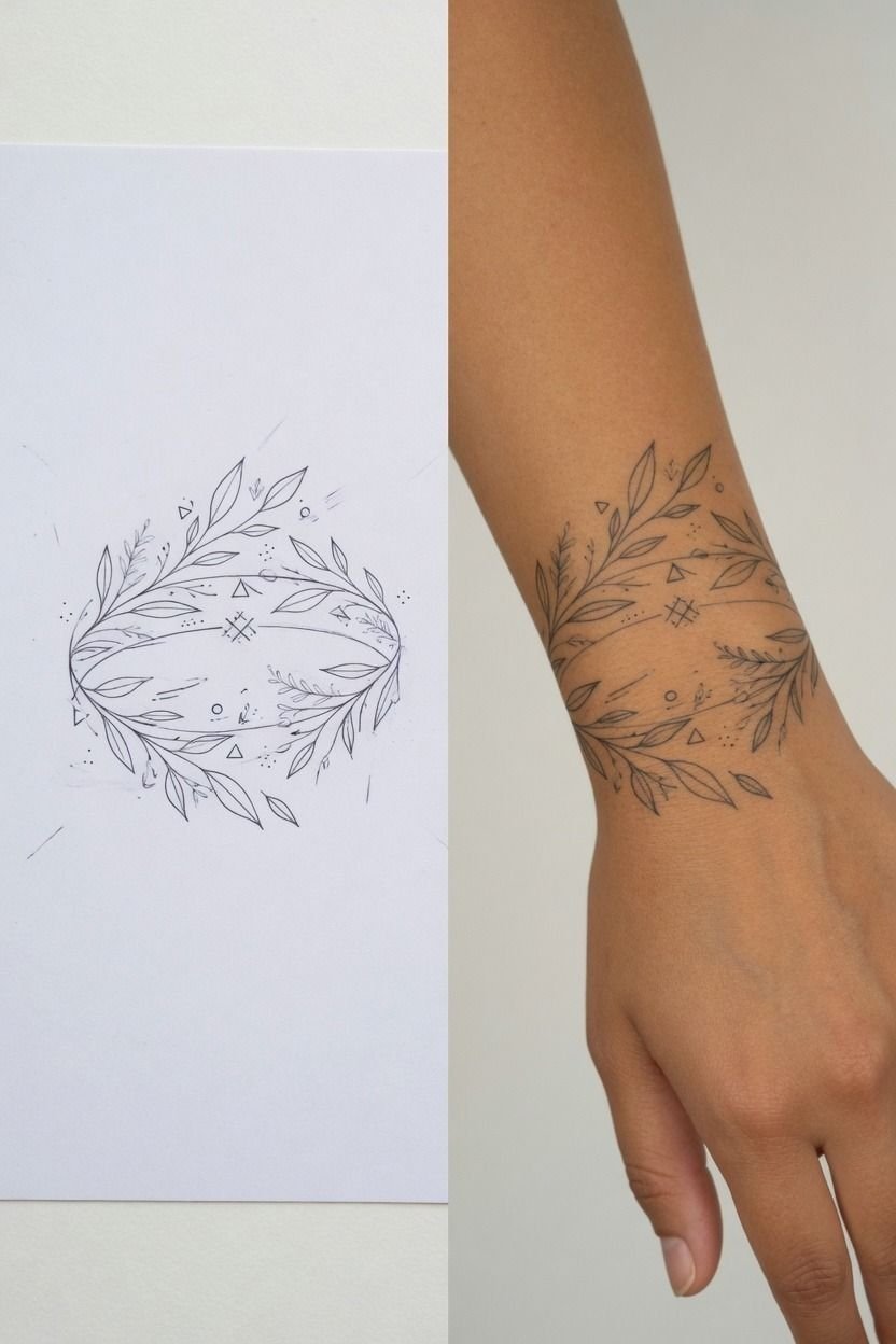
A bracelet tattoo has to move with your wrist, not choke it. I watched my artist wrap the stencil slowly, checking where the line met on the underside before she started. The key was leaving enough softness that it looked like ink, not a tight rubber band.
For this kind of wrist-tattoo-placement, a fine line chain motif or spaced botanical band works better than one dense solid ring. Solid black can hold, but it’s harder on narrow skin and more likely to feel heavy beside everyday jewelry.
The Two-Wrist Rule is simple: if you wear a watch, leave the tattoo above it or accept that you’ll hide it most days. I’d skip placing a delicate bracelet tattoo exactly where your metal band rubs.
11Mapping Pain Around The Inner Wrist
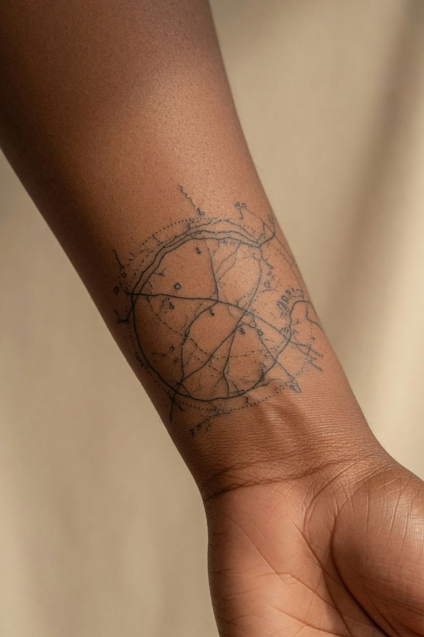
The inner wrist was spicy, but manageable. Lines felt sharper near the tendon, while the small amount of shading felt like a dull burn.
I didn’t need to prove anything. I took a five-minute break, drank water, and got back in the chair.
Your pain level depends on sleep, food, stress, and your own nervous system. Wrist bones, hands, feet, ribs, and sternum tend to hit harder than outer arm, thigh, calf, or shoulder. A rotary tattoo machine can feel smooth, but placement still matters.
But don’t let pain charts pick your tattoo for you. A small wrist piece may take less than an hour.
Eat first. Bring water.
Tap out for five rather than pass out on me.
12Avoiding The Tendon Line During Stenciling
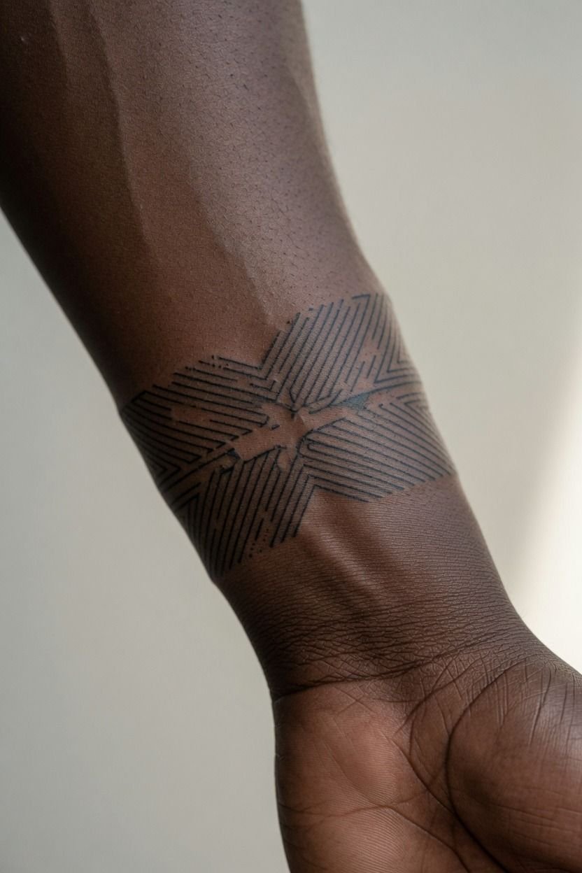
My artist marked the tendon line before applying the stencil, and I’m glad she did.
13Setting A Simple Tattoo Above My Hand
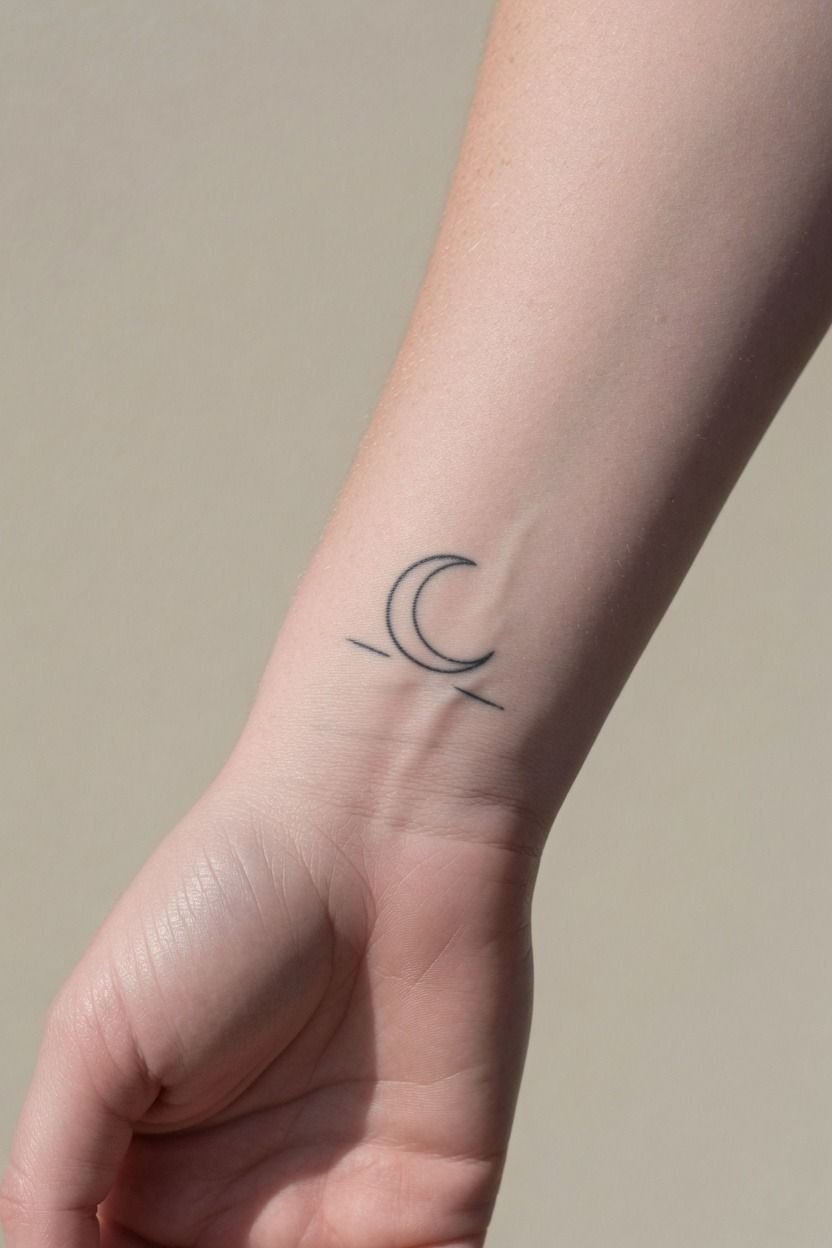
I kept the tattoo above my hand instead of creeping onto it. That decision gave the design a clean ending point and saved me from hand-level maintenance.
Hands are high-wear zones. They fade faster, get washed constantly, and take more sun than people admit.
A simple-wrist-tattoo above the hand can still feel bold. Mine used carbon black tattoo ink with a clean, open outline, and the contrast gave it enough punch without turning into blackwork.
Black is your best friend for longevity. Color is spice.
See small wrist tattoo ideas if you want a design that stays on the wrist but still has presence. You don’t need to cross onto the hand to make it visible.
14Keeping Botanical Details Clear On Narrow Skin
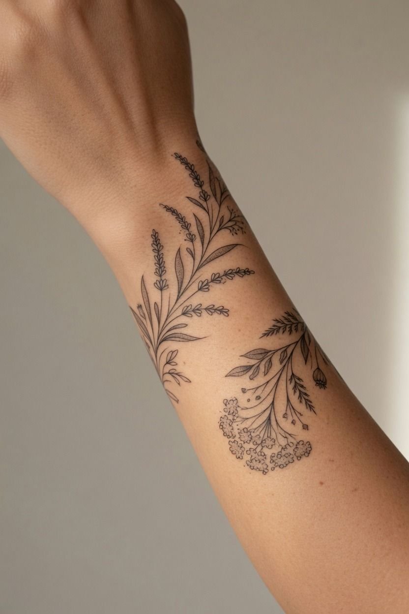
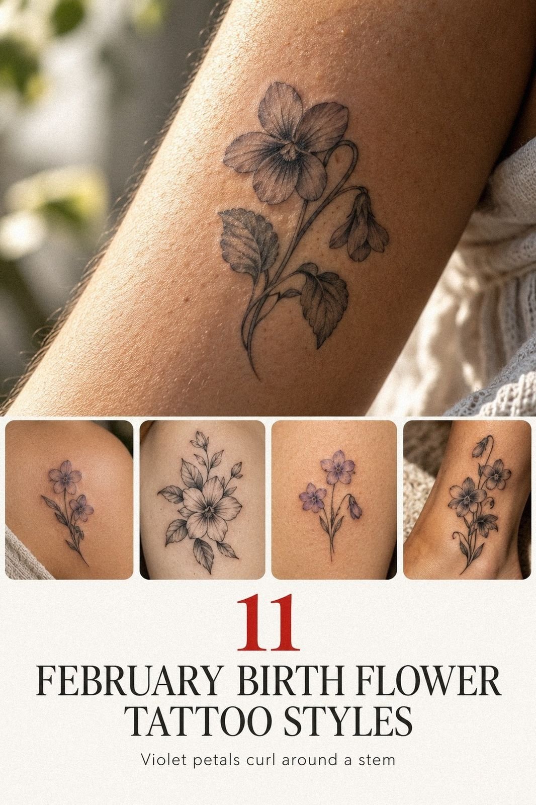
I cut two leaves from my original drawing.
15Choosing Red Ink For An Inside Wrist
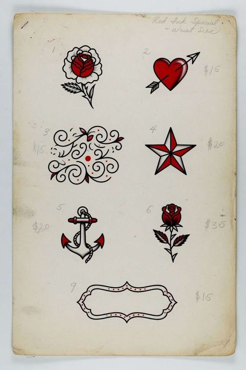
Red ink on an inside wrist can look soft and sharp at the same time, but I treat it as a color choice with consequences. I’d use it for one small symbol or a thin botanical accent, not for microscopic detail that relies on pale contrast.
A fine red-ink heart needs a proper patch test if you’ve had sensitivity before, and it needs extra sun care once healed. Red can look amazing on lots of skin tones, but it may fade differently than black and can need a touch-up sooner in high-wear spots.
If you’re choosing red, keep the form simple and the linework anchored. I like red with a black outline for a reason: the black keeps the tattoo readable long after the fresh brightness settles down.
16Confirming The Design From Every Angle
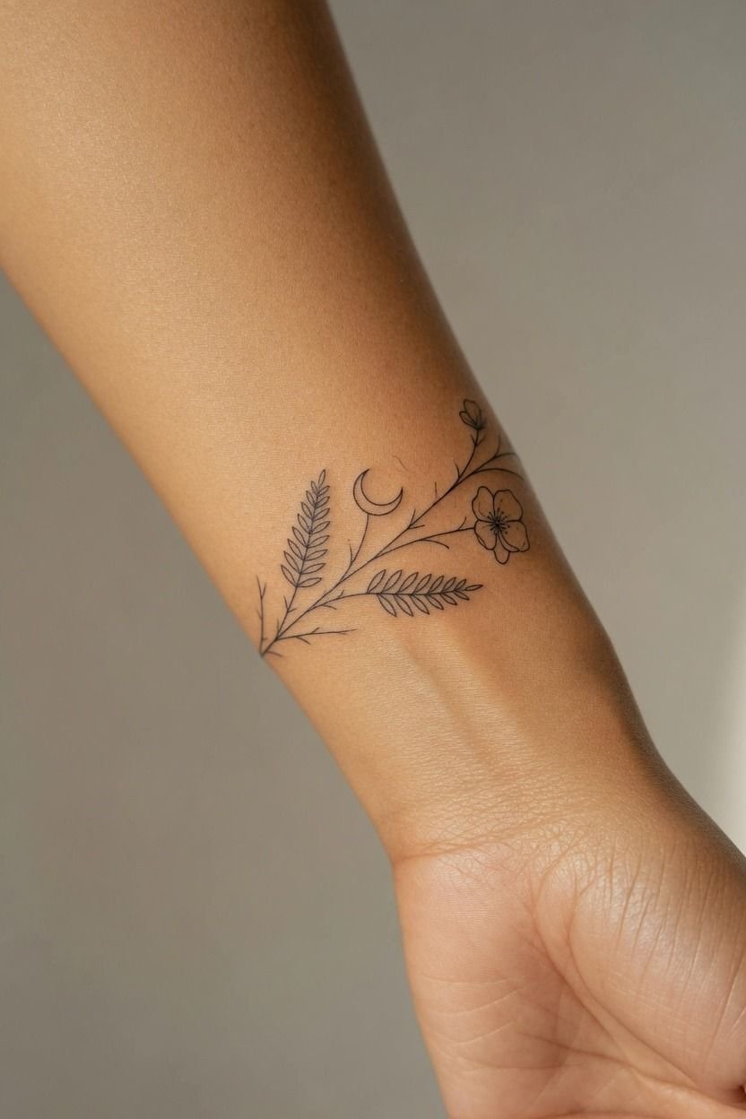
I made myself wait through one last stencil check. Annoying?
Maybe. Worth it?
Completely. We checked the tattoo while my wrist was straight, bent, palm-up, palm-down, and hanging naturally beside my body.
You should look for one thing: does the main shape still flow when your arm is relaxed? A purple stencil marker can smudge a bit during checks, so your artist may refresh it before starting.
That’s fine. Better than rushing because you’re nervous.
But don’t let friends in the studio vote on your placement. They’re seeing a moment. You’re wearing it for years.
Trust the artist’s eye, then trust the version that feels right in your own body.
17Planning Wrist Coverage For Future Tattoos
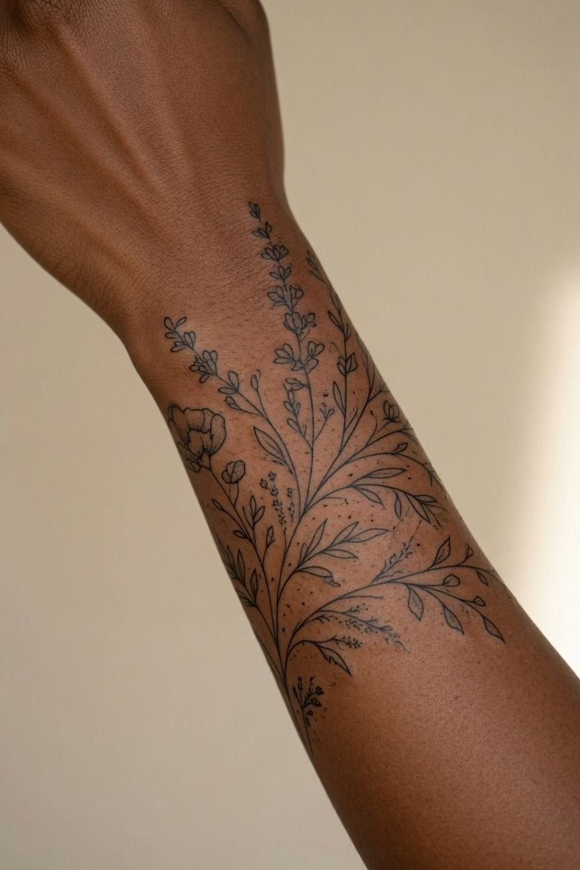
I planned my wrist tattoo as the first note in a bigger sentence.
18Protecting Fresh Ink During Daily Hand Use
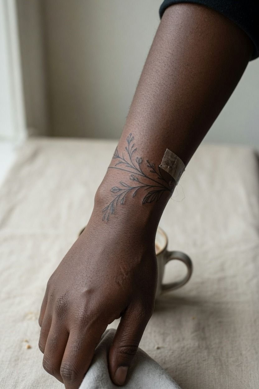
The first few days, it’s an open wound. Treat it like that. I washed mine with gentle unscented soap, patted it dry with a clean paper towel, and used a thin layer of fragrance-free tattoo ointment so it didn’t get suffocated.
Your wrist gets bumped by sleeves, countertops, steering wheels, gym straps, and sink water. Keep it clean, skip pools, and don’t let tight watch bands grind over it. It’ll peel like a sunburn around the first week.
Don’t pick flakes or you can pull color out.
And sun is not your friend here. Once the surface is healed, use sunscreen whenever the tattoo is exposed.
It’s the least glamorous part of tattoo care. It’s also what helps those lines stay crisp.
19Tracking Wrist Tattoo Healing Day By Day
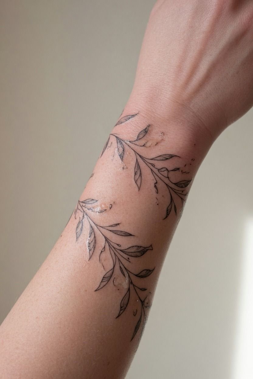
I took a quick photo every day for the first two weeks, mostly so I wouldn’t panic when the tattoo went dull during the silver-skin stage. Fresh ink looks bold, then it flakes, then it looks cloudy, then it settles. Normal.
Your surface healing usually takes about 2 to 3 weeks. Full healing under the skin can take 2 to 3 months, even when the tattoo looks finished. A gentle unscented moisturizer helped once my tattoo stopped feeling raw, but I kept the layer thin.
Use this fine line longevity and placement guide if you’re worried about fading or blowout. Healing isn’t a beauty contest. Let it do its work.
The Placement Math I’d Use Again
I’ve watched people blame fine line when the real problem was rushed placement. Fine line isn’t fragile by default.
Bad spacing is fragile. A wrist tattoo needs room around the crease, room around the bone, and enough contrast that it still reads when your skin isn’t freshly moisturized.
I went back and forth on inner wrist versus outer wrist because inner placement felt more meaningful to me. It’s visible when I want it, easy to cover with a sleeve when I don’t, and less exposed than the back of my hand.
But I had to accept the movement. Your wrist is not a flat canvas. It bends, turns, sweats, catches light, and bumps into life all day.
That’s why I’d never promise that the smallest version is the best version. The tiniest tattoo can be cute for a photo, then turn into a muddy little mark after years of sun and natural line spread.
Bold will hold, even in a fine line tattoo. Not “bold” as in huge.
Bold as in clear.
If you’re stuck, choose the design with fewer details and better spacing. Let your artist draw it at the size your skin can support.
I know that can feel like giving something up. You’re not.
You’re choosing a tattoo that’ll still look like itself later.
How much it cost
My wrist piece was small, but tattoo shops still have minimums. In the US, a typical shop minimum runs about $50 to $100, while hourly rates often sit around $100 to $250 depending on the artist, region, and specialty.
I’d pay more for an artist whose healed fine line photos look clean. Don’t chase the lowest quote for a wrist tattoo. A scratcher can save you money for one afternoon, then leave you paying for laser or cover-up work later.
The Questions Worth Answering First
How much does a Wrist Tattoo Placement usually cost?
A wrist tattoo placement usually costs about $100 to $300 for a small design, though some studios have a $50 to $100 minimum. A strong portfolio matters more than a cheap quote. Rates vary by artist, city, detail, and whether your tattoo needs custom drawing time.
Are Wrist Tattoo Placement a good idea for a first tattoo?
Yes, wrist tattoo placement can be a good first tattoo if you choose a simple design and accept that the inner wrist can feel spicy. Clear linework gives you better long-term readability. Outer wrist and lower forearm usually feel more tolerable than hands, ribs, feet, or sternum.
How do I choose a tattoo artist for Wrist Tattoo Placement?
Look for healed photos, not only fresh ones. You want crispy linework and clean spacing on real skin, plus a studio that uses sterile single-use supplies. Check whether the artist regularly tattoos fine line, lettering, florals, or the exact style you’re asking for.
How much do Wrist Tattoo Placement hurt?
Wrist tattoos can sting, especially near the bone, tendon, and inner crease, but a small design is usually manageable. Short sessions make the pain easier to handle. Lines feel sharp, shading feels like a dull burn, and dense color packing is usually the spiciest part.
How long does a Wrist Tattoo Placement take to heal?
The surface usually heals in 2 to 3 weeks, while deeper healing can take 2 to 3 months. Gentle aftercare protects the linework. Unscented soap, a thin layer of moisturizer, no picking, no pools, and sunscreen once the skin has closed.
What’s the best placement for Wrist Tattoo Placement?
The best placement is usually slightly above the wrist crease or on the outer wrist, where your design gets more stable skin and room to breathe. A clean placement ages better than a cramped one. Use ladies wrist tattoo designs for ideas that fit that zone.
Where I’d Start First
If I had to pick one, I’d start with placement below the wrist crease. That tiny buffer keeps your lines from folding into daily movement. Pin this for later, then bring your artist references for vibe, not a copy job.