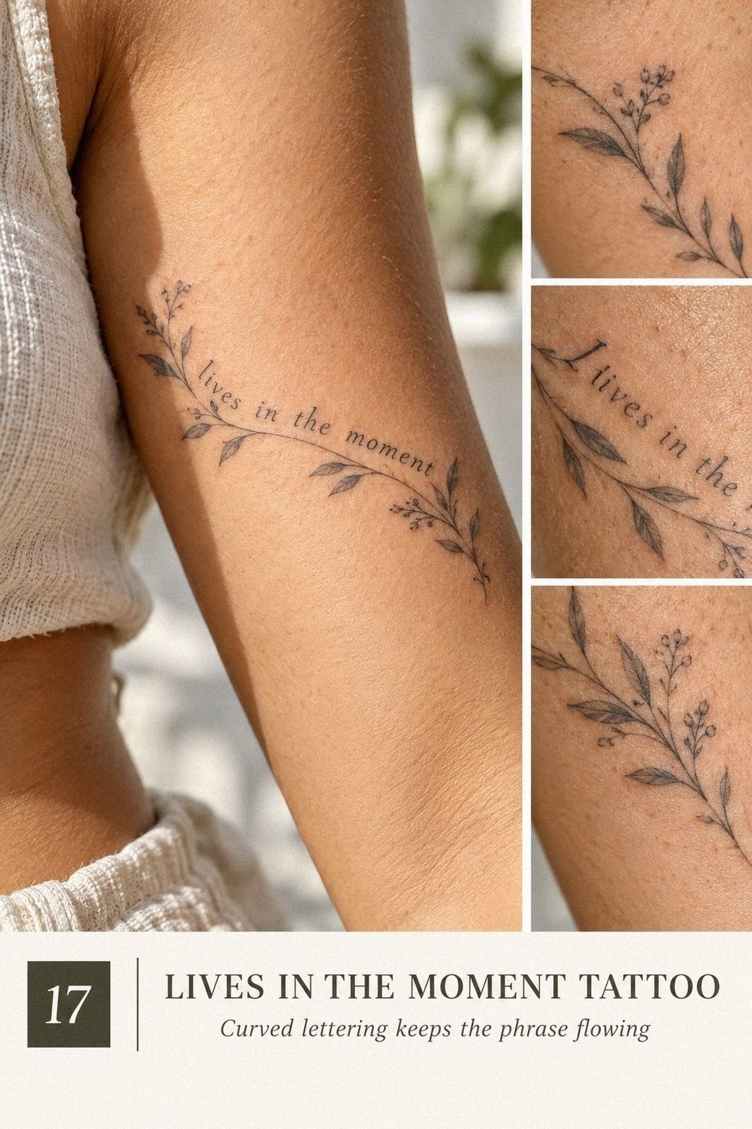
I almost talked myself out of my first fine-line tattoo because I thought a small phrase would look too plain. I was wrong. A Live In The Moment Tattoo works best when the lettering, placement, and skin tone are planned together. You don’t need a huge design, but you do need a crisp idea that still feels personal years later.
The strongest versions feel meaningful, striking, and honest without becoming loud. Start with the words, choose the right scale, then let the details support them. That small decision matters!
Start With the Phrase, Not the Font
Before choosing a style, write the phrase exactly as you want it on your tattoo consultation notes. Decide whether you want “Live In The Moment,” “Just Live,” “Just One Life,” “Enjoy Life,” or “Live Your Life.” Each one carries a different emotional weight.
“Just Live” feels bold and direct. “Enjoy Life” feels more playful, while “Live Your Life” can feel empowering and personal. Read each phrase aloud and notice which one still sounds true when you aren’t looking at tattoo references.
Lettering changes the mood quickly. A narrow script can feel delicate and romantic, while upright capitals may look sharp, crisp, and edgy. I’d choose the emotional direction before worrying about tiny flourishes.
Keep the final wording uncomplicated. A phrase that needs a paragraph of explanation may not be the phrase you want permanently on your skin. If symbolism matters, this yant tattoo meaning guide can help you think through a small companion mark.
Just Live Tattoo en Fine Line
This upper-arm version keeps the words narrow, graceful, and easy to read on fair cool-pink skin. The hair-thin single-needle lines give the phrase an understated look, while the horizontal placement keeps your shoulder from feeling crowded. If you’re choosing your first tattoo, this is a striking place to begin because you can see it without twisting your body.
The best reference is single-needle linework, not a heavy script sample. Ask your artist to show healed photographs, because fresh ink can look sharper than it will after the surface settles.
I’d skip an overly ornate font. It may look ornate today, but tiny loops can close together as the lines soften.
You can make the design more personal with a tiny star, dot, or short underline, but don’t add three symbols simply because the space allows it. One symbolic mark gives the phrase room to breathe. That restraint is the point!
Your artist should place the stencil while your arm is relaxed, then let you check it from the front and side. You’ll want the baseline to follow your natural upper-arm curve, not fight it. A black ink stencil will show whether the phrase feels balanced before the needle touches your skin.
Live In The Moment sur l’Avant-Bras
The inner forearm makes this phrase more visible and conversational. On medium warm ivory skin, a hair-thin forearm tattoo can look sleek without becoming severe. If you want a reminder you’ll notice during a busy day, this placement gives you quiet contact every time you turn your wrist.
Keep the lettering slightly longer than it is tall. A compressed phrase can look bold at first, but the letters may become difficult to separate as the ink settles.
I’ve seen people choose a tiny size because they’re nervous, then wish they’d allowed another half-inch for breathing room. Your artist can test the scale with carbon stencil paper first.
The forearm isn’t automatically painless. Most people find it more tolerable than ribs, feet, hands, or sternum, though individual sensitivity varies.
If you’re anxious, ask for short pauses and keep your arm loose. A clenched wrist makes the session feel longer, and you don’t gain anything from pretending you’re comfortable.
The phrase can sit straight along the arm or follow the forearm’s slight diagonal. I prefer the diagonal because it feels more expressive and less like a label. If your meaning leans toward balance, this yin yang tattoo meaning article may help you decide whether a tiny complementary mark belongs beside the words.
Just One Life en Chiffres Romains
Roman numerals turn “Just One Life” into a powerful symbolic design with a sharper edge. Along the spine, the vertical format feels personal, especially on medium olive skin. The narrow sequence creates a calm rhythm, but your artist still needs enough separation between each character for the design to remain legible.
Ask for Roman numeral lettering that has been tested at the intended size, not simply copied from a phone screenshot. Tiny serifs can blur when they’re packed together. I’d avoid adding a date unless it carries genuine meaning, because extra numbers can make the piece feel more like a record than a lived reminder.
The spine is a more sensitive placement than the forearm or upper arm, and the bony surface can make a session feel intense. You’ll want to discuss breaks before starting, especially if the phrase is longer than expected. My preference is a centered design with generous negative space, not a narrow column pressed too close to the vertebrae.
If you like the vertical symbolism but want softer imagery, pair the idea with a tree reference rather than another line of text. This Yggdrasil tattoo meaning guide can help you think through growth, time, and connection without making the final tattoo overly ornate. The Roman numerals should stay the visual anchor.
Make Skin Tone Part of the Plan
Your skin undertone can influence how black ink, color, and contrast appear after healing. That doesn’t mean one skin tone suits a particular design. It means your artist should understand how fine lines settle on skin similar to yours.
On fair cool-pink skin, very thin black lines can look crisp, but they may need careful spacing. On golden tan or medium olive skin, strong contrast and open lettering can keep the phrase readable without making it feel heavy.
Deep brown and deep ebony skin can carry remarkably elegant lettering when the artist understands contrast and placement. Ask to see healed examples on comparable skin tones, not only fresh work photographed under bright studio lighting.
Color deserves a separate conversation. A color tattoo accent may look vibrant at first and settle more quietly later. If the words are the emotional center, black lettering should remain strong enough to carry the design on its own.
Enjoy Life avec Fleurs Sauvages
This upper-back idea uses “Enjoy Life” with thin wildflower stems around the lettering. On golden tan skin, the design can feel vibrant and graceful without requiring heavy shading. The flowers should look slightly irregular, as if they’re moving upward rather than arranged into a stiff bouquet.
Use fine-line wildflower stems with enough open skin between the petals. I’d choose two or three flower shapes and repeat them lightly, rather than asking for a full botanical catalog. The phrase needs to remain readable from a distance, and a dense border can swallow the lettering faster than you’d expect.
The upper back gives you useful space without forcing the design to become enormous. You can keep the words centered beneath the shoulder blades, or let one stem drift toward the shoulder. If you’re concerned about visibility, remember that a back tattoo feels more private than a forearm piece.
A small yellow flower can carry a romantic, expressive note, but don’t choose one only because it looks cheerful in a reference. Meaning matters more when the phrase is this direct. Read the yellow rose tattoo meaning guide if that flower is part of your idea, then let your artist simplify it into crisp black lines.
Live Your Life en Lettrage Manuscrit
Handwritten lettering gives “Live Your Life” a personal and slightly vintage character. The goal isn’t to imitate someone else’s handwriting perfectly. It’s to find a stroke rhythm that feels natural when you see it on your own skin.
Look for hand-drawn lettering with a visible entry and exit rhythm. A real handwritten style shouldn’t look mechanically repeated, so slight differences in stroke direction can make it feel more authentic.
I’d skip a script with ten decorative swashes. Those swashes are the first details to lose clarity.
You might choose one dramatic capital letter or a lower-case version that feels more understated. The lettering can read as feminine, masculine, or neutral without turning the choice into a label. Your body, your handwriting preference, your call.
If you want the phrase to feel more raw, choose a slightly uneven line rather than polished calligraphy. For a reference point, browse these XXXTentacion tattoo ideas for examples of emotional lettering and personal symbolism. You can also compare a yantra tattoo meaning before adding a small geometric emblem.
Live In The Moment derrière l’Oreille
Behind the ear, the phrase becomes intimate and discreet. On deep ebony skin, crisp black lettering can create a sharp, elegant contrast, but the available space is limited. You’ll need to shorten the phrase, reduce the letter height, or let the words follow the curve behind the ear.
A small black-letter stencil should be checked from several angles before you approve it. The ear moves, and the skin can fold slightly when you turn your head. I’d choose a simple handwritten font with open counters, because closed loops may become muddy as fine lines soften.
This spot can be more sensitive than the upper arm, and the vibration may feel unusually close to the skull. You don’t need to prove anything during the appointment. Ask for a pause if your body tenses, then return to the design when you’re ready.
The phrase may be partially hidden by hair, which is part of its appeal. If you want a sacred or personal layer, keep the symbol tiny and let the words lead. This YHWH tattoo meaning guide can help you think through spiritual lettering before you add anything that could change the message.
Just Live avec Symbole Infini
The infinity symbol works well beside “Just Live” because it gives the short phrase a visual finish. On a fair cool-pink forearm, the fine-line design can feel playful, symbolic, and crisp without becoming childish. Keep the loop narrow and intentional so it supports the words.
Ask your artist to draw an open infinity loop rather than a thick, closed knot. The open center preserves skin and helps the shape stay readable.
I’d place the symbol after the phrase, not above it. A side-by-side layout reads faster and keeps the design from becoming too tall.
If you’re choosing this because the phrase feels hopeful, make sure the symbol reflects your own story. A generic loop can feel empty when it’s added without thought. You might use one tiny break in the line to represent a change, but keep that detail clean enough to survive normal fading.
This is also a good place to consider a small geometric reference. The yantra tattoo meaning guide offers ideas about focus and intention, though I’d avoid combining several symbols in one small area. The strongest version is minimal, personal, and easy for you to read at a glance.
Let Placement Carry Some Meaning
Placement can change the emotional tone of the exact same phrase. An inner forearm feels visible and conversational, while a rib tattoo can feel more private. Behind the ear feels discreet, and the spine can feel fierce and intentional.
Think about who you want to see the words. If the tattoo is a daily reminder, choose a place you can comfortably notice. If it belongs mainly to you, a shoulder blade, rib, or upper back may feel more appropriate.
Movement matters too. A phrase that looks straight on the arm may need a slight curve around the body contour. Ask your artist to check the stencil while you stand naturally, not only while your arm or torso is positioned for the appointment.
Your clothing routine also matters. Consider waistbands, straps, uniforms, sun exposure, and areas that rub often. A beautiful placement can become frustrating if it constantly catches on fabric during the first stage of healing.
Just One Life en Style Minimaliste
A minimalist calf tattoo gives “Just One Life” a quiet, modern shape. On medium warm ivory skin, a few deliberate strokes can make the phrase feel polished without looking overworked. The calf offers more usable length than the ankle, so your artist can protect spacing while keeping the design small.
Use minimal lettering as the starting point, then let the artist adjust it to your anatomy. You’ll want the phrase to follow the leg rather than wrap too far around it.
I’d skip a design that’s so tiny you need a phone camera to read it. Minimal does not mean microscopic.
The calf is usually more tolerable than the ribs or feet, though the area near the shin can feel sharper. If you’re new to tattoos, ask whether the placement can sit slightly toward the outer calf. That small shift can give you more soft tissue without changing the idea.
A dainty line can look refined, but it needs enough contrast to remain visible. Think black ink first, then decide whether a small dot or tiny star adds meaning.
This Zeus tattoo meaning guide may inspire a symbolic detail, but the phrase should stay in charge. That little loop carries more weight than it looks!
Enjoy Life sur les Côtes
Rib lettering has an intimate, edgy quality because the phrase follows a long, narrow plane. On medium olive skin, “Enjoy Life” can look flowing along the side of the body, especially when the letters are spaced with patience. The design should feel like it belongs to your movement.
Choose thin black script with open letterforms and a controlled baseline. I’d avoid heavy shading here, because the ribs already create natural movement and contrast. A short stem, tiny leaf, or single dot can soften the phrase, but too many flowers will make the composition feel busy.
Ribs are commonly considered one of the more painful placements, along with feet, hands, and sternum. You’ll want to plan around your comfort, not just the photograph. A shorter session may be the smarter choice, even if it means returning later for a small refinement.
If you’re drawn to floral symbolism, pick one plant with a reason behind it. The yellow rose tattoo meaning article can help you decide whether that flower fits the message. I’d keep the final design delicate and slightly raw, with enough bare skin that the words remain first.
Live Your Life avec Soleil Levant
The rising sun adds direction to “Live Your Life.” A few restrained rays can suggest movement, renewal, or a fresh beginning without competing with the lettering. The idea works especially well when the phrase remains the visual anchor.
Ask your artist to create a rising sun outline with restrained rays. Too many rays can turn the design into a dense badge, while a few uneven lines feel more expressive. I prefer a half-sun tucked behind the lettering because it suggests motion without overpowering the phrase.
A stencil is only a prediction. Skin texture, curvature, and healing will change the final look, so you shouldn’t expect fresh ink to remain identical line for line. The goal is a clear design that settles gracefully.
The upper body gives you flexibility if you want the sun to remain private or visible. You can also ask for a small floral ray if you want a more whimsical direction.
This yellow rose tattoo meaning guide is useful if you’re considering a flower in place of one sunbeam. It reads at a glance!
Live In The Moment en Aquarelle
An aquarelle-inspired Live In The Moment Tattoo can bring softness to fine-line lettering, but the color needs a careful plan. On deep brown skin with a warm undertone, black linework should establish the phrase first. Subtle color can then move around it without making the words disappear.
Start with black fine-line lettering and discuss which colors will remain visible after healing. A watercolor effect often looks vibrant in a fresh photograph, but some tones may settle more quietly. I’d choose one or two controlled hues instead of a rainbow wash.
The ribs are a sensitive placement, so ask how long the session might take and whether the color work will be done in one sitting. You’ll want the artist to understand both fine lines and color behavior on deeper skin tones. Look for healed examples, not only bright portfolio images from the same day.
Don’t let the word “aquarelle” push you toward excessive detail. A few expressive strokes, a soft halo, or one tiny color accent may be enough. Compare the emotional symbolism in this yin yang tattoo meaning guide if you want the contrast to represent balance.
When Should You Choose a Larger Scale?
A larger design isn’t automatically more dramatic. Sometimes it simply gives the letters enough room to remain legible. If the phrase contains several words, a slightly larger letter height can protect readability as the tattoo settles.
Choose more space when you want flourishes, symbols, or botanical details. A tiny tattoo can carry a dainty mood, but it can’t carry unlimited information. Every extra element needs room to remain distinct.
Scale also depends on placement. The inner forearm and calf can support a longer horizontal phrase, while behind the ear may require a shortened version. Your artist can show several stencil sizes before you decide.
I’d rather see a clean, readable tattoo than a miniature phrase that only looks impressive during the consultation. A restrained enlargement often feels more timeless and intentional.
Worth It? Budget and Artist Value
Tattoo cost depends on the artist, location, size, placement, and detail. A small phrase may still meet a studio minimum, while a larger or more intricate design may be priced hourly. Ask for the full studio pricing policy before booking.
Is a more expensive artist worth it? Often, the value comes from healed fine-line work, thoughtful placement, clean spacing, and a design that still reads well later. A lower price isn’t necessarily a bargain if the artist lacks experience with fine lettering.
Your budget should include the consultation, the tattoo, a possible touch-up policy, and aftercare supplies. If the quote is outside your range, ask whether reducing detail or changing placement would help. Don’t pressure an artist into rushing a design to meet a number.
A meaningful tattoo is an investment in a permanent decision, but that doesn’t mean you need the highest price available. Look for consistent work, clear communication, and a portfolio that makes you feel confident about the value.
Protect the Meaning After the Appointment
Fresh ink can look intense, delicate, or slightly swollen before the skin calms down. Follow your artist’s instructions for washing, moisturizing, sun protection, and avoiding swimming while the tattoo settles. Good tattoo aftercare protects both the skin and the design.
Don’t pick flakes or judge the final line quality too early. The surface may look uneven during healing, and fine lines can appear different as the skin calms. Give the tattoo its full healing window before deciding whether anything needs attention.
Sun exposure can affect the long-term appearance of black and colored ink. Once the skin has healed, use sunscreen as directed and avoid treating the tattoo like it has no history. A little care supports a more timeless result.
If a touch-up is needed, wait until your artist says the skin is ready. Fine-line tattoos sometimes need a small refinement, especially in areas with frequent movement or friction. That doesn’t mean the original idea failed.
The Rule I’d Keep for a First Tattoo
I used to think the safest first tattoo was the smallest possible tattoo. That sounds sensible until you see how tiny lettering behaves on real skin. Fine lines can be delicate and elegant, but they still need enough spacing, contrast, and placement support.
I’d also stop treating pain as the only decision point. Yes, ribs, feet, hands, and sternum can feel more intense than the forearm, calf, upper arm, or thigh. But a tolerable placement that you dislike is still a poor choice.
The best artist search is practical. Look for healed photographs, clean linework, consistent spacing, and examples on skin tones close to yours. Ask about hygiene, stencil placement, aftercare, and how the artist approaches fine lettering.
If you’re considering a symbolic companion, read this Yggdrasil tattoo meaning guide or the YHWH tattoo meaning guide before making the appointment. Keep the symbol secondary if the phrase is what you truly want to remember.
Your tattoo doesn’t need to explain your entire life. It needs to feel honest when you look at it. That is enough!
A bold idea can still be understated, and a minimal phrase can still carry fierce emotional weight when the design gives it room.
A Few Things Worth Answering
Where can I buy a Live In The Moment Tattoo design?
You don’t buy the finished tattoo online. Choose an artist whose portfolio shows clean fine-line work and healed lettering, then bring your favorite references to the consultation. A custom stencil gives you control over placement, scale, and personal meaning.
Avoid copying a design without checking its origin or asking whether the artist can redraw it. If you want symbolic inspiration, this yant tattoo meaning guide can help you develop an idea before your appointment.
How much does a Live In The Moment Tattoo usually cost?
A small US tattoo often lands around $100 to $300, while a studio minimum may be about $50 to $100 and hourly rates may run about $100 to $250. Your final quote depends on the artist, region, size, placement, and detail.
Ask for the studio’s pricing policy before booking. A lower quote isn’t always the better value if the artist lacks healed fine-line examples. This yin yang tattoo meaning reference may help if you’re adding a symbolic element.
Are Live In The Moment Tattoo a good idea for a first tattoo?
Yes, especially when you choose a readable size and a tolerable placement. The forearm, calf, upper arm, thigh, and shoulder are often easier starting points than ribs, feet, hands, or sternum. Clear lettering also makes the meaning easy to check before you commit.
You’ll still want an artist who understands how fine lines settle. Bring references, ask about healed work, and keep the design personal rather than chasing a passing style. A meaningful phrase can feel empowering without needing extra decoration.
How do I choose a tattoo artist for this design?
Review healed photographs, line consistency, stencil accuracy, and hygiene practices. Ask whether the artist regularly works with small lettering and whether they have examples on skin tones similar to yours. A strong portfolio should show settled work, not only fresh photographs.
You can also ask how the artist handles revisions, breaks, and aftercare. If the design includes a mythic symbol, read a guide such as Zeus tattoo meaning before the consultation so you can explain your intention clearly.
How much do Live In The Moment Tattoo hurt?
Pain varies, but ribs, feet, hands, and sternum are commonly more sensitive than the forearm, calf, thigh, upper arm, or shoulder. Placement matters because thinner skin and bony areas can make the session feel sharper.
You don’t need to sit through discomfort without speaking. Ask for pauses, keep your breathing steady, and follow the artist’s instructions. A short, simple design may still feel intense in a sensitive area, so choose your placement with honesty.
How long does a Live In The Moment Tattoo take to heal?
The surface usually heals in about 2 to 3 weeks, while complete healing can take about 2 to 3 months. Gentle aftercare instructions usually include washing carefully, moisturizing as directed, and avoiding direct sun and swimming while the skin settles.
Your artist’s instructions should come first because products and healing responses vary. Don’t pick flakes or judge the final line quality too early. Fine lines may look different as the surface calms, so give your skin the full healing window.
Where I’d Start First
If I had to pick one, I’d start with the inner forearm version. It’s readable, tolerable, and spacious enough for fine lines to settle without crowding. Pin the Live In The Moment Tattoo inspiration for later and bring one clear reference to your artist.
For a first tattoo, I’d choose a phrase with personal meaning, open lettering, and enough room to age gracefully. Keep the symbol small, the spacing deliberate, and the design emotionally true. That combination feels classic, stylish, and worth living with.