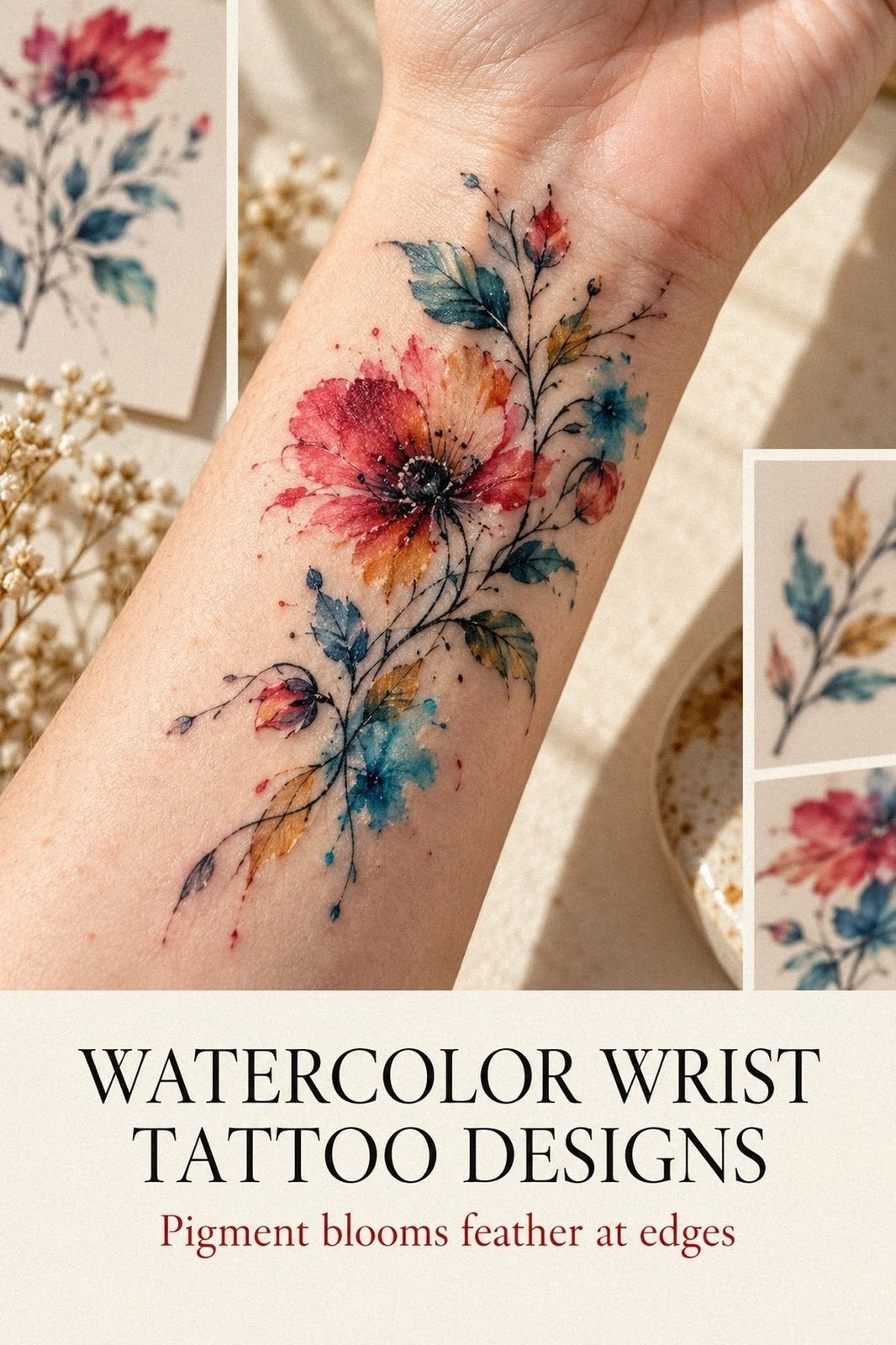
A watercolor wrist tattoo heals on the surface in about two to three weeks, and fully closer to three months. I stalled for three years before I found that out. Got mine the week I turned thirty, and the part I feared most, the bleed, healed the cleanest.
Don’t overthink: Run every screenshot through the Fade Filter.
Here’s what it looked like before
The inside of my left wrist, four inches of blank skin I’d been saving since college for the right idea. Fair, cool pink, veins showing through like pencil under tracing paper. A faint scar near the base of my thumb from a bread knife in 2019.
Every summer I’d hold my arm up to the light, imagine something there, then pull my sleeve back down. That patch wasn’t precious. It was just unclaimed, and I kept letting other people’s opinions claim it for me.
- Say yes to the wrist you keep postponing
- Run every screenshot through the Fade Filter
- What did my left wrist teach me before the needle?
- Skip the black outline everyone recommends
- Bring your own pigment swatches to the consult
- Map the Bone and Tendon Window
- Two peonies over one butterfly
- Stencil day, and the small head rush I didn’t expect
- Float the first splash with no guideline
- Forty minutes in the chair, and the pain over the bone
- Let the pink bleed on purpose
- Heal ten days under a long sleeve
- Why did one summer steal my blues?
- Add two drops with the One Year Rule
1Say yes to the wrist you keep postponing
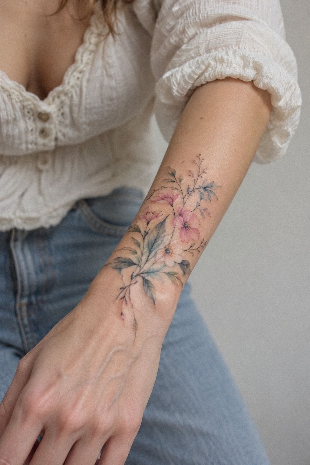
I booked on a Tuesday from my desk with my thumb hovering over the deposit button for a full minute. Three years of stalling, gone in ninety seconds.
What pushed me wasn’t a new design. It was seeing a healed piece in person, on a friend with the same cool pink skin I have, the kind that shows every ghost of a bruise. Her petals were still crisp petals at eighteen months, the terracotta pigment sitting even, no muddy halo, no gray creep at the edges.
That’s the proof you want before you book. Not a fresh portfolio image glowing under artificial light, but skin that’s lived through a year.
Fresh ink flatters everyone! Ask any artist and they’ll say the same thing, usually with a sigh.
And I’d been treating this as permanent in a frightening way, when it’s permanent in a quiet way. You wear it, you stop noticing it, then somebody grabs your wrist at dinner and you remember all over again. If you’re still gathering references, our wrist tattoo ideas page is where mine lived for months.
2Run every screenshot through the Fade Filter
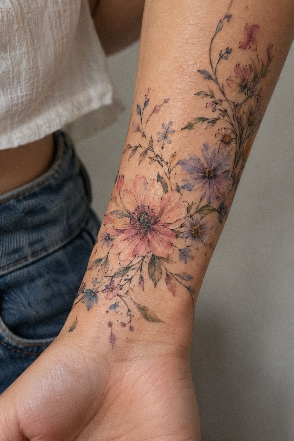
I saved 214 screenshots over three months. Most of them were garbage, and I mean that with love.
Here’s the Fade Filter I built, and it’s the single most useful thing I did. For every saved image, I asked one question: what survives if the lightest 30 percent of this washes out?
Because it will. Watercolor tattoo ideas that live entirely in pale clay and cream washes have nothing left to stand on in year five.
The ones that survive have a dark anchor somewhere, a stem, a stamen, a seed pod in deep clay pigment.
Roughly nine out of ten of my saves failed that test on the spot. Painful, but that ruthless filter is what turned a vague mood folder into an actual brief my artist could read.
Don’t save the image. Save the structure. Then write one line under it about why you kept it, because in six weeks you won’t remember what you were looking at, and a note like “delicate edge, dark center, still legible small” is worth more than the image itself.
3What did my left wrist teach me before the needle?
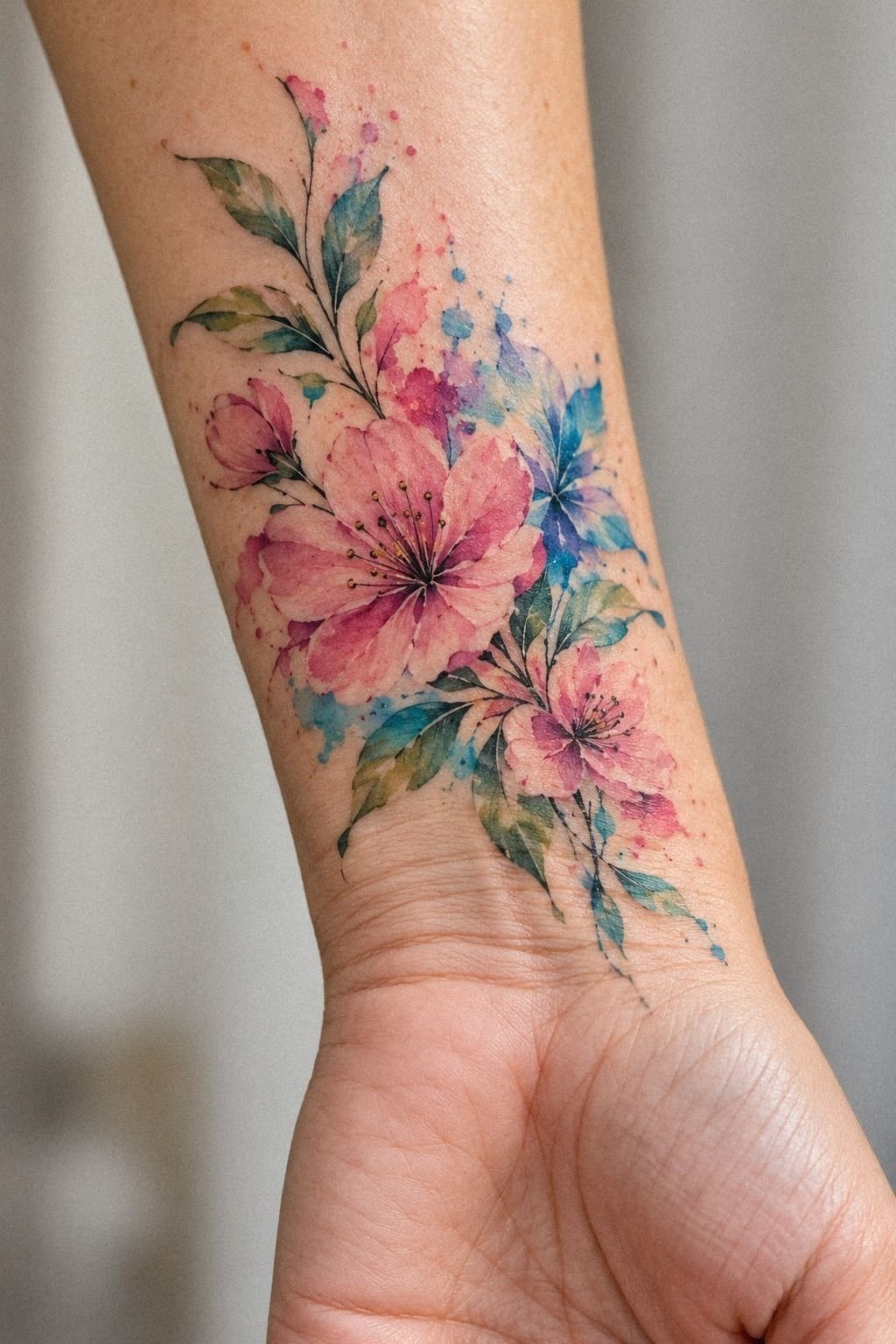
That skin is not paper, which sounds obvious and isn’t.
I taped a printed mockup to my wrist for a week, with painter’s tape, like a lunatic at the office. Watching it move taught me more than any consultation.
The inner wrist folds. It creases when you type, it stretches when you push a door.
A design that reads elegant flat on a sheet can go oddly wide across the joint if it sits too low.
With a plum and rose-gold palette, that lived-in look you see in daylight comes from ink that respects the flex, not from ink that fights it. My mockup shifted about half an inch during the week, and that tiny drift is exactly what sold me on going higher up the arm.
So try it. Print at real size, tape it on, and live with it for seven days.
Wear long sleeves, wash dishes, drive. If you still like it on day six, you like the tattoo and not the idea.
4Skip the black outline everyone recommends
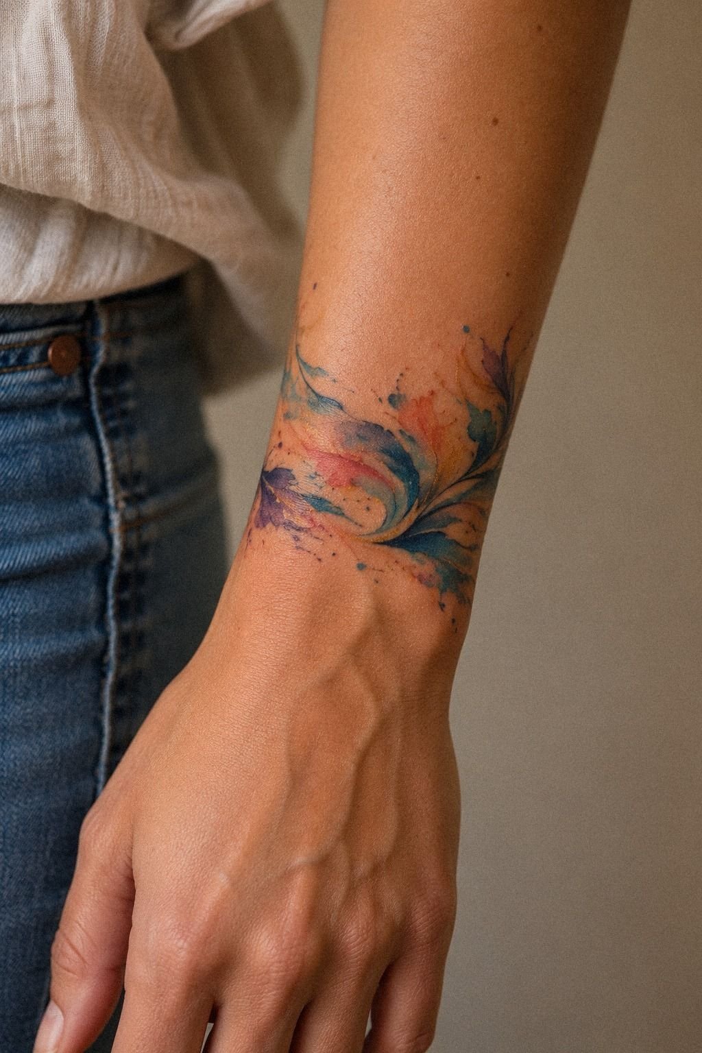
Every forum told me to cage the color in navy linework so it “holds up.” I went the other way.
Here’s my reasoning, and I’ll own it as opinion. A hard outline on a watercolor art tattoo turns it into a coloring book page, and the whole point of the style is that the pigment looks like it landed rather than got filled in.
What actually ages well isn’t the outline, it’s the density inside the shape. A flowing wash packed with saturated navy pigment survives. A pale wash inside a bold line just makes the line look lonelier every year.
I’d skip the full navy contour. I wouldn’t skip internal structure, and that distinction matters more than any advice thread I read.
Ask your artist for partial containment instead: two or three short, decisive dark marks where petals overlap, nothing tracing the whole silhouette. If you want the technical side of that argument laid out properly, the watercolor tattoo design breakdown covers it better than I can in a paragraph.
5Bring your own pigment swatches to the consult
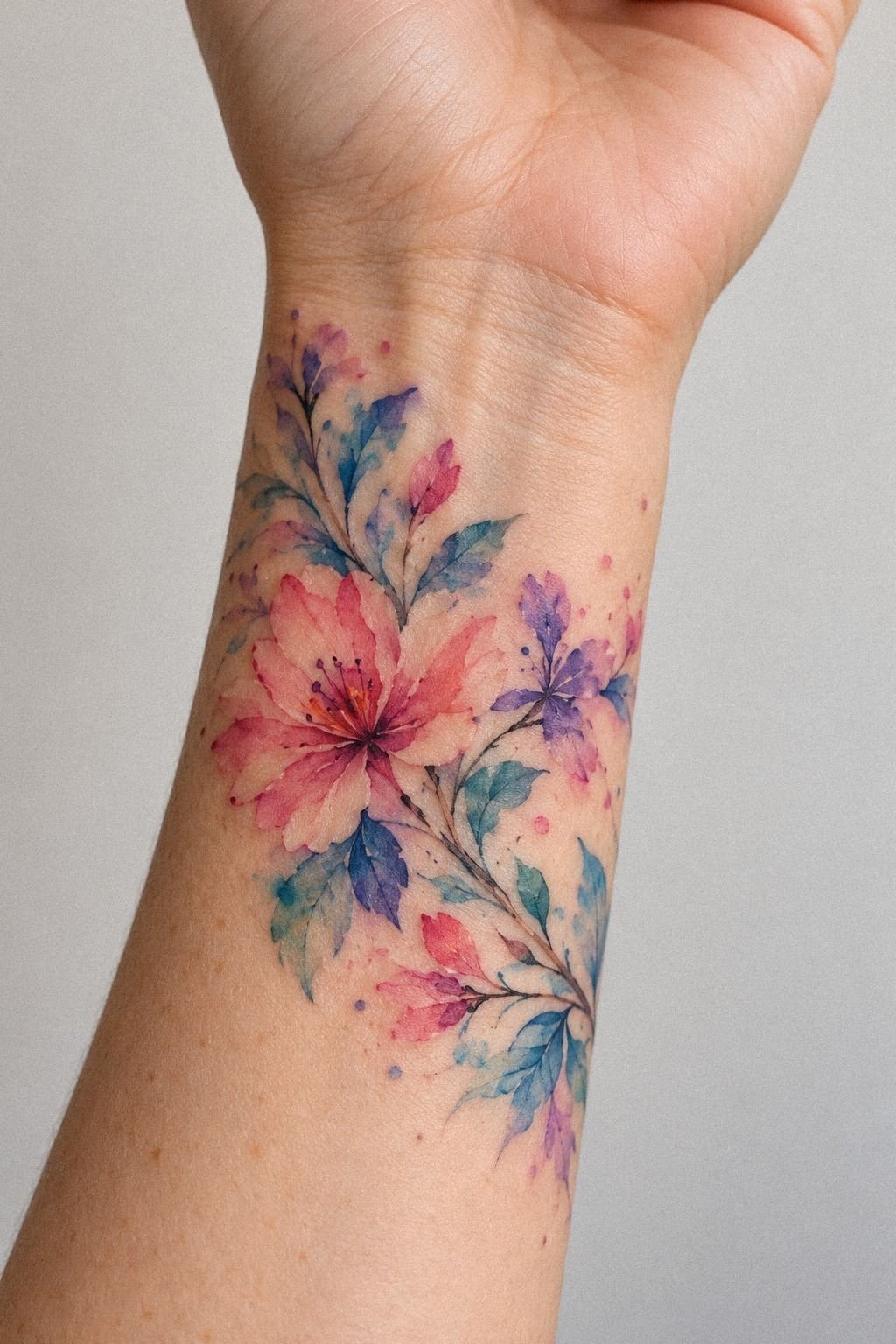
I walked in with a flash sheet, a paint card, and zero shame.
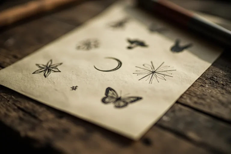
My artist had a portfolio of hand-drawn designs on aged off-white paper, which I loved, but nothing in those washes matched the exact emerald pigment in my head. So I’d brought three swatches torn from a watercolor pad. She matched two of them to Eternal Ink bottles in about four minutes, and adjusted the third with a warm cream blend.
That meeting reframed the whole thing for me. You’re not ordering off a menu.
You’re briefing a collaborator who knows things about healed color that you don’t. She told me my emerald would settle about 15 percent softer once the swelling dropped, and she was right.
Bring physical color. Phone screens lie about saturation, every single time! And if your artist can’t tell you how a pigment heals on your specific skin tone, that’s your answer about whether to book.
6Map the Bone and Tendon Window
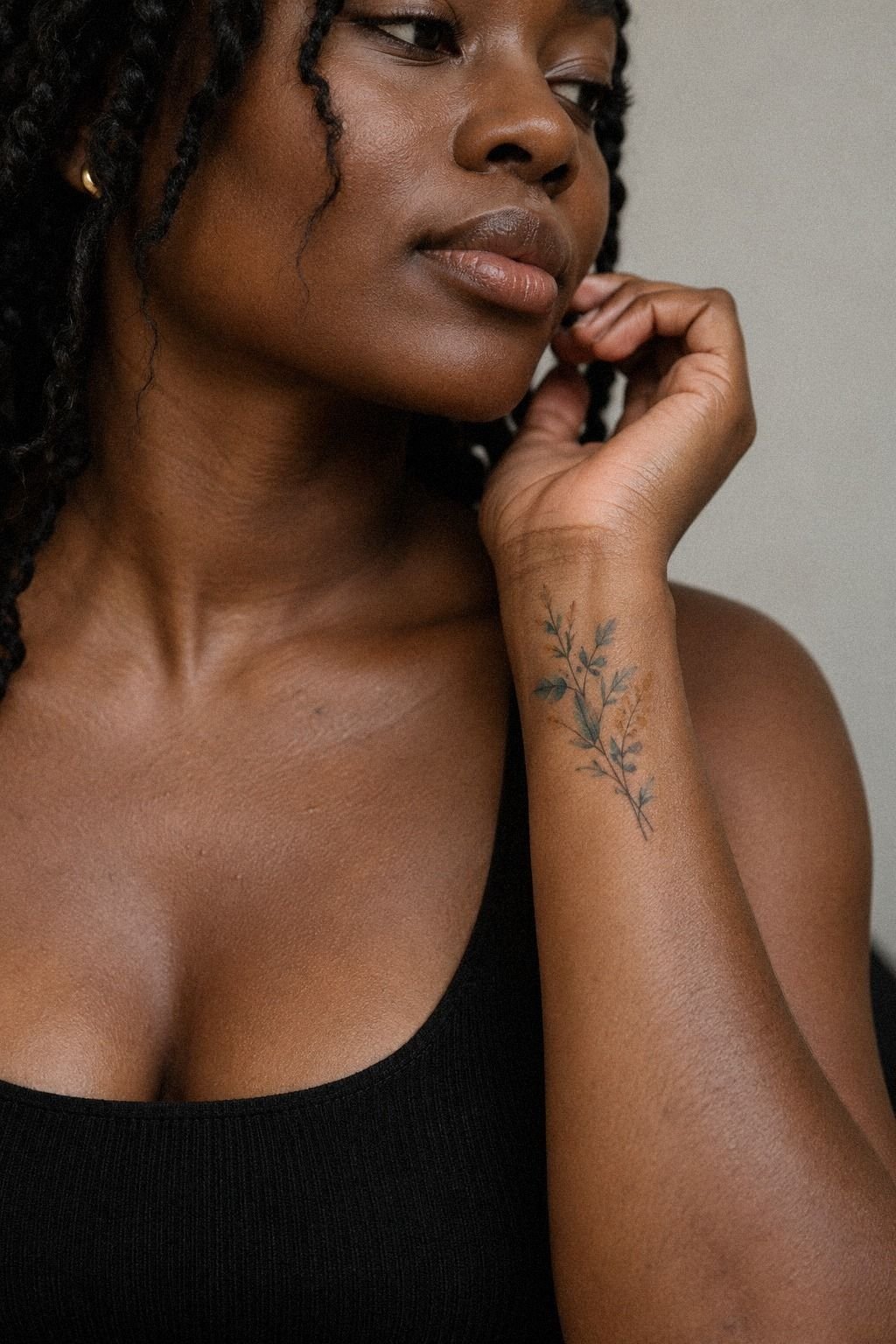
The inner wrist has a usable corridor, and your artist should be able to point to it before the stencil ever comes out.
Mine did it with a ballpoint, tapping the ulnar head, the knob on the pinky side, and then the two tendons that pop when you make a fist. The space between them is the calm zone.
It stretches evenly, holds pigment, and hurts less than the bone. With a forest-green and rust wash, that flat corridor keeps the color legible instead of letting tendon shadows chop through it.
We used about a two and a half inch window, sitting an inch above the crease.
Go outside that corridor and you’re into bone and thin skin, where lines can spread faster and every session minute costs you more nerve. Our wrist tattoo placement guide maps the same zones with anatomical drawings if you want to show something to your artist.
7Two peonies over one butterfly
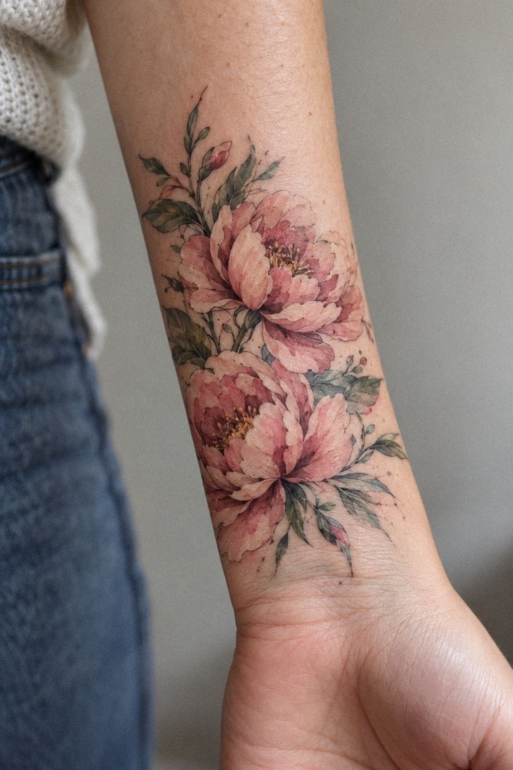
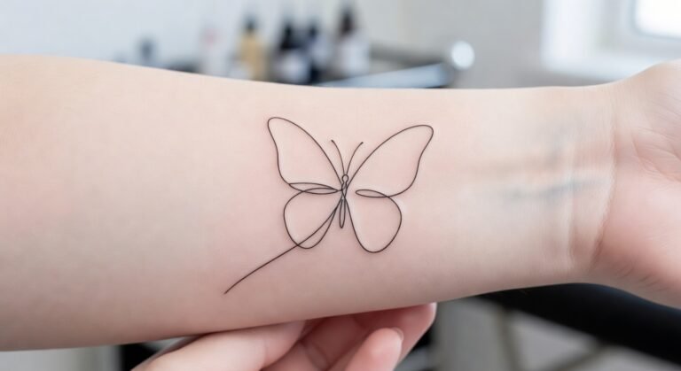
I walked in wanting a butterfly. I walked out with dusty-rose peonies, and I’m not sad about it.
The butterfly was the sentimental choice, and my artist gently pointed out that its whole readability depends on symmetry. Symmetry across a joint that flexes forty times an hour is a losing bet.
Two overlapping peony heads, though? They’re ornate where you want density and loose where you want the bleed, and nobody can tell if one sits a few degrees off axis.
That’s the trade I’d recommend to anyone planning a watercolour flower tattoo. Pick a subject that forgives, not one that demands.
She sketched both on the spot, side by side, a graceful pair of blooms next to the butterfly I’d been carrying in my camera roll for two years. The peonies won in about thirty seconds of looking. The butterfly stencil paper is still folded in my drawer, which tells you something about sentiment.
8Stencil day, and the small head rush I didn’t expect
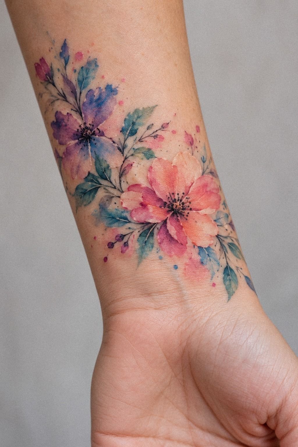
The stencil went on, and I got lightheaded. Not from pain, there wasn’t any yet, just from seeing it actually sitting on my arm in a warm camel transfer.
Stencil Stuff gel, a quick press, thirty seconds to set. Then she had me stand up, walk to the mirror, hold my arm at my side like a normal person instead of splayed on the chair. That’s the view everyone else gets.
From the chair, the piece looked too high. From the mirror, it looked right, so we kept it.
Eat beforehand. I hadn’t, and the wobble I felt was mostly a skipped breakfast talking.
My other rule: make them reposition it at least once even if you like the first placement. You’ll learn which version you prefer, and a good artist expects it. Mine moved it three millimeters toward my thumb and the whole thing snapped into balance.
9Float the first splash with no guideline
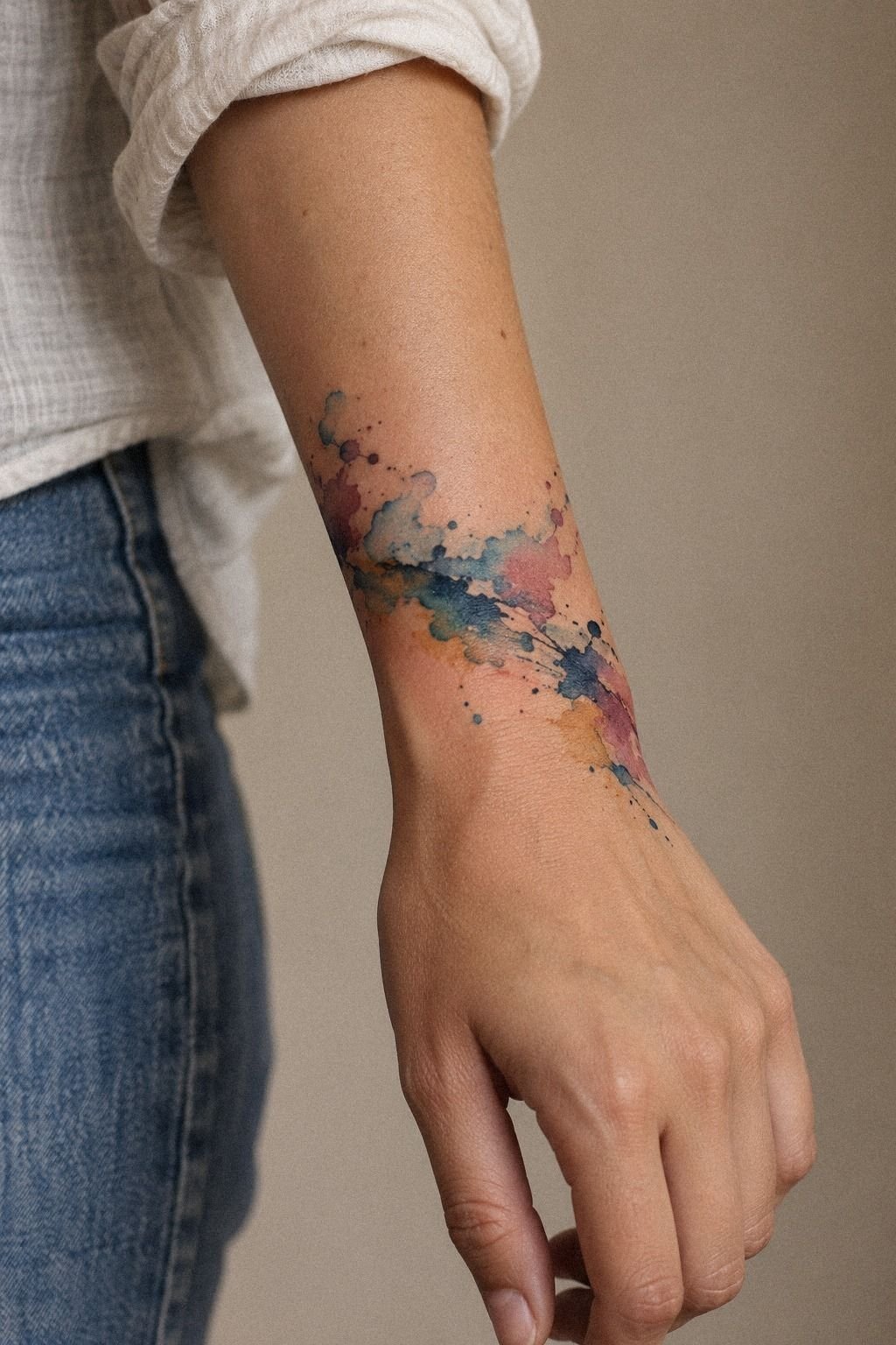
The first pass wasn’t a flower at all.
It was a midnight-blue wash with a small copper note and open ivory space, laid down without a hard guideline. The shape looked raw for about ten minutes, then the loose edge started to read as deliberate.
That was the moment I understood why watercolor work can feel so daring. The artist has to leave room for the pigment to breathe, but the placement still has to be expressive.
Too much control makes it stiff. Too little makes it muddy.
10Forty minutes in the chair, and the pain over the bone
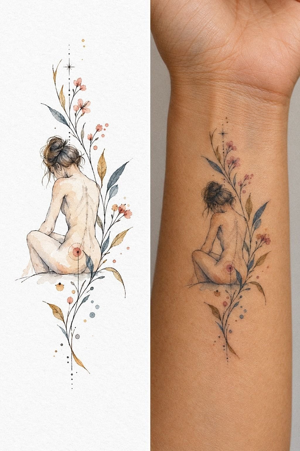
Total session: about two hours for a piece roughly two and a half inches tall. Forty of those minutes were genuinely uncomfortable.
The flat corridor felt like a hot cat scratch, maybe a four out of ten, boring enough that I was texting through it. Then she moved toward the ulnar bone for the lower petal edge and the sensation changed completely, sharp and vibrating, a solid seven. Bony zones run hotter than fleshy ones, which is why ribs, feet, hands and sternum have the reputation they do, and why forearm, thigh and shoulder are where most people start.
Forty minutes. That’s all the bad part lasted!
Bring an actual distraction, not just a phone you’ll be too sweaty to hold. And say something if you need a break, because a tense arm is a moving arm, and a moving arm is a wobbled line you’ll look at forever.
11Let the pink bleed on purpose
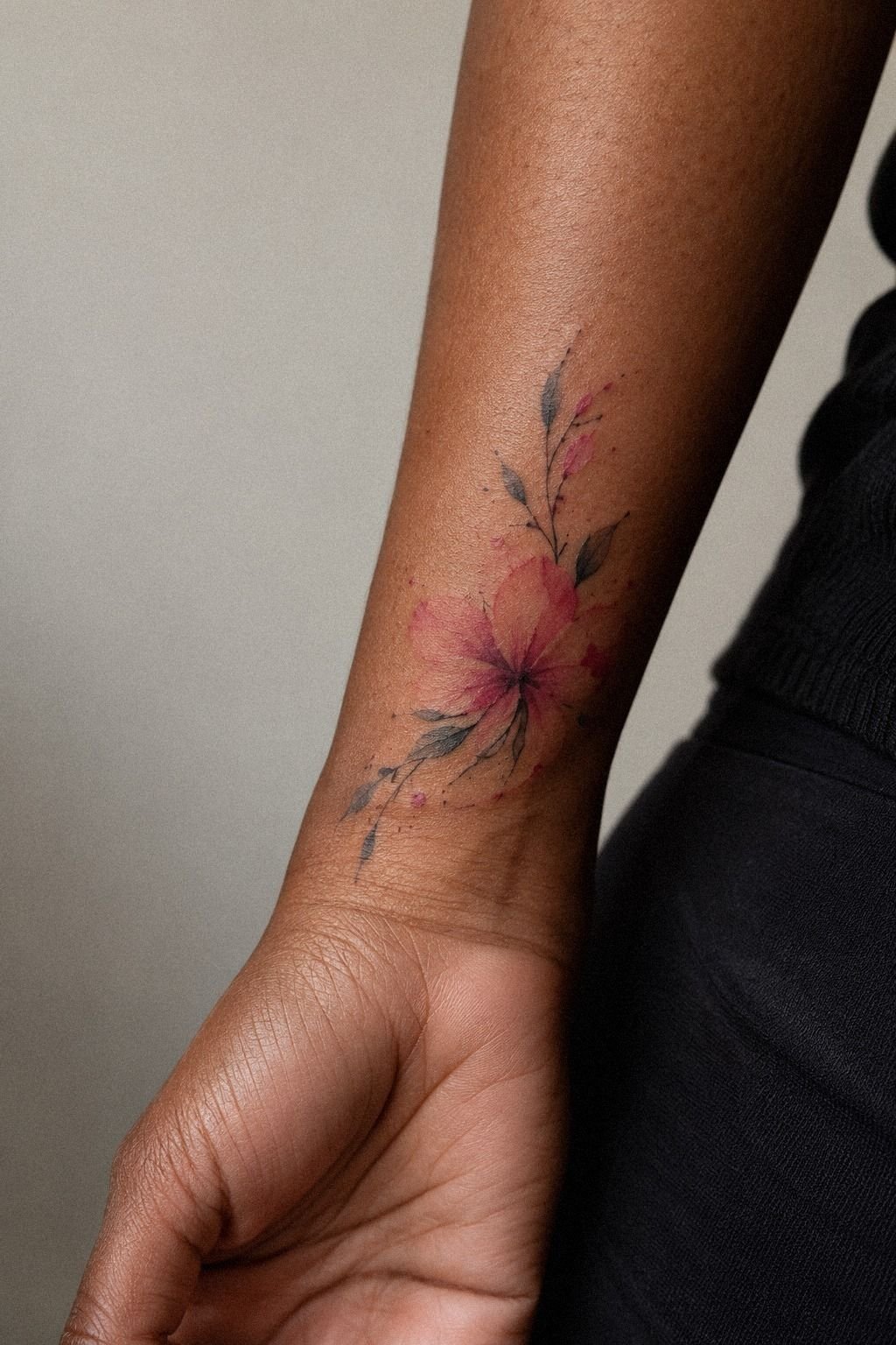
There’s a moment, maybe ninety minutes in, when the terracotta-red pigment crept past where I thought it should stop. My stomach dropped. Then I realized she’d done it deliberately.
Controlled bleed is the whole craft here. She pulled the pigment outward with a nearly dry needle grouping, letting it thin into nothing instead of stopping at a border. On deeper skin with a warm undertone, that faded tail reads as expressive rather than accidental, because the contrast is doing the work instead of a hard line.
A splash that stops abruptly always looks like a mistake. A splash that dissolves looks intentional.
But here’s the honest caveat I wish someone had given me: bleed that’s placed well is striking, and bleed that’s just under-saturated ink is a blur waiting to happen. The difference is density at the source. Look for that in portfolios, and the watercolor tattoo artists guide explains what to look for in healed work.
12Heal ten days under a long sleeve
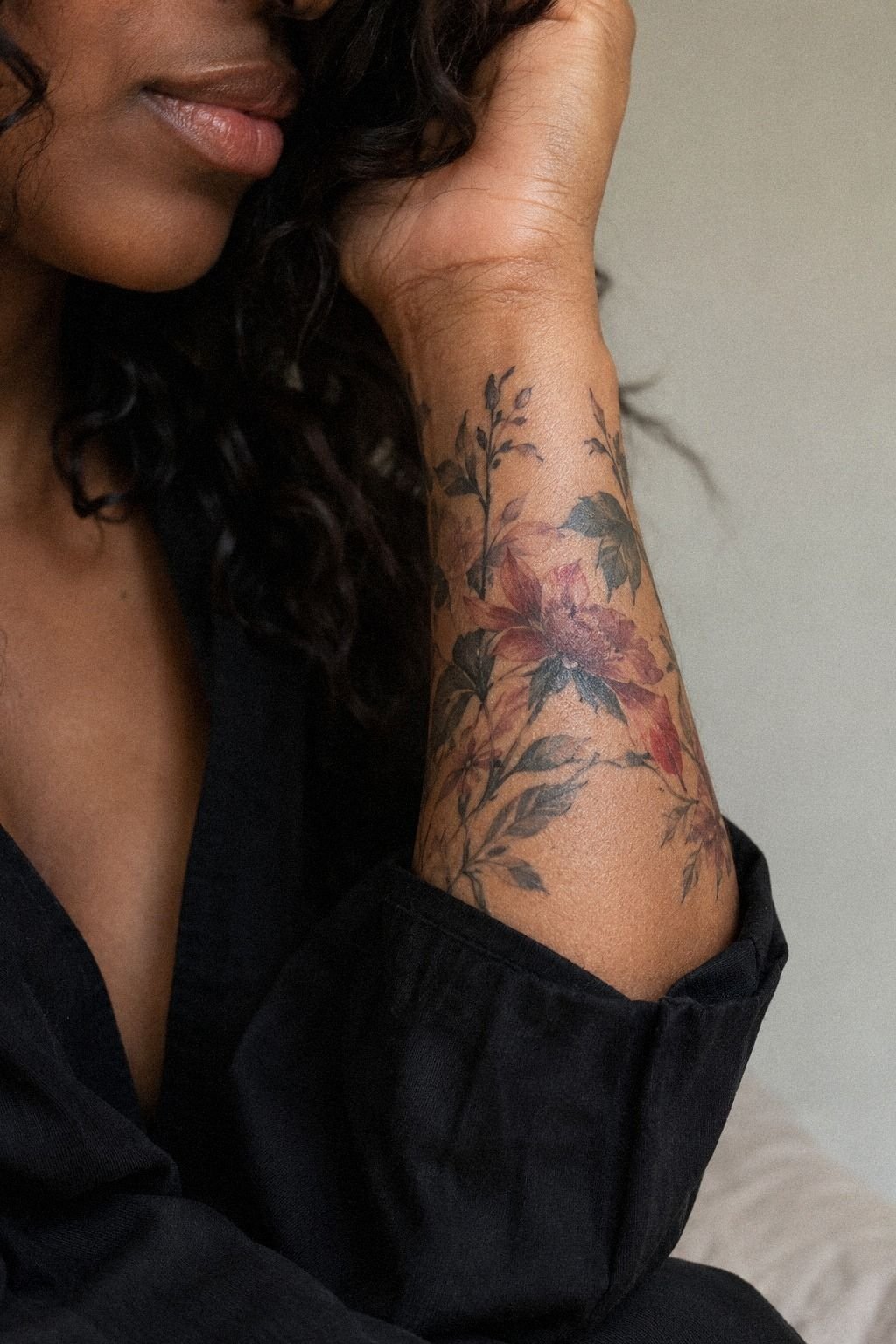
Ten days of October sleeves, and my coworkers never knew.
The clay-toned wash looked darker for the first few days, then softened as the surface settled. I washed gently, patted it dry, used the thinnest layer of aftercare, and left it alone.
No picking. No soaking.
No testing whether the skin is “ready” because the itch is driving you insane. By day ten, the flaking had stopped and the tattoo looked understated but clear.
13Why did one summer steal my blues?
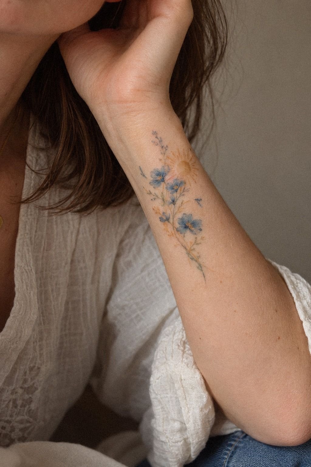
Because I got cocky in July, and UV doesn’t negotiate.
I wore short sleeves on a beach weekend, applied sunscreen once around ten, and swam for three hours. By September the plum wash in the upper splash had gone slightly softer than the rose-gold beside it.
The warm tones held. The cooler tone did not, and cool pigments almost never do.
Now it’s EltaMD UV Clear SPF 46 every morning on that patch, same as my face, and I reapply before anything outdoors. It takes four seconds.
Sun is the single biggest threat to a timeless tattoo, more than needle depth, more than aftercare, more than placement. If you’re planning a water colour tattoo for women’s typically exposed spots, wrists included, build the sunscreen habit during healing so it’s automatic by the time you’re allowed to skip it. Mine wasn’t automatic, and I paid a shade for it.
14Add two drops with the One Year Rule
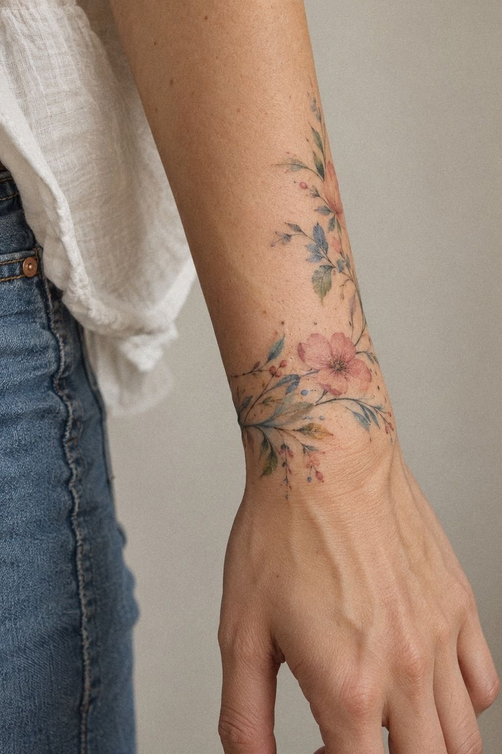
At the twelve month mark I went back and we added exactly two things: a small navy pigment drop below the lower peony, and one refresh pass over a softened white accent.
My rule now, and I’d give it to anyone: wait a full year before touching anything. Not six weeks, not four months.
A year, because what looks patchy at month two is often just settling, and ink you add too early stacks on skin that’s still reorganizing. My artist charged a shop minimum for the visit, which ran under an hour.
Two drops. That’s it, and the balance shifted completely.
The restraint is the point. I’ve watched people chase a piece into mud by adding something at every anniversary.
Add less than you want to, then live with it for another year. For more on how these designs mature, the watercolor tattoo overview covers aging by style.
How much it cost
Here’s every line, with the typical US ranges beside what I paid. Shop minimums generally run about $50 to $100, and hourly rates land somewhere between $100 and $250 depending on the artist and the city.
All in, across thirteen months: $505. The session itself, deposit included, was $300 and change. That’s less than I’ve spent on shoes I wore twice, and the first year of compliments alone paid for it.
What I’d do differently on the money: I’d have bought the sunscreen before the appointment, not after the fade.
What I’d Tell Anyone Booking Their First Wash of Color
I went back and forth on this style for years because the internet had me convinced watercolor was a beautiful mistake, the tattoo equivalent of a bad tattoo waiting to happen. That reputation isn’t entirely unearned.
It comes from a specific era, roughly 2014 to 2018, when the look exploded online and a lot of artists who had never mixed a wash in their life started offering it. Pale ink, low saturation, no structure, applied fast.
Those pieces did fade into bruises, and everyone saw the five-year updates.
What changed is the craft, not the style. The artists doing this well now come out of illustration backgrounds, they build density where the eye needs an anchor, and they show healed photos at twelve and twenty-four months instead of glossy fresh work taken ten minutes after wrap-off.
That’s the shift. The technique caught up with the ambition.
My three real mistakes, and I’ll own all of them. First, I shopped by aesthetic instead of by healed portfolio, which nearly landed me with an artist whose fresh work was gorgeous and whose year-old work was gray soup.
Second, I believed the outline argument for two full years and almost committed to a design I’d have resented. Third, and this one actually cost me something, I treated sunscreen as optional until the plum pigment went pale.
The advice I’d give you is simpler than all the guidance I collected. Choose a subject that forgives asymmetry.
Choose a corridor of skin that flexes evenly. Choose an artist whose healed photos are the ones they’re proudest of.
Then commit hard, because a hesitant client gets a hesitant tattoo, and hesitant is the only thing that genuinely ages badly.
Three years of overthinking, two hours in a chair. I’d give back the three years.
The Questions Worth Answering First
How much does a watercolor wrist tattoo usually cost?
Most land around $100 to $300 in the US for a small wrist piece. Shop minimums typically run $50 to $100, hourly rates $100 to $250.
Artist reputation moves the number more than size does, and region matters too. Budget a tip on top.
Are watercolor wrist tattoos a good idea for a first tattoo?
Yes, with one caveat. The inner wrist is reasonably tolerable, sessions are short, and the style is personal in a way that ages with you. Pick a design with a dark pigment anchor somewhere, not one built entirely from pale washes, and you’ll be glad at year five.
How do I choose a tattoo artist for a watercolor wrist tattoo?
Look for healed photos at twelve months and up, not fresh work. Healed portfolios tell the truth, glossy fresh images don’t. Check that watercolor is their stated specialty, not a side offering, and confirm single-use needles and proper studio hygiene.
Our watercolor tattoo artist guide lists the questions to ask.
How much do watercolor wrist tattoos hurt?
Moderate, with sharp spots. The flat inner corridor felt like a hot scratch, around four out of ten.
Over the ulnar bone it jumped to a seven. Bony zones hurt most: ribs, feet, hands, sternum.
Forearm, thigh and shoulder stay more tolerable.
How long does a watercolor wrist tattoo take to heal?
Surface healing takes about two to three weeks, full settling closer to two to three months. Gentle washing beats heavy moisturizing every time.
Wash twice daily with unscented soap, use a thin film of ointment, skip pools and direct sun entirely. More placement notes in our wrist tattoo placement guide.
What’s the best placement for a watercolor wrist tattoo?
Inner wrist, in the corridor between the tendons, about an inch above the crease. It flexes evenly and holds pigment well.
Outer wrist works too and hurts a bit more. Both placements beat wrapping over the bone, where lines spread fastest.
Browse more watercolor tattoo ideas by placement.
The One Thing I’d Do First
If I had to pick one, I’d find the healed portfolio before the design. A year-old photo tells you whether that artist builds density or just floats color, and no sketch you fall in love with survives a light hand. Mine still looks painted on.