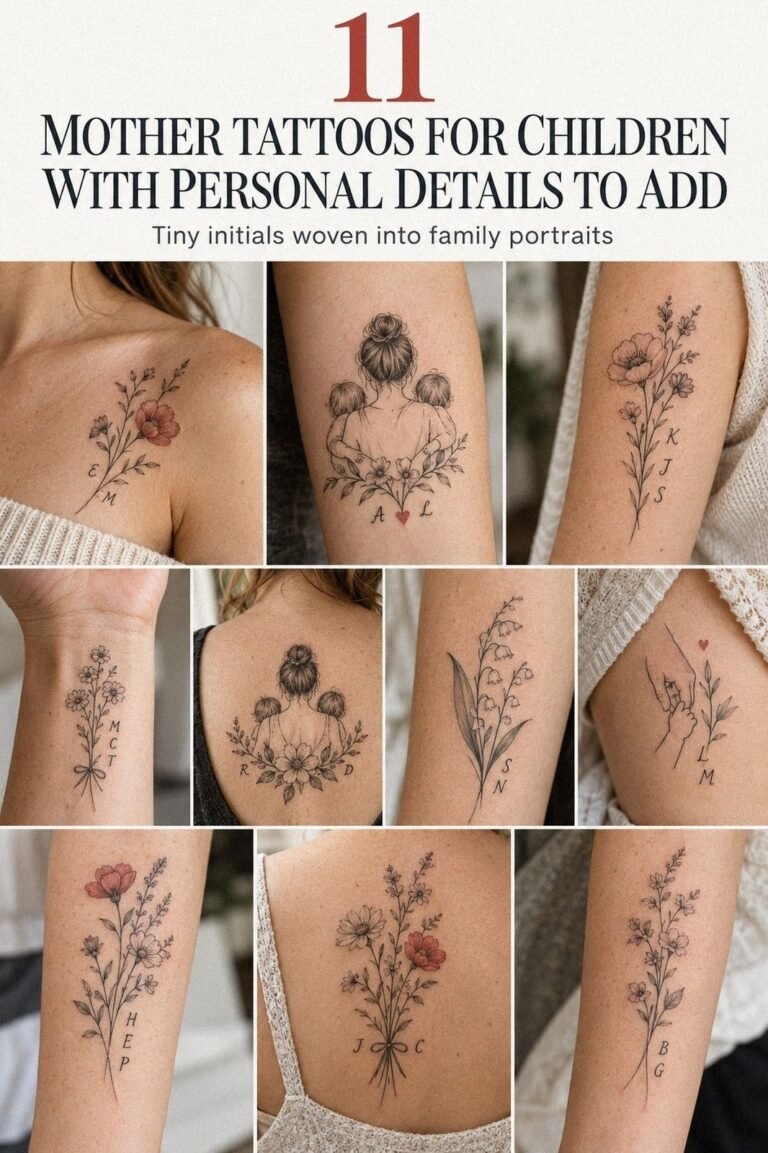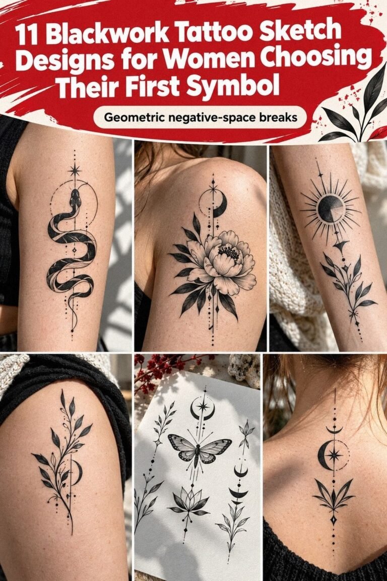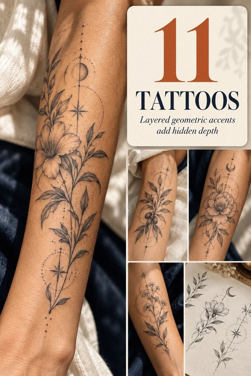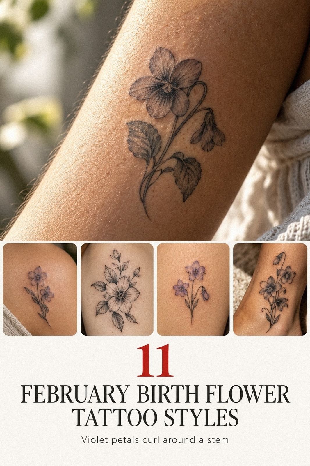
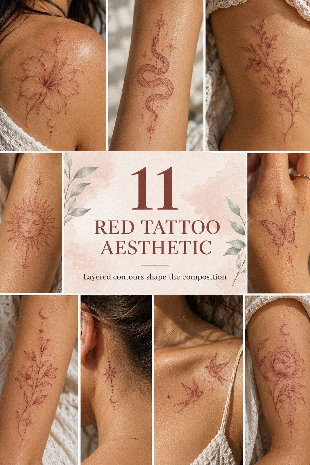
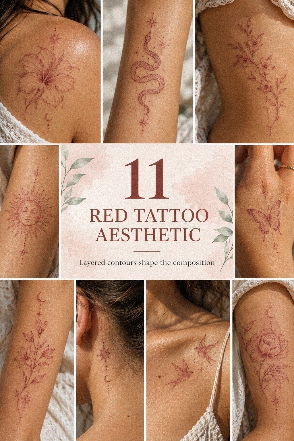
I chose an aesthetic red tattoo as my first ink because I wanted something personal, crisp, and quietly daring. I almost backed out after comparing healed photos, but a delicate red design on skin looked more expressive than black in the exact placement I wanted. I was nervous. Then it felt right!
Here’s what it looked like before
Before the appointment, I had a clear patch of skin and too many saved references. I hadn’t chosen a final shape, size, or placement, and every option looked different on my own body.
My first tattoo couldn’t feel random. I wanted a meaningful design that I’d still recognize as mine years later.
I kept checking the area in different light because fair, olive, and deep skin tones can make red ink read differently. Your undertone matters, and your artist should discuss it before drawing anything. I also reviewed tattoo red flags so I knew which studio practices deserved a hard no.
- Chose My All Red Tattoo Palette
- Saved Little Red Tattoo References
- Sketched A Minimalist Red Tattoo
- Matched Linework With My Skin Tone
- Selected A Meaningful Body Placement
- Compared Fine Lines And Bold Strokes
- Tested A Cute Red Tattoo Motif
- Prepared For The Tattoo Session
- Managed Pain During Red Ink Application
- Followed My Red Tattoo Healing Routine
- Styled My Finished Red Tattoo Aesthetic
1Chose My All Red Tattoo Palette
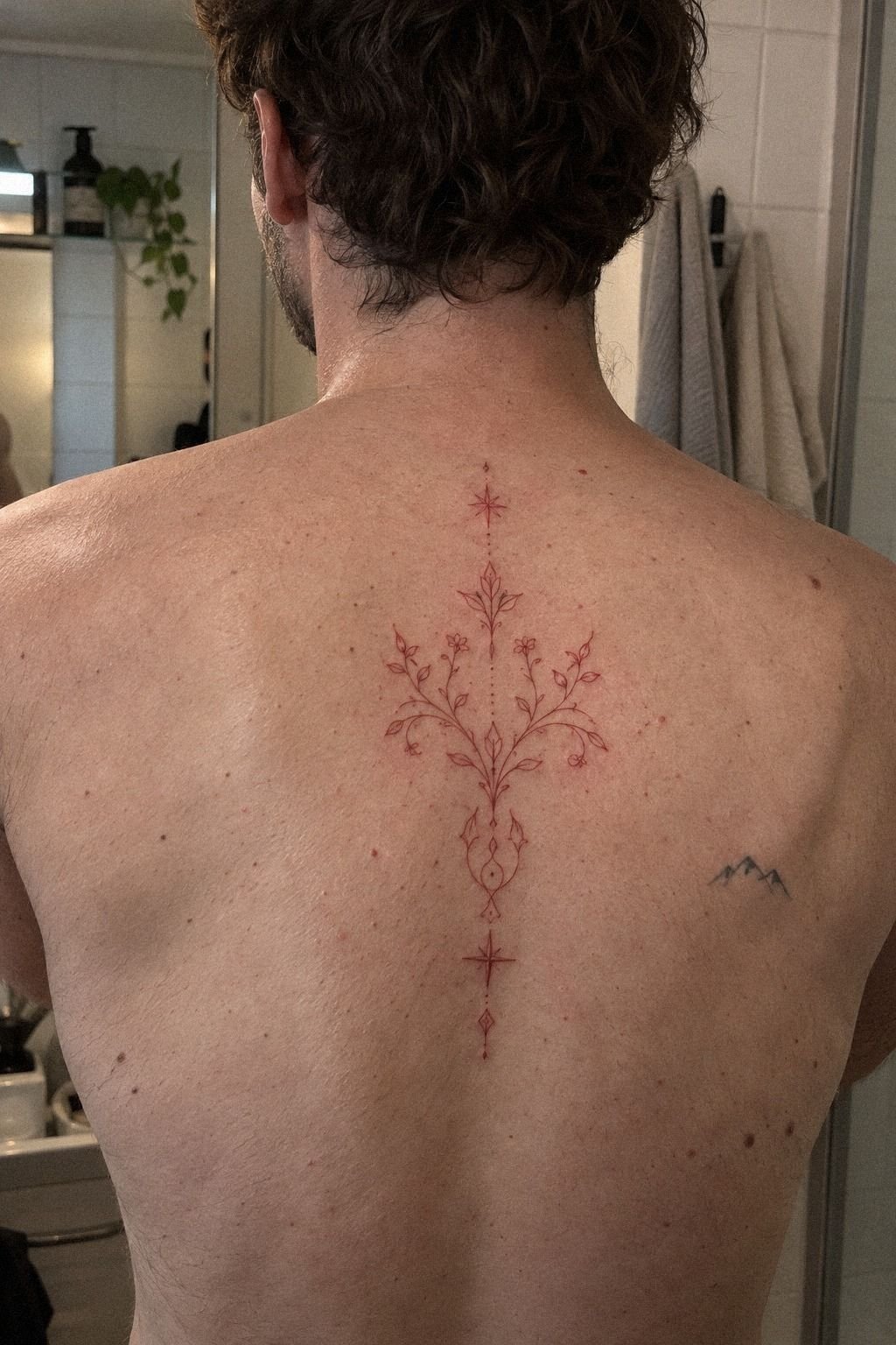
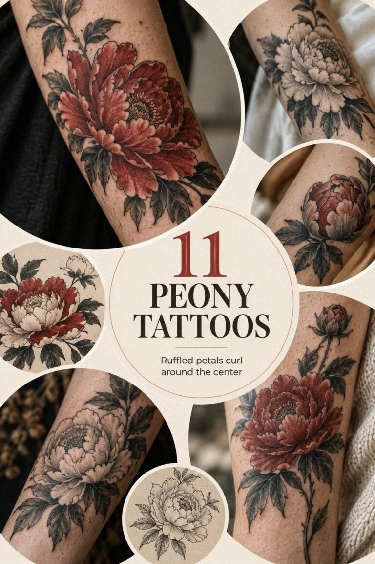
I started with an all red tattoo palette instead of mixing black, gray, and red from the beginning. The idea felt bold, but it wasn’t loud. I wanted one ink family to carry the shape, so the final design could stay delicate while still looking intentional from across the room.
My artist showed me several red samples and explained how saturation, skin tone, and healed color can differ. A deep crimson might look vibrant on paper but softer after healing. Your best reference should show healed work, not only fresh photographs, because fresh ink can look sharper and darker than the settled result.
I saved references with clean curves, tiny open spaces, and no crowded shading. Those details made the design feel sleek instead of busy. I also read about red ink tattoo allergy before committing, since red pigments can deserve extra attention during your consultation.
My first draft had too many elements. I removed the little stars, reduced the ornamental border, and kept one central mark.
That edit made the tattoo more understated and more meaningful to me. If you’re choosing your own red palette, start with the part you can’t stop looking at, then let everything else earn its place.
2Saved Little Red Tattoo References
My saved folder began with Little Red Tattoos that looked almost weightless. I liked dainty symbols, narrow curves, and tiny details that revealed themselves slowly. The inner forearm reference in my folder had a simple red motif with enough open skin around it to keep the design readable.
I didn’t copy one image directly. Instead, I compared the line quality, spacing, and proportions across several artists. Your reference folder should show a direction, not a demand.
One image had a graceful arc, another had a sharper point, and a third used a tiny heart that made the whole idea feel more personal.
I kept a note beside each saved image: “shape,” “placement,” “line weight,” or “mood.” That stopped me from confusing a charming photograph with a design that would suit me. I also considered a red heart tattoo as a symbol, but I didn’t want the finished piece to feel too literal.
The reference that stayed with me was the least complicated one. It had a quiet, romantic quality without looking childish.
If you’re saving ideas, delete anything you wouldn’t wear on your own skin. Your artist can combine influences, but you should still know which visual decision matters most to you.
3Sketched A Minimalist Red Tattoo
I sketched a Minimalist Red Tattoo on tracing paper before I booked the appointment. The first version was too thin in three places and too crowded near the center. My artist adjusted the spacing so the design could breathe, and that made the final idea feel crisp instead of fragile.
The sternum placement gave the sketch a strong vertical rhythm. I wanted only a few deliberate strokes, not a dense illustration. Your design needs enough separation for each line to remain visible as the tattoo settles, especially when the motif is small.
A tiny gap can be more useful than another decorative mark.
I tested the drawing at roughly 2 inches and then slightly larger. The smaller version looked minimal, but it lost one curve when viewed from a normal distance. That was my first real lesson: the smallest tattoo isn’t automatically the most refined tattoo.
Your artist should protect the recognizable parts, even if that means increasing the size.
I nearly chose the tiniest draft because it looked cute on paper. But paper doesn’t fold, stretch, move, or age like skin.
The larger version felt more timeless, and I knew I wouldn’t keep squinting at it to understand what it was. If you’re torn between two sizes, ask which version still reads clearly without a phone camera zoom.
4Matched Linework With My Skin Tone
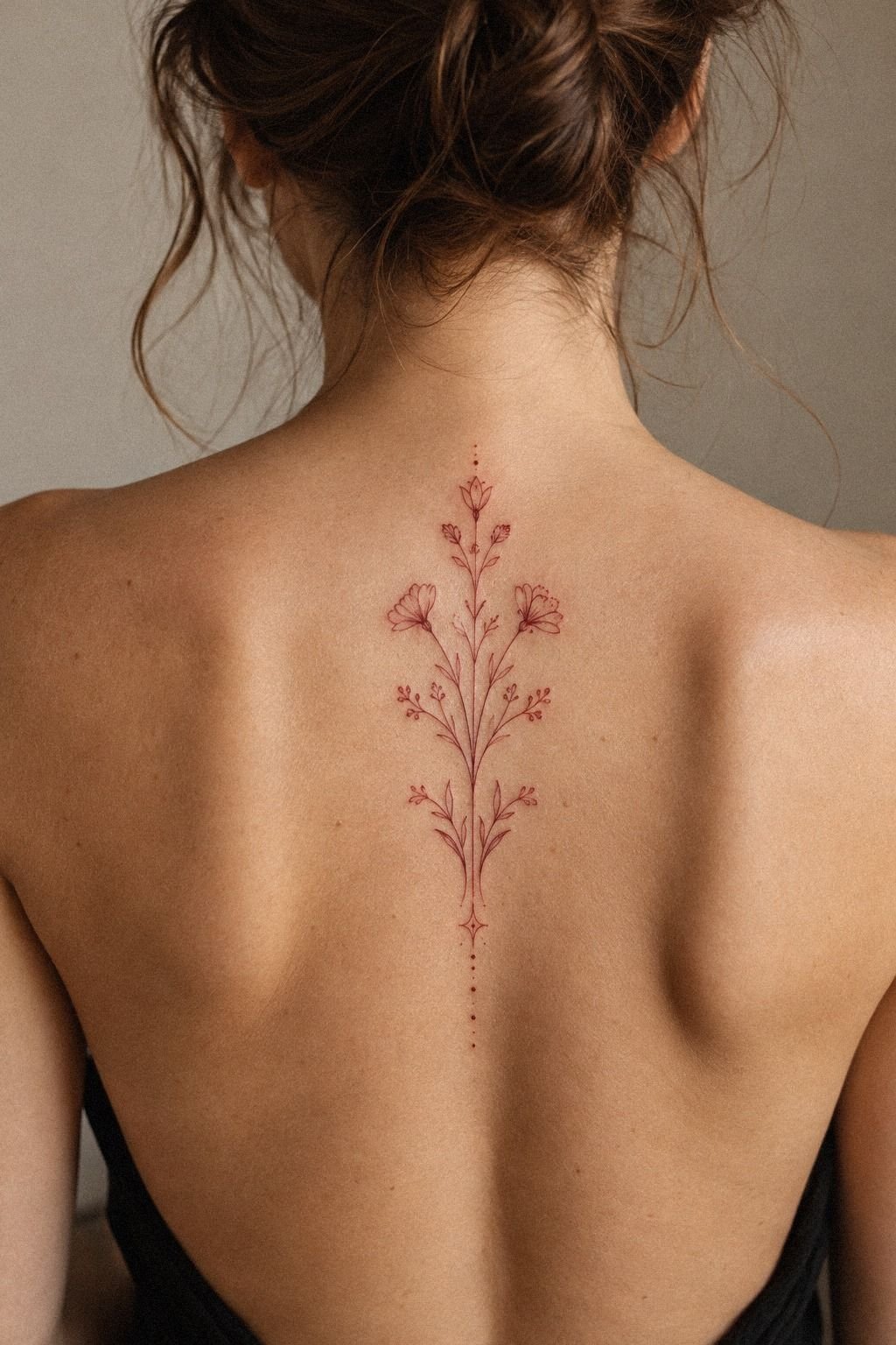
I wanted linework that would look deliberate against my skin, not like a faint red pencil mark. My collarbone reference used hair-thin strokes, but my artist explained that the exact weight had to suit my golden tan tone. The goal was elegant clarity, not maximum delicacy.
We looked at healed examples from people with similar undertones. That mattered more than comparing my skin with a studio model under bright lighting. Your artist should show you work in natural photographs when possible, because lighting can make red ink look ethereal one minute and much heavier the next.
I asked about needle groupings, saturation, and how the line might soften. The conversation was technical, but it helped me trust the process. I also read about whether red tattoo ink fades faster so I could protect the design instead of assuming every red pigment behaves identically.
My artist recommended a slightly stronger line in the focal curve and a lighter touch around the smaller details. That balance kept the result polished.
If you’re matching linework to your skin tone, don’t chase the thinnest possible line. Chase the cleanest line that your skin and placement can support.
5Selected A Meaningful Body Placement
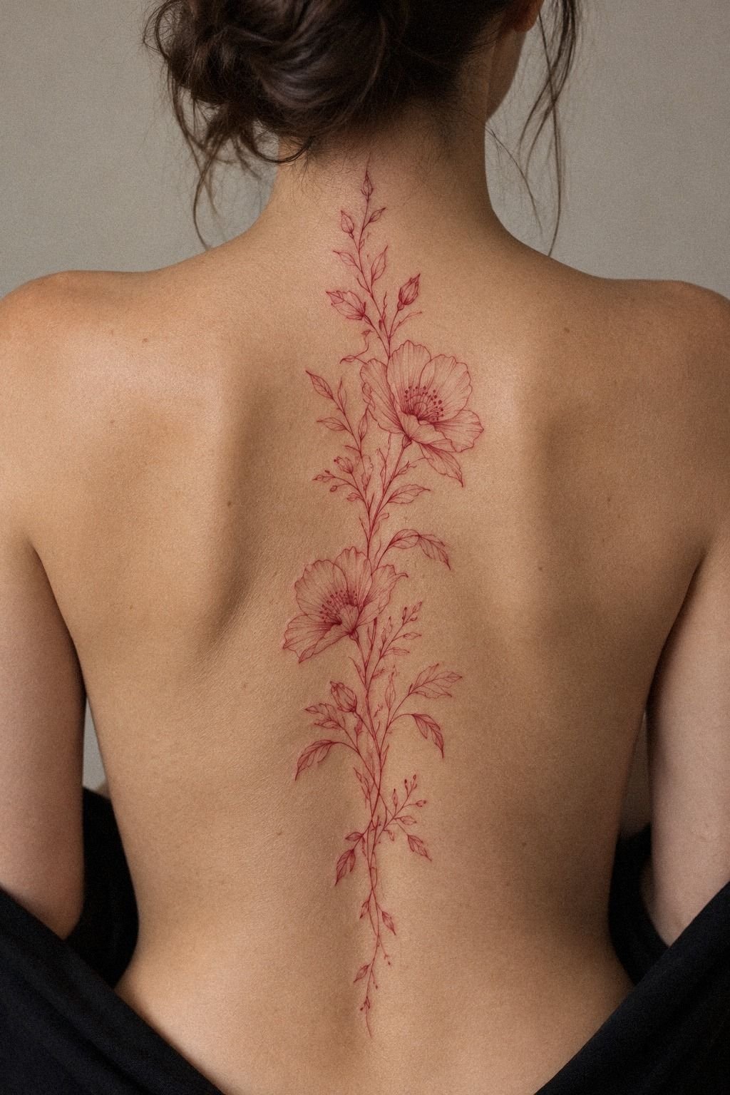
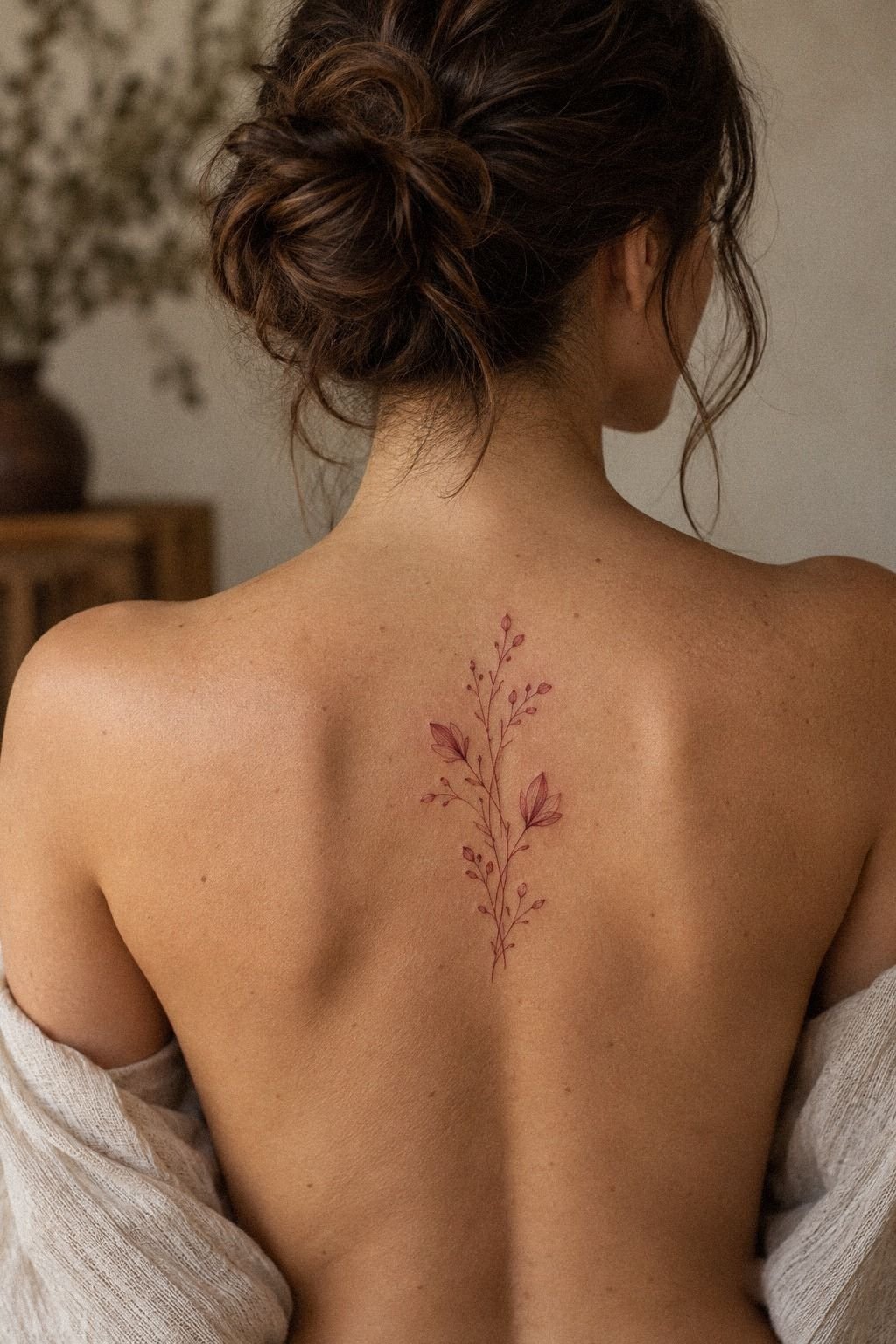
I selected a meaningful body placement by comparing a flash sheet rather than choosing from a random list of popular spots. The sheet had small red symbols, curved motifs, and fine-line designs on aged paper. I marked the ones that felt right near the upper back, sternum, collarbone, and forearm.
My first choice was the upper back because it felt private but not hidden forever. Your placement changes how often you see the tattoo, how it moves with your body, and how much sun it receives. A meaningful spot can be sacred without needing a dramatic story attached to it.
I wrote down the practical differences:
– Upper back: private visibility, broad skin, less daily rubbing. – Forearm: easy viewing, frequent sun exposure, strong visual presence. – Sternum: intimate placement, more sensitivity, clear vertical framing. – Collarbone: graceful visibility, bone proximity, careful sizing.
The flash sheet helped me reject a placement that looked good only in a photograph. I wanted an area where the design could remain expressive without fighting clothing or constant friction. If you’re deciding between spots, think about your real week, not only the moment you reveal the tattoo.
I also considered a red shoulder tattoo after reviewing red shoulder tattoo references. It was a strong option, but I preferred the upper back because I wouldn’t see it every hour. That little distance made the choice feel more intentional.
6Compared Fine Lines And Bold Strokes
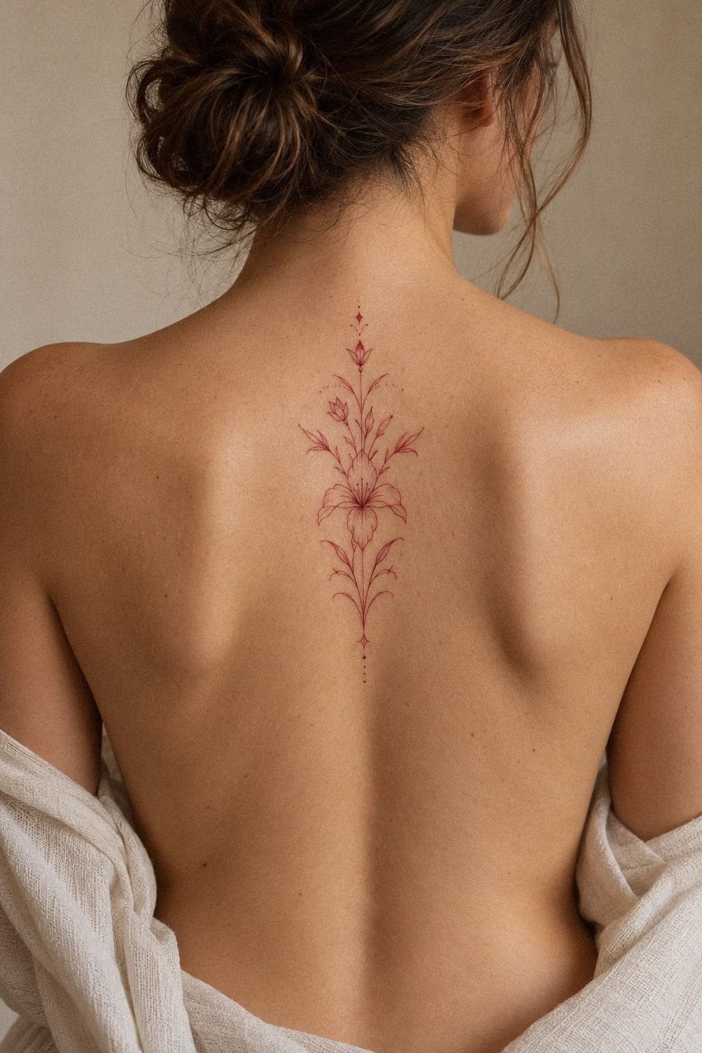
I compared fine lines and bold strokes on a calf reference with deep ebony skin. The fine-line version looked striking, but the bolder version held its shape more clearly from a distance.
I didn’t want to treat either option as automatically better. I wanted the line weight to serve the design.
My artist explained that very fine lines can soften or widen over time, depending on placement, skin, sun exposure, and how the tattoo heals. Your design should have enough structure to remain readable. A powerful outline can protect a small motif, while too much weight can erase the delicate character you wanted.
I tested three versions on paper: hair-thin, medium, and confident. The medium line won because it preserved the graceful details without making the symbol look weak. I also reviewed red string tattoo meaning because symbolic designs need room for their central idea to remain clear.
The boldest draft looked fierce, but it wasn’t right for my first tattoo. I preferred a controlled line with one stronger accent.
If you’re choosing between fine and bold work, ask which part should survive visual distance and which part can remain subtle. That answer will give your artist a useful hierarchy.
7Tested A Cute Red Tattoo Motif
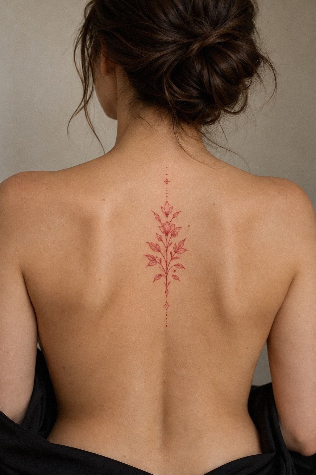
I tested a Cute Red Tattoo motif on paper before letting it near my thigh. The design had a tiny curved symbol, one playful detail, and enough negative skin to keep it from becoming a red blob. It felt whimsical, but the shape still had a clear visual reason.
I placed the paper stencil at several angles and walked around with it for an afternoon. Your tattoo should make sense when your leg bends, when you sit, and when you see it without posing. The version that looked most playful in a flat photo wasn’t the version that looked best in motion.
I removed a small face from the original drawing because it made the motif too literal. The remaining shape felt more personal and less trend-dependent. A cute red tattoo can be charming without becoming childish, especially when the outline stays clean and the color remains controlled.
I also checked similar red heart tattoo designs for proportion, then changed the symbol enough to make it mine. That was important to me. If you’re choosing a cute motif, keep one unexpected detail and remove anything that exists only because it appears in every saved reference.
8Prepared For The Tattoo Session
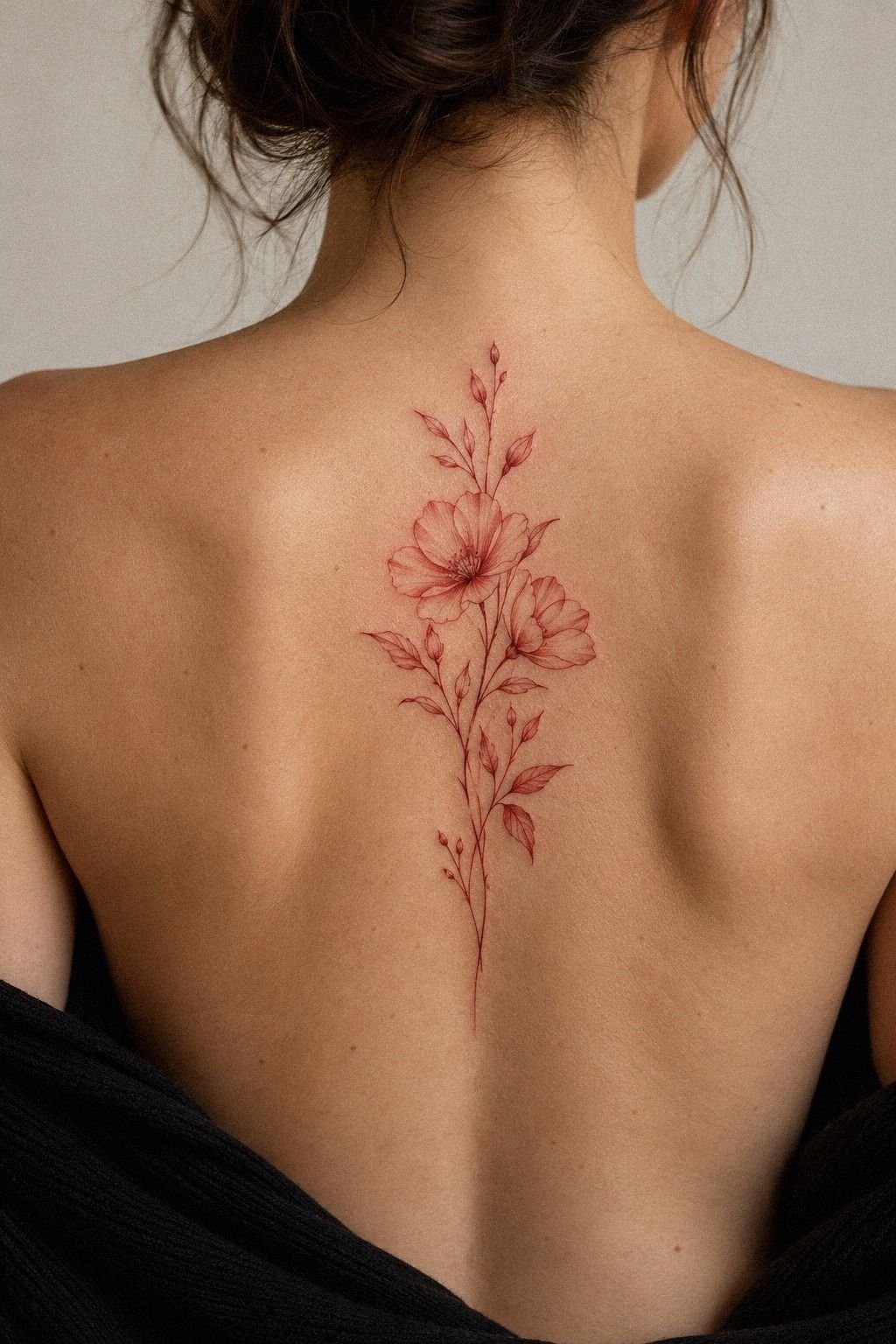
I prepared for the session by simplifying my day instead of treating the appointment like a dare.
9Managed Pain During Red Ink Application
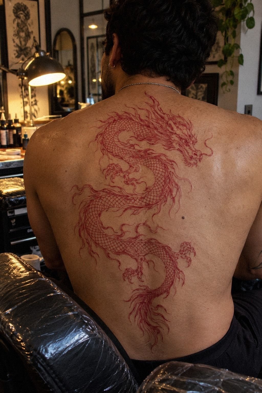
I managed pain during red ink application by staying still, breathing slowly, and accepting that some areas would feel sharper than others. The upper back was uncomfortable but manageable.
It wasn’t nothing, but it also wasn’t the dramatic ordeal I had imagined. The sensation was raw, brief, and easier once I stopped bracing.
Your pain level depends heavily on placement, time, skin sensitivity, and personal tolerance. Ribs, feet, hands, and the sternum can feel more intense because they’re close to bone or have less cushioning. Forearms, thighs, shoulders, and parts of the upper back are often more tolerable for many people.
I noticed the first pass felt sharp, while the slower detailing felt more like a hot scrape. We paused when I needed to reset my shoulders. If you’re nervous, tell your artist before the session begins.
You don’t win anything by hiding discomfort until your body is tense.
The whole experience felt more manageable than the anticipation. And yes, I was relieved when the last line was finished! Your first tattoo doesn’t need to prove your toughness.
It needs a process you can handle, with an artist who listens and keeps the session controlled.
10Followed My Red Tattoo Healing Routine
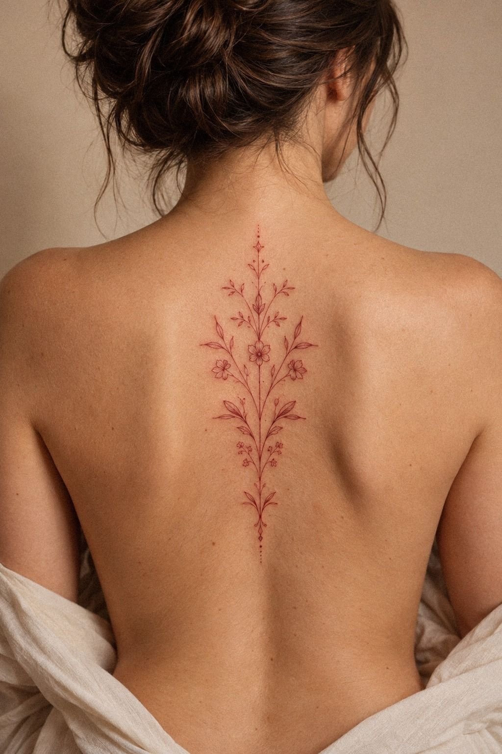
I followed my red tattoo healing routine carefully because fresh work needs time, not constant inspection.
11Styled My Finished Red Tattoo Aesthetic
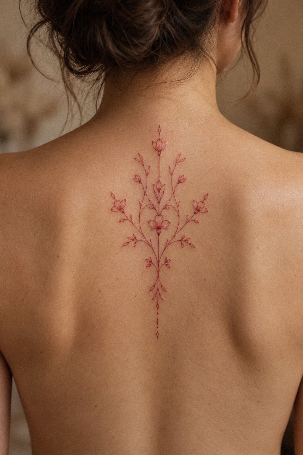
Once the tattoo settled, I styled my finished Red Tattoo Aesthetic around how I wanted to feel when I saw it. The wrist reference with deep brown skin showed a hair-thin red design that was visible but never aggressive. It looked understated, and that restraint became my favorite part.
I didn’t need matching symbols or a large collection around it. The finished piece stood on its own because the linework had room to breathe. Your tattoo can feel iconic without being oversized, especially when the placement gives the shape a clear boundary.
I took photos in natural light at one week, three weeks, and after the surface had fully calmed. The color shifted from bright fresh red to a steadier crimson. That change was expected, and it helped me judge the design more honestly than the appointment-day photograph.
If you’re building a red tattoo aesthetic, I’d keep the visual language consistent rather than copying every trend. A little ornate detail can work beside a minimal symbol, but only when the line weight and spacing agree. My finished piece feels like me because I edited it hard before anyone touched my skin.
How Much It Cost: The Honest US Budget
My tattoo budget depended on the artist, region, placement, size, and session time. Typical US shops may have a minimum around $50 to $100, while hourly rates often fall near $100 to $250. A small red design can fit a minimum, but a larger or more intricate piece may take longer.
I asked for the minimum, hourly rate, deposit policy, and touch-up policy before booking. Your estimate should be clear enough that you won’t feel trapped by a surprise. I also asked whether red pigment required any special consultation, since the final price isn’t the only part worth planning.
My own choice stayed meaningful because I spent more time editing the design than adding details. If you’re working with a fixed budget, protect the artist’s skill and the placement first. Cut ornament before you cut the line quality that makes the tattoo readable.
What I Learned Before Choosing Red Ink
I thought my first tattoo decision was mostly about color. It wasn’t.
The red mattered, but the real decision was whether the design could carry its meaning with restraint. I wanted something expressive, and I learned that expression often comes from one deliberate curve, not ten extra details.
I also learned that a fresh tattoo can flatter your certainty. The color is bright, the skin is tender, and everyone wants to photograph it.
The healed version asks better questions. Does the shape still read?
Does the placement still feel like yours? Would you choose it again without the adrenaline?
My mistake was assuming the thinnest line would look the most refined. It looked delicate on paper, but one section needed more strength to remain visible. That adjustment made the tattoo more timeless, and it taught me to listen when an experienced artist explains how skin behaves.
Now I think a first tattoo should be personal before it is fashionable. You don’t need a complicated origin story, and you don’t need to explain it to everyone.
Your design should fit your body, your tolerance, and your future self. That balance is what made red ink feel right for me.
A Few Things Worth Answering
How much does a Red Tattoo Aesthetic usually cost?
A Red Tattoo Aesthetic usually costs about $100 to $300 in the US, depending on size, placement, artist, and region. Some shops charge a $50 to $100 minimum, while hourly rates may reach $250. A clear estimate matters more than choosing the cheapest appointment.
Are Red Tattoo Aesthetic a good idea for a first tattoo?
Yes, Red Tattoo Aesthetic can suit a first tattoo when the design, placement, and artist are chosen carefully. Forearms, thighs, shoulders, and upper backs may feel more tolerable than ribs or feet. Clean linework can also keep a personal symbol readable without making it oversized.
How do I choose a tattoo artist for Red Tattoo Aesthetic?
Choose an artist with healed fine-line and red-ink examples, strong hygiene practices, and a portfolio that matches your preferred weight. Ask to see work on skin tones similar to yours. Healed portfolio photos tell you more than fresh studio pictures.
How much do Red Tattoo Aesthetic hurt?
Pain varies by person and placement. Ribs, feet, hands, and sternum often feel more intense, while forearm, thigh, shoulder, and upper-back work may feel more tolerable. Placement choice can make the session easier, especially for a first tattoo.
How long does a Red Tattoo Aesthetic take to heal?
The surface usually heals in about 2 to 3 weeks, while complete healing may take roughly 2 to 3 months. Wash gently, moisturize as directed, and avoid sun and swimming during early healing. Consistent aftercare helps the color settle cleanly.
What’s the best placement for Red Tattoo Aesthetic?
The best placement depends on visibility, pain tolerance, clothing, and how much sun the design receives. I prefer the upper back for privacy and room, while the forearm offers easy viewing. A practical placement is one you’ll still enjoy living with every week.
Where I’d Start First
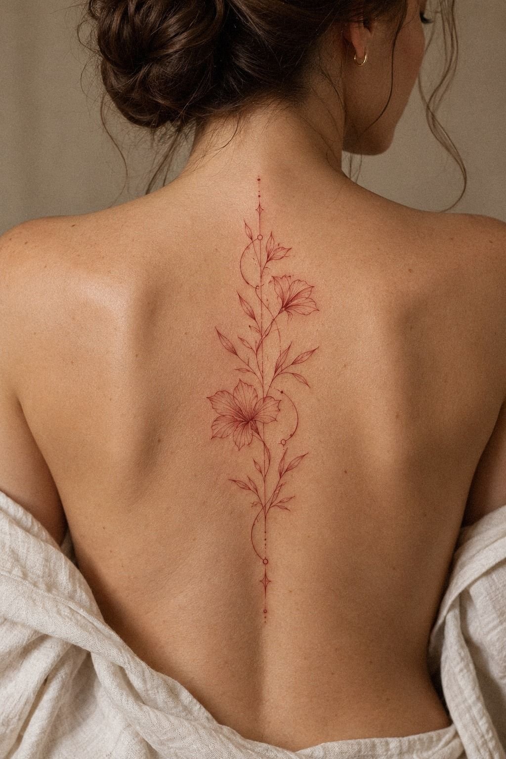
If I had to pick one, I’d start with the upper-back placement. It gives delicate red linework enough space, avoids constant viewing, and keeps daily friction lower than a wrist design. Pin the idea for later, then let yourself edit it until the shape feels personal.