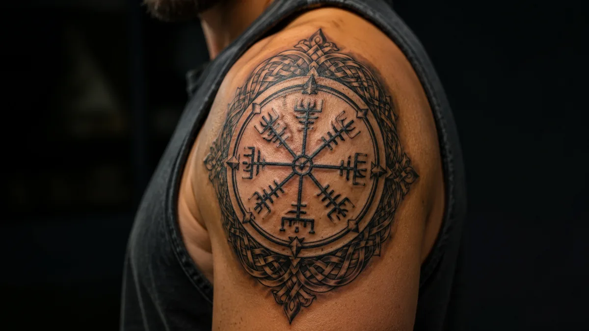
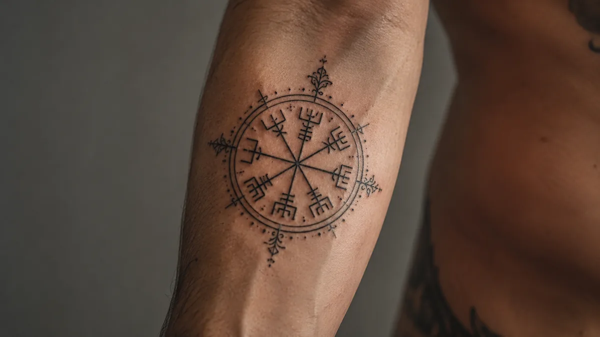
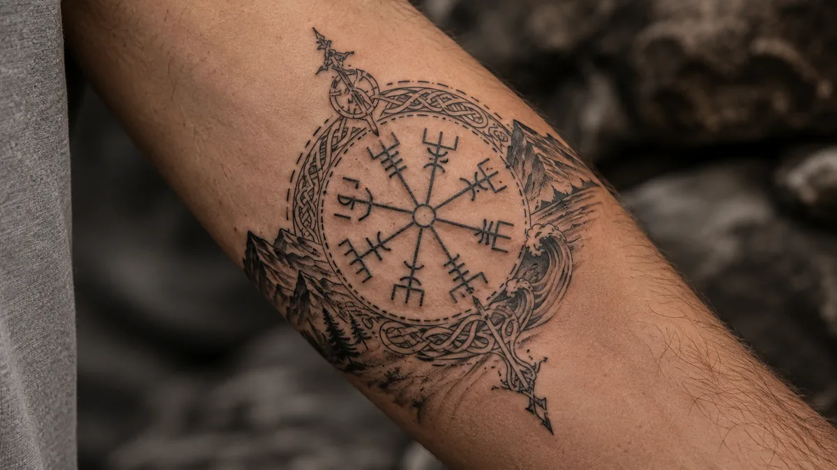
The viking compass tattoo, called the Vegvisir in Old Norse, is one of the most recognizable symbols in Norse-inspired ink. It looks like a compass rose with eight runic staves radiating from a center point. People get it for protection and guidance, the idea being that no matter how lost you get, you find your way home.
That meaning is simple, direct, and it hits hard. That’s why it keeps showing up on skin, from hardcore Norse mythology fans to people who just went through something rough and came out the other side. It’s not a trendy symbol. It carries real weight, and when it’s executed well, it reads from across the room.
What the Vegvisir Actually Means
Vegvisir translates roughly to “wayfinder” or “that which shows the way” in Icelandic. The symbol appears in the Huld Manuscript, an Icelandic grimoire from the 1800s. The inscription attached to it says the bearer will never lose their way in storms or bad weather, even when the road is unknown. That’s the core meaning. Protection. Guidance. Finding your path when everything around you is chaos.
People apply that literally and metaphorically. Some get it after a military deployment, a cancer diagnosis, a divorce, getting sober. The idea that you came through something disorienting and made it out. Others just connect to Norse heritage or the broader symbolism of navigation. Both are valid. The symbol holds whatever weight you bring to it.
The Real Historical and Cultural Background
A symbol that guided Vikings through chaos deserves linework that holds up the same way.
Let’s be straight about the history. The Vegvisir is not a Viking Age artifact. It shows up in 17th and 19th century Icelandic grimoire manuscripts, specifically the Galdrabók and the Huld Manuscript. Those texts draw on older Norse and runic traditions, but the symbol itself as drawn isn’t documented from the actual Viking era. That doesn’t make it fake. It makes it part of a living magical tradition that evolved from those roots.
The eight staves connect visually and conceptually to the eight directions and to the Elder Futhark runes. Some scholars link the design to the Norse concept of the world tree Yggdrasil and its branches extending in all directions. The symbol got mainstream exposure largely through Björk, who has it tattooed on her arm. That helped put it on the global radar but it had been used in Icelandic folk magic long before pop culture picked it up.
Vegvisir vs. Helm of Awe: Know the Difference
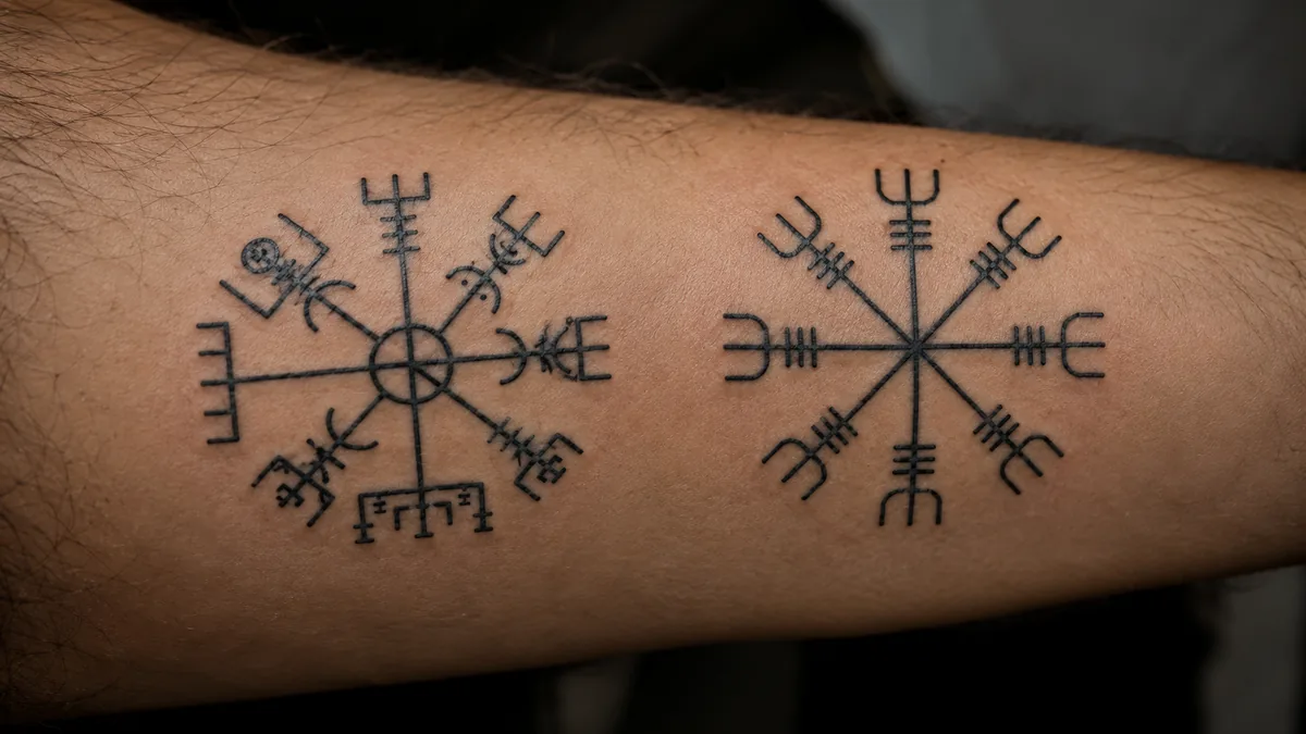
These two symbols get confused constantly in tattoo consultations. The Helm of Awe, or Aegishjálmr, also has eight arms radiating from a center, but its staves are more angular and forked at the tips. The meaning is completely different. The Helm of Awe is about protection through terror and invincibility in battle. Warriors reportedly drew it between the eyes before fighting. It’s aggressive, dominating energy.
The Vegvisir is softer in purpose. It’s about finding your way, not crushing your enemies. If you sit down in a consult and ask for a “viking compass,” your artist needs to know which one you mean. Look at reference images side by side before you commit. They are related symbols from the same tradition, but they are not interchangeable and mixing them up on your skin is a permanent mistake.
Design Variations and Style Options
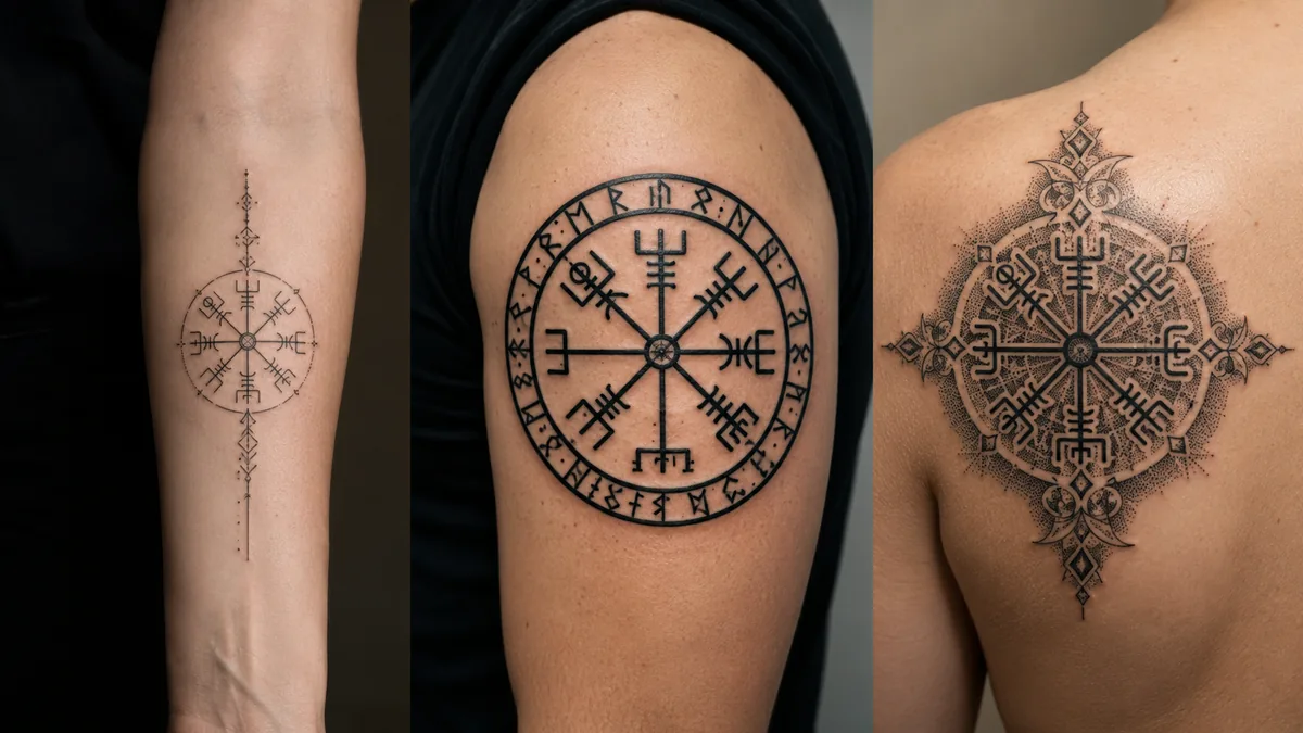
Traditional black and grey is the most common execution and it ages the best. Clean solid lines on the staves with a bold center point hold up over years. Fine line versions look incredible fresh but those thin strokes can spread and blur, especially on high-movement areas like the inner arm or ankle. If you go fine line, go with an artist who has a documented healed portfolio showing their fine work years later, not just fresh shots.
Geometric and dotwork styles work well with this symbol because the design is already structured and angular. Some people add runic inscriptions around the outside, compass cardinal points, knotwork borders, or integrate it into a larger Norse sleeve. Blackwork and neo-tribal give it serious visual weight. Watercolor washes behind it can look clean but they tend to fade unevenly. If you want longevity, keep the color saturated or skip it and go all black.
Best Placements and How It Ages
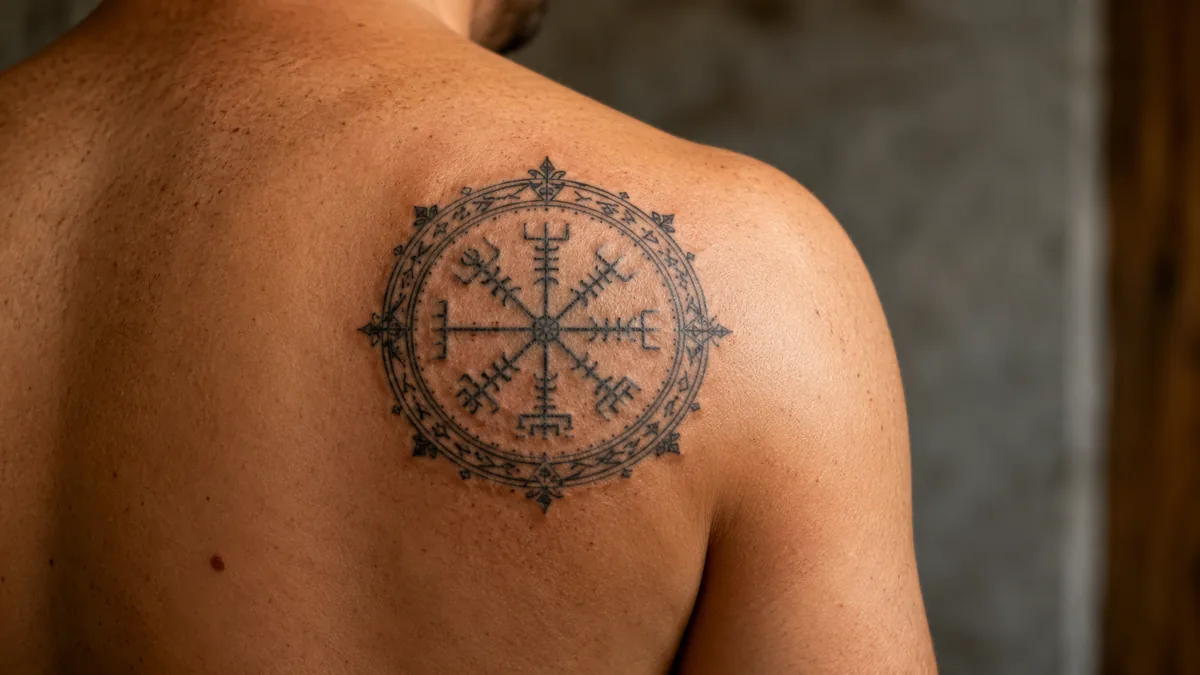
The chest, upper back, and upper arm are the strongest placements for this design. The symbol is radial and symmetrical, so it needs a flat or gently curved surface to read cleanly. The chest over the sternum is a classic spot and it makes sense symbolically, right over your heart, pointing you forward. Upper back between the shoulder blades is another strong choice. Both zones age well and don’t see the UV punishment that hands, neck, and forearms do.
The forearm is popular but it’s a higher-wear zone. Friction from sleeves, sun exposure, and the natural tapering of the skin near the wrist means touch-ups are more likely over time. Inner wrist placements are spicy and the skin there is thin, which can cause blowout on the finer staves if the needle goes too hot. The ribcage is a very spicy spot and it distorts with weight changes. Bold will hold anywhere, but keep your lines thick enough to survive the years.
Color Versus Black and Grey
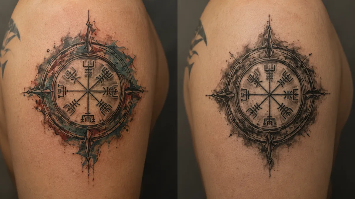
Most Vegvisir tattoos are done black and grey, and there’s a reason for that. The design is rooted in runic tradition and ancient manuscript drawings. Color can work but it needs a clear purpose. A deep navy or dark green fill on the interior sections can look sharp and still feel grounded in the Norse aesthetic. Bright colors tend to look disconnected from the symbol’s gravity.
White highlights over healed black can add dimension in a black and grey piece without pulling it away from its roots. If you want color, talk to your artist about what will still read cleanly at three to five years healed. Pastel fills in a fine line Vegvisir are a setup for disappointment. They fade fast and the symbol loses definition. Go bold with your color choices or stay black. Half measures heal poorly on a design that depends on clarity.
Who Gets This Tattoo and How to Make It Personal
Military veterans, recovery community members, hikers and outdoor people, Norse heritage folks, and people who have navigated major life upheaval all gravitate toward this symbol. That’s a broad group, and the tattoo works for all of them because the meaning is universal enough. Everybody has been lost. Everybody knows what it feels like to need to find their way. The Vegvisir gives that experience a form you can carry.
To make it yours, think about what you’re marking. A specific date worked into the design. Your family’s initials incorporated into the staves. A specific runic inscription that holds meaning for you, not just a generic one pulled off a Google image. Talk to your artist about the story. A good artist can build that context into the composition without making it look cluttered. The symbol should feel earned, not decorative. If you have the story, the tattoo carries it.