Let’s be honest. Spiderman tattoos are everywhere. Walk into any shop on a Saturday and some dude’s getting the logo slapped on his shoulder because he saw it on Pinterest. But here’s the thing, done right, a Spiderman piece can be absolutely killer. Done wrong, it’s a faded red blob you’ll be explaining for decades. I’ve watched hundreds of these go on skin, from tiny minimalist spiders to full back pieces that took forty hours. This is what actually works, what doesn’t, and how to get something you’ll still want to look at when you’re sixty.
Popular Styles That Hold Up
Not every style loves superhero subject matter. Some fight you the whole way.
American Traditional
Bold lines. Limited color palette. The classic Spiderman head in red, blue, and black with thick black outlines? This ages like a dream. The skin doesn’t blur it out because the lines are heavy enough to carry. I’ve seen traditional Spiderman pieces from fifteen years back that still read clear from across the room. The trade-off: you’re not getting photorealistic webbing. You’re getting the vibe. The energy. That’s usually enough.
Neo-Traditional and Illustrative
This is where most of the best Spiderman work lives now. Bolder than realism, more detailed than traditional. You can get the suit texture, the expressive eyes, the dynamic poses. Artists can push the composition, Spidey crawling up a forearm, webs wrapping around a limb. The linework carries detail without the insane maintenance of full color realism. If you want something that looks like a comic panel came to life, start here.
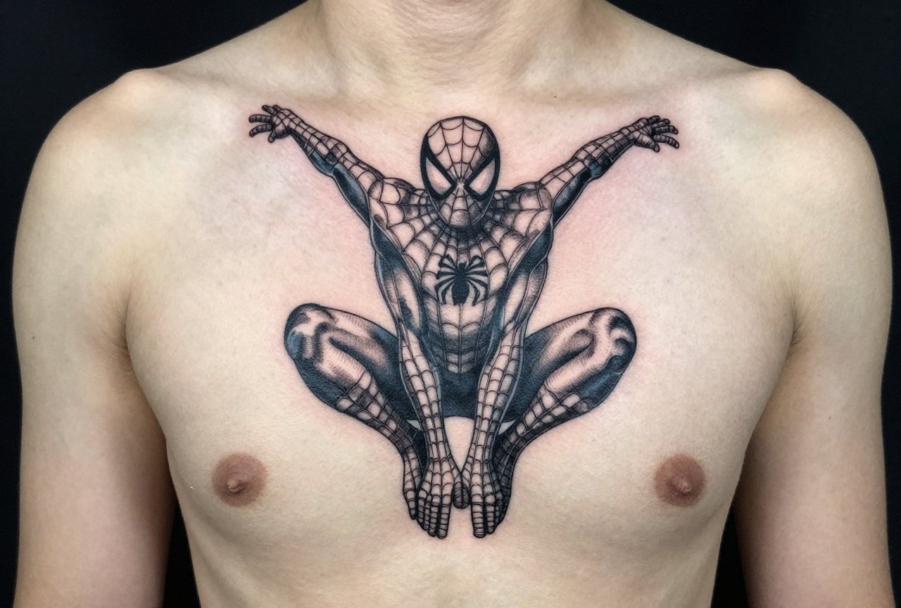
Black and Grey Realism
Tricky with Spiderman. The red suit is iconic. Strip that away and you’re relying on form, shadow, and the eye lenses to sell it. When it works, usually a dramatic portrait with strong lighting, it works beautifully. When it doesn’t, you get a mushy grey figure that could be any masked hero. Pick an artist who actually wants to do this, not one who reluctantly agrees.
- American traditional: best longevity, least detail
- Neo-traditional: sweet spot for most collectors
- Illustrative/comic style: captures the source material energy
- Realism: high risk, high reward, plan for touch-ups
- Minimalist: the spider logo or simple web, surprisingly effective if placed well
Design Ideas Beyond the Obvious
The logo is fine. Everyone does the logo. Here are directions that separate the memorable pieces from the forgettable ones.
The Suit Elements
Isolate the web pattern. The raised webbing texture from the Raimi films translates beautifully to tattoo, artists can build it with dotwork, whip shading, or even subtle white ink highlights on fresh black and grey. The spider emblem on the chest or back makes a strong standalone piece, especially when stylized. One guy I worked on wanted just the web-shooter on his wrist, mechanical detail and all. Small, weird, personal. Way better than another generic mask.
Character Moments
Spidey holding the mask. The upside-down kiss pose (yeah, people still get it). The graveyard scene with Gwen. These work because they carry emotional weight beyond “I like the character.” The best superhero tattoos tell a story about why this specific moment mattered to you. Artists can feel that difference. They put more into pieces that mean something.
Villain Pairings
Venom symbiote creeping over a shoulder. Green Goblin’s glider in the background. Doc Ock’s arms wrapping around a limb, these create composition opportunities a solo Spiderman can’t. Negative space becomes part of the design. The tentacles or webbing flow with the body’s curves instead of fighting them.
- Isolated web pattern as background filler or standalone
- The mask being held or removed, humanizes the hero
- Symbiote transformation sequence, black ooze creeping across skin
- Miles Morales or Spider-Gwen for representation that matters to you
- Comic panel recreation with your own twist
Best Placements for Spiderman Tattoos
Where you put it changes everything. The design should move with the body, not sit like a sticker.
Arms and Forearms
Classic for a reason. The cylindrical shape suits Spiderman’s body, limbs wrapping around limbs. Outer forearm gives you flat display space and tolerates detail well. Inner bicep? Softer skin, more movement, ink spreads slightly more over time. Save simpler designs for there. A full sleeve with Spidey crawling up the arm, webs trailing to the wrist? Cheesy if poorly executed. Incredible if the flow’s right.
Back and Chest
The broad canvas. Chest pieces with the spider emblem centered, think of it as the suit’s actual placement. Large enough to do the eyes justice. Back pieces allow for the full figure in dynamic pose, maybe swinging through a cityscape. The shoulder blades can be tricky; the skin stretches and moves significantly. Experienced artists account for this. Cheap ones don’t, and the proportions warp within a year.
Legs and Ribs
Thighs handle big color well. The calf can work for vertical compositions, Spidey climbing. Ribs? That’s for the committed. The spider logo on the ribs follows the body’s natural lines. Full character work there hurts, and the skin’s temperamental. But the silhouette against the rib cage’s architecture can be stunning. Know what you’re signing up for.
- Outer forearm: visibility, detail potential, manageable pain
- Chest: emblem placement, natural symmetry
- Upper back/shoulder: dynamic posing, larger scale
- Calf: climbing poses, vertical movement
- Hand/fingers: spider logo or webbing, fades fast, high maintenance
Color Choices and Aging Reality
Red is the hardest color to keep. Period. Bright scarlet fades to pinkish-orange. Dark crimson stays longer but loses the pop. Blue shifts purple or grey depending on the pigment. This isn’t opinion, it’s what happens to every color piece I’ve watched age.
Working With Red
Design around the fade. Use deeper reds, not fire-engine bright. Balance red areas with black webbing that’ll hold contrast even as the color mutes. Some artists pre-plan for this, building in enough dark structure that the piece reads as Spiderman even when the red’s calmed down. Others just blast bright color and hope. Hope isn’t a strategy.
Black and Grey Alternatives
The symbiote suit solves the color problem entirely. Black with white eye lenses, stark, graphic, ages cleanly. Same for noir-inspired designs. If you want color but worry about longevity, limit it: red eyes only, or just the emblem. Let the black ink do the heavy lifting.
- Bright red: plan for touch-ups every 5-8 years
- Deep crimson/burgundy: fades more gracefully
- Black suit: lowest maintenance, highest contrast retention
- Accent color only: strategic red/blue highlights on black and grey base
Tips for Choosing Your Artist
This matters more than your design concept. A mediocre idea executed brilliantly beats a brilliant idea executed poorly.
Look at their portfolio for similar work. Not just “do they tattoo color?” but do they tattoo this specific subject matter well? Comic and pop culture art requires understanding of the source material. The proportions on Spiderman’s mask are specific. The eye shape changes with emotion. An artist who doesn’t know the character will get it wrong in subtle ways that fans notice immediately.
Ask about their preferred approach. Some artists love working from specific reference images. Others want creative freedom to adapt the pose to your body. Neither is wrong, but mismatching expectations kills the experience. I’ve seen clients bring twenty reference images and get frustrated when the artist synthesizes rather than copies. Talk about this before depositing.
Budget honestly. A palm-sized clean Spiderman head in traditional style might run a few hours. A full back piece with cityscape? That’s multiple sessions, thousands of dollars, months of healing between sittings. Don’t bargain shop. The guy offering a full color realistic sleeve for half the price of everyone else? He’s cutting corners on pigment quality, needle hygiene, or experience. Sometimes all three.
- Portfolio review: look for healed photos, not just fresh work
- Consultation: discuss style adaptation, not just “can you do this exact picture”
- Budget for quality: good work isn’t cheap, cheap work isn’t good
- Aftercare commitment: color work needs diligent care to settle properly
- Touch-up plan: discuss timing and cost before starting
Final Thoughts
Spiderman tattoos get a bad rap because so many are lazy. The logo. The basic head. No thought about placement or personal meaning. But the character endures for reasons beyond merchandising, he’s flawed, he’s relatable, he’s the hero who struggles and keeps going anyway. That resonates. Your tattoo can capture that resonance if you put in the work.
Find an artist who gets excited about the project. Someone who suggests composition tweaks you hadn’t considered. Pay for their expertise. Care for the piece while it settles. And in ten years, when the red’s softened and the lines have settled into your skin, you’ll still recognize why you chose it. That’s the goal. Not a perfect Instagram photo on day one. A piece that becomes part of you, that carries its story without needing explanation every time someone asks.
Because they will ask. Might as well have something worth talking about.
More Tattoo Ideas
- Forearm Tattoo Ideas for Women
- Interesting Tattoo Ideas That Actually Hold Up
- Religious Tattoo Ideas That Actually Mean Something
- Explore more
Frequently Asked Questions
What are the most iconic Spider-Man poses that work well as tattoos?
The classic crouching-on-a-wall pose and the upside-down hanging kiss are the two most requested designs. Both silhouettes are instantly recognizable even in small sizes.
Should I get a comic-style or MCU-style Spider-Man tattoo?
Comic style ages better for tattoos because the bold black outlines hold up over time. MCU-style realism requires more touch-ups and looks muddier as it fades.
Where is the best placement for a Spider-Man tattoo?
The shoulder cap and forearm work best for dynamic poses that wrap around the muscle. Avoid spots with lots of stretching like the stomach or inner bicep if you want the web details to stay crisp.
How can I make a Spider-Man tattoo unique instead of generic?
Incorporate a personal element like your city skyline instead of New York, or pair him with a meaningful quote from a specific comic issue. Adding a memorial date in the spider emblem is another subtle customization.

