Walk into any shop worth its salt and you’ll see them tacked to the walls, flash sheets yellowed from sun, drawn by hands that knew the game. Classic designs aren’t a trend. They’re the bedrock. The stuff your grandpa’s buddies wore home from Korea, the imagery that made tattooing a language anybody could read across a bar or a beach. I’ve watched collectors fly in for a Bert Grimm reproduction and I’ve seen eighteen-year-olds ask for a Pinterest watercolor butterfly instead. Guess whose tattoo still looks right in twenty years? Let’s talk about what endures, where it sits best, and how color behaves when your skin’s been through a few summers.
Popular Styles
“Traditional” gets thrown around like it means one thing. It doesn’t. You’ve got American Traditional, its British cousin, Japanese tebori influence, even the bold-line Mexican black-and-gray that shares DNA. What ties them together? Readable silhouette. Strong black. A design that scans from across the room.
American Traditional
Sailor Jerry. Bert Grimm. Percy Waters. These names matter because they codified the vocabulary: anchors, pin-ups, panthers, clipper ships, eagles gripping banners. The rules are simple. Limited palette, red, yellow, green, black, sometimes blue. Thick black outlines. Minimal shading, and when it’s there, it’s whip-shaded or peppered, not smooth gradients. Skin changes. Lines spread. Color falls out. Traditional accounts for that. The design still reads because the bones are right.
I’ve sat next to artists who’ve been at this twenty years, and they’ll tell you: a well-executed traditional piece is harder than it looks. The simplicity is the challenge. No hiding behind fancy effects. Every line earns its place.
Old School Meets Neo-Traditional
Neo-traditional opened the color box and added some anatomical realism, but it kept the bold outline and the storytelling. You’ll see more jewel tones, more dimension in the faces, more ornamental frames. The subject matter expanded, moths, portraits of pets, Art Nouveau women with flowing hair. Still readable. Still built to last. Just… more detailed. Some purists sniff at it. I think it’s a valid evolution. The outline still saves it when the color softens.
- American Traditional: limited colors, heavy black, iconic imagery
- Neo-Traditional: expanded palette, more detail, same structural bones
- Japanese Traditional (Irezumi): different rulebook entirely, but equally built for longevity
- Black-and-gray traditional: bold lines, no color, relies on contrast and skin tone
Design Ideas
Here’s where people get stuck. They want “classic” but they also want it to feel personal. Good news: these images have always been personal. The sailor got a clipper ship because he’d crossed the Atlantic. The swallow meant 5,000 nautical miles. The dagger through a heart? Often a memorial. The symbolism was lived, not bought off a sheet because it looked cool.
Animals That Actually Work
Traditional panthers, snakes, eagles, and wolves. The panther crawl, those long, curved bodies wrapping a limb, has been done ten thousand times because it fits the body. The flow is natural. A snake coiled around a dagger reads immediately; the eye follows the curve. Eagles need chest real estate, ideally. Too small and the detail chokes. I’ve seen gorgeous eagle backs, eagle thighs, but the classic spot is the chest, wings spread, head turned. It fills the space the way the design demands.
Swallows. Let’s be honest about swallows. They’re small, they’re fast, and they’re a rite of passage. Every apprentice practices them. That means quality varies wildly. A good swallow has personality in the head, a slight smirk, wings that don’t look stamped from a template. Hold the flash up to the light. If both birds are identical, keep looking.
Roses, Daggers, and Memorial Pieces
The dagger through a rose. The name banner. The “Mom” heart. Cliché? Only if poorly done. I’ve watched grown men tear up getting their father’s navy anchor reproduced. The imagery carries weight because it’s carried weight for generations. A rose in traditional style is built from specific moves, teardrop petals, bold leaves with a single line of highlight, a stem that curves to fit the body. The dagger adds narrative. Who holds it? What broke? The story’s yours.
- Clipper ships: full sails, rocky waves, sometimes a red sun, demands space
- Pin-ups: require a solid artist; bad proportions ruin the whole piece
- Skulls: endless variation, but the classic has a rose in the teeth or a snake through the eye
- Banners and script: simple, effective, but spell-check everything twice
Best Placements
Skin moves. Skin stretches. Some spots hold ink like a dream; others chew it up and spit it out. Classic designs were developed for specific real estate, and ignoring that usually ends in disappointment.
Forearms are the traditional billboard. Easy to show, easy to hide with a sleeve. The flat plane lets a ship or a panther breathe. Inner bicep? Softer skin, more prone to blowout, but the teardrop shape of a dagger fits beautifully. Hands and knuckles are commitment territory. The ink falls out faster, the lines blur, and every artist knows the “job killer” conversation. Some won’t do fingers on a first-timer. Respect that.
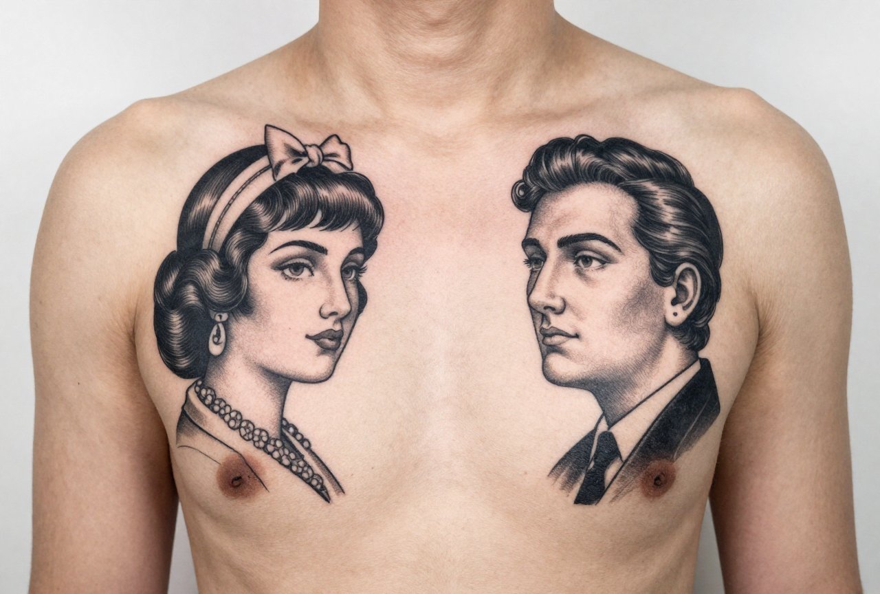
Thighs are underrated. Big canvas, less sun exposure than lower leg, and the curve of a snake or a long ship works with the muscle. Chest pieces, eagles, roses, hearts, need to account for the sternum’s flat plane and the pectoral curve. A good artist draws the stencil with you standing, not lying flat. Gravity changes the shape.
Back pieces in traditional style are statements. Full Japanese back. American traditional battle scenes. They take sessions, they cost, but they age like leather-bound books. The upper back, between the shoulder blades, holds detail better than the lower back where pants rub and skin flexes more.
Color Choices
Here’s the truth about color: it doesn’t stay. Red becomes pink. Blue goes gray-green. Yellow? Sometimes disappears entirely. Black endures. That’s why the outline is everything in traditional work.
What Actually Lasts
American traditional’s limited palette wasn’t just aesthetic. Those pigments, iron oxide reds, cadmium yellows, carbon black, proved stable over decades. Modern inks have more range, but the old wisdom holds. Heavy black outlines create a fence that keeps color from migrating. Solid color packing, not wispy washes, gives something to fade from.
I see people ask for “soft traditional” or “watercolor traditional” and I wince. Those are different languages. Watercolor relies on no outline, on skin tone showing through, on effects that look incredible at six months and muddy at six years. Traditional with its black armor? Still legible when your grandkids are asking about that blurry thing on your arm.
Green is the wild card. Some greens go almost black. Some stay surprisingly bright. Talk to your artist about their specific brand experience. This isn’t generic advice, it’s shop-floor knowledge that varies by supplier and even batch.
Skin Tone Considerations
Yellow and pale orange struggle on darker skin without a heavy black structure. That doesn’t mean avoid color; it means design differently. More black, bolder shapes, colors chosen for contrast against melanin rather than against white paper flash. A good artist adjusts. A bad one stamps the same stencil on everybody.
Tips for Choosing
Flash walls exist for a reason. Those sheets aren’t limitations; they’re conversations. Pick something that resonates, then ask the artist to make it yours. A banner name. A specific ship type your grandfather served on. A panther with the scar direction reversed because you’re left-handed and want it facing forward. Small moves, big ownership.
Research your artist like you’d research a dentist doing your front teeth. Traditional requires specific skills: consistent line weight, confident whip shading, color saturation without overworking the skin. Look at healed photos, not fresh. Fresh work is swollen, saturated, lying to you. Healed work, six months or a year out, tells the truth. Ask for it. Any artist proud of their craft keeps those photos.
Budget honestly. Good traditional isn’t cheap. The line work is unforgiving; there’s no hiding a wobble in a thick black contour. You’re paying for the years it took to make that line straight, for the knowledge of how skin accepts ink differently on the inner versus outer forearm. Shop minimums exist because setup, sterilization, and stencil time cost the same if you’re getting a dot or a dragon.
- Look at healed portfolios, not just fresh Instagram posts
- Ask about their specific ink brands and color experience
- Bring reference, but trust the artist’s adaptation to your body
- Plan for the long game: touch-ups, sun protection, aging
- Don’t rush the stencil placement, move it, stand up, check the mirror
Final Thoughts
Classic designs survive because they work. Not because they’re safe, not because they’re easy, but because generations of artists and collectors refined them against the reality of living skin. The best tattoo I saw last year was a Bert Grimm reproduction on a sixty-year-old biker’s forearm, fifty years old, sun-washed, lines softened, and still absolutely readable. Still telling its story. That’s the promise of traditional work. It doesn’t chase the moment. It outlasts it.
Get the swallow. Get the ship. Get the dagger if something needs cutting loose. Just get it from hands that know why the lines go where they go. Your future self, weathered and worn, will still recognize the choice you made.
More Tattoo Ideas
- Realistic Wolf Tattoos: Complete Style Guide
- Awesome Tattoo Designs That Actually Work
- Knuckle Tattoo Ideas That Actually Work
- Explore more
Frequently Asked Questions
Why do traditional American tattoos like anchors and swallows remain popular after decades?
These designs carry deep nautical symbolism that resonates across generations, representing stability, travel, and safe return. Their bold lines and limited color palette age exceptionally well on skin, keeping them visually striking for years.
Are Japanese irezumi designs like koi fish and dragons still considered timeless?
Japanese tattoo art has remained relevant for centuries due to its rich storytelling tradition and meticulous craftsmanship. The flowing compositions and meaningful symbolism continue to attract collectors who appreciate both aesthetics and cultural depth.
Do minimalist blackwork tattoos have the same lasting appeal as more elaborate classic styles?
Minimalist designs have proven their staying power because they rely on strong fundamental shapes rather than trendy details. Their simplicity often translates to better aging and broader versatility across different personal styles and body placements.
What makes roses and skulls such enduring tattoo motifs compared to other floral or anatomical designs?
Roses and skulls encapsulate universal themes of beauty, mortality, and the cycle of life that transcend cultural boundaries. Their visual adaptability allows artists to render them in countless styles while maintaining immediate recognition and emotional impact.


