When someone walks into my shop and asks for a “traditional outline,” I know exactly what they mean even if they don’t. They’re pointing at that bold, confident black line work that defines old-school American tattooing, the kind that reads clear from across a room and still holds up when you’re eighty. A traditional tattoo outline isn’t just the border of a piece; it’s the skeleton, the attitude, the whole damn personality. I’ve tattooed thousands of these lines over fifteen years, and I can tell you: get the outline wrong, and nothing else matters.
Origins & History
Sailors, Sideshows, and the Birth of Bold
The traditional tattoo outline comes from necessity. Sailors in the early 1900s needed ink that wouldn’t blur into a blue mess after months of salt water and sun. The solution was simple: thick black lines, spaced generously, with minimal fine detail that could blow out. I’ve seen original Bert Grimm flash from the 1940s, those lines look almost crude by modern standards, but they’re engineered to survive. We see this a lot in restoration work: I’ll open up a sailor’s piece from 1960 and the outline is still singing while the color faded decades ago.
Why the Line Weight Matters
Traditional artists worked with limited machines and even more limited needle groupings. A 14-round liner was standard. That forced a specific aesthetic: confident, single-pass lines with slight tapering at the ends. In my chair, I tell clients that a true traditional outline should feel almost carved, like someone took a sharp knife to the skin and left a groove. The weight varies, thicker on the dominant edge of an image, slightly thinner where light would hit, but it’s never wispy. Never tentative.
Key Characteristics & Motifs
Here’s what separates a traditional tattoo outline from other bold-line styles:
- Consistent line weight with intentional variation: Not every line is the same thickness, but the variation follows rules, shadow edges get weight, highlights get thinner or disappear entirely.
- No gray wash in the outline itself: Pure black. The shading happens inside or alongside, never as part of the contour line.
- Spherical, readable shapes: Every element, roses, daggers, swallows, reads as a distinct silhouette from ten feet away.
- Clean whip-shading transitions: The outline contains the shading; it doesn’t blend into it.
The classic motifs demand this treatment. A traditional rose without a heavy outline looks like a greeting card. A swallow with thin lines looks like a sparrow. I’ve had clients bring in Pinterest boards of “traditional style” pieces where the outline is basically a fine-line illustration, and I have to explain: that’s not going to age like you think. The magic is in the weight.
Color vs Black and Grey
The Traditional Color Palette
Traditional tattoo outlines were built for color, specifically, the limited, high-saturation pigments available before modern chemistry. Red, yellow, green, blue. Each color sits inside its black fence like a kid in a playpen. I tell clients who want color traditional: the outline has to be heavier than you think, because color needs containment. I’ve seen beautiful pieces where someone tried to “soften” the outline for color, and within five years the red bled into the green like a sunset nobody asked for.
Black and Grey Traditional
This is where the outline really gets to show off. Without color competing for attention, that black line becomes the entire story. The best black and grey traditional I’ve done, mostly eagles, snakes, and religious icons, relies on dense, velvety blacks right next to the outline, then smooth wash gradients moving outward. The outline doesn’t just contain the image; it provides the contrast that makes the grey work readable. Skin tone matters here. On darker skin, I might bump the line weight slightly and keep the interior blacks denser. Not because the outline changes, because the surrounding values need to pop harder.
Best Placements
Traditional tattoo outlines work almost anywhere, but some spots let them shine:
- Forearms and calves: Flat planes where the outline stays true to the design. I’ve tattooed so many forearm eagles I could do them blindfolded. The cylinder shape actually flatters the bold lines.
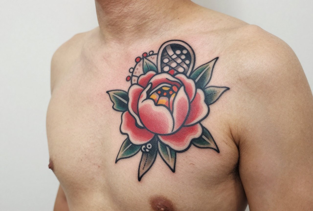
- Chest panels: The sternum and pecs give traditional outlines room to breathe. A ship on the chest with a heavy black horizon line? That’s tattooing’s greatest hit.
- Thighs: Big, generous curves that let a snake or dagger stretch to its full length. The outline here can be genuinely thick, 10s or 12s, without looking crude.
- Hands and knuckles: Tricky. The skin is thin, the wear is constant, but traditional outlines were made for this punishment. I warn clients: these will need touch-ups, but the bold line gives us something to rebuild on.
What doesn’t work as well? Ribs and feet, honestly. The rib skin moves too much, stretches too weirdly, fine for the finished piece, but the outline phase is a fight. Feet? The ink just doesn’t stay. I’ve watched solid black lines fade to gray in two years on some feet. Not the outline’s fault, but worth knowing.
Who It Suits
Traditional tattoo outline style doesn’t care about your aesthetic subculture. I’ve put these on punk kids, grandmothers, software engineers, and bikers. What matters is your commitment to the look. This isn’t delicate. It’s not “meaningful” in the whispered way people sometimes want tattoos to be. It’s loud, it’s proud, it’s permanent in a very specific visual language.
That said, if you want something that hides easily, traditional outline work fights you. The bold lines draw the eye. A small traditional piece on the wrist becomes a statement whether you meant it or not. I had a client, a lawyer, who wanted a tiny traditional heart behind her ear. I did it, but I warned her: that’s not hiding. That’s a choice. She loved it. But know what you’re choosing.
Modern Variations
Neo-Traditional and the Outline Evolution
Neo-traditional keeps the bold outline but loosens the rules. Line weight varies more dramatically. Decorative elements, filigree, ornamental frames, get added. The outline might even disappear in places, letting color gradients suggest edges instead of black lines. I enjoy doing this work, but it’s a different animal. When someone says “traditional outline,” I confirm: do you mean classic, or neo? Because my machine setup changes.
Ignorant Style and the Punk Revival
This one’s fascinating. Ignorant style deliberately fakes the naive quality of early traditional, wobbly lines, weird proportions, almost childlike. But here’s the thing: the good ignorant artists know exactly how to make a line look accidentally perfect. The outline is still doing the heavy lifting. I’ve had clients bring in flash by artists like @lilbubbtattoos or similar, and we talk about which wobbles are intentional, which would actually blow out. It’s a tightrope.
Choosing an Artist
This is where I get passionate. Not every tattooer who can do a clean line can do traditional outline work. Look for:
- Portfolio consistency: Do their traditional pieces look like they could hang next to Sailor Jerry flash? Or do they look like bold-line illustrations with a vintage filter?
- Line quality under magnification: Ask to see healed photos. Fresh lines are easy. Healed lines tell the truth. Look for crisp edges, no “fuzzy” migration.
- Knowledge of history: A traditional artist should know why the lines are bold, not just that they are. Ask about their machine setup. A liner running too fast will chew skin; too slow, the line wobbles. I run my traditional liners around 7-8 volts with a medium throw. That’s shop talk, but any artist worth their salt should have an answer.
- Flash availability: Do they draw their own traditional designs? That’s the heartbeat of the style. Custom work is great, but if they can’t riff on classic motifs, they’re missing the vocabulary.
Red flags? Artists who say they can “do any style.” Traditional outline work is specialized. The hand speed, the stretch, the way you read skin tension, it’s specific. I’ve been doing this fifteen years and I still learn from dedicated traditional artists. Humility is part of the craft.
Final Thoughts
A traditional tattoo outline is the closest thing we have to a universal language in tattooing. It crosses cultures, decades, and skin types with a clarity that other styles struggle to match. I’ve watched these lines hold through sunburns, weight changes, and the general indignity of being human in a body. They’re not subtle. They were never meant to be. What they are is honest, about the history they carry, about the artist who laid them down, about the person wearing them.
If you’re considering one, my advice is simple: find an artist who loves this work, not just tolerates it. Sit in their chair. Let them stretch your skin and feel the needle bite. When you look down at that bold black line, still slightly raised, still slightly angry from the session, you’ll know. This is what tattooing sounded like before it got quiet.
Frequently Asked Questions
How painful is getting a traditional outline compared to shaded or color work?
The outline phase is usually the sharpest part of any tattoo, traditional or otherwise. With traditional work, the lines are heavier and sometimes slower, which can feel more intense. Most clients say color packing and shading actually feel easier after the outline is done. I always tell first-timers: the outline is the handshake, the rest is the conversation.
Will a traditional outline tattoo look good if I never add color or shading?
Absolutely. A clean black outline holds its own as a finished piece. We call these “line-only traditional” or “outline specials,” and they’ve been popular since the 1940s. The key is that the line weight and design complexity must support standing alone, simple shapes work better than intricate ones for this approach.
How long does a traditional outline take to heal compared to full color pieces?
The healing timeline is roughly the same, two to three weeks for surface healing, a couple months for full settling. However, heavy black lines can scab more dramatically, and those scabs are tempting to pick. I warn clients: pick a line scab, lose the line. The black is concentrated, so the crust is dense. Leave it alone.
Can you add color to a traditional outline later, or does it need to be planned from the start?
You can absolutely add color later, and we do this often. The outline acts as your roadmap. That said, the artist needs to have left appropriate negative space, color packed right up to a heavy black line can look crowded. If you’re unsure, tell your artist you might want color later. They’ll plan the spacing differently.


