I’ve had a guy in my chair who wanted a full Smaug wrapping his bicep. I’ve tattooed a delicate moth-winged sprite behind someone’s ear so small I needed a 3RL and a magnifying lamp. Fantasy work is where the job gets genuinely fun, clients bring you their dreams, their D&D characters, their childhood book covers, and you get to translate that into something permanent. But here’s the thing: not every epic painting makes a good tattoo. Skin isn’t canvas. It moves, it ages, it blurs. The best fantasy tattoos I’ve done are the ones where we took something impossible and made it live in real flesh.
Popular Styles That Actually Work
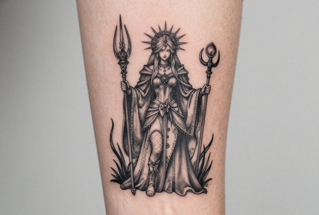
Fantasy art spans everything from hyper-detailed realism to flat graphic illustration. In my shop, we see three approaches that consistently heal well and age beautifully.
Neo-Traditional Fantasy
Bold outlines, limited but saturated color palettes, stylized forms. Think Art Nouveau fairies, medieval unicorns, or Celtic-adjacent dragons. The heavy linework gives these pieces structure that lasts decades. I’ve got a client who’s had a neo-trad phoenix on her thigh for twelve years; the reds softened but the shape reads clear from across the room. This style forgives the blur that happens as skin ages.
Black and Grey Realism
Dragons, wolves with glowing eyes, crumbling castles, rendered in smooth gradients without color. The trick here is contrast. You need deep blacks anchoring the piece or it’ll look like a foggy photograph in five years. I tell clients: “If you want a realistic dragon, we’re going to need some serious shadow work.” The best black and grey fantasy pieces I’ve done use reference from nature, actual lizard scales, real bird wings, then push into the impossible.
- Neo-traditional: bold lines, flat color, stylized forms, ages gracefully
- Black and grey realism: requires strong contrast, nature reference helps
- Illustrative/etching style: fine lines, crosshatching, best for larger pieces
- Watercolor fantasy: popular but risky, needs black structure underneath
Design Ideas Worth Considering
Here’s where I get specific. These are motifs I’ve tattooed multiple times, with notes on what actually succeeds.
Dragons That Don’t Look Like Clip Art
The failed dragon tattoos I’ve covered up usually share a problem: too symmetrical, too frontal, too much like a logo. The dragons that work have asymmetrical poses, coiling, diving, climbing. I did one last year that wrapped a client’s ribcage, head emerging from his hip bone, tail disappearing toward his shoulder blade. The body followed his anatomy. That’s the secret. Dragons should move with the body, not sit on it like a sticker.
Fairies and Sprites
Small, detailed, easy to blow out. The successful fairy tattoos I’ve done are either large enough for real detail (palm-sized minimum) or intentionally simplified, silhouettes, single-line work, or Art Nouveau flowing forms. The tiny realistic faces with individual eyelashes? Those blur into mush. I’ve seen it. We all have.
- Cosmic scenes: planets, nebulae, celestial dragons, work best as sleeves or back pieces with room for gradient
- Mythological hybrids: griffins, phoenixes, krakens, strong silhouette helps recognition
- Enchanted objects: crystal balls, spell books, potion bottles, great for filler or standalone pieces
- Portal scenes: doorways, windows, mirrors showing another world, excellent for forearms and calves
Best Placements for Fantasy Work
Placement changes everything. A design that sings on a thigh might die on a wrist.
Back pieces are the classic fantasy canvas for good reason. Flat surface, lots of room, the artist can work comfortably. I’ve done two full-back dragons in my career; both took multiple sessions, both healed clean because we weren’t fighting body contours. The shoulder blades specifically give you that natural wing structure for anything avian or draconic.
Thighs and calves are underrated. The cylinder shape wraps well for serpents, coiling creatures, vertical landscapes. I did a forest scene on a client’s outer thigh with a hidden unicorn, viewed from the front, just trees; from the side, the horn and eye emerge. That kind of dimensional trickery needs space and a curved surface.
- Ribs and sides: painful, but excellent for vertical compositions like towers or rising phoenixes
- Forearms: visible, so consider your professional life; great for objects and smaller creatures
- Upper arms and shoulders: traditional placement, easy to show or hide, good for medium-sized pieces
- Hands and fingers: generally avoid for detailed fantasy; the ink falls out, the skin turns over fast
Color Choices and Aging Reality
I love color. But I’m honest with clients about what happens.
What Fades and What Holds
Purples, light blues, and pastels fade fastest. I’ve watched lavender fairy wings turn grey in three years. Deep blues, forest greens, true reds, and black hold the longest. For fantasy work, I often suggest a “color anchor” strategy: the creature or central figure in strong saturated tones, the background and atmospheric effects in black and grey. That way when the softer colors mute, the piece still reads.
White Ink and “Magic” Effects
Clients always ask for “glowing” effects, magical auras, sparkling light. White ink isn’t the answer, it yellows or disappears entirely. The real technique is negative space: letting the natural skin tone read as light source, surrounded by deeper tones. I did a crystal ball where the “glow” was simply un-inked skin, edged with deep purple and black. Heals clean, reads as luminous, doesn’t depend on white ink that’ll vanish.
- Saturated jewel tones: emerald, sapphire, ruby, age better than pastels
- Black and grey with single color accent: classic, legible, sophisticated
- Full color sleeves: stunning when fresh, require commitment to touch-ups
- “Glow” effects: use negative space, not white ink
Tips for Choosing Your Fantasy Piece
After fifteen years in shops, here’s what I wish every client knew before they sat down.
Bring reference, not homework. I love when someone shows me a Frank Frazetta painting or their original D&D character sketch. I don’t love when they hand me ten Pinterest photos and say “combine these.” The best tattoos come from collaboration. I take your inspiration, consider your body, your budget, your pain tolerance, and we build something that works in skin.
Think about the long game. That hyper-detailed scene with fifty tiny figures? In ten years it’s a muddy suggestion. I steer clients toward strong silhouettes, readable at a distance, with detail that serves the composition rather than cluttering it. The fantasy tattoos I’m proudest of are the ones that still look like themselves when I’m squinting from across the shop.
- Choose an artist whose portfolio shows fantasy work, not just one who says they can do it
- Budget for the piece you want, not the piece you can afford this month, good work costs, and cheap fantasy tattoos look cheap forever
- Consider the story: the best fantasy tattoos have personal meaning, not just cool imagery
- Plan for multiple sessions on large pieces; your skin and your artist both need breaks
Final Thoughts
Fantasy tattoos are where technical skill meets pure imagination. They’re the reason I still love this job after all these years, the chance to put something impossible on someone’s body, to make their inner world visible. But they’re also where bad decisions live forever. The dragon that looks like a sock puppet. The fairy that blurs into a Rorschach test. The “magical” piece that needed black structure and never got it.
Work with an artist who respects the genre. Bring them your wildest ideas, then trust them when they say “that needs to be bigger” or “that color won’t hold.” The collaboration between your vision and their knowledge of skin, that’s where the real magic happens. Not in the ink itself, but in the conversation that gets us there.
Frequently Asked Questions
How do I find a tattoo artist who actually specializes in fantasy work?
Look for portfolios with completed fantasy pieces, not just one or two. Ask specifically about their experience with the style you want, neo-traditional dragons versus realistic ones are totally different skill sets. Most good artists will be honest if your idea plays to their strengths or someone else’s.
Will a colorful fantasy tattoo look bad when I’m older?
All tattoos age, but smart color choices help. Deep saturated tones hold better than pastels, and strong black outlines or shading give structure even as colors soften. I’ve seen twenty-year-old fantasy pieces that still look great because the original design accounted for aging.
How much should I expect to spend on a detailed fantasy sleeve?
Quality fantasy work takes time. A full sleeve with detailed creatures or scenes typically runs multiple sessions at hourly rates. Discuss budget openly with your artist, they can often suggest scaling, simplification, or phased approaches that respect your finances without sacrificing the piece.
Can I get my exact D&D character tattooed, or do I need to simplify?
Characters with fifty details don’t translate directly. I work with clients to identify the essential elements, silhouette, signature weapon, color palette, and build a tattoo version that captures the spirit. The character should be recognizable to someone who knows it, readable as cool art to everyone else.

