I’ve tattooed more compasses than I can count. They’re one of those designs that walk through the door every week, sometimes three in a single day. What started as a sailor’s staple has become something people get for all kinds of reasons: a cross-country move, getting sober, a divorce, a graduation. The compass means direction, sure, but in my chair it usually means someone finally figured out where they’re headed. That said, not every compass tattoo ages well. I’ve seen gorgeous pieces blur into gray blobs after five years, and I’ve seen simple little blackwork ones hold crisp for decades. Let me break down what actually works.
Popular Styles
Style choice determines everything, how long it takes, how much it hurts, how it looks at year ten. Here’s what I actually do in the shop.
Traditional Americana
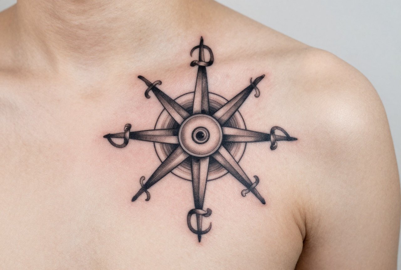
Think bold black outlines, limited red and yellow, maybe a banner with “Hold Fast” or a loved one’s name. The traditional compass rose with its spiky star points is built for this style. Heavy lines hold. The simplicity is the point. I’ve had clients come back fifteen years later and these still read clean from across a room. The trade-off? Less detail means less personalization. You work within the vocabulary of the style.
Realistic and 3D
This is where compasses get fancy, brass patina, cracked glass, shadow casting on imaginary skin. Looks incredible fresh. Here’s the reality: fine detail in realism spreads. That tiny engraved degree marking? Softens to a blur. The reflected highlight on glass? Disappears entirely. I tell clients straight: if you want realism, go bigger than you think. A palm-sized minimum, preferably larger. And expect a touch-up in five to seven years. It’s not a failure; it’s maintenance on a complex piece.
Blackwork and Geometric
My personal favorite to tattoo. Clean circles, precise lines, dotwork for texture. The mandala-influenced compass roses fall here too. These age like iron. The geometric precision actually helps, your eye forgives slight imperfections if the overall structure is strong. Plus, blackwork heals fast. Less trauma, less scabbing, less chance of infection. Clients walk out knowing what they’ve got.
- Linework only: Fast, affordable, but requires perfect execution. One wobble in a circle ruins the whole illusion.
- Stipple/dotwork: Gorgeous gradients, takes forever in the chair, heals with interesting texture.
- Black and gray wash: Classic, versatile, shows dimension without color commitment.
Design Ideas
The compass by itself is fine. But the best pieces I’ve done combine it with something personal. That’s where the tattoo stops being flash art and starts being yours.
Map Integration
Topographic lines fading into the compass face. A specific coastline wrapping around the border. Coordinates in small type. I did one where the compass sat inside an outline of Alaska, where the client had done a year of wilderness therapy. The map grounds the symbol. Without it, you’re just wearing a nautical cliché.
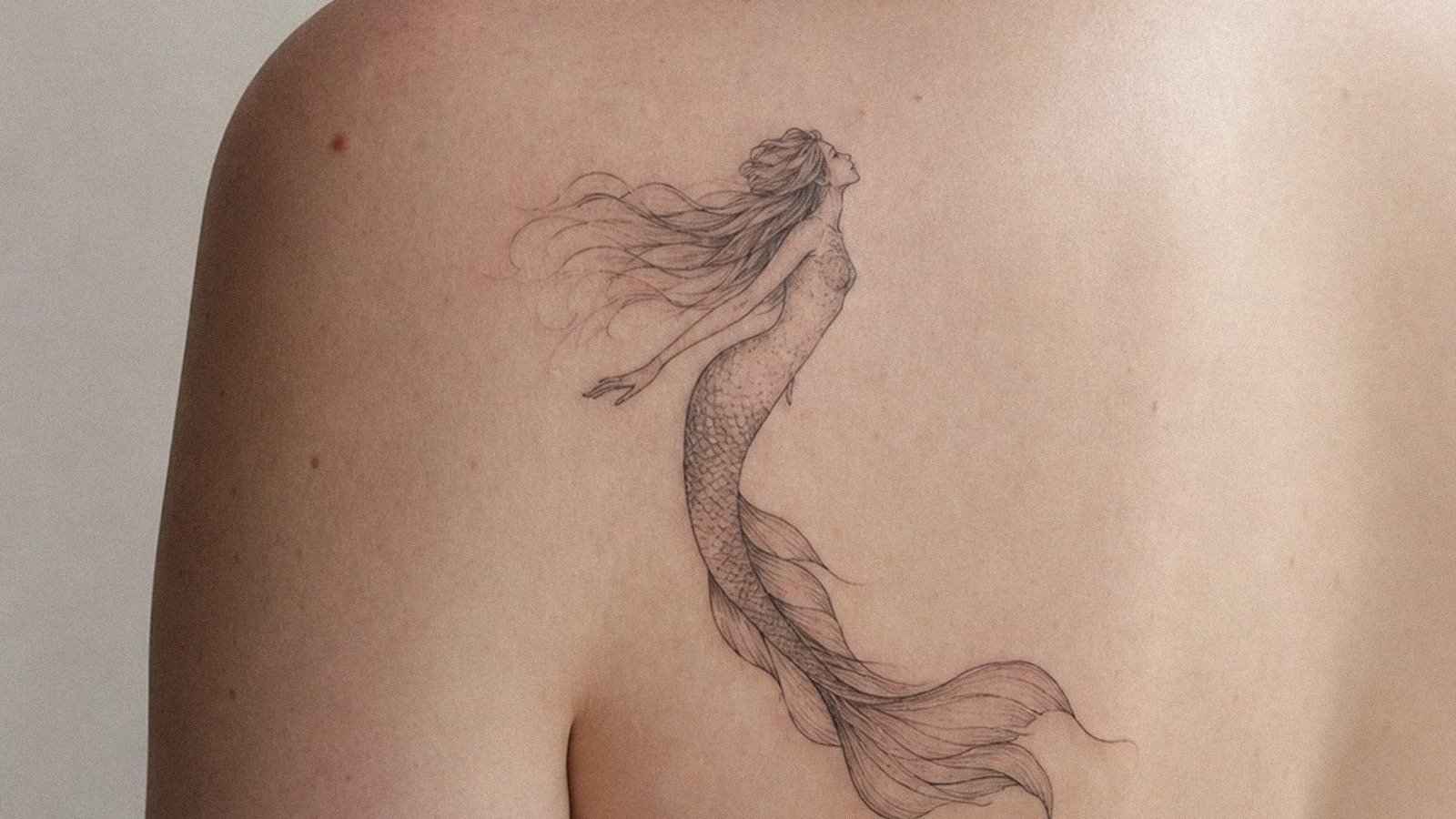
Nature Elements
Roses growing through the compass. Mountains behind it. Waves below. These frame the mechanical with the organic, which visually makes sense, the compass is human order imposed on wild space. I see this a lot with hikers, climbers, people who actually use maps. The design should reflect real experience, not Pinterest aspiration.
Other combinations that work:
- Clock or hourglass (time and direction, cheesy if done obvious, subtle if integrated)
- Feather or bird (movement, migration, freedom)
- Anchor (the classic sailor pairing, now often done ironically)
- Constellation or celestial chart (navigation by stars, literal and metaphorical)
Best Placements
Where you put it changes how you see it, how it ages, how much it hurts. I talk placement with every client before we touch design.
Forearm and Calf
The flat planes. These are forgiving for detail, easy to show off or cover, and the skin doesn’t stretch and shift as much as other areas. Outer forearm hurts less than inner. Calf has that nice muscle cushion. Both spots heal relatively clean because you’re not constantly flexing and rubbing them against things.
Chest and Ribs
More pain, more personal. The chest piece sits near the heart, which clients love to mention. The ribcage, “the tattooer’s revenge,” we call it, bounces with breathing, makes linework tricky. But the shape follows the body’s curve in a way that feels intentional. I’ve done compasses that wrap slightly around the side, using the torso’s cylinder to create depth. Worth the suffering for some people. Others tap out.
Spots I caution against:
- Hands: Compasses need circles. Fingers and knuckles distort circles. Plus, hand tattoos fade fast and carry professional weight.
- Feet: Constant friction, poor healing, detail loss guaranteed.
- Neck (small): Unless you’re heavily tattooed already, a neck compass reads as random. No context.
Color Choices
Black and gray is the honest default. It ages, it works on all skin tones, it doesn’t clash with your clothes. But color has its place.
Traditional palettes, red, yellow, green, are time-tested because those pigments are stable. The old-school guys figured this out through failure. Modern bright colors, especially neons and pastels, look electric fresh but can shift weird. I’ve seen turquoise go muddy, pink disappear entirely. If you want color in a compass, I suggest:
- Deep red for the rose points (holds, reads from distance)
- Antique gold for brass effects (warmer than yellow, more believable)
- Muted blue for water elements (navy ages better than sky blue)
On darker skin tones, which I work with regularly, high-contrast black and gray often reads stronger than color. Color is possible, bold, even, but requires more planning and usually more saturation. We test patches. We talk honestly about what will show.
Tips for Choosing
After years of doing these, here’s what I wish every client knew before they sat down.
Bring Reference, Not a Photocopy
I want to see what draws you, an antique compass from your grandfather’s desk, a screenshot from a movie, a watercolor painting. But I don’t want to reproduce someone else’s tattoo. That’s theirs. Your compass should come from your life. The best reference I ever got was a beaten-up Silva orienteering compass with a cracked lens. We incorporated the crack. That damage told the story.
Size Matters More Than You Think
People always want them smaller. I get it, tattoos are permanent, smaller feels safer. But a compass has text, degree marks, directional letters. At two inches, that’s all gone in three years. I push for three inches minimum for a basic design, five or more for anything with detail. Your future self will thank you when it still reads at fifty.
Final practical notes:
- Research your artist’s healed work, not just fresh photos. Instagram lies; healed skin tells truth.
- Budget for quality. A compass is linework-intensive. Rush jobs show in wobbly circles.
- Consider the meaning, then let it go. The tattoo doesn’t need to explain itself to strangers. You know why you got it.
Final Thoughts
Compass tattoos aren’t going anywhere. They’re too useful, too flexible, too genuinely meaningful to too many people. But the difference between a good one and a forgettable one is all in the specifics, the weight of the line, the logic of the placement, whether the design came from your actual life or a Google image search. I’ve watched clients cry in my chair getting these. Not from pain, from the relief of finally marking a direction after feeling lost. That’s the job. That’s why we do it. Get it right, and you wear something that keeps pointing true even when you forget why you started.
Frequently Asked Questions
How much does a compass tattoo usually cost?
A small simple compass starts around $150-250, while detailed realism or large pieces can run $500-1,000+. The circular precision takes time, good linework isn’t cheap, and cheap linework isn’t good.
Do compass tattoos have to face a certain direction?
Some clients want north pointing true north on their body, which is a nice touch. Others don’t care. It’s personal preference, though I think the intentionality adds something if it matters to you.
Will a compass tattoo stretch if I gain muscle or weight?
Any tattoo shifts with major body changes, but compasses on the forearm, calf, or upper chest are fairly stable. I’d avoid the stomach or inner bicep if you’re planning significant transformation.
How do I keep the fine details from fading too fast?
Start bigger than minimum size, use bold enough lines, follow aftercare exactly, and always wear sunscreen. UV exposure is the fastest killer of tattoo detail, no exceptions.