Japanese black and gray tattoos strip the classic irezumi tradition down to its bones, flowing lines, negative space, and tonal gradation that makes skin look like living ink wash painting. I’ve spent fifteen years in shops watching this style evolve from underground scenes to mainstream respect, and what strikes me most is how the absence of color forces every other element to work harder. The composition has to sing. The line weight has to carry narrative weight. When you remove the crimson of koi scales or the emerald of dragon bellies, you’re left with something quieter but no less powerful, something that ages with a particular dignity that saturated color sometimes can’t match.
Origins & History
The black and gray variant didn’t emerge from the formal ukiyo-e tradition that birthed classic Japanese tattooing. That was full color, bold, ceremonial. What we now call Japanese black and gray grew from practical constraints, prison tattooing, street work, and later Chicano black and gray influences cross-pollinating with Japanese iconography. In my early apprenticeship, I heard old-timers talk about the 1980s and 90s when Japanese motifs started appearing in single-needle, low-rider style shading. The fusion was inevitable once artists began crossing coasts and cultures.
From Underground to Respected
There’s a specific gravity this style carries now. Walk into any reputable shop in Los Angeles, London, or Tokyo and you’ll find artists who’ve dedicated careers to perfecting that smoky gradation. The stigma of watered-down tradition has largely faded, what matters is technical execution and understanding of the visual language.
What Traditionalists Think
I’ve tattooed beside Japanese masters who initially scoffed at black and gray irezumi. Some still do. But I’ve also watched them quietly appreciate how the restraint highlights compositional fundamentals they themselves studied for decades. The best traditionalists recognize that limitation breeds innovation.
Key Characteristics & Motifs
Japanese black and gray relies on specific visual grammar. Without color to differentiate elements, artists must deploy other tools with precision:
- Line weight variation: Thick outlines establish form; hairlines suggest texture and distance. I tell clients that bold lines hold, delicate lines fade, planning this balance is half the design work.
- Background wash: That characteristic fog or smoke effect, often achieved through whip shading or soft mag work, creates atmospheric depth without a single color.
- Negative space: Skin becomes sky, water, void. The un-inked areas breathe and prevent the piece from becoming mud over time.
- Wind bars and waves: Traditional filler elements that direct eye movement and frame central subjects.
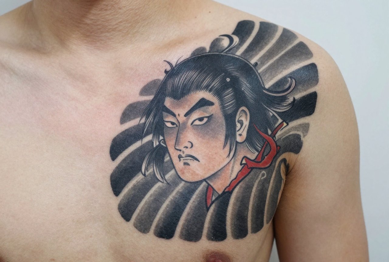
Common motifs translate beautifully: koi ascending waterfalls, dragons coiled through clouds, phoenixes mid-transformation, samurai in frozen combat. Cherry blossoms and maple leaves provide organic texture. The key is that each element must read clearly in grayscale, no relying on “red for passion” or “blue for water.”
Color vs Black and Grey
I’ve had clients sit in my chair agonizing over this choice. Here’s my honest breakdown after watching both age on human skin for years:
Traditional Japanese color work, vermillion, indigo, that particular yellow that only seems to exist in tattoo ink, has undeniable impact. Fresh, it’s breathtaking. But I’ve also seen twenty-year-old color pieces where the reds have gone muddy, the blues migrated, the yellows disappeared entirely into sun-damaged skin. Black and gray ages more predictably. The worst that happens is some softening of detail, some lightening of the darkest blacks to charcoal. It tends to stay cohesive rather than fragmenting into color patches.
That said, color done well by a specialist who understands Japanese pigment theory can last beautifully. It’s not automatic doom. But black and gray forgives more. For clients with darker skin tones, I’ve found it often provides better contrast and longevity than attempting to force bright colors that struggle to read against melanin-rich complexions.
Healing Differences
Black and gray typically heals faster with less peeling drama. Less ink volume means less trauma. Clients report less itching, less scabbing. The skin just seems to accept it more readily.
Best Placements
Japanese tattooing has always been body-conscious. The design flows with anatomy, not against it. Black and gray amplifies this because the tonal gradation can sculpt muscle illusionistically.
- Full back: The classic canvas. A dragon or phoenix spanning shoulder to waist, with background wash filling the negative space, creates something that moves when you move.
- Sleeves (arm or leg): The cylindrical form suits wrapping compositions, koi swimming upstream, snakes coiling. Black and gray makes the transition from shoulder to wrist feel continuous rather than segmented.
- Thigh and calf: Large muscle groups hold detail well. I’ve done tigers prowling across quadriceps that seem to flex with the muscle beneath.
- Chest panels: The sternum area takes black and gray beautifully, though I warn clients, this hurts. The proximity to bone, the thin skin. Worth it for the result, but no shame in breaking sessions.
Hands, neck, and face are traditionally avoided in Japanese work unless you’re fully committed to the aesthetic lifestyle. I discuss this seriously with clients. These placements change how the world sees you, permanently.
Who It Suits
Not everyone. I say this kindly. Japanese black and gray demands commitment to scale, small pieces rarely achieve the atmospheric quality that defines the style. You need skin real estate and pain tolerance for long sessions. The shading work is repetitive, numbing in a way that line work isn’t.
It suits people drawn to narrative, to symbolism with depth. The koi isn’t decorative; it’s a story of perseverance. The samurai isn’t cool armor; it’s discipline and sacrifice. If you’re attracted purely to surface aesthetics, you may tire of the imagery. But if the symbolism resonates, the style rewards lifelong relationship.
Professionally, black and gray is more forgiving than full color in conservative environments. A gray sleeve under a dress shirt disappears. The same cannot be said for vermillion and gold.
Modern Variations
The style continues mutating. I see this constantly in shops, at conventions, scrolling Instagram between appointments.
Neo-Japanese Black and Gray
Artists like Jack Mosher and others have pushed toward more illustrative, less traditionally structured compositions. Single elements isolated on skin. More white ink highlight. Less background filler. It borrows Japanese visual vocabulary without obeying compositional rules. Some traditionalists hate it. I find it valid when technically excellent.
Blackwork Fusion
Heavy black geometric patterns interwoven with Japanese motifs. The contrast is stark, traditional organic forms locked in modern angular frames. Not for everyone, but striking when executed by artists who understand both languages.
Realism Crossover
Photographic tiger faces rendered in Japanese compositional structure. Hyper-detailed scales on dragons. This pushes technical limits and requires artists who’ve studied both realism and traditional Japanese methods extensively. I’ve seen brilliant successes and catastrophic failures.
Choosing an Artist
This matters more than almost anything. Japanese black and gray is unforgiving of poor technique. Bad line work shows immediately. Uneven shading reads as amateur hour. The style’s restraint means every flaw is visible.
- Look at healed work, not just fresh photos. I tell every client this. Fresh tattoos look good by definition. Five-year-old photos reveal truth.
- Check their Japanese fundamentals. Can they draw the motifs freehand? Do they understand why the koi faces upstream, not down? Cultural fluency matters beyond technical skill.
- Ask about their machines and needles. Black and gray demands specific setups. Rotary or coil, grouping configurations for smooth shading. An artist who can’t discuss this technically may not specialize deeply enough.
- Consultation quality. Do they listen to your body? Your lifestyle? Your pain tolerance? Or do they push their pre-designed flash? The best artists adapt Japanese tradition to individual human beings.
Expect to travel. The best Japanese black and gray specialists concentrate in specific cities, Los Angeles, New York, London, parts of Europe. Budget accordingly. This isn’t bargain tattoo territory. I’ve seen clients try to save money, then pay triple for expensive cover-ups or laser removal. Invest once, correctly.
Final Thoughts
Japanese black and gray tattooing sits at an interesting cultural moment, respected enough for mainstream acceptance, technically demanding enough to filter out dabblers, spiritually rooted enough to reward genuine engagement. I’ve watched clients sit through forty hours of shading, emerging changed not just in appearance but in some deeper relationship to their own skin, their own story.
The style isn’t trend. It won’t look dated in fifteen years the way some aesthetic movements will. It asks something of you, commitment, patience, physical endurance, cultural respect, but returns something that genuinely lasts. In a field too often driven by novelty and Instagram immediacy, that permanence feels increasingly valuable. Choose carefully. Heal properly. Live with intention. The tattoo will do the rest.
Frequently Asked Questions
How long does a Japanese black and gray sleeve typically take?
A full sleeve usually requires 25-40 hours across multiple sessions, depending on complexity and your pain tolerance. I schedule clients for 3-4 hour max sessions because shading becomes unbearable after that point.
Does black and gray fade faster than color on darker skin tones?
Actually, black and gray often holds better contrast on melanin-rich skin than bright colors, which can appear muted. The key is an artist experienced with your specific skin tone who adjusts needle depth and ink saturation accordingly.
Can I add color to a black and gray Japanese tattoo later?
Technically possible but rarely recommended. The black ink creates a value base that makes color sit strangely, often looking muddy or artificial. Plan your palette from the start if color is a possibility.
Why do Japanese black and gray tattoos cost more than other styles?
The time investment is significant, shading large areas methodically takes hours. Plus, artists who’ve dedicated years to mastering this specific technique command rates reflecting that specialization. You’re paying for accumulated expertise, not just hourly labor.


