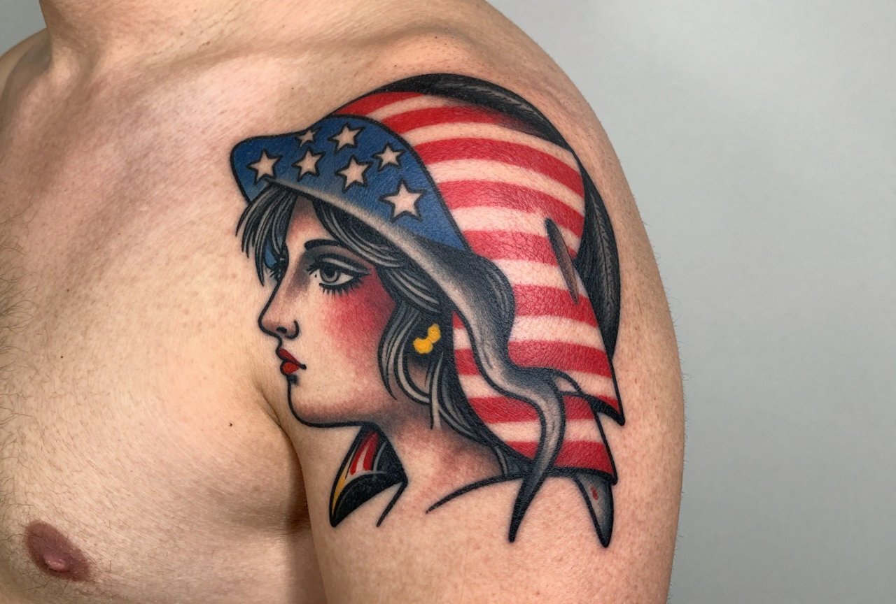
American traditional tattoos are the backbone of Western tattooing. Bold black outlines, limited color palettes, and iconic imagery that reads clear from across the room. I’ve been putting these designs on skin for over a decade, and I still love the honesty of the style. No tricks. No gradients hiding sloppy work. Just strong lines and saturated color that holds. This is the style that built the tattoo industry in this country, and it’s still what a lot of us cut our teeth on in apprenticeships. Let me walk you through what actually matters if you’re thinking about getting one.
Origins & History
American traditional tattooing grew out of the early 1900s, shaped by sailors, circus folks, and military men. The style crystallized through artists like Sailor Jerry Collins in Honolulu, working on guys who wanted something to remember the voyage by. These weren’t gallery pieces. They were badges. Proof you’d been somewhere, done something, survived something.
The constraints of the time forged the style. Artists worked with handmade machines, limited ink supplies, and skin that might not see a touch-up for years. That necessity became virtue. Bold lines stayed bold. Simple shapes stayed readable. The limitations became the aesthetic.
From Sailor Jerry to Today
Sailor Jerry, Don Ed Hardy, Bert Grimm, these names still echo in every shop. Jerry’s flash sheets are practically scripture. I’ve got reproductions pinned above my station. The imagery hasn’t changed much because it didn’t need to. Eagles, ships, pin-ups, panthers, snakes, daggers through hearts. These motifs carry weight because generations have worn them. When I tattoo a swallow on someone’s hands, I’m connecting them to a lineage that stretches back a hundred years.
Shop Culture & Apprenticeship
Most of us still learn American traditional first. My mentor had me tracing flash for months before I touched skin. “If you can’t pull a clean line,” he’d say, “nothing else matters.” The style teaches discipline. Thick outlines, solid saturation, no cheating with soft shading. In my chair, I can spot an artist’s foundation by how they handle a traditional piece. It’s the grammar of our craft.
Key Characteristics & Motifs
American traditional has rules. Break them and you’re doing something else, which is fine, but know what you’re breaking.
- Bold black outlines: Usually 5-7RL or larger. These lines are the fence that keeps your tattoo from bleeding into mush over decades.
- Limited color palette: Red, yellow, green, blue, black. That’s the classic set. Each color has specific mixing traditions. We still talk about “Sailor Jerry red.”
- Minimal shading: When present, it’s whip shading or sparse black fill. No smooth gradients. The contrast is the point.
- 2D presentation: Flat perspective, no dramatic foreshortening. The image reads like a symbol, not a photograph.
- Iconic imagery: Eagles, anchors, roses, skulls, pin-ups, panthers, snakes, ships, daggers, swallows, hearts with banners.
I tell clients: if you want something that looks like a painting, this isn’t your style. American traditional is graphic design for skin. It should punch you in the eye from ten feet away.
The Banner Problem
Everyone wants a banner with a name or date. Fine. But I warn people: script ages differently than imagery. Those tight loops in “Mom”? They blur. I space letters wider than feels natural. Better slightly too loose than illegible in five years. I’ve seen too many memorial banners become brown smears because the artist treated them like a fine-line piece.
Color vs Black and Grey
Classic American traditional is color. But black and grey traditional has its own following, especially on the West Coast and in prison-influenced work. The rules stay the same: bold lines, solid fill, high contrast. Just no red, no green, no yellow.
Color holds better than people think. The old “black lasts, color fades” thing is mostly myth. Cheap color fades. Well-saturated quality pigment stays. I’ve got fifteen-year-old trad pieces on my own arms that still pop. The black outline does the heavy lifting, it creates a reservoir that traps ink and slows migration.
Black and grey can look stunning on darker skin tones where color saturation is harder to achieve. But it can also look unfinished to traditionalists. I discuss this honestly with clients. Sometimes we do a hybrid: black and grey with one accent color, a single red rose or yellow eye. That choice alone changes the whole feel.
Best Placements
American traditional was designed for the body. These tattoos were meant to be seen, not hidden.
- Forearms: The classic billboard. Flat, visible, heals well. I’ve done hundreds of eagles and ships here. The muscle movement adds life without distorting the image.
- Upper arms/shoulders: Traditional half-sleeves built from separate pieces. The “patchwork” look is authentic to the style’s history.
- Chest: Bold centerpieces. Panthers, eagles, ships across the pecs. The sternum bone makes lining tricky, I’ve learned to stretch skin differently there.
- Hands and knuckles: Hard to hide, harder to heal. The skin regenerates fast here. Traditional motifs work because they’re readable even with some blowout. LOVE/HATE. HOLD FAST. Small anchors. We see this a lot in old-school shops.
- Thighs and calves: Great real estate for larger pieces. The calf muscle provides a stable canvas. Thighs allow for big ships, full pin-ups, detailed snakes coiling around daggers.
Necks and faces? We do them, but I have the conversation. This style is already attention-getting. Placement amplifies that. I won’t put a traditional eagle on someone’s throat for their first tattoo. That’s shop culture, not snobbery. We want you employed and happy with the choice in ten years.
Who It Suits
American traditional doesn’t care about your aesthetic tribe. I’ve put trad tattoos on punk kids, on grandfathers getting their first piece at sixty-five, on corporate lawyers who want something that won’t look dated. The style is democratic.
What matters is your tolerance for visibility. These tattoos don’t whisper. The bold lines and saturated color draw eyes. If you need your ink completely hidden for work, consider placement carefully. A trad piece on your upper arm is easy to cover. The same design on your forearm becomes part of every handshake.
Skin type matters too. Very dry or very oily skin both challenge longevity, but the bold construction of traditional work forgives more than fine-line styles. I’ve watched traditional tattoos age beautifully on skin that destroyed delicate watercolor pieces. The style was built for real bodies, not Instagram.
Modern Variations
Contemporary artists play with the formula. “Neo-traditional” keeps the bold outlines but adds more detail, more dimension, more colors. Japanese influences creep in with background waves or wind bars. Some artists push into almost painterly territory while keeping that black fence around everything.
I enjoy working in these spaces, but I distinguish them for clients. “If you want classic American traditional,” I say, “we’re doing it like they did in 1950. If you want my interpretation, that’s different. Both are valid. Which conversation are we having?”
The “ignorant style” trend, deliberately wonky, almost childlike traditional, divides shops. Some artists hate it as disrespect to craft. Others see it as punk’s natural evolution. I’ve done a few. The clients know exactly what they’re asking for. The irony is intentional. The technical challenge is real: making something look “bad” in a specific way requires control.
Choosing an Artist
Not every artist who can tattoo can do American traditional well. The style looks simple. That’s the trap. A wobbly line you might hide in a realism piece with shading becomes a screaming error in traditional work. There’s nowhere to hide.
- Look at healed photos: Fresh trad tattoos look great. Healed ones tell the truth. Ask to see work from a year prior. Good artists keep these.
- Check their line weight consistency: The outline should be uniform. Tapering where it shouldn’t, or blowout that widens unpredictably, signals problems.
- Ask about their apprenticeship: Most solid trad artists learned from someone who learned from someone. The lineage isn’t everything, but it matters in this style.
- Flash availability: Artists who draw their own flash sheets, who contribute to the visual vocabulary, usually respect the tradition more than those working exclusively from purchased designs.
I turn down work that wants traditional linework with non-traditional subject matter. Not because I’m difficult, because the style carries meaning through its motifs. A traditional eagle means something. A traditional rendering of your pet cat? That’s a mismatch of grammar and content. Find an artist who understands the difference.
Final Thoughts
American traditional tattooing endures because it works. The bold lines survive aging. The limited palette stays readable. The imagery connects to something larger than fashion. I’ve watched trends come and go, watercolor, geometric mandalas, single-needle fine line, and traditional keeps its seat at the table. Not because it’s conservative. Because it’s honest about what tattoos are: permanent marks on imperfect skin, designed to last longer than the moment of their making.
If you’re considering your first piece, American traditional offers clarity. If you’re adding to a collection, it offers grounding. Either way, find an artist who loves the style enough to do it right. The lineage deserves that respect. Your skin deserves that care. And ten years from now, when the lines have settled and the color has matured, you’ll have something that looks like it was always meant to be there.
Frequently Asked Questions
How painful is American traditional compared to other styles?
The pain level depends on placement, not style. However, traditional artists often work faster than realism specialists because we’re not doing delicate shading passes. A bold line goes in once, solid. Some clients find this more intense momentarily but appreciate getting through the piece quicker.
Can I get American traditional if I have darker skin?
Absolutely. The bold black outlines read beautifully on all skin tones. I may adjust color choices, deeper reds and blues rather than pastels, sometimes favoring black and grey with strategic color accents. A knowledgeable artist will discuss this during consultation, not avoid it.
How much should I expect to pay for a quality American traditional piece?
Good traditional work isn’t cheap, and cheap traditional work isn’t good. Small pieces might start around $150-250, with larger work going hourly. The artist’s speed matters here, experienced trad artists often work faster, so hourly rates can actually save money compared to slower styles. Don’t bargain shop for permanent art.
Is it okay to mix American traditional with other styles in a sleeve?
You can, but it requires planning. I’ve seen beautiful sleeves that transition from traditional to Japanese, but they need a skilled artist to bridge the visual languages. Patchwork sleeves of all traditional pieces are classic and coherent. Mixing without intention looks like a collection, not a composition.