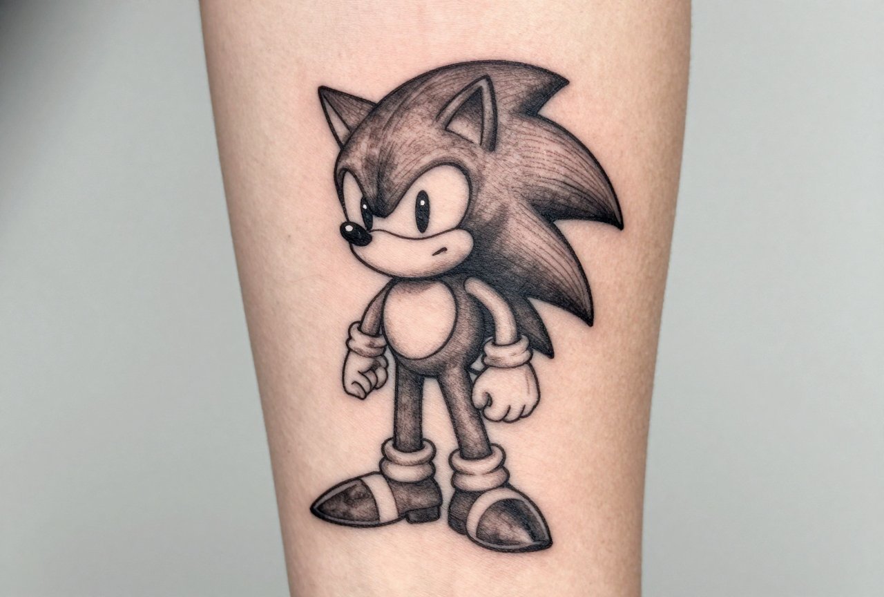
I’ve tattooed more Sonic the Hedgehog pieces than I can count. This little blue blur holds up surprisingly well in skin. There’s something about that early-90s Sega energy that translates to bold, readable tattoos aging better than you’d expect. In my chair, I’ve seen everything from tiny ankle pixels to full back pieces of Super Sonic. The character’s design was built for tattooing from day one: strong silhouettes, a limited color palette, and an instantly recognizable profile even at small sizes. But not every Sonic idea works everywhere, and some approaches look dated fast. Here’s what actually works, what real shop experience teaches you, and how to make yours something you’ll still want to show off in ten years.
Styles That Actually Hold Up on Skin
Style choice makes or breaks a Sonic tattoo. I’ve watched clients bring in reference from fan art sites that looked incredible on screen and turned into a muddy mess on skin. Here’s what survives the translation.
Classic 2D Sprite Work
Pixel art tattoos are having a real moment, and Sonic’s 16-bit sprites are perfect for the format. The limited color count, mostly blue, peach, white, red, and black, keeps things clean. I did a Sonic 1 running sprite on a guy’s forearm last year, about three inches tall, with bold black outlines around each pixel block and no blending. Two years later, it still reads crisp from across the room. The trick is sizing: too small and the pixels blur together; too large and you lose that authentic retro feel. For a full sprite, I recommend four to six inches minimum.
Modern 3D Rendered Style
Here’s where it gets tricky. Sonic’s modern green-eyed, longer-quilled design carries more detail, more gradients, more everything. That doesn’t age as gracefully. I’ve tattooed Adventure-era Sonics that looked amazing fresh but softened faster than the classic style. If you want modern Sonic, commit to touch-ups every few years. Better yet, let your artist simplify the design: keep the energy, lose the unnecessary detail.
- Neo-traditional: bold lines, limited shading, Sonic treated as a classic tattoo subject
- Blackwork silhouette: just the spines and profile, no color required
- Japanese influence: Sonic integrated with waves, wind bars, or cherry blossoms
- Minimalist line art: single needle, small format, for discreet placement
Design Ideas Beyond the Character
Not everyone wants Sonic’s face staring back at them forever. Some of the best pieces I’ve done use the franchise universe without putting the mascot front and center.
Chaos Emeralds and Iconography
The seven Chaos Emeralds are tattoo gold. Each has a distinct color, they work individually or as a set, and the cut-gem geometry holds line quality beautifully over time. I’ve done emerald clusters on collarbones, single emeralds behind ears, and a full color spectrum running down someone’s spine. Rings are another strong choice: gold bands with that distinctive sparkle, sometimes trailing like Sonic’s pickup animation. These work as filler, background elements, or standalone pieces.
Level Elements and Enemies
Green Hill Zone’s checkered ground. The spinning save posts. A single Motobug or Crabmeat. These deep cuts signal real fandom without announcing it loudly. I tattooed a checkerboard pattern wrapping a guy’s calf with no Sonic visible, and every gamer who saw it knew exactly what it was. Badniks are especially strong: their simple, mechanical designs were practically made for tattooing. Clean lines, limited colors, instant nostalgia.
- Item box with your personal “power up”: speed shoes, shield, or invincibility stars
- Zone title cards in that distinctive font
- Tails’ twin tails spinning, abstracted into a motion design
- Knuckles’ fist emerging from a Master Emerald shard
- Shadow’s inhibitor rings, broken or intact
Placement: Where the Design Actually Lives
Location changes everything. Sonic’s running pose has directionality. He’s always moving left to right in our cultural memory, and that matters for flow on the body.
Forearms are the natural home. The vertical or horizontal space fits a running pose perfectly. I’ve placed Sonic dozens of times to look like he’s racing up the inner forearm toward the elbow. Outer forearm gives more flat real estate for detail work. Either way, the shape of the limb works with the character’s energy.
Calves work great for action poses. The muscle curve echoes a spin dash or jumping arc. Thighs give room for full scene pieces: Green Hill background, multiple characters, comic-book story moments. Smaller spots suit subtler pieces, behind the ear for a single ring or tiny emerald, the wrist for minimalist line work, the ribs for something personal.
Chest pieces can work but watch for distortion. Sonic’s round head on a curved pec can warp unexpectedly. Always stencil, then have clients flex, stretch, and move around before committing. Hands and fingers? I talk people out of this more than I agree to it. The blue fades fast there, and the face detail becomes unrecognizable. If you must, go with a simple ring or the “S” logo.
Color Choices and the Aging Reality
That bright Sonic blue is iconic and it’s also a commitment. Blue pigment, especially lighter blues, tends to drift toward green or gray over time. I’ve seen fresh pieces that looked electric and five-year-old ones that read more teal.
The Blue Problem
I use a darker base blue than the reference suggests, sometimes with a touch of violet to keep it from going green. The face and belly peach holds better than you’d expect. Warm tones age more predictably. White highlights almost always yellow or disappear, so I use negative space for “white” areas instead of packing white pigment.
Black and Grey Options
Some of my favorite Sonic pieces have no color at all. A black and grey Sonic with heavy whip shading, done in a traditional style, reads as timeless rather than dated. The spines become pure flow and movement. I did one years ago where Sonic was implied entirely through negative space, spines carved out of black fill. It still looks as strong today as it did fresh off the needle.
- Full color: commit to touch-ups, protect from sun, budget for maintenance
- Limited color: just blue and red, let the black line carry the image
- Black and grey: ages best, reads from a distance, never goes out of style
- Single color accent: all black with one emerald green eye, for example
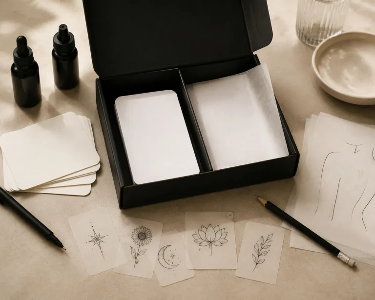
What to Bring Your Artist and How to Prepare
Bring actual game screenshots, not other people’s tattoos. Source from the original Genesis games or official Sega art, not Instagram copies of copies. Your artist needs clean material to design from. I’ve lost count of how many times someone shows me a tattoo found online and wants “the same thing.” That image is already degraded through multiple generations. Start fresh from the source.
Think about your future self. That hyper-detailed Sonic Adventure 2 render looked incredible at fourteen. Will it still feel right at forty? Classic designs have lasted over thirty years for a reason. Clients in their thirties and forties getting Sonic pieces now almost always lean toward the 16-bit era. That specific nostalgia doesn’t fade the way later iterations tend to.
Trust your artist’s redraw. Those gradients on Sonic’s arms in the reference will look like a bruise in two years. The tiny details in his eyes will blob together as the skin settles. Your artist will suggest solid color blocks or hatching instead. That’s professional knowledge from watching tattoos age, not artistic ego.
Budget for the work, not just the character. A proper Sonic tattoo takes time. The blue alone needs multiple passes for saturation. Cutting corners on cost gets you a faded blob in five years. I’ve done cover-ups of cheap Sonic tattoos. They’re never fun to fix and always more expensive than doing it right the first time.
The Character Was Designed for This Medium
Sonic tattoos work because the character was built with bold shapes and a constrained color palette from the start. Yuji Naka and the Sega team at AM8 created something in 1991 that accidentally became perfect for tattooing. You can go as subtle as a tiny pixel on your ankle or as ambitious as a full Mobius sleeve. The key is respecting what skin does over time. It moves, it ages, it lives. The best Sonic tattoos keep the energy, the speed, and the attitude, but translate them into something that genuinely belongs on a body. Bring clean source material, listen to your artist’s feedback, and plan for maintenance. That blue hedgehog can look incredible for decades if you approach it right.
Frequently Asked Questions
Will a Sonic tattoo look dated in ten years?
Classic 2D designs age better than modern 3D renders. The 16-bit sprite style has already lasted thirty years and shows no sign of feeling dated. Stick to bold, simple designs over hyper-detailed modern references.
How much does a full-color Sonic tattoo typically cost?
A palm-sized full-color Sonic runs $300-600 at most shops, with larger pieces or multiple characters climbing toward $1,000 or more. The blue saturation requires extra pass time, so budget accordingly rather than hunting for the cheapest option.
Can Sonic’s face be done small, like on a wrist or behind the ear?
Anything smaller than three inches for Sonic’s full face is risky. The eye and mouth details blur together at tiny sizes. Behind the ear, consider a single ring or emerald instead. Wrist placement works better for minimalist line art or a clean silhouette.
Do I need permission from Sega before getting a Sonic tattoo?
No. Tattoos fall under personal use, and no artist I know has ever encountered legal issues with character tattoos. That said, tattoo artists cannot legally sell pre-made Sonic flash or merchandise featuring the character without a license.