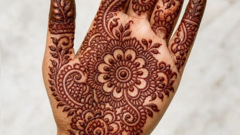
I’ve had a client sit in my chair with a printout of the Hilton of Cadboll stone, pointing at those spirals and saying, “I want that.” Not Celtic. Pict. There’s a difference, and any artist who’s done their homework knows it. The Picts were Scotland’s tattooed tribes, literally named for the pictures they wore on their skin. That word, Pict, comes from the Latin picti, meaning painted or tattooed. These weren’t decorative dilettantes. We’re talking about warriors who marked themselves with spirals, beasts, and geometric patterns that meant something fierce and personal. If you’re drawn to this imagery, you’re not picking a trend. You’re reaching back to some of the earliest documented tattoo culture in Britain. Here’s how to do it right.
Popular Styles
Pict art survives mostly in stone carvings, so the visual language is specific. I’ve tattooed enough of these to know what translates and what dies on the skin.
Classical Stone Motifs
The real deal: spirals, double disks, Z-rods, V-rod notched rectangles, and those incredible beast symbols. The Pictish beast, part horse, part dragon, part sea creature, shows up on cross slabs all over eastern Scotland. In my experience, the double disk and Z-rod reads beautifully as a chest piece or upper arm band. It’s graphic, immediate, recognizable to anyone who knows the material. The spirals work better as fill or background; alone they can look like generic Celtic knockoff to the untrained eye, which defeats the purpose.
Modern Interpretations
Some clients want the feeling of Pict art without replicating a museum piece. I’ve done pieces where we take the V-rod geometry and stretch it, make it more angular, pair it with contemporary blackwork techniques. One guy wanted his clan’s animal, the boar, rendered in that Pictish interlace style but with negative space cutting through it. We see this a lot: people honoring the source without being imprisoned by it. The key is knowing the rules before you break them. Study the Aberlemno stones, the Sueno’s Stone. Then talk to your artist about what you need it to say.
- Authentic replication: Best for history buffs, heritage pieces, large back or thigh work
- Stylized fusion: Mixes Pict geometry with neotribal or blackwork, good for arms, calves
- Minimalist extraction: Single spiral or beast head, small, clean, often behind ear or on wrist
Design Ideas
Here’s where I get practical. The stone record gives us categories, and I’ve watched certain ones land harder than others.
The Pictish Beast: This is the showstopper. It’s not quite any animal that ever lived, which is the point. I’ve tattooed it wrapping a forearm, head at the wrist, tail disappearing toward the elbow. The interlace in its body gives the artist room to move, to adjust for muscle structure. It ages well because the lines are bold, the negative space is intentional.
Symbols and Their Meanings: The mirror and comb, feminine symbols, probably. The crescent and V-rod, maybe lunar, maybe warrior. The tuning fork, the snake, the salmon. I tell clients: we don’t know what most of these meant to the Picts themselves. Scholars argue. What matters is what you decide they mean. One woman chose the mirror and comb for her mother, who was a hairdresser. Another guy got the salmon because he was a fisherman and the Pictish salmon is gorgeous, flowing, alive.
Combining Elements: My favorite piece last year was a full back: the double disk and Z-rod across the shoulder blades, Pictish beast descending the spine, spirals filling the gaps. Took three sessions. Healed like a dream because we planned the black saturation carefully, heavy where it needed to be heavy, open where skin tone does the work.
Best Placements
Large-Scale Work
The stones are big. The art expects room. Thigh pieces, full backs, chest panels, these let the interlace breathe. I’ve done a Pictish beast on a calf that wrapped beautifully; the muscle curve became the creature’s back. The forearm works for smaller symbols, but be careful: too small and the detail blurs over time. I generally won’t go below three inches for the beast head, two for a clean double disk.
Smaller, Strategic Spots
Behind the ear, a single spiral or small symbol. The wrist, if you’re willing to go bold and simple, no fine interlace there, it’ll mush. I’ve seen the mirror and comb done beautifully on a collarbone, the symmetry landing right. Ribs? Only if you want to suffer and only if the piece is substantial enough to justify the real estate. A tiny Pict symbol lost on ribs looks like a mistake, not a choice.
- Best for detail: Thigh, back, upper arm, calf
- Best for simplicity: Wrist, behind ear, collarbone, ankle
- Avoid: Fingers, toes, anywhere the skin turns over fast and the lines are fine
Color Choices
Here’s the truth: the stones don’t tell us what colors the Picts wore. We have educated guesses. Woad? Maybe. Iron-based pigments? Likely. But the carvings themselves are stone on stone, and that aesthetic has shaped how we see this art.
Black and Gray: The default. The stone look. I’ve tattooed Pict designs in solid black, in graywash, in dotwork that mimics weathered granite. This ages best. Black holds. The geometric precision of Pict art demands clarity, and black gives it.
Earth Tones: Some clients want color. I steer them toward ochre, rust, deep green, bone white. Colors that feel dug from the ground. One piece I did used a muted blue in the beast’s eye, just that, a hint, because the client said his grandmother’s eyes were that color. It worked because it was restrained.
Bright Color: Honestly? I talk people out of it. Neon Celtic-Pict fusion looks like a video game. The source material is stone, earth, time. Respect that or pick a different tradition.
Tips for Choosing
After years of this, I have a routine. Client sits down, says Pict, I ask three things.
Do your homework beyond Google: The Picts weren’t Celts, though they’re often lumped together. Their art is distinct, more abstract, more geometric, less flowing than Irish Celtic work. I’ve had to gently correct someone who brought in a Book of Kells illumination and called it Pictish. The books are different. Know which one you want.
Find an artist who knows the material: Not every tattooer can read a symbol stone. Look for someone who’s worked with historical Celtic or Pictish art before. Ask to see healed photos. The interlace has to be consistent; one broken line and the whole pattern looks sloppy, not ancient.
Think about aging: Those fine lines in a Pictish beast’s mane? Gorgeous on day one. In ten years? I’ve seen them blur into soup. Plan for bold. Where the stone carvings have depth, your tattoo has black. Use that.
Make it personal: Heritage helps, but it’s not required. One of my clients had zero Scottish blood; he was a stone carver himself, drawn to the craft. Another was a history teacher who’d written her thesis on the Picts. The best pieces come from real connection, not costume.
- Research the symbol stones directly: Aberlemno, Hilton of Cadboll, Sueno’s Stone
- Ask your artist about line weight and how it’ll settle in five years
- Consider the story you want, not just the image you saw
- Budget for the time it takes, interlace is slow, careful work
Final Thoughts
I still remember that first client with the Hilton of Cadboll printout. We ended up doing a simplified beast on his shoulder, the stone’s border pattern wrapping down his arm. He came back two years later, the black still solid, the lines clean, and said strangers stopped him to ask what it meant. That’s the thing about Pict tattoo designs. They carry weight. They’re not common. They speak of a people who marked themselves as warriors, as belonging to something older and fiercer than the moment.
If you’re going to wear this, wear it with knowledge. Study the stones. Find an artist who respects the source. And when you sit in the chair, know that you’re continuing a tradition that was old when Rome was young. The Picts didn’t have Instagram. They had stone, skin, and meaning. That’s enough.
Frequently Asked Questions
How do Pict tattoos differ from Celtic tattoos?
Pict art is more geometric and abstract than Irish Celtic work, with distinct symbols like the double disk, Z-rod, and the Pictish beast. Celtic art tends toward flowing knotwork and interlace, while Pictish stone carvings feature sharper angles and unique symbolic vocabulary that scholars still debate.
Will fine interlace details blur over time?
Yes, extremely fine lines in interlace patterns tend to spread and soften as skin ages. I always advise clients to go bolder than they think they want, especially for pieces that will be seen at a distance. Healed photos from your artist’s portfolio will show you exactly how their line work settles.
Can I get a Pict tattoo if I’m not Scottish?
Absolutely. I’ve tattooed Pict designs on people with no Scottish heritage whatsoever. What matters is genuine connection, whether that’s to the art form, the history, or a personal meaning you’ve developed. The Picts themselves were a mix of peoples, and their art belongs to anyone who approaches it with respect.
How long does a detailed Pict beast piece take?
A full forearm wrap with interlace and beast imagery typically runs three to four hours minimum. Large back pieces with multiple symbols can take eight to twelve hours across multiple sessions. The interlace demands precision; rushing it ruins the effect, so budget time and money accordingly.