Don Ed Hardy built a visual language that still saturates tattoo culture. Before the clothing brand, before the celebrity endorsements, he was a working artist who merged classic American sailor flash with Japanese ukiyo-e composition, Mexican folk art color, and California car-culture attitude. His actual tattoo work, bold eagles, snarling tigers, swimming koi, sacred hearts, and reaper sleeves, remains some of the most referenced flash in shops worldwide. If you’re considering a Hardy-inspired piece, you’re choosing a design with decades of proven visual impact, but the execution matters enormously. Here’s how to get it right.
Popular Styles and Motifs
American Traditional Foundations
Hardy trained under Sailor Jerry Collins in Honolulu, and that lineage shows in every line. His American traditional work features thick black outlines, limited but saturated color palettes, and immediate readability from across a room. Eagles with spread wings, clipper ships in churning seas, pin-up women, and banners reading “Hold Fast” or “Born to Lose” all appear in his flash sheets. The difference from standard trad? Hardy’s compositions tend toward asymmetry and movement. An eagle might dive rather than pose; a ship lists at a dynamic angle. When choosing this style, insist on bold line weight, thin lines blur and age poorly on these designs.
Japanese Fusion Elements
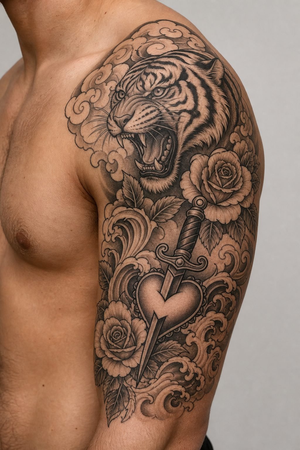
Hardy studied Japanese tattooing formally, unlike many of his American contemporaries who borrowed surface imagery. His tigers, dragons, and koi fish respect the Japanese approach to flow and negative space. A Hardy tiger typically wraps a limb with the body following muscle contours, mouth open in a roar that shows teeth and tongue in specific traditional arrangement. Koi swim upward against current, scales rendered in careful pattern rather than generic texture. The key fusion element: Hardy often inserted American boldness where Japanese work would use subtle gradation. His backgrounds might be solid color blocks rather than delicate wind bars or water spirals.
- Tigers: best with orange, black, and white; green eyes common accent
- Koi: traditionally red, gold, or black; scales need individual attention
- Dragons: rarely full-body in Hardy’s work; more often head and claw compositions
- Sacred hearts: flaming, thorn-crowned, often with banner and name
Design Ideas That Hold Up
Not every classic image translates well to modern skin. Some Hardy motifs have proven longevity; others show their age in execution.
Time-Tested Compositions
The tiger head on upper arm or thigh remains visually arresting. Hardy’s version typically features fur rendered in short directional strokes rather than smooth blending, creating texture that ages well as the ink settles. The sacred heart with banner, often customized with a name or date, works across decades because the symbolism carries personal weight beyond trend. Clipper ships with full sail and visible rigging reward large-scale commitment; small versions lose the thread detail that makes them interesting.
What to Avoid or Scale Carefully
Hardy’s reaper imagery, popular in the 1990s, can read as dated if rendered in the overly dark, low-contrast style of that era. If you want a reaper, push for the earlier Hardy approach: visible bone structure, scythe with defined blade, maybe a single rose for color contrast. The “Ed Hardy brand” skulls with rhinestone eyes, those are product design, not tattoo art. Distinguish between Hardy’s actual tattoo flash and the later commercial imagery.
- Full back pieces: dragon and tiger battles, or ship in storm seas
- Half sleeves: tiger wrapping from shoulder to elbow, or koi ascending
- Chest panels: eagle with banner, or dual symmetrical sacred hearts
- Lower legs: ship on calf, or pin-up with maritime frame
Best Placements for Hardy Work
Hardy’s designs were created for specific body geometry. The tiger wrap demands a cylindrical surface, arm or leg, to achieve the coiling effect. Flat planes like chest or back require different compositional approaches.
Upper arms and thighs carry tiger and dragon wraps most naturally. The muscle curve helps sell the animal’s body flow. Forearms work well for ship designs, where the horizontal orientation matches the limb’s length. Chest pieces suit eagle spreads and sacred hearts, both traditionally centered or slightly offset to follow pectoral shape. Calves accommodate vertical compositions, koi swimming upward, or a standing pin-up figure.
Hand and finger placements generally fail with Hardy-style imagery. The bold lines require space to breathe; knuckle area distorts too much with movement. Neck placements can work for small ship wheels or swallows, but these are secondary Hardy motifs rather than his signature work.
Color Choices and Aging
The Classic Palette
Hardy’s color work relies on specific, proven combinations. Saturated red for hearts and banners, deep green for dragon scales or tiger eyes, cobalt blue for water and background elements. Yellow and gold appear in koi and decorative details. Black dominates every piece, as outline, as shading, as structural weight.
These colors were chosen partly for available ink chemistry of the era. Modern pigments offer more stability, but the palette remains effective because it offers maximum contrast against skin. A Hardy piece with muted or pastel tones misses the point; the visual punch comes from bold juxtaposition.
How These Colors Age
Red and black age most reliably, remaining distinguishable after decades. Blue can shift toward greenish tones depending on specific pigment and sun exposure. Green sometimes fades faster than other colors, becoming muddier. Yellow requires the most maintenance, either dense application or acceptance that it will soften significantly. White highlights in Hardy’s work were typically sparse and strategic; modern white ink tends to yellow or disappear, so discuss with your artist whether to include it or rely on negative space instead.
- Black: outline and core shading, essential structural element
- Red: hearts, roses, mouths, banner text
- Green: dragon elements, tiger eyes, occasional water
- Blue: water backgrounds, ship sails, some dragon variants
- Yellow/gold: koi, decorative details, limited accents
Tips for Choosing Your Design
Reference material matters enormously. Hardy’s actual tattoo flash sheets, collected in books like Wear Your Dreams and various retrospective publications, show his line work and color application clearly. Instagram screenshots of brand merchandise or second-generation copies won’t give your artist the technical information needed.
Find an artist who understands traditional application, not just traditional imagery. The difference shows in line confidence, color packing, and compositional balance. Ask to see healed photos of their bold traditional work, not just fresh tattoos. Hardy’s style requires saturation that holds; an artist who works too lightly or too delicately will produce something that blurs within years.
Consider your own skin tone when selecting color emphasis. Darker skin carries black and red with full impact; yellow and light blue may need strategic placement or heavier saturation. Very fair skin shows all colors vividly but can reveal blowouts or shaky line work more obviously. Discuss these realities with your artist rather than assuming the flash sheet translates directly.
Size and commitment correlate directly. A small Hardy-inspired piece, under four inches, loses the detail that makes the style compelling. These designs were created for visibility and presence. If you want something discreet, Hardy-inspired work may not be your best choice.
Final Thoughts
Don Ed Hardy’s tattoo legacy endures because he solved visual problems that other artists still struggle with: how to make traditional imagery feel alive, how to merge cultural influences without diluting either, how to create flash that works on actual bodies rather than just paper. The clothing brand that borrowed his name will fade; the tattoo work remains foundational. Choosing a Hardy-inspired piece means accepting a certain visual volume, bold color, heavy black, dynamic movement. It’s not subtle work. But executed well, with respect for the original compositions and proper technical application, it carries a weight and immediacy that quieter styles rarely achieve. Bring strong reference, choose an artist with traditional technical skill, and commit to the scale these designs demand.
Frequently Asked Questions
How do I tell the difference between real Don Ed Hardy flash and brand merchandise designs?
Hardy’s actual tattoo flash features hand-painted watercolor with visible brush texture, bold black line work, and specific compositional complexity. Merchandise designs are simplified vector graphics, often with added rhinestones, skulls with crossed bones, or repetitive logo patterns. Reference his books or museum collections rather than clothing tags.
Will a Don Ed Hardy style tattoo look dated in ten years?
The core motifs, tigers, koi, ships, sacred hearts, have been tattooed for over a century and remain visually effective. What dates a piece is execution quality, not subject matter. Bold line work and saturated color age better than trendy techniques like heavy watercolor or fine-line detail.
How much should I expect to pay for a quality Hardy-inspired piece?
Large traditional work with full color saturation requires significant time. A palm-sized piece might run $300-500; a full tiger sleeve could reach several thousand. Artists specializing in this technical approach often charge hourly rates reflecting their experience. The investment shows in longevity.
Can Hardy-style designs work with other tattoo styles I already have?
Traditional bold work pairs reasonably with neo-traditional and some Japanese pieces, but clashes with fine-line, blackwork geometric, or delicate ornamental styles. The visual weight differs too dramatically. Consider placement separation if your existing work occupies a different aesthetic register.