Street racing films carved out their own visual language, gritty garages, chrome under neon, the sacred geometry of quarter-mile times. A Fast and Furious tattoo isn’t about copying a movie poster onto your skin. It’s about distilling that obsession with velocity, machinery, and the crew-as-family ethos into something that holds up when the credits roll and the years pass.
Popular Styles
Photorealism vs. Graphic Boldness
Photoreal car portraits demand space. A sleeve or thigh gives the artist room to render reflections in clearcoat, the amber glow of HID headlights, tire tread texture. These pieces age gracefully only if the black saturation stays heavy, gray wash fades to mush faster than solid black line work. Budget for touch-ups every five to seven years if you go this route.
Graphic and neo-traditional approaches trade detail for longevity. Think simplified muscle car silhouettes, thick black outlines, limited color blocks. A ’70 Dodge Charger rendered in four colors reads instantly from across a room and still looks crisp at fifteen years. The trade-off: you lose the drool-worthy chrome realism, but gain a tattoo that doesn’t turn into a smudgy ghost.
Japanese Influences
The franchise’s Tokyo Drift chapter opened the door to kanji numerals, rising sun motifs, and koi fish swimming through smoke. These hybrid designs work best when handled respectfully, actual Japanese tattoo artists or those deeply trained in irezumi techniques, not random letter generators. Kanji for “family” (家族, kazoku) or “speed” (速, haya) carry weight; get them wrong and the error is permanent.
Design Ideas
- Dom’s Cross Necklace: The iconic silver cross from the first film translates to skin as a small chest piece, collarbone accent, or even a hand tattoo. Simple line work in black or gray; some add a thin red drop for the blood-brother moment. Keep it under three inches for authenticity to the prop’s actual scale.
- NOS Tank and Gauge: A nitrous oxide bottle reads as pure racing culture even outside film context. Popular as a forearm piece, sometimes with the gauge needle pinned in the red zone. Shading on the metal cylinder separates amateur from accomplished, smooth gradients suggest polished aluminum, flat color looks like a cartoon.
- Quarter-Mile Clock: The 10-second timer, frozen at 9.96 or whatever your personal best might be. Works as a circular design on the shoulder cap, or stretched horizontally across the ribs. The digital number font matters, find reference from actual drag racing timers, not generic alarm-clock type.
- “Ride or Die” Script: Typography tattoos live or die by letter spacing and flow. Cursive with too much flourish turns illegible; too blocky and it reads as military stencil. Best placement: inner bicep, rib cage flowing with the body’s curve, or across the upper back in a straight banner. Black ink only; color ages poorly in fine script.
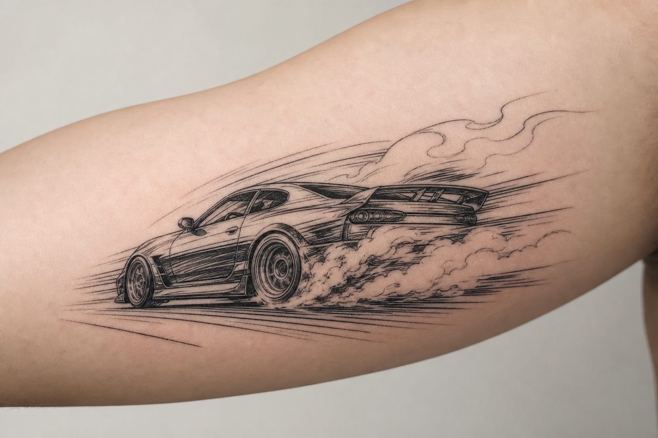
- Car Silhouettes: The Charger R/T, Supra MK IV, R34 Skyline, or Lykan HyperSport. Side profiles work as band tattoos around the calf or forearm. Three-quarter front angles need more width, chest panels or upper back. Negative space for windows and grilles keeps the design from becoming a black blob.
Best Placements
High-Visibility vs. Concealed
Forearms broadcast the affiliation. Car culture thrives on showing off, and a forearm piece gets airtime at every car meet, every handshake, every steering wheel grip. The downside: sun exposure fades ink faster here than under clothing. Commit to SPF 50 or watch your Supra dissolve into a blue smear.
Ribs and thighs hide easily for professional settings but offer the real estate for complex compositions. A full scene, car, skyline, smoke, quote, needs the thigh’s flat canvas or the rib’s vertical stretch. Pain level runs higher on ribs; the needle vibrates against bone with every line. Plan shorter sessions, more of them.
Hands and Fingers
Small icons, gear shifts, piston outlines, the “FF” logo, fit knuckles or the web between thumb and index finger. These spots blur notoriously fast from movement and friction. Expect significant fading within three to five years. Some artists refuse hand tattoos for first-timers; the commitment is permanent and the job market still judges.
Color Choices
Black and gray dominates automotive tattooing for good reason. It mimics chrome, asphalt, and smoke. Color enters when you want the specific orange of a Hemi ‘Cuda, the lime green of a Eclipse from the first film, or the purple and green of Brian’s Supra. Those bright tones, especially orange, yellow, and light green, fade fastest. They require larger saturation areas to maintain visibility as they age; tiny color accents disappear into skin tone within a decade.
White ink for highlights on headlights or chrome trim sounds clever but rarely delivers. Most white heals to a yellowish or skin-tone shadow, visible only against heavy black. Use it sparingly, if at all. Metallic inks (actual shimmer or glow) are gimmick products with poor safety profiles and worse longevity. Skip them.
Tips for Choosing
Reference Quality Matters
Bring your artist high-resolution photos from multiple angles, not screenshots. A paused Blu-ray frame at 1080p beats a compressed JPEG every time. For car portraits, include shots of the actual vehicle, not just the movie prop, Hollywood cars get modified, damaged, and rebuilt between takes. The “same” car might have different wheels, spoilers, or badging across scenes.
Artist Specialization
Not every talented portrait artist understands automotive perspective. Wheel ellipses, hood proportions, and reflection logic separate car specialists from generalists. Scroll their portfolio for machines, not just faces. A motorcycle specialist often translates better to car work than a pet portrait artist. Ask directly: “How many vehicles have you tattooed?” Honest artists refer out when the subject exceeds their comfort zone.
Scaling Reality
Intricate engine bay details, individual lug nuts, dashboard gauges, these tempt the enthusiastic fan. At small scale, they become gray mush. Simplify. A valve cover with bold lines reads better than a hyper-detailed V8 where every spark plug wire merges into gray spaghetti. Your artist should push back on unworkable detail; if they promise everything at two inches wide, find someone else.
Final Thoughts
The best Fast and Furious tattoos outlast the franchise’s release cycle. They work because the imagery, speed, loyalty, mechanical devotion, predates the films and will outlive them. Choose symbols that resonate beyond the screen. A cross for family, a timer for obsession, a silhouette for the machine that haunts your dreams. Execute with technical respect for the medium: bold lines where possible, realistic expectations for color, placement that suits your actual life rather than your fantasy of it. The ink stays. Make sure the reason does too.
Frequently Asked Questions
Will a photorealistic car tattoo still look good in ten years?
Photorealism fades faster than bold graphic styles. Plan for touch-ups and protect it from sun. Black-heavy designs with clear contrast age much better than fine gray wash or subtle color gradients.
Is it weird to get a Fast and Furious tattoo if I’m not a street racer?
Not at all. Car culture tattoos celebrate appreciation, not participation. Most people wearing nautical themes aren’t sailors either. The key is genuine connection to the imagery, not credential-checking.
How much should I budget for a detailed car sleeve?
Full photorealistic sleeves run multiple sessions at several hundred dollars per session minimum. Simple graphic silhouettes or script cost far less. Discuss session breakdown with your artist before starting.
Can I combine Fast and Furious imagery with other car culture references?
Absolutely. Many designs blend JDM icons, American muscle, and racing symbols into personal collages. The cohesive factor is usually consistent style, don’t mix photoreal Supra with cartoon Mustang in the same piece unless your artist specifically designs that contrast.
