Thirty-plus years later, the Goonies still hits that exact spot between childhood nostalgia and genuine adventure. Translating that into a tattoo means choosing imagery that works as body art, not just a screenshot on skin. Some references age better than others, both in film legacy and in how they sit in your skin for decades. Here’s what actually works, where to put it, and how to keep it readable long after the last VHS copy dies.
Popular Styles That Work
Traditional American
Bold lines, limited color palette, heavy black outlines, this style was practically built for pirate skulls and crossed bones. The One-Eyed Willy skull translates beautifully into traditional: exaggerated eye socket, clean jawline, maybe a dagger or doubloon tucked underneath. Traditional’s thick lines mean the piece stays readable even as it softens over fifteen years. The downside? You’re committing to a specific aesthetic that might not suit every reference from the film.
Black and Gray Realism
Want the actual skull from the movie, weathered and barnacle-crusted? Black and gray can render that texture, the wood rot, the salt damage, the hollow eye catching shadow. This style demands a larger minimum size, though. Too small and the subtle gray washes muddy together into a gray blob. For facial portraits of the kids, realism is risky; their young faces are recognizable but also very specific, and a slight proportion miss reads as “generic child” rather than “Mikey.”
Neo-Traditional and Illustrative
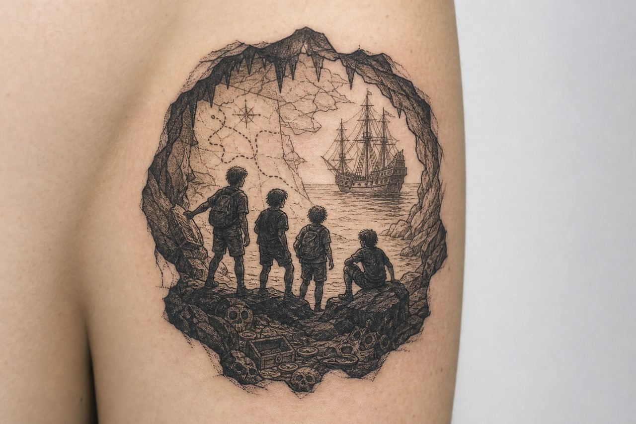
The sweet spot for most Goonies imagery. Neo-traditional keeps the bold outlines and readable color of traditional but allows more detail, more varied line weight, more atmospheric background elements. Perfect for the lighthouse, the cavern entrance, or the Inferno itself with sails full and tattered. Illustrative work, think Mike Mignola heaviness, or the actual movie poster’s painterly quality, can incorporate multiple scenes without looking cluttered.
Design Ideas That Hold Up
Not every iconic moment works as a tattoo. Some are too busy, too dependent on context, or just don’t resolve well at body-art scale.
- The Doubloon: Clean circular shape, instantly readable, works at palm-size or smaller. The date, the skull, the lighthouse, plenty of detail to zoom in on, or simplify to silhouette. Ages well because it’s already a flat design.
- One-Eyed Willy’s Skull: The classic. Works facing forward, in three-quarter view, or as a side-profile with the eye patch implied. Add crossed swords, a compass rose, or the key for context without crowding.
- The Key and the Map: Vertical composition, good for forearms or ribs. The key’s ornate handle gives your artist something to showcase; the map’s coastline and cryptic notes fill background. Layer them at slightly different angles for depth.
- “Hey You Guys”: Sloth’s face, or just the phrase in his jagged scrawl. The face needs a strong likeness; the text works as a banner, a collar piece, or integrated with the skull. Consider the phrase without the portrait, less risk of uncanny valley.
- The Truffle Shuffle: Chunk doing the dance. Funny now, but bodies change. A belly-focused tattoo on your own belly won’t age symmetrically. If you’re committed, consider a framed composition, Chunk as a small figure within a larger piece, not the sole focus.
- The Inferno: The ship itself, sails and all. Needs space. A small ship tattoo always looks like a toy; this needs at least a full forearm, ideally a thigh or calf, to read as a vessel with weight and presence.
Best Placements for Goonies Imagery
High-Detail Spots
The skull, the ship, any piece with fine linework in the map or doubloon, these need relatively flat, stable skin. Inner biceps, outer thighs, upper back between shoulder blades. Areas that don’t stretch dramatically with weight fluctuation and don’t see constant sun exposure. The doubloon specifically makes a great knee-ditch piece or centered on the chest; its circular shape fits those round contours naturally.
Text and Banners
“Goonies Never Say Die” has rhythm as a phrase. Straight across the collarbone works, though the bone proximity hurts and the skin there can blur slightly over time. Down the spine, each word a vertebra’s width. Around the wrist as a bracelet, risky for employment visibility, but the size fits. Rib lettering follows the curve; have your artist draft it standing, not lying flat, so the baseline arcs naturally with your body.
Small Accents
A single key. A tiny compass. These work behind the ear, on the side of a finger, or tucked into an existing patchwork sleeve. The danger is going too small: a key under an inch long loses the bit cuts and bow detail that make it recognizable as the Goonies key specifically, not just any skeleton key.
Color Choices and Aging
The Goonies palette is specific: that Pacific Northwest gray-green, the warm gold of the doubloon, the bone-white of the skull, the saturated red of Sloth’s Superman shirt. In tattoo ink, those translate differently.
- Gold and yellow: The brightest pigments fade fastest. A doubloon done in solid yellow will need touch-ups. Better: warm brown shading with strategic yellow highlights, or go full traditional with the coin as negative space surrounded by dark background.
- Reds: The Superman S on Sloth’s shirt, the bandana, blood on the skull. Quality red holds well but can spread slightly in very fine lines. Keep it bold, not whisper-thin.
- Black and gray: The cave systems, the ship’s rigging, the map’s ink. This is your structural color. Even if you want full color, anchor the piece in heavy black line or dark gray wash so it doesn’t float away as the brights soften.
- Green: The moss, the water, the general damp. Green is notoriously variable in longevity. Olive and forest tones last; neon or lime green often goes muddy. Discuss specific ink brands with your artist if you’re set on a particular shade.
One practical note: the movie’s darkness, literally, how many scenes happen in caves or at night, means shadow-heavy designs. Shadows in tattoos are black or very dark gray. Over decades, black can soften to dark blue-gray, but it stays readable. Attempting to render “darkness” with purple or blue tints instead of black often heals as bruise-colored ambiguity.
Tips for Choosing Your Piece
Reference Quality Matters
Bring your artist stills, not memories. The skull looks different in the cave, on the poster, in the final ship shot. The doubloon has two distinct sides. Know which version you want. If your artist doesn’t know the film, and many younger ones won’t, good reference prevents a generic pirate piece with a Goonies label slapped on after.
Scale to the Detail
The map’s coastline includes specific landmarks: the lighthouse, the restaurant, the country club. At three inches wide, that’s illegible scratching. At eight inches across a thigh, it breathes. Be honest about how much skin you’re willing to give. A good artist will tell you when your idea needs more real estate than you’re offering.
Consider the Companion Piece
Goonies tattoos pair well. The key and the map. The skull and the doubloon. Sloth and Chunk. If you’re planning multiple pieces, discuss layout with your artist even if you’re only doing one today. Negative space left intentionally reads as deliberate; accidental gaps look like you ran out of ideas.
- Mix close-up and wide shots: a detailed skull on one arm, the ship in silhouette on the other
- Repeat motifs: the skull appears on the doubloon, the flag, the cave entrance, use it as a visual thread
- Text as connective tissue: phrases from the film bridging separate images
Healing Reality
Any piece with heavy black fill, skull eye sockets, cave backgrounds, the ship’s hull, will peel and itch aggressively. The thick ink saturation creates a harder heal. Plan your timing; don’t get a palm-covering skull the day before a beach trip or a job with strict glove requirements. Finger and hand tattoos from the film’s key or map details? Those spots shed ink fast, need frequent touch-ups, and aren’t offered by all reputable shops due to known longevity issues.
Final Thoughts
The best Goonies tattoos capture the film’s specific texture: not just adventure, but the particular scrappiness of kids who refuse to give up their homes, their friends, their shot at something extraordinary. Choose imagery that resonates beyond the reference, something that works as a strong tattoo first, a film nod second. The skull will still look badass in thirty years even if nobody remembers the movie; the Truffle Shuffle might not survive your own body changes with the same dignity. Prioritize the art, trust your artist’s technical input, and you’ll end up with something worth showing to your own kids, maybe even your own Chunk someday.
Frequently Asked Questions
How big should a One-Eyed Willy skull tattoo be to stay detailed?
Aim for at least four to five inches in height. The eye socket alone needs room to show depth through shading, and the jaw teeth blur together below three inches. Your artist can simplify for smaller sizes, but it stops being specifically Willy and becomes generic pirate.
Will a Goonies map tattoo with all the landmarks look too crowded?
It absolutely can if you try to include every location. Pick three anchor points, lighthouse, skull, maybe the restaurant, and let negative space suggest the coastline. Or go large: a full back piece has room for genuine detail without clutter.
Is the “Goonies Never Say Die” phrase overdone as a tattoo?
It’s common, but the phrase has good rhythm and personal meaning for actual fans. Make it yours through custom lettering, integration with imagery, or placement that isn’t the obvious forearm banner. The problem isn’t the words; it’s lazy execution.
Can I get a small tattoo of just the key behind my ear?
Technically yes, but the key’s ornate bow and bit cuts need precision at tiny scale. Behind the ear also fades faster due to skin type and sun exposure. Consider the key slightly larger on the side of the neck, or simplified to its silhouette at small size.

