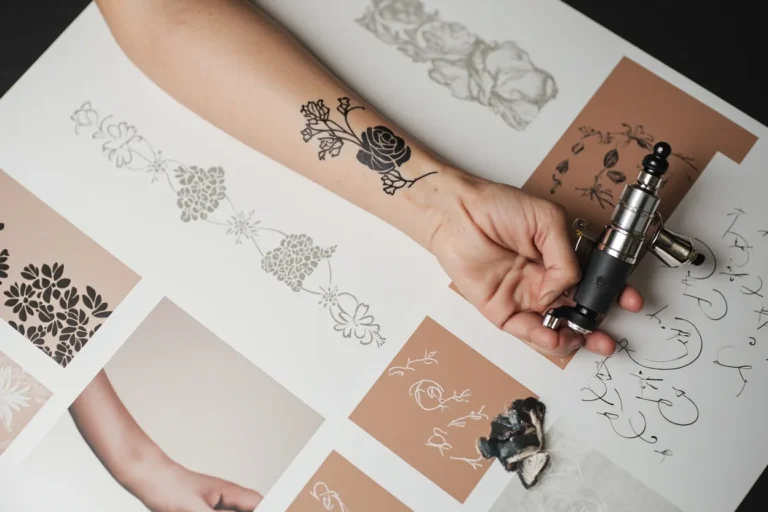
A gorgeous tattoo isn’t about chasing trends or copying what you saw on someone else. It’s about understanding how ink lives on skin, how lines soften, how color shifts, how a design that reads bold on day one settles into something different by year five. The best pieces combine technical know-how with personal intent, and they age with you rather than against you. Here’s how to think through the options and land on something that genuinely works.
Popular Styles That Hold Up
Japanese (Irezumi)
Traditional Japanese work relies on bold outlines, limited but saturated color palettes, and compositions that wrap around body parts rather than floating in isolation. Dragons, koi, cherry blossoms, and wind bars aren’t arbitrary, they create movement and flow that guide the eye across the skin. The style demands large areas to breathe; a quarter-size Japanese piece usually looks cramped and loses its impact. Full sleeves, back pieces, or thigh compositions let the imagery develop properly. The heavy black outlines and dense color packing also age exceptionally well, which is why collectors still seek out this approach decades after getting their first piece.
Black and Grey Realism
Portraits, wildlife, and soft landscapes dominate this category. The technique uses dilutions of black ink to create tonal range rather than relying on color contrast. Done well, it can be stunning. Done poorly, it muddies into grey blur within a few years. The key is contrast: even in black and grey, you need true blacks anchoring the design and clean highlights (skin tone, not white ink) providing relief. White ink itself fades fast and yellows unpredictably, so skilled artists plan around negative space instead. This style works best at medium to large scale; small realism loses detail quickly as ink spreads slightly during healing.
Neo-Traditional and Illustrative
These styles borrow the bold linework of American traditional but open up the color palette and subject matter. You get the readability and longevity of strong outlines combined with more complex shading, unconventional imagery, and compositional freedom. Animals rendered with decorative elements, stylized portraits, or surreal combinations fit here. The linework keeps the design legible over time, while the expanded color and detail options let you personalize more aggressively than strict traditional allows.
- American traditional: limited colors, bold lines, simple readable imagery, roses, eagles, ships, pin-ups
- Fine line: delicate, single-needle work; trendy but requires extremely skilled application and touch-ups
- Blackwork: solid black areas, geometric patterns, dotwork; high contrast, very durable
- Watercolor: color splashes and gradients without heavy outlines; beautiful fresh, challenging to maintain long-term
Design Ideas That Actually Work
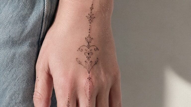
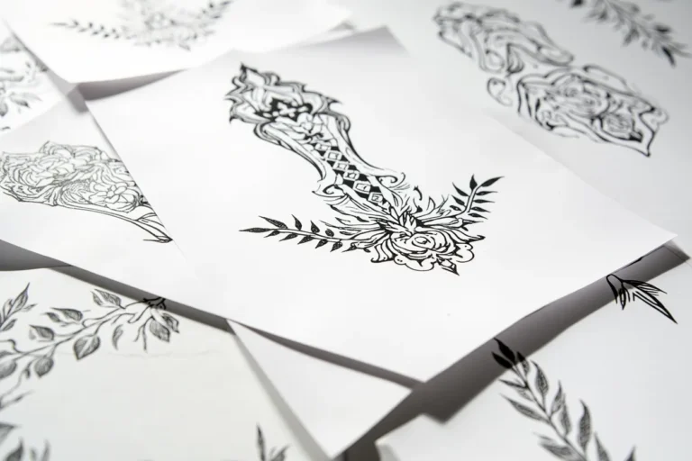
Specific subjects carry inherent technical advantages. Botanical pieces, peonies, magnolias, olive branches, offer natural line flow and layered petal structures that hide minor aging imperfections. Their organic shapes also conform well to body curves. Animal eyes and faces demand precision but reward with immediate visual impact; the trick is choosing artists who specialize in this rather than asking a generalist to attempt it.
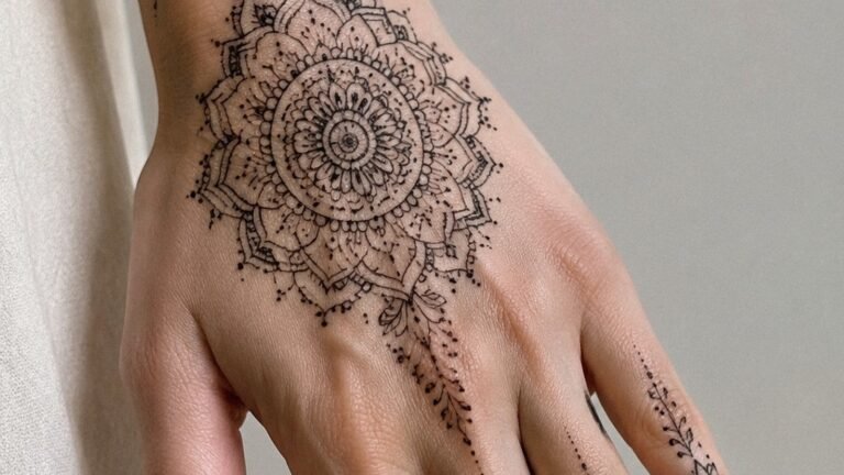
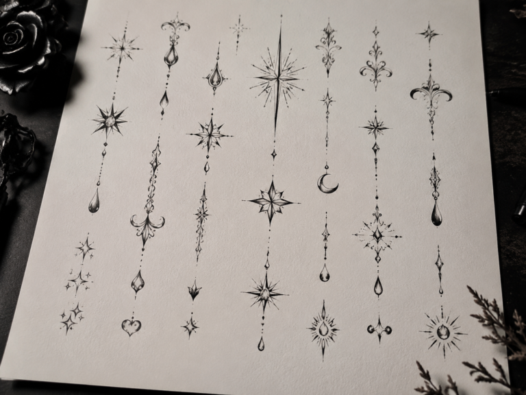
Abstract and ornamental designs bypass the literal entirely. Sacred geometry, mandala-influenced patterns, and purely decorative linework age based on their technical execution rather than representational accuracy. A slightly blown line in a geometric piece is obvious; in a soft floral, it’s often absorbed. This isn’t a reason to avoid geometry, it’s a reason to research your artist’s line consistency meticulously.
Text and lettering remain consistently popular but require specific caution. Small fonts blur. Script styles with varying line weights (thick downstrokes, thin upstrokes) often lose their contrast and become illegible. All-caps block lettering with consistent weight holds better. Placement matters enormously here: inner bicep, rib cage, and foot skin all move and stretch differently, distorting text over time.
Best Placements for Long-Term Quality
High-Visibility, Low-Distortion Areas
The outer upper arm, outer thigh, and upper back (between shoulder blades) experience relatively stable skin over decades. These areas don’t stretch dramatically with weight fluctuation, aren’t subjected to constant friction from clothing, and receive moderate sun exposure that’s manageable with basic care. Designs here maintain their original proportions and line quality longer than equivalent work on more volatile placements.
Challenging but Worth It
Ribs, sternum, inner bicep, and stomach all move, stretch, and compress constantly. They’re also more painful to work on, which can affect the artist’s precision if you’re struggling to hold still. That said, these placements offer intimacy and personal significance that visible locations don’t. The trade-off is real: you’ll likely need touch-ups sooner, and the design should be planned with some distortion tolerance built in. Flowing, organic compositions handle this better than rigid geometric work.
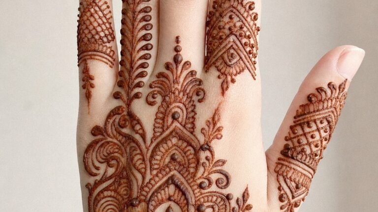
- Hands and fingers: high visibility, constant sun and friction, ink falls out unpredictably; plan for multiple sessions and eventual fading
- Feet and ankles: similar challenges to hands, plus shoes create ongoing abrasion
- Neck and throat: extremely visible, limits professional options in many fields, skin here ages noticeably
- Behind the ear and hairline: trendy placement, but hair growth patterns and sun exposure create uneven aging
Color Choices and Aging Reality
Black ink is carbon-based and stable. It lasts. Colors vary dramatically in their behavior. Red pigments (iron oxide-based traditionally, synthetic alternatives now) generally hold well. Blues and greens depend heavily on specific pigment formulations; some fade to grey-green within five years, others stay vibrant for fifteen. Yellow and orange are the most fugitive, often disappearing into skin tone or turning muddy. Purple sometimes splits into its constituent red and blue, creating unintended two-tone effects.
White ink is its own category. It yellows, it fades, it disappears into darker skin tones entirely. Artists sometimes use it for highlights in fresh work, but relying on it as a primary element is risky. The “white ink tattoo” trend produced a lot of disappointed collectors.
Skin tone fundamentally affects color appearance. The same bright red reads differently on very light versus very dark skin, not because the ink changes but because the optical mixing with underlying skin pigment changes. Experienced artists adjust their palette selections accordingly, cooler tones often work better on darker skin, while warmer tones can pop more on lighter skin. This isn’t about limitation; it’s about understanding the medium.
Tips for Choosing Your Design
Start with reference images that speak to you, then analyze what specifically draws you in. Is it the composition? The subject? The color mood? The negative space? Being able to articulate this helps you communicate with artists and avoids the “I want something like this but different” conversation that frustrates everyone.
Consider your daily life honestly. A hand tattoo changes how you’re perceived in most professional contexts. A rib piece you can’t see without a mirror serves a different purpose than a forearm piece you see constantly. Neither is wrong, but mismatching intent and placement creates dissatisfaction.
Budget for quality and wait for availability. The artist you want is probably booked months out. Rush jobs, discounts, and “tattoo events” with multiple artists working at speed rarely produce gorgeous results. A small, perfect piece from a specialist beats a large mediocre piece from whoever was available.
- Look at healed photos, not just fresh work; Instagram and portfolios skew heavily toward fresh, swollen, high-contrast images
- Ask about touch-up policies before booking; most reputable artists include one within a year
- Bring references but respect when an artist says a specific design won’t work at your desired size or placement
- Plan for the session physically: eat beforehand, avoid alcohol, bring entertainment for long sits
Final Thoughts
Gorgeous tattoos emerge from the overlap of what you want, what your skin can hold, and what your chosen artist executes best. The research phase, scrolling portfolios, reading healed results, having consultations, is part of the process, not an obstacle to it. The piece you live with for decades justifies the weeks or months of consideration that precede it. Trust the constraint: limitations of body, ink, and technique aren’t enemies of creativity but the framework that makes genuinely beautiful work possible.
Frequently Asked Questions
How long should I wait between designing and actually getting a tattoo?
Sit with your design concept for at least a few weeks, ideally longer for larger pieces. Initial excitement often narrows or shifts once the novelty fades, and that patience usually produces more lasting satisfaction.
Can I combine multiple styles in one tattoo?
Yes, but it requires an artist comfortable with both styles and a coherent plan for how they interact. Abrupt stylistic shifts within one piece usually look accidental rather than intentional.
Why do some colors fade faster than others?
Different pigment molecules break down at different rates under UV exposure and immune system activity. Black carbon particles are largest and most stable; lighter colors like yellow and white have smaller, more vulnerable particles.
How do I know if an artist’s portfolio shows healed work or only fresh tattoos?
Ask directly. Many artists maintain separate healed photo collections or can point to specific pieces on returning clients. Fresh work looks darker, more saturated, and sometimes slightly swollen compared to settled results.