Traditional tattoo wallpaper takes the bold, saturated imagery of old-school Americana, roses, swallows, anchors, banners, pin-up girls, daggers, and arranges it into dense, repeating fields that cover large skin areas like actual Victorian wallpaper. Think of a sleeve or a full back where individual motifs interlock, overlap, and flow into one another without hard borders between pieces. The effect is ornamental, almost textile-like, built from the limited color palette and heavy black outlines that define traditional tattooing.
Key Characteristics & Motifs
Wallpaper-style traditional work lives or dies by density. Gaps kill the illusion. The artist must pack motifs tightly enough that negative space becomes a deliberate design element, not an accident.
Core Imagery and Arrangement
Common building blocks include roses (stems and leaves used as connective tissue between unrelated images), swallows and eagles (directional movement to lead the eye), banners and scrolls (filling awkward gaps while carrying text or standing alone), nautical stars and compasses, pin-up faces and hands, snakes and daggers, and hearts with flames or arrows. These repeat, mirror, and rotate. A snake might coil through three roses; a banner weaves under a swallow’s wing and over an anchor’s ring. The motifs themselves stay recognizable, traditional tattooing demands readable imagery, but their placement prioritizes overall pattern over individual spotlight.
Color Palette and Aging Behavior
True traditional wallpaper sticks to the classic set: black, red, yellow, green, and sometimes navy or brown. No soft pastels, no photorealistic gradients. This isn’t nostalgia; it’s engineering. Those pigments, especially the heavy metals in older formulations and their modern equivalents, hold up. Red stays red longer than pink. Solid yellow doesn’t muddy the way peach does. When you’re building a field of interlocking images meant to read as a unified surface, color consistency across decades matters. A washed-out patch in the center of a back piece breaks the wallpaper effect worse than a single faded spot in an isolated tattoo.
Choosing the Right Artist
Not every traditional tattooer can do wallpaper. The skillset overlaps but isn’t identical. You need someone who thinks in planes and patterns, not just standalone flash.
What to Look For in a Portfolio
Check for large-scale work: half sleeves that flow into chest panels, back pieces with intentional repetition, thighs covered in interlocking roses. Look specifically for how they handle transitions. In wallpaper, the space between a dagger and a heart should be as considered as the motifs themselves. Artists who only post single palm-sized pieces probably aren’t building the spatial muscle for this. Ask to see healed photos from a year or more out. Fresh wallpaper looks crisp by default; the test is whether the density still holds after settling and minor spread.
Consultation Red Flags
Be wary of artists who want to “start with one piece and build around it later.” Wallpaper needs a blueprint. Random accumulation turns into a sticker book, not a pattern. Also watch for reluctance to use enough black. Traditional wallpaper relies on heavy blacks to separate colors and create rhythm; an artist who leans too light or too colorful will lose the graphic punch that makes this style work.
Aftercare Notes
Dense traditional wallpaper presents specific healing challenges. More ink means more plasma, more scabbing, and more opportunities for patchy healing.
- Moisture management: Large saturated areas weep longer. Keep the first wrap on for the time your artist specifies, usually 12-24 hours, sometimes longer for extensive work. Don’t let plasma dry into hard scabs.
- Movement restrictions: Wallpaper often crosses joints (elbow ditch, back of knee, armpit). These spots flex constantly. Plan clothing that doesn’t rub and activities that don’t stretch the fresh ink for at least a week.
- Spot checks: With so much packed detail, a small area of heavy scabbing or infection is easy to miss. Check daily in good light, especially where motifs overlap and scabs might stack.
- Long-term sun protection: Traditional colors fade predictably, but uneven fading destroys wallpaper’s unified surface. SPF 50, always. A back piece with one sun-bleached corner reads as damaged, not weathered.
Linework & Technique
The technical demands of wallpaper traditional are brutal. Every line must carry weight because there’s nowhere to hide.
Line Weight and Hierarchy
Primary outlines, around major motifs, run thick, usually 7-14RL depending on scale and artist preference. Secondary lines, like leaf veins or banner folds, drop to 5RL or 3RL. Tertiary details, perhaps single-needle accents in eyes or jewelry, sit even finer. This hierarchy lets the viewer’s eye read the pattern from distance (thick outlines) and discover detail up close (fine lines). Without this structure, dense wallpaper becomes visual noise. The artist must also consider how line weight will settle. A 14RL outline on a bicep spreads differently than on a shoulder blade; planning for that spread keeps the pattern legible.
Shading Approach
Traditional wallpaper uses limited graywash, mostly for depth in pin-up faces, snake coils, or rose folds. The shading stays graphic, no smooth gradients, no black-and-gray realism. Whip shading and pendulum shading create the necessary depth without softening the overall punch. Too much smooth shading dissolves the wallpaper effect into something murky. The goal is ornament, not illusion.
Modern Variations
Contemporary artists have pushed traditional wallpaper in several directions without abandoning its core constraints.
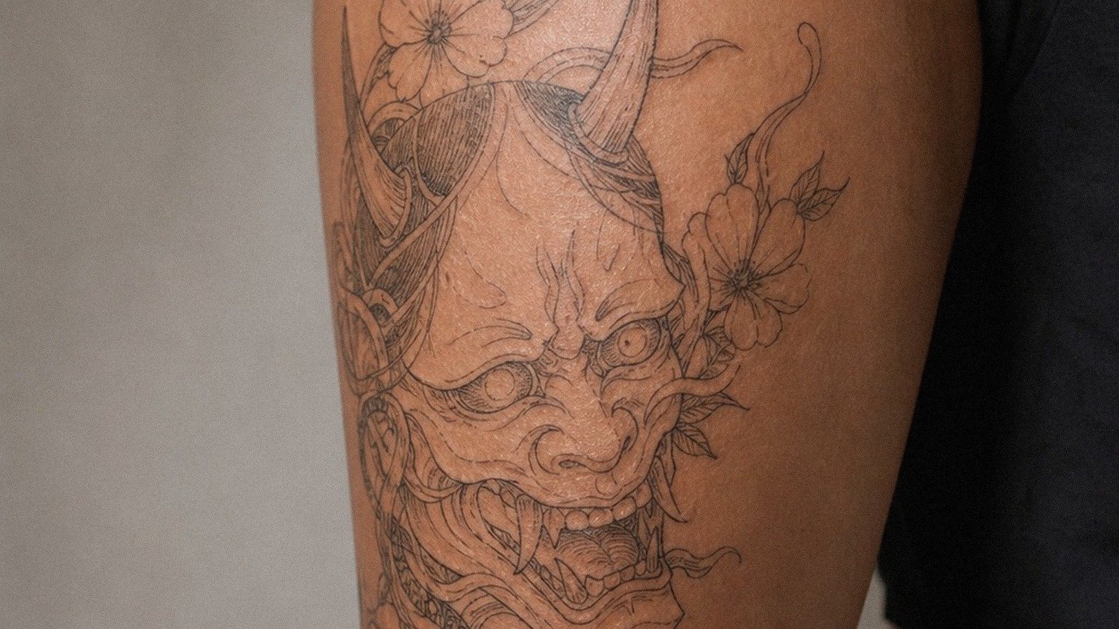
Japanese fusion: Some incorporate traditional Japanese motifs, waves, koi, cherry blossoms, into the American traditional framework. The key is maintaining the bold outlines and flat color fields; otherwise it becomes a different style entirely. Waves work particularly well as connective elements between Western imagery.
Black-only variants: Stripping color entirely creates a different but valid wallpaper tradition, often with heavier emphasis on dotwork and stippling for texture. This ages exceptionally well but demands even more precision in line placement since there’s no color to separate adjacent motifs.
Micro-traditional wallpaper: Smaller-scale pieces on forearms or calves, packed with tiny flash motifs. Technically harder because the artist has less room for error at reduced scale. Lines must be precise; there’s no surrounding skin to absorb a wobble.
Common Mistakes to Avoid
Design-Level Errors
Overloading with text: too many banners with words breaks the visual rhythm and turns the piece into a readable message rather than a pattern. Choose text sparingly, if at all. Ignoring flow: wallpaper on a sleeve must account for how the arm hangs, bends, and rotates. A pattern that looks perfect flat on paper can distort awkwardly in motion. Clashing scales: mixing very large and very small motifs without intermediate sizes creates visual jumps, not seamless pattern.
Technical Pitfalls
Insufficient black: light traditional work, however pretty in photos, won’t hold the wallpaper density through years of fading. Underpacking color: traditional yellow and red need solid saturation; tentative filling leaves patchy, sick-looking areas that disrupt the field. Poor needle selection: using liners for fill or mags for detail work that’s too fine creates texture mismatches visible across the whole composition.
Key Takeaways
Traditional tattoo wallpaper demands planning, density, and disciplined technique. It is not a collection of individual pieces but a single ornamental surface built from repeating, interlocking motifs. The right artist thinks in patterns, not flash sheets. Healing requires attention to scale and placement. Color choice and line weight must serve the unified effect, not individual images. Done well, wallpaper traditional ages into a living textile, graphic, readable, and unmistakably of its craft.
Frequently Asked Questions
How long does a traditional wallpaper sleeve typically take?
A full sleeve in this style usually requires 15-30 hours across multiple sessions, depending on density, arm size, and how much black fill is involved. The hand and inner elbow often get saved for last due to healing challenges.
Can wallpaper traditional work on darker skin tones?
Absolutely, but the approach shifts. Heavier black outlines and more saturated reds and greens show better than yellows or light blues. A skilled artist adjusts the palette rather than forcing a one-size-fits-all formula.
Does traditional wallpaper work for cover-ups?
It can, but the density that makes wallpaper effective also limits options. Old ink needs to be faded or incorporated as black background elements. Not all existing tattoos can disappear into a pattern; consult specifically about what remains visible versus what’s masked.
How do I prevent the wallpaper effect from looking too busy?
Trust your artist’s spacing and line hierarchy. The eye needs resting points, areas of heavier black or simpler motifs between complex clusters. Resist adding “just one more” image; the pattern’s power comes from restraint within density.