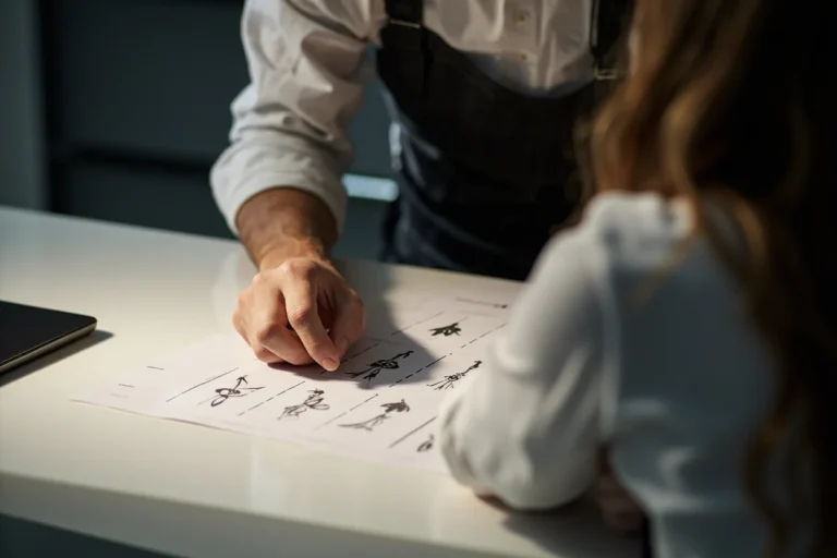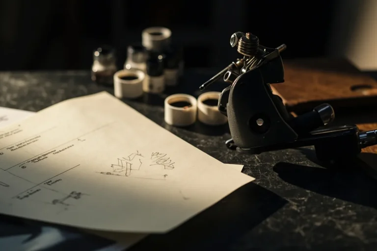
I’ve been pushing ink for over a decade, and here’s the truth nobody tells you at the consult: artistic tattoo designs are easy to draw, hard to tattoo. That gorgeous watercolor sketch your friend did on Procreate? Might bleed into a bruise-colored blob by year three. The delicate fineline botanical piece you saw on Pinterest? Could fall out entirely on certain skin types. I tell every client who sits in my chair the same thing, artistic doesn’t mean impractical. It means you need an artist who understands how pigment lives in skin, not just how it looks on paper. Let’s break down what actually works.
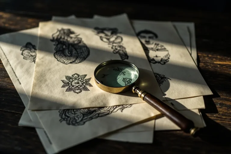
Popular Styles That Hold Up
Not every artistic style translates to tattooing. I’ve watched trends come and go, some age like wine, others like milk left in a hot car.
Abstract and Brushstroke Work
Abstract pieces can be stunning when done right. The key is bold, intentional negative space. I did a piece last year, thick black Japanese sumi-e inspired strokes wrapping a forearm, no color, no soft gradients. Five years from now it’ll still read as deliberate marks. Contrast that with the wispy “smoke” tattoos I see kids requesting: those fade to gray haze. If you want abstract, commit to solid blacks and clear shapes. Your artist should be leaving skin, not just filling it.
Illustrative and Fine Art Reproductions
Van Gogh’s “Starry Night” as a 4-inch bicep piece? I’ve been asked. I always say no. The magic of oil painting lives in color mixing and texture you can’t replicate with tattoo machines. But illustrative work, think Audubon bird prints, vintage anatomical drawings, woodcut styles, translates beautifully. The line weight variation is already built for tattooing. I did a client’s grandmother’s botanical journal pages as a sleeve last winter. The original ink-on-paper quality meant the tattoo version felt authentic, not forced.
- Linework-heavy styles (etching, engraving, technical drawing) age predictably
- Bold graphic styles (Art Deco, poster art, propaganda aesthetics) stay readable
- Stippling and pointillism work for small areas, blur in large soft gradients
- Expressionist or gestural work requires an experienced hand, mistakes read as mistakes, not “character”
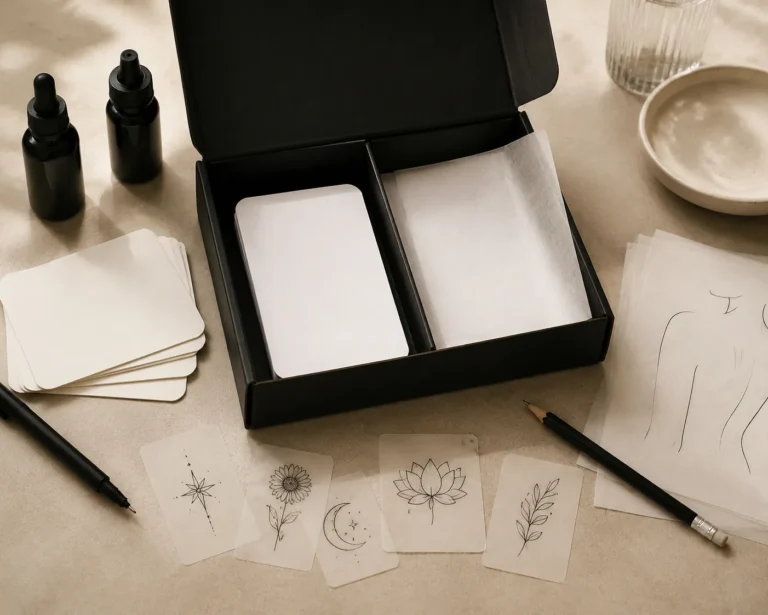
Design Ideas With Real Impact
The best artistic tattoos I’ve done started with a client’s actual life, not a Pinterest board. That said, certain motifs consistently translate to powerful work.
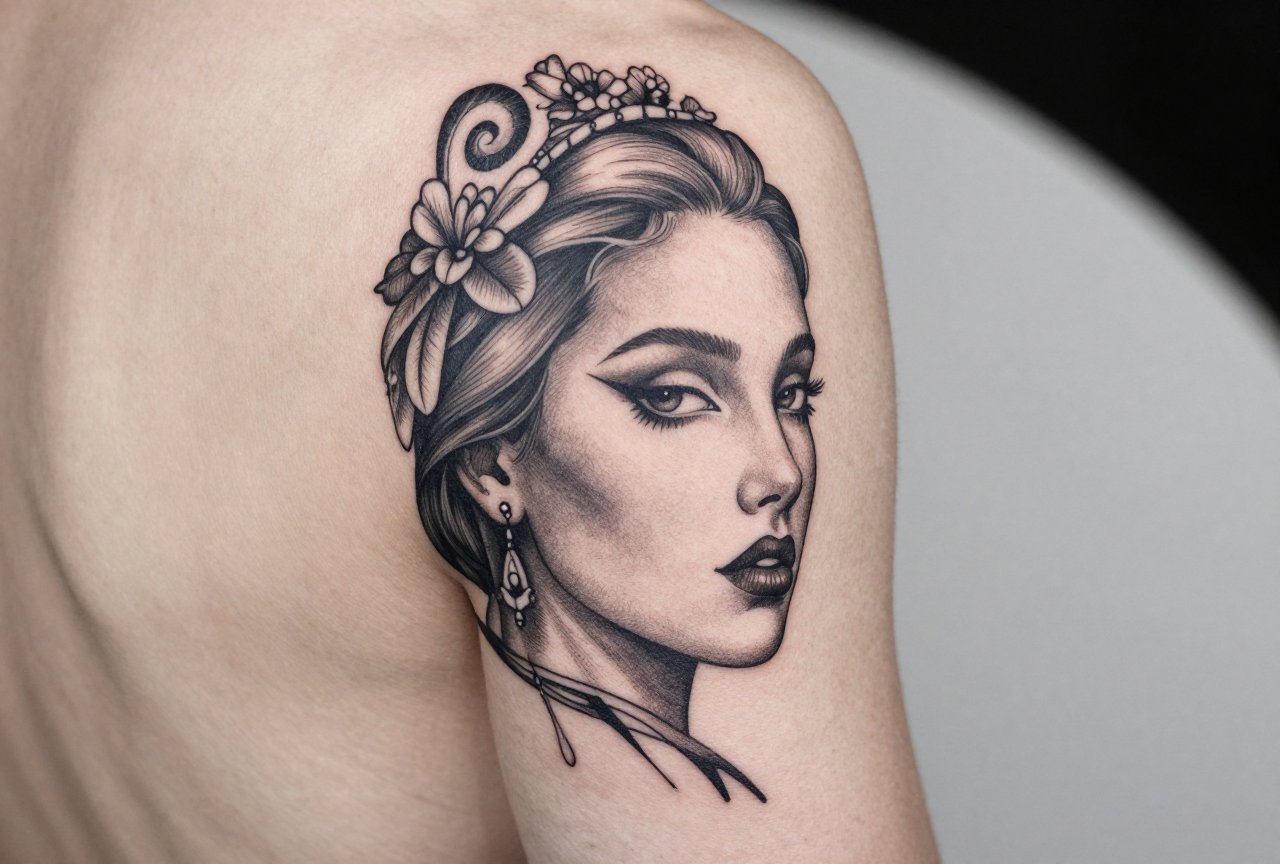
Deconstructed portraits are having a moment, and when they’re done with purpose, not just “make it look glitchy for Instagram”, they’re genuinely moving. I tattooed a musician whose father’s face split into waveform patterns where the audio of his last voicemail would visualize. The concept mattered. The execution followed.
Geometric overlays on organic forms work because the contrast creates visual tension that survives aging. A realistic raven with hexagonal pattern breaking through its wing feathers, that piece from 2017 still looks sharp. The geometry gives the eye structure when the softer details soften further.
- Single object treated as sculpture (dramatic lighting, cast shadows)
- Handwritten text layered with abstract marks, actual handwriting, not fonts
- Scientific illustration style: labeled, diagrammatic, precise
- Negative space silhouettes against dense pattern fields
- Mashups of unrelated visual languages (Renaissance cherub with circuit board wings, etc.)
Best Placements for Artistic Work
Skin moves, stretches, and ages differently depending on location. I turn down placements regularly, not because I’m difficult, but because I don’t want my work looking compromised in five years.
Flat, Stable Canvas Areas
Outer forearms, outer upper arms, calves, and upper back between shoulder blades. These spots take detail well and don’t distort much with movement. I did a full color art nouveau piece on a client’s outer thigh, flat plane, minimal muscle flex changing the surface. Still looks like the reference photo four years later.
Areas That Challenge Detail
Ribs, inner biceps, stomachs, and anywhere skin stretches significantly. I’ve seen gorgeous fine-line work on ribs that looked like a photocopy made by a broken machine after two summers. If you must do artistic work here, simplify. Bolder lines. Less tiny detail. I tell clients: “This spot will blur your tattoo like a Instagram filter you can’t turn off.”
- Hands and feet: High movement, poor ink retention. Artistic work here needs constant touch-ups.
- Neck and throat: Bold only. Delicate artistic effects disappear into skin texture changes.
- Behind the ear: Popular for tiny artistic pieces. I warn everyone, half the ink falls out, the other half migrates.
Color Choices: What Lasts vs. What Fades
Color theory for tattoos isn’t like painting. Pigment sits in dermal tissue, not on a white canvas. Your skin tone is the canvas, and it changes with sun, age, and health.
I’ve watched watercolor-style tattoos, those soft, bleeding color fields, age into bruise-like smudges on too many people. The technique requires diluting pigment heavily, which means less pigment particles per square millimeter. Less pigment = faster fade. If you want color that reads as “artistic,” I push clients toward limited palettes with high saturation.
Black and grey never goes wrong. A single accent color, vermillion, cobalt, ochre, against black and grey reads as intentional and artistic without the maintenance nightmare of full color fields. I did a piece last month: raven in black and grey, single red eye. The red will need touching up eventually, but the overall design doesn’t depend on it.
- Black: Most stable, sharpest aging, works on all skin tones
- Reds and oranges: Fade to pink/salmon, plan for this
- Blues and purples: Generally stable, but can go muddy on darker skin if not saturated enough
- Yellows and whites: Disappear fastest, use as highlights only
- Skin tone considerations: Darker skin carries black and bold color beautifully; pastel and “soft” effects rarely show up well
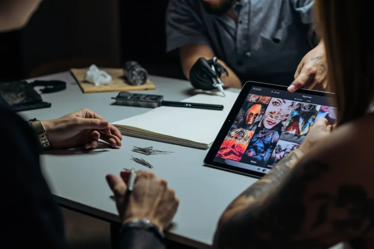
Tips for Choosing Your Design
After thousands of consultations, I can spot the clients who’ll love their tattoo in ten years versus the ones who’ll be in for cover-up consultations. Here’s what separates them.
Reference Differently
Stop bringing me other tattoos as reference. Bring me paintings, photographs, textures, moods. The best artistic tattoos come from visual conversations, not replication. A client brought me a cracked oil painting she’d seen in a museum and said “the feeling of this surface.” We translated that into a sleeve of layered, weathered imagery. She didn’t bring a single tattoo photo. That’s the energy.
Trust the Translation Process
Your artist isn’t being difficult when they say “this needs to be bolder” or “this detail won’t work at this size.” We’re translating between media. I’ve had clients get frustrated that their watercolor sketch needs black outlines to survive as a tattoo. I explain: ink in skin behaves like ink in skin, not like watercolor on paper. The good ones get it. The impatient ones find someone who’ll say yes, then regret it.
- Live with your design concept for six months minimum before booking
- Consider how it’ll read at conversation distance, not just in a close-up photo
- Ask your artist for healed photos of similar work, not just fresh
- Budget for the artist who specializes in the style, not the cheapest option
- Plan for aging, simpler designs with strong structure age gracefully
Final Thoughts
Artistic tattoo designs aren’t about proving how creative you can be. They’re about making something that lives in your skin and becomes part of you as you change. I’ve watched my own early work age on clients, some pieces I’m still proud of, others I’d do differently now. That’s the honesty of this craft. The tattoos that last, physically and emotionally, are the ones where the artistic concept met the reality of human skin with respect. Find an artist who’ll tell you no when no is needed. Bring them something real from your life, not your algorithm. And understand that the best artistic tattoo might look slightly different than you imagined, but it’ll be yours in a way no screen can replicate.
Frequently Asked Questions
How do I know if an artistic style will work as a tattoo versus just a drawing?
Ask your artist to show you healed examples of similar work. Fresh tattoos always look sharper and more saturated than they will in two years. If the artist can’t produce healed photos, that’s a red flag. Also, anything that depends on subtle color gradients or extremely fine detail will change significantly as it ages.
Why do watercolor tattoos seem to fade faster than traditional styles?
Watercolor technique uses heavily diluted pigment to create those soft, bleeding effects. Less pigment concentration means less stays in the skin long-term. The style also typically lacks the black outlines that act as structural anchors. I can do watercolor-style work, but I always warn clients they’ll need touch-ups and the colors will soften dramatically within a few years.
Can dark skin tones pull off artistic tattoos with lots of color and detail?
Absolutely, but the approach changes. Darker skin carries saturated, bold color beautifully, think jewel tones, deep reds, bright oranges. Where I adjust is avoiding pastel, watercolor-soft effects, and very fine light lines that won’t show up. The artistic quality comes from contrast, composition, and confident design, not from forcing techniques that fight the skin’s natural tone.
How much should I expect to pay for a custom artistic tattoo versus picking flash off the wall?
Custom artistic work typically runs higher because you’re paying for design time, not just application. In my shop, a detailed custom piece might be 50-100% more than comparable-sized flash. The range varies wildly by artist reputation and location, but don’t bargain shop for something permanent. A cheap tattoo is cheap forever; a good one is worth saving for.