Carpe diem literally means “seize the day” in Latin, and as a tattoo, it’s a personal commitment to living presently rather than deferring life. People get it after losses, at turning points, or simply as a daily nudge against procrastination. I’ve tattooed this phrase hundreds of times, and the stories behind it are rarely about drama, usually it’s someone quietly deciding not to wait anymore.
Symbolism & History
Where It Comes From
Horace coined it in 23 BC. His full line runs carpe diem, quam minimum credula postero, seize the day, trusting little in tomorrow. That’s darker than the motivational poster version. The Romans weren’t handing out yoga wisdom; they were acutely aware of death’s proximity. That shadow still lives in the tattoo. When someone sits in my chair and asks for this, I sometimes mention the fuller context. Some want the optimism. Others want the memento mori edge, the reminder that tomorrow isn’t promised.
The phrase survived through Enlightenment poetry, got romanticized by the Romantics, then flattened by Hollywood. Robin Williams whispering it in Dead Poets Society tattooed it on a generation’s imagination. But the skin version predates the film. Sailors and soldiers carried Latin mottos for centuries. There’s something about permanent ink and a dead language that pairs naturally.
What It Actually Symbolizes Now
- Agency over time: A refusal to let life happen to you
- Recovery from loss: I’ve done this on widows, on cancer survivors, on people who watched parents defer dreams until retirement that never came
- Rebellion against perfectionism: The permission to start before you’re ready
- Spiritual presence: For some, it’s mindfulness without the app
The meaning shifts with placement and context. Same words, different weights.
Common Variations & Styles
Script and Lettering Choices
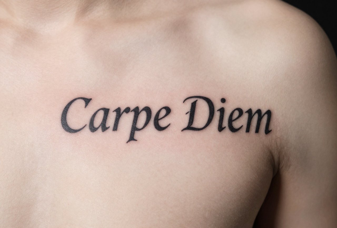
Most carpe diem tattoos are text-first, so the font does heavy lifting. Old English or blackletter reads as serious, almost monastic. I’ve had clients bring in their grandfather’s handwriting, photocopied, traced, then tattooed. That hits different than any typeface. Cursive scripts, especially flowing Spencerian or modern calligraphy, soften the phrase into something more intimate. All-caps serif feels like an inscription, architectural and permanent.
Line weight matters. Thin lines (single needle, 3RL) look delicate but blur faster on high-movement areas. Bold traditional lettering (7-9RL, solid saturation) holds for decades. I tell clients: if you want this readable at sixty, don’t go hairline.
Imagery Pairings
- Sundials and hourglasses: The time element made visual
- Skulls: Memento mori tradition, explicit about mortality
- Compasses or anchors: Direction and steadiness alongside urgency
- Feathers, birds, open hands: Release, lightness, grasping
- Clock faces frozen at meaningful times: The moment seized
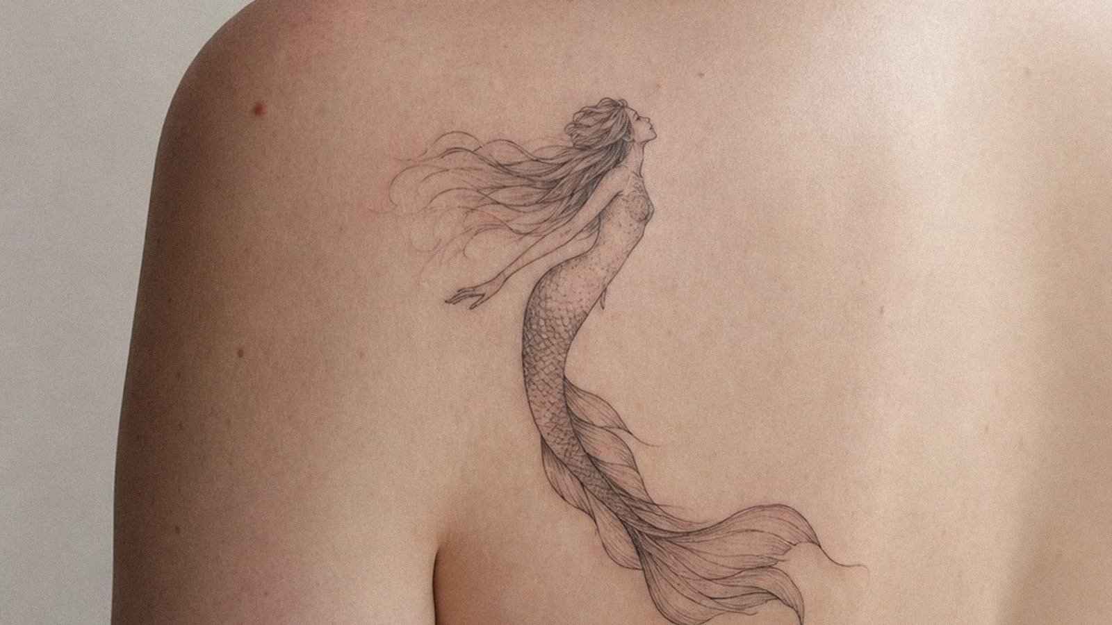
Some clients want the full phrase integrated into larger pieces, sleeves with life scenes, back pieces with landscapes. Others want just the words, small, somewhere they alone see.
Best Placements
Where you put it changes how you live with it. I’ve watched this play out across years of touch-ups and conversations.
- Inner forearm: Most common. You see it typing, driving, holding coffee. It’s a conversation starter, which some love and others regret. The skin here ages relatively well, though sun exposure is real, use SPF or watch it gray out.
- Ribs: Private. Hurts more. The breathing skin makes lettering tricky; I’ve had to redo ribs where the client lost their nerve and moved. Go bold here, not delicate.
- Collarbone/chest: Close to the heart, literally. Often paired with dates or names. The thin skin stretches and shifts; lettering needs extra spacing to stay legible.
- Wrist: Classic, but small. Two words, maybe abbreviated. We see this a lot on first-timers. It can look like a bracelet or a brand, depending on execution.
- Along the spine, vertical: Dramatic. The body’s central column. I’ve done this on dancers, on people who feel the phrase physically.
- Behind the ear: Tiny, almost secret. Requires extremely clean lines. Not for long phrases.
Placement also affects healing. Ribs rub against bras and seatbelts. Wrists get washed fifty times daily. Forearms catch sun. I warn people: the tattoo doesn’t end when you leave the shop.
Who Chooses This Tattoo / Personal Meanings
The Stories in My Chair
After fifteen years, patterns emerge. The twenty-two-year-old who backpacked Europe and got it in a Barcelona shop with a hangover, he’s not who I’m talking about. I’m talking about the quiet ones.
A woman in her fifties, divorced two years, got carpe diem across her wrist where her watch used to sit. She said she’d spent thirty years waiting for weekends, then vacations, then retirement. The watch came off. The words went on.
A father got it after his son’s leukemia went into remission. He’d been a workaholic, never at games. The tattoo was his own skin’s promise, not his son’s.
Younger clients often come in clusters after a friend’s sudden death. There’s a specific energy to those appointments, decisive, no design changes, no hesitation. They know exactly why they’re there.
What Artists Notice
We can usually tell who’s thought about it versus who saw it on Pinterest. The ready ones bring reference but listen to spacing and legibility concerns. The impulse ones want it tiny, trendy, yesterday. I don’t refuse work, but I do slow down the conversation. This phrase deserves that.
There’s also a gender split in how people wear it. Men tend toward bolder, more architectural presentations, chest pieces, full forearm bands. Women often choose more integrated, flowing designs. But that’s shifting. The best recent carpe diem I did was on a sixty-year-old man, delicate cursive, inner bicep, his first tattoo ever. He didn’t care about conventions. He’d finally retired from caring.
Similar Symbols
Clients sometimes hesitate between carpe diem and related concepts. Here’s how they differ in practice:
- Memento mori: Remember you will die. Heavier, more fatalistic. Carpe diem is the response; memento mori is the prompt. Some people get both, paired.
- Yolo: Same generation, different DNA. Yolo is permission for impulse; carpe diem is intention. I’ve never tattooed “yolo” and hope I don’t.
- Tempus fugit: Time flies. Passive. Carpe diem demands action.
- Amor fati: Love of fate. Acceptance versus seizing. Stoic cousins.
- Sanskrit or Japanese equivalents: 一期一会 (ichigo ichie, one time, one meeting) carries similar weight. Some clients switch to these for aesthetic or spiritual reasons.
I’ve had people cover “yolo” with carpe diem. That says plenty.
Final Thoughts
Carpe diem works as a tattoo because it’s both universal and personal. Everyone understands the phrase. Nobody knows what it means to you unless you tell them. That’s the balance good tattoos strike.
As an artist, I respect its simplicity. Two words, no translation needed, centuries of weight behind them. But simplicity is unforgiving. Bad lettering, poor placement, or fuzzy concept shows immediately. There’s nowhere to hide.
If you’re considering this, sit with the phrase longer than you think necessary. Say it out loud. Write it down. Notice when you feel resistance, that’s usually where the real meaning lives. Then bring that specificity to your artist. The best carpe diem tattoos don’t just decorate skin. They mark a decision that already happened.
Frequently Asked Questions
Does carpe diem tattoo have to be in Latin?
No. English translations, related phrases, or paired imagery all work. The Latin carries classical weight, but meaning matters more than language. I’ve done “seize the day” in clients’ own handwriting that hit harder than any serif font.
How small can carpe diem tattoo be and still read clearly?
For two words, I’d stay at least 2-3 inches wide. Smaller than that, and letters blur together as skin ages. Single-needle work can go tiny but won’t hold crispness over decades. If you want it discreet, consider placement over extreme miniaturization.
Is carpe diem considered cliché in tattoo shops?
We don’t think in clichés, we think in execution. A generic font, random placement, no personal story? That’s forgettable. Meaningful context, custom lettering, thoughtful placement? That’s a good tattoo regardless of how common the phrase is.
What should I pair with carpe diem if I want imagery?
Choose symbols that resonate with your specific reason for the tattoo. Hourglasses for time urgency, compasses for direction, birds for freedom. Avoid stacking random “deep” images. The best pairings are simple and personal, not crowded.