European traditional tattooing sits in that sweet spot between the flash-heavy American style and the finer, more illustrative work coming out of Japan and Eastern Europe. I’ve been running this style through my machines for over a decade, and what I love is how stubborn it is, thick lines, limited color, imagery pulled from sailor lore, circus culture, and folk art that refuses to look trendy. It ages like a leather jacket, not a fast-fashion tee. If you’re considering one, here’s everything I’ve learned from actually putting these on human bodies.
Origins & History
The roots aren’t as clean as some history books suggest. European traditional work grew out of the same sailor tattoo boom that spawned American traditional, but it took a different path. While American shops standardized flash sheets and bold primary colors, European artists, particularly in the UK, Germany, and Scandinavia, kept things rougher, more personal, more tied to local imagery.
I’ve got a client whose grandfather was a merchant marine out of Liverpool in the 1950s. His arms were covered in hand-poked anchors, names of ports, and crude swallows that looked nothing like the polished Sailor Jerry reproductions you see on Pinterest. That’s the lineage we’re talking about. Imperfect. Human. Built to last through salt water and bad decisions.
The Post-War Shop Culture
After WWII, European tattooing operated in a gray zone, legal in some countries, underground in others. Shops were often back rooms, kitchens, spaces above pubs. The equipment was improvised. The art reflected that scrappiness: bold enough to read from across a bar, simple enough to execute with questionable machines. I still know old-timers in Glasgow who learned on coils they wound themselves, using pigments they mixed from whatever was available. That resourcefulness shaped the aesthetic.
Folk Art Crossover
European traditional pulled heavily from existing visual traditions, woodblock prints, carnival posters, pub signage, military insignia. You see this in the heavy black outlines, the limited shading, the flat color areas. It’s not accidental. Those choices came from artists working fast, working cheap, working with materials that had constraints. The style honors those constraints rather than fighting them.
Key Characteristics & Motifs
When someone sits in my chair asking for European traditional, I start by showing them what this actually looks like on skin, not on paper, not on Instagram, but after five years of sun and showers.
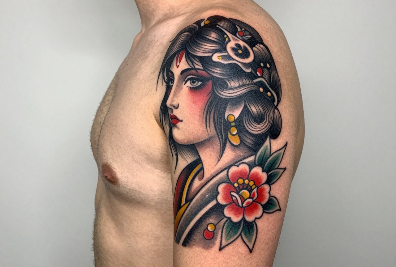
- Heavy black outlines: These aren’t the hairline precision outlines of fine-line work. We’re talking 7RL to 14RL needles, sometimes round shaders, building borders that will hold. The line weight varies but never disappears into nothing.
- Limited color palette: Red, green, yellow, blue, often muted, sometimes straight from the bottle. European traditional doesn’t chase the neon saturation of new school or the subtle gradients of realism.
- Flat color application: Minimal blending, minimal smooth shading. Color sits in distinct areas, separated by those black walls.
- Imagery drawn from: anchors, ships, swallows, roses, daggers, serpents, hearts with banners, military eagles, religious icons, drinking culture, gambling motifs.
The banner with script is almost a signature element. “Mum” or “Love” or a ship’s name, lettering that curves with the design, not floating separate from it. I’ve done hundreds of these, and the trick is spacing: too tight and it blurs, too loose and it looks like an afterthought.
Color vs Black and Grey
This is where clients get stuck. European traditional was historically color-heavy, those limited pigments were what artists had. But black and grey interpretations have become common, especially in Northern European shops where the aesthetic leaned darker anyway.
Color That Actually Lasts
Here’s what I tell people: that bright red heart on your forearm will settle. In three years, it’s not fire-engine anymore. It’s brick. In ten, it’s rust. That’s not failure, that’s the style. European traditional color is supposed to age into something softer, more integrated with your skin. The black outline does the heavy lifting for readability. If you want color that pops like a photograph, this isn’t your style.
I use mostly iron oxide and carbon-based pigments for this work. The reds I favor lean toward the ochre side rather than the blue-red side. They heal warmer, age better, don’t turn that unfortunate pink that some modern organic pigments do.
Black and Grey Variations
Black and grey European traditional is essentially a different dialect of the same language. Same motifs, same bold outlines, but shading built through whip shading and pepper techniques rather than flat color. It can look more severe, more contemporary. I’ve seen it work beautifully on clients who want the traditional feel but have professions where bright color draws unwanted attention. The trade-off: less historical authenticity, more visual punch in the short term, but black and grey always wins for longevity.
Best Placements
European traditional was designed for the body, not for a flat sheet. The designs wrap, they flow with muscle structure, they account for how skin moves and ages.
- Forearms: Classic. Visible, flat enough for clean lines, enough real estate for a proper composition. The outer forearm ages better than the inner, less sun, less friction.
- Upper arms: The traditional “cap” or full sleeve build. Muscle provides good canvas, and the style’s boldness reads well from distance.
- Chest panels: Old-school sailors often had full chest pieces. The sternum’s flat plane suits the style’s graphic quality. I’ve done eagles, ships, women with banners, always accounting for how the design moves when the person breathes.
- Hands and knuckles: Controversial now, but historically central. The rules are different here: simpler designs, heavier lines, faster aging. I make sure clients understand this is a commitment, not a decoration.
- Thighs and calves: Growing in popularity, especially for larger pieces. The calf’s cylinder shape works well for ships and serpents that wrap.
What doesn’t work: behind the ear, ribs for first tattoos, anywhere the skin stretches dramatically. The style’s boldness becomes blobby in areas with too much movement or too little subcutaneous tissue.
Who It Suits
Not everyone. I say this with love. European traditional demands a certain confidence, it doesn’t hide, it doesn’t whisper. The people who wear it best have some relationship with its history, or at least its attitude.
I’ve tattooed punk musicians, middle-aged accountants having their midlife crisis, a grandmother who wanted her husband’s navy portrait preserved in the style he wore. The common thread: they want something that looks like it belongs, not like it was applied. European traditional integrates with a life, it doesn’t accessorize one.
Skin tone matters less than people think. The heavy black outlines provide structure that reads on any melanin level. What matters more is sun exposure and aftercare discipline. This style is forgiving of age but unforgiving of neglect.
Modern Variations
The style’s having a moment, which means it’s being stretched in directions that purists debate over shop beers.
Neo-Traditional Fusion
Some artists, particularly in Berlin and Amsterdam, are blending European traditional’s boldness with neo-traditional’s expanded color palette and more complex compositions. The lines stay heavy, the subject matter stays classic, but there’s more dimension, more background, more ornamental framing. I enjoy doing this hybrid work, but I’m careful to tell clients: the more complex it gets, the faster it ages poorly. Every extra detail is a future blur.
Contemporary Subject Matter
I’ve done European traditional-style portraits of pets, video game characters, modern political imagery. The style’s vocabulary can accommodate new content if the grammar stays consistent. But there’s a line where it stops being European traditional and becomes something else wearing its clothes. I try to stay on the right side of that line, or at least be honest when we’re crossing it.
Choosing an Artist
This matters more than design choice. European traditional requires specific technical habits: confident line work without overworking the skin, color packing that saturates without blowing out, an understanding of how bold imagery sits on a three-dimensional body.
- Look at healed work, not fresh photos. Everyone’s portfolio looks good at two weeks. Ask for one-year healed examples.
- Ask about their machines. European traditional benefits from consistent, powerful setups, often coil machines, sometimes rotaries tuned for bold work. An artist using only pen-style machines for this style may lack the range.
- Notice their flash collection. Real European traditional artists collect and study historical flash. It’s not just reference; it’s a relationship with the lineage.
- Shop culture matters. Walk in, feel the vibe. Is there respect for the history, or just aesthetic borrowing? I’ve left shops where the attitude was wrong.
Price should be fair, not cheap. This style takes time to execute properly. Anyone rushing through heavy blackwork is damaging your skin and their reputation.
Final Thoughts
European traditional tattooing isn’t a trend you ride. It’s a commitment to a particular relationship with your own body and with history. I’ve watched clients grow into these tattoos over decades, the colors softening, the lines settling, the imagery becoming part of who they are rather than what they wore.
The best compliment I’ve received was from a client who said his grandfather’s tattoo artist and I would have understood each other. That’s the goal. Not innovation for its own sake, but carrying something forward with integrity. If you’re considering this style, sit with it. Research the history. Find an artist who respects it. Then commit fully. European traditional doesn’t do half-measures, and neither should you.
Frequently Asked Questions
How is European traditional different from American traditional?
European traditional tends toward rougher execution, more folk-art influence, and often darker or more muted palettes. American traditional standardized brighter primaries and cleaner flash sheets through Sailor Jerry and later artists. The European lineage stayed more regional and improvisational.
Will the thick lines look bad as I get older?
Actually, this style ages better than most. The heavy black outlines provide structural integrity that fine-line work loses. Colors soften, but the design remains readable. I’ve tattooed clients in their sixties who have fifty-year-old traditional work that’s still legible.
Can I mix European traditional with other styles in a sleeve?
It’s tricky but possible. The key is transition pieces, designs that bridge the boldness of traditional with whatever style you’re moving toward. I recommend planning the full sleeve concept before starting, not piecing it together randomly. The visual language needs to communicate.
How painful is European traditional compared to other styles?
The heavy saturation and repeated passes over the same areas can feel more intense than light, single-pass work. But pain varies wildly by placement and individual. Forearms and outer thighs are manageable; sternum and ribs test most people. I always adjust technique for clients who are struggling.


