When someone sits in my chair and says “I want Japanese,” I always pause. That word covers a lot of ground. They might mean a delicate cherry blossom branch, or they might mean a full back piece with a dragon fighting a koi through crashing waves. Japanese artwork tattoo as a style is one of the oldest, most rule-bound traditions in our industry, and it’s also one of the most misunderstood. I’ve watched artists who’ve never studied irezumi try to wing it with a Google image and some confidence. It never ends well. This guide is what I tell clients who want the real thing, not a tourist version.
Origins & History
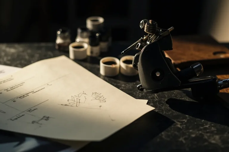
Japanese tattooing goes back centuries, long before electric machines. The tebori hand-poking method, still practiced by masters like Horiyoshi III’s successors, creates a texture you can’t replicate with a rotary. I’ve seen tebori work up close at conventions in Osaka, and the saturation is different, deeper, almost velvety. Machine work can get close, but there’s a patience to hand-poking that changes the skin differently.
From Punishment to Prestige
Early irezumi marked criminals, which is why you still see full body suits with gaps at the center chest, the wrists, the ankles, the strip down the spine. Those blank spaces let a kimono cover the ink. The Yakuza adopted and raised the practice, turning shame into pride. By the Edo period, ukiyo-e woodblock prints became the visual language, and that aesthetic still dominates what we do in shops today. I have a client, retired guy, who spent years getting his back done in pure tebori by a visiting Japanese artist. The commitment alone says something.
What “Japanese” Means in a Modern Shop
Most Western artists, myself included, work with machines. We reference the tradition rather than embody it. That’s fine, but honesty matters. I tell people straight: my Japanese-influenced pieces are homages, not authentic irezumi. The distinction is important. Real Japanese tattooing has apprenticeship systems, family lines, unspoken rules about who can wear what motif. We’re borrowing a visual language, and we should do it with respect.
Key Characteristics & Motifs
The style has grammar. You can’t just drop a dragon on a shoulder and call it Japanese. There’s flow, background, negative space, directional logic. I’ve fixed so many pieces where someone got a great central image with no background support, floating in skin like a sticker.
- Wind bars and waves: These create movement, direct the eye, fill space between major elements. Without them, the composition falls apart.
- Clouds and smoke: Soft transitions, often used to separate foreground from background or to suggest transformation.
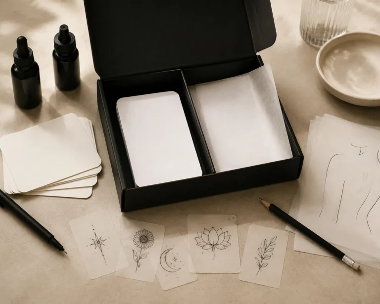
- Cherry blossoms, maple leaves, peonies: Seasonal markers. Peonies specifically pair with lions and fu dogs as symbolic companions.
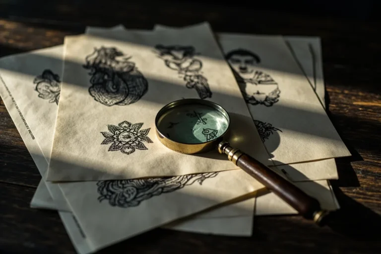
- Koi, dragons, phoenixes, tigers, snakes: Creatures with specific meanings and directional rules. Dragons face certain ways. Koi swim upward or downward depending on the story.
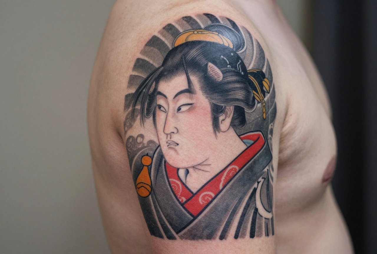
- Masks and figures: Hannya, oni, Fudo Myoo, geishas. These require facial knowledge most artists don’t have.
The background isn’t filler. It’s structure. I spend more time drawing wind and water than the main subject sometimes. That’s the work clients don’t see, but they feel it when the tattoo flows with their body instead of fighting it.
Color vs Black and Grey
This is where opinions get strong in shops. Traditional Japanese is bold color: vermillion, teal, mustard yellow, deep purple. The pigments are specific, and they age distinctively. I’ve watched a full-color dragon back piece settle over five years, and the reds always fade first, always. That’s not poor work, it’s chemistry. The yellows and greens hold longer than people expect.
When Color Works
Color Japanese demands real estate. Small color pieces tend to blur into mud. I won’t do a color koi under four inches. The scales need room to read. On larger pieces, sleeves, back panels, thighs, color sings. The contrast between skin and saturated pigment is the point. I use a lot of solid whip shading in color work, building density without black outlines in some areas.
Black and Grey Japanese
This is more common in Western shops, honestly. It references the tradition without the maintenance commitment. I do a lot of black and grey Japanese for clients who work corporate, who can’t have screaming red sleeves. The technique shifts: more line weight variation, more stipple texture, more empty skin to create contrast. It ages cleaner in some ways, but it can look flat if the artist doesn’t understand how to build depth without color temperature. I’ve seen beautiful black and grey hannya masks that read like photographs, and I’ve seen others that look like grey smudges after two years. The difference is usually in the original line work and the saturation of the blacks.
Best Placements
Japanese artwork tattoo is designed for the body, not imposed on it. The motifs wrap, flow, follow muscle structure. This isn’t accidental.
- Full back: The classic canvas. Dragons, phoenixes, full scenes. The spine becomes a river, a lightning bolt, a tree trunk. I map these sessions carefully, usually 8-12 sittings for detailed work.
- Sleeves (arm and leg): The term “sleeve” comes from this tradition. Japanese sleeves have specific names: hikae (chest to elbow), nagasode (full arm). They connect to body panels or stand alone.
- Thighs and calves: Excellent for koi, dragons, water scenes. The muscle curve becomes the wave curve. I love calf placements for koi swimming upstream, the gastrocnemius becoming the current.
- Chest panels: Often paired with sleeves. The gap at center chest is traditional, though many Western clients want it filled. I explain the history, then do what they want. It’s their skin.
- Ribs and torso: Painful, but the flow potential is unmatched. Snakes wrapping ribs, wind following the obliques. I’ve had clients tap out on rib work more than anywhere else.
Small placements are possible but tricky. A single cherry blossom behind an ear, a small hannya on a forearm. These work when the design is simplified, not shrunk. I turn down a lot of requests for “tiny detailed Japanese” because I know how it’ll heal. The lines spread, the detail disappears, the client blames the artist.
Who It Suits
Honestly? Commitment suits this style. Not personality, not aesthetic preference. The willingness to sit, to plan, to pay properly, to maintain. Japanese work is expensive, time-intensive, and visible. I have clients who’ve spent fifteen years building body suits. That’s the tradition.
Skin tone matters for color, always. On darker skin, I push toward bolder outlines, higher contrast, sometimes limit the color palette to what will actually show. Black and grey becomes more appealing. I’ve had beautiful results on every skin tone, but the approach changes. Any artist who says “color works the same on everyone” hasn’t done enough Japanese work.
Body type matters too. The designs wrap and flow. A dragon that looks perfect on a muscular back can distort on a softer frame. I draw directly on skin more for Japanese pieces than any other style. Stencils lie. The body doesn’t.
Modern Variations
The tradition isn’t static. I see younger artists mixing Japanese composition with illustrative techniques, neo-traditional color palettes, even geometric elements. Some of it works, some of it feels like fashion. The test is time.
Neo-Japanese and Fusion
Artists like Filip Leu and Paul Booth pushed Japanese structure into darker, more surreal territory. Now there’s a whole generation doing Japanese-inspired work with single-needle detail, muted color schemes, mixed cultural references. I respect the skill when the foundation is solid. When it’s not, it looks like a costume.
What I Won’t Do
I’ve turned down Japanese faces on non-Japanese clients, certain religious figures worn as decoration, and any request that treats the tradition as pure aesthetic without understanding. Other artists make different calls. For me, the conversation matters. If someone wants a full back piece and hasn’t thought about it beyond “it looks cool,” I suggest they sit with the idea, study the imagery, come back when they know why they want it.
Choosing an Artist
This is the most important section. Japanese artwork tattoo requires specific skills that general tattooing doesn’t build. Line weight variation, background composition, understanding how motifs interact with body movement.
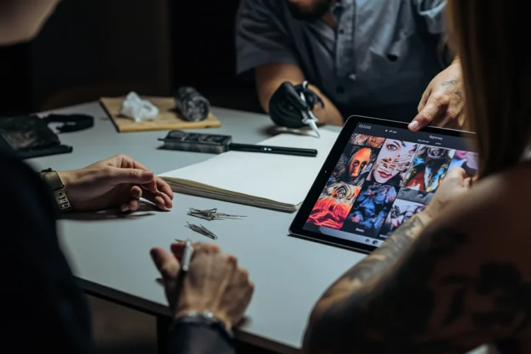
- Look at their Japanese portfolio specifically: Not one piece, many. Background work, not just central images. How do their waves flow? Their wind bars?
- Ask about their study: Have they traveled? Studied with Japanese artists? Looked at ukiyo-e prints? The answer doesn’t have to be yes to all, but silence on all three is a red flag.
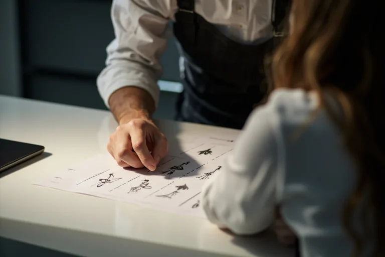
- Expect a longer consultation: I spend an hour minimum on Japanese consultations. The drawing takes weeks sometimes. Anyone who says “I can draw that up tonight” for a complex Japanese piece doesn’t understand the work involved.
- Price is information: Good Japanese work is expensive because it’s slow. Tebori is slower still. Cheap Japanese work is almost always bad Japanese work. I’ve fixed enough to know.
Shop culture matters too. Japanese work often requires multiple long sessions. You want an environment where you can settle in, where the artist isn’t rushing to the next walk-in. I block full days for Japanese clients. The rhythm is different.
Final Thoughts
Japanese artwork tattoo is one of the few styles in our industry with genuine lineage, rules, and cultural weight. That doesn’t mean it should be inaccessible or treated like museum pieces. It means we should approach it with the seriousness it deserves. I’ve been tattooing fifteen years and I’m still learning, still studying prints, still adjusting how I draw waves. The best Japanese tattoos I’ve done are the ones where the client and I both understood we were participating in something larger than a single appointment. That’s the difference between wearing a style and understanding it. If you’re considering Japanese work, take your time. Find the right artist. Sit with the imagery. The tattoo will outlast your current job, your current relationship, probably your current city. Make it worth the permanence.
Frequently Asked Questions
How many sessions does a full Japanese sleeve typically take?
A detailed Japanese sleeve usually needs 6 to 10 sessions of 3-4 hours each, depending on complexity, your pain tolerance, and how quickly your skin takes ink. I space them 3-4 weeks apart for proper healing.
Can I mix Japanese motifs with other tattoo styles I already have?
It’s possible but challenging. Japanese background elements like wind and waves can sometimes bridge to other styles, but the central motifs need visual room to breathe. I usually assess existing work in person before committing to a design.
Why do some Japanese tattoos have that blank strip down the center of the back?
That’s called hikae in some contexts, but more accurately it’s just traditional spacing from the kimono coverage era. Some clients keep it for authenticity, others fill it. I explain the history and let them choose.
Is tebori hand-poking less painful than machine tattooing?
Most clients say tebori hurts differently, deeper and more rhythmic, but not necessarily less. Some areas feel worse, some better. The real difference is healing time, which tends to be shorter and less scabby with proper tebori technique.