I’ve been in this trade long enough to watch the name tattoo pendulum swing. Fifteen years ago, every third walk-in wanted their girlfriend’s name in cursive across the chest. We all saw how that aged. Now? Name tattoos are smarter, more personal, and honestly, more interesting. People come in with stories, not just impulse. In my chair, I’ve tattooed children’s names on fathers who never thought they’d get ink, memorial pieces that make the room go quiet, and yes, I’ve done cover-ups on names that became ghosts. Here’s what actually works.
Popular Styles for Name Tattoos
Not all lettering is created equal. The style you pick determines how it reads from ten feet away versus ten years later.
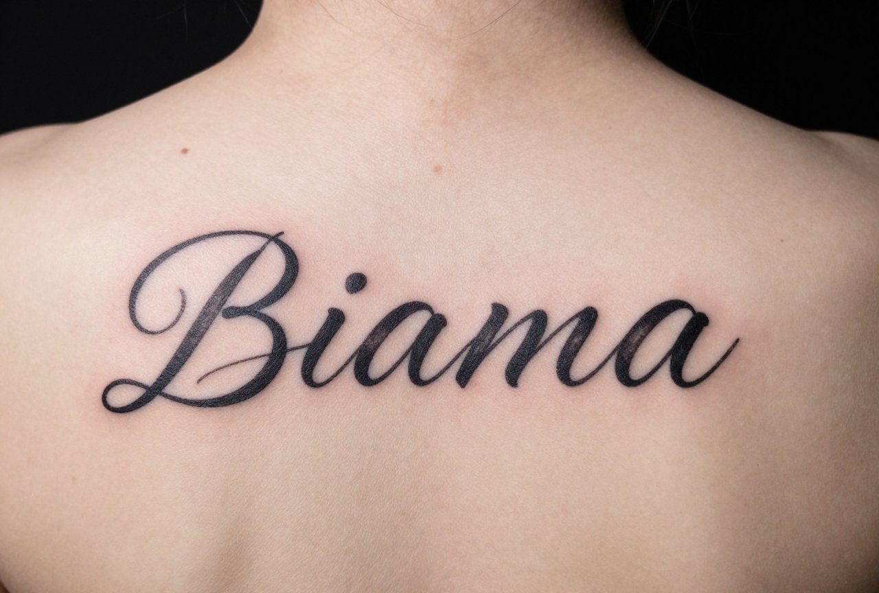
Script and Cursive
This is the classic for a reason. Flowing script follows the body’s natural lines, around a bicep, down a ribcage, across a collarbone. But here’s what I tell clients: thin cursive with lots of loops blurs. I’ve seen elegant swirls become muddy suggestion after five years. Go for medium weight, clean connectors, and enough space between letters that they don’t bleed together. My shop partner swears by a slightly bolder script with minimal flourishes; he’s been proven right too many times to count.
Old English and Blackletter
Heavy, aggressive, reads from across the room. Great on forearms, chest pieces, anywhere you want presence. The downside? Dense blackwork fades to a softer grey, which actually looks cool if the original was solid. What doesn’t work is wispy attempts at blackletter, those just turn into illegible blocks. Commit to the weight or pick something else.
Typography and Modern Sans
Clean, architectural, increasingly popular. Think brand logos, magazine headers. These age beautifully because the letterforms are simple. No thin points to disappear, no complex geometry to distort. I did a daughter’s name in condensed bold sans on a client’s inner forearm three years ago; it looks almost identical today. That’s rare.
- Script: best for organic placements, requires skilled artist for flow
- Blackletter: high impact, needs solid black saturation
- Sans-serif: most durable long-term, less emotional warmth
- Serif fonts: traditional feel, can feel dated if too generic
- Custom hand-drawn: most unique, most expensive, worth it for one-of-a-kind pieces
Design Ideas Beyond Plain Text
Names don’t have to float alone. Some of my favorite pieces integrate the name into something larger.
Birth Flowers and Birthstones
A name woven through peonies for October, or emerging from a cluster of garnet-toned berries for January. These tell more story than text alone. The flower provides visual interest that distracts from the literalness of a name. I’ve tattooed “Eleanor” where the final ‘r’ extended into stem and leaf, becoming part of a violet. The client cried. We see this a lot now, people want symbolism, not just labels.
Coordinates and Dates
Subtle, less emotionally risky than a name alone. The coordinates of a hospital where someone was born, a date in roman numerals tucked beneath. One regular got his son’s name in his grandmother’s handwriting, paired with the latitude/longitude of her farmhouse. That’s the kind of piece that holds weight without being obvious.
- Handwriting reproductions: deeply personal, requires high-quality source image
- Soundwave tattoos: visually interesting, technically challenging to execute well
- Negative space designs: name carved out of blackwork, striking but heals tricky
- Integrated with portraits: name as foundation, realistic face above or beside
- Multi-name compositions: children’s names as branches of a tree, birds in flight
Best Placements for Name Tattoos
Skin moves, stretches, suns, ages. Where you put a name matters as much as what it says.
High-Mobility Areas to Approach Carefully
Fingers, wrists, throats, these get sun, friction, and constant movement. I did “MOM” on a knuckle fifteen years ago; it’s now a blue-green blur that reads more like “WOW” on a good day. That said, inner biceps, upper chest below the collarbone, and outer forearms hold remarkably well. The skin is stable, relatively protected, and the name stays readable at conversational distance.
Hidden and Revealed
Ribcage names hurt. Everyone knows this. They still ask. The tradeoff is intimacy, only certain people see it, and the placement feels chosen, not displayed. Behind the ear works for small names, single words. I’ve done children’s names along the edge of the ear itself, tiny and precise, visible only when hair is up. One client called it her “secret handshake” with herself.
- Forearm: visible, socially acceptable, easy to show or cover
- Upper arm/shoulder: classic, ages well, good for larger compositions
- Chest over heart: traditional, meaningful, can stretch with weight change
- Ribcage: painful, private, dramatic vertical potential
- Ankle/foot: trendy, fades faster, lots of friction from shoes
Color Choices and Aging
Black and grey is the honest recommendation for name longevity. Color in lettering is possible, I’ve done deep red script, navy blue Gothic, but it requires more maintenance, faster touch-ups, and honest conversation about how that crimson becomes rose becomes pink over a decade.
When Color Works
Soft watercolor backgrounds behind black names. A single accent color in a flourish or accompanying image. One stunning piece had a child’s name in solid black with a watercolor butterfly in their favorite color, purple that will soften to lavender but won’t ruin the legibility of the text itself. That’s the balance.
- Black: highest contrast, longest readability, lowest maintenance
- Dark blue or purple: second best, subtle variation, still readable when faded
- Bright reds/oranges: high impact, significant fading, plan for touch-ups
- White ink: trendy, unpredictable healing, often yellows or disappears
- Watercolor backgrounds: beautiful, keep the name itself in black
Tips for Choosing Your Name Tattoo
After thousands of these, here’s what I wish people asked before sitting down.
The Relationship Reality Check
We don’t refuse romantic partner names in my shop, but we do have a conversation. Not because we’re cynical, because we’ve watched the cover-up appointments. One artist I apprenticed under kept a “name jar”: fifty dollars to get your partner’s name, five hundred to start the laser or cover-up fund. It was half joke, half truth. Family names, memorial names, children’s names, these carry different weight. Make sure yours is the kind that deepens with time.
Font Selection and Artist Match
Bring references, not prescriptions. A font you love on screen might have terrible tattoo geometry, thin strokes that won’t hold, spacing that doesn’t work at scale. Good lettering artists will redraw, adapt, improve. That’s not them being difficult; that’s them protecting your skin’s future. I turn down exact font replicas weekly. The result is always better when we collaborate.
- Wait six months if it’s a new relationship, this isn’t pessimism, it’s pattern recognition
- Consider the name’s length: “Max” fits places “Maximilian” won’t
- Ask to see healed photos, not just fresh work
- Budget for a lettering specialist: not every artist excels at text
- Plan for touch-ups: all tattoos fade, names need readability maintained
Final Thoughts
Name tattoos carry weight that geometric or decorative pieces often don’t. They’re declarations, memorials, commitments made visible. I’ve watched clients shake with emotion getting a father’s name after loss, and I’ve watched others laugh through a child’s nickname that will embarrass them both in ten years. Both are valid. The difference is intention and honesty about what you’re doing and why. Pick a style that honors the name, a placement that fits your life, and an artist who respects the permanence of what you’re asking for. The best name tattoos aren’t the most elaborate, they’re the ones that still feel right when you catch them in the mirror twenty years later, slightly softened by time but unmistakably still there, still true.
Frequently Asked Questions
Will a name tattoo stretch if I gain muscle or lose weight?
Some movement is inevitable, but stable areas like the outer forearm, upper arm, and upper chest handle change best. The ribcage and stomach shift most dramatically. I always tell clients to pick placement based on their body type and lifestyle, not just what looks good on Pinterest.
Can I get my name tattooed in another language or script?
Absolutely, but verify with a native speaker, not just Google Translate. I’ve fixed too many pieces where the characters were wrong, backwards, or accidentally said something unintended. Bring multiple sources, and expect your artist to ask questions, that’s professionalism, not doubt.
How small can a name tattoo be and still age well?
Smaller than two inches tall, and you’re gambling. Fine detail blurs, letters merge, and what reads clearly at twenty becomes a smudge at fifty. I generally recommend at least three inches for a single word, more for longer names. Legibility beats subtlety every time.
Is it weird to get my own name tattooed on me?
Not at all. I’ve done it plenty, sometimes as identity reclamation, sometimes for cultural reasons, sometimes just because someone likes their name. One of my favorite regulars has her full name down her spine in her grandmother’s handwriting. It’s powerful, unapologetic, and entirely hers.
