Watercolour tattoos look like someone spilled a dream on your skin. I’ve done dozens over the years, and I still love the technique, but I’ll be straight with you: not every design translates well to this style. In my chair, I see clients walk in with Pinterest boards full of gorgeous watercolour sleeves, and my job is to figure out what’ll actually look good five years down the road versus what’ll blur into a bruised-looking blob. Let me walk you through what works, what doesn’t, and where this style truly shines.
Popular Styles That Hold Up
Not every subject makes sense in watercolour. The technique relies on washes, splatters, and bleeding edges, so you need imagery that benefits from that chaos rather than fights it.
Floral and Botanical Work
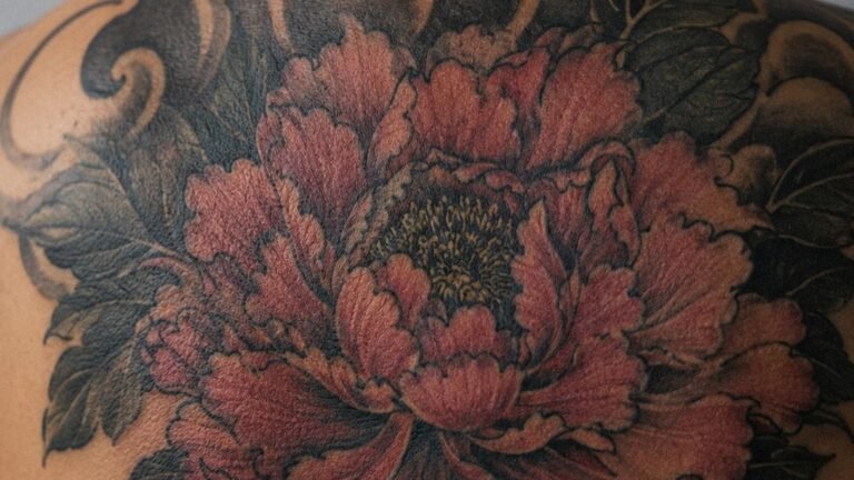
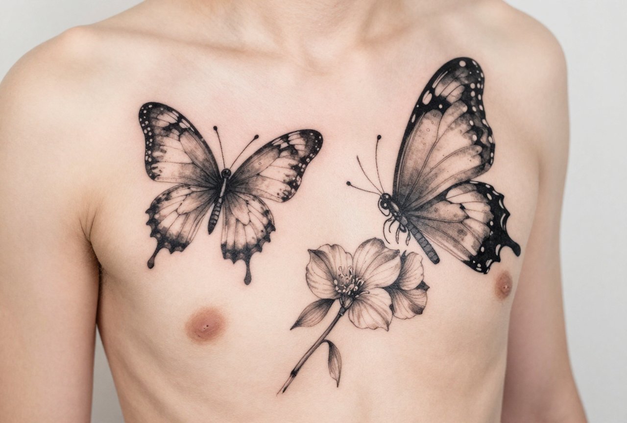
This is the bread and butter. Roses, peonies, cherry blossoms, wildflowers, I’ve tattooed hundreds. The organic shapes of petals naturally accept colour bleeding. Line work defines the flower structure, then watercolour fills create depth without hard borders. Peonies especially. Their ruffled layers hide any minor blowouts, and the colour transitions from deep magenta to pale pink look intentional rather than accidental. I tell clients: pick a flower with meaning, not just one that looks pretty on Instagram. You’ll live with it longer than the trend lasts.
Animals and Wildlife
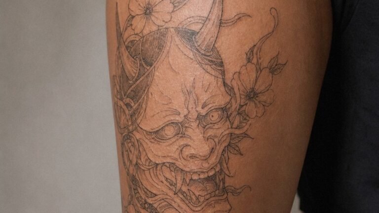
Wolves, birds, koi fish, butterflies, these work when the artist uses strategic negative space. A raven silhouette with watercolour bleeding from the wings? Stunning. The solid black anchors the design while the colour provides atmosphere. Without that dark anchor, though, a watercolour animal can look like a vague animal-shaped stain. I’ve seen it. We see this a lot in cover-up consultations, someone went too light, too loose, and now they’re back for rescue work.
- Geometric frames with watercolour fills, triangles, mandalas, or fine lines containing the chaos
- Abstract brushstroke pieces, pure colour movement without representational subject matter
- Script and lettering with watercolour backgrounds, words need crisp lines, colour provides mood
- Skull and dark imagery with bright colour contrast, death meets life, visually striking
Design Ideas That Make Sense
Here’s where I get practical. Watercolour isn’t a magic filter you slap on any image. The technique demands specific design thinking.
Small pieces rarely work. A tiny watercolour heart on your wrist? Cute for six months. Then the edges soften, the detail disappears, and you’re left with something that looks like a birthmark. I steer clients toward larger canvases where the colour washes have room to breathe. A watercolour piece needs scale to read as intentional art rather than a smudge.
Subject matter with natural flow helps. Feathers dissolving into birds. A clock melting into colour. Landscapes where the sky bleeds into abstract washes. These concepts justify the technique. A watercolour portrait of your dog? Technically possible, but why? The style undermines the realism you’re asking for. Pick a lane.
Meaningful Motifs
Clients often bring deep personal stories. A watercolour phoenix for rebirth after divorce. Ocean waves in blues and teals for a lost parent who loved the sea. I’ve tattooed a watercolour brain in purples and greys for a neuroscientist, anatomical line work with colour washes representing neural activity. The best watercolour tattoos merge technique with meaning so seamlessly that removing the colour would break the concept.
Best Placements for Longevity
Skin matters. Watercolour’s soft edges and lack of black outlining make it vulnerable to sun, friction, and stretching.
The upper arm, outer thigh, and upper back, these are your safest bets. Protected from daily sun exposure, relatively stable skin that doesn’t stretch dramatically with weight fluctuation. I’ve got a watercolour piece on my own upper arm from seven years ago that still reads clearly. The colour settled softly but maintained its character.
Ribs and stomach? Risky. The skin moves constantly, stretches, contracts. Watercolour there often ages into blurry confusion. Hands, feet, fingers? I gently talk clients out of these unless they’re prepared for frequent touch-ups. The colour just doesn’t hold on those high-wear, high-exposure areas.
- Upper arm/shoulder: excellent, protected, stable
- Outer thigh: good canvas size, minimal sun if you don’t live in shorts year-round
- Upper back/scapula: beautiful placement, easy to show or hide
- Forearm: acceptable if you’re diligent with sunscreen, but expect faster fading
- Inner bicep: decent, though moisture and friction from arm movement can affect healing
Working With Your Body
I always trace the area, look at muscle movement, skin texture. Someone with freckled arms, I’ll adjust the colour palette so the tattoo doesn’t compete with their natural spots. Darker skin tones need more saturated pigments; the pastel washes that look ethereal on pale skin can disappear entirely. A good artist adjusts the technique for the canvas, not just replicates a reference photo.
Color Choices and Aging Reality
Here’s the conversation I have weekly. Client wants soft pastels. Pink, lavender, pale blue. I explain: those fade fastest. Watercolour already lacks black outlines to hold structure; add fugitive colours and you’re looking at a expensive blur within three years.
Bolder pigments last. Deep teals, rich magentas, saturated oranges, dark purples. They soften over time, everything does, but they maintain enough presence to keep the design readable. I mix approaches: a watercolour piece needs some darker anchor points, even if they’re subtle. A deep blue shadow beneath a lighter wash gives the eye something to hold onto as the brighter colours settle.
White highlights? Nearly useless in watercolour. They disappear within months on most skin tones. I use negative space instead, letting the skin itself create brightness against saturated colour. That lasts forever because it’s literally your skin.
The Fading Timeline
Year one: bold, fresh, maybe slightly too bright. Year three: settled, the colours have found their permanent home in your skin’s layers. Year five to seven: noticeably softer, possibly needing a touch-up if you want that fresh intensity back. Year ten: a well-done piece still reads as watercolour; a poorly planned one looks like a faded bruise. The difference is in the original design choices and your aftercare discipline.
Tips for Choosing Your Artist
Not every tattooer who can do solid traditional work understands watercolour. It’s a specific skill set. When I’m hiring guest artists or recommending colleagues, I look at their healed work, not just fresh photos.
Ask to see pieces they’ve done that are two years old or more. Fresh watercolour always looks good. The question is how they planned for settling. Do they have return clients for touch-ups? That’s actually a good sign, watercolour needs maintenance, and artists who build that relationship understand the long game.
Style matching matters too. An artist who excels at photorealistic black and grey might struggle with the loose, painterly approach watercolour demands. Look for portfolios with actual brushstroke texture, splatter effects, colour bleeding that looks controlled rather than accidental. In shop culture, we can spot the difference between someone who studied watercolour technique and someone who just skipped the black outlines.
- Check healed photos, not just fresh work
- Ask about their colour choices and why, do they think about longevity?
- Discuss touch-up policy upfront; watercolour often needs it
- Bring reference but stay open to their design adjustments for your specific skin
- Budget for larger pieces; small watercolour rarely succeeds
The Consultation Conversation
What I tell clients in that first meeting: be honest about your lifestyle. Outdoor worker? Watercolour will fade faster, no way around it. Planning weight changes? Placement matters more. Want to build a larger sleeve later? Let’s talk about how this piece integrates. The best watercolour tattoos come from collaborative conversations, not just picking flash off a wall.
Final Thoughts
Watercolour tattoos can be breathtaking. I’ve watched clients cry happy tears at the reveal. I’ve also done cover-ups on watercolour pieces that were poorly conceived from the start. The difference is almost always in the planning, choosing the right subject, the right scale, the right colours, the right placement, and the right artist for this specific technique.
Don’t chase a trend. Chase a piece that makes sense for your skin, your story, and your willingness to maintain it. The best tattoo is the one you’ll still be proud to show in a decade, not just the one that gets the most likes this week. If watercolour genuinely fits your vision, commit to it fully. Half-measures in this style look exactly like what they are: hesitation made visible.
Frequently Asked Questions
Do watercolour tattoos fade faster than traditional tattoos?
They can, especially if they’re done with light pastels and no dark anchors. Bold colours and strategic black or deep shading help them last much longer. Sun protection is non-negotiable with this style.
Can you add watercolour to an existing black and grey tattoo?
Sometimes, but it depends on the existing work’s density and placement. I’ve successfully added colour washes around solid black pieces, but trying to tint over heavy black shading rarely works well.
Why do some watercolour tattoos look like bruises after healing?
Usually because the colours were too muted, too similar to natural skin tones, or placed without enough contrast. Purple and blue washes especially can settle into bruise-like tones if not balanced with warmer colours or deeper values.
How much should I expect to pay for a quality watercolour piece?
Watercolour takes serious skill and often more time than it appears. Expect to pay at least what you’d pay for detailed colour work in your area, cheap watercolour almost always means shortcuts that age badly.