Picture tattoos, designs that replicate photographs, paintings, or highly detailed imagery, demand a different approach than flash-style symbols. The goal is translation, not just replication. Skin stretches, blurs, and ages in ways paper and canvas never do. Getting a picture design right means understanding what survives the medium and what the body does to fine detail over time.
Popular Styles for Picture Tattoos
Not every tattoo style handles photographic reference well. Some approaches lean into the limitations of skin; others fight against them. Here are the styles that actually work for picture-based designs.
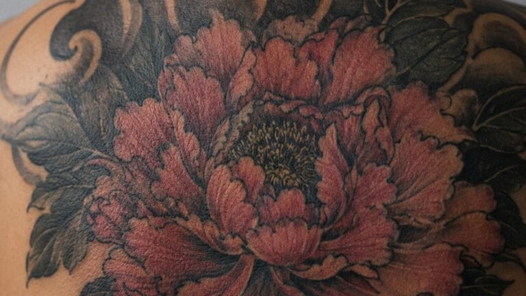
Black and Grey Realism
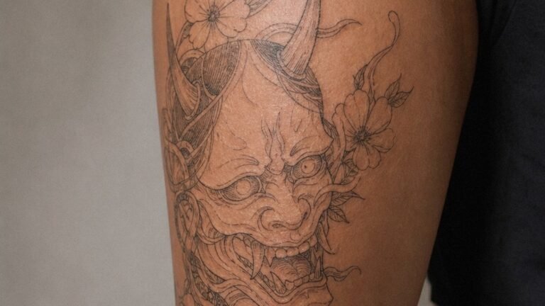
The dominant style for portrait work and still-life imagery. Black and grey realism builds dimension through graduated washes rather than hard lines. A skilled artist uses a single needle or tight three-needle grouping for hair-thin highlights, then switches to magnum shaders for smooth black-to-skin transitions. The result reads as photographic from normal viewing distance, but up close you see the deliberate construction of tones.
Healed black and grey settles about 20-30% lighter than it looks fresh. Artists compensate by pushing darks slightly deeper than reference. Without this adjustment, a healed piece looks washed out and flat.
Color Realism
More demanding on both artist and collector. Skin doesn’t hold bright yellows, light greens, or pale pinks well, those pigments fade fastest and warm toward the body’s undertone. Successful color realism relies on strategic saturation: deep crimsons, forest greens, navy blues, and burnt umbers carry decades. Artists often substitute reference colors with more stable alternatives rather than chasing exact matches that won’t last.
- Portraits in color require larger minimum sizes, typically palm-sized or bigger for facial features to read correctly
- Backgrounds in color realism often use muted earth tones that age gracefully rather than competing with the subject
- White ink in color realism is a highlight tool, not a standalone color; it yellows and disappears within months to years
Neo-Traditional and Illustrative Adaptation
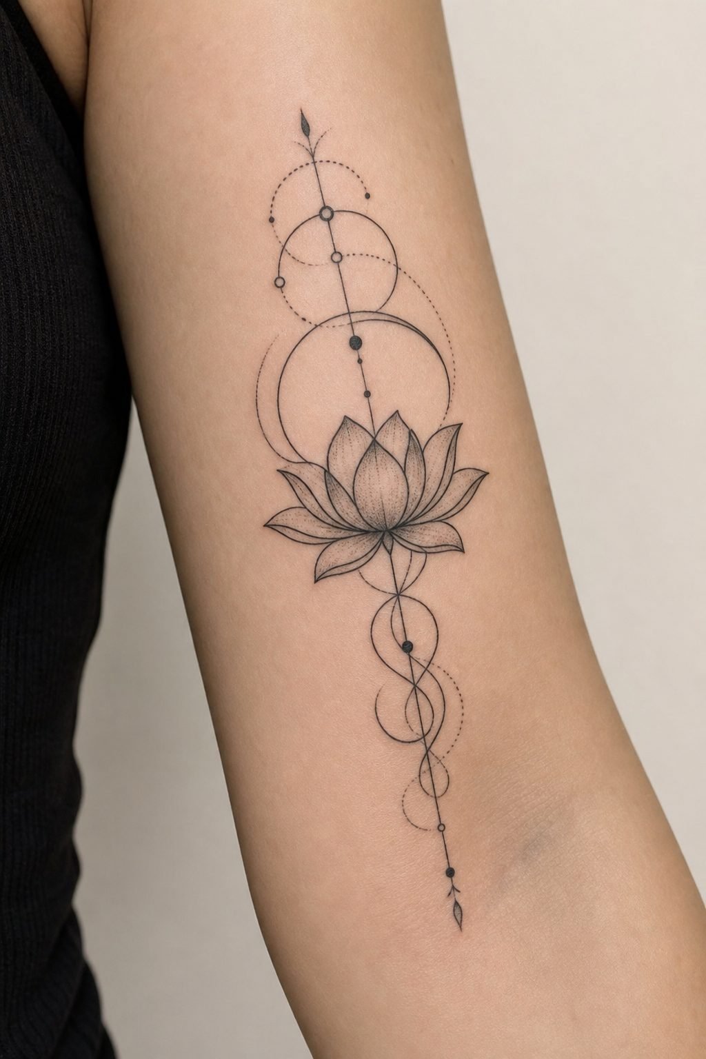
Some collectors prefer stylized interpretation over literal replication. Neo-traditional picture designs simplify photographic reference into bold shapes, limited color palettes, and strong readable outlines. The image becomes graphic rather than documentary. This approach sacrifices literal accuracy for longevity and visual punch from across a room.
Design Ideas That Translate Well
Certain photographic subjects consistently succeed as tattoos. Others fail predictably. Understanding why helps you choose wisely.
Portraits and Faces
The most requested picture category and the most technically punishing. Human faces require precise proportion, correct eye spacing, and accurate value mapping. A portrait that captures likeness but misses the light in the eyes feels dead. The best portrait artists spend as much time studying how light falls across bone structure as they do running machines.
Single faces work better than group shots. At smaller sizes, multiple faces compress into indistinguishable blobs. If you want multiple people, consider separate pieces or a composition where each face has adequate breathing room, typically at least two inches in any dimension for a recognizable likeness.
Animals and Wildlife
Fur texture translates beautifully to tattooing. The natural patterning of animal coats, stripes, spots, directional flow, gives artists structural guidance that human skin lacks. Predatory animals (wolves, big cats, birds of prey) remain popular because their intense eyes and dramatic lighting create strong compositions. The key is reference quality: blurry phone photos produce blurry tattoos. High-resolution images with clear directional lighting separate good results from mediocre ones.
Landscapes and Architecture
These demand careful simplification. A photograph contains infinite detail; a tattoo cannot. Successful landscape tattoos identify three to five focal layers, foreground, midground, background, sky, and reduce each to essential shapes. Atmospheric perspective (lighter, less contrasted distant elements) helps create depth without requiring microscopic detail. Architecture benefits from strong geometric framing; crumbling ruins or weathered barns often read better than pristine modern buildings because their irregularity hides the artist’s hand.
Best Placements for Picture Designs
Skin quality and movement determine where detailed imagery survives. Some placements age picture tattoos gracefully; others distort them beyond recognition within a few years.
- Upper arm and outer thigh: Flat, stable surfaces with minimal stretching. Ideal for medium to large portraits or landscapes. The cylindrical shape wraps imagery slightly, which artists can use compositionally
- Back and chest: The largest continuous canvases. Full back pieces allow complex multi-subject compositions. Chest placement works for centered portraits but requires awareness of how pectoral movement shifts the image
- Forearm and calf: Highly visible but challenging. Frequent sun exposure fades color faster. The forearm’s tendons and thin skin over bone can distort fine lines as the body ages
- Ribs and stomach: Generally poor for detailed picture work. Constant expansion, compression, and stretching from breathing and posture change warp imagery over time. Soft shading becomes blotchy; straight lines curve unpredictably
Small picture tattoos, under three inches, rarely age well regardless of placement. The ink spreads slightly during healing and more over years; fine details merge into muddy masses. If you want a small memorial piece, consider symbolic simplification rather than miniature portraiture.
Color Choices and Aging
Picture tattoos face a fundamental tension: the reference may be full color, but the canvas (your skin) modifies everything. Darker skin tones require different approaches than pale skin. Ink sits within the dermis, visible through the epidermis’s natural pigment. This filter effect means colors read differently on different bodies.
Black and grey offers the most predictable aging. It relies on carbon-based pigments with centuries of proven stability. Color demands more maintenance and realistic expectations. Reds and dark blues last longest. Yellows, oranges, and light greens fade to skin-tone within five to ten years in most cases. White disappears entirely, becoming a subtle scar-like texture at best.
Some artists use a “desaturated” approach for color realism, pulling reference toward muted tones that match what skin can actually hold. A sunset becomes rust and ochre rather than tangerine and lemon. Forest greens deepen to near-black in shadow. This isn’t artistic compromise; it’s engineering for the medium.
Tips for Choosing Your Artist
Picture tattoos separate specialists from generalists. The artist who does clean traditional work may lack the shading control that realism demands. Evaluating portfolios requires looking past subject matter to technical execution.
What to Look For in Healed Work
Fresh tattoos look sharper and darker than healed results. Any portfolio should include healed photos, ideally one to three years out. Check whether fine details survived, whether black areas stayed solid or developed a greyish haze, whether skin texture looks irritated or settled. Smooth gradients without visible needle marks indicate controlled machine speed and consistent hand pressure.
Reference Handling
Artists who simply trace and transfer photographs rarely produce strong tattoos. The best picture tattooists redesign reference for the medium: adjusting contrast ranges, simplifying busy backgrounds, exaggerating focal points that photographic flatness obscures. Ask how they plan to adapt your image. Vague answers suggest limited experience with the translation process.
- Request to see similar subject matter in their portfolio, portrait artists should show faces, not just animals or flowers
- Discuss minimum size requirements honestly; artists who agree to too-small detail work may prioritize booking over your long-term result
- Understand their touch-up policy; picture tattoos often need refinement after healing as the skin settles and reveals what didn’t take
Final Thoughts
Picture tattoos occupy a challenging middle ground between pure art and technical craft. The image must first be yours, personally meaningful, visually compelling, but then it must be rebuilt for a living, changing surface. Success comes from respecting both halves of that equation. Choose reference that matters, then trust the artist who explains how it needs to change to survive. The best picture tattoos aren’t perfect copies. They’re permanent images that still look like themselves when you’re decades older, with skin that has lived.
Frequently Asked Questions
How small can a picture tattoo be before details blur?
Most artists won’t go below two to three inches for recognizable faces, and four to five inches for complex scenes. Below that, lines merge during healing and aging. Simpler subjects like single flowers or geometric shapes can work smaller, but photographic detail needs room to breathe.
Can any tattoo artist do realistic picture tattoos?
Realism is a specialized skill requiring specific shading techniques and equipment setup. Artists who primarily do bold traditional or fine-line work may not have developed the graduated tone control that picture designs need. Always look for healed realism in their portfolio, not just fresh photos.
Why do color picture tattoos fade faster than black and grey?
Color pigments are generally less stable than carbon black, and lighter colors like yellow, pink, and light green have larger particle sizes that your body breaks down more quickly. UV exposure accelerates this process. Strategic color choices and sun protection help, but some fading is inevitable.
How do I prepare reference photos for a portrait tattoo?
Bring the highest resolution original you have, with clear directional lighting that shows facial structure. Avoid heavy filters, extreme shadows, or low-light grain. Multiple angles help the artist understand bone structure. The photo should capture personality, but technical clarity matters more than emotional resonance for the reference itself.