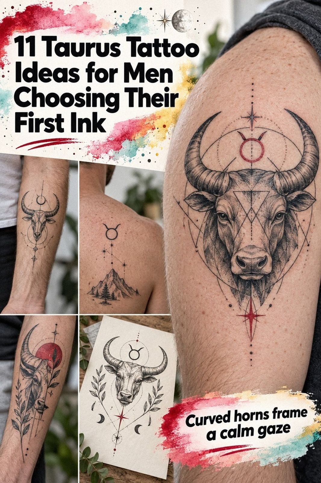
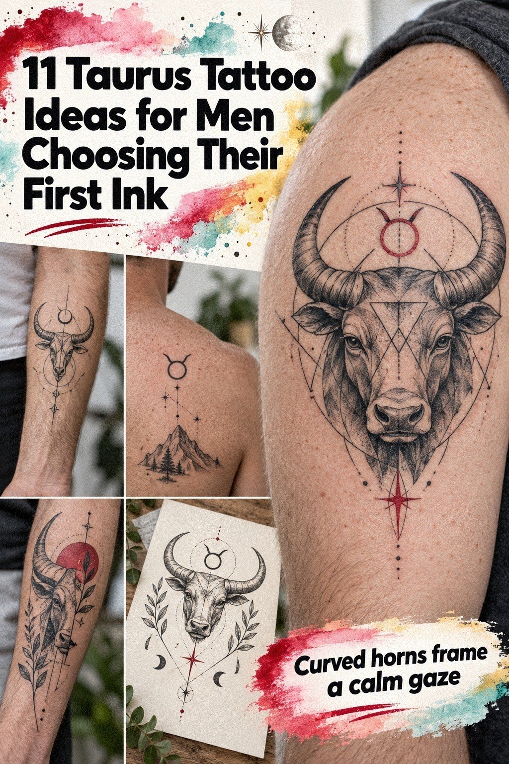
Taurus tattoo men ideas can stay readable for years when placement, line weight, and aftercare agree. I learned that after choosing a fine-line tattoo at 30, then watching the smallest details settle into my skin. The result is still striking, but it wasn’t luck!
I wanted something personal, expressive, and easy to recognize without making it loud. After years of looking at it, I still think the restraint was the right call.
Before the appointment
Before the appointment, I had a blank patch of skin I’d been saving for an idea with weight. I didn’t want a random bull copied from a flash page. I wanted something symbolic and masculine without turning into a bold emblem.
My first sketches were too ornate. The horns crowded the face, the eyes looked fierce, and the whole thing felt more aggressive than meaningful. I kept your future comfort in mind because a tattoo has to read while your body is relaxed and moving.
The final reference showed clean geometry, open skin, and a controlled expression. You’ll notice that the design doesn’t rely on heavy shading to carry the emotion. That choice gave me a crisp starting point and made the aging process easier to judge.
I kept one rule in front of me: if the bull needed ten extra lines to look impressive on paper, it wasn’t ready for skin. My tattoo ideas for men board helped me compare quieter designs before I booked.
- Why I Chose a Geometric Taurus Bull
- Fine Line or Hand Placement?
- The Taurus Profile
- Place the Horns on the Sternum
- Taurus and a Date
- When Fingers Cramp the Design
- The Full-Back Question
- Sharpen the Gaze With Black Shadows
- Does Placement Change the Pain?
- Protect the Details While It Heals
- My Initials, Not a Copy
1Why I Chose a Geometric Taurus Bull
I chose a geometric bull because circles and angled planes give you structure without filling every patch with ink. The face looks powerful, but the open skin keeps it understated. I’d skip a fully shaded head here because it would lose the delicate tension that makes the design feel modern.
The artist used hair-thin black lines for the muzzle and horn edges, then added restrained terracotta and olive-green accents. My trigger moment came when I saw the stencil from a few steps away. It still read as a bull, and I knew you wouldn’t need to stand close to understand it!
If you’re choosing this style, ask for a stencil that’s slightly larger than your first instinct. A tiny geometric face can blur faster than you expect, while a measured scale gives each angle breathing space. Your artist should show the design while your arm is relaxed and naturally turned.
The strongest part is the restraint. You can pair this idea with dotwork tattoo men references if you want texture later, but I’d keep the first pass symbolic, timeless, and open. That choice matters when you still recognize the expression years later.
2Fine Line or Hand Placement?
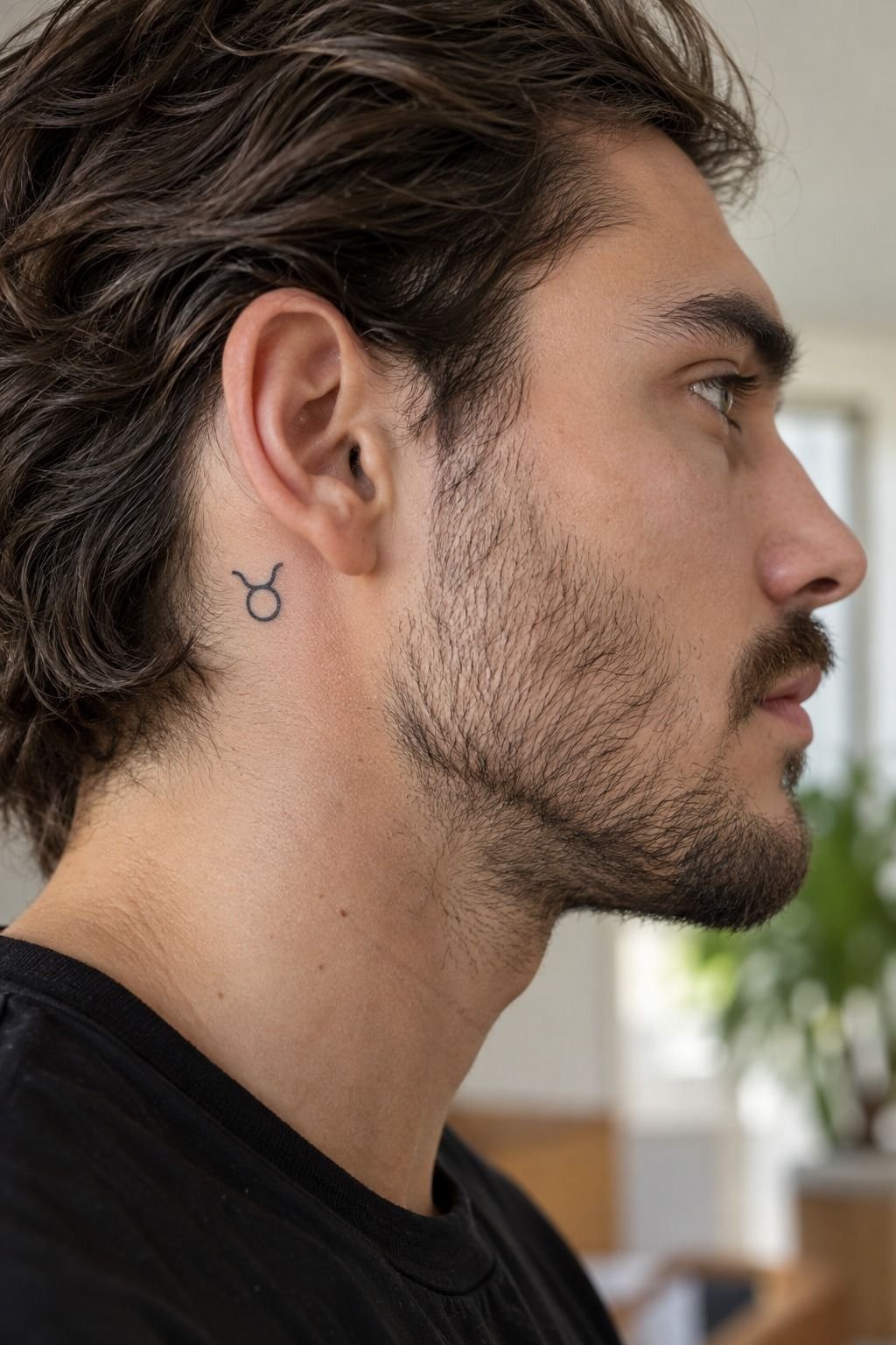
I tested single-needle linework because I wanted the bull to look expressive without turning gritty. The artist kept the horn tips narrow, used clay-toned details, and left the eyes almost blank. That made the face feel haunting in a quiet way and stopped the symbol from becoming cartoonish.
My first reaction was nervous. A fine line can look dainty on the stencil, especially beside stronger blackwork.
Then I saw the transfer sitting against the skin and noticed how the empty spaces made the head look larger. That was the moment I stopped trying to make it fiercer.
The hand has constant friction, sunlight, and movement. Your fingers and knuckles may soften delicate marks sooner than the ankle or outer forearm. For a first tattoo, I’d choose the ankle or outer forearm over the side of the hand.
If you’re set on visible placement, compare it with circle tattoo design for men ideas. A circular frame can protect the bull’s proportions, but I’d avoid squeezing that frame between finger joints. Clean spacing is more valuable than extra symbolism.
A hand tattoo can still be bold, but it needs a design that accepts change. Ask whether faster fading would bother you and whether a future touch-up fits your budget. That honest answer matters more than chasing an edgy placement.
3The Taurus Profile
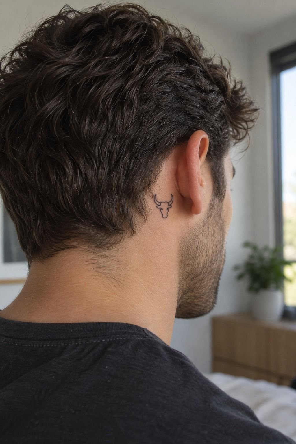
A front-facing bull feels confrontational. A side profile feels more elegant, reflective, and slightly mysterious. Both can be meaningful, but they speak with different energy.
I compared side-profile linework with a full frontal face before choosing the quieter option. You’ll see the difference in the nose and horn rhythm. The profile uses fewer marks, but each one carries more meaning.
I’d choose it when your goal is a meaningful tattoo with a polished silhouette.
The artist showed me three versions: rounded horns, narrow horns, and one with a rougher brow. The narrow version looked too sharp on the stencil. The rounded one looked more graceful, but it lost the fierce edge I wanted.
The middle drawing won because it felt balanced without being safe.
For the color version, I chose muted plum, soft grey, and a restrained rose-gold accent. The palette felt romantic without making the bull delicate. It also gave the profile a vintage quality that black ink alone would not have created.
I saved the rejected profiles beside Sagittarius tattoo for men references to compare movement and symbolism. That comparison helped me decide that Taurus should feel grounded, not pointed toward motion.
4Place the Horns on the Sternum
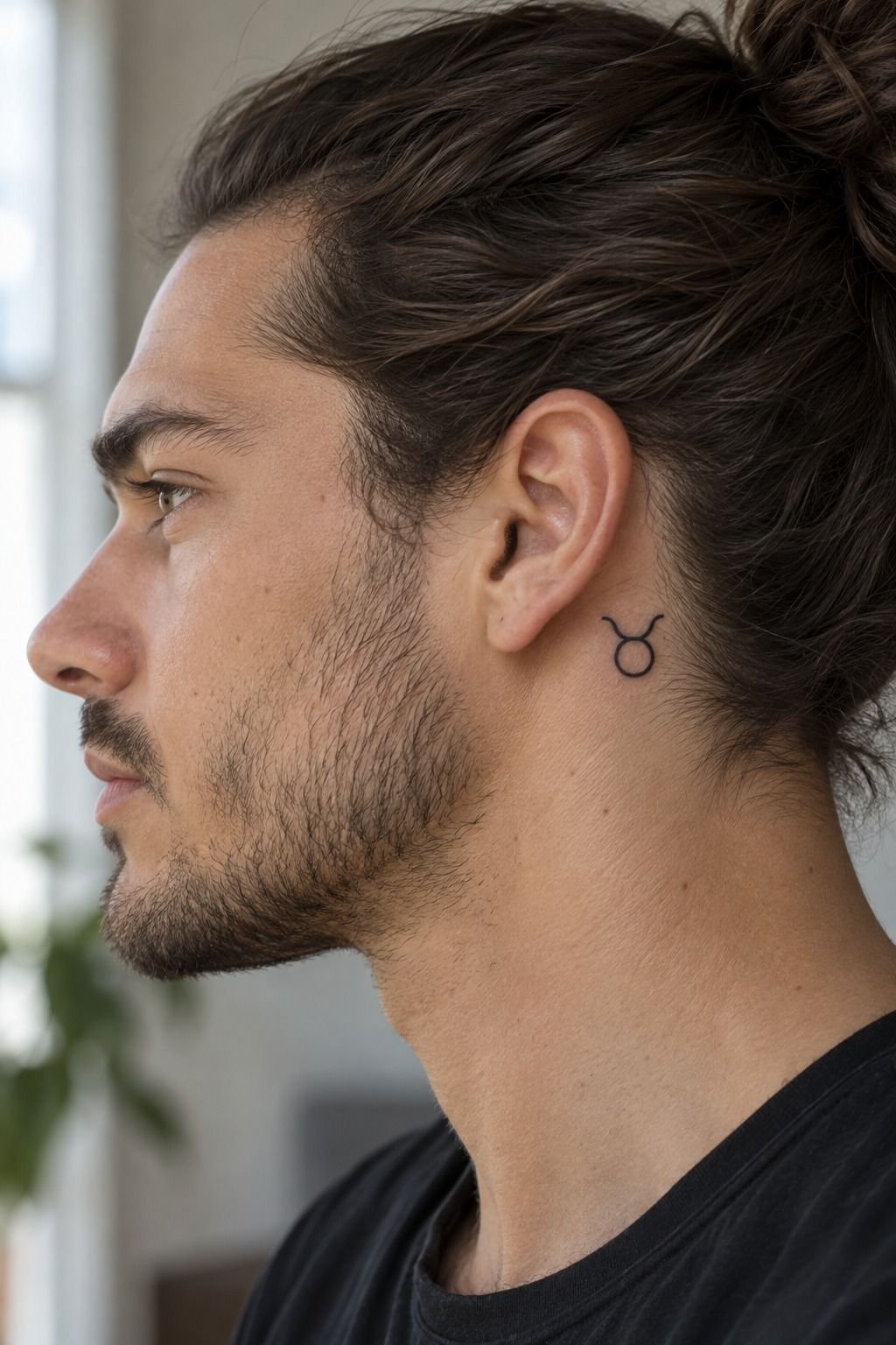
The sternum placement changed the whole character of the bull. I used deep navy-black ink with tiny white highlights and left generous space around the horns. The result felt sacred, symmetrical, and powerful without becoming overwhelming!
5Taurus and a Date
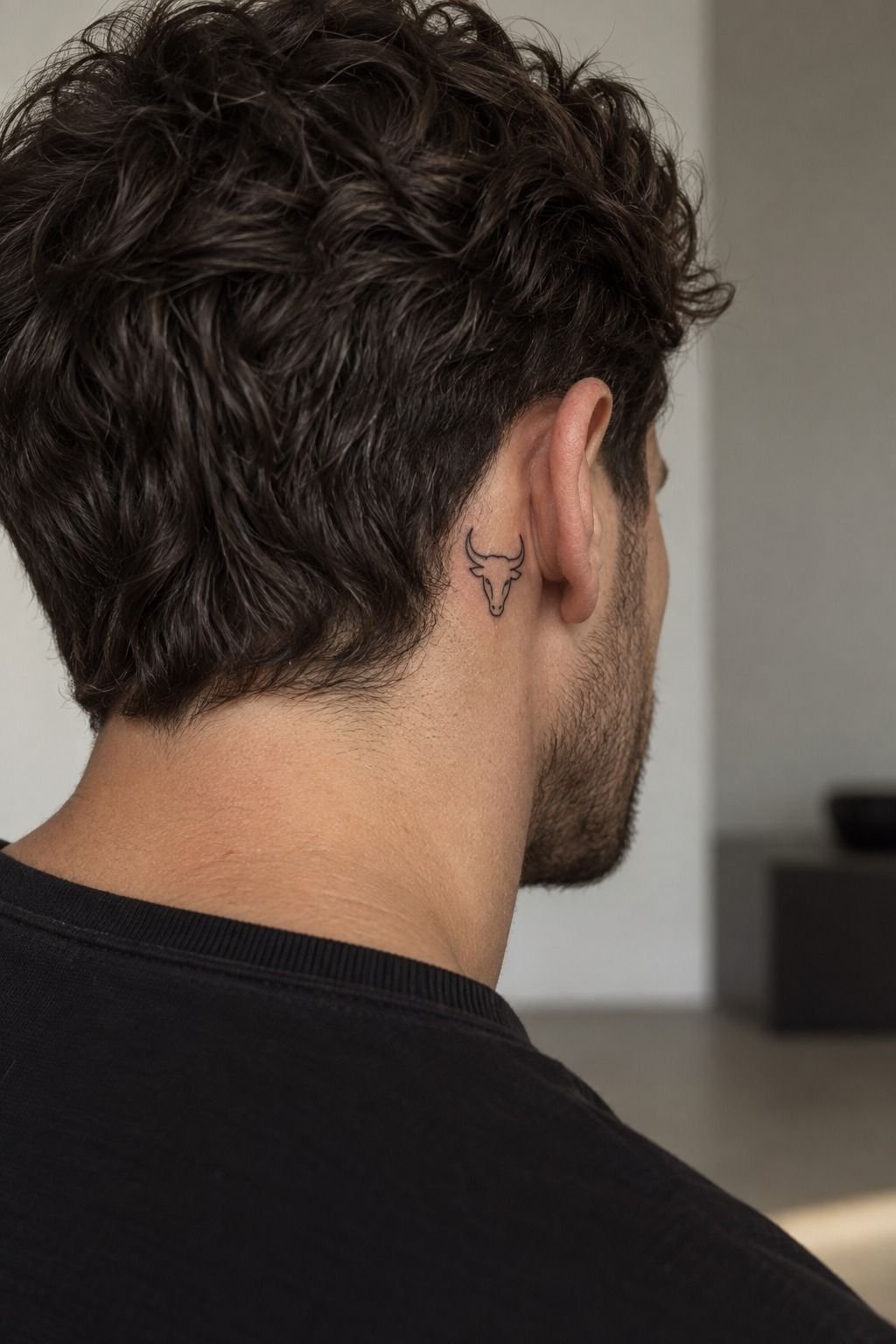
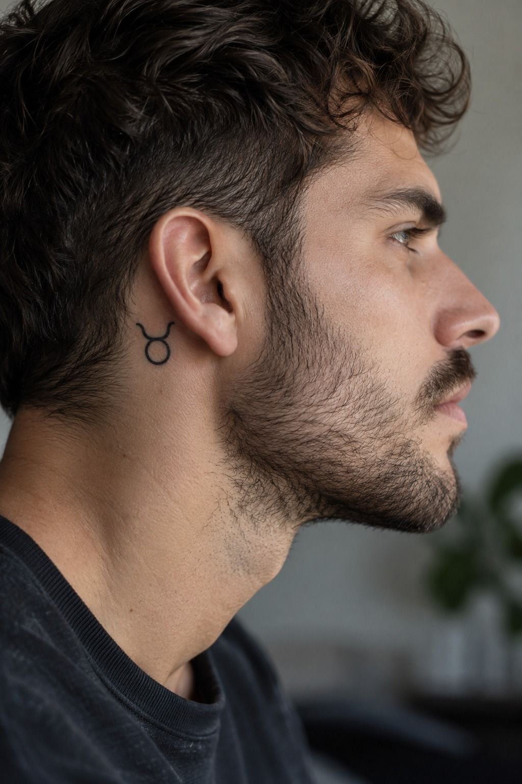
I paired the Taurus glyph with a date connected to a personal turning point. The numbers stayed smaller than the horns, and the type remained clean enough to read years later. I’d avoid placing the date directly across the face because it interrupts the expression.
The artist drew four versions on plain paper. One used Roman numerals, one used a narrow sans serif, and two used handwritten marks.
The handwritten version looked romantic but less readable. The narrow numerals felt more timeless, so that’s where I landed.
I added subtle emerald and gold accents around the glyph rather than forcing color into every line. That made the symbol vibrant but still understated. The cream-colored negative space kept the date from competing with the bull.
If you’re choosing a date, decide whether you want strangers to read it. A hidden anniversary can sit under the jaw or near the shoulder blade. A public year can work below the bull, but you’ll want enough spacing for future touch-ups.
Tiny numbers packed together rarely age with grace. A date can mark a move, a recovery, or the day you chose a different direction. For more symbolic references, browse 777 tattoo meaning, then keep your own piece minimal and personal.
My favorite version was the most minimal one. It looked sleek, but it still carried private meaning. That balance made the extra planning worth it.
6When Fingers Cramp the Design
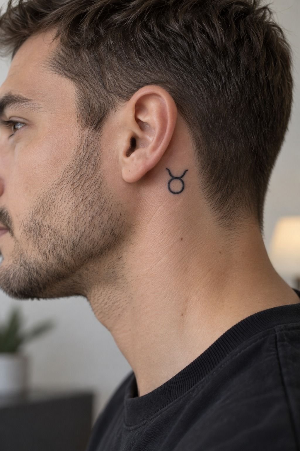
I used a finger stencil to study the horn width, eye placement, and spacing between each mark. Forest-green and rust accents looked expressive on paper, but the narrow finger placement left too little room for them to age gracefully.
7The Full-Back Question
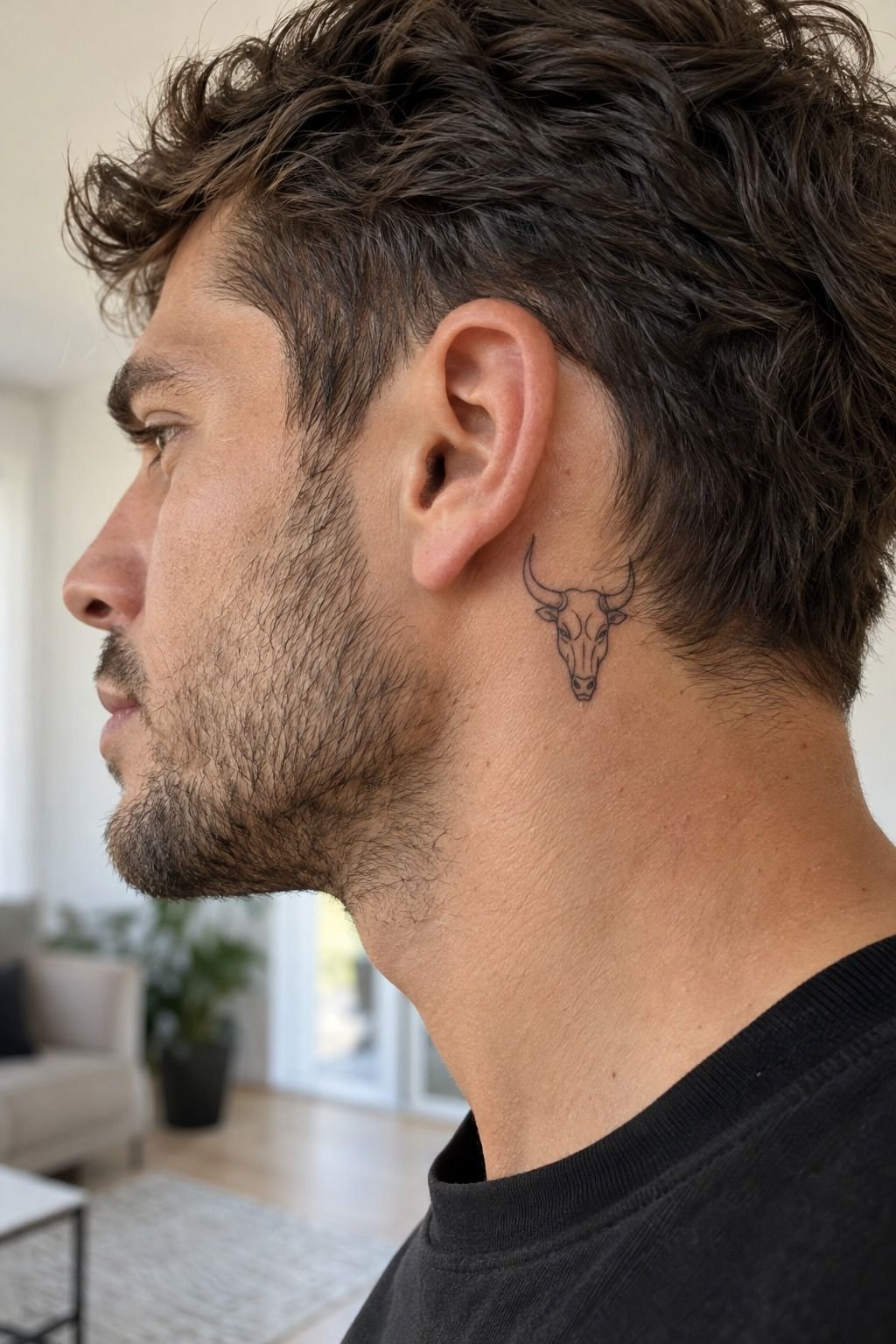
A full-back Taurus can look iconic, but the scale changes what the design needs.
At that size, the full-back composition needs a clear center. I’d enlarge the horns, forehead, and silhouette before adding secondary symbols. The larger area can support more movement, but it still needs a hierarchy.
I considered a dramatic back piece and rejected the busiest version. It had too many lines around the shoulders, and the bull lost its raw character. A quieter outline would have looked more daring because the main shape could speak first.
I eventually liked a dusty-rose and charcoal base with restrained brass-gold accents. The palette felt stylish and expressive without turning the emblem into a noisy mural.
The best test is the stencil. Stand naturally, turn gently, and check whether the expression survives movement. If you have to pose to understand it, the composition needs another pass.
8Sharpen the Gaze With Black Shadows
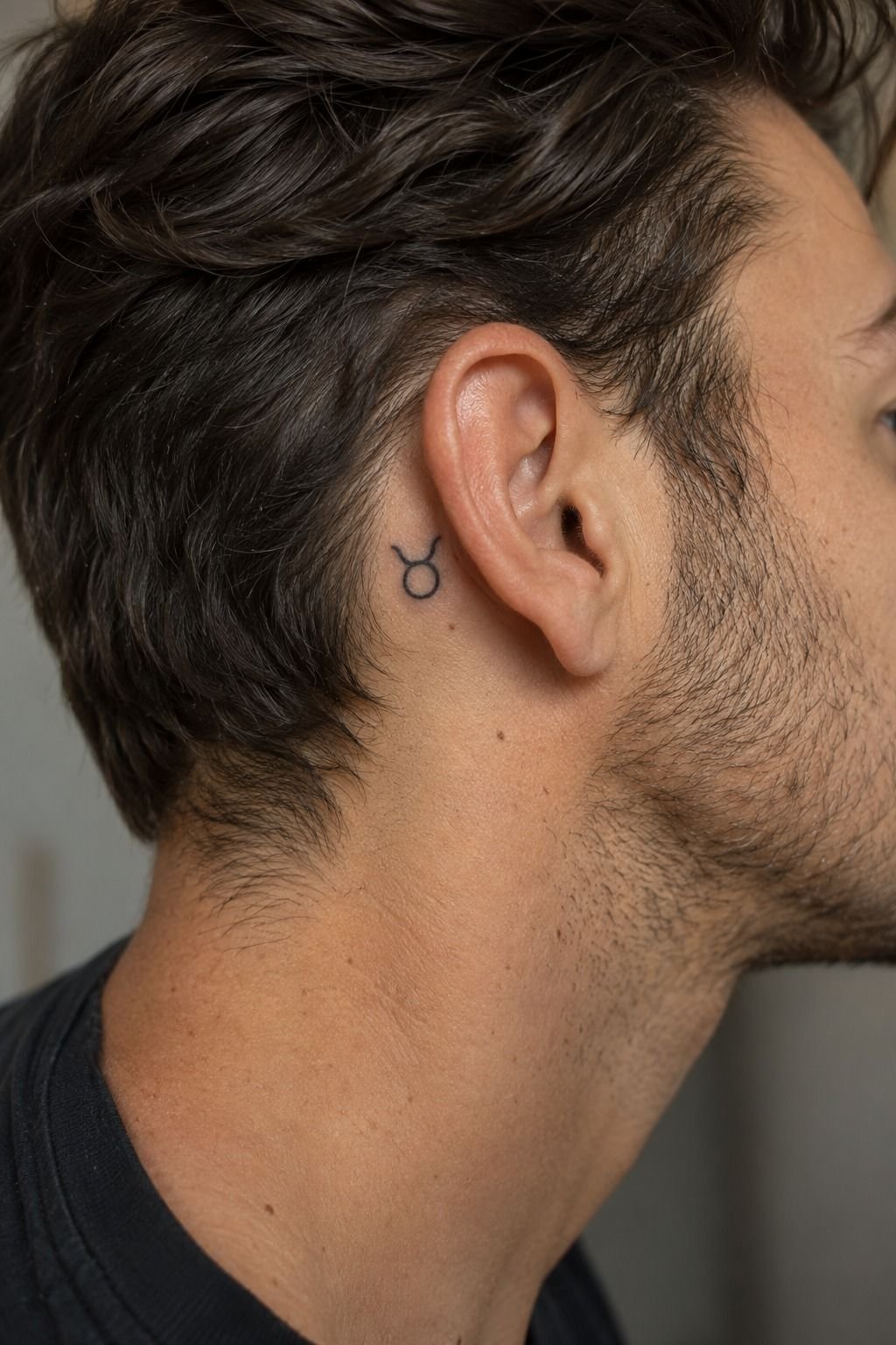
The gaze is the emotional center. You don’t need a fully shaded head to make the bull feel powerful, and I’d argue that restraint makes the expression sharper.
I added black ink shading beneath the brow and at the base of each horn. The artist used short, controlled marks rather than a soft wash. Warm-white and camel-toned accents softened the contrast without weakening the fierce expression.
The first version had too much shadow near the muzzle. It made the bull look angry instead of focused, so we removed half of it before the stencil. That edit was small, but it turned the expression from edgy to meaningful.
On a wrist, scale matters even more. A small design can look delicate when fresh, but lines may spread slightly as skin settles. I’d choose a clear silhouette with one darker anchor rather than chasing photorealism.
You can study contrast through bee tattoo design and dotwork tattoo guide references. Just don’t stack every technique into one bull. The strongest version uses one gritty shadow system and knows when to stop.
That single anchor became my favorite detail. It gave the face a fierce center without making the whole tattoo heavy. For me, that was a better use of money than adding layers no one would notice.
9Does Placement Change the Pain?
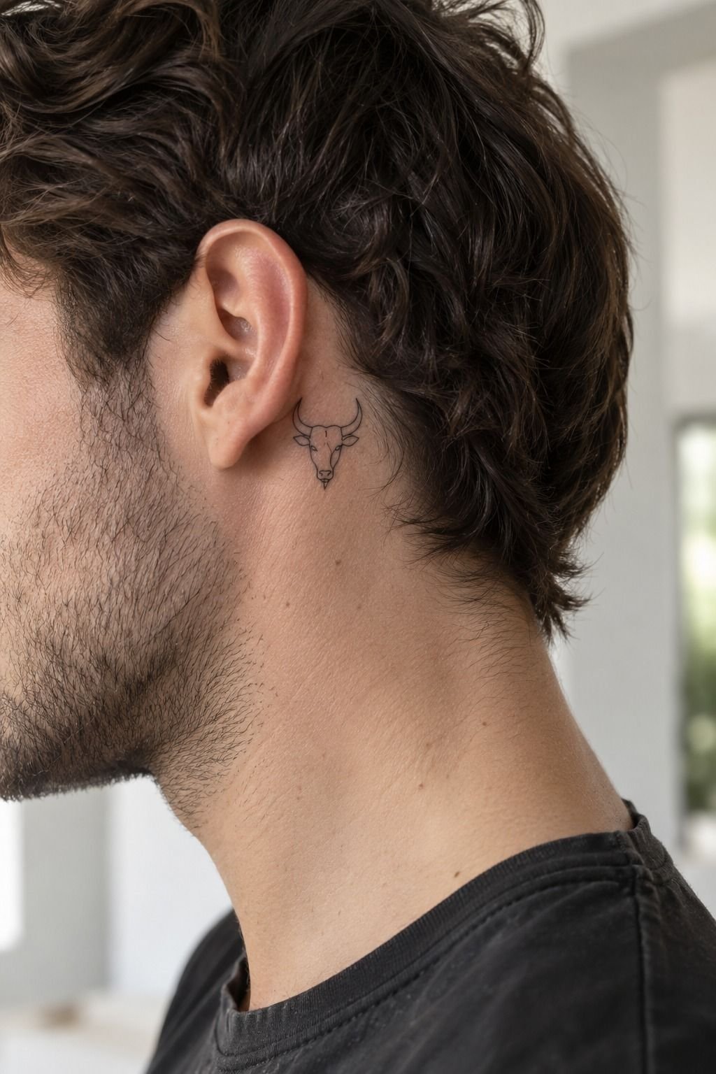
Pain varies by person, but ribs, feet, hands, and the sternum are often more sensitive than the outer forearm, thigh, or shoulder.
My placement decision mattered more than the zodiac symbol when I was planning comfort. I could tolerate a longer session on the outer forearm, while the sternum felt sharper even during the stencil. Midnight-blue and copper details made the final piece feel vibrant, but color could not change the sensitivity of the placement.
You won’t know your exact response until you’re there. Eat beforehand, drink water, and tell your artist if you need a pause. There’s nothing empowering about pretending you’re fine when your body is asking for a break.
For a first piece, I’d compare the outer forearm, upper arm, thigh, and shoulder. A meaningful tattoo doesn’t become more sacred because you chose the hardest location.
10Protect the Details While It Heals
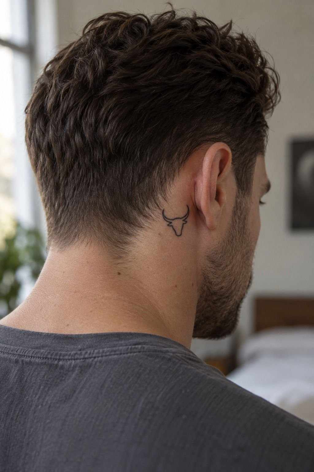
I followed a gentle aftercare routine: clean hands, mild washing, careful drying, and a thin layer of the product recommended by my artist. The sage-green and cream accents stayed vibrant because I resisted picking, soaking, and unnecessary sun exposure.
11My Initials, Not a Copy
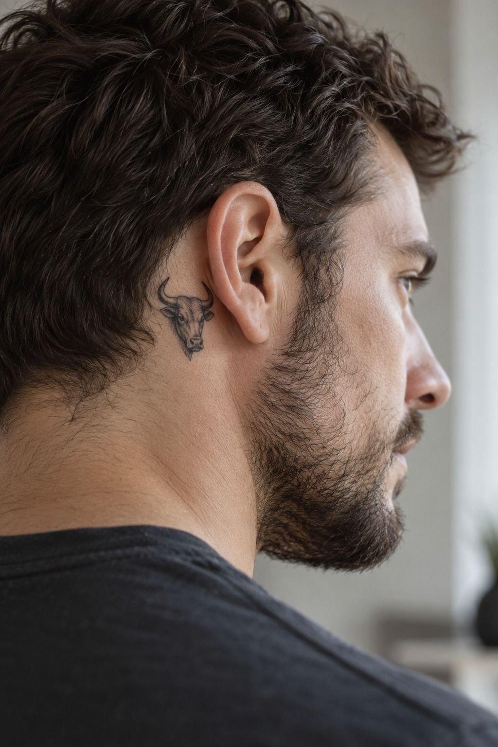
I added my personal initials beneath the Taurus symbol rather than copying another person’s lettering.
The initials made the piece feel daring without adding another large image. I kept them small, but not so small that the letters would merge as the skin settled.
I used terracotta and olive accents around the initials, tying them back to the bull without repeating the entire palette. That made the detail feel personal, playful, and intentional.
If I were doing it again, I’d leave a little more separation between the glyph, initials, and date. The symbolism works best when each element can be read on its own.
The Crisp-Line Decision: What I Learned
I went back and forth on fine-line work because people often describe it as fragile. My experience is more specific. Fine lines can soften, especially when they’re packed into a small area, but good placement, sensible spacing, solid black anchors, and protection from ultraviolet light make a meaningful difference.
The part I’d change is my first instinct to add detail. I thought an intricate bull would feel more valuable, so I kept adding tiny marks around the horns. The stencil looked polished, but the design became less expressive.
Removing those lines made the face clearer and gave the skin a flowing rhythm. If you’re choosing between delicate linework and full blackwork, ask which details must survive first.
For me, the best Taurus design sits between minimal and ornate. It’s symbolic enough to mean something, expressive enough to hold attention, and understated enough that I can still live with it years later.
You may prefer a dramatic back piece, but I’d rather see one classic shape than a crowded design that ages unevenly. That’s the crisp-line decision I’d bring to your artist: what should remain readable if the smallest lines soften?
The Rule I Kept
My rule was simple: every mark needed a job. If a line didn’t define the horns, support the gaze, or protect the silhouette, I questioned it.
That approach made the design feel sleek without making it empty. It also helped me compare the quote honestly. A higher price isn’t automatically better value if the extra detail only makes the piece harder to read.
Your artist should be able to explain why each major element is there. If the answer is only “it looks cool,” keep sketching.
A meaningful tattoo can still be whimsical or playful in its smallest detail. The point is to make the bold choice deliberate, not crowded.
What I Would Change Now
If I were starting again, I’d ask for healed examples on skin similar to mine before approving the final scale. Fresh ink is striking, but healed work tells you much more about spacing, contrast, and line survival.
I’d also leave more room around the date and initials. The symbols remained clear, but the smallest lettering softened sooner than the main bull.
That doesn’t make the tattoo unsuccessful. It simply proves that the most delicate details deserve the most planning.
I’d still choose the same Taurus concept. It feels vintage, stylish, and quietly fierce without depending on a trend.
How Much It Cost: The Session-Size Rule
The honest answer depends on the artist, region, size, placement, and whether the design takes one session or more. In the US, many shops have a minimum around $50 to $100, while hourly rates commonly land around $100 to $250.
For me, the artist’s hourly rate mattered less than their healed portfolio. An affordable session isn’t a bargain if the linework needs correction later.
I’d ask for the minimum, hourly rate, expected session length, and touch-up policy before you book. Don’t choose an artist solely because the quote is low.
Your tattoo ideas for men research should include healed photographs, clean linework, and work on skin tones similar to yours. That research is worth the time and may protect your budget.
You also don’t need to overspend on detail you won’t see. A smaller, well-spaced Taurus bull can be more cost-effective than a dense portrait that requires a long session.
The best budget decision is usually the design that stays readable with fewer marks. That’s where cost, value, and permanence finally agree.
What the Quote Should Include
Before you pay a deposit, ask about the touch-up policy, hourly rate, expected duration, stencil changes, aftercare instructions, and shop minimum.
A clear quote should tell you what you’re buying. If the answer feels vague, keep looking. You deserve to understand the budget before the appointment begins.
The cheapest option isn’t always the smartest value, especially for fine linework. An experienced artist may charge more but save you from correcting uneven spacing or weak placement later.
I’d also ask to see healed work. Fresh tattoos can look vibrant and polished, while healed examples reveal whether the lines remain clear, delicate, and balanced. The 15 tattoo designs men actually commit to long term list helped me think more seriously about permanence.
What People Always Want to Know
How much does a Taurus tattoo usually cost?
A Taurus tattoo usually costs about $100 to $300 for a small or medium design in the US, though shop minimums may run around $50 to $100 and hourly rates about $100 to $250. Your final quote depends on the artist, region, size, and placement.
Are Taurus tattoo men ideas good for a first tattoo?
Yes, a Taurus tattoo can suit a first appointment when you choose a tolerable placement and a clear design. Tattoo ideas for men can help you compare masculine, feminine, or neutral approaches before booking. The outer forearm, thigh, and shoulder are common easier starting zones.
How do I choose a tattoo artist for Taurus tattoo men ideas?
Choose an artist with healed linework in their portfolio, clean stencil control, and strong hygiene practices. Healed photographs are the useful proof because fresh ink can hide how delicate lines settle. The dotwork tattoo guide is useful when you’re comparing texture, but your artist’s healed work matters more.
How much do Taurus tattoo men ideas hurt?
Pain varies by person, but ribs, feet, hands, and the sternum are often more sensitive than the outer forearm, thigh, or shoulder. Placement is the biggest comfort variable. Eat beforehand, stay hydrated, and tell your artist when you need a short pause.
How long does a Taurus tattoo take to heal?
Surface healing usually takes about two to three weeks, while complete healing can take around two to three months. Gentle aftercare and avoiding sun, pools, and scratching protect the design. 500 tattoo designs can inspire ideas, but follow your artist’s specific aftercare instructions if they differ from general guidance.
What’s the best placement for Taurus tattoo men ideas?
The outer forearm is a strong choice for visibility and easier viewing, while the sternum or upper back offers more privacy and symmetry. Your best placement balances readability, pain, friction, and sun exposure. Ask your artist to place the stencil while your body is relaxed.
Where I’d Start First
If I had to pick one, I’d start with the geometric bull on the outer forearm. It gives your artist enough room for clear horns without demanding a long, intense session.
Save the stencil, compare healed work, and let the design earn its permanence. A timeless Taurus tattoo doesn’t need every detail. It needs the right ones, and that choice can feel genuinely empowering!