Veni vidi vici translates to “I came, I saw, I conquered”, a declaration attributed to Julius Caesar after a swift military victory. As a tattoo, it signals personal triumph, decisive action, and the kind of quiet confidence that doesn’t need explanation. The phrase works because it’s short, visually balanced, and carries centuries of accumulated weight without feeling pretentious.
Symbolism and History
The phrase originates from a letter Caesar wrote to the Roman Senate around 47 BCE, following his victory at the Battle of Zela. He used it to emphasize how quickly and completely he had crushed the opposition. That brevity, three words, three beats, gives the phrase its punch.
What It Represents Today
Modern wearers rarely reference ancient military campaigns. Instead, the tattoo marks:
- Overcoming illness, addiction, or major life disruption
- Career milestones, promotions, business launches, surviving layoffs
- Athletic achievements, especially comeback narratives
- Personal transformations after divorce, relocation, or identity shifts
The phrase also appeals to people who value efficiency and directness. Three words, no filler. That economy mirrors how some people prefer to move through life.
Caesar’s Shadow
There’s an unavoidable imperial association. Caesar was a conqueror, an autocrat, eventually a dictator. Some wearers lean into that edge, ambition, dominance, the will to power. Others simply appreciate the linguistic compactness and strip away the historical baggage. Neither approach is wrong, but the tension between ancient militarism and modern self-help gives the tattoo a complexity that plainer phrases lack.
Common Variations and Styles
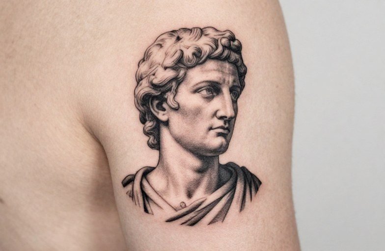
The classic rendering uses all caps in a serif or Roman-style typeface: VENI VIDI VICI. This treatment emphasizes the phrase’s architectural quality, each word same length, same visual weight.
Typography Choices
- Trajan-style serifs: Evokes stone inscriptions, permanence, classical authority. Best for larger pieces where detail won’t blur.
- Clean sans-serif: Modern, stripped-down, almost brutalist. Works at smaller sizes and ages more gracefully on high-movement areas.
- Hand-lettered or script: Adds personal warmth but risks legibility. Script versions often read as decorative rather than declarative.
- Gothic or blackletter: Aggressive, medieval, occasionally used by people in heavy music scenes. Can feel heavy-handed if not integrated into a larger design.
Integrated Imagery
Some designs pair the text with visual elements:
- Roman helmets or laurel wreaths (the classical route)
- Lions, wolves, or eagles (predatory symbolism)
- Clocks, hourglasses, or dates (marking a specific moment of victory)
- Broken chains or phoenix imagery (overcoming adversity)
- Minimalist lines or geometric frames (contemporary restraint)
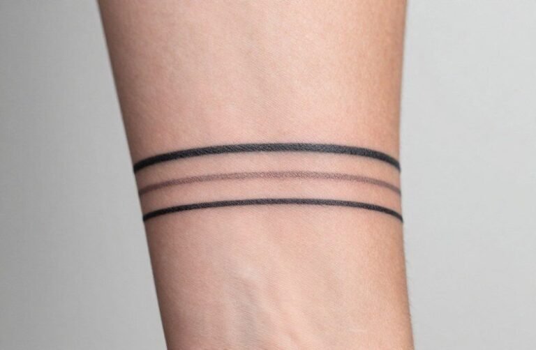
Line-only designs tend to age better than heavily shaded pieces, especially for text-dominant tattoos. Fine detail in serifs can bleed together over a decade; bolder letterforms hold their structure.
Best Placements
Text tattoos live or die by readability and how the skin stretches and ages.
- Forearm (outer or inner): High visibility, flat surface, easy to read. Inner forearm offers more privacy; outer forearm makes the statement public. Both see moderate sun exposure, sunscreen matters for longevity.
- Chest/upper pectoral: Classic placement for Latin phrases, echoing old military tattoos. The curve of the muscle can distort straight lines if the artist doesn’t account for body shape.
- Ribc cage: Painful, private, intimate. The phrase becomes something you show selectively. Lettering here needs to flow with the body’s natural lines, not fight them.
- Along the collarbone: Trendy, delicate, but high visibility means high commitment. Skin here is thin; ink can spread slightly over time.
- Spine (vertical): Dramatic, but reading downward requires the viewer to work for it. Best for people who care more about personal significance than immediate legibility.
- Behind the ear or along the jaw: Small, discreet, increasingly common. Limited space means simplified letterforms; three words is pushing it for these spots.
Consider your professional environment. Forearm and neck placements are harder to conceal than rib or thigh work. The phrase itself, conquest, dominance, reads differently in a corporate setting than in creative fields.
Who Chooses This Tattoo and Why
There’s no single demographic. The appeal crosses age, gender, and background, though the motivation clusters around a few patterns.
Recovery and Resilience
People who’ve survived something specific, cancer treatment, sobriety milestones, prison release, sometimes choose veni vidi vici as a marker of a battle won. The military language fits their experience of fighting through something that threatened to consume them. These tattoos often include dates or coordinates alongside the text.
Ambition and Self-Motivation
Entrepreneurs, athletes, competitive types. The tattoo functions as a private reminder and a public claim. It’s less about past victory than future orientation, a standard they’re holding themselves to. These designs tend toward cleaner, more minimalist executions.
Cultural and Familial Connection
Some wearers have Italian heritage and appreciate the Latin as a nod to ancestry, even if the family connection is distant or symbolic. Others studied classics in school and maintain an affection for the language. The tattoo becomes a small piece of continuity.
Aesthetic Appeal Over Deep Meaning
Not everyone needs a trauma narrative. Some people simply like how the words look and sound. The symmetry, the rhythm, the way it fits neatly into a rectangular space. That’s valid. A tattoo doesn’t require justification to be worth wearing.
Similar Symbols and Alternatives
If veni vidi vici feels too aggressive or too common, related concepts offer different angles:
- Amor fati: Love of fate, acceptance rather than conquest. Stoic, quieter, less martial.
- Memento mori: Remember you will die. The counterweight to victory, humility rather than triumph.
- Per aspera ad astra: Through hardships to the stars. Emphasizes struggle rather than outcome.
- Single-word Latin: Fortis (strong), invictus (unconquered), audere (to dare). More open to interpretation.
- Non-Latin alternatives: Japanese kanji for “perseverance,” Greek phrases, or simply numbers marking a significant date.
Some people pair veni vidi vici with a contrasting element, memento mori below it, or a broken sword. The tension between triumph and mortality creates a more nuanced piece than either phrase alone.
Final Thoughts
Veni vidi vici works as a tattoo because it compresses a lifetime of struggle into three words. The best versions respect that compression, clean lettering, thoughtful placement, no unnecessary ornament. Let the phrase carry its own weight. Over decades, the ink will soften, the edges will blur slightly, and the meaning will either deepen or detach. That’s true of any tattoo. The difference here is the explicit claim: you conquered something. Make sure the something was real enough to justify wearing the declaration.
Frequently Asked Questions
Does veni vidi vici tattoo have to be in all capital letters?
No. All-caps Latin is traditional and visually balanced, but lowercase or mixed case works fine with the right typeface. The key is legibility, some script fonts sacrifice readability for style.
How much does a veni vidi vici tattoo typically cost?
Simple text starts around $100-200 for a small, single-needle piece. Larger designs with integrated imagery or custom lettering run $300-600 or more depending on the artist’s rate and your location.
Will the Latin phrase look dated in ten years?
Classical text ages better than trendy fonts or pop-culture references. The risk isn’t the phrase itself but the style, overly delicate lettering or trendy geometric additions can feel locked to a specific era.
Is it culturally appropriative to get a Latin tattoo if I’m not Italian?
Latin is a dead language with no living ethnic claimants. It functioned as a shared European scholarly language for centuries. The concern would be more about the imperial/military connotations than cultural appropriation specifically.