Washington DC carries a visual language few cities match: neoclassical columns, low skylines by law, cherry blossoms, Metro maps, row house geometry. That restraint makes for tattoos that hold up, if you know what translates to skin and what turns to mush. Here’s what actually works, where it sits best, and how it ages.
Popular Styles That Fit DC’s DNA
Architectural Line Work
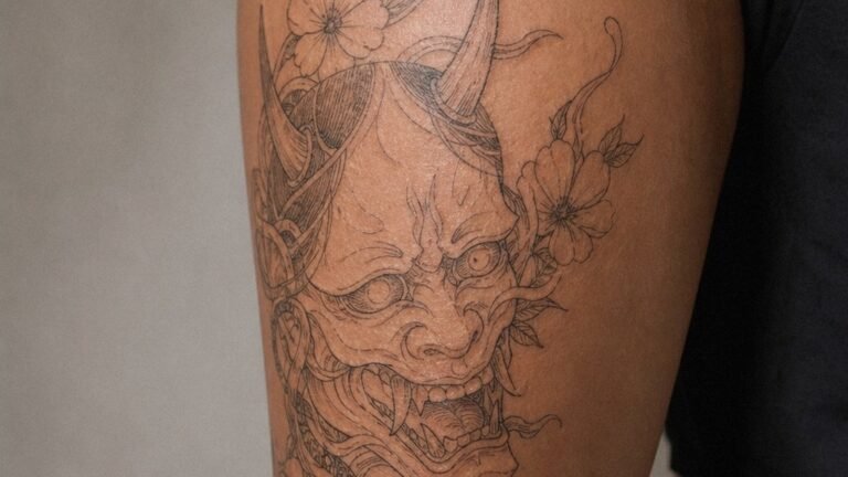
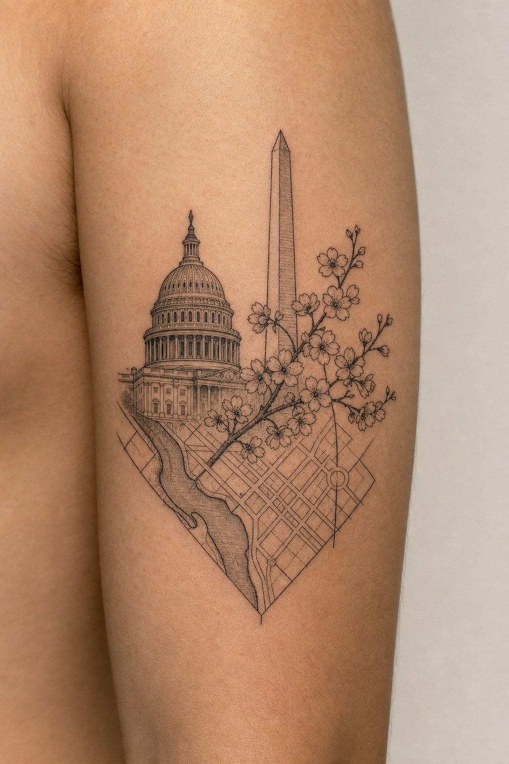
The Capitol dome, Lincoln Memorial columns, the sharp angles of the Metro escalators, these shapes reward clean, single-weight line work. Thick enough to stay legible after ten years, thin enough to feel precise. Black ink only, no shading, lets the geometry speak. The Washington Monument especially: a simple obelisk reads instantly, doesn’t blur, and scales from two inches behind an ear to a full forearm.
Watercolor splashed behind monuments almost always ages poorly. The color drifts, the edges soften, and you’re left with a grey blob hovering over a once-crisp dome. If you want color, keep it in the cherry blossoms or the flag elements, not bleeding into the architecture.
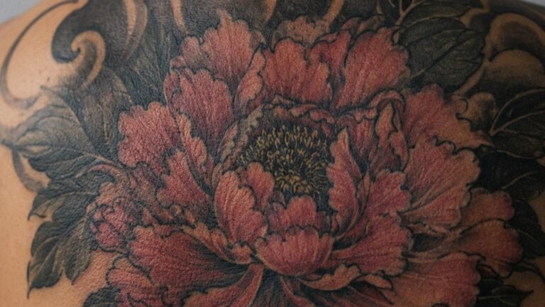
Black and Grey Realism
Marble textures, the Reflecting Pool at dusk, the worn steps of the Lincoln Memorial, black and grey handles these with gravity. The style suits larger pieces: upper arm, thigh, ribs. Skin texture matters here. Ribs and inner biceps move and stretch; a marble column on a ribcage will distort with breathing. Upper outer arm, calmer skin, keeps the stone looking like stone.
- Line-only Capitol dome: forearm, calf, shoulder blade
- Shaded Lincoln Memorial interior: thigh, upper arm, back panel
- Metro map abstract: inner forearm, side of calf
- Cherry branch with negative-space blossoms: collarbone, wrist wrap
Design Ideas Beyond the Obvious
The Cherry Blossom as Structure
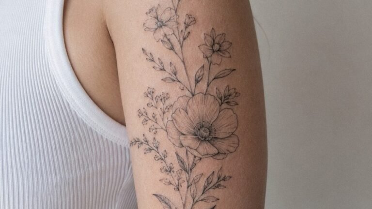
Everyone wants cherry blossoms. The problem: petals are soft, skin is not. A branch with five realistic petals and drifting fall-off looks beautiful for eight months, then the fine lines ghost and the pink muddies to a bruised tone. Better: use the blossoms as negative space within a black branch. The skin shows through as petal. The branch stays bold. The pink, if you must have it, sits in a few strategic buds, not scattered everywhere.
Another route: the blossom as pattern, not scene. A band around the arm, stems hidden, blooms repeating like a textile. This reads as DC without being literal, and it ages like a woodblock print rather than a photograph.
Metro as Abstraction
The Metro map’s color-coded lines, Red, Blue, Orange, Green, Yellow, Silver, offer built-in palette and geometry. A simplified circuit diagram, stripped of station names, becomes a personal map: where you lived, worked, met someone. The colors need saturation to last; pastel Metro lines fade to grey within a few years. Solid blocks of color, sharp edges, no gradients.
Some people add a single station dot enlarged, their home stop. Keep it small. A dime-sized circle with clean edges holds detail; a quarter-sized soft circle becomes a smear.
Best Placements for DC Imagery
DC’s horizontal skyline, no skyscrapers, by law, mirrors the body’s natural bands. Wrist to elbow, ankle to knee, these lengths suit panoramic layouts. But not all skin takes detail equally.
- Forearm outer: Best for line-work monuments. Stable skin, easy to show, enough flat surface for a dome or column sequence.
- Upper arm, outer: Black and grey realism thrives here. Muscle movement is minimal; the image stays consistent whether relaxed or flexed.
- Calf, side or back: The vertical Washington Monument works naturally. Calf skin holds solid black well, though it swells during healing, plan for two weeks in shorts or loose pants.
- Ribs: Only for simple shapes. The Capitol dome’s silhouette, not its detail. Ribs expand and contract; fine lines warp.
- Behind ear: A single cherry blossom, solid black or one small color accent. The size constraint is real; anything complex becomes a blur.
- Foot and ankle: The cherry blossom branch wrapping from ankle to foot. High wear area; expect touch-ups. The design must account for fading, bold lines, not whispers.
Hand and finger placements with DC imagery rarely work. The scale is wrong, the detail impossible, the fading aggressive. A tiny Capitol dome on a finger becomes a grey rectangle within two years.
Color Choices and Aging
The Pink Problem
Cherry blossom pink is the most requested color in DC-themed tattoos. It’s also the most disappointing. Light red pigments fade fastest; what starts as soft coral ends as a dirty beige. Solutions: deeper magenta, almost red, which settles to a true pink; or skip color entirely and let the skin tone read as blossom against black branch.
Flag Elements
The DC flag, three red stars, two red bars on white, looks simple. It is not simple on skin. The white background is your skin, uninked, which means the red must be perfectly saturated. Patchy red, common on some skin types, ruins the graphic punch. Test patch if you’re prone to uneven saturation. The stars, small, need to be bold enough that they don’t close in during healing, slightly thicker points than you think necessary.
Black and grey ages democratically. It fades to charcoal, then soft grey, but stays readable. Color demands commitment: sun protection, touch-ups, the understanding that a bright Metro Red line will dull to brick in a decade.
Tips for Choosing Your DC Tattoo
Reference photos help, but the best artists translate, not copy. A photograph of the Capitol at golden hour has fifty colors, atmospheric haze, scale you can’t feel. A tattoo needs reduction: five values, clear edges, a shape that reads from six feet away.
Consider your daily visibility. A Metro map on your forearm is a conversation starter in DC, a puzzle elsewhere. Monument silhouettes travel better, they’re recognizable architecture, not local in-joke.
- Bring multiple references, not one perfect photo
- Ask to see healed photos of the artist’s architectural work, not just fresh
- Size up if between sizes, detail needs room, and slightly larger ages better
- Plan for the long healing of solid black areas: scabbing, itching, the temptation to pick
- Budget for a touch-up, especially with color or fine lines
The artists who do this well are often booked months out. The ones who promise your full-color Lincoln Memorial interior in two hours are cutting corners you can’t see until year three.
Final Thoughts
Washington DC offers a rare combination: instantly recognizable imagery and legal restraint that keeps it human-scale. That translates to tattoos that don’t need to shout. A clean dome, a branch of blossoms rendered as negative space, a single color-coded line tracing where you came from, these carry weight without weightiness. The city was designed with proportion in mind. Your tattoo should be too.
Frequently Asked Questions
How small can a Washington Monument tattoo be before it loses detail?
Two inches is the practical minimum for the full obelisk shape to stay legible. Smaller than that, and the tip and base blur together within a few years. For finger or behind-ear placement, consider just the pyramidion tip as a standalone triangle.
Do cherry blossom tattoos always need pink ink?
No, some of the most durable cherry blossom tattoos use only black ink for the branch and let the skin show through as petal. If you want color, choose a deeper magenta rather than soft pink; it fades to a truer tone over time.
Is the DC flag a good first tattoo?
The flag’s graphic simplicity works well for a first piece, but the uninked white background means any patchiness in the red bars shows immediately. Choose an artist with experience in solid color saturation, and expect the red to need a touch-up as it settles.
How do skyline tattoos age on curved body parts like shoulders?
Shoulder caps and rounded shoulders distort horizontal skylines, domes stretch, columns tilt. Flat planes like the outer forearm, calf, or upper back carry panoramic layouts more faithfully. If you want a shoulder piece, consider a vertical monument rather than a horizontal scene.