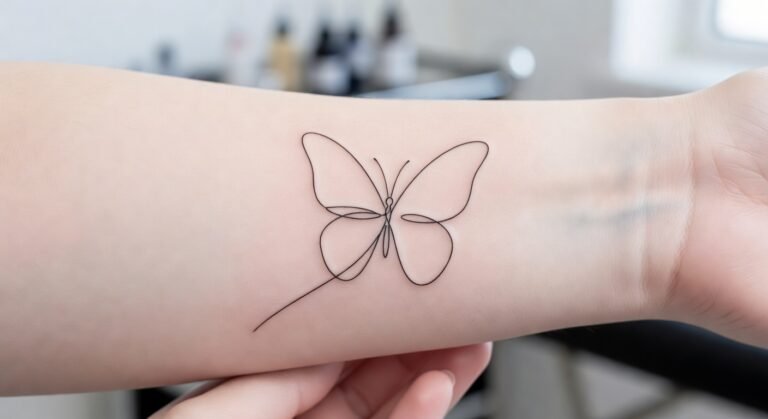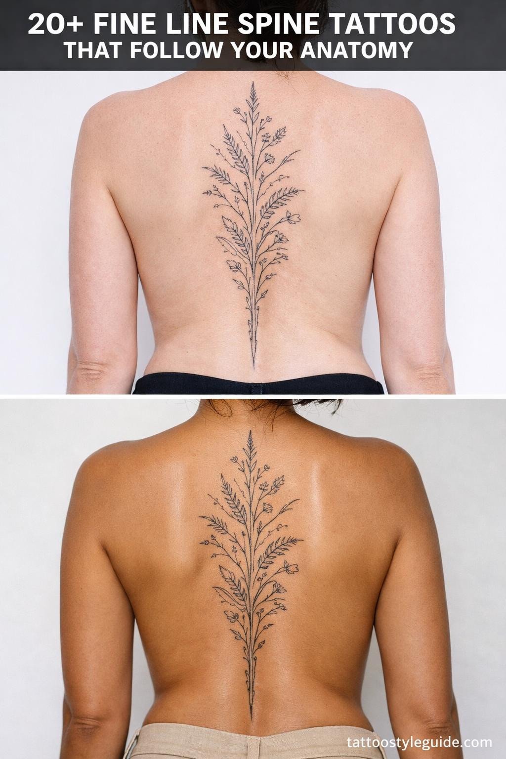
Feminine back tattoos punish lazy placement more than any other canvas on the body. The upper back bows, the lower back curves, and the spine shifts with every breath. Designs that ignore that movement read as flat. The ones worth studying are built around it.
What separates a strong back piece from a regrettable one is usually compositional axis, not subject matter. Vertical flow, bilateral symmetry, and scale relative to the spine length matter far more than the motif itself.
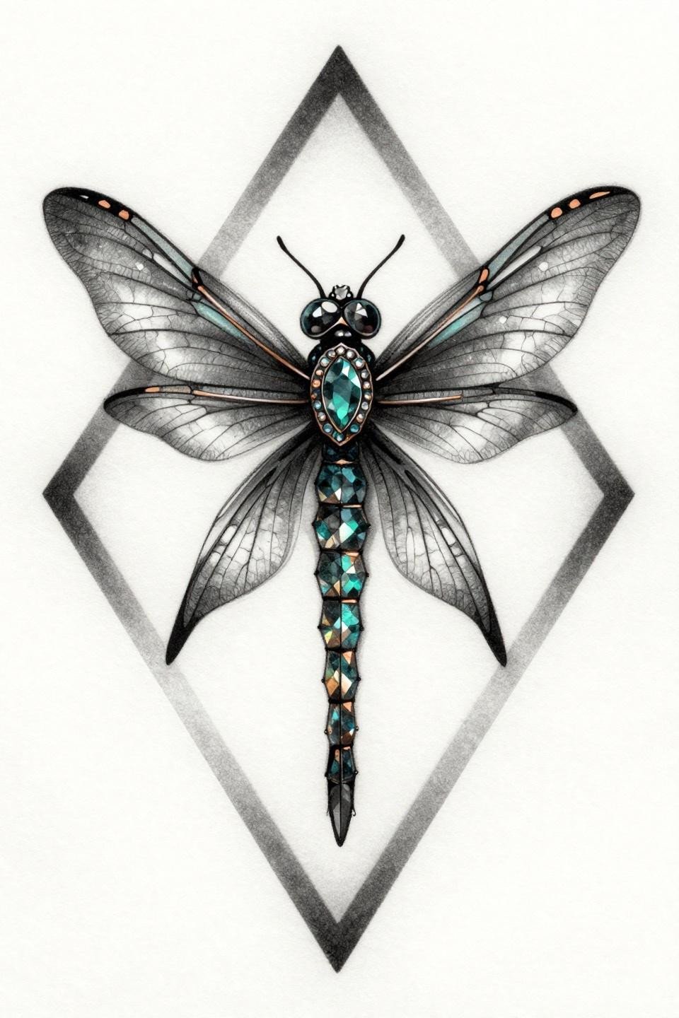
Ornamental Dragonfly in a Hard Diamond Frame
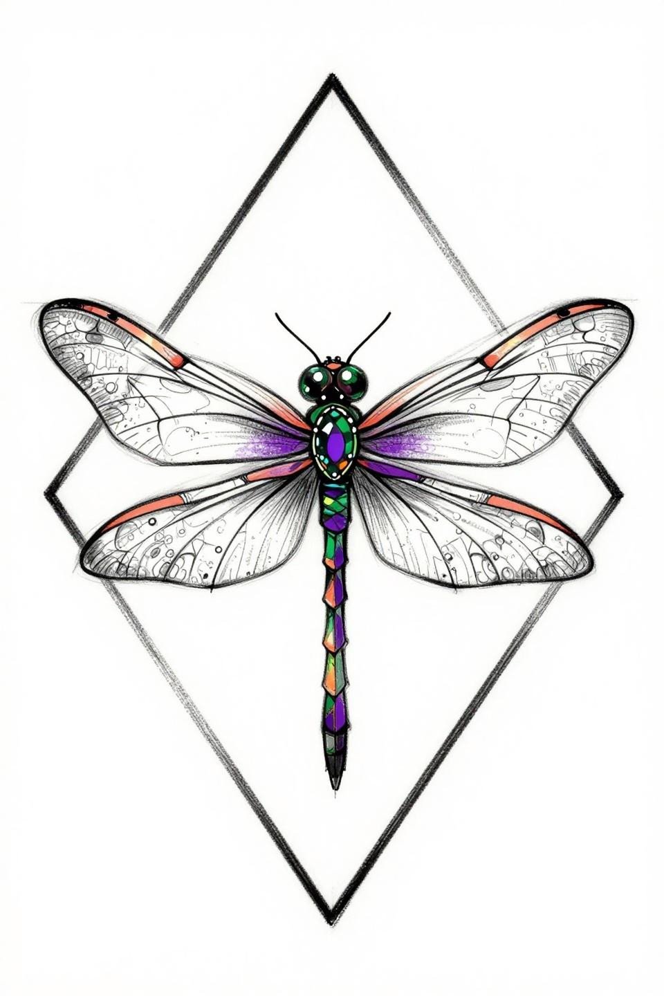
This ornamental dragonfly sits inside a hard diamond geometric border, giving the composition a clean termination point that works well centered on the upper back or between the shoulder blades.
The bold 2-3pt outlines signal longevity. At this weight, the coral and purple fills hold contrast against the black for a decade before needing refresh.
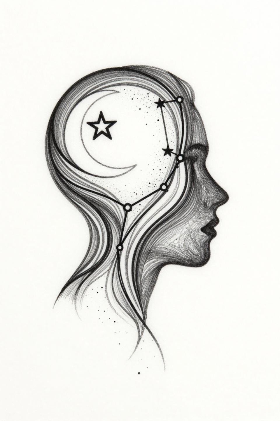
Moon Phase Stack That Actually Tracks the Spine
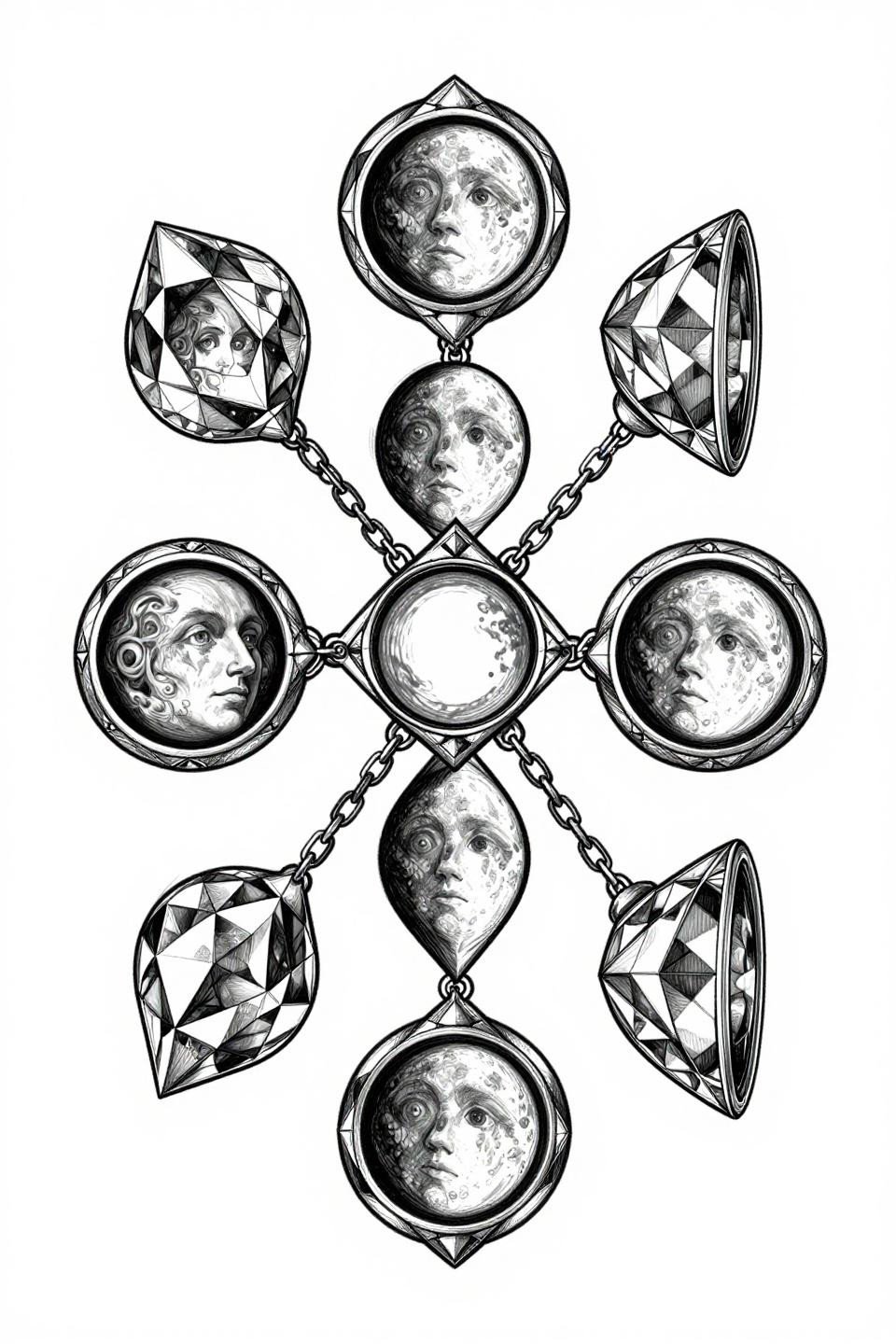
A stacked moon phase sequence locked inside diamond capsule frames, connected by filament chains, runs the vertical axis cleanly. This is a textbook spine-placement composition.
Single needle 1RL work like this needs an artist who controls speed. Rush it and the hairline strokes spread within two years, especially on the spine where skin flexes constantly.
Why the Ignorant Scorpion Earns Its Placement
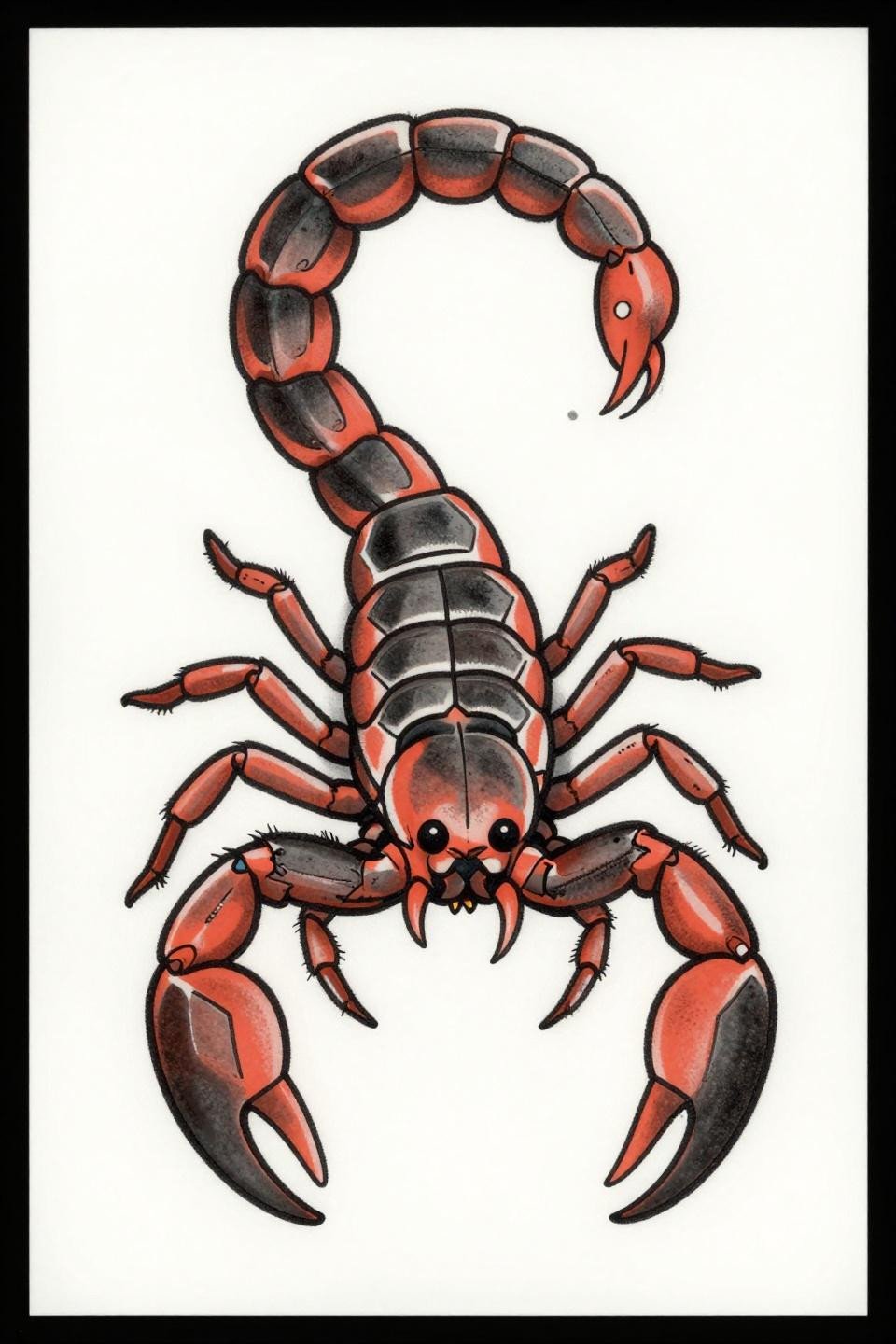
The ignorant style scorpion uses crude 3-4pt uneven outlines deliberately. The intentional rawness reads as confident, not sloppy, when executed by someone who actually controls that looseness.
This centered bilateral pose maps directly onto the thoracic spine. The flat coral and charcoal fills are low-maintenance. No gradient means no muddy midtones as it ages.
Phoenix Rising: When Traditional Flash Fits a Full Back
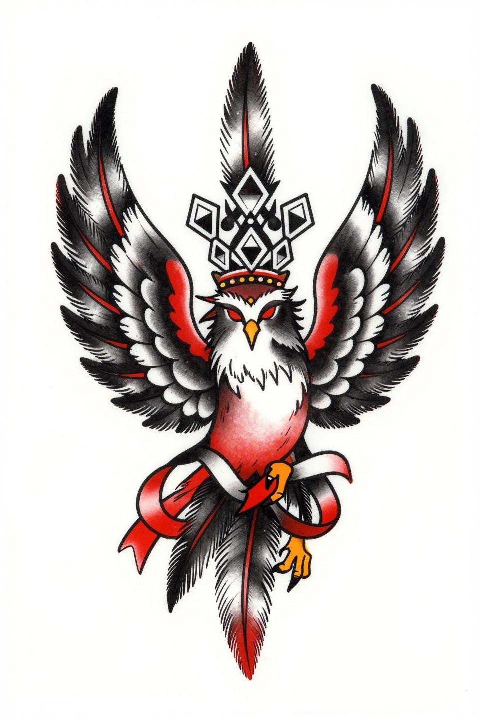
This traditional American phoenix uses a stacked vertical feather cascade to fill a full back canvas from shoulder to lower back without padding. The elongated frame is the design.
For anyone considering back tattoo designs for women’s spines, this composition type earns its session count. The bilateral wing symmetry means any asymmetry in the artist’s linework shows immediately. Check healed work before booking.
Celtic Beetle: Mandala Framing on a Non-Mandala Subject
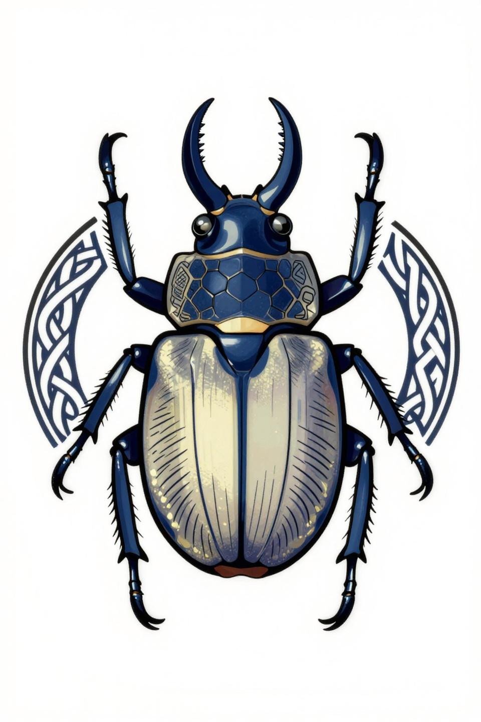
A stag beetle in dorsal view sits inside a circular knotwork mandala border, using the frame to anchor the asymmetric subject into a placement-ready shape.
The navy and cream fills on solid black read cleanly across skin tones from fair to medium. On deeper skin, the navy can lose separation from the black outlines. Opt for the cream dominant version in that case.
Art Nouveau Moon Stack Built for Spine Length
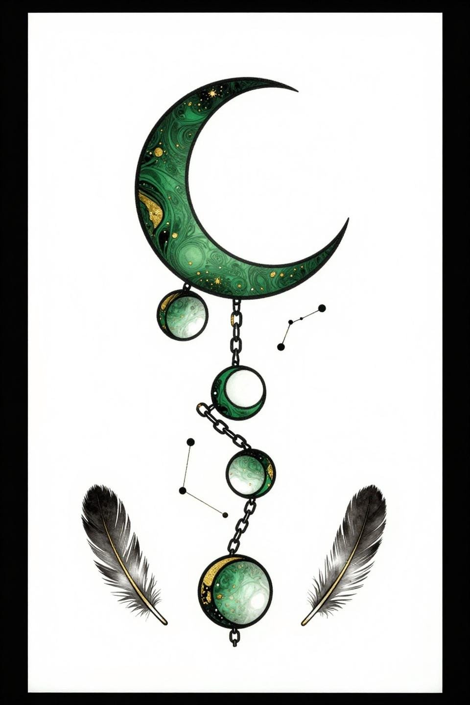
Graduating crescent moons connected by chain linework, with feather silhouettes flanking the edges, creates a stacked vertical composition that scales to any spine length by adding or removing segments.
Forest green and gold leaf fills age at different rates. Gold-toned inks tend to warm and shift yellow by year five. Know that going in and choose a studio using quality pigment brands, not house ink.
Grey Wash Dragonfly: The Teal Ink Gamble
The Chicano grey wash version of the ornamental dragonfly replaces hard fills with soft volumetric grey wash dilution, giving the wings depth that the flat-fill version trades for longevity.
Deep teal ink on the upper back is a commitment. Teal sits between blue and green pigment chemistry. On olive and darker skin tones, it can read as near-black within three to four years. Ask for the healed teal work specifically.
Anatomical Heart With Wildflowers: A Crosshatch That Ages
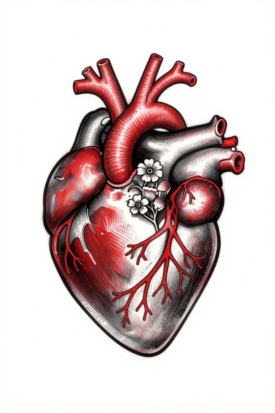
An anatomical heart with wildflowers blooming from the aorta, contained in a diamond frame, uses parallel crosshatch etching to build shadow rather than grey wash.
Crosshatch shading holds better than grey wash on the upper back long-term. The line density does the tonal work, and dense lines maintain structure even as the skin moves and the ink settles over years.
Celestial Fairy in Profile: Asymmetric Flow on a Symmetric Canvas
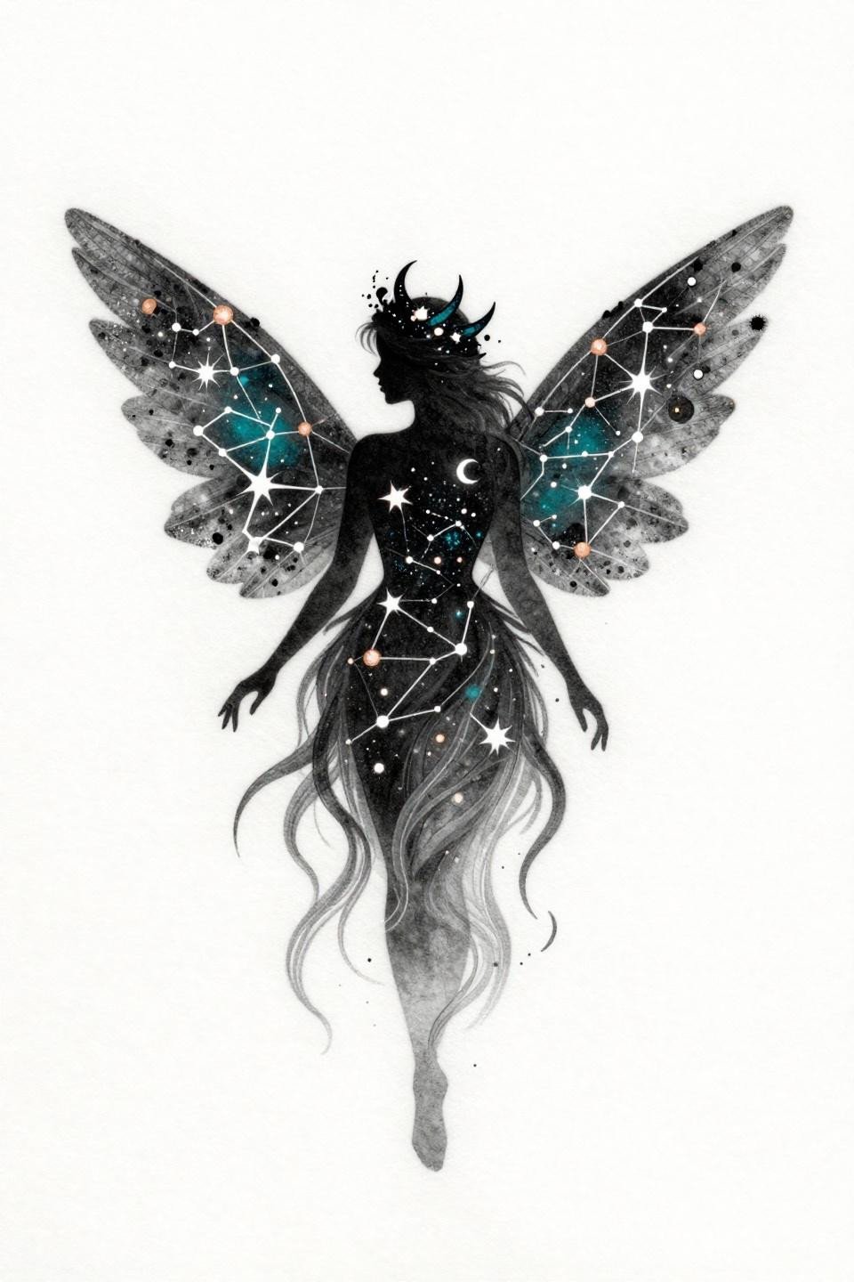
A fairy silhouette with constellation-line gossamer wings and hair dissolving into comet trails works as an asymmetric vertical piece, typically placed off-center on the mid to upper back.
Grey wash without solid black anchors like this needs placement on a protected zone. The upper back qualifies. Ribs and lower back see too much friction from waistbands and fabric to keep soft grey wash clean.
Tribal Geometric Lotus: When Solid Black Does the Work
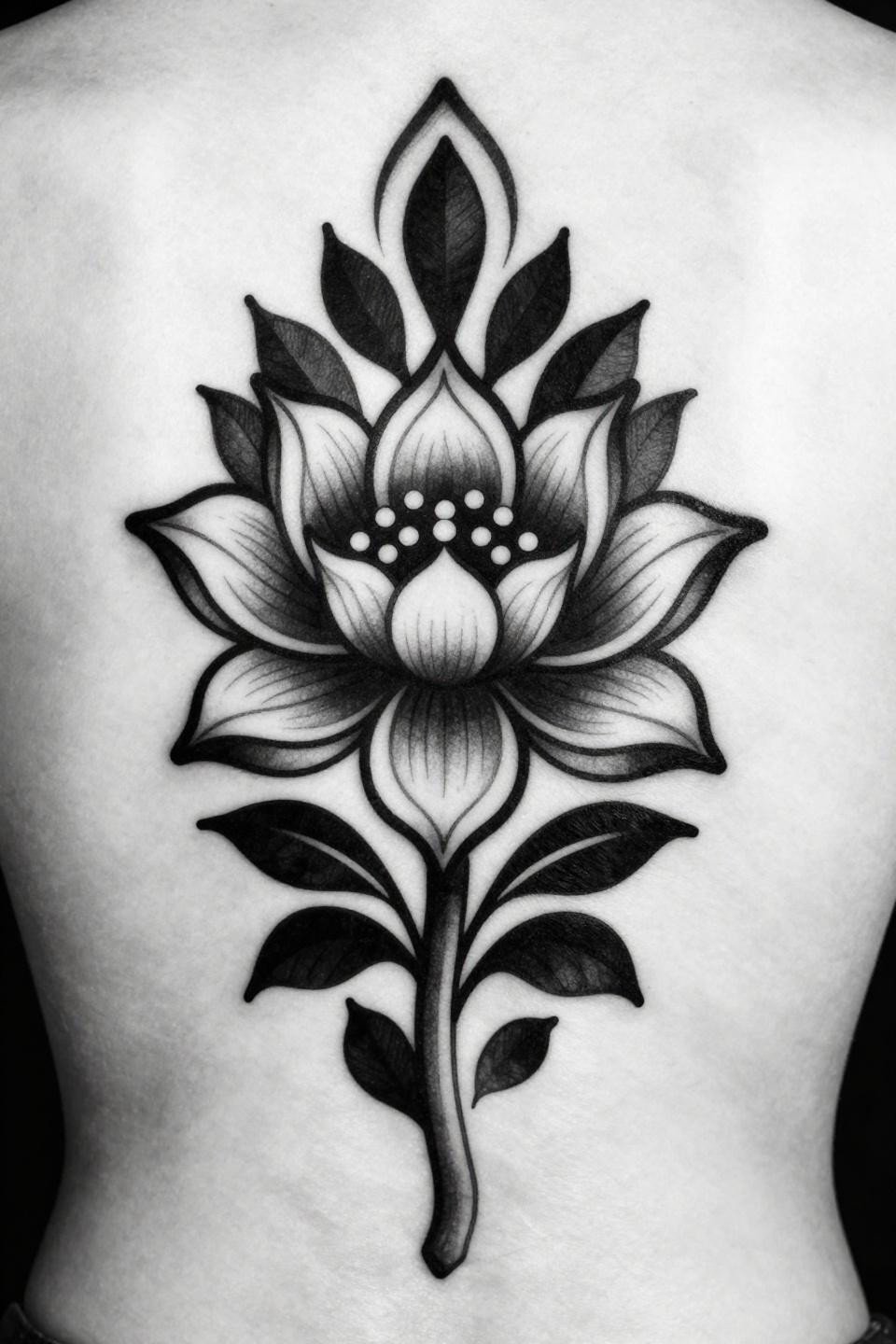
A symmetrical eight-petal lotus with geometric stamen and solid flat black fills runs on pure graphic contrast, no grey wash, no color gradient.
Blackwork at full saturation holds density indefinitely when the artist commits to layered passes. The tell on underpacked black is patchiness within the first year. Review healed portfolio shots specifically for solid fill work.
Peacock Feather and the Woodcut Line Problem
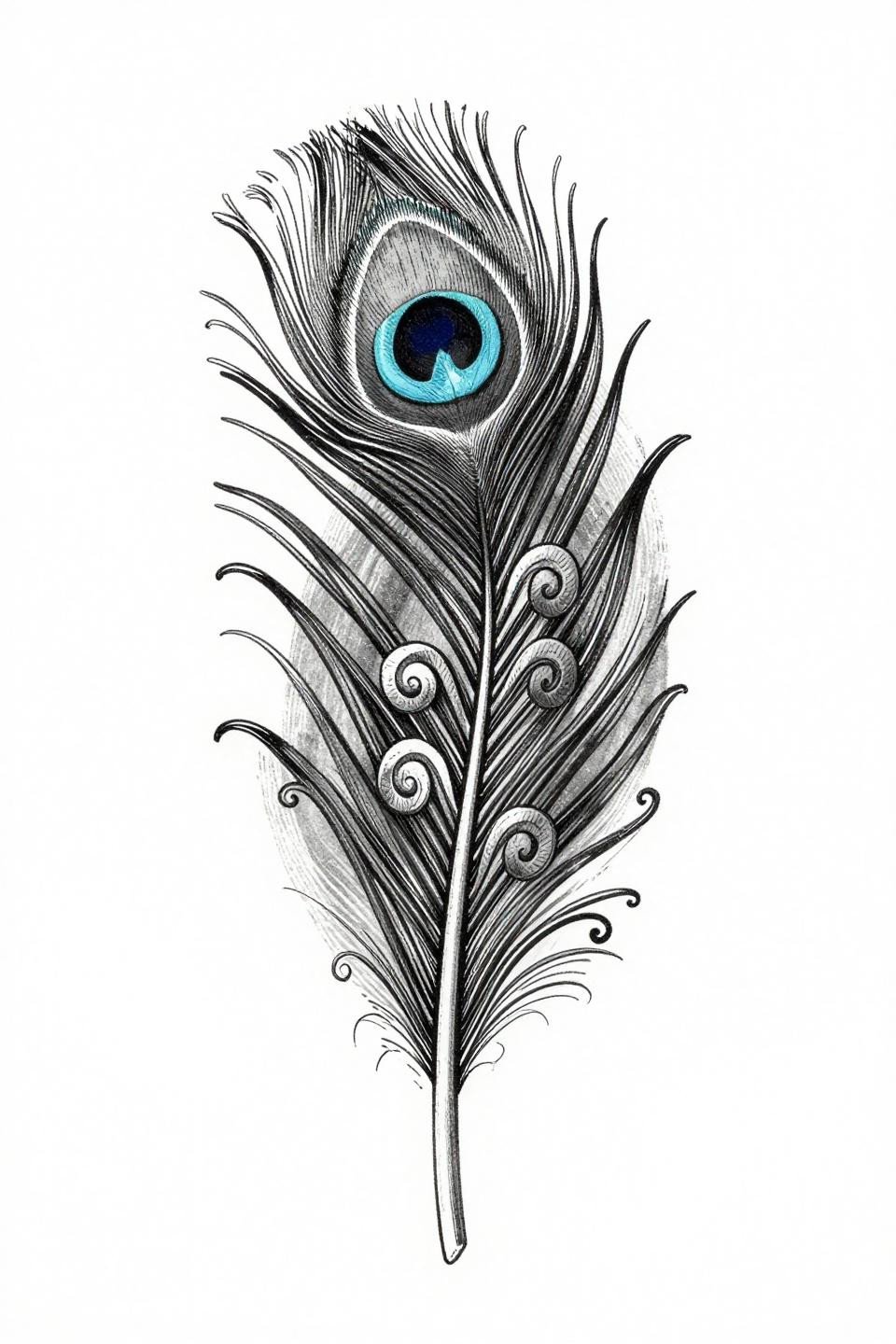
A centered peacock feather in woodcut style uses dense-to-open crosshatch hatching along the shaft to create tonal range without grey wash, with the central eye motif as the visual anchor.
The vertical centered composition makes this a direct spine placement candidate. Shaft taper from thick to hairline reads well on long spines. On shorter torsos, scale down the base flourishes, not the eye detail.
Fine Line Botanical Vine: Know the Shelf Life Upfront
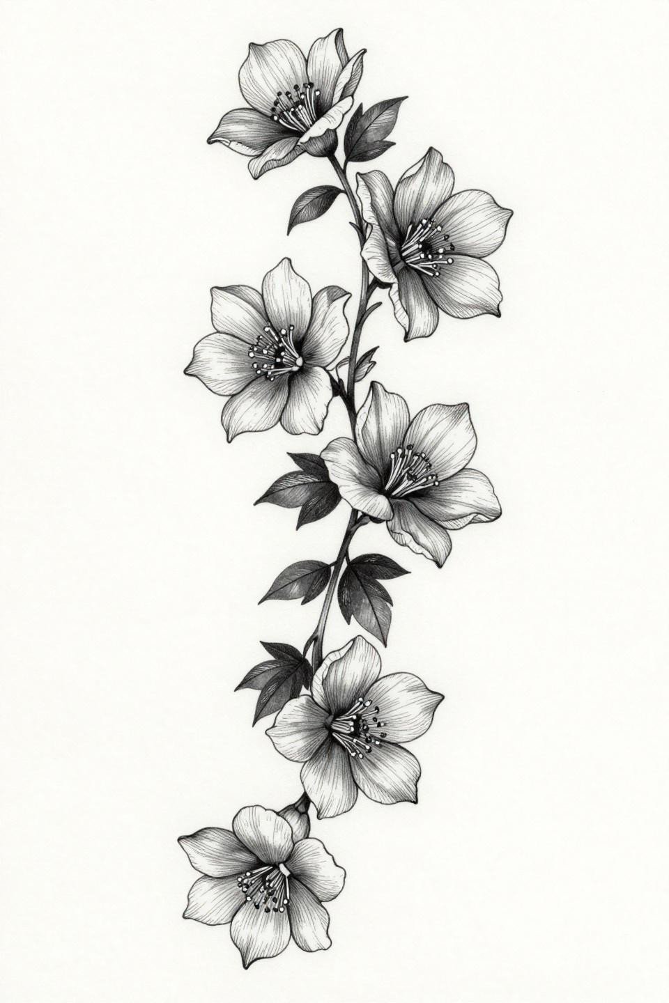
A descending botanical vine with asymmetric petal clusters and hairline 0.5mm single-needle strokes relies entirely on line weight consistency from top to base for the composition to read.
On lighter skin tones, this reads crisp at installation. On olive and darker skin, fine lines at this weight need bolder stroke to maintain contrast. Request a test stroke placement before committing to the full piece.
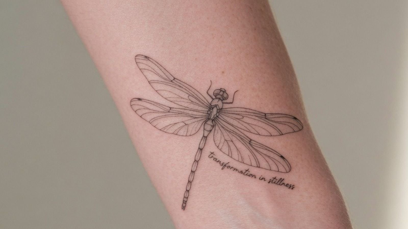
Japanese Irezumi Dragonfly: What Ruled Strokes Signal
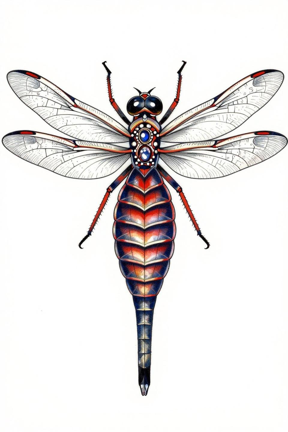
The irezumi dragonfly uses parallel ruled engraving strokes to map wing veins, a technique that demands consistent needle speed across the full wing span to avoid bunching.
Deep indigo fills in irezumi work hold their cool tone on fair skin for years. On warmer olive skin, indigo reads closer to black within five to seven years. Factor that into the long-term look you want.
Neo-Traditional Moth: Reading Crescent Cutouts at Scale
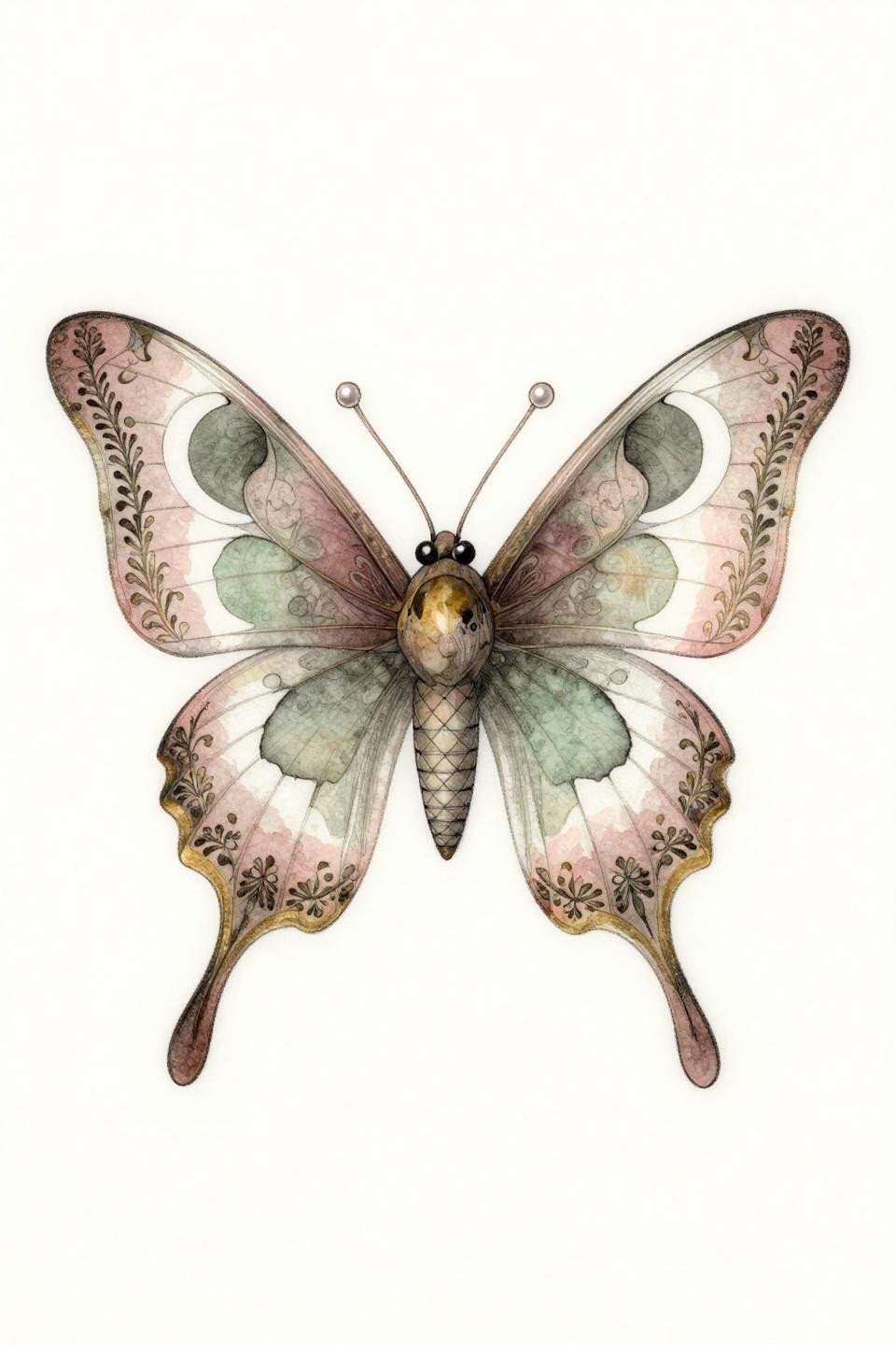
A neo-traditional moth with crescent moon negative space cutouts in each wing uses the negative space as structural detail, not decoration. The bilateral symmetry locks this for a centered upper back placement.
Whip shading in dusty rose and sage green reads soft at installation. These muted tones fade faster than saturated pigments. Budget for a single touch-up pass at year three to five for protected placements like the upper back.
Art Deco Phoenix: Geometric Feathers and Flat Fill Longevity
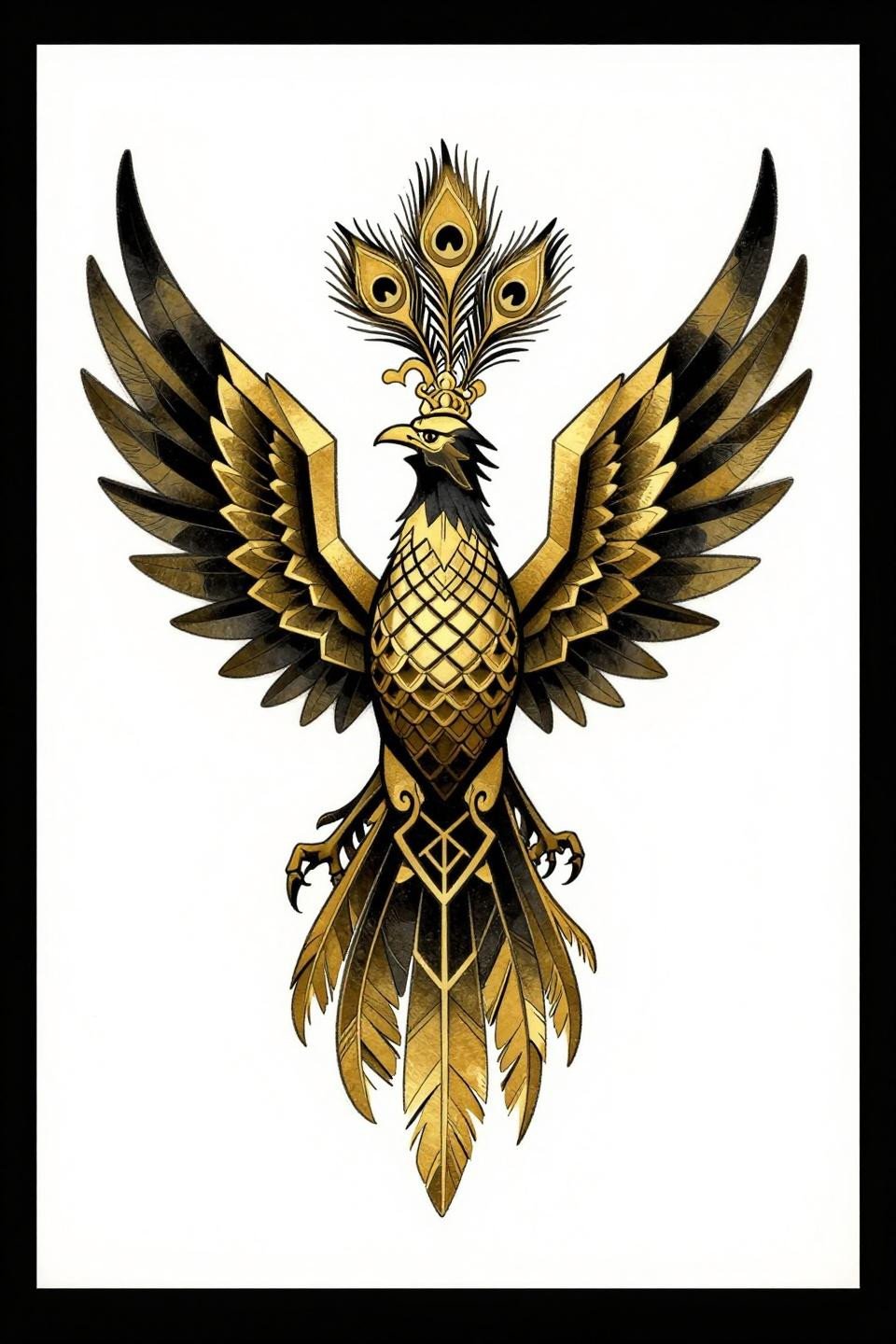
The art deco phoenix replaces curved organic feathers with angular faceted geometric planes, using compass-drafted geometry and flat fills that photograph as sharply as they age.
Burnished gold and solid black is a high-contrast pairing that holds well on most skin tones. The tessellated scale pattern across the torso is the skill signal: even tessellation at scale separates trained technical artists from decorative generalists.
Watercolor Winged Figure: The Outline Anchoring Rule
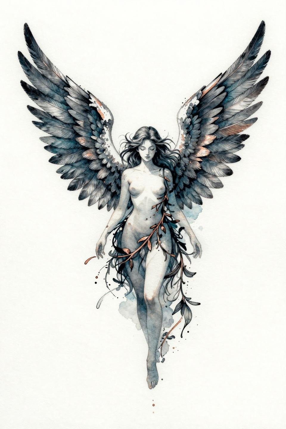
This winged ethereal figure pairs calligraphic ink linework with watercolor bleed fills, using the clean linework as an anchor to slow the inevitable edge diffusion of the color fields.
Watercolor without a hard black outline blurs by year three to five on most placements. This design mitigates that with the figure’s linework. Still, expect the teal color field to feather at the edges before the decade mark.
Dotwork Mandala: Density Mapping and the Five Year Question
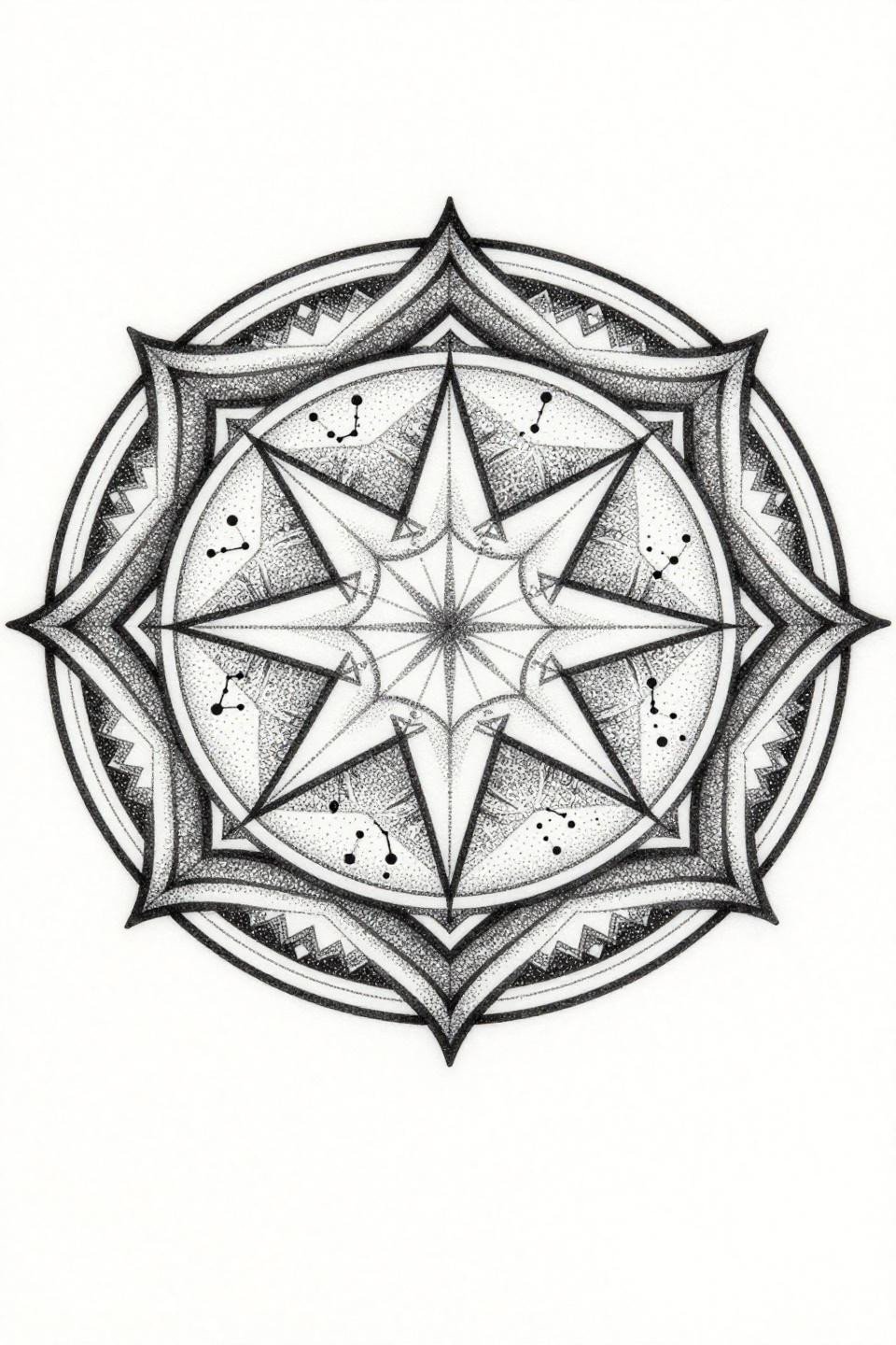
A dotwork celestial mandala uses stipple density mapping from a solid black core out to open field, building tonal range through dot spacing rather than wash dilution.
Look for consistent dot size across the full gradient. Inconsistent dot sizing is the most common failure point in dotwork mandalas, and it shows at year five when the dense zones compact and the open zones expand unevenly.
Art Nouveau Serpent: Organic Flow That Earns the Side Placement
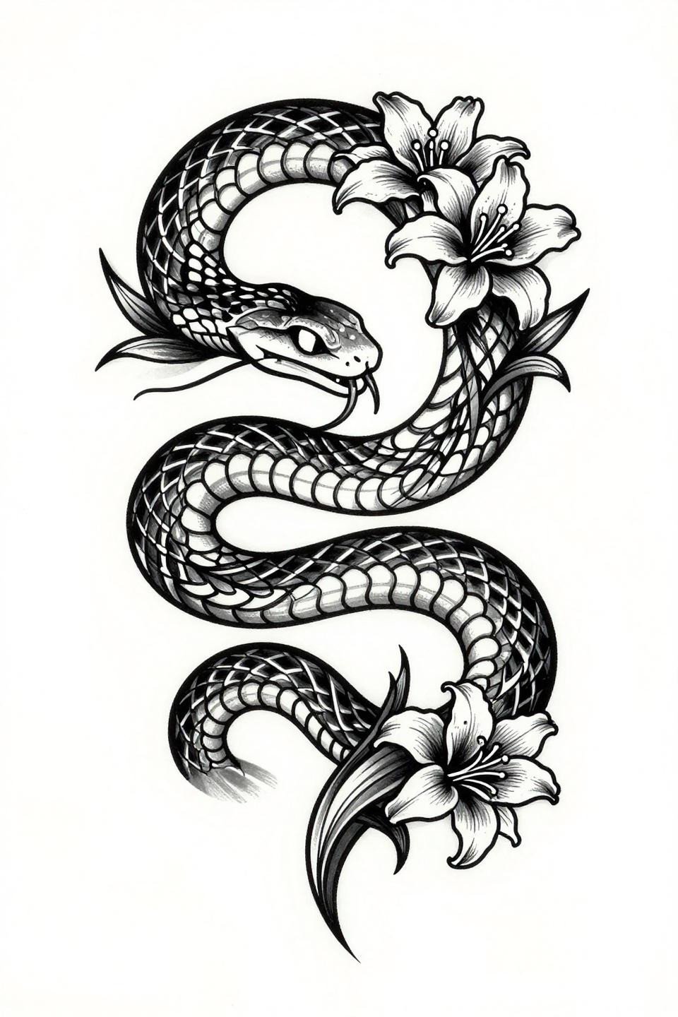
An art nouveau serpent in an S-curve, with its scaled body transitioning into botanical tendrils, follows the natural organic vertical axis that makes it placement-ready along the side back or full spine.
Bold 2-3pt outlines at this weight hold clean for ten-plus years on the upper back. The flat black fill with zero grey wash means no muddy midtones to manage as the piece ages.
Celestial Constellation Profile: Single Line and Its Limits
A continuous hairline constellation map forming a profile silhouette uses unbroken single-needle 1RL strokes from Polaris to Southern Cross, with isolated pinpoint marks as cosmic scatter.
This style has the shortest reliable shelf life of any technique in this collection. Protected upper back placement extends it, but single-needle line work at 0.5mm weight will need a re-line by year seven on most skin types.
Botanical Peony With Ribbon: Weight Variation as the Design
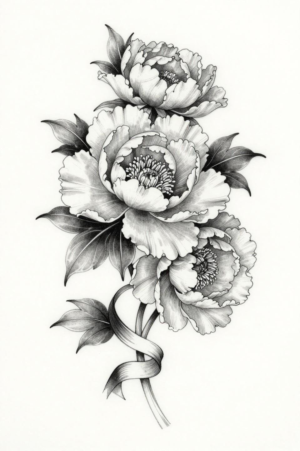
A botanical peony with layered asymmetric petals and a ribbon weaving through the stem uses petal edge weight variation as the primary technical language, thicker at the base, hairline at the tips.
The grey wash midtones in the petal folds require an artist who dilutes consistently across the full piece. Inconsistent dilution produces patchy grey midtones by year two. Ask to see healed botanical grey wash work before booking.
Narrow this collection down by placement first. Spine-axis designs from the stacked moon phase and irezumi dragonfly sections need a different artist skill set than the side-back serpent or the off-center celestial fairy. Send three references maximum, matched to your actual placement. That’s what makes a consultation productive.