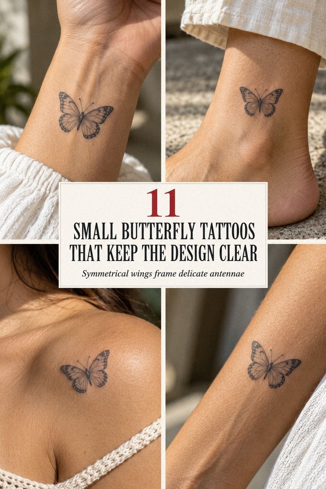
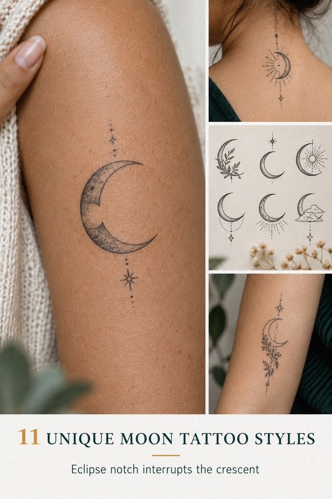
A Unique Moon Tattoo can hurt less than you expect, even on a sensitive placement. I chose a crescent, checked the linework, and braced myself for a long, sharp session. The design was finished before I had time to panic. It’s now one of the most personal pieces I’ve chosen.
I didn’t want a random moon pulled from a trend board. I wanted something meaningful, delicate, and quietly powerful, with enough open skin to keep the shape readable. My final design felt more personal because I removed details instead of adding every idea I liked.
Before the Appointment, I Had a Blank Patch
Before the appointment, I had nothing on the patch of blank skin I’d been saving. No faded outline, no old ink to work around, just empty space and too many references saved on my phone. I wanted a symbolic design, but I didn’t want a motif that looked copied from the first search result.
My problem wasn’t finding a moon tattoo. It was choosing one that still felt like mine after the trend passed.
I kept returning to a fine crescent, a few stars, and enough open skin for the design to breathe. You’ll want to make that decision before you sit down, because changing the idea under bright studio lights is a stressful way to start.
- I Chose a Crescent in Fine Line
- Where Should a Moon Go on the Arm?
- The Three-Star Rule Changed the Mood
- Test the Smallest Version Before Committing
- The Flower I Left Out
- Can a Moon Have a Face?
- Crescent, Half Moon, or Full Circle?
- Let Moon Phases Carry One Meaning
- Adapt the Motif to My Skin
- Which Placement Actually Hurt Less?
- Protect the Moon While It Heals
1I Chose a Crescent in Fine Line
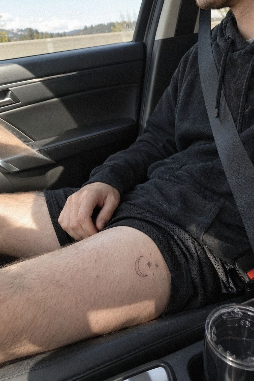
I chose a crescent moon first because its shape reads instantly, even when the design is small. My reference had a fine-line outline, three tiny stars, and no heavy shading.
It looked delicate, minimal, and slightly mysterious without becoming overly ornate. If you’re considering cute-moon-tattoo ideas, this is the version I’d study first.
The artist showed me how the curve would follow my body instead of sitting like a sticker. That mattered. I didn’t want a stiff arc with identical points on both ends, so we adjusted the tilt by a few degrees.
I’ve learned that black ink needs clean spacing more than extra detail. You’ll see every crowded mark once the skin settles, and I’d rather have three crisp stars than ten muddy ones.
For your reference folder:
– Crescent outline with open negative space. – Three small stars, each with a different point length. – A single-needle line kept lighter around the inner curve.
I’d skip dense fill here. It can make a small moon look heavier than you intended, while the negative space keeps the design sleek and timeless. See more unique tattoo ideas if your saved references are starting to blur together.
2Where Should a Moon Go on the Arm?
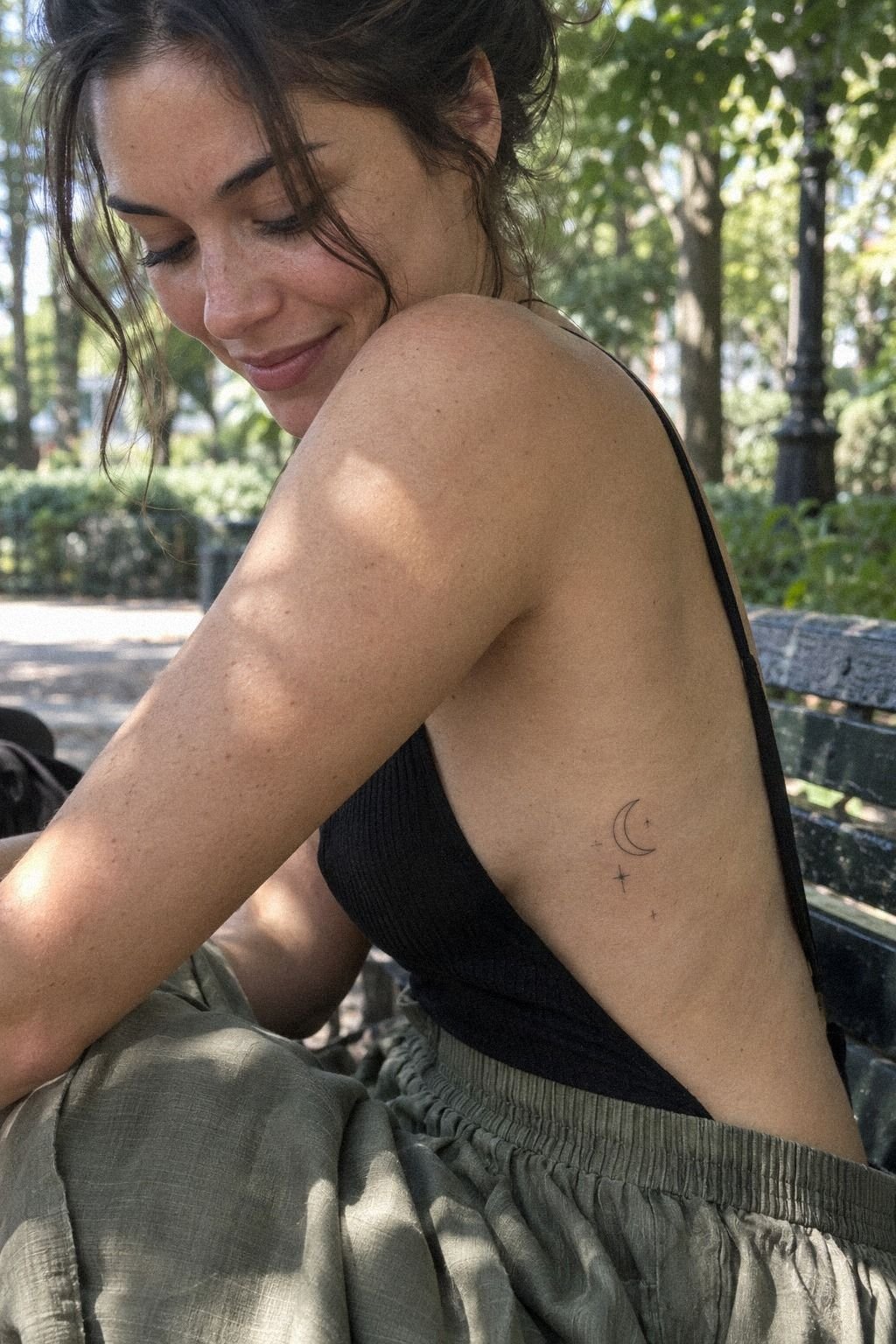
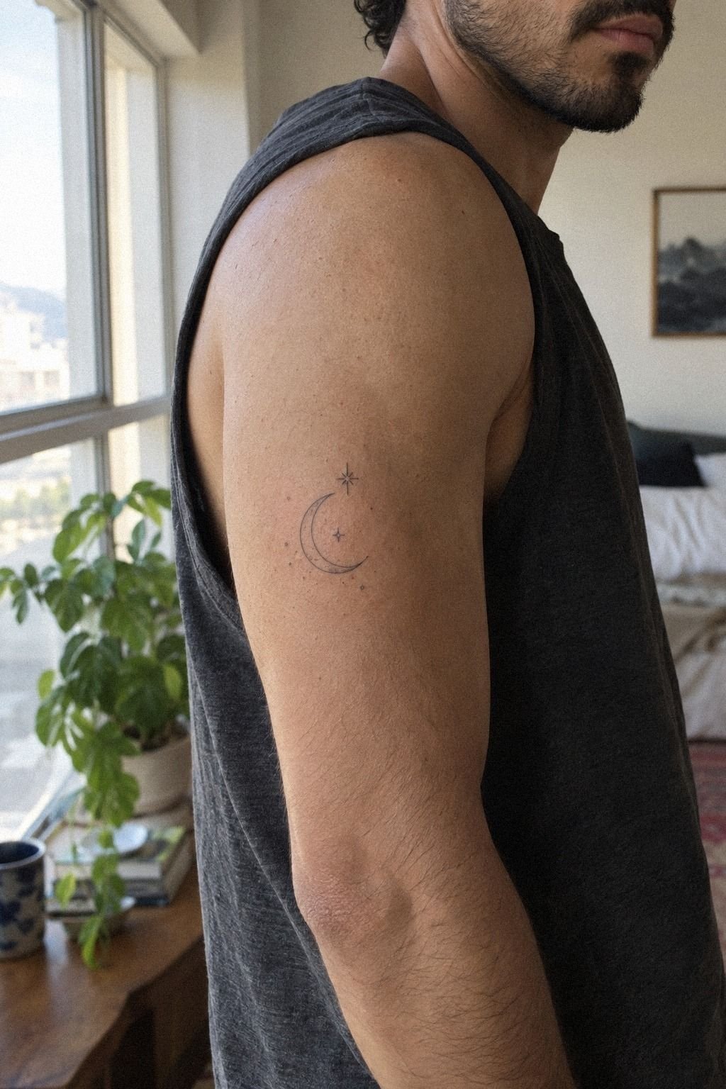
I placed the moon behind my arm because I wanted a design I could reveal or cover without planning my whole outfit around it. The skin tone in my reference made the black marks easy to read, but your result may look softer or sharper depending on contrast and line weight.
The spot felt more sensitive than my forearm, but it wasn’t the disaster I’d imagined. I kept my shoulder loose, breathed through the first pass, and stopped checking the clock. You don’t need to prove anything by sitting rigidly.
A relaxed arm gives your artist a steadier surface, and that helps the crisp linework stay controlled.
If you’re drawn to a witchy moon tattoo, you can shift the crescent slightly toward the back and add one pointed star. I’d avoid placing too much detail right on a bend, because movement can make tiny marks look uneven. My witchy moon tattoo references helped me compare a back-of-arm placement without copying one design exactly.
I also browsed unique tattoo sketches before the consultation. The first surprise was real! The area felt manageable once I stopped tensing my arm.
3The Three-Star Rule Changed the Mood
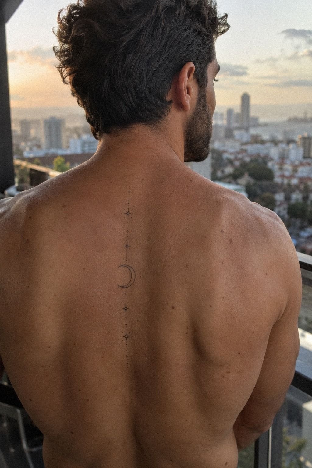
The stars came after the crescent, and they changed the whole mood. I chose small four-point stars instead of identical sparkles, so the group would feel playful and expressive.
One sat close to the upper tip, two drifted lower, and the smallest mark worked like a quiet pause between them. That uneven spacing kept the tattoo from looking like a logo.
I didn’t let the artist fill every open area. You’ll be tempted to keep adding stars once the first few look good, but negative space is doing real work here.
I asked for each mark to remain readable at arm’s length, which meant keeping them separated from the crescent’s thinnest section. The result feels graceful, not busy.
My favorite comparison was a sun moon and stars tattoo with a stronger celestial layout. It showed me what I didn’t want: too many competing symbols and no visual rest. If you’re building your own reference sheet, save one sun moon and stars tattoo guide for balance, then remove anything that doesn’t carry personal meaning.
The final spacing felt more expressive than a packed design. Less ink gave the moon more presence!
4Test the Smallest Version Before Committing
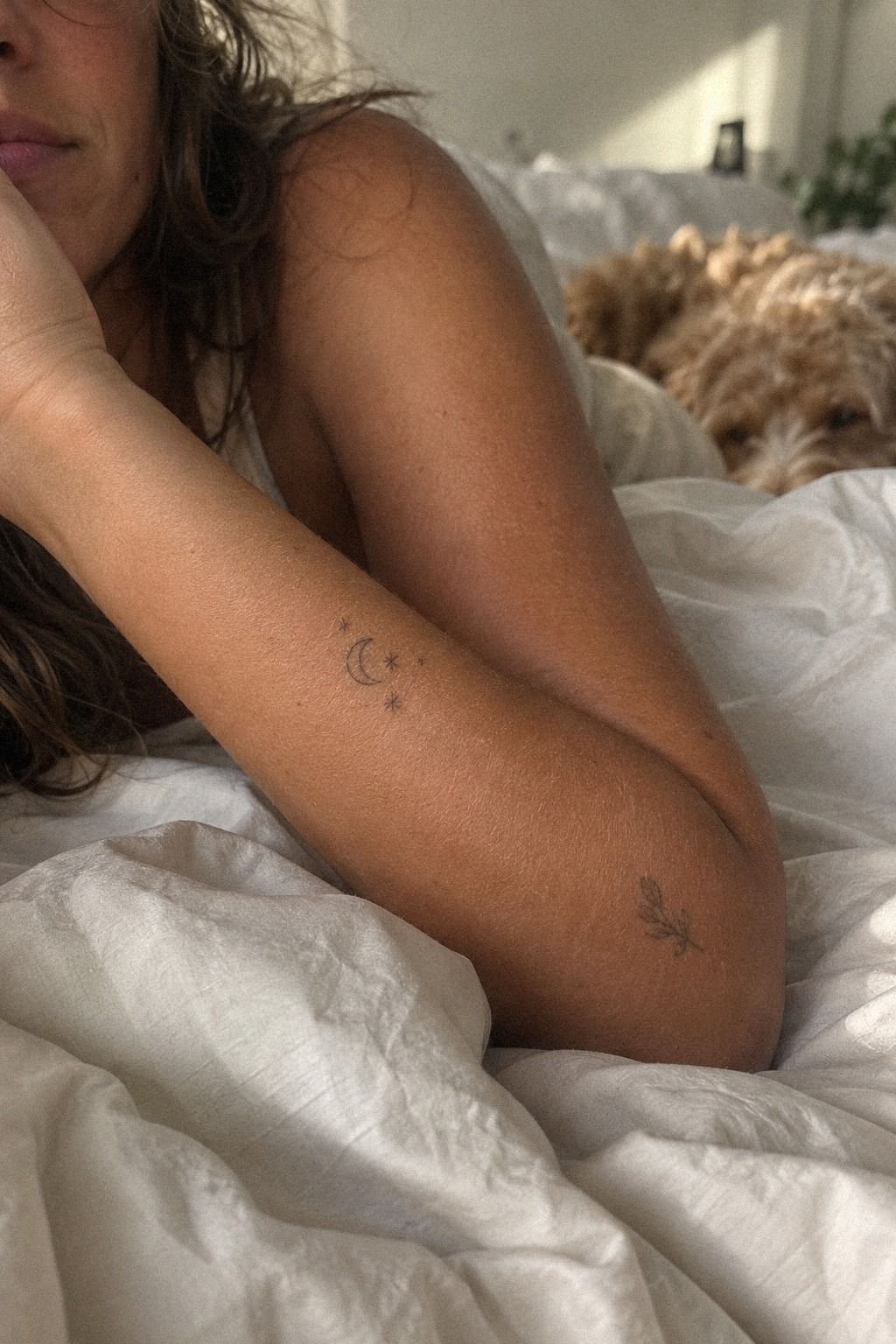
I tested the smallest version on paper before committing to skin. The stencil was barely over an inch wide, with a minimal crescent and two stars placed outside the curve. It looked understated and dainty, but I worried it might become too quiet after healing.
That’s a real concern with fine lines, especially when you’re choosing a design because it looks sharp on a screen.
My artist enlarged it slightly and strengthened only the outer contour. That compromise worked better than adding shading everywhere.
You’ll want your artist to explain which lines need enough pigment to remain legible, not just which size looks cute in a photo. I’d skip an ultra-tiny moon if your idea depends on facial details, phases, or lettering.
For moon-tattoo-ideas-female, I found the most useful references were the ones showing real placement rather than isolated flash. Your skin moves, folds, and catches light differently from a white page. I compared several unique tattoo ideas for females and kept the version with the clearest silhouette.
A small design can still feel bold when the shape is decisive. That tiny adjustment made the idea click!
5The Flower I Left Out
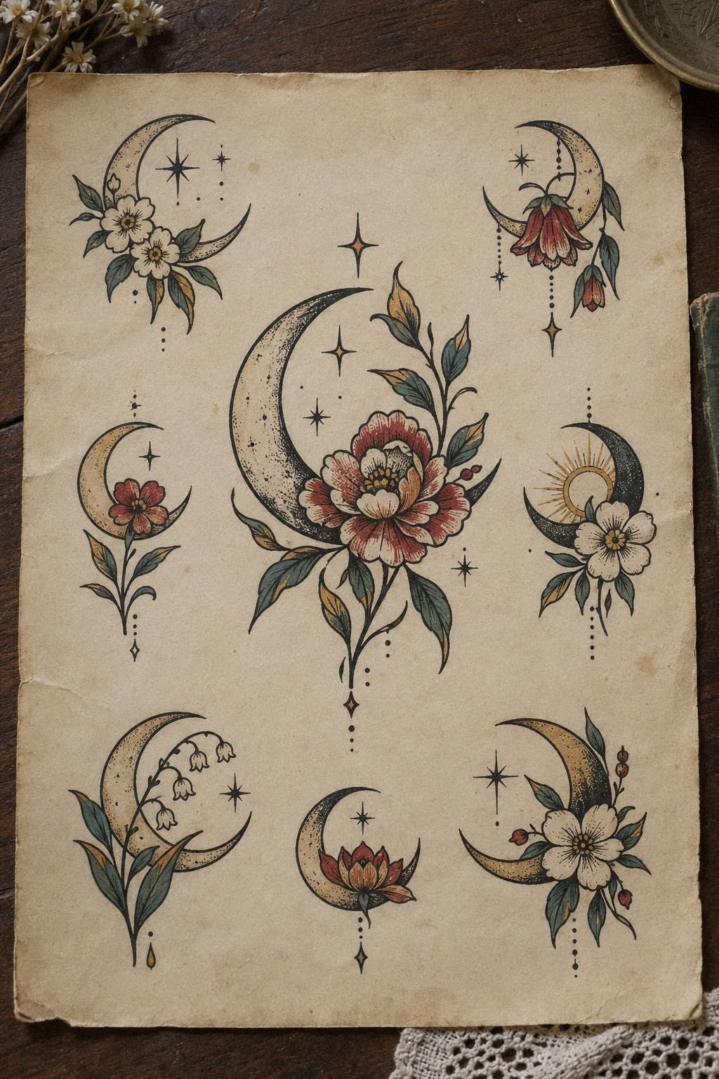
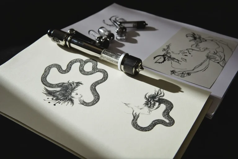
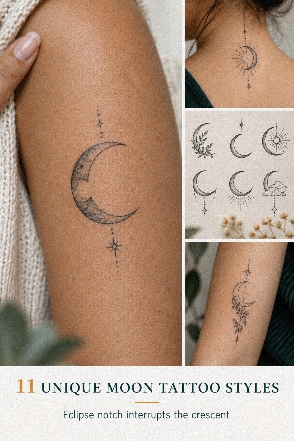
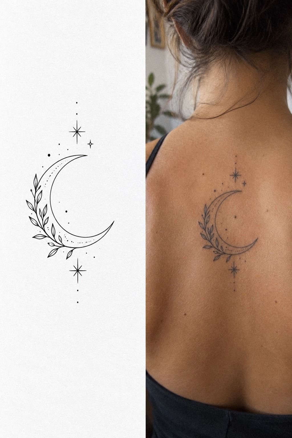
I considered pairing the crescent with a flower, but I treated it as a separate direction instead of forcing both ideas together. On the flash sheet, the moon sat beside a fine botanical stem with a single dark bloom.
The mix looked romantic, organic, and more feminine than my first sketch. I liked it, but it didn’t tell my story as clearly as the stars did.
My first idea didn’t have to survive unchanged. I asked the artist to show me a version with one small flower tucked under the lower tip, and the extra shape made the crescent feel crowded.
That was my answer. I’d choose a flower only if you’re comfortable with the tattoo reading as botanical first and lunar second.
A black botanical outline can age differently from a clean moon curve, especially when the petals are tightly packed. You’ll want to ask whether the flower needs slightly thicker lines or more open spacing. I looked through unique American traditional tattoo references to understand stronger silhouettes, then returned to fine line.
The flash sheet stayed part of my process, even though I left the flower off my final piece. Sometimes restraint is the more daring choice.
6Can a Moon Have a Face?
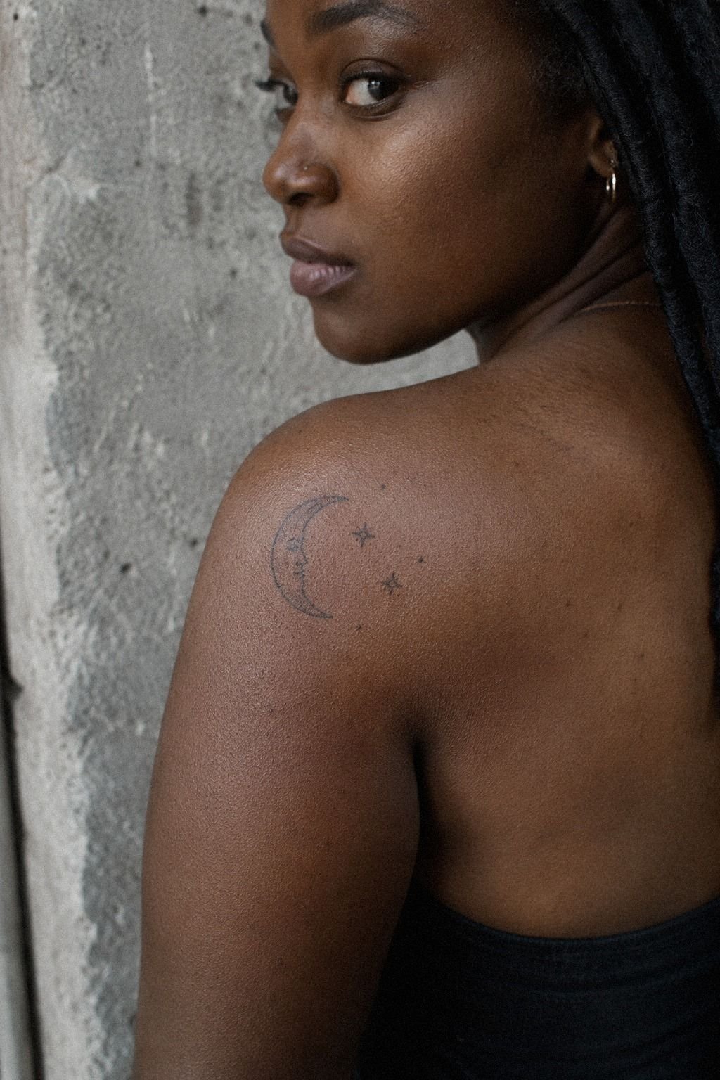
A moon with a face was my most whimsical option. I tried sleepy eyes, a small nose, and one curved mouth inside the crescent.
On deep ebony skin in the reference, the black details looked striking, but the facial details needed enough room to stay readable. Tiny marks can disappear into the curve if the design is pushed too small.
I eventually kept only a subtle expression, because a full face made the tattoo feel more like a character than a personal symbol. You might prefer that expressive direction, especially if your moon-tattoo-meaning is tied to comfort, humor, or a specific memory. I’d ask your artist for a healed example before approving the stencil.
The key was spacing between the facial details and the outer line. I didn’t want the eyes touching the edge, and I didn’t want a mouth so low that it looked surprised. Your artist can test the expression with a temporary stencil first.
My unique tattoo drawings helped me compare faces, phases, and plain crescents without rushing the decision. A restrained expression felt more timeless than a fully illustrated face.
7Crescent, Half Moon, or Full Circle?
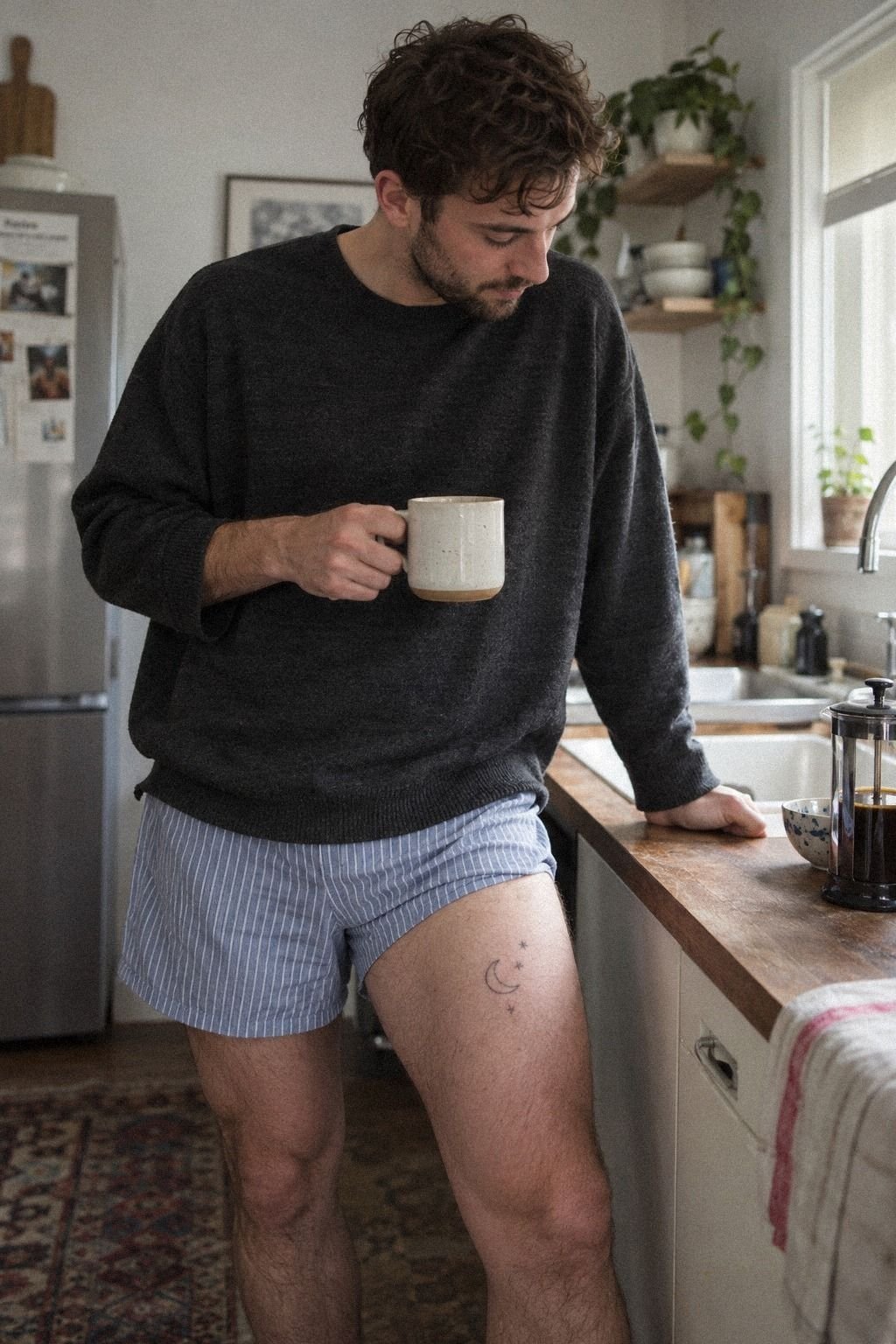
I compared a crescent, a new moon, a half moon, and a full circle before choosing the crescent. The new moon tattoo looked powerful and clean, but it lacked the open shape I wanted.
A full moon felt too direct. The half moon was classic, though it didn’t have the same movement when placed along the body.
Why should one curve matter so much? Because the symbol is what you’ll see every day, and its shape controls the entire tattoo.
I printed each option at the size I was considering, then held the pages against my skin in daylight and under a lamp. You’ll notice details differently when the design is moving with you instead of sitting flat on a phone.
My final comparison included a solid black circle, an outlined crescent, and a crescent with stars. I’d skip the full circle if your goal is a light-looking tattoo, because it creates a heavier visual stop. For more moon-related-tattoos, I used this witchy moon tattoo collection as a reference, not a template.
The crescent won because it left space for my own interpretation. It was the sharpest, most personal option.
8Let Moon Phases Carry One Meaning
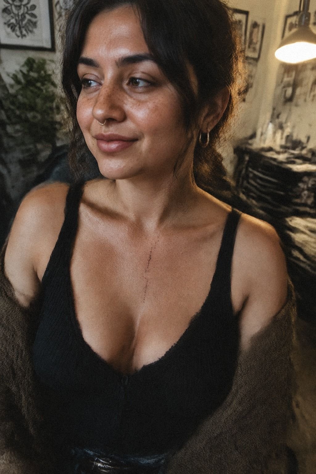
The phases version had the most symbolic pull.
9Adapt the Motif to My Skin
I adapted the design after looking at it beside my actual skin tone, not just the original reference. The medium olive skin in the example made the marks read differently from the fair and deep tones I’d saved earlier.
That doesn’t mean one skin tone is better for fine line. It means contrast, line weight, and placement need to be discussed together.
I asked the artist to make the outer edge slightly stronger and leave the stars open inside. You’ll want to show healed examples on skin similar to yours, because fresh tattoos can look sharper than they’ll look later. My artist explained how UV exposure can soften fine lines, so I chose a spot I could cover during long sunny days.
I didn’t redesign the moon until it lost its personality. The final version stayed personal, elegant, and slightly edgy, with one thicker curve and lighter stars. For moon-tattoo-ideas-female, I’d study artists who show varied skin tones rather than relying on one polished studio photo.
This unique tattoo ideas for females page gave me more range to compare. Your body should guide the design, not the other way around.
10Which Placement Actually Hurt Less?
I compared the back of the upper arm with the forearm, shoulder, and thigh before settling on my final spot.
11Protect the Moon While It Heals
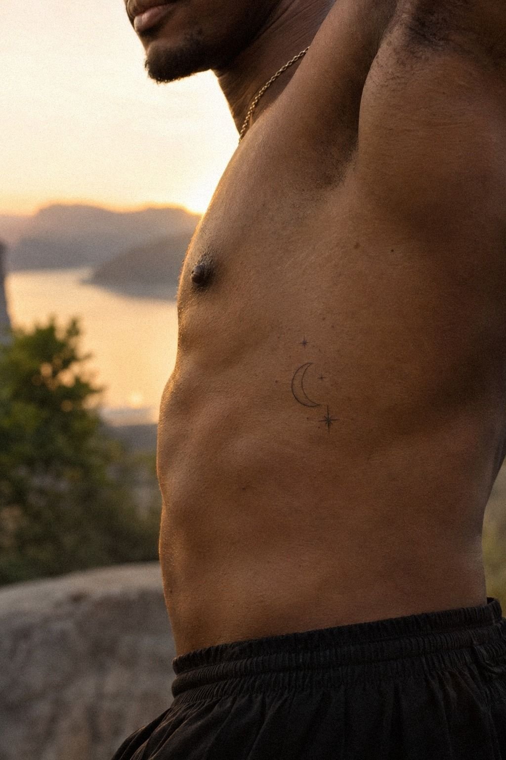
Aftercare started before I left the studio. I followed the artist’s aftercare instructions, washed the tattoo gently, and used a thin layer of fragrance-free moisturizer instead of covering it with too much product. The first days were less dramatic than I expected, but the skin still needed patience.
Your job is simple: keep it clean, don’t pick, and don’t treat peeling as an emergency. I used a small amount of fragrance-free moisturizer only when the skin felt dry, and I stopped adding product when the surface looked comfortable.
Surface healing usually takes about 2 to 3 weeks, while complete healing can take roughly two to three months. I avoided swimming and direct sun during the early stage, and I kept fabric from rubbing across the lines.
You’ll see the tattoo change as the surface settles. That doesn’t mean the ink has failed.
Fine lines can spread or soften over time, while solid black sections and sensible placement often hold up better. I’d protect the tattoo from UV exposure after healing too. These unique sun tattoo ideas made me think about long-term symbolism, not just the first photo.
My moon looks polished and timeless now because I didn’t rush the recovery. Good aftercare protects the value of the design!
What I Asked Before Booking
Before I booked, I asked whether the artist had healed photographs of fine-line work. Fresh tattoos can look crisp while the skin is still settling, so healed results mattered more to me than a dramatic studio portfolio. I also asked how the artist would adjust the line weight for my skin tone.
I asked about the shop minimum, the estimated appointment length, and whether the consultation was included in the booking cost. Those answers helped me set a realistic budget instead of treating the first online estimate as a promise.
I also wanted to know how much freedom the artist expected during the design process. A good artist should explain what may blur, what needs more space, and which details might not age well. That information gave me more confidence than a cheap quote ever could.
I asked whether a deposit would be required and whether it would come off the final price. Clear policies made the process feel more professional and prevented an awkward surprise later.
How I Compared Cost, Value, and Long-Term Results
The cheapest quote wasn’t automatically the best value. I compared the artist’s healed linework, hygiene standards, communication, and experience with small symbolic designs. Paying more felt worth it when the artist could explain how the crescent would sit on my arm and remain readable over time.
I treated the tattoo cost as part of the design decision, not an annoying extra. If your budget is limited, simplify the motif before choosing an inexperienced artist. Removing the flower or extra phases lowered the complexity without making the tattoo feel less meaningful.
I also considered whether the design would still feel personal after the trend passed. A timeless crescent with three stars had stronger long-term value for me than a crowded concept that looked impressive only at first glance.
The artist’s design process mattered too. I wanted someone who would question a cramped detail instead of agreeing to every request just to finish quickly.
The Budget I Set for a Small Moon Tattoo
My starting budget was $300, with room for a higher quote if the artist’s work justified it. I didn’t want to negotiate every dollar when the piece would stay on my skin permanently. At the same time, I wanted a clear range before I booked.
A realistic budget should include the studio minimum, consultation, design time, and possible adjustments. Ask whether a deposit is required and whether it comes off the final price. Those details can change the real cost even when the hourly rate looks reasonable.
If you’re comparing artists, look at the full value rather than the lowest number. Clean work, thoughtful placement, and clear aftercare guidance can be worth paying for. A small tattoo doesn’t always mean a small amount of skill.
I kept a little extra aside for an artist deposit and possible stencil changes. That made it easier to choose the design I wanted instead of trimming every detail for financial reasons.
How Much It Cost
My planning range for a small Unique Moon Tattoo was based on typical US pricing, not a promised quote. A shop minimum may run about $50 to $100, while hourly rates often land around $100 to $250. For a small crescent with a few stars, many people plan for roughly $100 to $300, depending on the artist, region, placement, and detail.
The final price can change if you add phases, a flower, heavier blackwork, or a longer consultation. I’d rather pay for clean healed work than chase the lowest number. Your artist’s portfolio, hygiene standards, and experience with fine line matter more than saving a small amount at the appointment.
Ask for the studio’s minimum before you book, and ask whether the consultation is included. You can compare tattoo design drawings before requesting a quote. I’d also save the exact reference because changing the design after pricing can alter the time.
Why I Chose Restraint Over Detail
I used to think a meaningful tattoo had to explain itself immediately. I wanted the moon, a flower, a face, several stars, and a full sequence of phases to carry every possible interpretation.
Then I looked at the page and saw a crowded little universe that belonged to nobody. The most memorable part was the moon curve I had nearly buried.
That changed how I judge tattoo ideas now. I’m not asking whether a design has enough decoration.
I’m asking whether the shape still works when the phone is gone, the lighting is ordinary, and the skin has finished healing. A striking silhouette beats a complicated concept that needs a paragraph of explanation.
You’ll feel more confident choosing fewer marks when each one has a job. I also learned that pain anxiety can make every decision feel urgent.
Mine wasn’t. I could test the stencil, ask about line weight, and walk away if the artist couldn’t show healed examples.
That isn’t indecision; it’s part of choosing responsibly. My small crescent felt bold because it had room around it, not because it occupied half my body.
The best moment came after the appointment, when I stopped checking whether other people understood it. The moon didn’t need to announce a biography. It marked a private shift, and that was enough.
If you’re choosing a personal tattoo, let the meaning guide the design, then let the design stay visually honest. Your skin doesn’t need every thought you’ve ever had placed on it.
The Questions Worth Answering First
How much does a Unique Moon Tattoo usually cost?
A small Unique Moon Tattoo usually costs about $100 to $300 in the US, though shop minimums may start around $50 to $100 and hourly rates may run $100 to $250. Your artist, region, placement, and detail level will change the quote. Ask before booking.
Are Unique Moon Tattoos a good idea for a first tattoo?
Yes, a Unique Moon Tattoo can be a strong first choice because the design can stay small, personal, and readable. An arm, thigh, or shoulder placement may feel more tolerable than ribs or sternum. Choose an artist with clean healed linework and clear aftercare guidance.
How do I choose a tattoo artist for a Unique Moon Tattoo?
Choose an artist whose portfolio shows crisp linework, healed photographs, and skin tones similar to yours. You’ll also want a hygienic studio and a style match.
Don’t judge from one fresh tattoo alone. Review unique tattoo ideas while comparing artists.
How much do Unique Moon Tattoos hurt?
Pain depends on placement, but ribs, feet, hands, and sternum often feel more intense than the forearm, thigh, shoulder, or upper arm. My experience was manageable because the design was small. You can reduce stress by eating beforehand and wearing accessible clothing.
How long does a Unique Moon Tattoo take to heal?
The surface usually heals in about 2 to 3 weeks, while complete healing can take roughly 2 to 3 months. Wash gently, moisturize as directed, and avoid sun, swimming, and picking during early healing. Your artist’s instructions should lead.
What’s the best placement for a Unique Moon Tattoo?
The forearm, thigh, shoulder, and upper arm are practical choices for visibility and tolerable pain. Ribs and sternum can look dramatic, but they may hurt more. I’d choose the placement that gives your crescent enough space to remain readable as the lines soften.
Where I’d Start First
If I had to pick one, I’d start with the crescent moon and three fine stars. The open spacing gives fine lines room to age without turning the design muddy. Pin this tattoo sketches guide for later, then take your time with the stencil.
The final design felt personal, empowering, and quietly iconic. Good design earns its space!