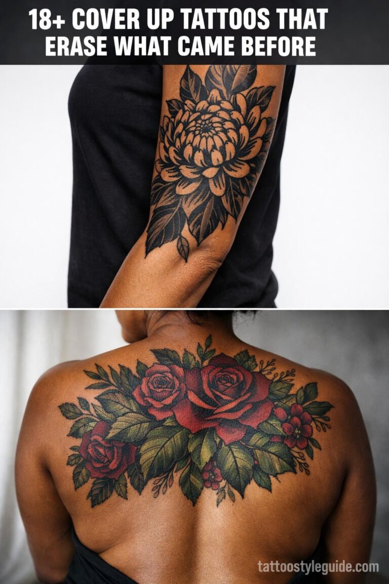
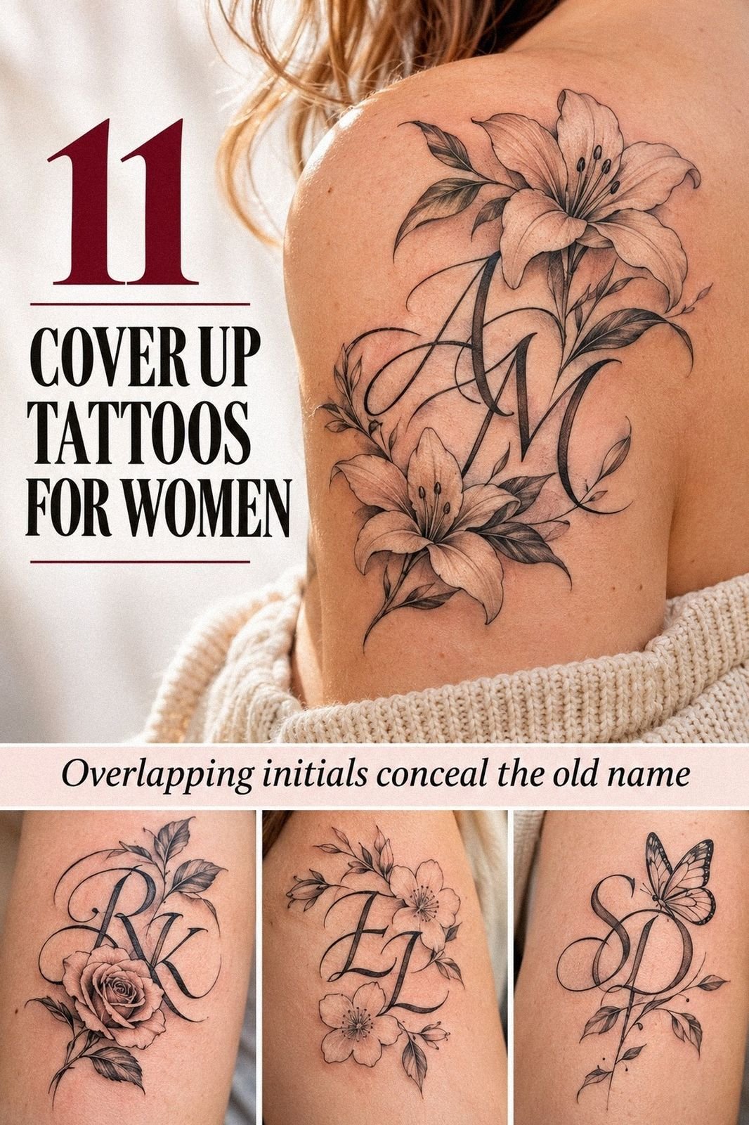
Name cover-up tattoos for women can cost about $100 to $300 in the US, depending on the artist, region, placement, and amount of old ink. I chose a cleaner name cover-up tattoo with muted terracotta, stone, and olive accents after one failed idea and finished it in one sitting. The result was delicate, personal, and far less painful than I’d feared!
The best value wasn’t the lowest price. It was choosing a design that could work with the old mark instead of fighting it.
Here’s What It Looked Like Before
Before I chose the new design, I had a patch of old lettering that felt stuck in another chapter of my life. The lines were faded, uneven, and darker in the middle, so a tiny replacement wouldn’t have worked. I’d kept the skin untouched for months because I didn’t want another rushed decision.
The old mark wasn’t dramatic, but I could see it whenever I changed clothes or caught my reflection. I wanted something meaningful without making the cover-up plan look heavy. If you’re in that place, study the old ink first, because its width and direction will decide what your new tattoo can become.
Before I Booked the Appointment
I started by collecting references for old pigment that looked similar to mine. Some examples had dense black patches, while others showed faded lettering with open skin between the strokes. That comparison helped me understand what was realistic before I talked about price or placement.
I also saved healed examples, not only fresh tattoos. Fresh work can look vibrant and sharp, but settled skin tells you whether the loops stayed readable. I’d rather judge the long-term value of a design than fall for one dramatic result.
These name tattoos for women helped me compare lettering direction and scale. I also looked through upper arm tattoos for women before deciding whether I wanted the name to be visible every day.
What Makes a Name Cover-Up Work?
A successful cover-up has to account for the shape underneath. The artist needs to know where the old ink is darkest, where it has faded, and which lines can become part of the new design. That planning matters more than choosing the most dramatic style.
I wanted the result to feel striking but still connected to me. The strongest designs used contrast, spacing, and direction instead of piling on random details. If you’re asking whether a cover-up is worth it, start with the structure, not the trend.
A meaningful cover-up can be elegant without becoming ornate. The goal isn’t to bury every trace under heavier work. It’s to create a new visual story with enough contrast, movement, and personality to feel intentional.
- Choose the Name First
- Can Skin Tone Change the Cover-Up?
- Let the Floral Sketch Earn Its Place
- Test Three Word Shapes
- Before and After: What Held Up?
- Blackwork Gave the Name More Authority
- Why I Placed It Across My Forearm
- How Much Did the Old Ink Matter?
- Use Intricate Linework With Restraint
- Follow My Artist’s Healing Rules
- The New Name Felt Like Mine Again
1Choose the Name First
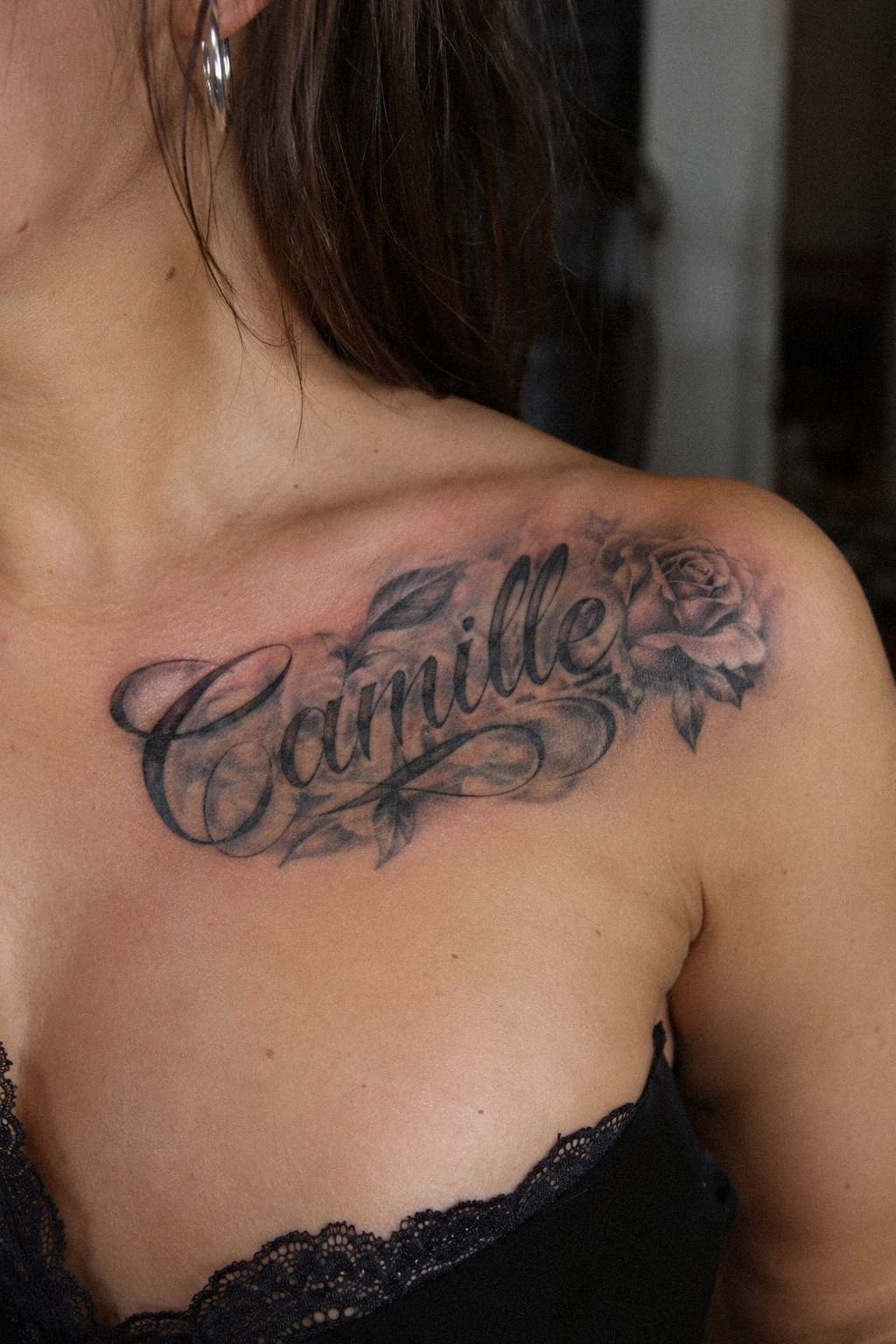
I started with the personal name that still felt meaningful to me, then tested it in several letter shapes. I didn’t want to hide the old tattoo with a random symbol. I wanted the new word to carry its own story.
A thin, flowing script gave the design a graceful direction. I compared fine-line lettering beside my skin tone and watched how each loop moved across the old mark. I’d already learned that a pretty design on a screen isn’t automatically a good tattoo.
My first instinct was to choose ornate vines around every letter. I changed my mind. You don’t need extra decoration if the name already carries emotional weight, and a minimal outline can look more timeless when the tattoo settles.
The artist showed me how the word could follow the calf placement, wrist, or sternum. That mattered because a sleek name can twist awkwardly when it crosses a curved area. You’ll want to judge the design while moving, not only while sitting still.
I left the consultation with an understated but recognizable idea. It felt like a symbolic replacement, not a loud attempt to erase the past. I knew I’d made the right call when I stopped comparing it with everyone else’s tattoos.
2Can Skin Tone Change the Cover-Up?
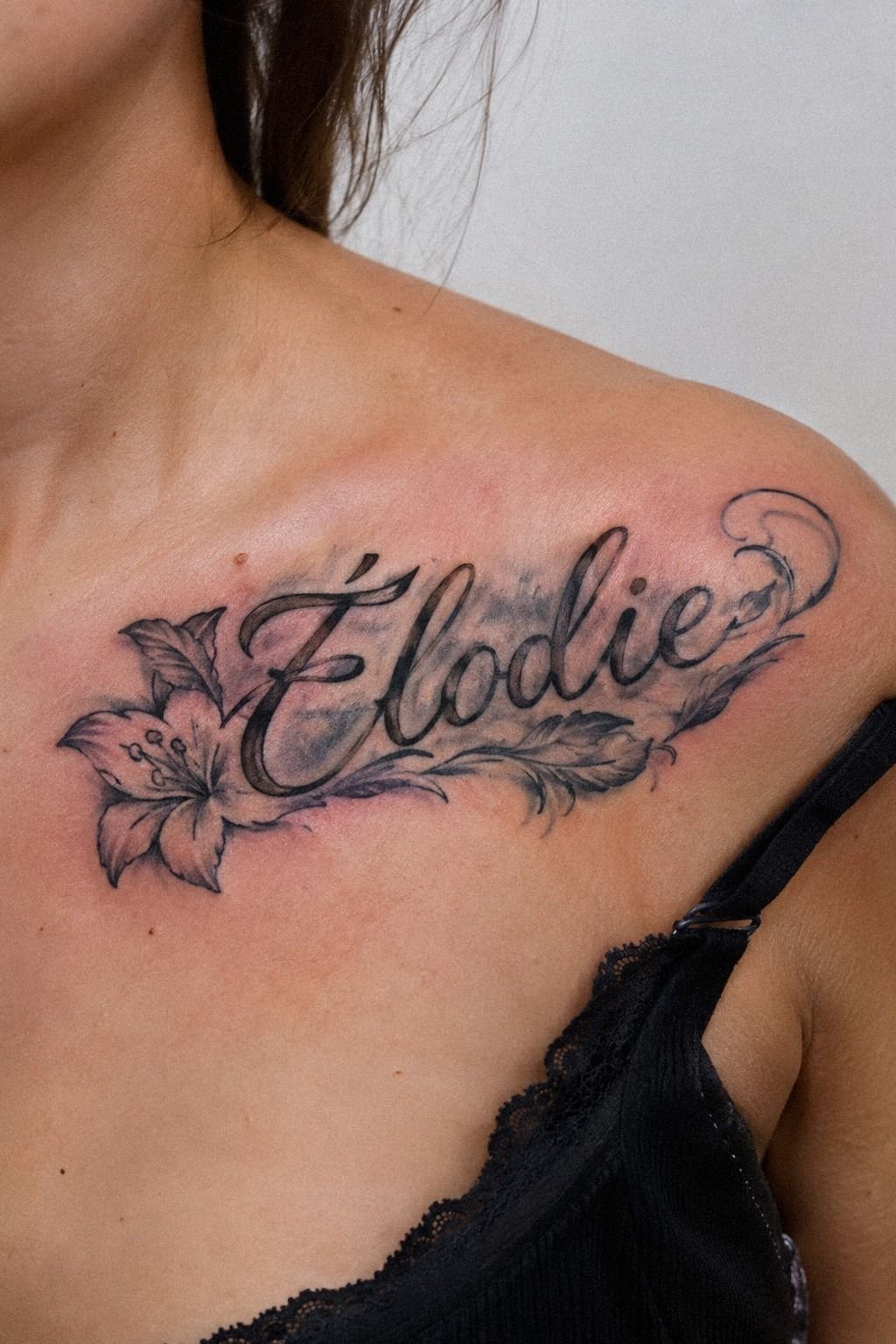
Yes, skin tone changed how I judged every reference.
Clay-toned ink, pale cream highlights, and aged-brass accents gave the cover-up a softer contrast against my skin. I wanted the result to feel graceful and personal rather than overly harsh.
3Let the Floral Sketch Earn Its Place
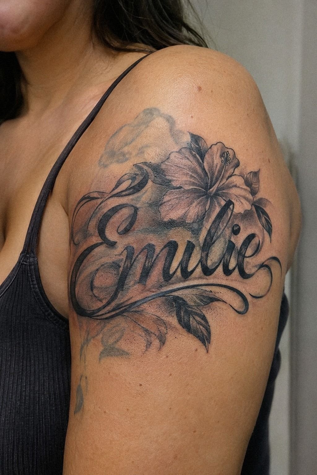
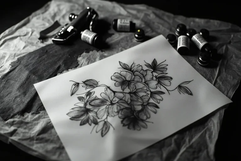
The floral sketch began as a practical solution. A few feminine curves could cross the darkest old lines while keeping the name readable. I didn’t want the flowers to become the entire tattoo.
The artist drew botanical curves around the heavier letters and left the lighter sections more open. The result felt romantic rather than crowded. I’d keep the floral elements selective, because too many petals can blur together once the tattoo settles.
We tested the sketch with plum, gray, and restrained rose-gold accents. The plum version gave better coverage, while the lighter version looked ethereal but less reliable over the old lettering. That was the first time I understood how design beauty and coverage can pull in different directions.
I kept only the details that improved the cover-up balance. The final sketch was feminine, expressive, and easier to read from a distance. For another direction, these thigh tattoos women unique show how curved designs can follow a larger placement.
4Test Three Word Shapes
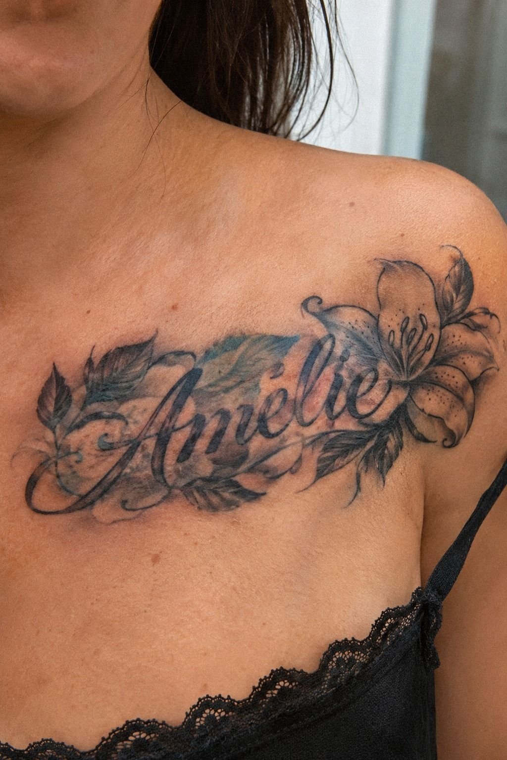
I tested the name in script lettering, compact serif lettering, and a soft handwritten style.
I also compared navy ink, pale highlights, and muted brown shading. The navy version felt crisp and bold without making the lettering look severe.
5Before and After: What Held Up?
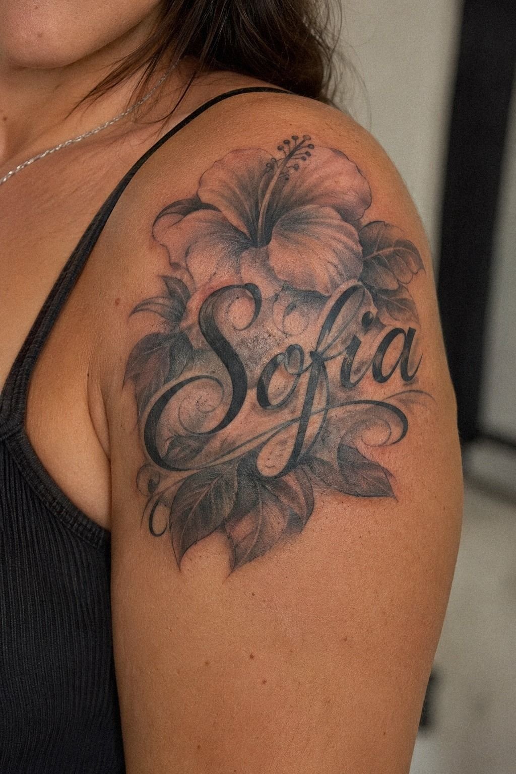
Before-and-after results helped me separate fresh excitement from a genuinely strong cover-up. I looked for healed examples, not only glossy first-day results. Fresh tattooing can look vibrant and sharp, while settled skin gives you a more honest view of contrast.
The artist showed me a healed lettering portfolio with several names, initials, and short words. Some were striking because the black stayed clear. Others had expanded until the smaller loops were hard to read.
You’ll want to ask how old each healed example is. Three months and three years tell different stories, especially when the design uses delicate lines. That detail can affect whether the artist’s price feels worth it.
I compared examples by placement, skin tone, and old-ink density. A design that worked on a thigh didn’t automatically work over a wrist tattoo. I’m glad I didn’t judge the artist by one dramatic transformation.
This was also where I noticed that blackwork structure can age more confidently than extremely faint linework. Delicate tattoos can be gorgeous, but very fine lines may widen over time. I saved these thigh tattoos women black references for that reason.
Emerald and gold accents looked vibrant beside cream details, but I kept them controlled so the name remained readable.
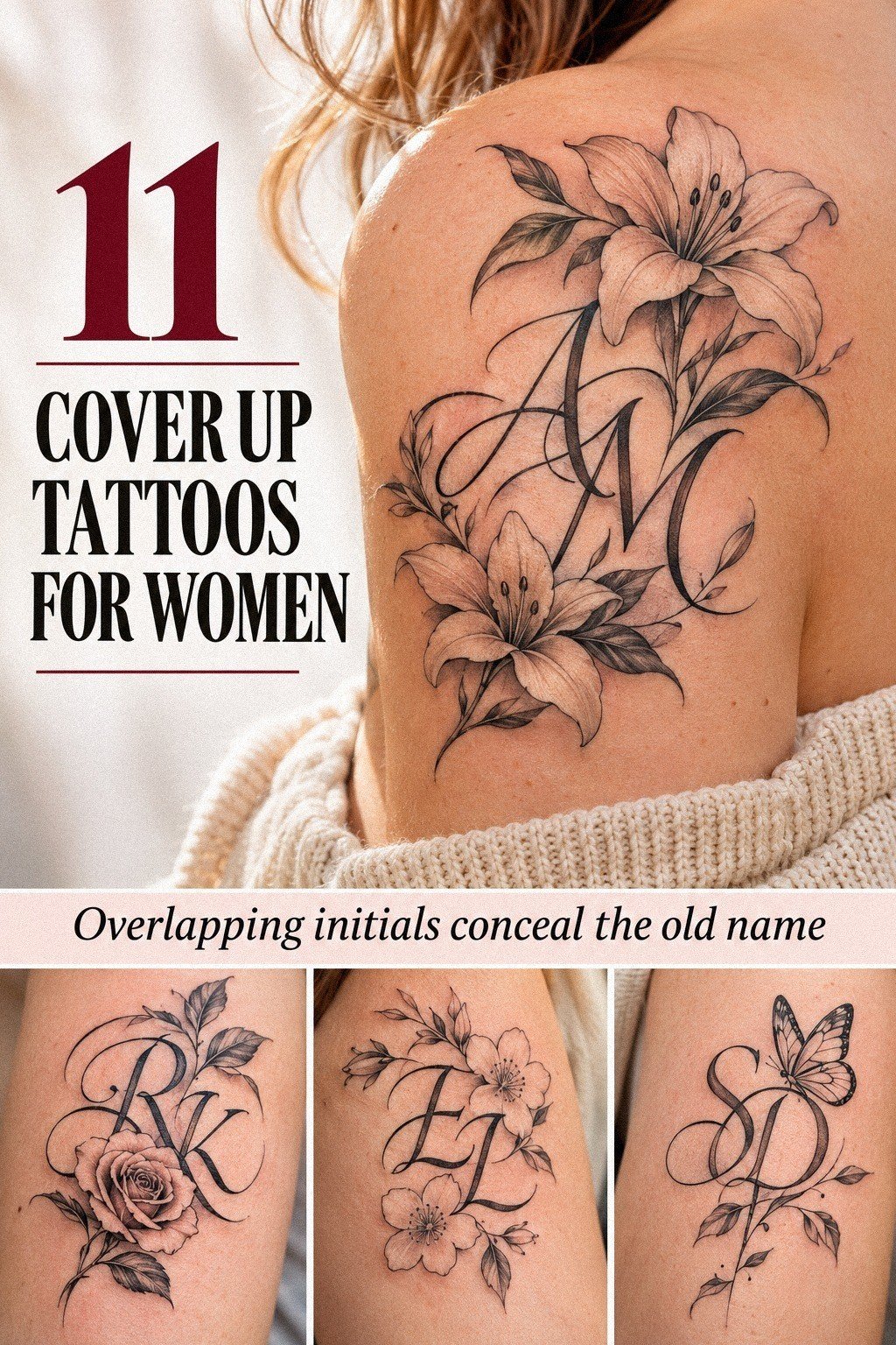
6Blackwork Gave the Name More Authority
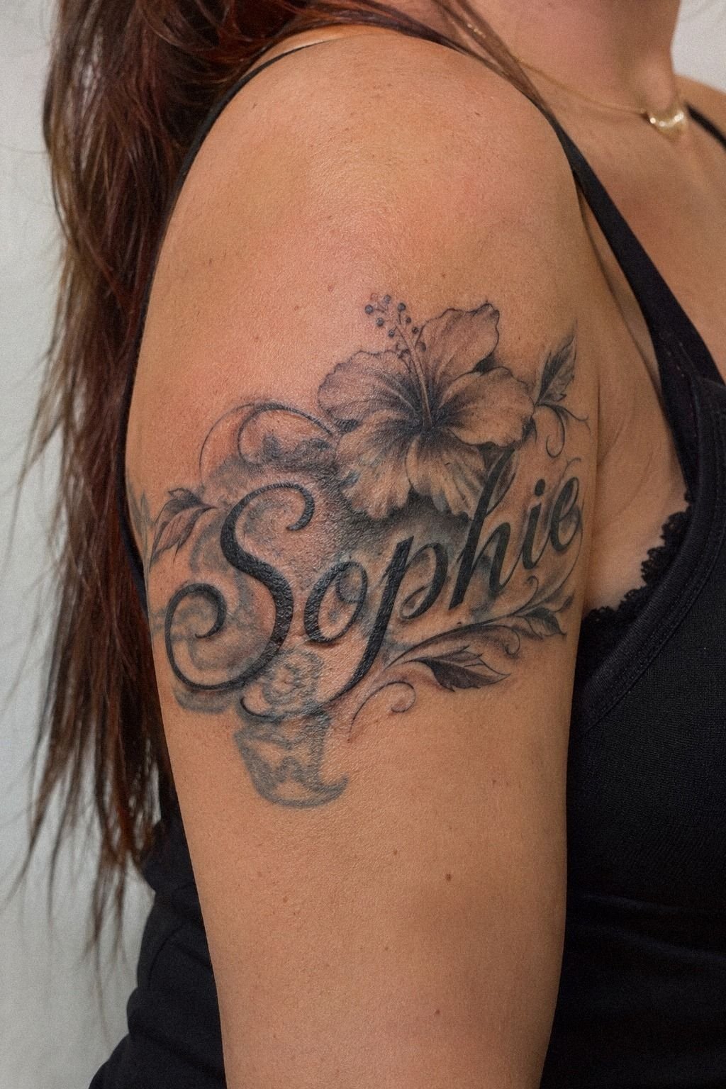
The blackwork option surprised me. I’d expected something soft and feminine, but a compact blackwork design looked more polished over the old pigment. The contrast was bold without becoming aggressive.
My artist used solid black shading only where it served the cover-up. I didn’t want a heavy block around the name, so we kept the outer curves crisp and placed darker sections beneath the thickest old lines.
Forest-green and rust accents gave the design a daring edge without replacing the blackwork structure. You’ll want to see healed work on similar deeper skin tones and ask how the artist evaluates settled results. I’d skip anyone who can’t explain how their work changes after healing.
The final sketch looked iconic in a quiet way. It wasn’t trying to look fierce from across the room, but it had enough structure to stay readable. That made the artist’s experience more valuable than a cheap quote.
I also reviewed an artist’s healed portfolio before confirming the appointment. These thigh tattoos for women show how larger lettering can follow the body without becoming visually overwhelming.
7Why I Placed It Across My Forearm
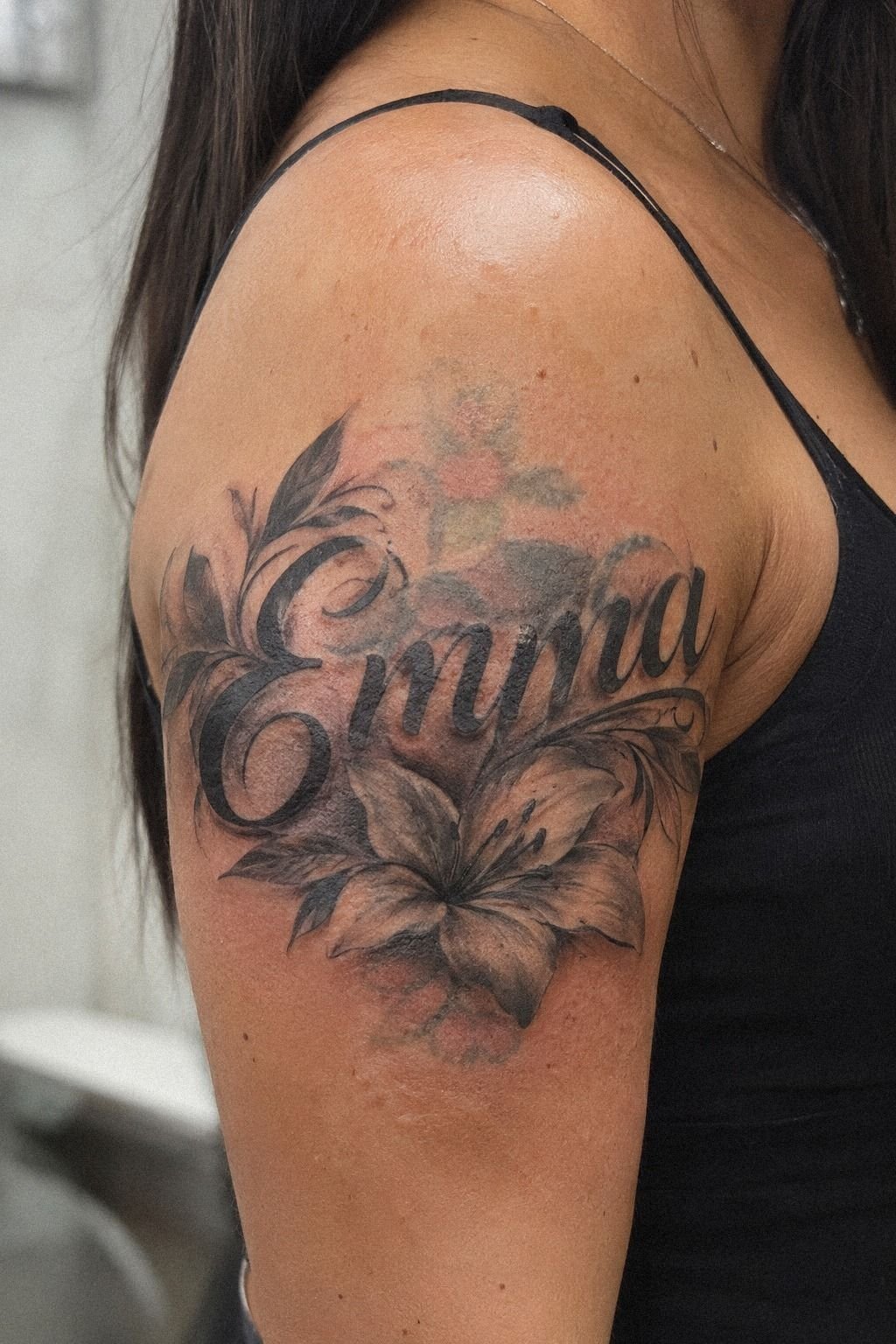
I chose the forearm because I wanted to see the name without twisting my body. The surface gave the letters enough space to breathe, and the placement felt more tolerable than the sternum or hand.
A compact forearm lettering design can be visible without taking over your entire look. I liked that I could check the tattoo easily while it healed, which made aftercare feel more manageable.
The artist positioned the word along the natural arm line instead of placing it straight across. That made the script look flowing and helped the cover-up feel connected to my body.
I tested the stencil with my arm relaxed and turned outward. The name looked different when the muscles shifted, so we adjusted the stencil angle by a small amount. That was a sharp reminder that placement isn’t just a flat drawing problem.
Dusty rose, charcoal, and brass accents made the forearm design feel stylish and expressive. I didn’t choose the forearm because it was trendy. I chose it because I wanted the tattoo to remain readable when I moved.
You can compare more visible placement ideas in these arm tattoos for women before committing.
8How Much Did the Old Ink Matter?
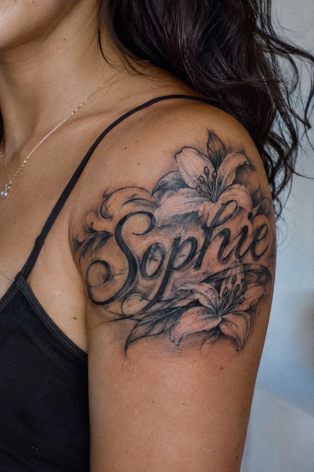
The session barely hurt compared with what I’d imagined, but the sensation changed around the old-ink sensitivity and closer to bone. The forearm felt manageable, while the sternum and feet sounded more intense based on the artist’s experience.
My artist used a 3RL needle for the finer lines and slowed down over the cover-up areas. The sensation felt scratchy and hot in short bursts, then settled when we paused. I’d rather have a careful artist take more time than rush through a painful patch.
Pain varies by person, but ribs, feet, hands, and sternum are often sharper than forearm, thigh, or shoulder areas. That doesn’t mean you can’t choose a meaningful placement. It means you should plan breaks and ask direct questions before booking.
I brought water, ate beforehand, and wore clothing that left the area easy to reach. Those choices were simple, but they made the appointment feel less stressful. I’m glad I didn’t treat preparation as an afterthought.
My artist and I agreed on planned breaks before the needle started. Warm-white, camel, and black accents kept the result understated but crisp. If you’re considering a larger placement, these stomach tattoos for women can help you compare visibility and sensitivity.
9Use Intricate Linework With Restraint
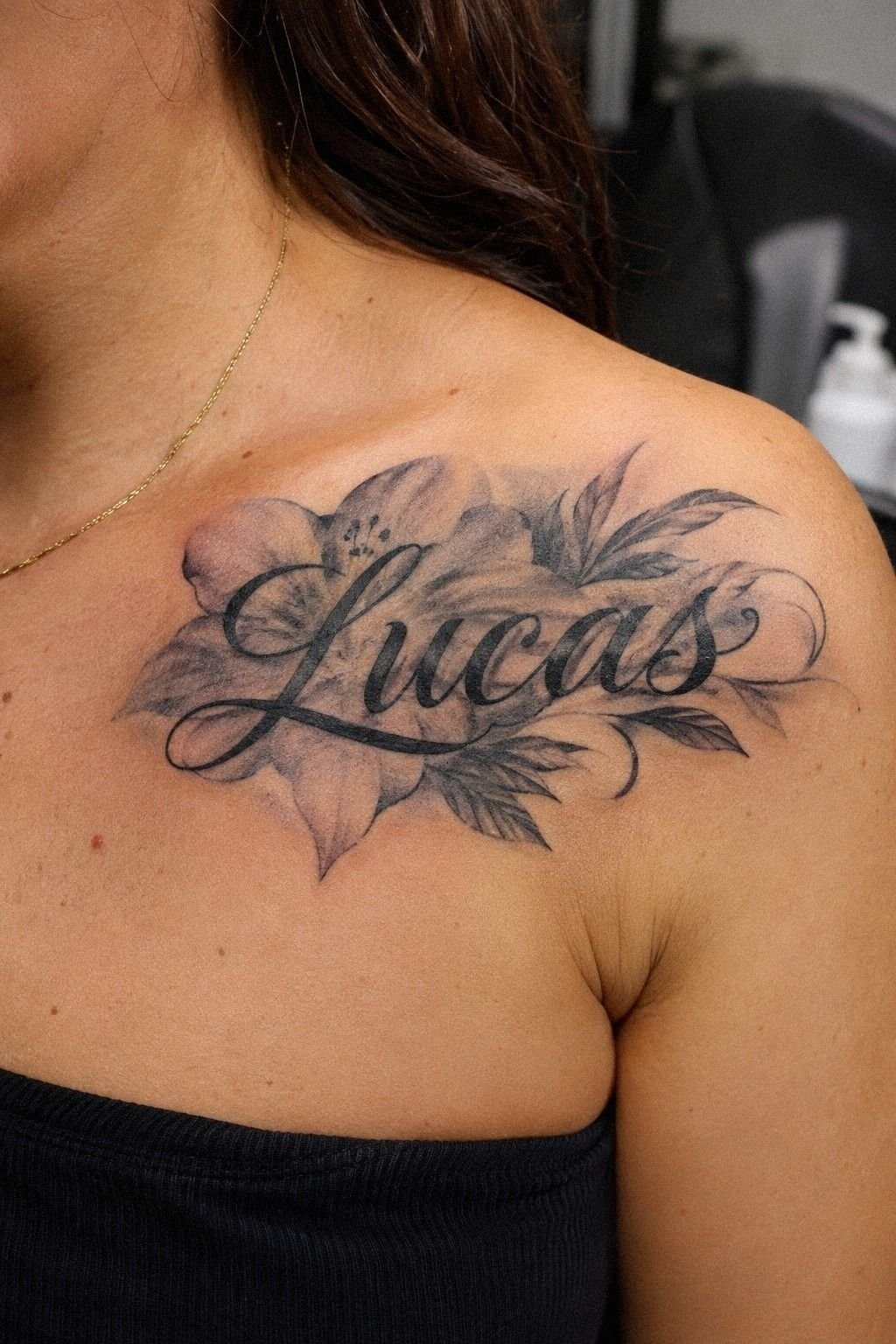
The cover-up worked because the intricate linework had a job. Each curve either supported the name, crossed an old mark, or guided the eye toward the strongest letter.
I didn’t want every section filled with detail. A few controlled strokes created a more elegant result than a dense pattern. That restraint kept the tattoo expressive without making the word difficult to read.
The artist left open negative space around the lighter parts of the old lettering. This gave the design a crisp rhythm and stopped the darker areas from spreading into one indistinct shape.
Midnight-blue lines with copper and ivory accents made the result feel sharp and timeless. I considered adding dainty stars and a playful border, but both ideas felt unnecessary.
The strongest version was stylish, personal, and slightly edgy without trying too hard. These thigh tattoos women black helped me compare how detailed blackwork can age.
10Follow My Artist’s Healing Rules
The first few days were less dramatic than I expected. I followed the artist’s instructions, washed the area gently, and used a thin layer of fragrance-free aftercare balm. You don’t need to keep touching a new tattoo to check it.
Surface healing usually takes about 2 to 3 weeks, while complete healing can take roughly 2 to 3 months. I kept the tattoo away from pools and strong sunlight during that period. The design looked darker at first, then settled into a softer finish.
My artist told me not to scratch, peel flakes, or overload the skin with moisturizer. That advice sounded basic, but it was easy to forget when the area became itchy. I’m glad I took progress notes instead of judging the tattoo hour by hour.
I also protected the tattoo once the surface looked healed. Strong sunlight can affect the appearance of settled ink, so I treated UV protection as part of the long-term design process.
Sage-green and warm-cream accents softened the settled result while keeping the lettering clear. Comparing the stencil with the healed tattoo made the difference obvious. The plan showed the intended direction, while the settled tattoo showed the real line weight.
If you’re comparing artists, ask for healed examples and read the aftercare sheet before your appointment.
11The New Name Felt Like Mine Again
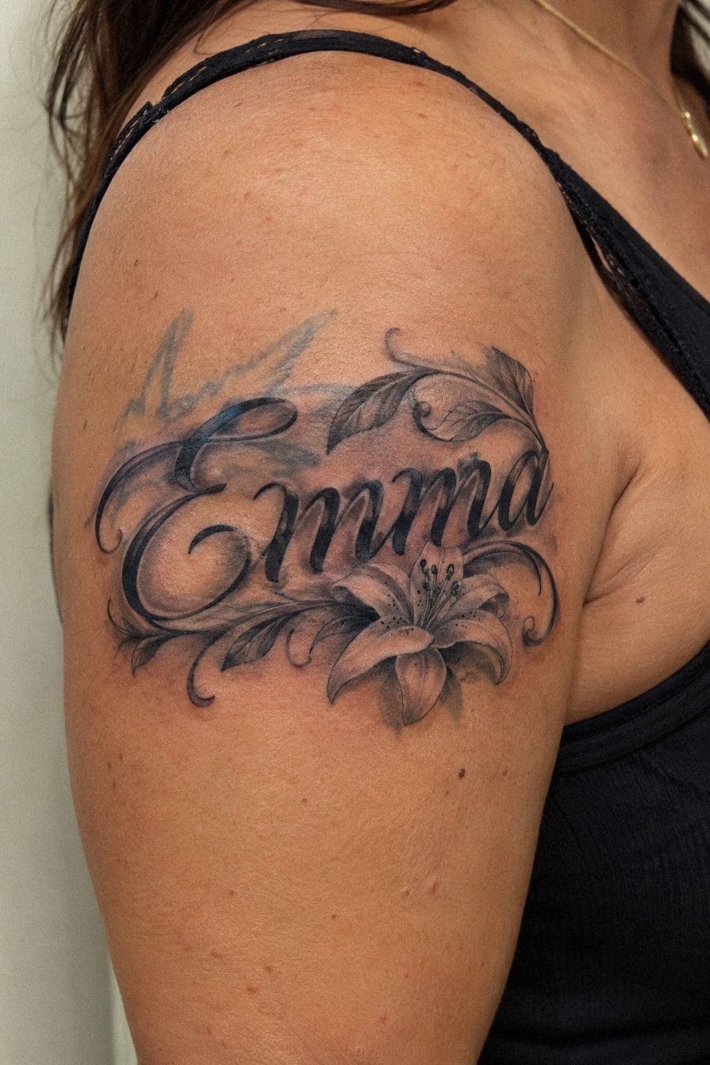
When the tattoo settled, I stopped seeing the old name first. The new name had a gentle curve, a sharp opening letter, and enough black to stay readable. It felt empowering to look at the finished piece and recognize a choice I’d made for myself!
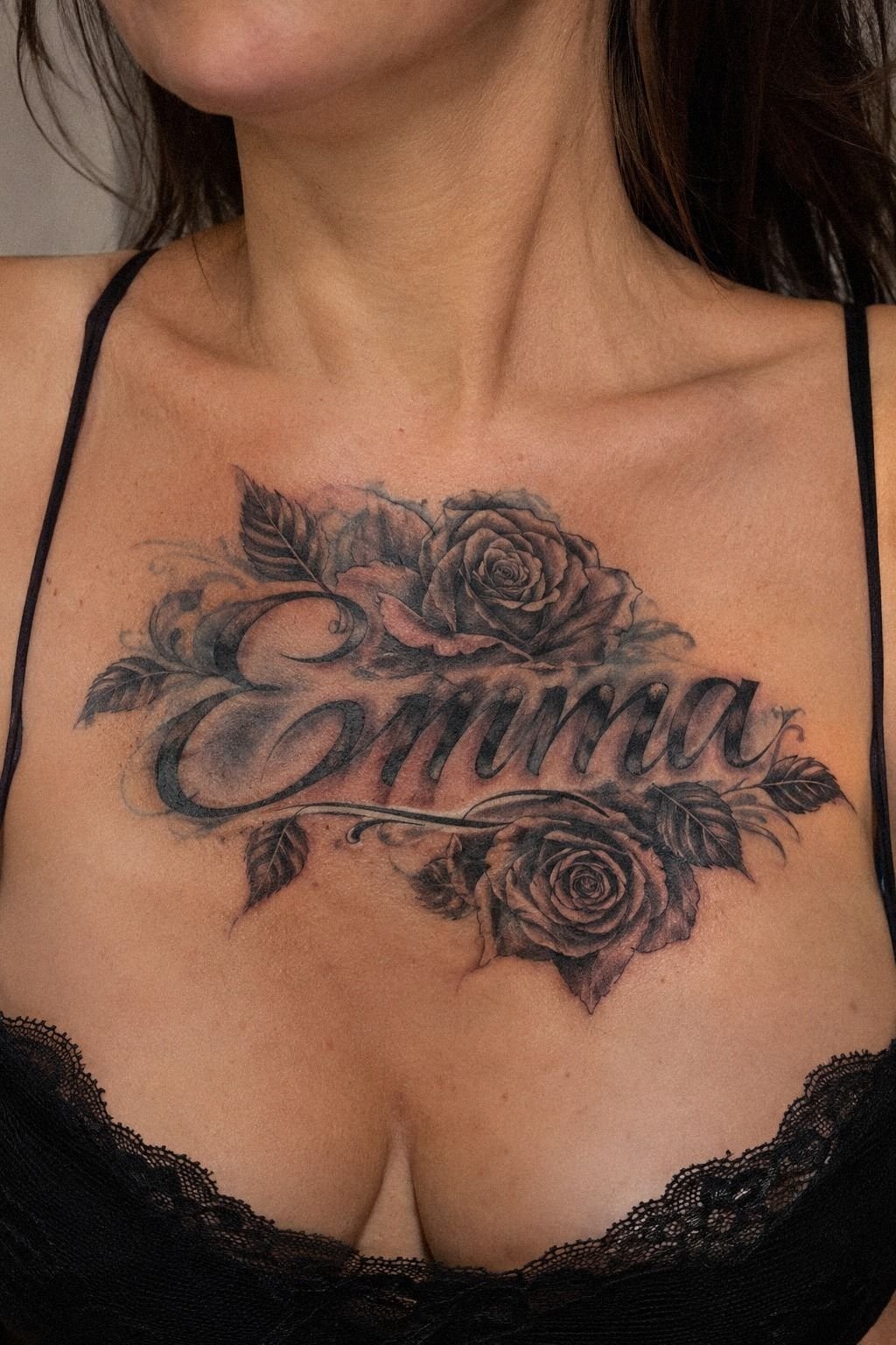
The sternum version felt intimate, while the forearm version felt more expressive and visible. Both could work for name cover-up tattoos for women, but I’d choose based on your comfort with attention.
I kept the final design personal with black botanical accents, terracotta touches, and restrained olive shading. No extra symbols, no crowded border, and no attempt to explain the name through decoration. That made the result feel elegant and honest.
The final piece looked classic without feeling vintage. It had a raw emotional reason behind it, but the finished lines were polished and controlled. I didn’t need the tattoo to tell everyone the whole story.
And yes, I looked at it constantly during the first week. You’ll probably do the same. The best part wasn’t that the old ink vanished completely, but that the finished tattoo gave my skin a different story to carry!
How Much It Cost
I planned around typical US tattoo pricing instead of expecting a universal quote. A shop minimum may fall around $50 to $100, while an hourly rate often lands near $100 to $250. A name cover-up can take longer than fresh lettering because the artist has to assess the old pigment, test placement, and build enough coverage.
A shop minimum can make a small cover-up cost more than expected. The tattoo may be physically small, but the artist still needs to assess the old design, prepare the stencil, and work carefully around uneven pigment.
An hourly rate also reflects experience, speed, and regional demand. I wouldn’t assume the lowest number gives the best value. For this kind of work, careful planning mattered more than finishing quickly.
My budget focused on the artist’s cover-up experience, not the lowest quote. You’ll want to ask whether the consultation, stencil changes, and touch-up policy are included. I’d rather spend within the typical range for careful work than choose a cheap appointment that leaves the old lettering visible.
Ask whether the cover-up consultation is part of the price. The artist may need to see the tattoo in person before confirming the amount of work, especially when the old name is darker in the middle.
I also asked about the touch-up policy before booking. That didn’t mean I expected a problem. It simply gave me a clearer idea of the total budget and what would happen if a small area healed lighter.
The final quote will vary by region, size, placement, and the artist’s schedule. Get the price after the artist sees the old tattoo, because a name that looks small can require more coverage than a fresh name design.
Is a Cover-Up Worth the Budget?
For me, it was worth it because the artist understood how to use the existing lines. A cheaper design might have hidden the name temporarily but left me with a shape I didn’t actually like.
I focused on artist experience, healed work, and communication. Those factors gave me more confidence than a low number on a booking page. You’ll want to decide which priorities matter most before comparing prices.
The best value came from choosing a design that could age with its structure intact. I didn’t need the biggest or darkest tattoo. I needed a meaningful piece that stayed legible.
A cheap appointment can become expensive if you later need correction or another cover-up. That doesn’t mean the most expensive artist is automatically right. It means the budget decision should include skill, planning, placement, and the possibility of future touch-ups.
What I Learned About Choosing a Cover-Up
I used to think the best cover-up would be the darkest possible design. After comparing my own before-and-after results, I changed my mind. Coverage matters, but direction, spacing, and contrast matter just as much.
My first lesson was to bring healed references. Fresh work can look vibrant and flawless, but healed work tells you whether thin loops stayed readable and whether the black softened evenly. I’d ask for examples at different ages.
The second lesson was to respect the old tattoo. It doesn’t have to dictate every detail, but it does set limits. My artist used the faded sections as guides for darker downstrokes and kept the lighter parts open.
The third lesson was to choose meaning before decoration. I tested flowers, stars, and tiny symbols, but the strongest version only needed the name and a few supporting curves. You’ll know the design is right when the extra details start feeling like noise.
I also learned that pain deserves an honest conversation. Forearm, thigh, and shoulder placements are often more tolerable, while ribs, feet, hands, and sternum can feel sharper. Nobody can promise a painless session, but your artist can explain the sensation and plan breaks.
Finally, I learned that healing is part of the design process. Gentle washing, light moisturizing, avoiding pools, and protecting settled skin will help your tattoo age more gracefully.
The result isn’t finished when you leave the studio. It’s finished when your skin has had time to settle!
The Questions Worth Answering First
How much do Name Cover Up Tattoos For Women usually cost?
A small name cover-up usually costs about $100 to $300 in the US, while shop minimums may run $50 to $100 and hourly rates about $100 to $250. The final quote depends on placement, old pigment, artist, region, and detail.
Are Name Cover Up Tattoos For Women a good idea for a first tattoo?
Yes, they can be meaningful if you choose a tolerable placement and an experienced artist. Clean lettering gives you a personal design that can remain readable when the artist uses suitable line weight and spacing.
How do I choose a tattoo artist for Name Cover Up Tattoos For Women?
Look for healed cover-up examples, clear lettering, strong linework, and good studio hygiene. A healed portfolio is more useful than fresh results alone. Ask how the artist handles old pigment before booking.
How much do Name Cover Up Tattoos For Women hurt?
Pain depends on placement and your own sensitivity. Ribs, feet, hands, and sternum are often sharper, while forearm, thigh, and shoulder areas are usually more tolerable. Planned session breaks can make the appointment easier.
How long does a Name Cover Up Tattoos For Women take to heal?
Surface healing usually takes about 2 to 3 weeks, while complete settling can take roughly 2 to 3 months. Wash gently, moisturize lightly, avoid pools, and protect the tattoo from strong sun. A consistent aftercare routine supports clearer long-term lines.
What’s the best placement for Name Cover Up Tattoos For Women?
Forearm, upper arm, thigh, and shoulder placements offer useful visibility and are often more tolerable than sternum, hands, feet, or ribs. Your placement choice should fit your pain comfort, clothing, and desired visibility.
Where I’d Start First
If I had to pick one, I’d start with the forearm cover-up. It’s visible enough to enjoy, spacious enough for clean lettering, and usually easier to tolerate than bone-heavy placements.
Before booking, I’d compare name tattoos for women, upper arm tattoos for women, and thigh tattoos for women. Then I’d ask for healed examples and a realistic quote before confirming the appointment.
That combination gave me the confidence to choose a personal, daring, and timeless design instead of rushing into another mark.