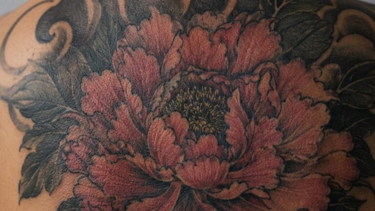
I’ve had a lot of people sit in my chair with crumpled photos of subway cars and alley walls, wanting that spray-can energy permanently. Graffiti tattoos hit different, they’re loud, personal, and carry that street-level authenticity. But skin ain’t concrete, and paint ain’t ink. After fifteen years of translating wall culture to body art, I’ve learned what soars and what turns into a blurry regret. Let me walk you through the real deal.
Popular Styles That Translate
Not every burner belongs on a bicep. Some styles carry over beautifully; others fight the medium every step.
Throw-Up and Bubble Letter Styles
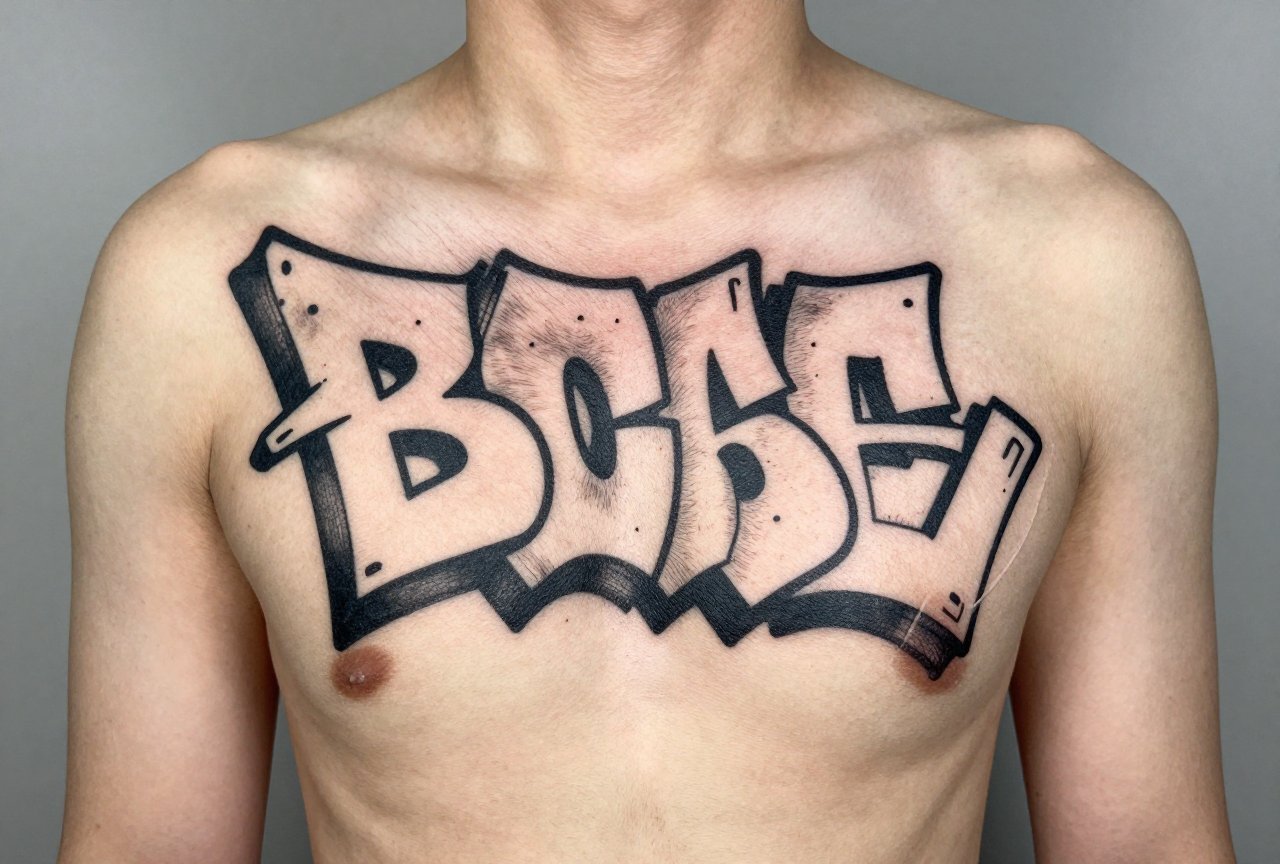
These are the bread and butter of graffiti tattoos. Thick, rounded letters with that soft spray fade, I’ve done hundreds. The key is keeping the fill tight and the outline heavier than you’d think. On skin, those soft edges need a crisp border or they bleed together in six months. I tell clients: think of the outline as your wall, holding the fill inside. Bubble letters work great on forearms, thighs, anywhere with some flat real estate. The round shapes flow with muscle curves instead of fighting them.
Wildstyle and Complex Interlocks
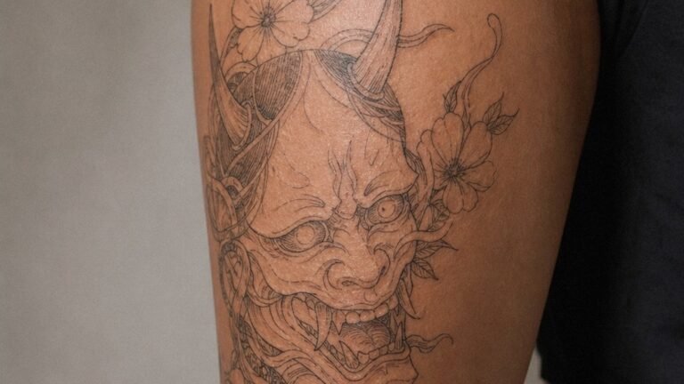
Here’s where it gets tricky. Wildstyle on a wall is meant to be deciphered slowly, stepped back from, admired at ten feet. On skin, that dense interlocking gets muddy fast. I’ve seen gorgeous wildstyle pieces that looked like a bruise after two years. If you’re set on it, we simplify. I keep the interlocks to three layers max, boost the negative space, and never go smaller than a handspan. The best wildstyle tattoos I’ve done read as abstract energy up close but resolve into letters from a few feet away. That’s the sweet spot.
Character and Mascot Work
Those big-eyed spray characters, the b-boy rabbits and angry spray cans, clients bring them in constantly. They work, but they need adaptation. Wall paint has opacity; tattoo ink sits in skin, which is translucent and changes color. I shift the palette warmer, add more black weight to the eyes and mouth, and simplify detail that would vanish at tattoo scale. A character the size of a grapefruit can hold detail; one the size of a lime can’t.
Design Ideas With Real Meaning
Graffiti tattoos work best when they’re personal, not just aesthetic. Here’s what I’ve seen resonate:
- Your tag in your own hand. Nothing hits harder than your own signature, stylized. I’ve tattooed tags for writers who haven’t touched a can in decades, and the emotion in the room gets thick. We photograph the tag, clean it up, keep the raw energy.
- City coordinates or neighborhood landmarks. A Brooklyn water tower, a Philly love letter, the 5Pointz silhouette, these anchor the graffiti style to place. I did a piece last year with “718” woven into a burner for a client who moved to Austin. He still gets stopped.
- Collaborative pieces. Some of my favorite sessions involve two artists: me on the machine, the client’s crewmate sketching on the fly. We adapt live. The energy transfers. The tattoo carries that session’s story.
- Negative space throw-ups. Using the skin tone as the fill, black outline only. Bold, graphic, and they age like iron. I’ve got one on my own forearm from 2011 that still reads clean.
What doesn’t work? Random words in fonts you found online. Graffiti without connection is just decoration, and decoration ages poorly.
Best Placements for Graffiti Work
Skin moves, stretches, and sun-damages. Graffiti’s bold graphics need placement respect.
Flat Panels: Chest, Thigh, Calf Back
These are your walls. The chest plate especially, I’ve done full-name burners across pecs that read like subway panels. Thighs give you length for horizontal pieces. Calf backs stay relatively stable as people age, and they’re easy to show or hide. The flatness lets those straight letter bases sit true.
Flowing Areas: Forearm, Ribs, Outer Bicep
These require more design adaptation. The forearm’s cylinder shape means letters need to wrap slightly or stack vertically. I curve the baseline subtly, never force straight lines onto a curved canvas. Ribs hurt, no lie, but that long vertical space suits tall, stacked letters beautifully. The outer bicep’s gentle curve works for single words or small throw-ups. I’ve done “MOM” in wildstyle there more times than I can count, always for tough guys who tear up when we finish.
Avoid: fingers for detailed graffiti (they blur into oblivion), inner bicep soft skin for complex fills, and anywhere sun-exposed if you’re not committed to sunscreen. I’ve watched red fades turn to brown mush on unprotected forearms.
Color Choices: What Lasts and What Fades
Graffiti culture loves neon, hot pinks, electric greens, that spray-can magenta. Skin doesn’t.
- Black and grey. The classics. I push clients toward this for their first graffiti piece. It ages gracefully, maintains contrast, and reads at any distance. A solid black fill with grey fade reads as “color” to the eye without the commitment.
- Red and orange. These are the workhorses of graffiti color. They stay relatively true, though reds can go brownish. I use them for highlights, accents, never full fills unless the client understands the five-year touch-up.
- Yellows and light greens. Beautiful fresh, problematic fast. I use them sparingly, surrounded by black borders, never as large fields. The exception: dark olive and army green, which settle in nicely and feel authentic to the culture.
- Blues and purples. Deep royal blue lasts. Pastels don’t. I did a purple throw-up in 2019 that’s still bold because we went dark, almost black-purple, with strategic highlights.
White ink? I use it for small highlights only. It yellows, it disappears, it causes more touch-ups than it’s worth. In graffiti tattoos, white is the exception, never the rule.
Tips for Choosing Your Graffiti Tattoo
After all these years, here’s what I tell people before we start:
- Bring reference, not homework. Photos of walls you love, tags that moved you, color combinations that hit. But let me adapt them. A photo of a mural is a starting point, not a blueprint.
- Think about the viewer’s distance. Graffiti tattoos should read from across the room. If someone needs to be six inches away to understand it, the design’s too dense. I test this by stepping back from my iPad during design, if it blurs to a nice shape, we’re good.
- Consider your other work. Graffiti style clashes with some traditional pieces. I’ve seen beautiful American traditional sleeves with a graffiti hand jammed in that looks like a mistake. We can bridge styles, but it takes intention. Talk to your artist about the long-term plan.
- Respect the healing. Graffiti tattoos often have heavy saturation. They’ll peel, they’ll itch, they’ll look terrible for two weeks. Don’t panic. The black crust that forms over a solid fill is normal. I’ve had clients scrub their fresh pieces trying to “fix” the healing. Leave it alone. Let the skin do its work.
- Budget for the real estate. Good graffiti work needs space. A tiny tag is a waste of the style’s impact. If you can only afford small, consider a different approach and save for the piece that deserves the scale.
Final Thoughts
Graffiti tattoos carry weight. They’re not just style choices; they’re cultural statements, personal histories, sometimes memorials to streets and people left behind. I’ve watched clients weep getting their first tag, laugh through characters that remind them of teenage mischief, sit in silence for pieces that say what they can’t verbalize.
The best graffiti tattoos I’ve done weren’t the most technically perfect. They were the most honest. A shaky tag from a lost friend, copied line for line. A neighborhood nickname that only five people ever used. A throw-up color scheme that matched a crew’s jackets from 1998.
Skin holds memory differently than concrete. It changes, it sags, it tans. But done right, a graffiti tattoo becomes part of your body’s architecture, readable, meaningful, alive in a way no wall can be. Choose your artist carefully. Bring your real stories. And trust the process from wall to skin. It’s a translation, not a copy, and the best translations have soul.
Frequently Asked Questions
How small can a graffiti tattoo be before it turns to mush?
I generally won’t go smaller than a handspan for any piece with letter detail. Below that, interlocks blur and thin lines disappear into skin texture. For tiny placements, I simplify to bold block letters or single characters.
Will a graffiti tattoo look weird if I gain or lose muscle?
Graffiti’s geometric nature shows distortion more than organic styles. I place burners on areas that stay relatively stable, outer arm, chest, thigh. Ribs and stomach shift more; we design with that movement in mind, never forcing rigid straight lines.
Can you tattoo over actual spray paint scars or calluses?
I’ve worked on hands with paint damage and callused knuckles. Scarred skin takes ink differently, often lighter and patchy. We go slower, build saturation in passes, and sometimes need a touch-up once everything settles. It’s doable but requires patience.
Why do some graffiti tattoos look faded after just a year?
Usually it’s sun exposure or too-light color choices. Graffiti styles often have large saturated fields that break down faster than line work. I push for heavier black weight and darker color values than wall pieces would use, specifically to fight this fade.