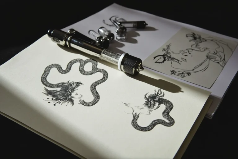
I’ve had a Calcifer sketched on my flash sheet for three years now, and I still get at least one person a month asking me to pull it out. There’s something about Howl’s Moving Castle that hits different from other Ghibli films, maybe it’s the messiness of it, the way nothing in that movie stays still or clean. People who want these tattoos aren’t looking for perfect princess moments. They want the chaos, the soot sprites, the castle lumbering on chicken legs across a shoulder blade. I’ve tattooed Howl’s moving castle on ribs, on calves, wrapped around forearms like a sleeve in progress. Here’s what actually works on skin, what I’ve learned from doing these pieces, and what you should know before you sit down in the chair.
Popular Styles
Studio Ghibli’s Soft Aesthetic
The film itself has this watercolor, dreamlike quality that translates beautifully to tattoo work when done right. I’ve seen artists nail this with soft color washes, no hard black outlines, everything bleeding gently into skin like a watercolor painting that actually stayed. The trick is finding someone who understands that “soft” doesn’t mean “faded in six months.” I tell clients: those pastel skies need saturation, or they go muddy. The best Ghibli-style pieces I’ve done use enough pigment density to hold, but with enough negative space to keep that airy feeling.
Anime-Inspired Linework
Some people want the crisp cel-shaded look, bold black lines with flat color blocks. This is harder than it looks. Skin isn’t paper, and those clean anime edges require serious technical precision. I’ve done Calcifer in this style, thick black outline, solid orange fill, simple white highlight, and it pops like a sticker. But the line weight has to be consistent. Wobbly anime lines look like a mistake, not a style choice. We see this a lot with walk-in requests: someone brings a screenshot, wants it exactly. I have to explain that translating digital color to skin is its own art.
- Watercolor wash: Best for castle skies, magic scenes, emotional moments, requires touch-ups more often
- Traditional bold: Calcifer and Sophie portraits hold up great, strong readable shapes from across a room
- Fineline black and grey: The castle’s mechanical details, Howl’s ring, the door dial, intricate but risky at small sizes
- Neo-traditional: I’ve done the castle with ornamental framing, roses, decorative elements that aren’t in the film but feel right
Design Ideas
Character Portraits
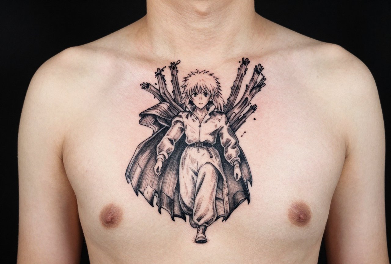
Calcifer wins by a mile. That little fire demon fits anywhere, wrists, ankles, behind ears, tucked into armpits where only certain people see. I’ve tattooed him in a frying pan, in a hearth, just floating with his little stick arms. Sophie as old Sophie has this incredible face, all wrinkles and determination. Young Sophie is pretty, sure, but old Sophie has character. I’ve only done her twice, both times on people who specifically said “I want her when she’s brave.” Howl himself? Less common. People love him, but he’s harder to capture. That floppy hair, the jewelry, the vanity, it’s a lot of detail that needs space to read.
The Castle Itself
The moving castle is the showstopper piece. I’ve done it three times, each one took multiple sessions. The first was a full back piece, castle striding across the shoulder blades, smokestacks billowing up the neck. The second was smaller, just the silhouette on a calf, recognizable but not overwhelming. The third was wild, my client wanted the interior, the cluttered kitchen with Calcifer in the hearth, the dangling charms, the impossible architecture. We did it on a thigh, big enough to breathe, and it took eight hours. Worth it, though. Every time she comes back for something else, I see how it’s settled, and it still looks like a home.
- Calcifer alone: Classic, versatile, works in any color palette
- The door dial: Four color-coded destinations, compact and meaningful
- Howl and Sophie flying: Needs horizontal space, forearm, collarbone area, hip
- The scarecrow (Turnip Head): Underrated, weird, people who pick him are my favorite clients
- Starlit scene: The falling star where Calcifer is born, dark background, bright flame, dramatic contrast
Best Placements
Where you put a Howl tattoo changes what you can do with it. I’ve learned this the hard way after watching beautiful detail work blur in bad spots.
Forearms and calves: These are the sweet spots for the castle itself. Long vertical shapes, room for the legs and smokestacks. Calf skin is forgiving, forearm is visible but not throat-visible. I’ve done two castle forearms where we wrapped the legs around the wrist, let the smoke drift toward the elbow. Movement in the design matches movement in the placement.
Ribs and sides: Painful, obviously. But for that falling star scene, for Sophie and Howl in the sky, the rib cage gives you this natural canvas shape. I’ve had people sit like champions through four hours there. The skin stays fairly stable on the side, doesn’t stretch as much as stomach or thigh inner.
Small spots: Behind the ear for a tiny Calcifer, ankle for the door dial, finger for a miniature flame. These are cute, they photograph well, but I warn everyone: small tattoos age fast. Lines spread, color falls out. I did a Calcifer on a finger once, touched it up twice in one year. Still, the client loved it. You just need to know what you’re signing up for.
- Back/shoulder blade: Full castle scenes, complex compositions
- Thigh: Intricate interiors, detailed character moments
- Upper arm: Classic placement, easy to show or hide, good for medium-sized pieces
- Sternum: I’ve done one Calcifer there, heart-shaped flame, very striking but not for the pain-sensitive
Color Choices
Staying True to the Film
The movie has this specific palette: muted earth tones, sudden bursts of orange and blue, that green slime when Howl throws a tantrum. I’ve had clients bring in color keys, screenshots with the hex codes pulled. I love that level of preparation. But I always explain: film color is light-based, tattoo color is pigment-based. They don’t match one-to-one. That perfect sky blue? It might heal slightly purple, slightly grey. I mix custom batches for Ghibli pieces now, test them on paper, adjust. The orange of Calcifer is the one I get most particular about. Too red and he looks angry. Too yellow and he looks like a generic flame. I want that specific Studio Ghibli orange, the one that says “demon but cute.”
Black and Grey Options
Not everyone wants color. I’ve done the castle in black and grey with dotwork texture for the rust, whip shading for the smoke. It reads differently, more melancholy, less whimsical. One client wanted it this way specifically because she said the movie felt sad to her, not magical. The castle as a weary thing, limping across a landscape. That’s valid. That’s the thing about this film, it holds multiple feelings at once.
- Full color: Best for Calcifer, sky scenes, the door’s magical glow
- Limited palette: Blue and orange only, or rust tones with one accent, sophisticated, cohesive
- Black and grey with selective color: Castle in grey, Calcifer in orange alone, he becomes the emotional focus
Tips for Choosing
I’ve been in shops where someone walks in with a Pinterest board and wants everything at once. Here’s what I actually say to people considering Howl’s Moving Castle work.
First: pick your moment, not just your character. The castle walking is different from the castle standing still. Calcifer cooking breakfast is different from Calcifer nearly dying. The movie has arcs, and your tattoo can too. I ask clients what scene they remember without trying. That’s usually the one that matters.
Second: size matters for detail. I’ve had to talk people down from thumbnail-sized castles with visible windows and door dials. At that scale, it becomes a blur. Either go bigger or simplify. I can do a recognizable castle silhouette at two inches. I can’t do the interior kitchen at that size. Be honest about what you want versus what skin allows.
Third: find an artist who knows the source. I’ve turned down Ghibli requests when I knew someone else in the shop was obsessed with the films. You want the person who lights up when you mention Turnip Head, who references the flower scene without prompting. That enthusiasm shows in the work. We all have our specialties, and pretending otherwise does you no favors.
- Bring reference, but trust your artist’s translation to tattoo form
- Consider how the piece flows with your body, not just how it looks flat on paper
- Plan for touch-ups, especially with soft color and fine detail
- Think about visibility, Ghibli tattoos attract conversation, be ready for that
Final Thoughts
I’ve been tattooing long enough to see trends come and go, but Studio Ghibli endures. There’s something about these films that people carry with them, literally now. Howl’s Moving Castle specifically, it’s not the most popular Ghibli tattoo, and I think that’s why I love doing them. The people who choose it are specific. They want the messy, the complicated, the beautiful disaster of that castle and those people inside it. I’ve watched clients cry in my chair looking at their finished Calcifer. Not from pain. From finally having something they felt on the inside, visible on the outside. That’s the job. That’s why I still pull that flash sheet out when someone asks.
Frequently Asked Questions
How long does a detailed Howl’s Moving Castle castle tattoo take?
A full castle with background usually needs 6-10 hours minimum, often split across multiple sessions. Simpler silhouettes can be done in 2-3 hours. I always book longer than I think, because that mechanical detail takes time to get right.
Will a watercolor-style Ghibli tattoo fade quickly?
Soft color washes do fade faster than bold traditional work, especially in sun-exposed spots. I use denser pigment packing than true watercolor painters, and I always tell clients to plan for a touch-up around year two or three.
Is it okay to combine multiple Ghibli films in one tattoo?
Absolutely, I’ve done pieces where Totoro and Calcifer share space, or the castle walks through a Spirited Away scene. Just make sure your artist can match the aesthetic cohesion, different films have slightly different color temperatures.
What’s the most painful spot for a Howl tattoo?
Ribs and sternum are brutal, no way around it. The castle’s vertical shape makes ribs a natural fit, but I always warn people: you’ll feel it in your soul. Calves and outer arms are much more manageable for long sessions.