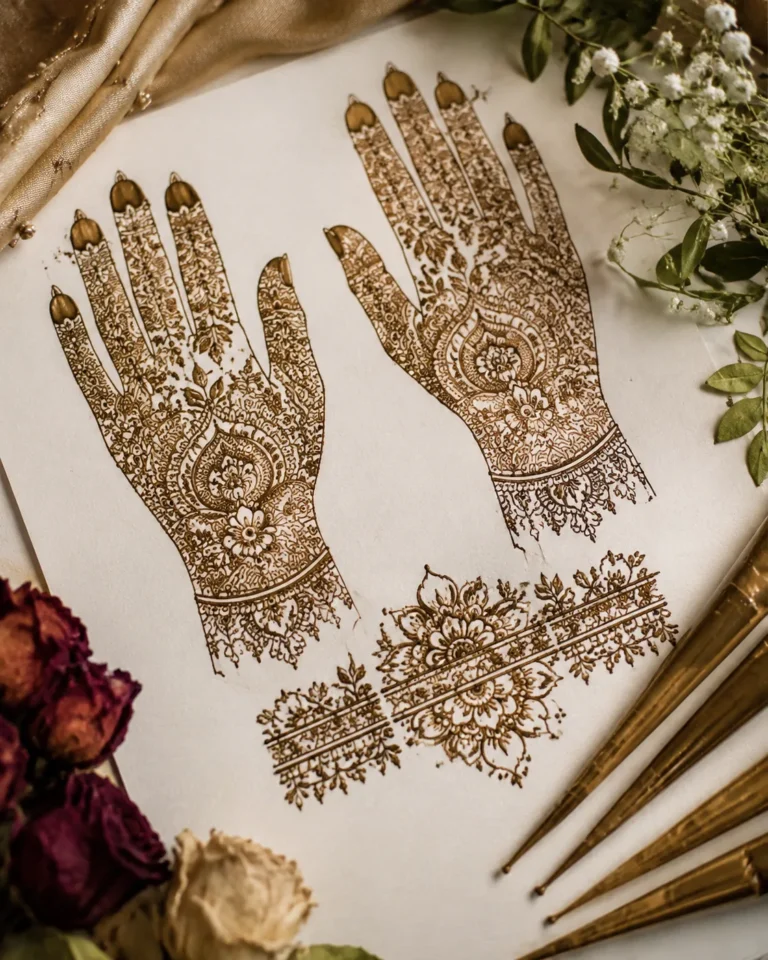
Fancy mehndi designs were the reference set I kept saving, and I almost copied them line for line for my first ornamental tattoo. Then I slowed down, watched what healed clean, and changed the plan entirely. That choice made the difference between crisp linework and soup.
Mehndi, also called henna art, is a tradition rooted in South Asia (India, Pakistan) and the Middle East, used at weddings and celebrations for centuries. Translating it into permanent ink follows different rules than applying a paste. This is what I learned.
Why Fancy References Break Down as Tattoos
The prettiest mehndi references are built for a moment: fresh paste, a close crop, zero wear. Tattoos do not live like that. Your skin moves, dries, and heals. The lines you loved in a photo spread a little after week three, and that is normal skin physics, not bad luck.
The real question is not what looks fancy in a photo. It is what will still read clearly in five years. I learned to separate image-perfect from skin-smart planning, and always pick skin-smart first.
Three patterns cause the most problems:
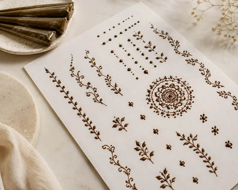
- Dense fills on high-wear zones. Hands and feet see constant friction and sun. Fine lacey fills that look gorgeous on those zones in henna photos tend to bleed together after healing as a tattoo.
- Uniformly thin lines everywhere. Thin lines are beautiful when intentional. When they are timid, they disappear. Build a hierarchy: bold outer structure first, finer detail second.
- No negative space. The rich ornamental pieces that hold are edited. They let skin do part of the work. Crowding every gap reads as blur within a few months.
The Design Moves That Actually Survive
Steal the flow, not the map
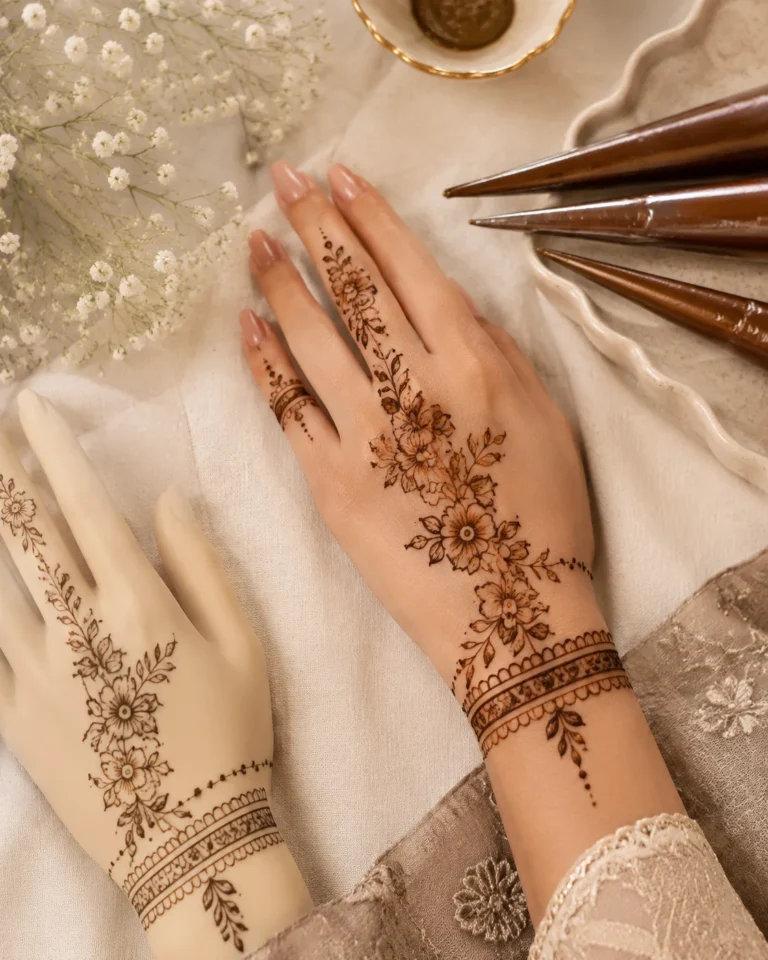
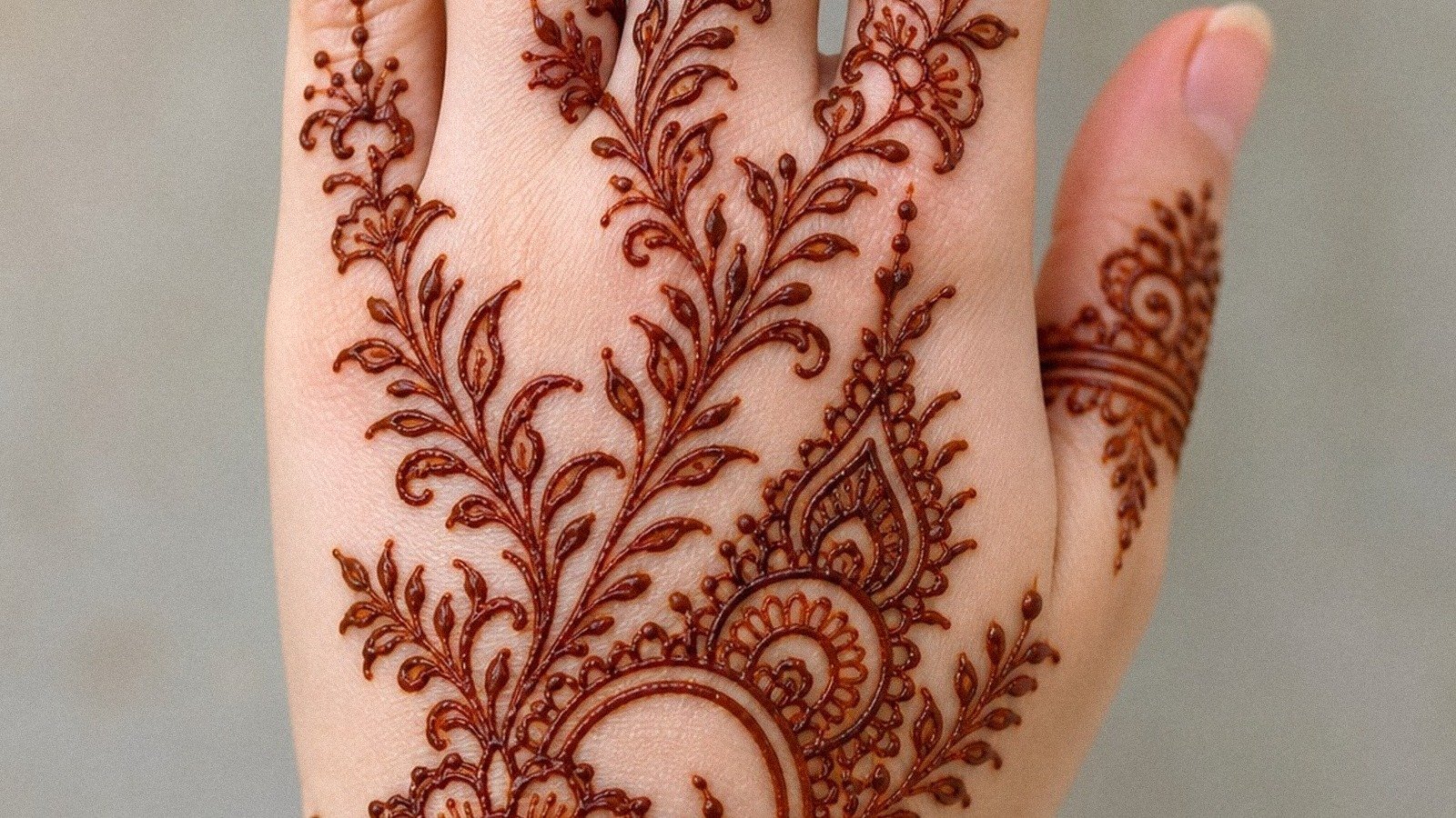
The first reference that grabbed me was a front-hand layout with slim trails moving from knuckles toward the wrist. I loved the symmetry but knew the exact density, tattooed too small, would not stay crispy. So I kept the front-hand composition because it flatters the eye and gives movement, then I opened the spacing so each curve had room to heal right.
If you are taking a mehndi-inspired piece to an artist, ask them to bump the scale up by half an inch or move it off the hand onto the outer forearm. You keep the fancy energy, lose a lot of the maintenance, and your artist gets one clean pull instead of ten fuzzy ones.
Use paisleys as hero shapes, not wallpaper
Pakistani paisleys carry motion without looking chaotic. The mistake is stacking them tight. Use one large paisley as an anchor, then let two smaller ones support it. Plenty of open skin between each. That is how they stay readable at arm’s length instead of collapsing into pattern soup.
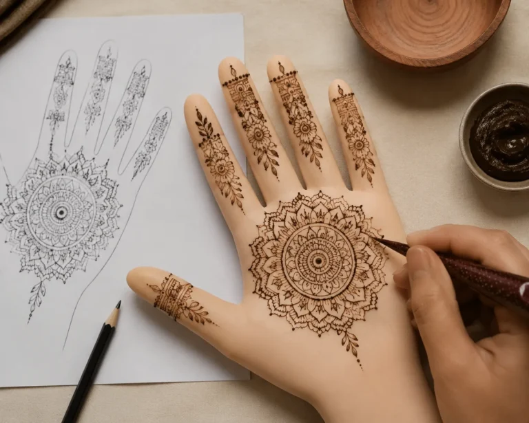
Give the center mandala room to breathe
Without a focal anchor, an ornamental layout feels pretty but loose. I gave my center mandala about 2.5 inches of width so the petals could stay open and the dot rings would not mush together after healing. Bold will hold. A clean central rosette with fewer petals ages better than a hyper-detailed flower that looks fancy only on day one.
Dots as punctuation, not filler
Dots soften transitions, fill awkward pockets, and keep larger motifs from looking isolated. The mistake is using too many, which makes the whole thing dusty. I only added dot connectors where the eye needed a pause or a lead-in: three-dot clusters, tiny arcs, one short scatter near the wrist. Those small edits make a mehndi-inspired tattoo photograph clean on day one and still read clearly months later.
The Three-Foot Test: Your Stencil Checkpoint
Before I locked the design, I stepped back and checked which sections would still make sense if the lines softened slightly. That saved me from picking a pattern that only looked good under perfect lighting and zero movement.
The check is simple: can you still read the big shapes from three to four feet away? If not, it is too busy. If the answer only works in a close-up photo, it is too busy again. You want a design that reads solid when your arm is relaxed, when your hand is moving, and when the silver skin stage makes everything look slightly cloudy during healing.
Bridal wrist florals need this test the most. I built mine with three ornamental florals instead of a full cuff: one larger bloom, two supporting shapes, a few leaves pushing outward. Your wrist bend needs breathing room, and your future self will thank you when the lines still look clean after the first few weeks of surface healing.
Placement: Where the Fancy Actually Lasts
Placement changes value fast. The outer forearm, upper arm, thigh, calf, and upper back are low-wear zones. They are easier to sit through and easier to heal well. Hands, feet, ribs, sternum, inner bicep, elbows, and knees are spicy or high-friction or both.
That does not mean you cannot tattoo the hand. It means you should do it with your eyes open and your touch-up budget ready. A 3-inch outer forearm piece can be a better long-term value than a smaller hand tattoo that fades faster and needs extra care.
For aftercare: wash with gentle unscented soap, use a thin layer of ointment, do not suffocate it, and stay out of pools and hard gym friction while the surface closes. Surface healing takes about two to three weeks. Full settle, where tone evens out and the final read becomes clear, takes two to three months. That is how you protect linework.
What to Ask Your Artist
Fancy does not have to mean fragile. A mehndi layout can still feel intricate if the artist knows where to let skin show through. That is the real edge, not more detail, but better editing.
When you sit down with your artist, ask for:
- Confident line weight changes instead of uniformly thin lines throughout
- Placement scaled up if you want hand or foot references moved to lower-wear zones
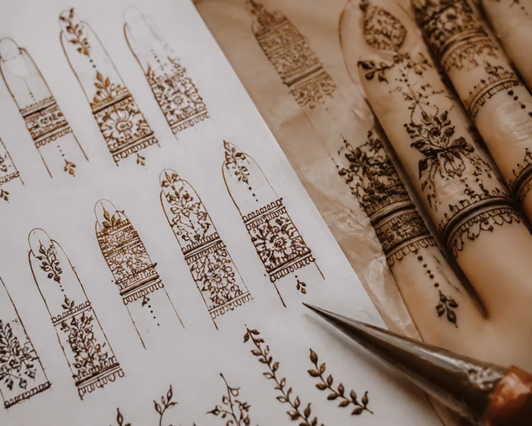
- Solid fill on any fingertip caps or bold accents, because scratchy half-fill does not hold
- A wide halo of negative space around every major curve near knuckles or ankle bones
I also used what I call the Bridge-Line Rule: every trail had to earn its next move before crossing into the wrist area. That kept me from adding random filler just because there was a gap. A little asymmetry can feel more alive on skin than forced perfect symmetry, especially when the piece wraps around the outer wrist.
The Version That Still Looks Solid Six Months Later
I did not end up with the busiest design in my reference folder. I ended up with the one that still reads clean when I am reaching for coffee six months later. Strong outer shapes. Clean spacing. Black contrast doing the heavy lifting. Placement that is not fighting motion every hour of the day.
Push contrast, keep your biggest motifs readable, and let the small details play a supporting role. That is the piece that stays elegant without getting muddy. Not the version that wins the close-up. The version that holds.