Alternative tattoos have carved out their own lane, messy on purpose, referencing zines and basement shows rather than polished Instagram portfolios. The best ones borrow from punk flyers, medical illustration, folk horror, and early internet aesthetics. What separates a lasting alt piece from a trend that’ll date badly comes down to intent and technical execution. Here’s how to get something that feels genuine and wears in rather than wearing out.
Popular Styles
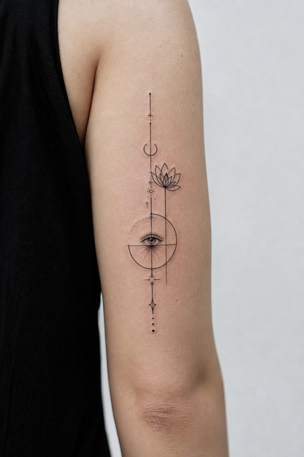
Ignorant and Grunge Linework
Ignorant style started in European punk circles, wobbly lines, blown-out proportions, deliberately unpolished. The key is that the artist still understands structure. Bad ignorant looks like a mistake; good ignorant knows exactly which rules it’s breaking. Grunge linework pushes further into texture: scratchy crosshatching, inconsistent needle groupings, areas where the ink sits heavier and creates soft blur. These pieces work best at smaller scales where the roughness reads as intentional rather than amateur.
Horror and Folk-Inspired Flash
Traditional flash reimagined through darker lenses, think sailor jerry skeletons but with actual anatomical knowledge, or Victorian mourning jewelry rendered in heavy black. Folk horror elements (ritual figures, standing stones, agricultural tools) gained traction through film and have translated into tattooable imagery that carries weight without needing explanation. The best horror-inspired work avoids jump-scare obviousness; a single eye in a field of flowers hits harder than a full demon face.
- Medical and anatomical illustration: cross-sections, teratology specimens, botanical pathology
- Early digital aesthetics: pixelation, dithering, CRT scan lines rendered in stipple or line weight
- DIY/punk flyer collage: mixed fonts, torn edges, photocopied gradients
- Religious and occult ephemera: ex votos, spirit photographs, alchemical diagrams
Design Ideas
Specificity matters more in alt work than in traditional styles because the reference pool is narrower. A generic skull reads as mall flash; a skull with a specific jaw deformity referencing a particular medical plate reads as considered. The same applies to text pieces, poorly chosen fonts destroy alt credibility instantly.
Text and Typography
Typewriter fonts, distressed serif, and deliberately corrupted digital faces (glitch effects, compression artifacts) work when the artist understands letter spacing and baseline alignment. Vertical text down the forearm or ribcage requires careful planning, letters compress and stretch depending on body curvature. All-caps treatments hold up better over time than mixed case, which can become illegible as ink spreads slightly.
Figurative and Symbolic Work
Hands holding objects, partial faces cropped at the mouth or eyes, animals in unnatural poses, these recur in alt imagery because they carry ambiguity without being vague. A two-headed calf references actual museum specimens. A figure with too many fingers suggests both medical anomaly and digital manipulation. The best designs operate on multiple registers: immediately striking, then revealing layers on longer examination.
- Single continuous line drawings that break intentionally at stress points
- Negative space pieces where skin tone forms the primary image
- Heavy black silhouettes with minimal interior detail
- Scarification and branding patterns rendered in ink
Best Placements
Alt aesthetics favor certain placements because of how they interact with clothing and social context. The upper arm, visible in a tank top, carries different connotations than the same piece hidden under a sleeve. Forearms read as declarative; ribs and thighs as private. The neck and hands remain contentious, some shops won’t execute them on clients without substantial existing work.
High-Visibility Areas
Hands, fingers, and throat pieces age fastest due to sun exposure and skin turnover. Linework here blurs within five to seven years; solid black holds better but can blow out at edges. If you’re committed to a hand piece, plan for touch-ups and accept that fine detail will soften. The side of the neck, from jaw to collarbone, offers more stable skin with similar visibility.
Concealed and Partially Visible
The upper outer arm, outer thigh, and shoulder blade provide flat, stable surfaces that age predictably. These areas also allow for larger compositions where alt stylistic elements, rough texture, deliberate imperfection, have room to breathe. A postage-stamp-sized ignorant piece on a bicep dies; the same approach at palm size or larger reads as confident.
- Behind the ear: limited space favors bold simplicity, but healing is finicky
- Inner bicep: soft skin, good for pieces meant to be shown selectively
- Shin and calf: flat bone proximity allows for crisp linework that lasts
- Sternum and stomach: high movement, significant stretch potential over time
Color Choices
Alt tattooing runs heavy on black and limited palettes. When color appears, it tends toward specific associations: sickly yellow-green, dried-blood brown, institutional blue. Bright, saturated primaries read as commercial unless deployed with clear ironic intent.
Black and Gray Approaches
Heavy black fill with whip shading creates depth without smooth gradients. This technique ages exceptionally well because there’s no subtle gray to lose contrast, the black stays black, the skin provides the light values. Dotwork and stipple build texture that holds for decades if executed at proper density; too light and it fades to uneven peppering within a few years.
Strategic Color Accents
Single-color accents against black and gray draw the eye efficiently. A small red element in an otherwise monochrome piece functions like a focal point in composition. Limited color palettes (black, red, and cream; black and oxidized green) reference specific print traditions, early horror paperbacks, safety signage, military surplus, which strengthens the alt contextual framework.
- Black-only: fastest sessions, lowest long-term maintenance, maximum versatility
- Black with red: classic punk association, strong contrast, predictable aging
- Muted earth tones: olive, rust, bone, reference military and agricultural aesthetics
- Neon accents: technically challenging, require experienced color saturation
Tips for Choosing
Finding the right artist matters more in niche styles than in mainstream work. A strong traditional artist can execute a competent eagle; alt work requires someone who actually inhabits the visual language. Portfolio review should show consistency in the specific approach you want, not just one or two pieces among hundreds of unrelated styles.
Evaluating Artist Fit
Look for healed photos, not just fresh work. Ignorant style in particular can look compelling when new and terrible at three years, blown lines that seemed intentional become clearly accidental. Ask directly about their experience with your specific reference. Someone who primarily does neotraditional color may not understand why you’re requesting a photocopied gradient effect, even if they’re technically skilled.
Reference and Communication
Bring specific sources: album art, zine pages, film stills, medical plates. “I want something dark” communicates nothing. “I want this specific mood from this specific Goya etching, but with a modern figure” gives the artist material to interpret. Be prepared for pushback on placement or scale, artists who care about longevity will tell you when your idea won’t physically work.
- Prioritize healed portfolio examples over fresh Instagram posts
- Discuss aging explicitly: how will this blur, soften, or shift?
- Consider the social context of visible work in your actual life
- Budget for potential touch-ups, especially in high-wear placements
Final Thoughts
Alternative tattooing rewards the specific over the generic. The visual language is established enough that vague gestures read as inauthentic, another skull, another meaningless phrase in a distressed font. The pieces that last, both physically and in terms of your own relationship to them, come from genuine engagement with source material. Know what you’re referencing, understand why it matters to you, and find someone who can translate that into technical execution. The best alt tattoos feel discovered rather than selected, like something that was already waiting in the skin.
Frequently Asked Questions
Do ignorant-style tattoos age worse than clean linework?
Intentionally rough linework ages differently, not necessarily worse. The key is whether the artist understood which irregularities would hold and which would blur into genuine damage. Well-executed ignorant style with proper depth and density often ages more gracefully than overly fine “clean” work that loses detail quickly.
Can I mix alt aesthetics with more traditional tattoo styles?
Mixing requires careful planning. A single traditional piece surrounded by alt work can read as accidental rather than eclectic. Successful mixing usually happens within unified compositions, folk art elements rendered in ignorant linework, or traditional subject matter with deliberately degraded technique. Discuss integration strategy with your artist before starting.
How do I know if an artist actually specializes in alt work or just has a few pieces?
Check portfolio ratios and consistency. Someone who genuinely works in this style will show dozens of healed examples with coherent approach, similar line quality, consistent reference points, recognizable thematic through-lines. Be wary of portfolios where alt pieces appear scattered among unrelated styles without development over time.
Are hand and finger tattoos worth the accelerated aging for visibility?
That depends on your tolerance for maintenance and your professional context. Hand pieces require touch-ups every few years. The visibility is permanent and immediate, there’s no selective revealing. If your work environment accommodates visible tattoos and you’re prepared for ongoing care, the placement makes sense. Otherwise, consider forearm or upper arm alternatives with similar visibility options.

