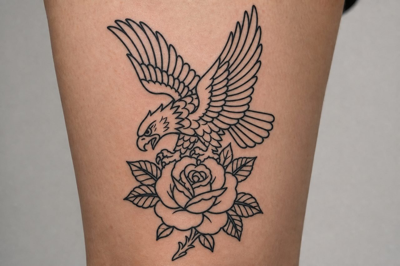
American traditional tattoo outlines are the backbone of one of the most recognizable styles in Western tattooing. Thick black contours, minimal shading, and saturated color fills create images that read clearly from across a room and hold up for decades. The outline isn’t merely a border, it’s the structural skeleton that gives the design its weight, its readability, and its staying power. Understanding how these outlines function helps you make smarter decisions about design, placement, and artist selection.
Origins & History
This style crystallized in the early-to-mid 20th century, often linked to sailors and traveling military personnel who frequented port-city shops. Artists like Bert Grimm, Sailor Jerry Collins, and later Don Ed Hardy standardized a visual vocabulary that prioritized immediate recognition over subtle detail. The technology of the era shaped the aesthetic: coil machines with limited needle configurations, carbon-based inks with restricted color ranges, and clients who needed their tattoos to heal fast and stay legible under harsh conditions.
The Role of the Bold Outline
Outlines served a practical purpose. Without the fine-line capabilities of modern cartridges, artists relied on heavy black contours to separate color fields and prevent bleeding between adjacent hues. A strong outline also compensated for the limitations of available pigments, colors that might fade or shift over time remained contained within their borders, preserving the design’s integrity. This functional necessity became the style’s signature visual trait.
Regional Variations
While the core approach remained consistent, subtle differences emerged geographically. West Coast shops often featured larger, more dramatic compositions suited to biceps and chest pieces. East Coast traditions, particularly in New York and Boston, leaned toward smaller, denser designs that accumulated into patchwork sleeves. Japanese influences occasionally appeared in the form of simplified dragons or waves, filtered through the American traditional lens.
Key Characteristics & Motifs
American traditional outlines aren’t simply “thick lines.” They vary in weight strategically, creating visual hierarchy and movement within the design.
- Line weight variation: Primary contours typically run 7-11 needle groupings, while interior details drop to 3-5 round liners. This contrast gives depth without relying on complex shading.
- Whip shading: Limited, directional gray washes create dimension in minimal space, often just a few passes near the outline’s inner edge.
- Negative space: Skin breaks function as highlights, particularly in flames, water, and animal fur. The outline defines these boundaries precisely.
- Iconic subject matter: Eagles, swallows, ships, anchors, roses, daggers, pin-up figures, and panthers dominate. Each carries established symbolic associations within the tradition.
The outline’s relationship to the subject is specific. A dagger’s blade receives a single heavy contour with perhaps a thinner line for the fuller groove. A rose’s petals stack with each layer getting its own defining border, creating dimensional overlap through line placement rather than modeled shading.
Color vs Black and Grey
Traditional outlines accommodate both approaches, though the visual effect differs substantially.
Classic Color Traditional
The standard palette, bold red, navy blue, green, yellow, and black, relies on outlines to prevent color contamination. Each hue sits in its own outlined compartment, like stained glass. The black contour remains visible as a deliberate design element, not merely a technical necessity. Colors age into softer versions of themselves, but the outline preserves the shape’s clarity even as saturation drops.
Black and Grey Traditional
Removing color shifts emphasis entirely onto line weight and limited shading. These pieces often feel more graphic, more poster-like. The outline must carry more visual weight since there’s no chromatic contrast to create separation. Healing tends to be slightly more forgiving, no color fallout to monitor, but the linework itself must be impeccable because there’s nowhere for imperfections to hide.
Best Placements
American traditional outlines excel where the design can be displayed at a consistent scale and angle.
- Outer bicep/upper arm: The classic canvas. Flat enough for clean application, visible in short sleeves, enough real estate for medium-sized designs without crowding.
- Forearm: Excellent for longer compositions like ships, banners, or snake wraps. The cylindrical surface requires the artist to account for distortion when the arm rotates.
- Chest panels: Large, flat areas suit eagles, pin-ups, or symmetrical designs. The sternum’s center line often anchors the composition.
- Thighs: Increasingly popular for larger pieces. The muscle’s flat plane accommodates detailed work, and the area ages relatively well compared to joints or high-friction zones.
- Hands and fingers: Traditional enough historically, but challenging. Skin here regenerates faster, lines spread more readily, and the outline’s boldness can blur into illegibility within years rather than decades.
Small, highly detailed spots, inner wrists, behind ears, collarbone edges, generally fight against the style’s strengths. The outline needs room to breathe; compressing it destroys the readability that defines the tradition.
Who It Suits
There’s no demographic restriction, but certain practical and aesthetic considerations apply. The style’s graphic boldness complements varied body types; the outline’s clarity isn’t dependent on subtle skin undertones the way some watercolor or realism work can be. Darker skin tones sometimes show less contrast with black ink, but the heavy traditional outline remains distinctly visible, and color choices can be adjusted for optimal saturation.
People who want their tattoo to read clearly at any distance, in any lighting, tend to gravitate here. The trade-off is minimalism of detail, you won’t get photorealistic texture or delicate gradation. If your priority is a piece that looks substantially the same at age sixty as at age thirty, with touch-ups, this approach delivers.
Modern Variations
Contemporary artists have expanded the vocabulary while respecting the outline’s central role.
Neo-Traditional
Retains the bold outline but introduces more complex shading, broader color palettes, and expanded subject matter, animals, botanicals, and figurative work rendered with greater dimensional modeling. The outline still defines every form, but the interior treatment has grown more sophisticated.
Japanese-American Fusion
Some artists combine traditional American outlines with Japanese compositional structures, wind bars, wave patterns, or background elements. The outline weight stays consistent with American tradition, but the imagery and arrangement borrow from irezumi conventions.
Contemporary Subject Matter
Modern iconography, video game characters, pop culture references, personal symbolism, gets rendered in traditional outline style. The technical approach remains unchanged; only the content has shifted. These pieces age according to the same rules as their historical predecessors.
Choosing an Artist
Not every tattooer who “can do traditional” executes it well. The style’s apparent simplicity is deceptive.
- Line consistency: Examine healed photos, not just fresh work. The outline should maintain uniform saturation without wobbling, blowouts, or tapering irregularities.
- Color packing: Solid, even fills without patchiness or visible machine trauma. The outline should contain the color completely.
- Design knowledge: Genuine fluency in traditional motifs, not just generic “old school” approximations. Ask about specific influences, does the artist reference Grimm, Collins, Hardy, or their direct disciples?
- Portfolio specificity: A substantial body of traditional work, not three pieces among hundreds of unrelated styles.
Consultations should involve discussion of placement flow, how the outline will interact with existing or planned adjacent pieces, and whether the design suits the scale you have in mind. Artists who push back on sizing, suggesting larger for clarity or smaller for fit, are often demonstrating professional judgment worth heeding.
Final Thoughts
American traditional tattoo outlines represent a solved problem: how to make permanent marks on skin that remain legible, attractive, and meaningful over a lifetime. The heavy black contour isn’t stylistic excess, it’s engineering. Choosing this approach means accepting its constraints in exchange for its durability. The best outcomes come from artists who understand not just how to lay down a bold line, but why that line matters structurally, visually, and historically. Your piece will join a lineage that stretches back nearly a century, and with proper execution, it’ll hold its place in that tradition for decades to come.
Frequently Asked Questions
How thick should the outline be on an American traditional tattoo?
Primary outlines typically use 7-11 needle groupings, creating substantial black contours that remain visible as the tattoo ages. Interior details may use thinner lines, but the main structural outline needs real weight to maintain separation between color fields over time.
Do American traditional outlines hurt more than fine-line tattoos?
The sensation differs rather than necessarily hurting more. Bold outlines require the artist to work more slowly and deposit more ink, which some people experience as a deeper, more consistent pressure rather than the sharper, faster sting of fine-line work.
Can you add color later to a black traditional outline?
Technically possible but not recommended. Traditional design relies on outlines being placed specifically to contain predetermined color fields. Adding color after the fact often results in awkward spacing and compromised composition.
Why do some traditional outlines look blurry after healing?
Blowouts occur when ink spreads beyond the intended line in the skin’s dermis, often from needle angle, depth, or overworking an area. Proper technique and aftercare minimize this, but some spreading is natural as skin ages and loses elasticity.