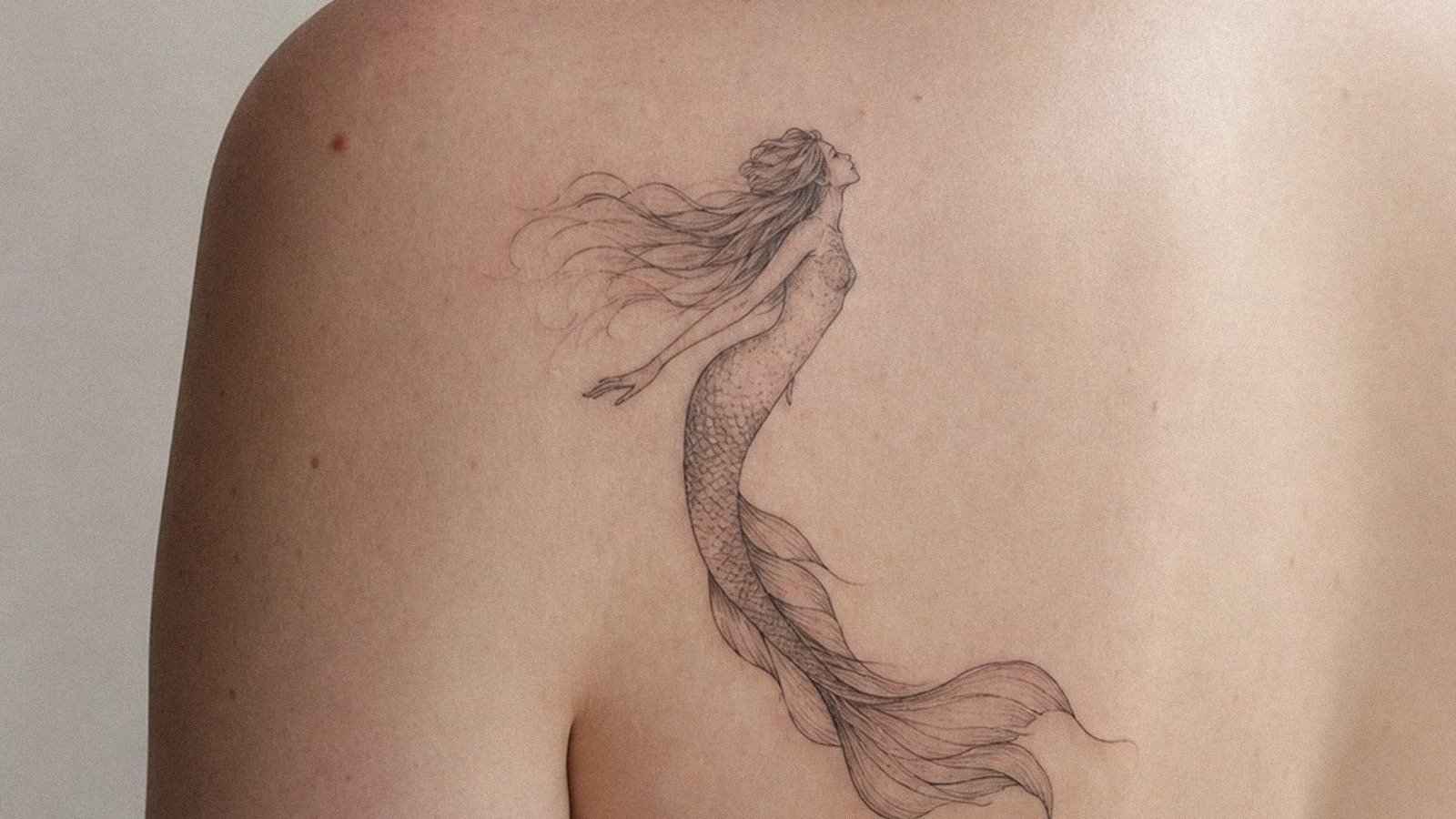
Angel number tattoos can mark timing, grief, faith, protection, or a private sign, but the design needs enough size and context to avoid looking like random digits.
Quick answer: Angel number tattoos usually work best as clean numerals, tiny date-like marks, fine line scripts, or symbols paired with stars, wings, or flowers. Keep the number readable and choose a placement you can explain later.
Angel Number Tattoos meanings by design choice
Meaning is not only the symbol. It changes with style, placement, color, scale, and the story you bring to the appointment.
| Direction | Best use | Watch out for |
|---|---|---|
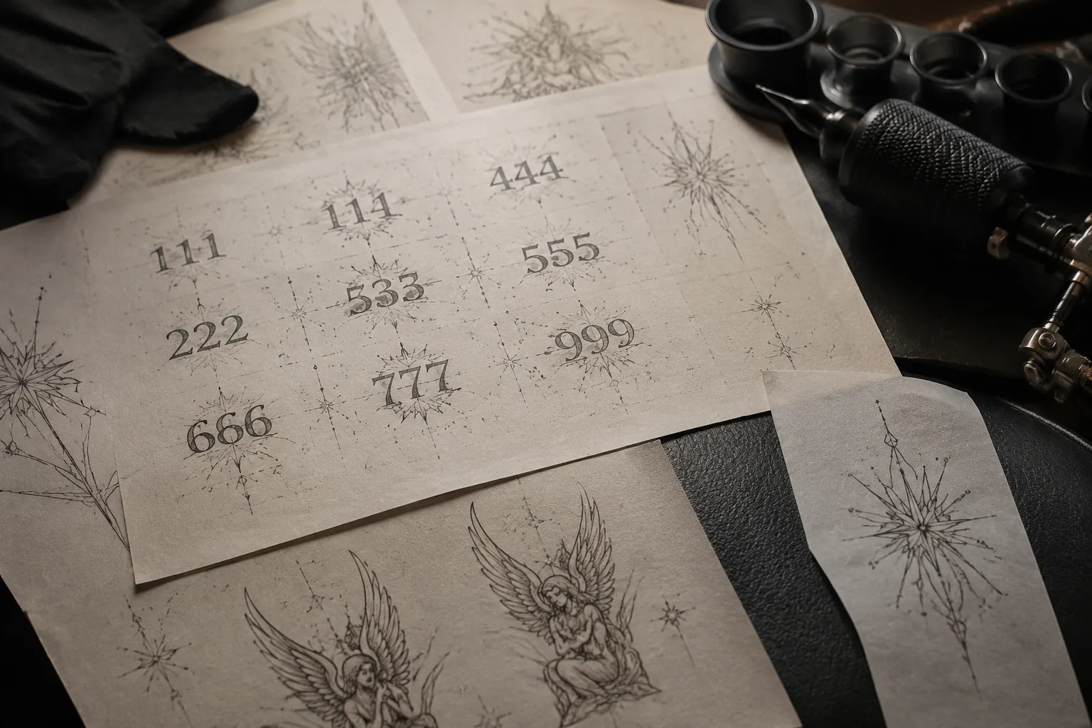
| 111 | Fresh start or alignment | Can feel trend-driven |
| 222 | Partnership and balance | Needs personal context |
| 333 | Growth and protection | Avoid cramped digits |
| 444 | Stability and grounding | Can look like a code |
| 777 | Luck or spiritual signal | Easy to over-style |
How to make it work on real skin
The number means nothing if you chose it because it looked good on someone else's wrist.
The strongest angel number tattoos usually include one small visual clue: a star, a birth flower, a wing, or a placement tied to the story.
Digits age better when they are not microscopic. A wrist, inner arm, ankle, or rib placement gives enough room without making the piece loud.
Angel Number Tattoos: Meanings, Placement and Design Risk: style, scale, and aging
For this tattoo to hold up, the symbol needs a clean silhouette first. Detail can support the meaning, but it should not be the only reason the design works.
Ask for healed examples in a similar size and style. The fresh version should look good, but the healed version is what you will actually live with.
- Choose the number because it means something off-screen.
- Ask for numeral spacing that will survive healing.
- Decide whether you want it visible every day.
- Pair it with one symbol at most.
Mistakes to avoid
Do not copy a number just because it is trending on Pinterest.
Do not make the digits so small that they close up into a dark mark.
What this symbol should say before it looks cool
The best angel number tattoos designs start with one clear meaning, then choose the style around it. If the meaning is protection, grief, rebirth, loyalty, love, or direction, the tattoo should make that readable through shape, placement, and restraint.
Compare the main variants first: 111, 222, 333, 444, and 777. Each version changes the story. A tiny symbol can feel private. A bold traditional version can feel public and declarative. A realistic version asks for more space and a better specialist.
| Reference to compare | What to inspect | Decision rule |
|---|---|---|
| 111 | Fresh start or alignment | Can feel trend-driven |
| 222 | Partnership and balance | Needs personal context |
| 333 | Growth and protection | Avoid cramped digits |
| 444 | Stability and grounding | Can look like a code |
| 777 | Luck or spiritual signal | Easy to over-style |
Placement changes the meaning
Visible placements make the symbol part of how strangers read you. Private placements make it feel more like a reminder. Joint and hand placements add attitude, but they also add fading risk. Rib, inner arm, shoulder, back, and thigh placements give the artist more room to keep the symbol legible.
If the symbol has cultural, religious, prison, memorial, or mental-health associations, do not rely on the prettiest image. Ask what the symbol has meant historically and what it might signal outside your own circle.
How to make the design less generic
Add specificity with one detail, not five. A date, birth flower, direction, color choice, pose, or small secondary symbol can make the design yours. Too many additions usually weaken the meaning and make the tattoo harder to read.
Visual reference note: Bring one reference for meaning, one for style, and one for placement. Do not ask the artist to copy one tattoo exactly; ask them to build a version that fits your body and story.
Reader questions before you book
Can one symbol have different meanings?
Yes. Tattoo meaning changes by culture, style, color, placement, and personal context. The design should make your intended meaning easier to understand, not more confusing.
Should I add words to explain the meaning?
Only if the words matter on their own. A strong symbol usually does not need a label, and tiny lettering can age worse than the image.
What if the symbol is trendy?
Use trend as a starting point, then test whether the meaning still matters without the outfit, filter, or moodboard around it.
How do I make it personal without clutter?
Use one personal anchor: a date, flower, object, color, placement, or style choice. One precise cue beats a crowded collage.