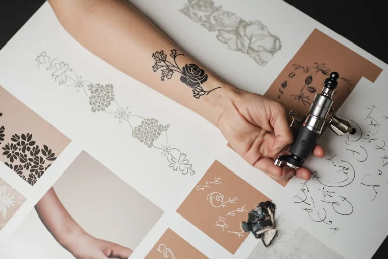
Looney Tunes built the vocabulary of American animation, and Bugs Bunny sits at the top of that heap. A Bugs tattoo carries instant recognition, crossing generations, coasts, and subcultures. But that same familiarity is a trap. Do it flat, and you’ve got a sticker. Do it with some thought about style, placement, and how cartoon ink ages, and you get something that holds up. Here’s how to approach it.
Popular Styles
Cartoon character tattoos live or die by style choice. Bugs has enough visual history that you can go several directions without running out of reference.
Traditional American
Bold black outlines, limited color palette, heavy saturation. Think Sailor Jerry meets Termite Terrace. The 1940s-50s theatrical shorts actually share DNA with classic flash: thick lines, readable at distance, colors that don’t muddy. Bugs in this style usually features the grey fur rendered with solid black and white, red tongue, orange carrot. The carrot itself becomes a nice compositional element, natural curve for wrapping around arms or legs. Traditional ages well because the line weight carries the image even as color softens.
Black and Grey Realism
Portrait-style Bugs, rendered from a specific still frame. The challenge: he’s a rabbit with human expressions. Realism demands reference, and not all frames translate. The smug sideways glance from “Rabbit of Seville” works. The exaggerated squash-and-stretch frames from “What’s Opera, Doc?” don’t, they rely on motion and distortion that freeze awkwardly. For realism, pick a frame where his proportions are relatively stable, eyes are both visible, and the expression reads instantly. Grey wash can handle his fur texture without needing color, but you’ll need a solid black background or negative space to keep him from floating.
Neo-Traditional and New School
More color freedom, stylized proportions, sometimes decorative backgrounds. Neo-traditional keeps the bold line but adds ornamental elements, roses, banners, filigree. New School pushes the cartoon quality further: exaggerated features, brighter gradients, sometimes graffiti-influenced letterforms. Both work because they acknowledge Bugs as pop culture artifact rather than pretending he’s a photograph. New School particularly suits the “cross-eyed” or manic expressions from the Chuck Jones era.
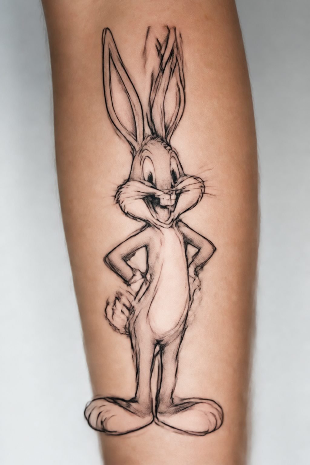
Fine Line and Illustrative
Single needle or tight liner work, no bold outline, more drawing than tattoo. This is risky with Bugs. His design depends on specific shapes, the cheek fluff, the ear notch, the buck teeth. Fine line can lose those identifiers if the artist isn’t precise. Best approach here is a partial rendering: just the face, or just the ears and eyes emerging from negative space. Full body in fine line tends to look tentative, like a sketch that hasn’t committed.
- Traditional: most durable, fastest to execute, reads from across the room
- Realism: technically demanding, needs excellent reference, requires large size
- Neo/New School: most creative flexibility, color-dependent, touch-ups likely
- Fine line: subtle, contemporary, higher fade risk, better for small pieces
Design Ideas
Beyond just “Bugs standing there,” there’s compositional territory worth exploring.
The Classic Pose
Leaning on the carrot, one leg crossed, maybe chewing. This is the default for a reason, it communicates everything in one image. But it’s also the most common. If you want this, differentiate through background or secondary elements: the Warner Bros. shield, a specific scene reference (the opera helmet, the drag costume), or a period-specific color treatment. The 1940s color palette was different from 1980s television broadcast, more muted, more watercolor. Specify your era.
Scene Recreation
Single frames from iconic shorts. “Rabbit of Seville” with the opera hat and tunic. “What’s Opera, Doc?” in Viking drag with Elmer as Siegfried. The cross-dressing bits are visually interesting but consider whether you want to explain that reference for decades. The hunting rivalry with Elmer Fudd works as a two-character piece, but compositionally it’s harder, you need space for both figures to read, and their scale relationship matters. Bugs is taller and leaner; Elmer is squat. That contrast can be dynamic or awkward depending on placement.
Deconstructed or Minimal
Just the ears. Just the teeth and eyes. The silhouette. This approach works at smaller sizes and in less conventional placements. The ears alone are recognizable enough that some artists have done them as a matching set, one ear on each forearm, or behind each ear on the head. The face without ears reads as incomplete to non-fans, so commit fully if you go minimal.
- Carrot as separate element: wraps well, good for filler or connecting pieces
- “What’s up, Doc?” lettering: script style matters more than you’d think; period-appropriate fonts exist
- Broken fourth wall: Bugs addressing the viewer directly, a meta-narrative touch
Best Placements
Cartoon characters need room for the face to do its work. Bugs’s expression is everything.
Forearm: The classic spot. Outer forearm gives you flat, visible canvas. Inner forearm is more private but catches more sun and wear. Either way, you want enough width for both ears and the full cheek spread. Too narrow and he looks compressed. A vertical composition, Bugs standing, carrot down, works on the outer forearm. Horizontal face portrait fits the inner.
Upper arm/Shoulder: Good for larger pieces with background. The deltoid curve can frame a circular composition nicely. The upper arm also allows for the full body in a dynamic pose, something like the “ballerina leap” from the end of a short. Sleeve integration is natural here, Bugs can anchor a larger cartoon or pop culture sleeve.
Calf/Thigh: Flat planes, good for detailed work. The calf’s verticality suits standing poses. Thigh allows for the most ambitious scene recreations, enough real estate for multiple characters or a full background. Both spots are less sun-exposed than arms, which matters for color longevity.
Chest: Center chest, Bugs facing forward. Symmetrical, iconic, but demands confidence, this is a statement piece. The sternum area is painful and doesn’t hold fine detail as well as flatter spots. Better for bold traditional than realism.
Hands, feet, neck: Generally avoid for full renderings. Too small, too much movement, too much fade. A minimal ear or tiny face here is possible but will blur faster than you’d like.
Color Choices
Bugs has a canonical palette: grey fur, white muzzle/inner ears, pink nose and ears, orange carrot, green carrot top. But “canonical” doesn’t mean “mandatory.”
Grey fur: In black and grey work, this is rendered with black and white ink, no grey wash needed, his fur is flat color, not textured. The white ink goes in last, bright against the black. Over time, white softens to skin tone; plan for that by keeping white areas crisp and bordered.
Color saturation: His original theatrical colors were watercolor-based, softer than modern digital. Some artists replicate this with muted oranges, desaturated greens, greyed pink. Others push saturation for visibility. Both work, but know which you’re choosing. Saturated color pops for five years, then needs refresh. Muted color ages more gracefully but reads softer from distance.
Black and grey only: Surprisingly effective. The character’s shape carries him without color. This also avoids the “sticker” look that bright cartoon color can give. The trade-off is less immediate recognition from across a room.
Tips for Choosing
Reference quality matters more than almost anything. Screenshots from compressed YouTube videos won’t do. The animation cels themselves, preserved in collections, sometimes reproduced in art books, show the actual paint colors and line quality. If your artist doesn’t ask about reference specificity, that’s a warning.
Consider the era of Bugs you want. The 1940s Bob Clampett version is wilder, more rubbery, teeth sometimes visible. The Chuck Jones 1950s version is cooler, more controlled, the definitive “smart guy” take. Friz Freleng’s is somewhere between. Post-1960s designs vary more and are generally less beloved. Specify which Bugs, not just “Bugs Bunny.”
Think about companions. Solo Bugs is clean. Bugs with Daffy creates a dialogue, two personalities in tension. The full Looney Tunes ensemble is a commitment, usually sleeve-scale. Avoid the “character collage” look unless you have a unifying compositional idea; random floating heads read as sticker sheets.
Healing reality: color packing in solid grey fur areas will peel and flake. The white ink in his muzzle may scab heavily and appear to disappear before settling back in. Don’t panic at the two-week mark. The carrot orange is often the first color to fade, being a warmer pigment. Plan for a touch-up at one year if you want it crisp.
Final Thoughts
A Bugs Bunny tattoo succeeds when it respects the source material while making specific choices about style, placement, and personal reference. The character has survived eighty-plus years because his design is fundamentally sound, good proportions, readable expression, cultural weight. Your tattoo can tap that or waste it. Know which Bugs, know why, and find an artist who gets the difference between a cartoon and a cartoon tattoo.
Frequently Asked Questions
Will a Bugs Bunny tattoo look dated in a few years?
The character has been culturally present since 1940, so ‘dated’ isn’t really the risk, execution is. A poorly rendered or trend-chasing style (like overdone watercolor backgrounds) will age worse than a clean traditional or well-executed realism piece. Focus on technical quality over trend.
Can I get a Bugs tattoo if I want to add other Looney Tunes characters later?
Yes, but plan compositionally from the start. Bugs works as an anchor piece, usually larger or more central, with others orbiting. Don’t let him float arbitrarily; give him ground to stand on or a scene to inhabit. Your artist can rough in future placement without committing ink.
How big should a Bugs Bunny face portrait be minimum?
For the full face with both ears readable, you need about four inches of width. Smaller than that and the teeth blur, the ear notch disappears, and the expression becomes generic rabbit. If you want smaller, go minimal, just the ears or just the eyes, rather than compressing the full design.
Is there any copyright concern with getting a Bugs Bunny tattoo?
Tattoo artists reproduce copyrighted characters daily without legal issue for the wearer. The liability, if any, falls on the artist reproducing the image for profit. That said, some artists prefer to do their own stylistic interpretation rather than direct copy, both for legal comfort and creative integrity. Ask your artist their preference.