Compass tattoos occupy a rare sweet spot in tattoo culture. The image itself carries enough weight to stand alone, yet it’s structurally forgiving enough to warp, combine, or simplify without falling apart. For artists, the compass rose offers a natural geometry that guides the eye. For the person wearing it, the symbolism ranges from literal travel to directional focus in life. This article breaks down how compass tattoo drawing designs actually work in practice: which styles hold up, where they sit best on the body, how color changes the read, and what separates a compass that ages well from one that turns into a blurry star in five years.
Popular Styles
The compass has been adapted into nearly every major tattoo tradition. Some translations work better than others.
Traditional American
Think bold black outlines, limited color palette of red, yellow, green, and navy blue. The traditional compass typically features a circular border, eight or sixteen points, and a banner or ribbon for lettering. The heavy line weight is functional, not merely stylistic, those thick borders hold up against decades of sun and skin changes. Traditional compass designs often incorporate rope, swallows, or ships to anchor the nautical context. The rose itself stays relatively flat, readable at a glance, which is the whole point of the style.
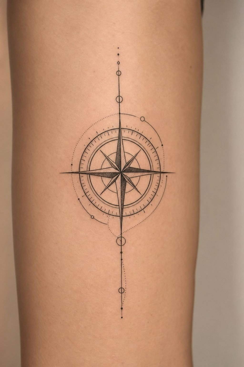
Blackwork and Dotwork
Removing color entirely changes the compass from a bright identifier to something more atmospheric. Blackwork compasses push contrast to extremes: solid black backgrounds with negative-space lines forming the rose, or intricate mandala-style layering where the compass becomes almost secondary to the surrounding pattern. Dotwork softens the geometry, building tone through stippled gradients rather than smooth shading. This suits larger pieces where the eye needs somewhere to rest. Both approaches demand precise execution; uneven dot density or wobbly black fills read immediately as amateur work.
Fineline and Single Needle
Delicate compass work has exploded in popularity, but it carries real risks. Single-needle compasses can achieve hair-thin divisions between points and almost architectural precision. The tradeoff is longevity. Lines that fine tend to spread slightly over time, especially on areas with more movement or sun exposure. A fineline compass works beautifully on inner forearms or ribs, where the skin sees less abrasion, but it may blur into obscurity on a shoulder or calf. Artists often compensate by keeping the central star slightly heavier, preserving the core readability even if outer details soften.
Design Ideas
Beyond the basic rose, compasses accommodate combination and modification without losing recognizability.
- Map integration: The compass sits atop or within a partial map section, with coastlines or topographic lines flowing behind or through the rose. Works best when the map stays low-contrast, letting the compass structure dominate.
- Clock face overlay: Replacing the compass center with a clock mechanism, or merging the two into a single instrument. The shared radial symmetry makes this feel natural rather than forced.
- Floral growth: Vines, roses, or native plants emerging from between the compass points, softening the instrument’s hardness. The organic elements should follow the existing geometry rather than fighting it.
- Broken or weathered: Cracked glass, rusted needle, or partial erosion suggesting use and time. Requires careful balance, too much damage and it stops reading as a compass.
- Constellation mapping: The compass points align to actual star positions, with subtle dotwork representing specific constellations. Appeals to astronomy enthusiasts without defaulting to generic “space” imagery.
Lettering and Text Integration
Coordinates, dates, names, or short phrases fit naturally into compass designs. The banner across the center remains the classic placement, but text can also ring the outer edge, follow the curve of a point, or sit in the negative space between elements. The critical consideration is scale: lettering needs enough room for each letter to remain distinct. Script or typewriter fonts at very small sizes often close up during healing. Block letters or simple sans-serif hold their edges longer.
Best Placements
Compass geometry interacts differently with body contours depending on size and orientation.
Forearm: The flat plane suits medium-sized compasses, typically 3-5 inches in diameter. Inner forearm offers more stable skin for fine detail; outer forearm sees more sun and movement, favoring bolder work. Vertical orientation with north pointing toward the elbow reads naturally when the arm hangs.
Upper arm/shoulder: The rounded surface distorts perfect circles slightly when viewed straight on, which actually helps, real compasses are three-dimensional instruments, and a hint of foreshortening feels authentic rather than erroneous. This placement accommodates larger pieces with surrounding elements.
Chest: Centered over the sternum, the compass gains symbolic weight from its position over the heart. The relatively flat, stable skin preserves detail well. Off-center placements over one pectoral work too, but the compass reads more as a badge than a navigational tool.
Thigh: Excellent for substantial pieces with extensive map or floral integration. The muscle movement is predictable, not the random stretching of stomach or rib skin. Healing tends to be straightforward.
Back of neck/nape: Small compasses here function almost like a brand mark. The limited space forces simplification, which often improves the design. Hair coverage offers protection from sun fading, though it complicates healing hygiene.
Color Choices
Color fundamentally changes how a compass communicates.
Classic nautical: Deep navy, crimson, and aged gold evoke brass instruments and maritime tradition. These pigments have proven stability, navy and black-based reds resist fading better than bright primaries. The gold typically reads as yellow ochre rather than metallic, since true metallic gold ink doesn’t exist in tattooing (despite persistent myths).
Earth tones: Sepia, olive, and umber suggest antique maps and terrestrial exploration. These fade into skin tones more readily than cooler colors, requiring slightly heavier saturation during application. They suit vintage or academic aesthetics.
Black and grey: The most versatile approach. Greywash shading creates depth without color commitment. A black and grey compass pairs easily with other tattoos and doesn’t clash with clothing or future additions. For pieces that need to read clearly across decades, this is the conservative choice.
Vibrant contemporary: Teal, coral, lavender, or neon-adjacent hues push the compass into modern territory. These can be striking but demand commitment to sun protection. Bright blues and greens derived from organic pigments are particularly prone to shifting toward grey or disappearing entirely.
Tips for Choosing
Walking into a shop with a Pinterest screenshot rarely yields the best result. Consider these practical factors before committing.
- Check the artist’s linework: Compass tattoos are unforgiving. Any wobble in the circle or uneven point spacing destroys the illusion of precision. Ask to see healed photos, not just fresh work. Instagram-perfect fresh tattoos often calm down considerably after a month.
- Size for your detail level: A sixteen-point compass with map coordinates and banner text needs minimum 4-5 inches to breathe. Cramming that onto a wrist results in a brown smear by year three.
- Consider your existing and future collection: Compass designs often serve as central pieces that other tattoos orbit around. Placement should leave logical room for expansion if you’re building a larger theme.
- Think about clothing coverage: Professional contexts still matter for many people. A compass on the hand or neck is a different statement than one on the upper arm or thigh.
- Ask about touch-up policy: Fine detail and light colors may need reinforcement after healing. Reputable artists typically include one touch-up in the original price.
Working with Reference Material
Bringing actual antique compasses, technical drawings, or historical maps to your consultation helps more than filtered photos. The three-dimensional structure of real instruments, the raised glass, the worn brass, the needle’s slight tilt, gives artists concrete information to translate. Photos flatten everything and often hide structural logic under aesthetic styling.
Final Thoughts
Compass tattoo drawing designs succeed when they respect the object’s inherent geometry while allowing personal adaptation. The best versions don’t try to do everything. They choose a scale, a style, and a level of detail appropriate to the placement, then execute with precision. Whether you’re drawn to the traditional sailor’s rose or a deconstructed contemporary version, the compass offers enough structural integrity to survive interpretation. What matters is that the needle still points somewhere recognizable after the skin settles and the ink ages.
Frequently Asked Questions
How much detail can a small compass tattoo realistically hold?
For compasses under 2.5 inches, stick to eight points maximum and avoid interior text. Sixteen-point roses and fine lettering blur together as the ink spreads slightly during healing. Simpler reads stronger at small sizes.
Do compass tattoos have to be perfectly circular?
Not necessarily. Slight distortion from body curvature is normal and often looks natural. However, intentional asymmetry should feel deliberate, an oval or partial compass can work, but a lopsided circle usually looks like a mistake.
Can a compass tattoo be covered up or modified later?
The radial symmetry makes compasses moderately challenging to cover. Black-heavy centers with dense ink are harder to mask than open designs with negative space. Plan modifications as part of the original design if you anticipate wanting change.
What’s the typical healing time for a detailed compass piece?
Surface healing takes 2-3 weeks, but the fine lines and dotwork common in compass designs may need 6-8 weeks to fully settle. During this period, the tattoo often looks cloudy or dull before the final clarity emerges. Avoid swimming and direct sun throughout.
