There’s something about a crescent moon that hits different in tattoo form. It’s not the full statement of a complete circle, not the emptiness of a new moon, it’s that in-between tension, a sliver of light against dark. When you add detail to that shape, you transform a simple symbol into something that rewards close looking. I’ve watched clients sit for three hours of stippling on a thumbnail-sized crescent, and I’ve seen bold, black-heavy versions that read clean from across a crowded room. The detailed crescent moon lives in that space between subtlety and impact. Let’s talk about what actually works.
Popular Styles That Hold Up
Not every style suits the crescent’s curve. Some fight it; others ride it like a wave.
Linework and Fine Line
Single-needle or tight three-needle groupings trace the crescent’s edge with hair-thin precision. The best artists vary their line weight, thick where the moon’s terminator meets shadow, whisper-thin along the illuminated horn. This creates dimension without shading. The catch? Fine line moons blur faster than bolder work. Expect a touch-up in 3-5 years, especially if you’re hard on your skin (gym rats, swimmers, I’m looking at you). Placement matters enormously here, inner forearm or collarbone, where sun hits and skin stays relatively stable, beats the hell out of a finger or foot.
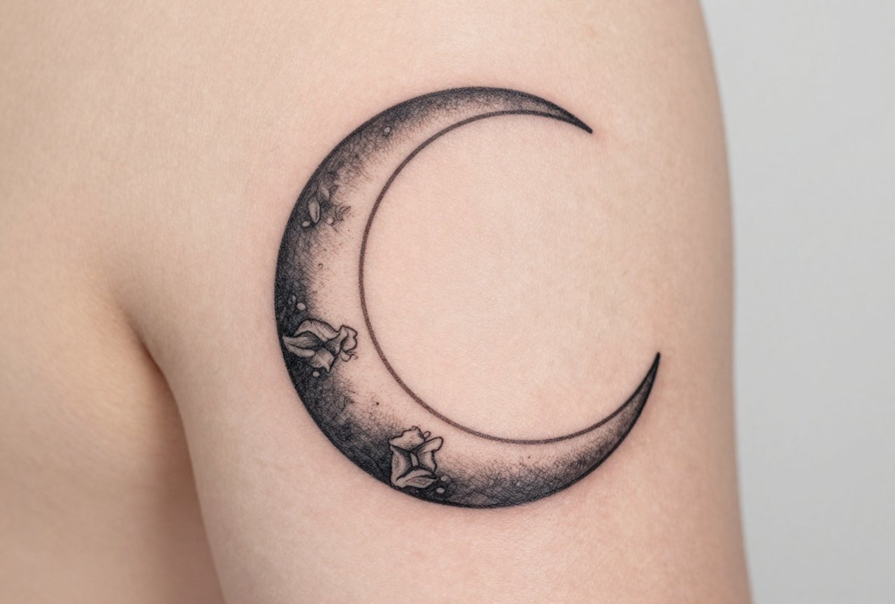
Dotwork and Stipple Shading
This is where crescent moons absolutely sing. The gradient from dense black dots to scattered specks to bare skin mimics actual lunar surface texture. I’ve watched artists build up a crescent’s shadow over two sessions, layering stipple density like printer ink. The result photographs beautifully and ages with surprising grace, dots blur into a soft, atmospheric haze rather than the muddy blob that solid black wash sometimes becomes. Time commitment is real, though. A palm-sized detailed stipple crescent runs 4-6 hours minimum. Bring snacks. Bring a charged phone. Bring patience.
Black and Gray Realism
Some clients want the moon to look like NASA took the photo. Craters, rilles, maria rendered in smooth gray tones. This demands an artist who understands skin’s limitations, what reads as subtle gradation on paper can disappear into a gray smear after healing. The best realism moons use selective detail: sharp focus on one or two craters, atmospheric softness elsewhere. Don’t try to cram every surface feature in. Skin isn’t paper, and ink spreads. Smart artists exploit that spread instead of fighting it.
Ornamental and Decorative
Filigree, mandala elements, or geometric patterns filling or surrounding the crescent shape. This style leans into the moon as frame or container rather than subject. Art nouveau whiplash curves echo the crescent’s arc naturally. Art deco geometry creates satisfying tension against it. The detail lives in the ornament, not the moon itself, sometimes the crescent stays pure negative space, letting the surrounding work do the heavy lifting.
Design Ideas That Go Beyond the Obvious
Everyone’s seen the crescent with a face. Here’s what else is happening in shops right now.
- Botanical crescents: Ferns, night-blooming flowers, or creeping vines following the curve. The organic growth pattern mirrors the moon’s own waxing and waning. Artists often draw the plant emerging from the moon’s shadow side, reaching toward light.
- Animal silhouettes: Cats, ravens, moths, wolves positioned within or perched on the crescent. The animal’s detail level should match the moon’s, don’t render a photorealistic owl against a cartoon crescent. That’s a mismatch that ages badly.
- Celestial mechanics: Orbital paths, phases rendered in sequence, gravitational field lines. This appeals to the astronomy crowd. I’ve seen beautiful pieces where the crescent contains a tiny solar system, planets orbiting within its curve.
- Text integration: Script following the inner or outer arc. The curve is unforgiving, straight lines look wrong, so artists either bend text dramatically or accept minimal words. Dates, coordinates, short phrases in languages with flowing scripts (Arabic, certain Cyrillic hands) work better than blocky English capitals.
- Fractured or deconstructed: The crescent broken into geometric shards, dissolving into particles, or constructed from separate elements. Risky conceptually, easy to look like a mistake rather than intention, but stunning when an artist commits fully.
Best Placements for Detailed Work
Detail demands real estate, but also the right kind of skin. Here’s where I’ve seen crescent moons thrive and where I’ve watched them struggle.
Spots That Work
Outer upper arm: flat, stable, easy to heal, reads well at medium distance. The natural curve of the deltoid can echo or contrast the crescent’s arc, your choice. Ribs: dramatic, intimate, follows the body’s own crescent of floating bone. Detail holds beautifully here, though sitting for it tests your breathing control. Sternum or underboob: the central placement feels ceremonial, and the crescent’s curve mirrors the natural architecture. Be prepared for a multi-session commitment; this skin moves with every breath.
Spots That Fight You
Hands and fingers: detail dies here. The crescent becomes a blue blob within years, no matter how fine the original work. I’ve had the “can you fix my finger moon” conversation too many times. Ankles and feet: same problem, plus healing complications from shoe friction and swelling. Behind the ear: tempting for visibility control, but the skin’s thin and mobile. Detailed stipple turns to soft gray wash faster than you’d hope.
Color Choices: When to Stay Black and When to Branch Out
Most detailed crescent moons I do stay black and gray. There’s a reason. The moon reads as nocturnal, and color can feel like a violation of that logic, unless you’re deliberately violating it.
That said, strategic color pops work. A single gold accent on a crater rim. Deep indigo or violet in the shadow areas, kept low saturation so it reads as darkness rather than purple. I’ve seen gorgeous work where the crescent itself stays graphite-toned but surrounding ornamental elements carry jewel tones. The key is intentionality, not rainbow explosion.
White ink highlights are having a moment. They brighten crater edges, suggest reflected light. The reality: white ink yellows on most skin tones and disappears into scar tissue on others. Some artists love it; others refuse to use it. Ask your artist’s honest opinion for your specific skin. Don’t demand it because you saw it on Instagram.
Watercolor backgrounds behind a detailed crescent, soft washes of midnight blue, fading to black, can create depth without competing. The detailed moon stays the hero; the color supports. Reverse that hierarchy and you’ve got a mess that neither element wins.
Tips for Choosing Your Artist and Your Design
This is where I get protective. The crescent moon seems simple. It’s not. The curve is a trap.
- Look at healed work, not fresh photos: Any decent artist can make a crescent look crisp at day three. The question is month three, year three. Ask to see healed examples of their detailed work, specifically.
- Consider the negative space: The un-inked skin inside or around the crescent is as designed as the ink itself. A detailed crescent with no breathing room feels claustrophobic. Good artists plan the emptiness deliberately.
- Size appropriately: Below about two inches, true detail becomes impossible. Craters become dots; dots become blur. If you want a tiny crescent, commit to simplicity. If you want detail, commit to size.
- Discuss aging explicitly: A responsible artist will tell you how their specific approach to detail will shift over time. If they promise zero change, they’re lying or naive. Either way, keep looking.
- Bring references, not blueprints: Show your artist moons that move you, but trust them to adapt to your body’s specific curves. A crescent that looks perfect on paper may need angle adjustment to sit right on your shoulder.
One last thing from shop floor reality: the crescent moon carries heavy feminine coding in tattoo culture. That’s neither good nor bad, but it’s real. If you’re a guy wanting this symbol, you might get side-eye from artists who assume you’re “settling” for a “women’s design.” Push past that. The moon belongs to everyone. I’ve done detailed crescents on construction workers, on grandmothers, on teenagers getting their first piece. The symbol transcends the stereotype when the detail is serious and the placement is considered.
Final Thoughts
A detailed crescent moon tattoo rewards the wearer who thinks in years, not just the day of the appointment. It’s a shape that looks effortless but demands precision, one wobble in the curve and the whole illusion shatters. Find an artist who respects that geometry, who builds texture with patience, who’ll tell you when your idea fights the medium instead of flowing with it.
The best crescent moon I’ve ever done took five hours. The client sat silent through the stipple work, watching the shadow build crater by crater. At the end, she looked at it in the mirror and said, “It looks like it’s actually glowing.” That’s the goal. Not a picture of a moon. A moon. The difference lives in the detail, and the detail lives in the choosing.
More Tattoo Ideas
- Religious Tattoo Ideas That Actually Mean Something
- How to Make Minimal Mehendi Designs Heal Clean and Stay Crisp
- Crow Tattoo Meaning: Intelligence, Mystery, Transformation and Omen Sy
- Explore more
Frequently Asked Questions
What does a detailed crescent moon tattoo symbolize?
A crescent moon tattoo typically symbolizes change, growth, and transition. It can also represent feminine energy, intuition, and the cyclical nature of life. Many people choose it as a reminder that even in darkness, light will return.
Where is the best placement for a detailed crescent moon tattoo?
The ribcage, upper back, and forearm are popular placements because they offer enough flat surface area for intricate linework and shading. Smaller detailed designs work beautifully behind the ear or on the wrist. Your artist can help scale the design to fit your chosen location while preserving the fine details.
What elements pair well with a detailed crescent moon design?
Floral wreaths, geometric patterns, celestial bodies like stars and planets, and animal silhouettes such as wolves or cats complement crescent moons beautifully. Crystals, mandalas, and script lettering also add personal meaning without overwhelming the central moon shape. The key is balancing detail levels so the moon remains the focal point.
How much should I expect to pay for a detailed crescent moon tattoo?
A small to medium detailed crescent moon typically ranges from $150 to $400 depending on your location and artist experience. Larger pieces with extensive shading, dotwork, or color can cost $500 to $1,000 or more. Highly detailed custom work from reputable artists commands higher rates but ensures cleaner, longer-lasting results.

