A deeper meaning tattoo is any design chosen for personal significance rather than pure aesthetics, think memorial dates, spiritual symbols, or abstract representations of growth, grief, or transformation. The term itself has become a category in tattoo culture, covering everything from minimalist glyphs to elaborate narrative pieces. What separates these from trendy flash is the intent behind the chair time: the wearer chose the image because it anchors something they can’t easily articulate.
Symbolism & Core Meaning
What “Deeper Meaning” Actually Covers
There’s no fixed symbol set. A deeper meaning tattoo might be a semicolon for continuation after mental health struggle, a coordinates piece marking a pivotal location, or a completely abstract shape that only the wearer reads. The common thread is that the image functions as a private reference point, visible enough to matter, personal enough to resist full translation.
Some recurring categories:
- Memorial work: dates, portraits, or objects tied to loss
- Recovery markers: phoenix imagery, lotus from mud, unbroken chains
- Geographic anchors: coordinates, topo lines, skyline silhouettes
- Abstract emotional states: fragmentation, connection, stillness
The risk here is cliché drift. Symbols that start sincere, semicolons, butterflies for transition, birds for freedom, can flatten into visual shorthand. The strongest pieces either personalize the standard symbol or abandon recognizable imagery entirely.
How Placement Shapes the Meaning
Inner forearm: visible to the wearer, easy to show or cover. Ribs or sternum: hidden, intimate, physically close to organs. Back of neck: seen by others more than the wearer. These aren’t neutral choices. A grief piece over the heart reads differently than the same image on a calf. The body becomes part of the grammar.
Religious & Spiritual Angles
Across Faith Traditions
Crosses, om symbols, hamsa hands, and mandalas all get used as deeper meaning work, but the application varies. A crucifixion scene rendered in black and grey realism carries different weight than a simple line-cross on the wrist. Buddhist unalome designs spiral upward to represent the path to enlightenment, fine line versions trend hard, but the symbol itself predates Instagram by centuries.
Some trace certain mandala structures to Hindu and Buddhist ritual art, where they functioned as meditation tools and cosmological maps. Whether that context transfers to a shoulder tattoo depends on the wearer’s relationship to the source tradition.
Spiritual-But-Not-Religious
More common now: abstract representations of presence, attention, or the passage of time. Moon phases, sundials, hourglasses with personal modifications. These borrow religious visual language without doctrinal commitment. The moon waxes and wanes; the wearer identifies with cyclicality rather than lunar worship.
Color vs Black and Grey
Emotional Temperature
Color reads warmer, more immediate. A memorial piece with birthstone hues hits differently than the same composition in black and grey. Watercolor-style backgrounds, often linked to deeper meaning work since the 2010s, can look luminous fresh but age unpredictably. Those soft color bleeds rely on skin tone contrast; on darker complexions, they can muddy or disappear entirely.
Longevity Reality
Black and grey holds. Color saturation drops. Red and yellow fade fastest. Blue and green last longer but can shift toward grey. For a tattoo meant to carry meaning across decades, this matters. A piece commemorating a parent shouldn’t require a refresh in eight years because the chosen palette couldn’t hold.
Line weight factors in too. Fine single-needle work looks delicate but blurs faster. Bold lines with adequate spacing age cleaner. If the meaning is meant to last, the technical choices need to support that.
How It Ages on Skin
The First Five Years
Fresh tattoos look sharper than they’ll ever look again. Lines settle, blowout happens, color settles into its long-term value. Deeper meaning pieces with heavy text, names, dates, quotes, are especially vulnerable. Small lettering blurs. “Forever” becomes a smudge. Script below 8-point equivalent rarely ages gracefully.
Areas with constant movement or sun exposure age worst: tops of hands, fingers, outer forearms. A meaningful symbol on the finger often becomes a blob requiring coverup or laser.
What Holds
Simple geometry with adequate spacing. Bold silhouettes. Designs that read clearly at two inches and twenty feet. The memorial tree with individual leaves for each family member looks intricate fresh; in ten years, it’s a green lump. The same concept as a single strong trunk with negative-space branches ages better.
Mythology & Folklore
Classical Sources
Phoenix rebirth, ouroboros cycles, Celtic knots without clear endpoints, these carry built-in narrative weight. The phoenix is often linked to Egyptian and Greek sources, though the cross-cultural fire-bird motif appears globally. Ouroboros imagery, commonly associated with alchemical and Gnostic traditions, represents self-devouring renewal. These symbols work because they already contain story; the wearer plugs personal experience into existing architecture.
Norse and Celtic Material
Vegvisir (the Norse “wayfinder”) gets used heavily for direction-through-difficulty meaning. Actual historical attestation is thin, it’s primarily from early modern Icelandic grimoires, not the Viking Age, but that hasn’t stopped its adoption. Celtic knotwork similarly: intricate, endless, visually compelling. The meaning often projected onto it is continuity and interconnection, which the form supports regardless of specific historical use.
Common Variations & Styles
Minimalist and Fine Line
Single-needle or tight three-needle work. Small scale, high detail, often abstract. A wave, a mountain, a pair of parallel lines. The restraint reads as intentionality, nothing extra, nothing wasted. The downside: fine line doesn’t hold. What looks elegant at two months can look broken at five years. For deeper meaning work, that’s a real tradeoff.
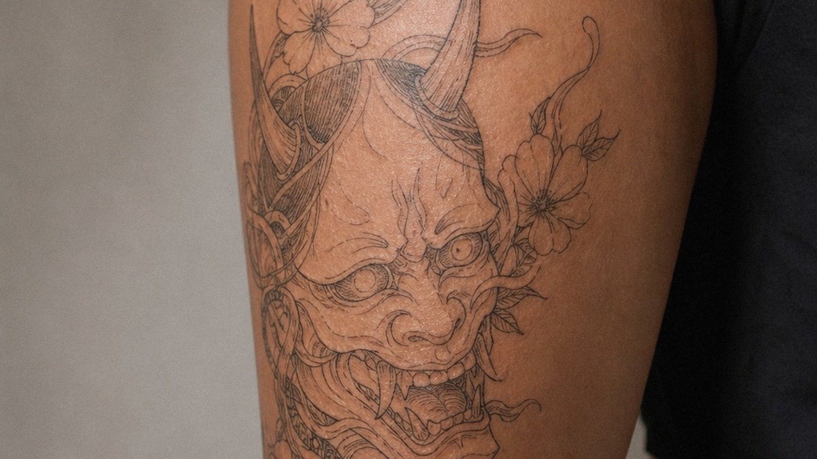
Realism and Portrait
Photographic rendering of faces, objects, or scenes. Memorial portraits dominate here. The technical demand is high; bad realism is worse than bad stylization because the failure mode is uncanny. A blurred face doesn’t read as abstract, it reads as failed likeness. This style requires an artist with specific training, not just a portfolio with one decent portrait.
Abstract and Geometric
Shapes that suggest without defining. A fragmented circle. A line that breaks and resumes. These resist literal reading, which can be the point, the meaning is felt rather than decoded. The best abstract deeper meaning tattoos have internal logic: consistent line weight, balanced composition, a clear focal point. The worst look like arbitrary shapes chosen to seem profound.
The Bottom Line
A deeper meaning tattoo succeeds when the image, placement, and execution all serve the same private purpose. The most common failure isn’t bad art, it’s disconnection between what the wearer feels and what the image can actually carry. A semicolon on five hundred wrists doesn’t dilute the meaning for the person who chose it after a specific crisis, but it does mean the symbol operates in a noisier visual field.
The technical choices matter as much as the symbolic ones. Black and grey lasts. Bold lines last. Small text and fine color bleeds don’t. A tattoo meant to mark something permanent should be built to be permanent. The meaning you bring to the chair is yours; what stays on your skin depends on what happens there.
Frequently Asked Questions
What’s the best placement for a tattoo with personal meaning?
Ribs, inner forearm, and upper chest hide easily but remain accessible to you. Avoid fingers and tops of hands if you want the piece to stay readable long-term.
Do watercolor-style deeper meaning tattoos hold up over time?
They tend to fade and blur faster than black and grey work. Soft color bleeds rely heavily on skin tone and aftercare; most need significant refreshing within five to eight years.
How small can script or lettering be before it becomes illegible?
Text below roughly 8-point print equivalent usually blurs into unreadability within a few years. For dates, names, or quotes, bolder and slightly larger always ages better.
Is it okay to use a symbol from a culture or religion I don’t belong to?
That depends on the symbol’s context and your relationship to it. Some imagery is broadly shared; other pieces carry specific obligations or histories. Research the source, and consider whether your personal meaning genuinely connects or just borrows aesthetic weight.