I’ve had a few Dexter fans in my chair over the years, and honestly? They always come in knowing exactly what they want, or thinking they do. The show’s visual language is so strong that people latch onto the blood spatter, the opening titles, that creepy-calm vibe. But here’s the thing about TV tattoos: what looks killer on screen can turn muddy on skin if you don’t think about how it’ll age. I’ve tattooed the Dark Passenger on forearms, the “Tonight’s the night” script on ribs, and one guy got the entire Miami skyline with a tiny blood drop hidden in the palm trees. Let me walk you through what actually works, what doesn’t, and where I’ve seen Dexter ink shine.
Popular Styles
Minimalist and Fine Line
This is what most people ask for first. A single blood drop. Clean, simple, instantly readable. I’ve done these behind ears, on inner wrists, along collarbones. Fine line can work for Dexter imagery because the show itself has that sterile, almost clinical aesthetic, white rooms, sharp edges, plastic wrap everything. But I always warn clients: fine line blood drops tend to blur into little blobs after five years. If you’re set on minimalist, go slightly larger than you think, and place it somewhere that doesn’t get a ton of sun or friction. The inside of the bicep holds better than the top of the hand.
Neo-Traditional and Bold Illustration
When someone wants the full scene, Dexter at his table, the kill room plastic, the photo walls, neo-traditional gives you the saturation to make it readable long-term. I did a piece last year with the iconic green shirt, the gloves, the knife, all framed in a coffin shape. Heavy black outlines, limited but punchy color palette. That’s the stuff that stays crisp. The show’s color grading is already stylized, those teal Miami mornings, the amber interiors, so translating that into tattoo pigments actually works pretty naturally. We see this a lot with TV tattoos: borrow the show’s existing visual shorthand rather than trying to recreate a screenshot.
Design Ideas
- The Blood Spatter: Not just random splatter, I’m talking the specific opening-credits sequence, the droplet hitting the sink, the steak juice, the mosquito. That slow-motion violence made domestic. As a tattoo, it works as a sleeve filler or a chest piece, but isolated splatter without context looks like a accident. I always suggest framing it: the razor, the floss, the coffee mug, something that anchors it.
- “Tonight’s the Night”: Script tattoos live or die on lettering choice. I’ve seen this done in that sharp, almost typewriter font from the show’s title cards, and I’ve seen it in cursive that aged like milk. Go bold, go simple, go bigger than you want. Ribs are popular for quotes but they hurt like hell and move with breathing, consider the outer forearm where you can actually read it.
- The Dark Passenger: Abstract but powerful. I’ve tattooed this as a shadow figure in negative space, as a silhouette in a rearview mirror, as literal text. One client wanted the passenger seat of a car, empty, with blood pooling in the footwell. That one stuck with me. Dark imagery needs light to work, make sure your artist understands contrast, not just darkness.
- Miami Metro Badge: Clean, recognizable, carries the authority theme. Works great as a standalone on the chest or incorporated into a larger law enforcement piece. The shield shape holds its geometry well over time.
- The Ice Truck Killer: Prosthetic hand, fingertips, the frozen doll parts. This is for the deep cuts fans. I’ve only done one, thigh piece, full color, the hand reaching up through cracked ice. Gorgeous, disturbing, not for everyone. That’s kind of the point.
Best Placements
Visible vs. Hidden
Dexter’s whole thing is the double life, right? So placement becomes thematic. I’ve had clients specifically want somewhere they can cover, upper arm under a short sleeve, thigh, back of calf. Others want it right there: forearm, hand, neck. One regular got the blood drop on his left pec, over his heart, because “that’s where the code lives.” Corny? A little. But placement with intention always makes for better tattoos.
How It Ages by Spot
Hands and fingers: the blood drop seems perfect here, but I’ve watched them fade to pink smudges in two years. The constant washing, the sun, the sheer abuse your hands take. If you must, go bold black with minimal detail. Inner bicep and thigh: fat holds ink well, less sun, less movement. These are my recommendations for detailed pieces. The ribcage: popular for quotes, but the skin stretches, twists, breathes. “Tonight’s the night” on ribs looks amazing at 25, questionable at 45. Plan for the long game.
Color Choices
The show’s palette is actually pretty tattoo-friendly. That teal-green of the opening, the warm amber of Dexter’s apartment, the clinical blue-white of the labs. But red, blood red, is where people get in trouble. Bright red fades to pink or muddy brown depending on your skin tone and the pigment quality. I tell clients: if you want blood, go darker. Crimson, burgundy, almost black-red. It reads as blood longer and ages with more dignity. The neon-bright stuff you see on Instagram? That’s fresh. Come back in five years.
Black and grey is the safest bet for Dexter imagery, honestly. The show’s mood is noir-adjacent. A black and grey kill room scene, all those plastic sheen highlights done with white ink (which I use sparingly, it yellows), can be stunning. One of my favorite pieces was just Dexter’s face in profile, black and grey, the only color the tiny blood drop on his cheek. Restraint reads as confidence in tattooing.
Tips for Choosing
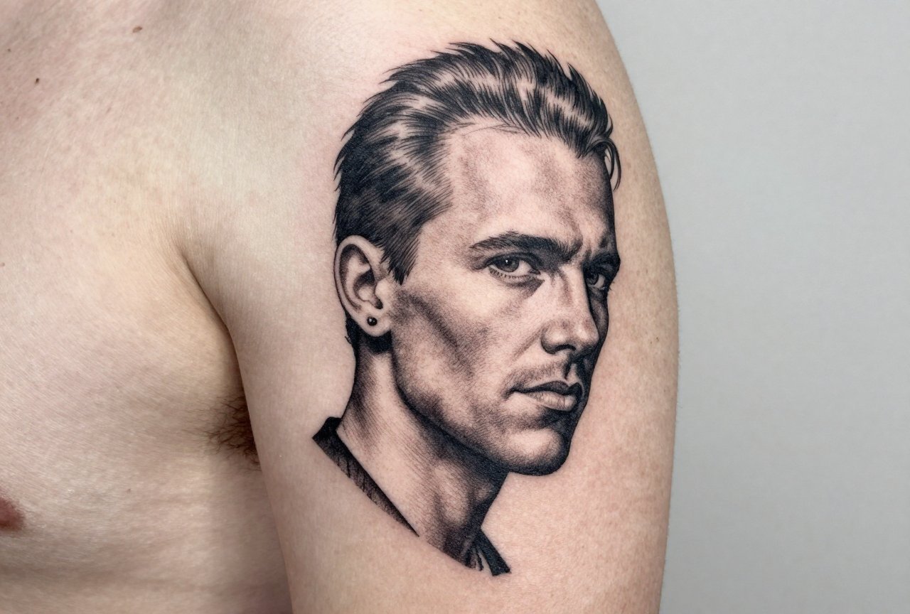
- Don’t get the actor’s face. I’ve said this so many times. Portrait tattoos of real people are incredibly hard to do well, and Michael C. Hall’s specific bone structure is not forgiving. Go symbolic. The silhouette, the props, the mood.
- Think about the Code. The show’s morality is deliberately murky. Are you celebrating the vigilante, the monster, the forensic scientist? Your design should know which one. I’ve had to talk people out of combining Dexter imagery with actual religious iconography, they hadn’t thought through how that reads.
- Reference the right seasons. Early Dexter had a different visual language than the later, more melodramatic years. The restrained, almost documentary feel of seasons 1-4 translates better to skin than the bombastic later stuff. I point clients to the original opening credits sequence as the purest distillation.
- Find an artist who gets it. Not every tattooer watches the same shows. If you want a Dexter piece, find someone who can reference the ice truck, the trinity killer’s cycles, the specific shade of that green shirt. The details matter. I once had to correct another shop’s “Miami Metro” badge that said “Miami Meter” instead. Client didn’t notice for three years.
Final Thoughts
I’ve been doing this long enough to see TV tattoos go through phases. Some age like the show itself, still compelling, still worth the conversation. Others feel like a time capsule you’d rather not open. Dexter ink has staying power because the imagery is strong enough to stand alone: the blood drop, the knife, the code. But it needs you to be thoughtful. I’ve watched clients sit in my chair with Pinterest boards full of screenshots, and we always end up somewhere simpler, bolder, more theirs. The best Dexter tattoo I ever did was just the words “Born in blood” in the client’s own handwriting, small, upper arm, black as hell. No one else would know what it meant. That was the point. That’s the whole show, really.
Frequently Asked Questions
Will a blood spatter tattoo look like a real mess as it ages?
It can if it’s too scattered or too fine. I always suggest anchoring the splatter with a solid object, the knife, the mug, the razor from the opening credits. Isolated droplets blur together; framed violence reads as intentional design even ten years out.
Is it weird to get a tattoo of a serial killer, even a fictional one?
I get this question more than you’d think. My honest take: know what you’re representing. Dexter’s a complicated figure, not a hero. Most of my clients connect with the duality, the hidden self, the code, not the violence itself. Your intention matters more than anyone else’s opinion.
How much detail can I get in a small Dexter piece?
Less than you want, always. I’ve seen people try to fit entire kill room scenes into palm-sized spaces. At that scale, faces become blobs and plastic wrap becomes grey mush. Pick one iconic element and let it breathe. The blood drop works because it’s simple.
Should I get color or stick to black and grey for Dexter imagery?
Black and grey is safer and honestly more faithful to the show’s mood. If you want red, go dark, crimson or burgundy, not bright blood red. That neon freshness fades fast. I’ve had to rework too many pink, blurry splatters that started out vivid.
