I’ve been tattooing long enough to watch trends come and go like seasons. The famous designs? They’re famous for a reason, they’ve been tested on thousands of skins, healed through countless summers, and still read clean from across the room. In my chair, I see clients walk in with Pinterest boards full of whatever algorithm pushed that week, and I always steer them back to the classics. Not because I’m boring, but because I want them happy in ten years. Here’s what actually works, where it works, and why some famous designs refuse to die.
Popular Styles That Built the Craft
These aren’t just “old school cool.” They’re the structural DNA of tattooing.
American Traditional
Bold black outlines. Limited color palette, red, green, yellow, blue, maybe black. That’s it. I’ve tattooed more anchors, swallows, and roses than I can count, and they all heal the same: readable, tough, unmistakable. The magic is in the constraint. No subtle gradients to muddy up, no hairline details that fall out. Sailor Jerry and his contemporaries designed for sailors who needed art that survived sun, salt, and hard living. The rules haven’t changed. I tell clients who want something that lasts: start here, even if you modify from there.
Japanese Irezumi
Koi swimming upstream. Dragons coiling through clouds. Cherry blossoms falling. The Japanese masters figured out something crucial, large-scale storytelling with built-in movement. The wind bars, the water waves, they’re not just background; they guide the eye across the body. I’ve done sleeves where the koi’s tail starts at the wrist and the head breaks through at the shoulder, and the flow matters more than any single element. This style demands skin real estate. Don’t shrink it. I’ve seen gorgeous back pieces shrunk to arm size and the detail turns to soup in two years.
- Tebori vs. machine: Hand-poked tebori exists but most Western shops use machines. The aesthetic remains.
- Cover-up friendly: Dense backgrounds hide old work beautifully.
- Commitment level: High. These pieces take multiple sessions and serious money.
Design Ideas That Keep Showing Up
Certain images have tattooed themselves into collective consciousness. Here’s why they persist and how to make them yours without looking like flash off the wall.
Animals With Meaning
Wolves, lions, bears, snakes. The predator roster. I’ve tattooed wolves howling at moons that weren’t there, lions with crowns they didn’t earn, and every time the client has a story. The trick is specificity. A wolf from a photo reference, not the generic profile everyone recognizes. A lion with scars, with age in its eyes. I did a snake last month wrapped around a client’s actual forearm scar, coiled, protective, the scales following the body’s curve. That’s the difference between decoration and tattooing.
Flowers follow the same rule. Roses are the most requested design in probably every shop on earth. I love them, but I push for variety. Peonies for Japanese pieces. Chrysanthemums for longevity. Wildflowers that actually grow where the client grew up. The meaning attaches to the specific, not the category.
Text and Lettering
Script is everywhere and mostly terrible. I’ve seen “live laugh love” in cursive so thin it’ll be hieroglyphics by year three. The famous lettering styles, Old English, traditional script, typewriter fonts, work because they’re designed for readability at size. I make clients say their phrase out loud. If they hesitate, we redesign. The best text tattoos I’ve done were single words, big, on ribs or forearms, where the body becomes the page.
Best Placements for Famous Designs
Skin moves, stretches, suns, ages. Placement isn’t just about showing off or hiding, it’s about how the design lives.
Forearms are honest. Everyone sees them, including you, so the tattoo better be something you want to confront daily. American traditional thrives here. The flat planes let bold designs sit clean. I’ve watched forearm roses soften beautifully over fifteen years, the lines stay, the color mutes to something vintage, not ruined.
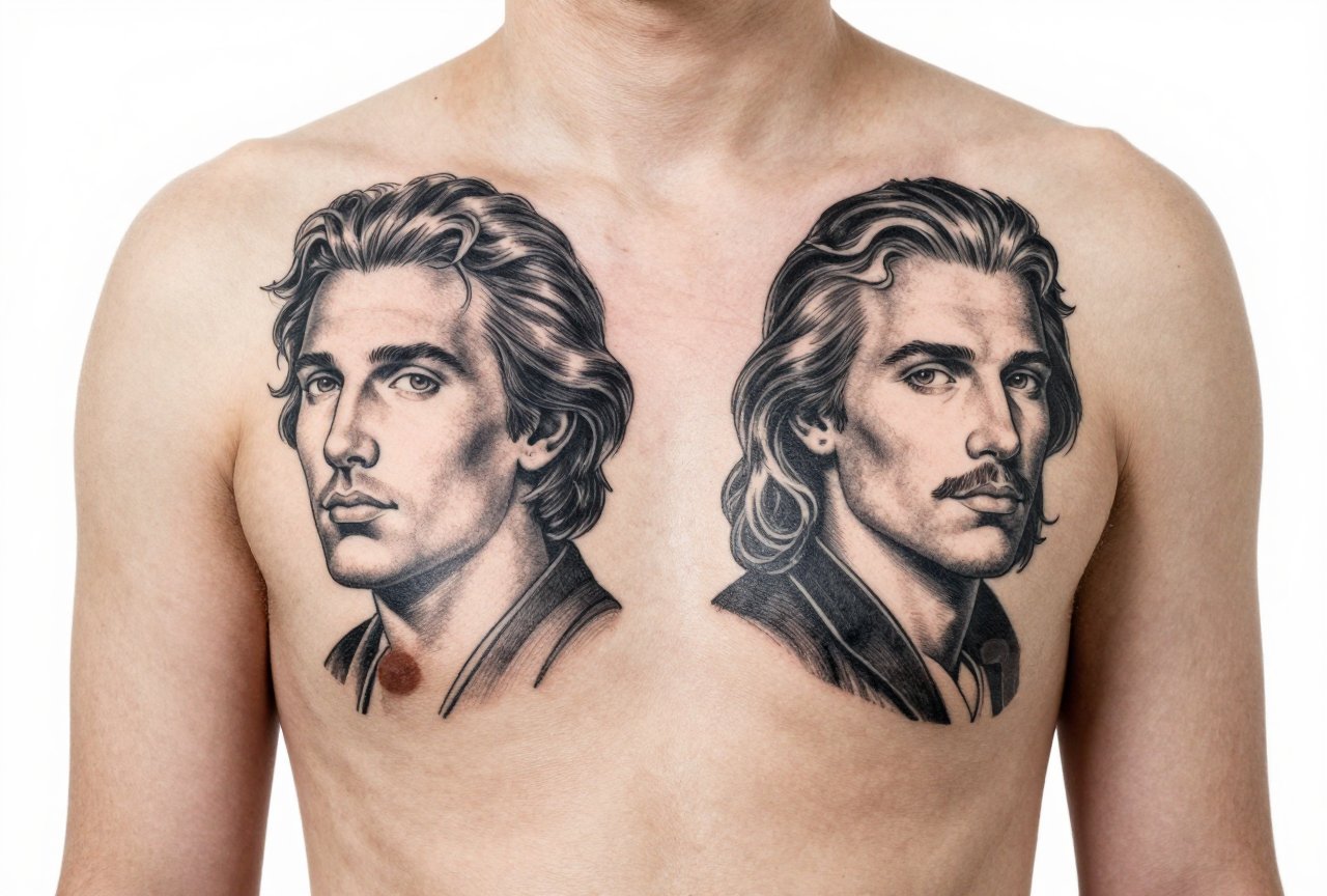
Chests are for the committed. Eagles spread wide, hearts with banners, ships sailing into collarbone territory. The skin’s different here, thinner, more vascular, heals tricky. I warn clients: chest tattoos hurt more and can blow out easier. But the impact? Unmatched. A proper chest piece frames the torso like architecture.
- Thighs: Hidden, spacious, forgiving. Japanese designs love this canvas.
- Back: The billboard. Dragons, phoenixes, full scenes. Takes years, costs serious, looks museum-quality when done.
- Hands and neck: We call these “job stoppers” for a reason. I make clients wait, think, come back. The famous designs here, spiders, skulls, letters, read aggressive because the placement is.
Color Choices That Survive
Black and grey versus color isn’t just aesthetic preference. It’s a maintenance decision.
The Black and Grey Reality
Chicano black and grey, photorealism, soft shading, this is Los Angeles’s gift to tattooing. I’ve watched black and grey portraits age into something almost charcoal-drawing-like, the tones settling into skin like they were always there. The limitation is warmth. No red lips, no blue eyes unless you add them. But the longevity? Superior. Black ink is carbon. It’s stable. It doesn’t argue with your immune system the way some pigments do.
Color That Holds
When clients want color, I talk about the famous palette. Sailor Jerry red. That particular green that looks like aged copper. Yellow is the problem child, fades fastest, turns peachy, sometimes disappears entirely. I use it sparingly, for highlights, never for structure. Blues are trustworthy. Purple splits the difference. The new organic pigments are better than what I started with, but I still tell people: color needs commitment. Touch-ups, sun protection, the whole program.
We see this a lot in my shop, someone brings a watercolor reference, all soft bleed and no line. I explain: that bleeds in skin too. Without black anchoring it, color drifts like wet paint on wet paper. The famous designs that use color successfully? They’re bordered. Contained. The color lives inside lines that keep it honest.
Tips for Choosing What Actually Fits
I’ve sat through enough consultations to know the difference between impulse and intention. Here’s what I tell people in my chair.
First, look at healed work, not fresh. Instagram lies. Fresh tattoos are swollen, saturated, lit for drama. Healed work, six months, a year, five years, that’s truth. Ask artists for healed photos. The good ones keep them. I have a folder on my phone, hundreds of images, dates attached, that I show anyone who asks.
Second, consider your actual life. Gym daily? Sweat fades color faster. Outdoor job? Sun is tattoo enemy number one. I have a client who works fisheries in Alaska, got a gorgeous full-color sleeve, and watched it grey out in three seasons. Not the tattoo’s fault. Physics.
- Size appropriately: Detail needs space. A design with twenty elements doesn’t shrink to three inches.
- Think in decades: What reads at twenty-five should read at fifty-five. Bold ages better than busy.
- Trust the artist’s no: If we say something won’t work, it’s not ego. We’ve watched things fail.
Third, the famous designs are famous because they’re proven. That doesn’t mean copy them exactly. The best tattoos I’ve done started with a classic structure, traditional rose, Japanese wave, black and grey portrait, and bent it toward the person’s actual life. Their dog, not a generic wolf. Their grandmother’s handwriting, not a font. The framework holds; the content makes it theirs.
Final Thoughts
Tattooing famous designs isn’t playing it safe. It’s respecting a craft that figured out what survives. I’ve got my own classics, an eagle on my chest, a snake winding up my leg, both done by mentors who taught me what matters. They don’t look like anyone else’s because the hands that made them were specific, even if the images weren’t original.
The designs that last aren’t necessarily the ones that trend. They’re the ones built on real understanding of skin, time, and how people actually live in their bodies. Choose something with history behind it, then make it yours. That’s the tattoo that stays good long after the shop visit fades from memory.
Frequently Asked Questions
How do I know if a famous design will look good on my specific body type?
A good artist maps the flow of your muscles and movement before drawing. I always have clients stand, move, flex, designs that look flat on paper need to wrap and flow. Bring reference, but trust the stencil placement.
Why do some classic designs cost more than trendy ones?
Specialists in traditional Japanese or American traditional often apprentice for years mastering specific techniques. The precision those styles demand takes real skill. You’re paying for the education behind the hand, not just the hour.
Can I mix different famous styles in one tattoo?
It’s tricky but possible. I’ve blended traditional Japanese backgrounds with American traditional foregrounds, but the rules of each have to respect each other. Find an artist who actually works in both styles, not someone who claims everything.
How long should I wait between sessions on a large famous design like a sleeve?
Minimum two weeks for the skin to surface-heal, but I prefer three to four. The body keeps working below what you see. Rushing means compromised healing and patchy results. Good work takes the time it takes.
